We design responsive website in Delhi
What is meant by responsive website?
First answer this question;
“Did you ever leave a website you were visiting on your smartphone due to bad interface?”
Yes? Then you definitely understand how important is User friendly interface on desktops, smartphones, tablets and even Televisions.
If No, then, we are here to give your users the same experience you had.
Responsive website design definition goes as;
The designing of websites such that they are compatible with all devices. This includes ranging from a huge desktop monitor to a tablet or smartphone.
Basically you no longer have to develop a new website to match every device. One responsive website is enough to work well on all devices.
As an experienced website designing company in Delhi India we understand the importance of optimizing websites for fruitful returns, for either Start-ups or Established businesses. So, we explain this importance to our clients and insist to design responsive website for their business. Your customers will get a clean and nice user experience if your website is accessed perfectly on devices of all sizes.
Our team design responsive website which is easy to use, navigate and scroll on all Screens. For example, original design of the website is rendered completely if it is viewed on Laptops or bigger screens. On smartphones the sections beautifully rearrange themselves one below the other for a nice scrolling experience.
We make sure to benefit our clients with our responsive web design service by developing websites which are not only compatible with all screen sizes and also maintain high page load speed which is a major factor for the SEO of a website.
Design responsive website for your business
We design responsive websites which respond to user behavior
Our expert website designers in Delhi India know how to use media queries and CSS layouts to make a website respond to user’s behavior. No matter which device users use, in which orientation and which browser to browse through a website.
We know how to work with images while designing a responsive website
The most tricky part when you design a responsive website is to make images look good on every device. Our experts know how to resize images proportionately to look good with responsive websites.
We use custom layout structure
These days there are so any types of devices and mobile operating systems that the standard media queries and CSS layouts sometimes don’t work properly on some of them. We use custom layout structures for devices such as for iPhones, so that your users get unmatched experience.
We use javascript with CSS3
There are many browsers which do not support CSS3 media queries. In such case while designing a responsive website, we make sure to include proper javascript libraries to make the media query work.
Fast loading responsive websites
While using a lot of CSS and javascript to design a responsive website, there are good chances that the website becomes slow and this is a very important factor for user experience. Slow websites doesn’t generate results. Our experts use various techniques to make javascript and CSS optimized in a responsive website.


Benefits of a responsive website
Design responsive website for your business
Get awesome mobile web experience for your customers with our carefully optimized websites for all devices.


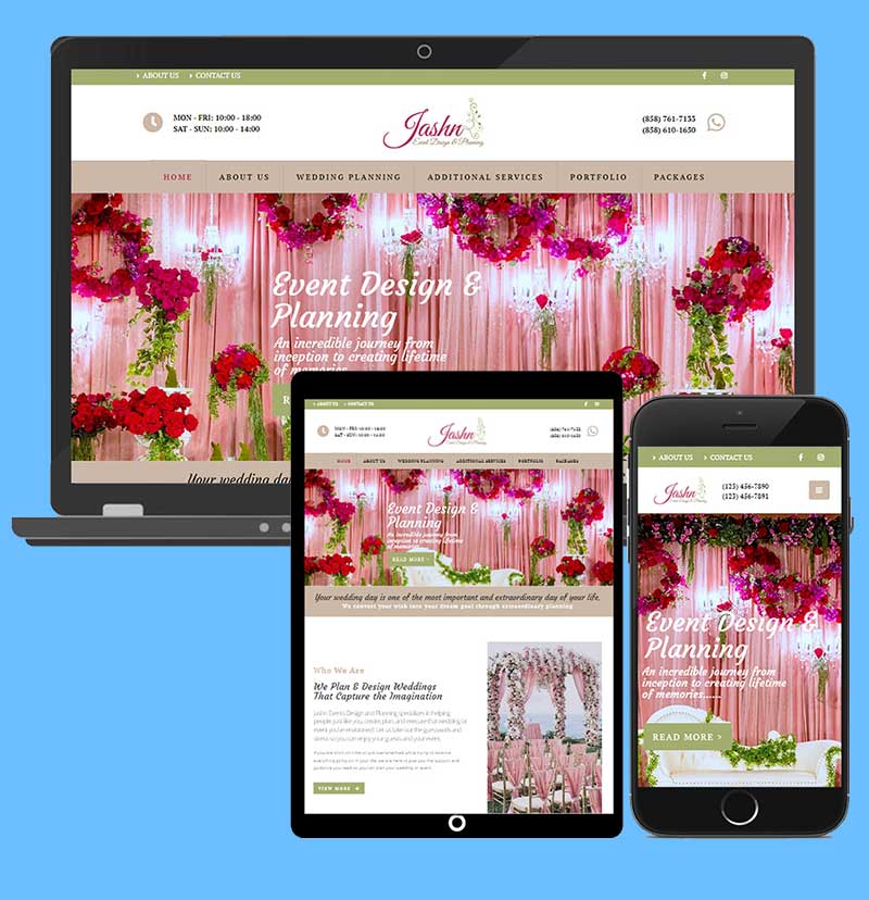
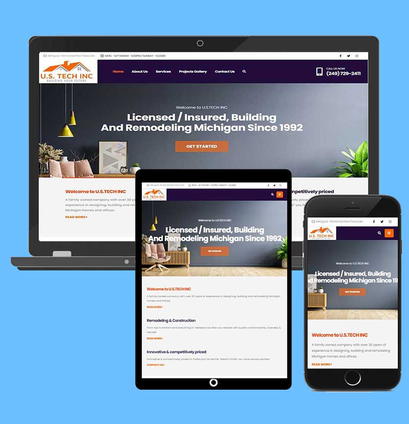
Examples of responsive websites
Though every website which we design is responsive. However below are some of the examples of responsive websites designed by us.
Key elements of responsive website
Consistence browsing experience:
Your website should run smoothly across all devices and no user will spend time on your website if the experience is inconsistence. Inconsistency will make the users leave your website early and will increase the bounce rate which will have negative impact on your website SEO.
Mobile phone compatibility:
As more and more user these days access internet from their mobile devices, web designers should make sure that the responsive website is fully compatible with mobile phones of different screen sizes. We test your website on real devices rather than simulators to rule out errors in compatibility.
Optimized white spaces:
While designing a responsive website, web designers should be extra careful with paddings and margins as there are good chances that these spaces get lost on mobile devices. It is recommended to use % format with margins and paddings.
User friendly navigation:
Your website visitors should be able to easily find what they are looking for on your website. Navigations play an important role in your website’s user experience. Never leave your users puzzled when they land on your website.
Image optimization:
Images in a responsive website should be optimized and resized properly as website speed largely depends on image optimization. Un optimized images will make your website load slow and will adversely affect your website user experience.
Hire best website designers in Delhi
Our website designing services in Delhi provide timely and accurate solutions for your website related needs
FAQs on responsive website design
Is responsive design difficult?
It is always difficult to design responsive website. It requires high level of expertise and a lot of precision. If not done right it could harm the over all user experience and performance of your website. Responsive design makes your website compatible with every device and the types of devices are countless. You need to keep in mind the existing devices and upcoming devices when you design a responsive website.
How much does it cost to create a responsive website?
Cost of designing a responsive website varies as per the type of website. There are different types of websites such as a 5 to 6 page standard website, 10 to 20 pages corporate websites, blog website, ecommerce or portals websites. All these websites require different amount of work to make them compatible with different devices.
Can I convert my existing website into a responsive website?
Yes you can convert your existing website into a responsive website. However we recommend to get it done from scratch.
Does Google prefer responsive design?
Yes, Google has officially stated that it prefers responsive websites over the websites which are not compatible with mobile phones. As more and more people use mobile phones to search internet, Google aims at providing the best experience.
Which language is best for Responsive Website?
HTML5 and CSS3 account for most part of the responsive layouts and compatibility across devices. You can choose any platform like WordPress, Custom PHP, Magento etc for the functionality of your website.
Is WordPress responsive design?
Yes almost every WordPress theme is responsive but you should carefully choose your WordPress theme as not all themes perform good. We do custom designing in WordPress to rule out any performance issues which means we create our own WordPress themes.
Responsive website designing services articles
What Are Responsive, Adaptive And Fluid Designs
To make your website mobile friendly or look good on devices other than laptops and desktops, you might have come across terms like responsive websites, fluid design for website and adaptive web design. Don’t get confused by these tech terms. Read the details and increase your knowledge.
Read about it here >>
Using WordPress? Here We Give The Best Theme Options To Make Your Website Responsive
Don’t get into technical part and spend a huge chink of money on getting your website responsive. You can easily do it using WordPress. All you need to do is choose a nice responsive WordPress theme.
Read about the best responsive WordPress themes here >>
All You Need To Know About AMP. Accelerated Mobile Pages
Know how to implement Accelerated Mobile Pages in your website and increase your mobile phone visibility and rankings. Impress both Google and your customers.
Read full guide here>>
Get Answers To Frequently Asked Questions About Website Designing
If you want to know about something about our website design service you can try reading our FAQ section. Or contact us
Read all answers here>>
Want To Mark Your Presence In The Digital World?
Get started with first step towards it by getting a website which is dynamic and fully functional.
Start-up? Mid-size firm? Enterprise? We’ve got you covered with our suit-to-all services and pricing.