
Mobile phone users have grown drastically in past few years. Easy access of internet on small screens makes it comfortable for more and more people using mobile phones.
On an average around 5 hours are spent by a normal person on a smart phone every day. This usage includes searching for services, online shopping, blogs reading, social network games etc.
Have you ever noticed, how many people arrive on your website from smart phones?
You can easily get this data from Google Analytics.
Why is that your website doesn’t appears on mobile phone internet search results on Google. Even if it does then why are you not getting sales or subscribers. Why do people leave your website within first few seconds of arrival making your website bounce rate high.
Not familiar with bounce rate? Read all about bounce rate.
It is all about following the best practices of mobile SEO. SEO is not just a process which starts afer the website is developed and live. SEO starts right from planning your website.
SEO exists while you design your website. If you haven’t realized it then you have made huge mistake and lost all the mobile traffic to your competitors who rank on first page of Google in mobile searches.
But it is never too late. You can still prepare your website for 2019 if you start right away. You can avoid mobile SEO mistakes for 2019 as mobile phone traffic is still growing fast and will continue growing.
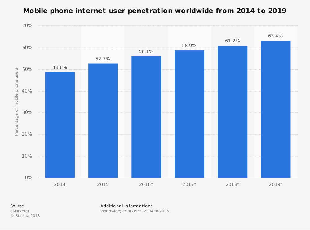
Here is Mobile phone internet user penetration worldwide from 2014 to 2019
Here is the data of global mobile phone data traffice from 2016-2021

The compound annual growth rate is expected to be 47%.
This article talks about how to make the most of this super growth of mobile traffic.
How to avoid mobile SEO mistakes in 2019
Below are the mobile SEO mistakes and measures to avoid them.
1) You website pages are not responsive in design
The the researches show that people prefer mobile phones over desktop these days for internet surfing and the number is growing each day.
If you want this increase in traffic to reach your website on smart phones then you need to have a responsive website.
Responsive website design makes your website compatible with devices of all the screen sizes. Read more about responsive website design here.
If you cannot impress your mobile visitors with a robust design then they tend to leave your website within 3 to 4 seconds.
You need a website which changes its design depending on the device it is viewed on. The website sections should be as prominent and text should be as readable as it is on the desktops.
People used to maintain a different mobile website for mobile phones but we recommend to make only one website which has responsive web design. It is easy to maintain and more search engine friendly as it has just one URL for all devices.
Below is an example of responsive website which we have created for one of our clients.


You see how the navigation menu and buttons rearrange on different screen sizes.
2) Your website pages have very slow page speed
Website page speed is an important ranking factor both for mobile and desktops.
Users never spend time on a website which loads slow and takes more than 3 to 5 seconds to load. Google never ranks the website which people don’t love and don’t spend time on it.
If you want your website to rank on mobile searches then you have to fix page speed optimization.
You can use the page speed test tool from Google.
You can take care of few thinks to improve your website speed:
Optimize images: You can use free tools available online to optimize images on your website. There are many available like tinypng
Enable cache: Enable caching on your website improves the website speed drastically. Caching serves content to your website visitors faster and reduce the load time.
Minfiy HTML, CSS, Javascript: Minifcation of HTML, CSS and Javascript also helps in increasing your website speed. It deletes the blank spaces in these files and makes them work faster.
Keep all CSS, Javascript in footer This is the best practice and should be kept in mind fromthe begining.
Enable AMP: AMP stands for Accelerated Mobile Pages. AMP enables create website pages for mobile users and load them at lightning fast speed for mobile visitors. Learn more about AMP in our Google AMP Guide.
There are many other things which can be done to improve your website speed. Contact us to get more details on how to improve your website speed.
3) You have blocked files in your website.
Most people tend to block CSS and javascript files for Google bots. These doesn’t renders the page completely to Google and they cannot see the good design your website has.
Google doesn’t ranks the websites which they can’t access completely. Website pages are not indexed by Google if they have blocked resources. Proper indexing of the website pages is extremely critical for a website to rank in mobile searches.
Make sure your robots.txt file doesn’t has code which blocks these files. If you are not familiar with indexing and blocked resources then take the help of a digital marketing company to take care of this for you.
Good online marketing companies understand the importance of indexing the site in Google have technical experience in dealing with robots.txt, XML sitemap, site URLs and structure.
You must avoid doing it yourself if you are not sure of what you are doing as it may backfire on your mobile SEO.
4) You don’t have rich snippets in your website
Rich snippets is not the traditional SEO technique and is often ignored while doing the SEO. Rich snippets extract important information from your website pages and display them on the search result pages in your search appearnace along with meta content.
Here is an example of how Rich snippets look like.

It is a good way to display extra relevant information in search results to gain your visitors trust. By extra information I mean things like star ratings, images etc.
Rich snippets are a good way to catch users attention even if you are not on top of the search results.
5) Multimedia on your website
Multimedia content like videos on your website should be served smoothly to your website visitors on your website on mobile.
It is a good way to engage your website visitors by using videos etc on your website. If not used properly the heavy video files may make your website super slow.
A good way to do this is upload your videos on video platforms like Vimeo and YouTube and then embed them on your website.
Another issue is with the trend of using background videos on web pages. You should be extremely careful as some mobile platforms doesn’t display background videos on websites.
You should use a fallback background image in such cases for a better user experience.
Conclusion on mobile SEO mistakes to avoid in 2019.
I am sure you now know the importance of mobile SEO and how to avoid mistakes and increase traffic on your website. This is the right time to work on the mobile SEO mistakes if you want to perform it better in 2019.
These things require time effort and patience so if you start today then you will have a perfect website by beginning of 2019 and impress your website visitors in the new year.
If you are not sure about these things. Contact us now for a free mobile SEO consultation.