At some point of time after getting a website and doing it’s SEO properly and still not getting results, many of the website owners think;
“What are we not doing right?”
or,
“What do the highest converting websites do for high conversion and sales?”
This post details about what exactly does highest converting websites follow so as to get high sales and conversion numbers.
It happens most often that website owners are too caught up in running the business cycle, that they tend to focus less on their site’s Conversion Optimization.
What is Conversion Optimization?
“Conversion Rate Optimization or Conversion Optimization (CRO) is the well ordered process of boosting the percentage of your site’s users who take an action on your site.”
This required action can be anything like:
- Filling a form
- Subscribing to email newsletters
- Placing an order, or
- Just becoming a customer
By understanding CRO, you can gain a better learning about:
- your customers behavioral flow on your website,
- actions they take there, and
- most importantly what’s stopping them from taking a desired action.
Irrespective of the type of conversion (Macro or Micro) it is recommended that website owners invest some time in Conversion Optimization of their websites.
Note:- Macro Conversions are primary goals like purchasing, requesting a quote etc. Whereas Micro Conversions are the small goals leading to the primary goals. For example; adding to cart, subscribing to emails etc.
Some Important Facts for Consideration
- You have maximum 8 seconds to impress your site’s visitors with your landing page and headlines. After 8 seconds your visitors will leave.
- Not every user is a buyer. In fact 96% of visitors are on your website for just some information and not for buying.
- More number of landing pages means more leads.

- For eCommerce websites, a product video can boost the purchases by 144%.
- Delay in page loading by 1% can bring down your conversion by 7%.
- A/B Testing method has got success to many companies.
The purpose of showing these facts to you was to help you gain better insights about the focus of highest converting websites.
Let us now dive in towards how does highest converting websites work on their conversion optimization.
1. Very Clear Unique Selling/Value Proposition (USP/UVP)
All highest converting websites have a very prominent answer to “Who” and “Why” about their business.
Who – they are visiting, and
Why – should a visitor buy from you.
A very good example to explain this is GoDaddy’s website.

There are many hosting service providers across the globe. Therefore it becomes essential for dedicated hosting service providers like GoDaddy to stand-out in competition.
GoDaddy has clearly stated what they do, and why should the users choose them for hosting solutions. They have focused on their pricing and simple hosting solutions.
It is important for the website owners to give reasons to their visitors to choose you for their requirements.
For this, mention some of your extra perks like – Money back guarantee, free delivery, no extra charge etc. in your landing page. This acts as a great catalyst for conversions and results in high ROI.
2. Test Call to Actions on landing pages
Call to Actions have a major role in taking your visitor towards your Conversion Goal.
In fact by redesigning your homepage and placing the CTAs above the fold, Hubspot claims to have increased the conversion rate by 106%. They focused on driving the traffic towards downloading company’s whitepaper. And the whitepaper had information about the company and it’s services in detail.
Any end-to-end Digital Marketing Company should focus on three main target areas to increase conversions:
- Impactful Headlines
- Clear Call-to-Actions
- Meaningful Graphics and Content
Let us understand it in a better way by using an example.
Mozilla tested two versions of CTA, both having different text.
a. Try Firefox 3
b. Download Now – Free
After the A/B testing on a single web page they decided to go for the “b” CTA. This was clearly due to the results which showed better conversions for the Download Now – Free CTA.

As is clear from the results, Download now – Free, clearly directed the visitors to download the browser which was absolutely free.
Note: Easy and Free are the two most loved words for boosting conversion.
Hence it is clear that highest converting websites don’t just go with the regular CTA. They try and test which one works best for a particular web page.
Some examples of better converting CTAs which may work for your are:
- Try Now – Get the secret Now!
- Register Now – Sign Up and Reserve Your Spot Now
- Buy Now – Shop Now
- Read Now – Get Access Now
- Get started now – I’d love to analyze my website now
If you are a start-up business or medium enterprise then these tips will help you mark your place in the market:
- Showcase your USP above the fold; preferable at someplace in the top.
- Mention years in business, no. of clients served, orders shipped, Client ratings etc at the top.
- Run a slider or a banner with customer testimonials
3. Test Homepage Headlines
Homepage of a website attracts majority of the search engine traffic. And, the main element which drives attention of a visitor on a homepage is – the Headlines.
It is imperative for a SEO company to test different headlines and choose the one which resonates best with the visitors.
Let us discuss more about this with an example.
37signals increased conversions for one of their product by 30%. How?- By testing headlines.
They started with the headline “Start A Highrise Account”

This turned out to be their worst headline since it contributed in no way to the conversions and sales.
After careful analysis they decided to change the headline to “30-day Free Trial on All Accounts”. Result – a boost in their conversions by 30%.

The reason for this boost is quite clear. The new headline is clear, motivated and attractive.
Therefore, it is recommended for websites to add a clear headline in their banner which gives reasons to visitors to take action. You can add words like “Free Trial” or “Free Download” or “Save –%” to add more value to your headlines.
Similarly another company; CityCliq tested various headlines to reach for the best one which helped them increase conversions by 90%.
They started with very basic and general headlines. But found their way to the best performing headline making them one of the highest converting websites.
The headlines used for testing were:
- Businesses grow faster online!
- Online advertising that works!
- Get found faster!
- Create a webpage for your business
And the best performing headline was – “Create a webpage for your business”.
This is because it is:
- Crisp and clear
- Language does not include words which end up in spam
- “What we do” is loud and clear
Always go with the headline which clearly informs the visitor of what you do and why should they choose you.
4. Keep the forms short
If a visitor has reached a form, then it signifies his interest in your service/product.
This is a great news for all the website owners, and it should not be skipped for any unattended mistake.
There are times when website owners flood there forms with multiple and unnecessary fields.
Sad Result – the visitor who was just going to sign up or send the query and convert into a customer, exits from your website.
No body likes to spend time filling unnecessary information just to sign up or send information requirement. Therefore, keep the form short and simple.
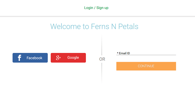
In fact many eCommerce website are giving the option to sign up from social accounts or sign up later or continue as a Guest.

All these alternatives are great to encourage conversions by removing any delay of filling a sign up form.
Other Helpful Methods
- “Live Chat” feature increases sign ups by 31%. Source
- Have a security seal on your website to increase the trust vales on your visitors.
- Boost conversions by adding discount information in the title (e.g. 25% off Product X vs Product X)
- Include credibility factors like testimonials, social profiles etc to increase conversions.
- Segment your users to increase conversions. Eg. naukri.com – they have segments for recruiters and job seekers.
- If possible add real customers’ photo on your homepage to boost conversions. Source
- Add an empathizing emotion in the headline. Example – “Track your blood pressure level easily” vs “Maintain Optimal Health by tracking blood pressure easily”.
- The color of your CTA button should be impactful like red color. Source
- Have a responsive website design.
Summary
The highest converting websites lay emphasis on testing and implementing. They don’t just haphazardly include any element in the website. Rather they test their performance and then include in their website.
And this is the major part which most websites lack.
Therefore, test the elements and include only the best one which works for you in the most beneficial manner.
We’re recognized as a top Website Development Company on DesignRush.Therefore, if you are looking for an end-to-end Website Designing company in Delhi – India to manage your website’s conversion? Contact us now!


