
Before we dig in to the details of how to benefit from responsive web design, let us first refresh our memory about what exactly is a responsive design.
A Responsive web design seamlessly fits to any screen size, without compromising the quality of a web page.
The quality here is measured in terms of comfort in readability, navigation, clickable buttons and the overall look and feel.
As per studies there is a stratospheric increase in the percentage of internet surfs on mobile devices. Therefore it is absolutely essential for all business owners to develop a website which fits mobiles, tablets, desktops or basically screen size of any resolution.
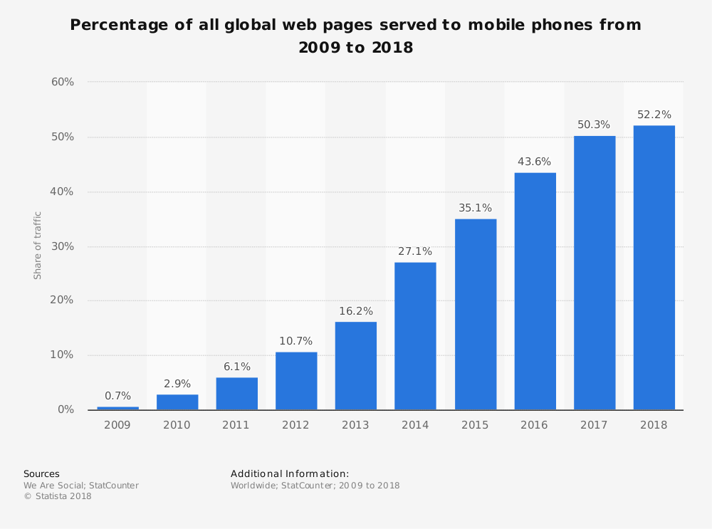
From the above study it is clear that there is a constant increase in the share of mobile phone website traffic worldwide. In fact as of February 2017, mobile holds 65.1 percent of all web traffic in Asia. This is huge.
Note: Mobile website is different from Responsive Website
Learn more about optimizing your website for mobile phones.
Planning to create a responsive website?
Read these responsive web design essentials for better insight.
Now that we know about the basics of a responsive web design, let us learn about how to benefit from responsive website design.
How can a Business Benefit from Responsive Web Design?
For a business the convenience of an online user while browsing the website is crucial. Because if the user is not comfortable to browse your website, then your potential sales goes down. And this is not a good news for any business.
Therefore it’s time to get your business loaded with benefits of using a responsive website.
How?
Read on for answers.
#1. Higher Search Engine Ranking
One of the most important benefits of a responsive website is higher SERPS. Google clearly states one of the reason for choosing responsive website design, i.e.,
A responsive website helps Google’s algorithms to precisely assign indexing rules to a web page. Rather than requiring to point directions towards the existence of related desktop/mobile pages.
Hence, making responsive web design an important Google Ranking Factor.
When you have only one strategic URL to focus on, your SEO efforts become more fruitful. Thereby giving better results in terms of search engine rankings.
#2. Increased Sales and Revenue
Just like it’s important for every business to have a website; it is equally important for a website to attract traffic and convert it into sales. So how does a business benefit from responsive web design?
Well, as said in #1, when you are making SEO efforts towards only one URL, then the outcome is better as compared to efforts towards multiple URLs.
And, second, a responsive website design allows a single compatible cascading style sheet (CSS) for a great user experience.
Further, a great user experience on your website means less bounce rate and more conversions.
#3. Easy to link
Responsive design makes it convenient for the users to share and link to your website’s content with a single URL. Unlike a website which has different websites for mobile, desktop, tablet and other devices.
If the users find the content interesting they do not have to go through the hassle of first identifying the URL and then its matching platform. One URL and you are sorted.
The sharing of content is also helpful for SEO as it gets you a genuine backlink – another reason for SEO boost.
#4. Reduces load time
You must have noticed that sometimes when you try opening a business website it redirects to a mobile version (m.website.com) and then it opens.
This is because that website is not responsive and has a different site and a different URL for mobiles.
This is not a good practice because users hate to wait. If a website redirects to a mobile version then it will obviously increase the load time. Moreover Google says that a user agent-based redirection is error-prone and can upset your site’s user experience.
Therefore shift towards a responsive website to cut down redirection and load the website quickly.
#5. Better indexing of business website
Every business website needs to be indexed by Google or other search engines so as to be found in search results. And in case of Google it’s web crawling bot discovers new and updated web pages for the purpose of indexing.
The advantage with responsive web design pages is that only a single Googlebot user agent is needed to crawl your page once. Unlike with multiple versions of a website where the Googlebot user agents have to crawl multiple times to extract all versions of the content.
Therefore it is clear that with responsive websites Google crawlers can find updates in a website more efficiently. Thereby helping in the indexing of your site’s updated content and keeping it fresh.
#6. No penalty for duplicate content
Multiple versions of a website end up creating duplicate content of your website. And Google does not like duplicate content at all. Therefore, it penalizes the website, or worst de-indexes it.
Though revoking the penalization is a tough task but upgrading to a responsive website can surely help.
Redesign your website to be a responsive one. Then request Google to re-index your website. This time Googlebot crawlers will find only one website, therefore no scope for duplicate content.
#7. Low cost development, maintenance and SEO
Responsive website designing service is the perfect solution to cut down on the money spent loosely. This is because developing a website , maintaining it and running a SEO campaign for one website is any day cheaper. In comparison to doing all this for multiple versions of a website.
Apart from the cost factor another benefit from responsive web design is the time-saving factor. By choosing responsive design you save a lot of time which can be utilized for working on core competencies of your business.
#8. Easy to track and study Google Analytics
For effective digital marketing it is important to study various factors like audiences’ behavioral flow, device used, demographics etc. And all this information can be gained from Google analytics account of a website.
Now imagine how difficult it becomes to study multiple versions of a website and collect all the info from their Analytics account and then form a strategy.
It is very confusing, unnecessary and very time consuming.
Therefore switch to a responsive website for easing and fast-tracking the monitoring process. With Google Analytics you can study how your website is performing on various devices like desktop, mobile, tablets and others.
#9. Great User Experience
The most loved benefit of responsive designing is the awesome user experience. Forget about pinching-in and out to zoom the text, or click a button.
Give your users the same experience and convenience they have while browsing your website on a desktop. They will reward you for this with the sales they make on your website.
#10. Offline browsing made easy
Majority of the smartphones and tablets in the market are HTML5 enabled. This makes them capable for offline browsing.
Therefore the responsive website users can continue viewing web content in HTML5 even when they do not have an internet connection.
Conclusion
Test your site on Google.
If you end in the green zone you are good to go.
But if your are in the red zone, contact your website designing company to quickly upgrade your website to a responsive one so as to reap its benefits.

Related items

Take a look at your website analytics right now. If your digital footprint matches global
Most businesses treat their website like a finished product. They launch it, move on, and
Imagine a modern, multi-story corporate headquarters located in the heart of a major finan