Above the fold or below the fold – but what is a “Fold” in a website design?
When you ask website design company Delhi for their web design samples you will notice that and will be asked if you’d like a CTA above the fold or below the fold. Not just this, you may also be asked about how many folds you want in a web page.
But what does this “fold” mean exactly?
In website design jargon:
“A fold is the space covered in a web page in a single scroll.”
The screen sizes differ from user to user therefore there is no set pixel range to define a single fold.
Furthermore, above the fold in a website signifies the first visual without any scrolling to display the most important information about that web site.
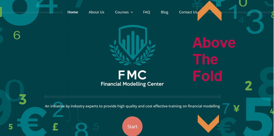
And below the fold refers to the part of a web page that cannot be seen without scrolling.

Now the big question: Above the fold or below the fold web design?
Many industry experts debate for above the fold design, some argue for above the fold myth, others say there is no fold while some also insist on below the fold design.
Which one to believe?
The main cause of argument is which way the users of the website will respond well to a call-to-action (CTA). The website owners want the users to take some action while browsing on their website (…being the action they do not want their users to take is; hitting the back button)
And for this does the fold really matter?
Well not exactly.
Although a website designer should aim at designing a website such that the user feels motivated to hit the action buttons like “add to cart” or “buy now” or “contact us”. Be it above the fold or below the fold it does not matter.
What matters is the usability and the motivation directed towards a user.
Let me explain this with an example from blog.kissmetrics
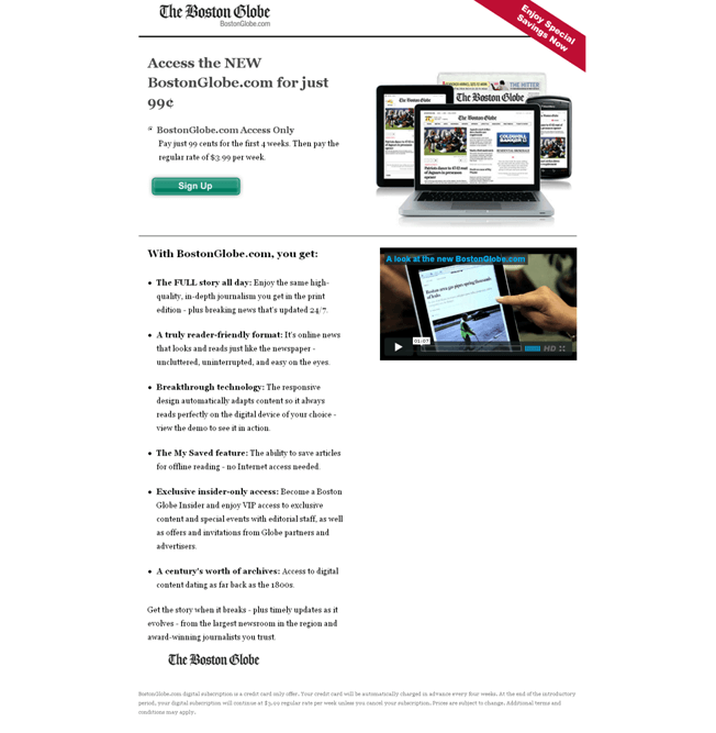
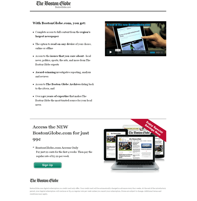
In your opinion which website fold would have initiated better conversions? One which had the CTA above the fold. Or the one which had the CTA below the fold?
That ain’t simple, right?
Well there is not much of a difference between placing the CTA above the fold or below the fold.
This study gives a better insight into the usability of the content and the motivation to hit the CTA, more than the placement of the content into “folds”.
Increased Conversion rates depend on the quality of the content on the website and how it inspires the users to take actions. And NOT on the placement of the content or CTA in the folds.
Being this said it is still recommended to place the important information like significant site navigation, website’s imagery, any important message or a little preview about your site above the fold.
However one must NOT try to jam in all the information just for the sake of putting it above the fold. Group the site’s content based on importance and then place it wisely in the website or web page.
So, is above the fold a myth?
Yes.
Because what’s important is to place the CTA at the right place where the chances of the user taking an action are high. And not to just place the CTA buttons right when a user/visitors enters your website.
Concluding the “folds”
While placing important information about your website above the fold to give a preview about your website to your users is a good practice. But still it does not make much of a difference in increasing conversions of your website.
Therefore be wise in placing your website’s content, be it above the fold or below the fold. Just make sure it inspires the users to take actions.
You may also be interested in:
Did the Chicken come first or the egg???
9 Little Changes to Contact Page Design That’ll Make a Big Difference To Your Conversions
Google Ranking Factors: Updated 2018
6 Reasons Why It Is Time for Website Redesign
Why did SEO Traffic Drop after Website Redesign?
Want to redesign your website? Take action now!


