
Designing for the ‘Goal Gradient Effect’: How to Visualise Progress in Complex E-Commerce Multi-Step Checkouts
The digital checkout is the most volatile, high-stakes environment in the entire digital economy. After spending millions on brand equity, search engine optimization, programmatic acquisition channels, and algorithmic personalization, global enterprise retail operations routinely lose approximately 70% of their prospective buyers at the final hurdle: the checkout container. While conventional conversion rate optimization (CRO) frameworks frequently diagnose this systemic failure as a mechanical issue—such as unexpected shipping fees, forced account creation, or input field clutter—behavioral psychology points to a deeper, more fundamental cognitive vulnerability. Shoppers do not merely abandon checkouts because a form is long; they abandon because they lose the psychological momentum required to finish it.
As online retail transitions away from basic transactional storefronts toward complex, multi-tiered enterprise setups, the checkout sequence naturally scales up. High-ticket purchases, configurable enterprise B2B software, customized physical goods, cross-border shipping matrices, localized tax regulations, and complex insurance attachments require substantial user input. This reality makes the multi-step checkout an operational necessity. At this level of complexity, treating your progress tracking bar as a minor aesthetic choice is a costly operational oversight.
To systematically lower cart abandonment, enterprise e-commerce platforms must build their user experiences around the Goal Gradient Effect. By re-engineering how progress is visually measured and scaled, optimization teams can reshape how the human brain perceives cognitive load. This shifts a tedious data-entry process into an accelerating sprint toward the purchase confirmation page.
1. The Science of the Finish Line: Deconstructing the Goal Gradient Effect
The Goal Gradient Effect is a foundational concept in behavioral psychology, first proposed by behaviorist Clark Hull in 1932. Testing animal behavior through maze navigation, Hull observed a distinct motivational pattern: an organism’s effort, speed, and focus intensify as it draws closer to its target reward. The physical or psychological distance to the goal directly dictates the velocity of the effort applied.
In 2006, researchers Ran Kivetz, Oleg Urminsky, and Yuhuang Zheng brought Hull’s animal behavior models into consumer economics. By studying coffee shop loyalty programs, they discovered that consumers holding a 12-stamp frequency card with 2 stamps pre-populated completed their purchases significantly faster than consumers holding a blank 10-stamp card. Even though both groups required exactly 10 transactions to secure their reward, the group that perceived they had a head start exhibited an accelerated purchasing cadence. They were caught in the motivational pull of the goal gradient.
When applied to digital product design, the Goal Gradient Effect demonstrates that motivation is highly elastic and driven by perceived proximity rather than absolute mathematical distance. In a multi-step checkout environment, this means your customer’s willingness to complete tedious form fields is directly proportional to how close they feel to the confirmation page. If a shopper feels they are making rapid, substantive progress, their cognitive resistance to providing sensitive data or navigating complex delivery choices drops dramatically.
2. The Architecture of Illusion: The Endowed Progress Effect in Action
The most common mistake in multi-step checkout configurations is starting your progress indicator at zero. When a customer arrives at the initial shipping information screen and encounters a progress bar sitting at 0% or a step counter reading “Step 1 of 5,” the psychological weight of the task amplifies. The interface tells the user that the journey is long, momentum is non-existent, and the initial interaction cost is entirely uncompensated.
To leverage the Goal Gradient Effect, you must implement an operational strategy known as the Endowed Progress Effect. This involves granting users an artificial advancement before they have inputted a single keystroke. This shifts their mental model from a state of zero-start inertia to a state of active funnel-momentum progression.
The Principle of Endowed Progress: People are significantly more likely to complete a multi-step task if they are provided with an illusion of progress toward the goal, rather than starting from an absolute baseline of zero.
Framing Pre-Checkout Actions as Completed Milestones
An optimized multi-step checkout should frame pre-checkout actions as completed milestones within the user interface. Consider this architectural framing strategy:
- Step 1: Basket Verification (Completed) – The moment the user clicks “Proceed to Checkout,” the system records the review of their cart as the official completion of the first step.
- Step 2: Authentication / Identification (Completed) – If the user is logged in, or if their session has cached their basic guest details, this step is automatically checked off in the background.
- Step 3: Shipping & Delivery Parameters (Active) – This is where the user begins active data input, but they are greeted by an interface that already displays a 33% or 40% completion status.
By framing the checkout as a journey that is already well underway, you leverage loss aversion. The human brain naturally avoids abandoning an investment of effort that is already yielding visible returns. Giving the user a psychological head start makes them feel that walking away from the cart means wasting accumulated progress.
3. Non-Linear Progress Bars: Manipulating Visual Scaling for High Velocity
Standard user interface guidelines usually state that progress bars must reflect absolute mathematical reality. If a checkout consists of four pages, each page should logically advance the progress indicator by exactly 25%. While mathematically logical, this approach ignores how human beings process time, effort, and cognitive fatigue.
To optimize for the Goal Gradient Effect, enterprise UX designers must implement Non-Linear Progress Visualisation. This strategy deliberately alters the visual scaling of progress increments to inject momentum during high-friction phases of the checkout sequence.
| Checkout Step | Cognitive Friction Level | Linear Scaling (Standard UX) | Non-Linear Behavioral Scaling (Optimized UX) | Psychological Objective |
|---|---|---|---|---|
| Cart & ID Verification | Low Friction | Advances from 0% to 25% | Jumps instantly from 0% to 35% | Triggers an early dopamine spike; builds immediate momentum. |
| Shipping Address Details | High Friction (Form Fields) | Advances from 25% to 50% | Advances incrementally from 35% to 55% | Steady visual movement pacing the user through keystroke execution. |
| Delivery Method Selection | Medium Friction (Cost Decisions) | Advances from 50% to 75% | Surges forward from 55% to 80% | Pushes the user over the decision hurdle by highlighting proximity to the finish. |
| Payment & Review | Extreme Friction (Wallet Opening) | Advances from 75% to 100% | Holds at 80% then snaps rapidly to 100% | Minimizes the perceived distance during the high-anxiety payment phase. |
By compressing the visual progress of early stages and expanding the visual distance cleared during high-friction decision points, you manipulate the user’s perception of speed. When the progress bar takes a substantial leap forward right after the user selects their shipping tier, it signals that the finish line is within reach. This visual reassurance counters the natural instinct to abandon the process when the user is asked to input sensitive credit card or billing numbers.
4. Cognitive Milestones: The Micro-Interactions of Progression
Visualizing progress should not be limited to a single bar running along the top of a webpage. To maximize the Goal Gradient Effect, progress indicator loops must operate at both macro and micro levels throughout the interactive layout.
Inline Validation as Dynamic Momentum
Every individual input field represents a small psychological hurdle. If a user inputs their credit card number only to be met with a cold, system-wide error page after clicking submit, their momentum collapses. Implementing real-time inline validation turns this friction point around completely.
The moment a user accurately populates a field, the interface should instantly trigger a visual micro-reward: a subtle green checkmark animation, a gentle border glow, or a micro-transition that smoothly slides down the subsequent field. These small animations act as micro-progress bars, providing immediate visual confirmation of forward movement and reinforcing the feeling of closing in on the goal.
The Concept of Sub-Goal Chunking
If your checkout requires cross-border compliance documentation or complex shipping inputs, grouping 15 fields onto a single page will trigger immediate cognitive overload. Instead, break those fields down into sub-goals within that specific checkout step. For instance, within the “Shipping” stage, sub-divide the container into “Destination,” “Recipient,” and “Delivery Method.” As the user fills out each sub-section, visually cross out or fade the completed sub-group. This approach constantly emphasizes that the user is continuously reducing the remaining distance to completion.
5. Engineering Behavior: Technical Execution and Architecture Challenges
Transitioning from a standard, linear checkout to a non-linear, behaviorally optimized progress tracking engine introduces complex technical dependencies. You cannot simply apply an arbitrary CSS transition onto a progress bar and expect it to reduce abandonments sustainably. The underlying frontend state machine must stay perfectly synchronized with your database layers, server processing validation, and dynamic tax calculations.
In a modern headless or decoupled application ecosystem, this requires complex asynchronous state management. As users interact with complex checkout APIs, your interface must instantly calculate the visual representation of progress without causing layout shifts, rendering lag, or asynchronous stuttering. A slow UI that freezes during calculation completely breaks the psychological illusion of speed and momentum.
For mid-market and enterprise operations, implementing these custom, psychology-driven conversion architectures requires advanced engineering capabilities. Partnering with a premier Ecommerce website development company in India allows brands to leverage global technical talent specialized in high-performance frontend frameworks like React, Next.js, and Vue. These advanced engineering teams can build complex, conditional checkout state engines, seamless API micro-service architectures, and lightning-fast edge-rendered UI components. This ensures that your behaviorally optimized progress bars render instantly and adapt dynamically to your user’s actions, all without introducing technical debt or slowing page load speeds.
// Architectural Example: Behaviorally Scaled State Configuration
const checkoutProgressMatrix = {
  step_cart_reviewed: { mathematicalPercentage: 0,   behavioralVisualPercentage: 25 },
  step_shipping_input: { mathematicalPercentage: 25,  behavioralVisualPercentage: 55 },
  step_delivery_choice: { mathematicalPercentage: 50, behavioralVisualPercentage: 75 },
  step_payment_method: { mathematicalPercentage: 75,  behavioralVisualPercentage: 90 },
  step_final_review:  { mathematicalPercentage: 90,  behavioralVisualPercentage: 98 }
};

function getBehavioralProgress(currentStepState) {
  const stateConfig = checkoutProgressMatrix[currentStepState];
  return stateConfig ? stateConfig.behavioralVisualPercentage : 0;
}
6. Strategic Framing: Designing “Percent Completed” vs. “Distance Remaining”
The linguistic and visual framing you choose for your progress systems dictates how users process information. Behavioral psychology demonstrates that humans evaluate numerical progress differently depending on where they are in their journey. This is known as the Focus Shift Principle.
During the first half of a multi-step checkout (Steps 1 and 2), the user’s brain naturally tracks progress by looking at what has already been accomplished (e.g., “I have already completed 2 of 5 tasks”). However, once the user passes the halfway mark, their mental model shifts. They stop looking at how far they have come and start focusing on how much work remains to reach the finish line (e.g., “I only have 1 step left before I’m done”).
Optimizing Your Progress Heuristics
To maximize conversion rates, your progress bar copy should dynamically adapt based on where the user sits in the checkout flow:
- In the Initial Stages (0% to 49%): Frame progress accumulation positively. Use tooltips or micro-copy like: “Great start! 35% of checkout details secured.”
- At the Exact Midpoint (50%): Bridge the cognitive shift seamlessly. Use messaging that balances effort: “Halfway there! Your order details are confirmed.”
- In the Late Stages (51% to 100%): Shift focus exclusively to proximity to the goal. Change the micro-copy to highlight distance remaining: “Only 1 quick step left to secure your order!”
By tailoring your interface messaging to match the natural cognitive shifts of your users, you minimize the perceived effort required to finish the checkout, maximizing the acceleration provided by the Goal Gradient Effect.
7. The Checkout Optimization Testing Framework
Deploying a behaviorally optimized checkout model requires rigorous empirical verification. Optimization managers shouldn’t just guess at scaling variables; they must run structured A/B testing frameworks to isolate which visual configurations drive the highest conversion lift.
- Isolate the Baseline Metrics: Measure your current step-specific drop-off rates, total checkout completion time, and average field interaction speeds. This establishes your behavioral benchmark.
- Test Endowed Progress vs. Absolute Progression: Run an isolated A/B test comparing a standard progress tracking design against an optimized design that grants a 25% completed status right at the start. Monitor if this head start correlates with lower drop-off rates on your initial shipping data collection form.
- Refine Your Non-Linear Progress Steps: Experiment with different progression weight allocations. Try accelerating progress during the shipping address phase versus the delivery method phase to see where visual speed updates yield the greatest reduction in user drop-off.
- Track Device-Specific Interactions: Mobile screen layouts offer limited visual real estate. Ensure that non-linear progress tracking sticky bars remain visually clear on compact devices without distracting from necessary inputs or triggering accidental misclicks.
Conclusion: Transforming Transactions into Psychological Triumphs
Optimizing an e-commerce checkout is far more than an exercise in shrinking forms and cutting down on inputs. In a highly competitive digital economy where customers are constantly distracted and comparison options are just a tab away, the checkout experience must be engineered as a continuous psychological accelerator.
By embedding the Goal Gradient Effect directly into the layout architecture of your multi-step checkouts, you actively reshape how your customers perceive effort, time, and friction. Shifting from a static, literal progress bar to an intentional, behaviorally optimized progress tracking engine reduces cognitive load and creates a powerful sense of momentum. When your checkout interface treats progress as a motivator rather than a simple metric, your customers won’t just endure the path to purchase—they will sprint across the finish line.


Shared Hosting vs VPS: Time to Upgrade Your Server?
Imagine launching a gorgeous brick-and-mortar retail storefront in the heart of a bustling commercial district. You spend months perfecting the interior design, sourcing premium inventory, and hiring a highly trained sales staff. But there is a massive catch: you accidentally leased a building with a decaying foundation, a front door that randomly jams shut, and an electrical grid that cuts out entirely whenever the restaurant next door runs its industrial blenders. No matter how incredible your products are or how hard your staff works, customers will walk out the moment they encounter physical resistance.
In the digital realm, your web hosting provider is that foundational building. It is the invisible infrastructure supporting your entire online presence. Every line of code, every high-resolution product image, every secure payment gateway, and every single customer interaction relies entirely on the server hardware you choose to rent. Yet, all too often, businesses treat hosting as a minor utility expense—a tiny technical checkbox to be ticked as cheaply as possible during launch week.
This structural oversight quickly catches up to growing brands. As your digital marketing strategies take root and begin to deliver organic traffic, your site can suddenly buckle under the weight of its own success. Pages slow down to a sluggish crawl, checkout forms hang indefinitely, and visitors bounce back to Google before your homepage even finishes rendering. When a website goes down or stalls out, it isn’t just a minor technical glitch; it is an active destruction of your marketing ROI, your brand equity, and your daily corporate revenue.
If you are currently evaluating your website setup or preparing for a new digital deployment, you will inevitably find yourself standing at a classic infrastructure crossroads: Shared Hosting vs. Virtual Private Server (VPS) Hosting. Both options serve vital functions in the modern web ecosystem, but they are engineered for completely different business realities, scaling thresholds, and technical capacities. Choosing incorrectly can either drain your startup capital on unnecessary resources or bottleneck your brand’s growth potential. Let’s pull back the curtain on server architecture and explore exactly which option aligns with your commercial objectives.
Demystifying Shared Hosting: The Digital Apartment Complex
To understand Shared Hosting, look no further than a traditional, high-density apartment complex. When you sign up for a shared hosting plan, you are renting a single room inside a massive building. You share the overall framework, the central plumbing, the electrical grid, the entrance hallways, and the main lobby with hundreds of other tenants—which, in this scenario, are completely unrelated websites owned by other individuals and companies.
From a resource standpoint, all websites residing on a shared server draw from the exact same central pool of Central Processing Unit (CPU) cores, Random Access Memory (RAM), and physical Solid-State Drive (SSD) storage space. The system operating system allocates these resources dynamically as requests come in from across the globe.
The Advantages of Shared Hosting
- Unmatched Cost Efficiency: Because the overall operating, maintenance, and hardware expenses of the server are split among hundreds of distinct clients, the cost per individual user is remarkably low. You can easily host a starter website for the price of a couple of premium coffees per month. This makes it a fantastic sandbox for testing new concepts without financial risk.
- Zero Server Administration Overhead: Shared environments are fully managed by the hosting provider’s internal system engineers. You don’t need to know how to configure a Linux terminal, patch server-side security vulnerabilities, or manage Apache or Nginx web servers. The hosting company takes care of the backend maintenance, giving you a clean, user-friendly control panel (like cPanel) to manage your domain and files.
- Instant, One-Click Deployments: Most modern shared environments come tightly integrated with automated script installers. Deploying a fresh instance of WordPress, Joomla, or a standard content management system takes less than two minutes, requiring absolute zero coding proficiency.
The Disadvantages: The “Bad Neighbor” Effect
While the apartment lifestyle is highly affordable, it comes with inherent structural vulnerabilities. The most prominent risk is known in technical engineering circles as the “Bad Neighbor” effect. Because resources are not strictly isolated, if a completely unrelated website on your shared server experiences a massive, unexpected traffic surge, or runs a poorly optimized database script that creates an endless loop, it can consume 95% of the entire server’s processing power.
The consequence? Your website—which did absolutely nothing wrong—suddenly runs out of memory and crashes. Furthermore, if a neighbor’s site gets compromised by malware or flags the server’s shared IP address for spamming operations, your business emails might start getting blacklisted by global email providers, destroying your daily corporate communication pipelines.
Demystifying VPS Hosting: The Digital Condominium
Virtual Private Server (VPS) hosting represents a massive evolutionary step forward in digital infrastructure. To maintain our structural analogy, moving from shared hosting to a VPS is the exact equivalent of moving out of a crowded apartment room and purchasing your own private condominium or townhouse.
Physically, your site is still technically sharing a physical server machine with a few other tenants. However, the architectural magic lies in a specialized technology layer called a Hypervisor. The hypervisor executes advanced hardware-level virtualization, slicing the massive physical server into completely distinct, strictly isolated virtual compartments. When you buy a VPS plan that promises 4 CPU cores and 8GB of RAM, those resources are digitally locked down exclusively for your website. Even if every other tenant on the server experiences a monumental traffic surge, your resources remain completely untouched, pristine, and ready to serve your visitors instantly.
The Advantages of VPS Hosting
- Guaranteed Resource Allocation: Your baseline performance remains incredibly stable. You no longer have to worry about the resource consumption of external entities. Your site enjoys consistent Time to First Byte (TTFB) metrics, fast database lookups, and incredibly snappy page render speeds.
- Absolute Root Control and Customization: A VPS grants you full root access to the virtual server instance. You can select your exact preferred operating system flavor (Ubuntu, CentOS, Debian), install custom server-side caching systems (like Redis, Memcached, or Varnish), alter execution limits, and optimize server firewalls to match the precise operational blueprints of your application.
- Isolated Security Environment: Because your virtual environment is completely containerized, its file system is invisible to other users on the machine. If another tenant’s site on the physical rack falls victim to a catastrophic SQL injection attack or a ransomware script, the infection cannot breach the hypervisor wall to compromise your business data.
- Seamless Scalability: Scaling a VPS is incredibly clean. If your brand is preparing for a major television feature or a massive Black Friday marketing blitz, you don’t need to physically migrate your files to a new machine. With a simple click inside your cloud console, you can dynamically scale up your allocated RAM and CPU allocations on the fly to process incoming customer volume.
The Disadvantages of VPS Hosting
The principal tradeoff of a VPS centers around cost and technical complexity. A VPS commands a higher monthly financial commitment than a basic shared package. Additionally, if you select an unmanaged VPS plan, you are fully responsible for the health of the operating system. If a server update breaks a critical database dependency, or if you misconfigure an Nginx configuration file, your site will drop offline, and it is entirely up to your technical staff to log in via SSH and fix the issue manually. (Though many hosts offer “Managed VPS” plans to mitigate this, they do come at a premium).
The Technical Head-to-Head: A Five-Point Comparison
To make an informed choice for your enterprise capital, we must examine how these two hosting paradigms execute under core operational stress. Let’s evaluate their performance across five foundational performance vectors.
1. Raw Performance, Processing Power, and Speed
Website load speed directly dictates your digital survival. Google treats mobile page performance as a primary organic ranking signal, and consumers systematically abandon platforms that exhibit even minor rendering lag. In a shared framework, your page delivery speeds fluctuate constantly throughout the day depending on global server load. During peak hours, your site can feel heavy and unresponsive. A VPS delivers consistent execution speed. Because its processing cycles are dedicated solely to your database execution, your site processes modern dynamic applications, complex product filters, and interactive media modules instantly.
2. Security Defenses and Threat Isolation
A breach of customer information can trigger profound legal vulnerabilities and permanently destroy consumer trust in your brand. In shared setups, the risk of cross-contamination is always present. If an amateur user on your server uploads an unpatched, vulnerable WordPress plugin, hackers can gain unauthorized access to the shared directory layer. A VPS provides robust containerization. Your file system, data structures, and incoming traffic pathways are heavily shielded from the rest of the physical infrastructure, providing an enterprise-grade posture for brands handling sensitive client credentials or payment details.
3. Server Administration and Operational Control
If your digital roadmap only requires a basic, standard blogging platform or a simple informational landing page, the automated, plug-and-play nature of shared hosting is exceptionally convenient. You don’t want to spend your weekends updating Linux kernels. However, if your business model features custom web software, specialized APIs, or proprietary databases, the configuration limitations of shared hosting will rapidly become a restrictive bottleneck. A VPS treats you as the absolute master of your operating system, granting you the architectural freedom to build custom server environments.
4. Scaling Capability Under Traffic Surges
Imagine your marketing team successfully orchestrates a viral campaign, causing thousands of eager buyers to flood your platform simultaneously. On a shared plan, this sudden spike will trigger automated resource-limiter alarms. To protect the other tenants, the hosting provider’s automated firewalls will temporarily throttle your bandwidth or serve your visitors a frustrating “503 Service Unavailable” error page. A VPS is designed to handle elasticity. It absorbs traffic spikes gracefully, and if you approach your threshold, cloud resources can be instantly expanded with near-zero service downtime.
5. Total Cost of Ownership (TCO) and Return on Investment
While shared hosting wins the upfront cost battle, it can cost you significantly more in lost conversions if your business model demands high performance. If a cheaper hosting plan causes your e-commerce checkout page to lag, resulting in a 5% drop in completed transactions, that cheap plan is actually draining your corporate profits. A VPS requires a larger upfront line item in your monthly operational budget, but it protects your marketing investments by ensuring your user experience remains fast, reliable, and secure under commercial pressure.
The Hosting Architecture Matrix
To summarize the core differences between these two solutions, let’s look at a side-by-side technical matrix comparing their operational boundaries:
Making the Final Decision: Which Model Fits Your Business?
Now that we have stripped away the marketing jargon, it’s time to map these hosting tiers directly to your current operational reality. There is no single universal “winner” in this matchup; the right choice is a direct reflection of your business stage, internal technical capability, and growth velocity.
When Shared Hosting Is Genuinely the Smarter Move
Shared hosting shouldn’t be dismissed as a substandard product; it is a highly engineered, exceptionally convenient solution when deployed for the right use case. It is the optimal choice for:
- Early-Stage Solopreneurs and Local Small Businesses: If you are launching a local service brand (like a plumbing business, a boutique consulting firm, or a neighborhood bakery) where your site primarily serves as a digital business card, shared hosting is ideal. Your traffic patterns will be modest, predictable, and easily sustained by a shared environment.
- Personal Portfolios and Creative Showcases: If you are a graphic designer, portrait artist, or writer seeking a polished online space to showcase your historical work, shared hosting provides a frictionless, highly economical foundation.
- Concept Testing and Content Blogs: If you are launching a brand-new content publication or testing a business hypothesis, shared hosting allows you to validate your idea with absolute minimal financial exposure. You can always migrate to higher tiers once your community expands.
When VPS Hosting Becomes an Absolute Business Imperative
Conversely, under-investing in server architecture can severely bottleneck an enterprise that is ready to scale. You should immediately prioritize a VPS if your brand falls into any of the following categories:
- Active E-Commerce Platforms: If your website utilizes WooCommerce, Magento, or any dynamic shopping cart system, shared hosting is a massive gamble. Processing credit card transactions, maintaining real-time inventory counts, and serving thousands of concurrent product query variants requires high processing power. A VPS ensures your checkout funnel stays fast, protecting your transaction completion rates.
- B2B Lead Generation and High-Traffic Media Portals: If your revenue engine relies heavily on constant inbound paid traffic, inbound landing pages, or high-volume publishing schedules, a single instance of server downtime can waste thousands of dollars in active ad spend. A VPS provides the stable runtime environment needed to capture every single lead safely.
- Custom Web Applications and SaaS Startups: If you are launching a proprietary web application, a secure member portal, or a customer software dashboard, you will require unique script packages, custom server daemons, and strict data containerization. A VPS provides the foundational framework and root configuration authority required to power custom digital products.
The Strategic Takeaway: Invest in Your Digital Future
When finalizing your operating decisions, try to avoid viewing web hosting merely as a dry, technical line-item expense. Instead, view it as a critical strategic asset within your broader customer experience apparatus. Your digital infrastructure directly influences your site speed, your search engine optimization authority, your data defenses, and your ultimate consumer retention metrics.
If you are just getting started, keeping costs low with a premium shared hosting plan is a perfectly rational, highly practical strategy. But as your brand builds momentum, expands its digital footprint, and accelerates its audience acquisition pipelines, do not hesitate to upgrade to a robust Virtual Private Server. Providing your business with dedicated cloud computing muscle ensures your digital storefront remains accessible, safe, and lightning-fast for every single customer who taps on your link.
Stop letting a slow server cost you customers.
If your business is growing, your website needs room to breathe. Switch to a lightning-fast, secure Virtual Private Server today and experience guaranteed resource allocation, ironclad data protection, and seamless scaling.

Optimizing for ‘Choice Paralysis’: How to Redesign Your Category Pages to Prevent Cart Abandonment
Think about the last time you walked into a massive grocery store looking for a simple bottle of hot sauce. You stood there staring at an entire wall of seventy-five different brands, variations, and heat levels. Did you feel excited by the unlimited freedom? Probably not. You likely felt a tiny wave of anxiety, picked the one with the coolest label, or walked away entirely because the mental effort required to make a truly informed choice simply wasn’t worth it.
In behavioral economics, this is known as the Choice Paradox. When this psychological friction occurs inside a retail brick-and-mortar store, it is frustrating. When it happens on an e-commerce platform, it is financially catastrophic. Your online store visitors are constantly battling cognitive exhaustion, and if your category pages resemble an unorganized digital warehouse rather than a curated retail journey, your conversion rates will suffer.
To fix this, online store owners must look past basic aesthetic updates. Maximizing your digital storefront requires a calculated restructuring of your platform’s layout, product data, and visual architecture to protect your customer’s limited cognitive bandwidth. Collaborating with a professional website designing company in Delhi can help you overhaul these dense product walls into streamlined, high-converting digital spaces.
The Hidden Cost of Choice Fatigue on Modern Category Pages
For a long time, the dominant belief in online retail was that wider selection directly equaled more sales. Businesses pushed their engineering teams to display as many products as possible on a single grid. However, modern consumer data shows that endless lists of highly similar items actively trigger cart abandonment. When a user is forced to process dozens of identical product cards, their brain flags the task as high-cognitive labor.
To avoid the potential regret of making a sub-optimal choice, the consumer frequently defaults to making no choice at all. They exit the tab. Below is a breakdown of the differences between traditional product layouts and cognitive-first interfaces designed to keep shoppers engaged:
| Layout Attribute | Traditional “Warehouse” Grid | Cognitive-First Category Page |
|---|---|---|
| Scrolling Architecture | Infinite scroll with no clear boundaries or progress indicators. | Smart pagination or “Load More” controls paired with explicit count indicators. |
| Information Delivery | Displays all tech specs, prices, and reviews simultaneously on the grid. | Progressive disclosure that reveals deeper details only upon user interaction. |
| Filtering Logic | Overwhelming sidebar lists with dozens of checkbox variations. | Dynamic, intent-based filtering systems that adapt based on the user’s primary goal. |
| Visual Hierarchy | Monotonous uniform grid cells where no individual product stands out. | Asymmetric spacing and strategic merchandising badges that guide the eye naturally. |
Resolving this friction requires shifting your platform’s architecture from an unguided catalog to an intuitive digital concierge. Whether you manage an enterprise marketplace or run a specialized boutique brand, partnering with an experienced ecommerce website development company allows you to build structural boundaries that guide hesitant browsers into confident buyers.
Step 1: Audit Current User Friction and Identify Drop-Off Points
Before modifying your code or altering your interface layouts, you need to gather clear data regarding how your current visitors interact with your category pages. You cannot optimize what you do not accurately measure. The goal here is to pinpoint exactly where your selection layout shifts from an exciting asset into a point of friction.
Begin by analyzing your Google Analytics 4 (GA4) scroll-depth metrics specifically on your highest-volume category URLs. Look closely at the percentage of users who scroll past the first three rows of products without interacting with a product card or a filter toggle. If your data reveals a sharp vertical drop-off at a specific point on the page, you have found your cognitive fatigue threshold.
Key Insight: A high average session duration on a category page combined with a low click-through rate to individual product pages does not indicate deep user engagement. Instead, it usually means your users are lost in the layout, reading row after row of products because they lack the structural tools to filter out irrelevant options.
Next, use behavioral heatmaps and session recording tools to see exactly how your users interact with your sidebar filters. Are they clicking multiple checkboxes only to find zero matching results? Are they completely ignoring the filtering panel because it contains too many technical options? Reviewing these user recordings will highlight where your current interface design is working against natural browsing behavior.
Step 2: Transition from Infinite Scroll to Structured Boundaries
Infinite scrolling was hailed as a massive breakthrough for user engagement, but while it works wonders for passive social media feeds, it frequently actively damages conversion rates on e-commerce sites. Infinite scrolling deprives the user of a psychological sense of closure. As they scroll further down the page, the pool of potential options grows infinitely larger, which quickly amplifies decision anxiety.
To eliminate this browsing fatigue, replace automatic infinite scrolling with a highly visible “Load More” button paired with a real-time progress indicator. For example, your interface should explicitly state: “Viewing 24 of 144 items.” This minor change creates a clear mental boundary, giving the shopper a natural moment to pause, evaluate the options currently on screen, or refine their search parameters.
If you prefer standard pagination pages over a “Load More” button, ensure that your page numbers are large, easy to tap on mobile devices, and preserve the user’s exact vertical position if they click a product and then hit the back button. Implementing this clean, high-performance pagination logic requires clean development practices, which is why working with a skilled ecommerce website development company is vital to keep your store’s performance smooth across all viewports.
Step 3: Implement Intent-Based Filtering Systems
Standard e-commerce filtering layouts are often incredibly tedious to use. They force shoppers to sift through long, confusing columns of technical parameters, fabric weights, or manufacturing codes. A casual shopper shouldn’t have to understand complex industry specifications just to find an item that fits their basic needs.
Your filtering architecture should speak the same everyday language as your customers. Shift your system away from basic parameter check-boxes and move toward high-level, intent-based filtering categories. Look at how this approach changes the user experience:
- Traditional Technical Filter: “GSM Weight: 400g – 500g”
- Intent-Based Alternative: “Best for Freezing Temperatures”
- Traditional Technical Filter: “Aperture Range: f/1.4 – f/2.8”
- Intent-Based Alternative: “Ideal for Low-Light Portraiture”
Additionally, you should implement conditional filtering logic. When a user selects a primary filter option, the remaining options should dynamically update to hide any combinations that yield zero results. Nothing breaks shopping momentum faster than spending time adjusting multiple filter criteria only to be met with a blank page that says “No products match your criteria.” Your platform should protect users from reaching these dead ends.
Step 4: Use Progressive Disclosure to Clean Up Product Cards
A major cause of category page fatigue is the desire to display every piece of product data simultaneously on the main grid. When each individual card is packed with star ratings, price comparisons, color swatches, short descriptions, and shipping notices, the resulting layout looks incredibly cluttered and chaotic.
Instead, apply the UX design principle of progressive disclosure. This practice keeps the default view of your product cards clean and focused on the essentials: a clear product image, a concise title, the price, and a high-level differentiator. More complex details—such as secondary materials, comprehensive size charts, or extended customer reviews—should remain hidden until the user hovers over the card on desktop or taps a quick-view toggle on mobile.
This layout style allows shoppers to easily scan the overall product mix without feeling overwhelmed by a wall of text. Building these smooth micro-interactions, responsive hover transitions, and lightweight modals requires refined styling. Working with a top-tier website designing company in Delhi helps ensure these interactive elements look polished and load quickly across all devices.
Let’s take a look at how a clean, minimalist product card can be written in clean, semantic HTML and CSS structure:
<div class="product-card">
  <div class="image-container">
    <img src="product-image.jpg" alt="Minimalist Leather Boots" class="primary-img" />
    <div class="quick-view-trigger">Quick View</div>
  </div>
  <div class="card-details">
    <span class="badge-curated">Top Rated</span>
    <h3 class="product-title">Classic Weatherproof Boots</h3>
    <p class="product-price">$180.00</p>
    <div class="progressive-disclosure-content">
      <p>Handcrafted full-grain leather with water-resistant lining.</p>
      <span class="stock-status">Only 3 left in stock</span>
    </div>
  </div>
</div>
Step 5: Introduce Interactive Selection Wizards
When your store carries a large volume of products, even optimized filters might not be enough to prevent choice paralysis for new users. In these scenarios, the most effective way to drive conversions is to bypass the standard category grid entirely and offer a guided conversational assistant.
Embedding a simple, step-by-step product recommendation quiz at the top of your main category walls can drastically improve your user experience. This quiz should ask three or four simple lifestyle or goal-oriented questions, process the user’s input, and then display a tailored selection of just three curated items that match their exact needs.
By narrowing the final selection down to a handful of highly relevant options, you completely eliminate choice anxiety. The user feels supported, much like talking to a knowledgeable sales assistant in a physical boutique. Building this kind of dynamic, personalized quiz requires deep integration with your inventory database, making it a valuable project to tackle with a specialized ecommerce website development company that can connect your front-end interfaces to your backend product management systems.
Step 6: Use Merchandising Badges and Visual Accents Strategically
Visual hierarchy plays a massive role in how human brains process information. When an e-commerce page features twenty identical product squares arranged in a continuous grid, the eye glides over them without registering specific details. You can easily break up this visual monotony by adding deliberate structural shifts to your layout.
Use visual accents and merchandising labels with strict restraint. If you tag every single item on your page as a “Best Seller,” “Trending Item,” “Limited Edition,” or “Staff Pick,” you nullify the value of badging entirely. A good rule of thumb is to ensure that less than 10% of your visible inventory carries a promotional badge at any given time.
You can also create visual breaks by introducing asymmetrical banners directly into the product grid. For example, replace a standard product card slot in the third row with a lifestyle banner that showcases a curated lookbook or shares a helpful usage tip. This breaks up the monotonous scrolling rhythm, gives the shopper’s eyes a moment to rest, and naturally refocuses their attention on the surrounding products.
Creating these dynamic grid variations requires a deep understanding of modern CSS Grid and Flexbox layouts. Partnering with a skilled website designing company in Delhi allows you to craft fluid, adaptive interfaces that look stunning on small mobile displays and expansive desktop screens alike.
Step 7: Measure Success and Fine-Tune Your Layouts
An interface redesign shouldn’t rely on guesswork; it must be driven by continuous measurement and validation. Once you have launched your streamlined category pages, track your conversion metrics closely over a 30-day period to measure the performance impact of your updates.
Monitor your category-to-PDP (Product Detail Page) click-through rates. You should see a clear increase in this metric, proving that users are finding relevant products faster and moving deeper into your conversion funnel. Keep a close eye on your cart abandonment rates and overall revenue-per-visit metrics to ensure your UX refinements are translating into actual business growth.
If your store handles high transaction volumes, run systematic A/B tests to continuously optimize your layouts. Test a variation with intent-based filters against your classic technical filter labels, or test a “Load More” button directly against a clean pagination layout. This data-driven approach removes the guesswork from design, ensuring that every interface update you push to production directly supports a faster, lower-friction path to checkout.
Partnering for E-Commerce Growth
Optimizing an online store is an ongoing journey of balancing psychological insights with technical performance. To build a highly competitive digital storefront that respects your user’s time and cognitive energy, you need an engineering architecture that scales seamlessly alongside your business.
Whether you need to restructure your product data hierarchy or completely refresh your frontend design, working alongside a premier ecommerce website development company ensures your platform is secure, fast, and optimized for growth. Combined with the aesthetic expertise of a dedicated website designing company in Delhi, you can transform your e-commerce store from a complex warehouse into a smooth, high-converting retail experience that keeps customers coming back.
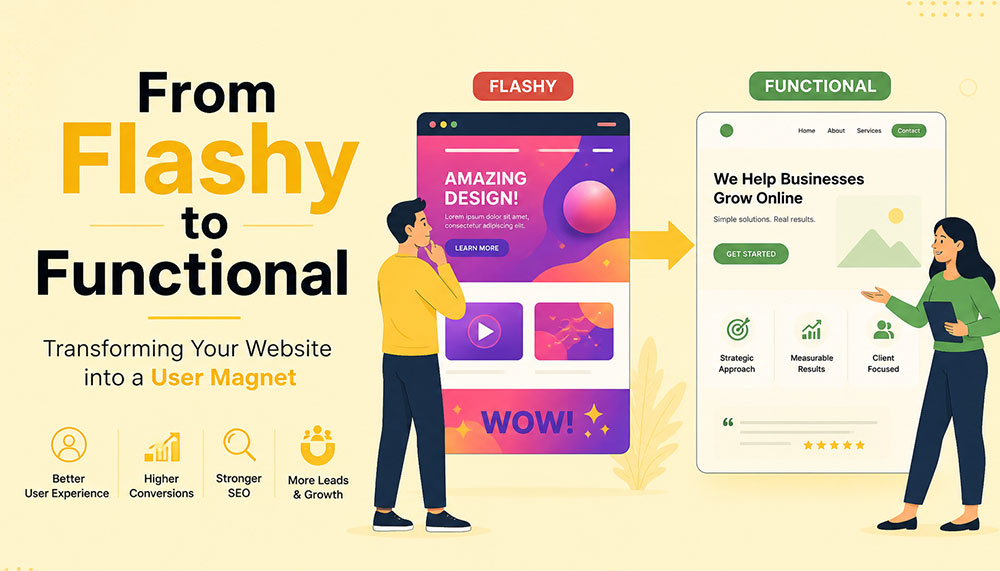
From Flashy to Functional: Transforming Your Website into a User Magnet
In the early days of the internet, a flashy website was often enough to impress visitors. Bright colors, animations, auto-playing media, and complex layouts were seen as signs of creativity and innovation. But times have changed. Today’s users are smarter, faster, and far less patient. A visually overloaded website is no longer impressive—it’s exhausting.
If your website looks stunning but fails to convert visitors into customers, then it’s not doing its job. The modern approach to web design focuses on functionality, usability, speed, and experience. Businesses that understand this shift are the ones that win.
This article explores how to transform your website from merely flashy to genuinely functional—and ultimately turn it into a powerful user magnet.
The Problem with “Flashy” Websites
At first glance, a flashy website can feel impressive. Bright visuals, animations, sliders, and interactive effects often give the illusion of sophistication and creativity. But here’s the reality—what looks exciting to a designer can quickly become frustrating for a user.
Today’s internet users are not browsing casually—they’re searching with intent. They want answers, solutions, and clarity within seconds. If your website slows them down or overwhelms them, they won’t admire the design—they’ll abandon it.
Flashy websites often prioritize aesthetics over usability. While they may look appealing initially, they tend to create friction in the user journey. And in the digital world, even small friction points can lead to big losses in engagement and conversions.
Let’s take a closer look at the common problems:
- Slow loading times: Heavy animations, large images, auto-playing videos, and complex scripts can significantly slow down your website. Users today expect pages to load almost instantly. Even a delay of a few seconds can cause frustration and increase bounce rates.
- Confusing navigation structures: Over-designed menus, hidden navigation elements, or too many options can leave users unsure of where to go next. When visitors feel lost, they rarely try to figure things out—they simply exit.
- Distracting visual elements: Too many moving parts—sliders, pop-ups, flashing banners—can shift attention away from what actually matters: your message. Instead of guiding users, these elements overwhelm them.
- Poor mobile responsiveness: A design that looks great on a desktop may completely break on a mobile device if not optimized properly. With the majority of users browsing on smartphones, this is a critical flaw.
- Low accessibility: Flash-heavy designs often ignore accessibility standards. Poor contrast, unreadable fonts, or non-intuitive layouts can make it difficult for users with different abilities to interact with your website.
Think about your own browsing habits. When you land on a website that takes too long to load or feels complicated, what do you do? Most likely, you hit the back button. That’s exactly what your visitors are doing too.
Modern users expect instant gratification. They want fast, smooth, and effortless experiences. If your website fails to deliver that within the first few seconds, you’ve already lost their attention—and potentially their business.
This is why businesses today are shifting their focus from “looking impressive” to “working effectively.” A professional Website Designing company in India understands this balance. Instead of adding unnecessary elements, they focus on creating clean, user-friendly designs that guide visitors naturally and help businesses achieve real results.
Because in the end, a website isn’t meant to just impress—it’s meant to perform.
Understanding the Shift: From Design to Experience
There was a time when website design was judged almost entirely by how it looked. If it was visually appealing, colorful, and “different,” it was considered successful. But that definition has evolved—dramatically.
Today, design alone is not enough. A website can look stunning and still fail miserably if it doesn’t deliver a smooth, intuitive experience. This is where the shift happens—from design-centric thinking to experience-centric thinking.
In simple terms, it’s no longer just about how your website looks. It’s about how it feels to use.
When a user lands on your website, they are not there to admire your design skills. They are there with a purpose—maybe to learn something, compare options, or make a purchase. The faster and easier you help them achieve that goal, the more successful your website becomes.
This is why User Experience (UX) and User Interface (UI) design have become the backbone of modern websites. These disciplines focus on understanding user behavior, removing friction, and creating seamless interactions.
Instead of asking “Does it look good?”, businesses now need to ask deeper, more practical questions:
- Is it easy to use? Can a first-time visitor navigate your website without confusion, or do they have to think too much before taking action?
- Can users find what they need quickly? In a world where attention spans are shrinking, every second matters. If users have to dig through multiple pages to find basic information, they won’t stick around.
- Does it guide users toward action? A good website doesn’t just present information—it gently leads users toward the next step, whether that’s filling out a form, making a purchase, or contacting your team.
- Does it work seamlessly on all devices? Your audience is browsing on phones, tablets, laptops, and everything in between. A consistent and smooth experience across all devices is no longer optional.
Think of your website like a physical store. A beautifully designed store with confusing layouts, hard-to-find products, and unhelpful staff will struggle to make sales. On the other hand, a clean, well-organized store that makes shopping easy will naturally attract and retain customers.
The same principle applies online.
Functionality doesn’t mean sacrificing beauty—it means giving beauty a purpose. Every design element, from colors to typography to spacing, should support usability rather than distract from it.
This is where experienced professionals, such as a Website Designing company in India, bring real value. They don’t just design for visual appeal—they design for human behavior, ensuring that every click, scroll, and interaction feels natural and meaningful.
Because at the end of the day, users don’t remember how “cool” your website looked. They remember how easy it was to use—and whether it helped them get what they came for.
Key Elements of a Functional Website
A functional website doesn’t happen by accident—it’s the result of thoughtful planning, user understanding, and smart design decisions. Every element on your website should have a purpose. When all these elements work together, they create an experience that feels smooth, intuitive, and satisfying for the user.
Let’s break down the core elements that truly make a website functional—not just visually appealing, but genuinely effective.
1. Clear and Intuitive Navigation
Your website should feel effortless to explore. A visitor should land on your homepage and instantly understand where to go next—without thinking too hard. The moment users feel confused, they start losing trust.
Think of navigation as a roadmap. If the directions aren’t clear, people won’t keep wandering—they’ll simply leave and find another destination.
A well-structured navigation system includes:
- Simple menus with clear labels: Avoid clever or vague naming. “Services,” “About,” and “Contact” may sound basic, but they work because users instantly recognize them.
- Logical page hierarchy: Your pages should be organized in a way that makes sense. Important information should never be buried deep within multiple clicks.
- Easy access to key pages: High-priority pages like pricing, services, or contact information should always be easy to find—preferably within one or two clicks.
If users get lost, they leave. It’s that simple. Good navigation doesn’t draw attention to itself—it just works seamlessly in the background.
2. Fast Loading Speed
Speed is one of the most critical factors in user experience. No matter how beautiful your website is, if it takes too long to load, users won’t wait around to see it.
We live in a world of instant results. A delay of even one second can feel like an eternity—and that’s often enough to lose a potential customer.
To improve your website’s speed:
- Optimize images: Large, uncompressed images are one of the biggest causes of slow websites. Proper optimization keeps quality high while reducing load time.
- Use efficient code: Clean, streamlined coding reduces unnecessary load on your website.
- Leverage caching: Caching helps store data so returning users can access your site faster.
- Choose reliable hosting: Your hosting provider plays a major role in your website’s performance. A slow server means a slow website—no matter what you do.
A skilled Website Designing company in India understands that performance is not an afterthought. They build speed optimization into the foundation of your website from the very beginning.
3. Mobile Responsiveness
Take a moment to think about how often you use your phone to browse the internet. Now imagine your website being viewed on that small screen. Does it still look clean? Is it easy to navigate? Can users interact with it comfortably?
With mobile users now dominating web traffic, your website must perform flawlessly across all screen sizes. A responsive design ensures that your website adapts automatically—no matter what device is being used.
This includes:
- Content that adjusts smoothly: Images, text, and layouts should resize and rearrange themselves for different screen sizes.
- Tap-friendly buttons: Buttons should be large enough and spaced properly so users can easily tap them without frustration.
- Readable text: Users shouldn’t have to zoom in just to read your content. Proper font sizing is essential.
A mobile-first approach is no longer optional—it’s the standard. If your website doesn’t work well on mobile, you’re likely losing a significant portion of your audience.
4. Strong Visual Hierarchy
When users land on your website, they don’t read every word—they scan. Your design should guide their eyes naturally, helping them understand what’s important within seconds.
This is where visual hierarchy comes in. It’s the art of organizing content in a way that leads users through your website effortlessly.
You can achieve this through:
- Proper use of headings: Headlines should stand out and clearly communicate key messages.
- Contrasting colors: Important elements like call-to-action buttons should be visually distinct.
- Whitespace: Giving elements room to breathe makes your website easier to read and less overwhelming.
- Strategic placement: Key information should be positioned where users naturally look first.
A clean, well-structured layout often outperforms a cluttered design. Simplicity doesn’t mean boring—it means effective.
5. Compelling and Clear Content
Design might bring users in, but content is what keeps them there—and ultimately convinces them to take action.
Your messaging should speak directly to your audience. It should answer their questions, address their concerns, and clearly explain how you can help them.
Effective website content is:
- Clear and concise: Avoid unnecessary jargon or long-winded explanations. Get to the point quickly.
- User-focused: Instead of talking only about your business, focus on what the user gains.
- Easy to scan: Use short paragraphs, bullet points, and headings to make content digestible.
Within a few seconds of landing on your website, visitors should understand exactly what you offer and why it matters to them. If they have to guess, you’ve already lost them.
When all these elements come together—navigation, speed, responsiveness, hierarchy, and content—you don’t just have a website. You have a powerful user experience that attracts, engages, and converts.
Why Functionality Drives Conversions
At the end of the day, your website has a job to do. Whether it’s generating leads, selling products, or encouraging inquiries—everything comes down to conversions. And here’s the truth many businesses overlook: people don’t convert because your website looks good… they convert because it feels easy.
A functional website removes friction from the user journey. It makes every step—from landing on the page to taking action—feel natural and effortless. When users don’t have to struggle, think too much, or second-guess their decisions, they are far more likely to move forward.
Think of it like walking into a well-organized store. You can quickly find what you need, understand the pricing, and check out without confusion. Compare that to a cluttered store where nothing is clearly labeled—you’d probably walk out. The same psychology applies to your website.
Functionality builds trust. And trust is the foundation of every conversion.
When users can easily navigate your website, find relevant information, and complete actions without frustration, they begin to feel confident in your brand. On the other hand, even small issues—like a confusing layout or a slow-loading page—can create doubt and push them away.
A conversion-focused website is intentionally designed to guide users toward action. It doesn’t leave things to chance. Every element plays a role in helping users take the next step.
Here’s what that looks like in practice:
- Clear call-to-action (CTA) buttons: Your CTAs should stand out and communicate exactly what users need to do next—whether it’s “Get a Quote,” “Book a Demo,” or “Buy Now.” There should be no confusion or hesitation.
- Minimal distractions: Too many pop-ups, animations, or competing elements can overwhelm users and dilute your message. A clean, focused design keeps attention where it matters most.
- Trust signals: People are naturally cautious online. Reviews, testimonials, case studies, certifications, and client logos help reassure users that they’re making the right choice.
- Simplified forms and checkout processes: The more steps you add, the more users you lose. Shorter forms, fewer fields, and a smooth checkout experience can significantly increase conversions.
It’s important to understand that users don’t want to “work” to interact with your website. The easier you make things for them, the more likely they are to take action.
This is why businesses increasingly partner with a Website Designing company in India that focuses on performance-driven design. Instead of adding unnecessary features, they refine the user journey—removing obstacles and guiding users toward meaningful actions.
Every element on your website should have a clear purpose. If something doesn’t contribute to the user experience or support conversions, it’s likely doing more harm than good.
Because in the digital world, simplicity isn’t just a design choice—it’s a competitive advantage.
The Role of User Psychology
Behind every click, scroll, and decision on your website, there’s a human mind at work. And that mind doesn’t behave randomly—it follows patterns. Understanding these patterns is what separates an average website from one that truly connects with users.
One of the biggest misconceptions in web design is assuming that users carefully read everything on a page. In reality, they don’t. People scan. They skim through headings, glance at visuals, and look for familiar cues that help them quickly understand what to do next.
This means your website isn’t just a collection of pages—it’s an experience shaped by human behavior. The more you align your design with how people naturally think and interact, the more effective your website becomes.
Let’s explore some key psychological principles that influence user behavior:
- Familiarity: Users feel comfortable with what they already recognize. This is why most successful websites follow certain standard patterns—like having a logo at the top left, navigation at the top, and contact information easily accessible. When you stick to familiar structures, users don’t have to “learn” how to use your website—they already know.
- Clarity: The human brain prefers simplicity. When a website is cluttered or overly complex, it increases cognitive load—meaning users have to work harder to process information. And when things feel difficult, people tend to give up. Clean layouts, simple messaging, and clear pathways reduce this mental effort and keep users engaged.
- Trust: First impressions happen in seconds. A clean, professional-looking website instantly builds credibility, while a messy or outdated design raises doubts. Elements like consistent branding, high-quality visuals, testimonials, and secure browsing indicators all contribute to building trust.
- Urgency: People are more likely to take action when they feel a sense of urgency. Strategic prompts like limited-time offers, countdowns, or phrases such as “Only a few spots left” can encourage users to act sooner rather than later. When used thoughtfully, urgency can significantly improve conversions without feeling pushy.
Think about your own online behavior. When you visit a website, you instinctively look for certain things—clear headings, easy navigation, and quick answers. If those elements are missing, frustration builds almost instantly.
This is why understanding user psychology isn’t optional—it’s essential. A website that aligns with human behavior feels intuitive, trustworthy, and easy to use.
A modern Website Designing company in India doesn’t just focus on visuals or code—they dive deeper into how users think, what motivates them, and what stops them from taking action. By combining design expertise with behavioral insights, they create websites that don’t just look good—they feel right.
Because when your website speaks the language of your users’ minds, engagement and conversions naturally follow.
Common Mistakes to Avoid
Sometimes, the biggest problems on a website aren’t what’s missing—they’re what’s unnecessarily added. Many businesses invest time and money into their websites, yet unknowingly make decisions that hurt performance instead of improving it.
The tricky part? These mistakes often come from good intentions—trying to impress users, add more information, or stand out from competitors. But in reality, they end up doing the opposite.
Let’s break down some of the most common website mistakes and why they matter:
- Overusing animations and effects: Animations can enhance a website when used sparingly, but too many moving elements can overwhelm users. Sliders, pop-ups, hover effects, and auto-playing media can quickly turn from engaging to distracting. Instead of focusing on your message, users get caught up in visual noise—and often leave before taking any action.
- Ignoring mobile users: This is one of the most costly mistakes today. A website that works perfectly on desktop but feels clunky on mobile is guaranteed to lose a large portion of its audience. Tiny buttons, misaligned content, and slow mobile performance create frustration and drive users away almost instantly.
- Cluttering pages with too much information: It’s tempting to put everything on one page—every service, every feature, every detail. But more information doesn’t always mean better communication. When pages are overcrowded, users don’t know where to focus. Instead of reading more, they end up reading nothing at all.
- Using unclear or generic CTAs: Call-to-action buttons like “Click Here” or “Submit” don’t tell users what they’re getting. Strong CTAs are specific and action-driven—like “Get Your Free Quote” or “Book a Consultation.” Clarity here can make a huge difference in conversion rates.
- Neglecting SEO fundamentals: A beautiful website is useless if no one can find it. Ignoring SEO basics—like proper headings, meta tags, keyword optimization, and page speed—limits your visibility on search engines. Without traffic, even the best-designed website won’t deliver results.
If you look closely, all these mistakes have one thing in common: they prioritize business preferences over user needs. And that’s where things start to go wrong.
The good news is that these issues are completely fixable. In fact, addressing even a few of them can lead to noticeable improvements in user engagement, time on site, and conversions.
This is why many businesses turn to an experienced Website Designing company in India to audit and refine their websites. With a fresh perspective and user-focused approach, they can identify hidden issues and transform your website into something far more effective.
Because sometimes, improving your website isn’t about adding more—it’s about removing what’s getting in the way.
Balancing Aesthetics and Functionality
There’s a common misconception in web design—that you have to choose between a website that looks beautiful and one that works well. In reality, the most successful websites don’t pick one over the other. They strike a balance.
Visual appeal matters. It creates the first impression, sets the tone for your brand, and captures attention. But if that visual appeal comes at the cost of usability, it quickly loses its value. On the other hand, a purely functional website that lacks personality can feel dull and forgettable.
The real goal is to bring both together—where design enhances functionality, not competes with it.
Think of your website like a well-designed workspace. It should look inviting and professional, but more importantly, everything should be placed exactly where it’s needed. Nothing should feel out of place, unnecessary, or confusing.
Here are some practical ways to achieve that balance:
- Using a consistent color palette: Colors play a huge role in how users perceive your brand. A consistent palette creates a sense of harmony and professionalism. It also helps guide user attention—for example, using a specific color for buttons makes them instantly recognizable.
- Choosing readable fonts: Stylish typography can enhance your design, but readability should always come first. If users have to strain their eyes to read your content, they won’t stick around. Clean, simple fonts with proper spacing make a big difference in user comfort.
- Maintaining visual consistency: Consistency builds familiarity and trust. When elements like buttons, headings, spacing, and layouts follow a uniform style across your website, users feel more comfortable navigating it. Inconsistency, on the other hand, creates confusion and disrupts the experience.
- Using images purposefully: Images should support your message—not just fill space. High-quality visuals can enhance storytelling, explain concepts, and create emotional connections. But irrelevant or excessive images can slow down your website and distract users from your core message.
It’s also important to remember that simplicity is powerful. A clean design with thoughtful spacing and focused content often feels more premium than a cluttered, over-designed layout.
This is where experienced professionals, such as a Website Designing company in India, truly make a difference. They understand how to blend creativity with usability—ensuring that every design choice serves a purpose and contributes to the overall experience.
At its core, design is not the end goal—it’s a tool. A tool to communicate, guide, and engage your users. When used wisely, it doesn’t just make your website look better—it makes it work better.
And that’s the kind of balance that turns visitors into loyal users.
How SEO and Functionality Work Together
SEO and website functionality are often treated as two separate things—but in reality, they are deeply connected. You can’t build a strong online presence by focusing on just one. The websites that perform best today are the ones where SEO and user experience work hand in hand.
Search engines like Google are no longer just scanning your website for keywords. They are analyzing how users interact with it. Do people stay on your site? Do they explore multiple pages? Or do they leave within seconds? These behaviors send powerful signals about the quality of your website.
In simple terms, search engines want to recommend websites that users actually enjoy using. And that’s exactly where functionality comes into play.
A functional website naturally supports SEO because it creates a better experience for users—and when users are happy, search engines take notice.
Here’s how functionality directly impacts your SEO performance:
- Improving page speed: Fast-loading websites not only keep users engaged but are also favored by search engines. Speed is a ranking factor, and even small improvements can make a noticeable difference in your visibility.
- Enhancing mobile usability: With mobile-first indexing, search engines prioritize how your website performs on mobile devices. A responsive, mobile-friendly design ensures that your site ranks better and reaches a wider audience.
- Reducing bounce rates: When users land on your website and immediately leave, it signals that something isn’t working—whether it’s slow speed, poor design, or irrelevant content. A functional website keeps users engaged and encourages them to stay longer.
- Encouraging longer session durations: When your website is easy to navigate and provides valuable content, users naturally spend more time exploring it. This increased engagement sends positive signals to search engines about your site’s relevance and quality.
It’s important to understand that SEO is no longer just about ranking—it’s about retention. Getting users to your website is only half the battle. Keeping them there is what truly makes the difference.
This is why businesses are increasingly working with a Website Designing company in India that understands both SEO and user experience. Instead of treating them as separate strategies, they integrate them into a unified approach—building websites that are not only easy to find but also enjoyable to use.
When your website is fast, intuitive, and user-friendly, visitors stay longer, interact more, and trust your brand. And when that happens consistently, search engines recognize your website as valuable—and reward it with better rankings.
Because in today’s digital landscape, the formula is simple: when users love your website, search engines do too.
Steps to Transform Your Website
Transforming your website from flashy to functional isn’t about making random changes—it’s about taking a structured, thoughtful approach. The goal is to create a website that not only looks better, but works better for your users and your business.
Think of it as a continuous improvement process rather than a one-time redesign. Every step you take should bring you closer to a smoother, more effective user experience.
1. Audit Your Current Website
Before making any changes, you need to understand where you currently stand. A website audit helps you uncover what’s working well and what’s holding you back.
Start by looking at real user data:
- User behavior: How do visitors interact with your site? Which pages do they visit most? Where do they drop off?
- Bounce rates: Are users leaving quickly after landing on certain pages? If yes, those pages may have usability or content issues.
- Conversion data: Which pages are driving results, and which ones are not?
You can also review your website from a user’s perspective. Try navigating it as if you were a first-time visitor. Is everything clear and easy to find? Or does it feel confusing?
This step lays the foundation for everything that follows.
2. Simplify the Design
Once you know what’s not working, the next step is to simplify. Many websites try to do too much—and end up overwhelming users.
Simplification doesn’t mean removing value—it means removing distractions.
Focus on:
- Eliminating unnecessary animations and visual clutter
- Reducing the number of competing elements on each page
- Highlighting key messages and actions
Ask yourself: “Does this element help the user, or does it just look nice?” If it doesn’t serve a purpose, it probably doesn’t belong.
A clean, focused design makes it easier for users to understand your website—and take action.
3. Improve Performance
Performance is a critical part of functionality. Even the best-designed website will fail if it’s slow or unresponsive.
Improving performance involves both technical and design-related optimizations:
- Speed optimization: Compress images, minimize code, and use caching to reduce load times.
- Responsive design: Ensure your website works smoothly across all devices and screen sizes.
- Technical improvements: Fix broken links, optimize server response times, and ensure clean coding practices.
This is often where working with a Website Designing company in India can make a big difference. Their technical expertise ensures that your website performs efficiently without compromising on design.
4. Enhance Content Strategy
Your website’s content is what communicates your value to users. If your messaging is unclear or unfocused, even the best design won’t help.
Shift your content strategy from “what we want to say” to “what users need to hear.”
Effective content should:
- Address user problems and offer solutions
- Be easy to read and scan
- Clearly explain your services or products
- Guide users toward the next step
Every page should have a purpose—and every piece of content should support that purpose.
5. Test and Optimize Continuously
Your website is never truly “finished.” User behavior evolves, trends change, and new opportunities emerge. That’s why ongoing testing and optimization are essential.
Use tools and techniques like:
- A/B testing: Compare different versions of a page to see what performs better
- Analytics: Track user behavior, engagement, and conversions
- Heatmaps: Understand where users click, scroll, and focus their attention
Small improvements over time can lead to significant results. Even minor tweaks—like changing a button color or simplifying a form—can have a noticeable impact on conversions.
The key is to stay curious, keep testing, and continuously refine your website based on real data.
When you follow these steps, you’re not just redesigning your website—you’re transforming it into a powerful tool that attracts users, engages them, and drives meaningful results.
The Importance of Professional Expertise
Transforming a website isn’t just about changing colors, adding new sections, or updating a layout—it’s a much deeper process. It requires a careful balance of design, technology, user psychology, and marketing strategy. And this is exactly where many businesses struggle when trying to handle everything on their own.
A website today is not just a digital brochure—it’s a performance-driven asset. It needs to attract visitors, engage them, guide them, and ultimately convert them. Achieving all of that requires more than creativity—it requires expertise.
This is why many businesses choose to partner with a professional Website Designing company in India. Instead of relying on guesswork or trial-and-error, they gain access to a team that understands how to build websites that actually work.
Let’s look at what such expertise brings to the table:
- Industry experience: Professionals who have worked across different industries understand what works and what doesn’t. They’ve seen trends evolve, tested strategies, and know how to avoid common pitfalls. This experience helps them make informed decisions that save time and deliver better results.
- Technical expertise: From coding and performance optimization to responsiveness and integrations, there’s a lot happening behind the scenes of a functional website. A skilled team ensures that everything runs smoothly—so users never have to think about the technical side at all.
- Strategic thinking: A great website isn’t built randomly—it’s planned. Professionals approach design with a clear strategy in mind, aligning your website with your business goals. Every element, from layout to content placement, is designed to support conversions and user engagement.
- Cost-effective solutions: While hiring experts may seem like an added expense, it often saves money in the long run. Avoiding mistakes, reducing redesigns, and getting things right the first time leads to better ROI and fewer ongoing issues.
Another key advantage is perspective. When you’re deeply involved in your own business, it’s easy to overlook usability issues or assume things are “obvious” to users. A professional team brings an outside perspective—seeing your website the way your visitors do.
They don’t just ask, “Does this look good?” They ask, “Does this work?”
And that shift in thinking makes all the difference.
The result is a website that doesn’t just impress visually—it performs consistently. It loads faster, guides users better, communicates clearly, and converts more effectively.
Because in today’s competitive digital space, a good-looking website is no longer enough. You need a website that delivers results—and that’s exactly what professional expertise helps you achieve.
Real-World Impact of Functional Design
When businesses shift their focus from flashy visuals to functional design, the results are not just noticeable—they’re measurable. This isn’t about subjective opinions like “it looks better” or “it feels smoother.” It’s about real, data-driven improvements that directly affect how your website performs and how your business grows.
A functional website doesn’t just change how your site looks—it transforms how users interact with it. And when user behavior improves, everything else follows.
Here’s what businesses typically experience when they make this shift:
- Higher conversion rates: When users can easily navigate your website, understand your offering, and take action without confusion, conversions naturally increase. Whether it’s filling out a form, making a purchase, or booking a service—simplicity leads to action.
- Lower bounce rates: A well-structured, fast-loading, and user-friendly website encourages visitors to stay instead of leaving immediately. When users find what they’re looking for quickly, they’re far more likely to explore further rather than exit.
- Increased user engagement: Functional design keeps users interested. They spend more time on your site, visit multiple pages, and interact with your content. This deeper engagement not only improves user experience but also strengthens your brand connection.
- Better search rankings: Search engines pay close attention to how users behave on your website. Lower bounce rates, longer session durations, and improved usability all contribute to better rankings—bringing in even more organic traffic.
But beyond the metrics, there’s a bigger picture.
A functional website builds confidence. It makes your business feel reliable, professional, and easy to work with. Users don’t just visit—they trust. And when trust is established, conversions become a natural outcome rather than a forced action.
Many businesses notice that after optimizing functionality, they don’t need to push as hard with aggressive marketing. Their website starts doing the heavy lifting—guiding users, answering questions, and encouraging decisions organically.
This is why working with a Website Designing company in India that focuses on performance-driven design can be a game-changer. Instead of chasing trends or adding unnecessary features, they focus on what truly impacts user behavior and business outcomes.
Because in the real world, success isn’t measured by how impressive your website looks—it’s measured by how effectively it works.
And when your website works seamlessly, growth isn’t just possible—it becomes predictable.
Future Trends in Website Design
Website design is constantly evolving—but one thing is becoming clearer every year: the future belongs to websites that truly understand and serve their users. Trends may change, technologies may advance, but the core focus remains the same—creating seamless, meaningful, and human-centered experiences.
What’s exciting is that the next wave of web design isn’t just about looking modern—it’s about becoming smarter, more intuitive, and more inclusive. Businesses that adapt early will not only stand out but also build stronger, long-lasting connections with their audiences.
Let’s explore some of the key trends shaping the future of website design:
- Minimalistic design approaches: The shift toward simplicity is only getting stronger. Clean layouts, ample whitespace, and focused content are replacing cluttered, over-designed pages. Minimalism isn’t about doing less—it’s about doing what matters most. By removing distractions, websites can guide users more effectively and create a calmer, more enjoyable browsing experience.
- AI-driven personalization: Websites are becoming smarter and more adaptive. With the help of artificial intelligence, websites can now tailor content, recommendations, and user journeys based on individual behavior. Imagine a website that understands what a visitor is looking for and adjusts its content accordingly—this level of personalization can significantly improve engagement and conversions.
- Voice and gesture-based interactions: As technology evolves, the way users interact with websites is also changing. Voice search and voice commands are becoming more common, especially with the rise of smart devices. Gesture-based interactions, particularly on mobile and touch devices, are also shaping how users navigate and engage with content. Designing for these interactions means thinking beyond clicks and taps.
- Accessibility-first design: Inclusivity is no longer optional—it’s essential. Future-ready websites are built to be accessible to everyone, including users with disabilities. This includes better color contrast, keyboard navigation, screen reader compatibility, and clear content structure. Accessibility doesn’t just expand your audience—it also improves overall usability for all users.
Another important shift is the growing expectation for speed, privacy, and trust. Users want websites that load instantly, respect their data, and provide a smooth, secure experience. These factors will continue to influence design decisions moving forward.
For businesses, this means one thing: staying static is not an option. A website that works well today may feel outdated tomorrow if it doesn’t evolve with user expectations.
This is where partnering with a forward-thinking Website Designing company in India becomes valuable. Such teams stay updated with emerging technologies and user trends, ensuring your website doesn’t just keep up—but stays ahead.
Because in the digital world, success isn’t just about where you are today—it’s about how prepared you are for what’s coming next.
And the future? It belongs to websites that are not only functional—but intelligent, inclusive, and deeply user-focused.
Conclusion
A flashy website might capture attention—but a functional website captures users.
In today’s competitive digital landscape, success depends on how well your website serves your audience. By focusing on usability, performance, and clarity, you can create an experience that not only attracts visitors but keeps them coming back.
Whether you’re revamping an existing site or building a new one, the goal should always be the same: create a website that works for your users.
And when done right, your website doesn’t just become a digital presence—it becomes your most powerful business asset.

Worried About Cybersecurity? Here’s How ICO WebTech Protects Your Website and Data
In today’s hyper-connected digital world, cybersecurity is no longer optional—it’s a non-negotiable part of doing business online. Whether you’re running a simple informational website or a high-traffic eCommerce store, the threats lurking in the digital shadows are real. From automated bots scanning the internet for vulnerabilities to sophisticated hackers trying to steal customer data, every website—regardless of size—faces risks.
At ICO WebTech, we’ve seen this firsthand. As a leading web design and development company with over 14 years of experience, we understand how crucial it is for businesses to operate with confidence. And that confidence starts with security. If you’re worried about cyberattacks, hacking attempts, data leaks, or the safety of your customers’ information—you’re not alone. Thousands of business owners share the same concerns every day.
But here’s the good news: you don’t have to tackle these threats alone.
This article dives deep into the cybersecurity challenges online businesses face today and shows exactly how ICO WebTech protects your website, data, customers, and brand reputation. We’ll also share the real-life success story of Coverwell India, a fast-growing Indian eCommerce brand, and how they successfully avoided a major cyber threat by partnering with us.
The Rising Concern: Why Cybersecurity Matters More Today Than Ever Before
Cybersecurity was once a term only tech giants and government organizations cared about. But those days are long gone. Today, hackers aren’t targeting just multinational companies—they’re attacking small and medium-sized businesses because:
- They often lack advanced security.
- They use outdated software or weak passwords.
- They don’t perform regular security audits.
- They underestimate cyber threats altogether.
According to multiple global cybersecurity reports, more than 43% of cyberattacks target small businesses. The worst part? Most business owners realize this only after they’ve already been attacked.
Here are the most common cyber threats affecting businesses today:
- Malware attacks: harmful software injected into websites.
- Ransomware: hackers lock your data and demand payment.
- Brute-force attacks: continuous login attempts to guess passwords.
- SQL injection: injecting malicious queries into your database.
- Cross-site scripting (XSS): injecting scripts to steal user information.
- Phishing: tricking users into revealing sensitive data.
- DDoS attacks: overwhelming your server to force downtime.
If your website handles sensitive customer information—names, emails, phone numbers, addresses, or payment details—the risk becomes even greater. A single security flaw can lead to:
- Data theft
- Loss of customer trust
- Severe brand damage
- Financial penalties
- Lawsuits
- Website blacklisting by Google
For any business operating online, cybersecurity is not just about protection—it’s about survival.
How ICO WebTech Protects Your Website and Data
At ICO WebTech, security is built into everything we do. We don’t just design beautiful, high-performing websites—we design secure digital environments where your business can grow without interruption.
Here’s exactly how we safeguard your online presence.
1. Industry-Standard SSL Certificates (HTTPS Security)
If your website still uses “HTTP” instead of “HTTPS,” your data is vulnerable. SSL certificates protect the communication between your website and your users.
We provide and configure strong SSL certificates that ensure:
- Encrypted data transfer
- Protection against middle-man attacks
- Trust signals for customers
- Better SEO rankings (Google prefers HTTPS websites)
Without SSL, hackers can intercept sensitive information entered on your website. With ICO WebTech, your website is immediately upgraded to a secure connection.
2. Advanced Firewall Protection
Firewalls act as virtual security guards that monitor every incoming request to your website. They block suspicious activity, malware, bots, and harmful code before it ever reaches your server.
Our firewall solutions include:
- Application-level firewalls for website protection
- Server-level firewalls for hosting environments
- Real-time threat detection
- IP blocking for spam and malicious users
- Rate limiting to prevent bot attacks
With firewall protection, your website stays shielded 24/7—even while you sleep.
3. Regular Security Audits & Vulnerability Scans
The biggest mistake business owners make is believing their website is safe simply because it has never been hacked. In reality, vulnerabilities can exist silently for months or years before an attack happens.
We perform:
- Monthly security audits
- Server health checks
- Plugin/theme vulnerability scans
- Malware scanning & removal
- Database security checks
These proactive measures ensure that risks are detected and resolved long before they can cause damage.
4. Secure Server Configurations
A website is only as secure as the server it runs on. Whether you’re using shared hosting, VPS, or cloud hosting, we make sure your server is protected with optimal configurations.
This includes:
- Hardening the server against attacks
- Disabling unnecessary ports and services
- Installing security modules
- Regular server-level backups
- Real-time malware monitoring
Our secure hosting configurations reduce hacking attempts by up to 80%.
5. Backup & Disaster Recovery System
Even with the best security systems, unexpected events can happen. That’s why we implement a complete backup and recovery system that ensures your data is never lost.
Our backup features include:
- Daily automatic backups
- Offsite cloud backups
- Multiple restore points
- One-click full website restore
This means that even in the worst-case scenario, your website can be restored within minutes—not days.
6. Malware Protection & Hack Recovery
If your website ever gets hacked (or even if we suspect an attempted attack), our team performs an immediate deep-cleaning and restores your website to a safe state.
We provide:
- Malware scanning and removal
- File integrity monitoring
- Blacklist removal assistance
- Reinforcing weak access points
Your business gets peace of mind knowing experts are watching your back.
7. Secure Development Practices
Every website we build follows industry-leading security standards. Our development practices include:
- Secure coding techniques
- Sanitized database queries
- Escaped output to prevent XSS
- Hardened forms to block spam
- Security patches & updates
We don’t just fix vulnerabilities—we prevent them from happening in the first place.
8. Ongoing Monitoring & Support
Cybersecurity is not a one-time fix. It requires continuous monitoring, updates, and supervision. That’s why ICO WebTech offers long-term support to keep your website secure all year round.
Our support includes:
- 24/7 monitoring
- Instant alert systems
- Emergency support
- Regular performance & security reports
Your website stays fast, protected, and stable—always.
Success Story: How Coverwell India Avoided a Major Cybersecurity Breach
One of our recent clients, Coverwell India (https://coverwellindia.in/), is a rapidly growing online store offering premium device protection covers. As their traffic increased, so did their exposure to cyber threats.
Before partnering with ICO WebTech, their team noticed unusual activity, including:
- Suspicious login attempts
- Sudden slowdowns in their website
- Random spikes in bot traffic
- Failed checkout sessions
These were early warning signs of a potential data breach.
Once Coverwell India approached us, our cybersecurity team conducted a deep security audit. What we found confirmed their concerns—there were active brute-force attempts, and hackers were trying to exploit unpatched plugins.
Here’s what we did immediately:
- Installed an enterprise-level firewall
- Patched all outdated plugins
- Enabled CAPTCHA on login pages
- Secured their database
- Configured an SSL certificate properly
- Hardened server-level security
- Set up daily automated backups
Within 48 hours, Coverwell India’s website was fully secured and optimized. The hacking attempts stopped, bot attacks were blocked, and their website performance improved dramatically.
Most importantly, they avoided a possible data breach that could have leaked customer details and financial information.
Today, their online store runs smoothly, safely, and confidently—thanks to our ongoing security management.
Why Businesses Trust ICO WebTech for Cybersecurity
With 14+ years in the industry, ICO WebTech has helped hundreds of businesses secure their digital assets. Our clients trust us because:
- We provide customized security solutions
- We stay updated with the latest cybersecurity trends
- We offer rapid support during emergencies
- We focus on long-term protection, not temporary fixes
- We combine design, development, and security under one roof
Your business deserves more than a website. It deserves a secured digital ecosystem.
Final Thoughts: Your Website Security Is Not an Expense—It’s an Investment
Cyber threats are becoming smarter, stronger, and more aggressive every year. But with the right team protecting your digital presence, you can focus on running your business instead of worrying about hackers.
ICO WebTech is here to ensure your website, data, customers, and brand reputation stay completely safe. From SSL setup to firewall implementation, from security audits to hack recovery—we protect your business like it’s our own.
If you’re serious about keeping your website secure, now is the time to act.
Ready to secure your website and protect your business?
Contact ICO WebTech today and let us build a strong, future-proof cybersecurity foundation for your digital success.
Need More Leads? Discover How ICO WebTech’s Lead Generation Solutions Can Skyrocket Your Business
Generating high-quality leads is one of the biggest challenges businesses face today. You might be running campaigns, posting on social media, or even investing in paid ads — yet somehow, the leads you get don’t convert. They’re either unqualified, uninterested, or simply disappear after the first click. If this sounds familiar, you’re not alone.
At ICO WebTech Pvt. Ltd., we’ve spent over a decade helping businesses overcome this exact problem. As a leading web development company in Delhi and a trusted web design agency, we understand that successful lead generation isn’t about chasing clicks — it’s about creating systems that attract, engage, and convert the right audience into loyal customers.
In this article, we’ll show you how ICO WebTech’s proven lead generation solutions can transform your marketing results — and how one of our clients saw a surge in qualified leads within weeks of implementation.
The Challenge: Why Businesses Struggle to Generate Quality Leads
Let’s start with the truth — generating leads isn’t the problem. Generating quality leads is. Many businesses rely on random tactics instead of building a cohesive strategy. They spend on ads, post on social media, send newsletters, and wait for magic to happen. Unfortunately, that approach no longer works in today’s crowded digital landscape.
Here’s why:
- Unoptimized landing pages: Visitors arrive but don’t convert because your page doesn’t grab attention or inspire trust.
- Weak value proposition: Your offer doesn’t clearly explain how you solve the customer’s problem.
- No conversion funnel: There’s no defined journey guiding the visitor from awareness to action.
- Generic targeting: You’re reaching a broad audience instead of focusing on your ideal customers.
- Inconsistent follow-ups: Many leads drop off because of a lack of nurturing or automated engagement.
At ICO WebTech, we approach lead generation as both an art and a science — built on strategy, psychology, design, and data.
The ICO WebTech Solution: Smarter, Data-Driven Lead Generation
We don’t believe in cookie-cutter marketing. Every business is unique — its audience, goals, and challenges differ. That’s why our lead generation solutions are customized for each client, combining cutting-edge technology with human insight to create measurable results.
Our process begins with understanding your target audience, analyzing your existing marketing funnel, and identifying gaps in your digital presence. From there, we create a holistic system that includes landing page optimization, compelling lead magnets, high-converting funnels, and automation tools that nurture leads until they’re ready to buy.
What Makes Our Approach Different?
- Strategic planning: Every campaign starts with research — your audience, competitors, and conversion goals.
- Human-centered design: As a top web design company in Delhi, we craft user experiences that inspire trust and encourage action.
- Advanced analytics: We use real-time data to measure performance, tweak campaigns, and improve ROI continuously.
- End-to-end support: From SEO and web development to CRM integration and automation — we handle it all in-house.
Our mission is simple: to help you spend less time chasing leads and more time closing deals.
Step 1: Landing Page Optimization — Your First Conversion Point
Your landing page is the digital equivalent of a first impression. If it doesn’t capture interest within a few seconds, potential leads leave. Most businesses lose 70% of traffic simply because their landing pages aren’t optimized for conversion.
At ICO WebTech, our experts in website development company in India services design and optimize landing pages that don’t just look good — they perform. Every element is crafted to guide the visitor toward one clear action: conversion.
Our Optimization Process Includes:
- Headline clarity: Crafting headlines that immediately communicate value.
- Visual hierarchy: Using color, contrast, and placement to draw attention to key CTAs.
- Compelling copy: Writing persuasive yet concise content that addresses pain points.
- Trust elements: Adding testimonials, certifications, and data-driven proof.
- Speed and usability: Ensuring fast loading times and seamless mobile experience.
When your landing page aligns with user intent and provides genuine value, it becomes your strongest conversion tool.
Step 2: Lead Magnets That Attract Your Ideal Audience
Think of lead magnets as your digital handshake — an exchange of value that builds trust. Whether it’s an eBook, free demo, checklist, or webinar, a well-crafted lead magnet can turn casual visitors into interested prospects.
ICO WebTech’s lead generation specialists design lead magnets tailored to your audience’s needs. Our in-house team — including designers, writers, and strategists — ensures each asset delivers instant value and positions your brand as an authority in your field.
Examples of High-Performing Lead Magnets We Create:
- Free industry reports and guides (e.g., “10 Web Design Mistakes That Kill Conversions”)
- Interactive calculators or tools related to your business services
- Exclusive webinars featuring insights from our SEO experts in India
- Free consultations for businesses looking for a web development company in Delhi
By offering something useful, you attract leads who are genuinely interested in your services — not just people browsing for freebies.
Step 3: Conversion Funnels That Turn Interest into Action
A conversion funnel is the structured path that transforms awareness into action. It’s how we guide potential customers from their first interaction with your brand to becoming paying clients.
Our website development company team designs custom funnels that are psychologically persuasive and data-optimized. Each step — from ad to landing page to follow-up — is strategically designed to nurture intent and reduce friction.
Our Conversion Funnel Includes:
- Awareness: Using SEO, ads, and social media to attract traffic.
- Consideration: Providing lead magnets and case studies to build trust.
- Decision: Offering limited-time deals or personalized consultations.
- Action: Streamlining forms and CTAs for effortless conversion.
We also implement automation workflows that keep your leads engaged post-conversion — ensuring no opportunity slips through the cracks.
Step 4: SEO and Content Alignment for Sustained Growth
No lead generation system is complete without strong organic visibility. Our SEO experts in India ensure your campaigns attract consistent, long-term traffic through strategic optimization.
Our SEO-Driven Lead Generation Approach:
- Keyword research targeting high-intent searches (like “website development company in Delhi”)
- On-page and technical SEO to improve discoverability
- Content creation that educates and nurtures potential leads
- Backlink building through genuine industry partnerships
SEO and lead generation go hand in hand. While one brings in potential customers, the other ensures they find your business in the first place.
Step 5: Tracking, Analytics, and Continuous Optimization
At ICO WebTech, we believe what gets measured, gets improved. Every lead generation campaign we run is backed by real-time analytics. We track conversion rates, bounce rates, heatmaps, and user behavior to refine performance continuously.
Our team provides clients with transparent reports that highlight:
- Lead quality metrics
- Cost per acquisition (CPA)
- ROI per campaign
- Funnel conversion stages
This data-driven approach allows us to scale what works and eliminate what doesn’t — maximizing your return on investment.
Client Success Story: Turning Traffic into Tangible Leads
One of our clients — a mid-sized website development company in Delhi — approached us with a familiar problem: plenty of traffic, but few conversions. Despite investing in digital ads and SEO, their leads were either irrelevant or unresponsive.
Our team conducted a detailed funnel audit and discovered multiple gaps:
- Their landing pages were cluttered and lacked clear CTAs.
- They had no lead magnets or automated nurturing system.
- Follow-up emails were inconsistent and generic.
We implemented a customized lead generation strategy, including:
- A new landing page optimized for conversions with strong visuals and testimonials.
- A downloadable “Free Website Performance Checklist” as a lead magnet.
- Automated email sequences that nurtured leads through a 7-day funnel.
Within 45 days, the client saw:
- 60% increase in qualified leads.
- 35% reduction in cost per acquisition.
- 2x increase in conversion rate from ad traffic.
More importantly, the leads were now from their ideal customer segment — businesses actively looking for website development and digital marketing services.
“ICO WebTech helped us turn website visitors into paying customers. Their team understood our audience and built a lead generation system that finally works. We now get consistent, qualified leads every week.”
— Client Testimonial
Why Businesses Trust ICO WebTech for Lead Generation
We’re not just another marketing company. We’re your partners in growth. Our team combines the technical expertise of a website development company in India with the strategic insight of a digital marketing agency — offering complete end-to-end solutions.
Over the years, we’ve worked with businesses across industries — from startups to established enterprises — helping them generate leads that truly matter.
What Sets ICO WebTech Apart:
- Experience: 14+ years in web design, development, and digital marketing.
- Expertise: A dedicated team of designers, developers, and SEO experts in India.
- Transparency: Real-time reporting and complete campaign visibility.
- Customization: No templates — every strategy is tailored to your business.
- Results: Proven success stories and measurable ROI improvements.
Let’s Build Your Lead Engine
If your business is struggling to convert traffic into leads, it’s time to rethink your strategy. With ICO WebTech’s comprehensive lead generation solutions, you can finally build a system that works — attracting the right customers, automating engagement, and driving growth sustainably.
Our approach isn’t about quick wins; it’s about creating lasting impact. Through smart design, focused targeting, and data-driven optimization, we help you generate leads that fuel long-term business success.
Get Started Today
Contact ICO WebTech Pvt. Ltd. — your trusted web development company in Delhi — and discover how we can transform your digital marketing efforts into a consistent stream of qualified leads.
Ready to grow? Let’s build your lead generation engine together.
Schedule Your Free Consultation
Talk to our experts today to explore customized solutions for your business. Let’s turn clicks into clients — and ideas into measurable results.

Content Translation vs. Content Localization: What’s Best for Multilingual SEO?
In today’s digitally connected world, expanding your online presence to reach a global audience isn’t just a growth strategy—it’s a necessity. Consumers are browsing, shopping, and researching across borders more than ever before, and businesses that fail to adapt risk being left behind. One of the most common challenges companies face when going global is figuring out how to effectively present their content in different languages. Many businesses mistakenly use the terms content translation and content localization interchangeably, but in reality, they are very different strategies with distinct impacts on SEO and user engagement.
Content translation focuses on converting words from one language to another, ensuring that your message is understood, whereas content localization goes deeper by tailoring your content to resonate with the cultural, linguistic, and even visual expectations of a specific market. For an SEO company in India helping clients expand internationally, understanding this difference is critical. Choosing the right approach can mean the difference between simply making your content readable and creating an experience that truly connects with audiences around the world.
In this article, we’ll explore the key differences between content translation and localization, explain how each affects multilingual SEO, and guide you on which strategy—or combination of strategies—can deliver the best results for your global growth ambitions.
What is Content Translation?
Content translation is the process of taking your existing content and converting it into another language while keeping the original meaning intact. At its core, translation is about clarity and precision—it ensures your message can be understood by audiences who speak a different language. Think of it as a word-for-word or phrase-for-phrase transfer: simple, technical, and literal.
How Content Translation Works
-
Approach: Content translation focuses on verbatim conversion of text. For instance, if your English product page reads “High-Quality Leather Wallet”, a direct Spanish translation would be “Cartera de cuero de alta calidad.” The goal is to accurately convey the same information, without altering the meaning or tone.
-
Best For: Content translation is ideal for materials where precision is more important than cultural nuance. This includes:
-
Technical manuals and guides
-
Academic papers and research reports
-
Legal documents or compliance content
-
-
SEO Impact: Translation is an essential first step for multilingual SEO because it makes your content accessible to speakers of other languages. However, it has limitations. A literal translation may not account for local search habits, idioms, or keyword variations. As a result, search engines might not recognize your content as highly relevant, and users could find it awkward or hard to read. This can lead to lower engagement, higher bounce rates, and ultimately, reduced SEO performance.
Key Takeaway
Content translation is all about accuracy and clarity—it ensures your content is understood in a new language. But while it opens the door to international audiences, it doesn’t always engage them on a cultural or emotional level. For businesses, including an SEO company in India helping clients expand globally, translation is the first step, but not the complete solution for successful multilingual SEO.
What is Content Localization?
While content translation ensures your message is understood, content localization takes it a step further by adapting your content to fit the cultural, linguistic, and even visual expectations of a specific target audience. Localization isn’t just about words—it’s about creating a truly native experience for users in a new market, making them feel like your content was designed specifically for them.
How Content Localization Works
-
Approach: Unlike literal translation, localization involves cultural adaptation. For example, the English phrase “High-Quality Leather Wallet” might be localized into Spanish as “Billetera de piel de alta calidad.” While both translations are correct, the localized version uses wording that feels natural and familiar to Spanish speakers in a specific region.
-
Key Elements of Localization:
-
Keywords: Direct translations often miss the mark for local search intent. For instance, “sneakers” in the U.S. can translate to “zapatillas” in Spain and “tenis” in Mexico. Choosing the right term improves visibility in local search results.
-
Currency & Formatting: Adjust prices to the local currency and adapt date, time, and measurement formats to match local conventions.
-
Imagery: Use visuals that resonate culturally—featuring local people, landmarks, or symbols helps your audience connect emotionally.
-
User Interface: Modify website layouts to accommodate longer text, right-to-left languages like Arabic, or other region-specific usability considerations.
-
-
Best For: Localization is especially effective for content aimed at building engagement, trust, and conversions. This includes:
-
Marketing campaigns and promotional content
-
E-commerce product pages and descriptions
-
Blog posts, newsletters, and social media content
-
Slogans or taglines that require cultural nuance
-
-
SEO Impact: When done correctly, localization has a profound effect on multilingual SEO. By incorporating locally relevant keywords and cultural context, your content can rank higher in search results, attract more qualified traffic, and engage users more effectively. Visitors who feel a connection to your content are more likely to spend time on your site, explore your products, and convert into loyal customers—metrics that search engines reward with better rankings.
Key Takeaway
Content localization goes beyond making your website readable in another language—it makes your brand relatable, trustworthy, and relevant to a specific audience. For an SEO company in India working with clients targeting international markets, localization is the key to turning global visitors into engaged users and loyal customers. In essence, translation tells users what you’re offering; localization shows them that you understand them.
Translation vs. Localization: Choosing the Right Strategy
Deciding between content translation and content localization isn’t just a matter of preference—it’s about understanding your business goals, target audience, and available resources. Both strategies have their place, and the right choice depends on what you’re trying to achieve in each market.
Comparing Translation and Localization
Here’s a simple breakdown to help guide your decision:
| Feature | Content Translation | Content Localization |
|---|---|---|
| Objective | Convey information accurately | Connect with and persuade a local audience |
| Effort | Low to medium | High; requires in-depth market research and cultural insight |
| Cost | More affordable | Higher investment due to specialized expertise |
| SEO Impact | Minimal; may miss local keywords and search intent | Significant; improves local rankings, engagement, and conversions |
| Best For | Technical documents, legal content, data sheets | Marketing materials, product pages, blog posts, and campaigns aimed at building relationships |
Finding the Right Approach
For many businesses, a hybrid strategy works best. Start with high-quality translation for your essential content to establish a presence in a new market. This ensures your message is understandable and accessible to a wider audience.
Once your market presence is established, invest in localization for your most critical pages—like your homepage, key product descriptions, and marketing campaigns. Localization allows your brand to resonate culturally and emotionally with your audience, significantly improving engagement and driving better SEO results.
Why This Matters for an SEO Company in India
For an SEO company in India helping clients expand internationally, understanding the difference between translation and localization is more than just technical knowledge—it’s a strategic advantage. Choosing the right mix of these approaches ensures that your clients’ content doesn’t just exist in another language, but actually connects with users, ranks well in search engines, and drives meaningful business results.
Key Takeaway
Ultimately, translation is a great starting point, but localization is what truly opens doors in global markets. By tailoring content to the language, culture, and expectations of your target audience, you can turn international visitors into loyal customers, enhance brand credibility, and achieve lasting success with multilingual SEO.
Why Localization is the Secret to Multilingual SEO Success
Expanding into international markets is an exciting opportunity, but it comes with its challenges. Simply translating your content may help your website reach new audiences, but without cultural adaptation, it often falls short of creating real engagement. On the other hand, content localization goes beyond words—it speaks directly to your audience in a way that feels natural, relatable, and trustworthy.
For businesses aiming to succeed globally, including an SEO company in India assisting clients in international expansion, understanding the difference between translation and localization is crucial. Translation ensures your message is clear and accurate, while localization ensures your message resonates, connects, and converts.
A smart approach is often a combination of both: start with high-quality translations to establish a presence in new markets, then gradually localize key pages and campaigns to strengthen engagement, improve SEO performance, and build long-term trust with your audience.
Ultimately, the companies that succeed internationally aren’t just multilingual—they’re culturally fluent. By investing in localization, you turn your global website from a simple information portal into a fully engaging experience that resonates with users, drives conversions, and strengthens your brand worldwide.
In short, if your goal is not just to be seen but to be remembered and trusted, localization is the key to unlocking true international success.

Core Web Vitals — The 2025 Guide for Business Owners
A human-first, no-fluff roadmap to what Core Web Vitals are, why they matter for your business, and exactly what to do next.
TL;DR — What every business owner needs to know
If you’re a business owner, here’s the quick version without the tech jargon: Core Web Vitals (CWV) are three simple but powerful measures of how your website feels to real people.
They track three big things:
- Largest Contentful Paint (LCP): How quickly your main content shows up. (Think: how long before a customer can actually see your product page?)
- Interaction to Next Paint (INP): How responsive your site feels when someone clicks, taps, or types. (Nobody likes a button that lags, right?)
- Cumulative Layout Shift (CLS): How stable your page layout is. (Ever try to click “Buy Now” and suddenly the button jumps? Frustrating!)
Now, why should you care? Because Google does. These metrics are baked into Google’s page experience signals, which influence search rankings. But beyond SEO, they directly affect how customers see your brand. A slow or jumpy website doesn’t just hurt your ranking — it makes your business look untrustworthy or outdated.
Here are the golden rules of thumb (Google’s benchmarks you should aim for):
- LCP: 2.5 seconds or faster
- INP: 200 milliseconds or faster
- CLS: 0.1 or less
The bottom line: faster, smoother websites mean happier customers. And happier customers mean more sales, fewer people leaving your site in frustration, and stronger brand loyalty. In other words, improving your Core Web Vitals isn’t just about pleasing Google — it’s about protecting your revenue and building trust with every single visitor.
1 — Why Core Web Vitals matter for business (not just techies)
Let’s strip away the jargon for a moment. Core Web Vitals aren’t just numbers Google geeks obsess over—they’re signals about how your customers actually experience your website.
Think of your website like a physical store:
- Slow-loading pages? That’s like having a jammed door. People get frustrated before they even step inside.
- Jittering layouts? Imagine your shelves wobbling and items falling off when a customer enters. It feels sloppy and unsafe.
- Laggy buttons or forms? That’s like a cashier fumbling at checkout, keeping your customers waiting when they’re ready to pay.
In the real world, no store owner would tolerate these issues—yet many businesses let them happen online without realizing the cost.
Here’s why this matters:
- Google tracks how real people on real devices experience your site.
- If your Core Web Vitals are solid, you not only earn better SEO rankings, but you also deliver a smoother, more trustworthy experience.
- And that directly translates into what matters most for you: more conversions, fewer abandoned carts, and higher customer satisfaction.
Bottom line: good Core Web Vitals aren’t just about pleasing Google—they’re about keeping customers happy and loyal.
2 — The three Core Web Vitals (what they measure & why they matter)
Now let’s break down the three Core Web Vitals in plain English. These are the “health checks” Google runs on your site, and each one directly ties back to how your customers feel when they visit.
Largest Contentful Paint (LCP) — When the page feels ready
- What it means: This measures how long it takes for the main part of your page (like a big hero image, banner, or headline) to load. Basically, the moment visitors stop staring at a blank screen and see something useful.
- Why it matters: People don’t wait around online. If your key content doesn’t show up quickly, users assume your site is slow or broken—and they bounce.
- Goal to aim for: Your big content should load in 2.5 seconds or less for most visitors.
Think of it like opening a store: if the front lights flick on quickly and customers see neat displays right away, they’re reassured they’re in the right place.
Interaction to Next Paint (INP) — How fast your site reacts
- What it means: This measures how responsive your site is when people click, tap, or type. It’s not about just the first click (like the old FID metric); it looks at the whole interaction experience.
- Why it matters: Nothing kills trust like clicking “Add to Cart” and feeling like the button didn’t work. Slow response makes users think your site is buggy, which is a fast track to losing sales.
- Goal to aim for: Your site should respond in 200 milliseconds or less for most users.
Picture a checkout counter: if the cashier immediately scans your item, you’re happy. If they stand there fiddling for a few seconds every time you hand them something, you’ll think twice about shopping there again.
Cumulative Layout Shift (CLS) — Does stuff jump around on the page?
- What it means: This tracks how much your page elements unexpectedly move while loading. You’ve probably experienced it: you’re about to click a button, but it jumps down because an ad or image pushed it out of place.
- Why it matters: Layout shifts aren’t just annoying—they can break trust. No one wants to accidentally buy something or click the wrong link because your site was shaky.
- Goal to aim for: Keep shifts to 0.1 or lower (basically: things should stay put).
Imagine walking through a store where the shelves keep wobbling and products slide around. Would you stay and browse? Probably not. That’s exactly how users feel with a high CLS score.
Together, these three vitals measure speed, responsiveness, and stability—the holy trinity of a good user experience. Nail them, and both Google and your customers will reward you.
3 — How to Measure Core Web Vitals (the right tools and data)
Here’s the thing: you can’t improve what you don’t measure. Core Web Vitals aren’t about guesswork — they’re about real people using your site on real devices. That’s why Google splits measurement into two categories: field data (what your actual visitors experience) and lab tools (controlled tests you can run anytime). Both matter, and together they give you the full picture.
-
Google Search Console (field data)
Think of this as your health checkup dashboard. It shows how groups of URLs on your site are performing for real users out in the wild. Are mobile visitors struggling? Do certain product pages load slower? Search Console will flag those patterns. It’s not instant data (usually a few days delayed), but it’s gold for spotting where to focus.
-
PageSpeed Insights (field + lab in one)
If you only want one tool, start here. Plug in a page URL, and it blends:
- CrUX (field data): how actual Chrome users experienced the page.
- Lighthouse (lab data): a controlled test you can repeat to diagnose issues.
It even highlights which metric (LCP, INP, CLS) is failing and gives you a to-do list for fixes.
-
Chrome DevTools (lab deep dive)
This is for the techies (or your web dev). Inside Chrome, you can open DevTools → Performance, and literally watch how your site renders frame by frame. It helps pinpoint things like “this script is blocking rendering” or “that animation is eating CPU.”
-
Web Vitals Libraries & Real User Monitoring (advanced but powerful)
If you want ongoing insights, you (or your dev team) can add lightweight scripts like Google’s web-vitals library. That way, you build your own dashboard of how your actual customers are experiencing your site over time. This is especially useful if you run campaigns globally — you might discover users in India have a very different experience than those in the U.S.
Golden rule for business owners: Always prioritize field data (real-world performance) over lab scores. Why? Because your customers don’t care how pretty your Lighthouse score looks — they care about whether your site feels fast and stable on their device, their connection.
4 — Quick-win optimizations (what to tackle first)
Here’s the good news: you don’t need to rebuild your entire website to see improvements in Core Web Vitals. There are some low-hanging fruits — quick, practical changes that can immediately move the needle for your users and your Google rankings. Let’s break them down by metric:
Optimizing Largest Contentful Paint (LCP) — Get that “ready” feeling fast
This is about how quickly the main stuff (hero image, headline, or video) shows up. If it lags, people bounce.
Quick wins:
- Use a fast CDN: Think of it like having mini-warehouses across the globe so your content doesn’t have to travel halfway around the world.
- Smarter images: Resize and compress them properly, and use modern formats like WebP or AVIF. For responsive sites, srcset ensures mobile users don’t get stuck downloading desktop-sized images.
- Preload critical assets: Fonts and CSS for above-the-fold content should be ready to fire instantly — not waiting in line.
- Speed up server response: Use quality hosting, caching, and cut down on unnecessary back-end calls. Your server should feel like a sprinter, not a hiker.
Taming Interaction to Next Paint (INP) — Make clicks feel instant
This measures how quickly your site reacts after someone taps or clicks. If it feels sluggish, visitors assume the site is broken.
Quick wins:
- Break up heavy JavaScript: Instead of one giant task freezing the page, split it into smaller, digestible chunks using requestIdleCallback, web workers, or code-splitting.
- Defer the “extras”: Ads, analytics, social widgets — all the things that don’t help someone buy, sign up, or interact — can load later.
- Prioritize interactivity: Make sure the scripts that power buttons, forms, and navigation run first.
- Lighten the load: If you don’t need a massive framework (looking at you, React/Angular on a simple landing page), don’t use it.
Eliminating Cumulative Layout Shift (CLS) — Stop things from jumping around
Ever tried to tap a button, only to have it jump just as you click? Frustrating — and that’s CLS in action.
Quick wins:
- Reserve space for content: Always set width/height (or use aspect-ratio) for images, videos, ads, and embeds so they don’t suddenly push text around.
- Don’t shove new stuff above existing content: Avoid late-loading banners or cookie notices that push everything down.
- Mobile-first mindset: Assume most users are on slower devices and networks. Design for that first. If your site is smooth on a budget Android phone, it’ll fly on a MacBook Pro.
Bottom line: These optimizations aren’t just “SEO chores.” They directly translate into happier visitors, higher conversions, and fewer lost opportunities. A site that loads smoothly, responds instantly, and doesn’t jump around is a site people trust.
5 — A simple, practical roadmap (30 / 60 / 90 days)
Improving Core Web Vitals isn’t about doing everything at once — it’s about building momentum in phases. Here’s a straightforward roadmap that any business can follow:
Days 1–7 — Audit (Quick Wins First)
Before fixing, you need clarity. Think of this as your “health check.”
- Run Search Console and PageSpeed Insights on your highest revenue-driving pages.
- Identify the “hotspots” for LCP, INP, and CLS. Is it oversized images? A slow server? Fonts loading too late?
- Create a list of immediate fixes (image optimization, caching, font preloading).
Business case: A week of auditing can reveal fixes that shave off seconds of load time and instantly reduce bounce rates.
Days 8–30 — Fix & Deploy
Now it’s time to roll up your sleeves.
- Tackle the low-risk, high-impact changes: image compression, adding a CDN, preloading fonts & CSS, enabling server caching.
- Shorten long JavaScript tasks so your site doesn’t freeze.
- Lazy-load anything offscreen (images, videos, widgets).
Business case: These are the quick wins that users actually feel — faster loading, smoother clicks, and fewer “ugh” moments.
Days 31–60 — Measure & Iterate
Optimization isn’t a one-and-done job. It’s like fitness — you need to track progress.
- Monitor your improvements using field data (Search Console, RUM dashboards).
- Prioritize the pages that are still failing at the 75th percentile threshold.
- Roll out deeper fixes: generate critical CSS, split heavy JavaScript into smaller chunks, and consider server-side rendering for key pages.
Business case: This phase ensures your improvements are sticking — and you’re not leaving money on the table from underperforming pages.
Days 61–90 — Scale & Govern
Now you move from one-time fixes to a sustainable system.
- Bake Core Web Vitals checks into your CI/CD pipeline — meaning every future code deployment gets an automated Lighthouse check.
- Create a quarterly review cycle that ties performance directly to business KPIs like conversions, bounce rate, and revenue.
Business case: This keeps performance from slipping back over time. You’re not just fixing your site once — you’re building performance into your business DNA.
6 — How Core Web Vitals ties to revenue (short business case)
At the end of the day, Core Web Vitals aren’t just about pleasing Google — they’re about making money.
Speed drives conversions. Every extra fraction of a second adds friction. Studies consistently show that shaving off just 100–200 milliseconds can measurably increase conversion rates. In 2025, speed is often the line between a lead bouncing or a customer completing checkout. Want proof? Run a simple A/B test: compare your optimized version to the original and measure the lift in conversions.
User experience builds trust. A fast, smooth site signals professionalism, reliability, and care for the customer experience. That’s not just technical polish — it’s a brand advantage. Especially in high-value purchases and B2B deals, performance becomes a trust factor that influences decision-making.
In short: Core Web Vitals aren’t a “developer metric.” They’re a revenue lever.
7 — Common pitfalls & how to avoid them
Core Web Vitals aren’t just a checklist you tick once and forget about — they’re more like fitness. You don’t hit the gym once, get in shape, and call it done. You need consistent habits. Here are the mistakes we see most often:
- Chasing lab scores only.
It’s tempting to obsess over Lighthouse or GTmetrix because they give you a nice, clean number. But here’s the catch: your real customers don’t live in a lab. They’re on different phones, networks, and conditions. Google ranks you based on field data — how actual people experience your site. Use lab tools to debug, but let real-user data (from Search Console or RUM dashboards) be the ultimate judge. - Forgetting mobile.
It’s 2025 — the majority of your traffic is mobile. Yet so many sites still optimize for the big desktop screen and neglect mobile performance. That’s like polishing your storefront window while the main door (where most people enter) is jammed shut. If you want conversions, mobile has to come first. - Over-fixing one metric.
Maybe you got LCP blazing fast — great. But if your page is now jumping around (CLS nightmare) or your forms respond sluggishly (INP issues), you’ve only traded one problem for another. Core Web Vitals are a balancing act: speed, stability, and responsiveness all matter. - Treating it as a one-time project.
This is the big one. Performance is never “done.” New features, fresh ad scripts, or even a marketing popup can tank your hard-earned gains. That’s why smart teams bake performance checks into their workflows — like automated Lighthouse runs in CI/CD — so regressions get caught early.
Bottom line: Core Web Vitals are a living, breathing part of your site’s health. Ignore them and you’ll feel it in your traffic and revenue. Stay proactive, and they’ll quietly work in your favor.
8 — Checklist for your dev/marketing teams (copy-paste into your project plan)
(Yes, you can literally copy-paste this into your project plan.)
Think of this as your playbook. It’s not just “tech stuff” — marketing, product, and dev all need to be aligned because Core Web Vitals touch both user experience and revenue. Here’s how to tackle it step by step:
- Start with visibility.
Run the Core Web Vitals report in Search Console for your top 50 money-making pages. This is your scoreboard. It tells you where you’re winning and where you’re bleeding visitors. - Get the diagnostics.
For any page that’s failing, plug it into PageSpeed Insights. Export the diagnostics and hand them to your devs like a doctor’s test results. No guessing, no vague “it feels slow.” You’ll know exactly what’s wrong. - Fix your loading speed (LCP).
This is the “how fast do I see something useful?” metric. Quick wins include: turn on a CDN, compress your images (tiny files, same quality), and preload your critical fonts or hero image so they’re ready instantly. - Improve responsiveness (INP).
Ever clicked a button and felt like the page took a nap before reacting? That’s INP. To fix it: break up long JavaScript tasks, lazy-load stuff that isn’t immediately needed, and offload heavy lifting to web workers. - Stabilize your layout (CLS).
You know when you go to click “Buy Now” and suddenly the page jumps because an ad or image loads late? Frustrating — and expensive if you’re the brand. Reserve space for ads, always set width/height on images, and keep your DOM from shifting around. - Monitor like a pro.
Don’t fly blind. Add web-vitals monitoring to capture real user data. This is your early warning system — so if things go south, you know before your customers start complaining. - Make it part of your process.
Don’t leave performance to chance. Add a Core Web Vitals “pass/fail” step into your deployment pipeline. That way, a bad update never slips into production unnoticed.
Bottom line: This checklist isn’t just homework for your developers. Marketing needs it to protect conversions, and leadership needs it to tie performance back to revenue.
9 — Tools & resources (quick links you can hand to your devs)
Here’s your starter toolkit. Share this with your developers so they’re not hunting around Google for “that one link I saw in a blog once.” These are the essentials:
Google Search Console — Core Web Vitals report
Your reality check. This shows how real people experience your site, across groups of URLs. It’s where you’ll see which pages are doing fine — and which ones are quietly driving visitors away.
PageSpeed Insights
Think of it as your performance doctor: it runs both field (real user) and lab (controlled test) diagnostics, then tells you exactly what’s slowing you down. No fluff, just “here’s what to fix.”
web.dev — Learn Core Web Vitals
This is the official playbook. Deep dives, examples, and step-by-step guides straight from Google’s performance team. Perfect for devs who want to know the why as well as the how.
Chrome DevTools — Performance panel
Your microscope. Pop open DevTools and run a trace — you’ll see CPU usage, paint timings, and exactly which script is dragging its feet. Great for debugging those “mystery” slowdowns.
web-vitals JS library (by Google Chrome team)
If you want your own dashboard with live Core Web Vitals data from real users, this is your shortcut. Drop the library in, and suddenly you’re tracking LCP, INP, CLS in real time.
Hand these links to your devs, keep them in your project plan, and you’ll save yourself a dozen “where do I start?” conversations.
10 — When to hire help (and what to ask for)
Let’s be honest: sometimes Core Web Vitals fixes aren’t just about “compressing images” or “adding a CDN.” If your site is big, complex, or mission-critical, it might be time to call in reinforcements. Here’s how to know:
When it’s worth bringing in external help:
- You’re running a large site with hundreds of moving parts — think e-commerce catalogs, dashboards, or member portals. Optimizing these isn’t a weekend project.
- You’ve already tried fixes, but can’t nail down the root cause — maybe it’s long JavaScript tasks, maybe server latency, maybe third-party scripts. Either way, you’re stuck.
- You want more than quick wins — you need a repeatable system that ensures future updates (new features, marketing banners, design changes) don’t wreck your performance.
What to ask an agency or developer for (so you don’t just pay for “faster load times”):
- Real-user dashboards — not just lab scores. You want ongoing visibility into how actual visitors experience your site.
- A prioritized fix list — ranked by business impact, so you know which changes will actually move the needle on conversions and SEO.
- Guardrails in your CI/CD pipeline — so new code can’t sneak in and break performance.
- Before-and-after proof — A/B tests or conversion uplift reports that show the fixes actually paid off, not just prettier graphs.
Hiring help isn’t a sign of weakness — it’s like calling in an architect when your DIY renovations start hitting the plumbing. The right expert won’t just patch your site; they’ll help future-proof it.
Final notes for business owners
Core Web Vitals are not a one-off IT sprint — they’re a business competency. Treat them like conversion rate optimization: measure, test, and iterate. The good news is that many impactful wins are straightforward and inexpensive (image optimization, caching, simple JS changes). The long-term benefit is a faster, more trustworthy site that keeps customers engaged and converts better.

How Startups Worldwide Are Using Indian SEO Experts to Launch Faster
Launching a startup is like being thrown into a high-speed chase with no roadmap. You’re sprinting to build your product, talking to users, pitching to investors, refining your messaging, onboarding a team—and somehow, amid all that chaos, you’re also expected to become an SEO expert?
You’re told to “rank on Google,” drive organic traffic, build domain authority, start a blog, optimize metadata, speed up your site, and track search intent—all while your product is still in beta and your sleep schedule is a disaster.
It’s a lot.
And for most founders, it’s either pushed to the bottom of the to-do list—or tackled in a rush, with little strategy and even less time.
But here’s what the sharpest startup founders are doing differently:
They’re skipping the SEO overwhelm entirely and plugging into India’s SEO superpower.
Instead of wasting weeks learning what a canonical tag is or trying to guess which keywords to target, they’re working with seasoned SEO experts from India who already know the playbook—and are helping them get seen, indexed, and ranking before their competitors even finish building their homepage.
It’s not just about outsourcing. It’s about unlocking a shortcut to traction, credibility, and scalable growth.
So how does this actually work? Why are so many global startups trusting Indian SEO specialists to fuel their launch—and seeing real results?
Let’s dig in. This could be the smartest move you haven’t made yet.
Founders Don’t Have Time for SEO Guesswork
Let’s be real for a second—founders are juggling a hundred things at once. Product bugs. Investor meetings. Hiring. Cash flow. Customer feedback. Maybe even doing their own support tickets at midnight.
So when someone says, “Hey, have you optimized your H1 tags and structured your internal links for SEO?”—it’s enough to make your brain melt.
Because SEO isn’t just writing a few blog posts or sprinkling in keywords anymore. It’s a full-time, ever-changing world of:
-
Technical cleanups
-
Site speed optimization
-
Meta tags and schema
-
Keyword clustering
-
Link building
-
Content planning
-
And yes, whatever Core Web Vitals are this week
It’s not that founders don’t care about SEO. They do—because they know how powerful it is when it’s done right.
But they simply don’t have the time to experiment or guess their way through it.
That’s why so many are now bringing in Indian SEO experts who already know what works—and how to execute it quickly, effectively, and affordably.
Instead of struggling through DIY audits or hiring an overpriced local agency, founders are partnering with SEO pros in India who’ve helped dozens (sometimes hundreds) of startups before—and can plug into the business like a well-oiled growth machine.
No trial and error. No wasted weeks. Just smart SEO work that actually moves the needle, right when it matters most.
Because in startup life, you can’t afford to learn SEO by Googling it at 2am. You need results. Fast. And Indian SEO pros are helping founders get them.
Why Indian SEO Experts Are the Startup World’s Best-Kept Secret
If you hang around enough early-stage founders, you’ll start to hear a pattern:
“We found this amazing SEO guy from India, and suddenly we were ranking. No drama, no delay, just results.”
And it’s true. While big agencies pitch six-month contracts and bloated strategies, Indian SEO experts are quietly helping startups launch stronger, get discovered faster, and grow leaner.
Here’s why more founders are calling it the best decision they made.
They move fast—like, really fast
You don’t have time to wait 3–6 months to maybe get indexed. You need momentum now.
Indian SEO pros get that.
They’re used to the startup pace. They know that speed isn’t optional—it’s survival. So while other teams are still “finalizing the strategy deck,” these folks are already:
-
Auditing your site
-
Fixing crawl issues
-
Optimizing your metadata
-
Submitting your sitemap to Google
-
And getting those first keyword wins on the board
They don’t just show up. They sprint.
They don’t break the bank
Let’s talk money. Hiring a Western SEO agency can run you $5K–$15K/month. That’s not exactly MVP-friendly.
Indian SEO professionals? You’ll often pay a fraction of that—and still get a partner who knows how to get you traction.
No bloated retainers. No unnecessary fluff. Just smart, ROI-focused execution.
It’s lean startup thinking at its best: get maximum value, without burning through your runway.
They’ve done this before (many times)
You’re not their first startup—and that’s a good thing.
Most Indian SEO experts come with a portfolio full of global startups across industries: SaaS, ecommerce, fintech, healthtech, edtech, marketplaces… you name it. They’ve seen what works (and what doesn’t), and they bring that insight straight into your strategy.
So when you explain your idea, they don’t just nod—they get it. Fast.
They know how to choose keywords that match user intent, structure content for conversions, and guide search engines to fall in love with your site. It’s second nature to them.
They set you up for success—before you even launch
Think SEO only starts after your site is live? Not with the right partner.
Indian SEO specialists are often brought in pre-launch to do the heavy lifting behind the scenes:
-
Planning the site structure for crawlability
-
Building a clean, logical URL framework
-
Writing keyword-optimized landing pages that actually convert
-
Making sure your Core Web Vitals and mobile performance are on point
-
Getting your pages indexed within days, not months
They’re not just handling SEO. They’re laying the foundation for your entire growth engine.
They act less like a “vendor” and more like a co-founder who happens to speak fluent Google.
Bottom line?
If you’re launching a startup and SEO is on your to-do list (somewhere below “sleep” and “don’t run out of money”), tapping into India’s SEO talent might just be the smartest move you make.
Because when you find the right person or team, you’re not just getting help with search rankings.
You’re unlocking speed, savings, and strategy—right when you need them most.
Real Startup Wins: Stories You’ll Want to Steal
This isn’t just theory. These are real startups—just like yours—that stopped trying to do it all alone and partnered with Indian SEO pros to move faster, rank sooner, and grow smarter.
Let’s look at what happened when they did.
A SaaS Startup in the U.S. Went from Zero to Leads Without Ads
Just two weeks before their product launch, the founder brought on an Indian SEO consultant. No time for long strategy decks or overthinking—they dove right in.
Together, they fixed the technical structure, created high-converting landing pages, and built a keyword map that made sense for their audience.
By the end of month two?
-
They were ranking for 80+ targeted keywords
-
Organic traffic started flowing
-
And best of all? Their first batch of signups came in—with zero ad spend
“We didn’t expect SEO to work that fast,” the founder said. “But it did. And we haven’t stopped since.”
A UK Ecommerce Brand Got Indexed—and Made Sales—in Record Time
This small online store had been stuck in Google limbo for weeks—no indexing, no traffic, no traction.
So they brought in a solo Indian freelancer who specialized in Shopify SEO. He cleaned up the sitemap, structured the product pages, optimized the content, and submitted everything properly to Google Search Console.
Result?
-
The site was fully indexed within 5 days
-
Organic search traffic picked up
-
And in under 3 weeks, they made their first sales from search—no ads, no influencers, just good SEO
Simple moves. Big results. And the best part? They paid less than a single week of what a local agency quoted them.
An Aussie Health Startup Tripled App Downloads With Content—Not Ads
This healthtech founder knew her users had questions—but didn’t know how to turn that into organic traction. So she hired a small SEO team based in Mumbai.
Together, they identified the top pain points her users were Googling, and rolled out 25 targeted blog posts—each one answering a real question, optimized for long-tail keywords.
No ads. No fluff. Just helpful content.
Within 6 months:
-
Organic traffic had nearly quadrupled
-
App downloads tripled
-
And the startup had a trust-building content hub that kept working for them 24/7
“That content became our silent salesman,” the founder said. “It brought people in before we ever spoke to them.”
These aren’t outliers. They’re part of a growing wave of scrappy, smart startups that are choosing strategy over guesswork—and getting Indian SEO experts to help them win.
Because when you combine global ambition with sharp, affordable SEO talent?
Things move fast. Really fast.
Founders Are Saying It Out Loud
When you’re in the early stages of building something, you don’t have time—or budget—for guesswork. You need what works. And more and more founders are finding that Indian SEO talent is not only effective, but essential to getting momentum without blowing through their runway.
Here’s what they’re saying—loud and clear.
“We were burning money on ads with zero retention. Our Indian SEO team helped us build a solid content base that kept bringing traffic—even when we weren’t spending a dime.”
— SaaS Founder, San Diego
They had a great product. They were running Google Ads and social campaigns. But the numbers didn’t add up. Users were clicking, bouncing, and disappearing.
That’s when they brought in an Indian SEO team.
They stopped focusing on clicks and started building value: high-intent blog content, keyword-optimized landing pages, and organic traffic that actually stuck around.
No more throwing money at paid ads for fleeting results. Now, their content is still bringing in leads—long after the ad budget ran out.
“We were skeptical about outsourcing. But honestly, it felt like we had an in-house team—just based in another time zone.”
— Healthtech Co-founder, Sydney
The co-founders hesitated at first. Would communication be a nightmare? Would the work be subpar?
Instead, they were pleasantly surprised. Slack messages got answered before breakfast. Weekly updates were clear and on-point. And the results? Solid.
What started as a “trial run” quickly became an ongoing partnership—with their Indian SEO team becoming an essential extension of their core operations.
“They didn’t just do SEO. They understood our business and gave us a plan that made sense for our growth.”
— Fintech Startup, Berlin
This wasn’t a cookie-cutter approach. From the first call, the SEO team asked smart questions:
Who are your users? What’s your long-term vision? What makes you different?
Then, they built a plan that actually aligned with the startup’s product roadmap. Instead of generic blogs or spammy backlinks, the team created SEO assets that supported funding rounds, new feature launches, and customer acquisition goals.
It wasn’t just SEO. It was strategy—delivered with precision and clarity.
These founders aren’t exceptions. They’re part of a growing global movement:
Startups turning to India not for cheap labor—but for top-tier talent that gets results without the agency markup.
Because in the fast-moving world of startups, smart SEO isn’t a luxury—it’s a growth lever. And Indian experts are helping pull it, every single day.
How to Find the Right SEO Partner in India
It’s not just about cost—it’s about connection. Look for:
-
People who ask smart questions about your business
-
A clear plan (with timelines and metrics that make sense)
-
Experience with international or startup clients
-
Someone who explains SEO in plain English—not jargon
Start small. Give them one project. See how they communicate and deliver. The good ones? They’ll prove their value fast.
Final Thought: Growth Doesn’t Have to Be So Hard
If you’re building something new, you need visibility—fast. SEO isn’t a luxury anymore. It’s a launch tool. And the smartest founders aren’t trying to figure it all out themselves. They’re bringing in experts who already know how to make things rank and move.
India is full of those experts. And they’re ready to help you scale smarter, faster, and leaner.
If SEO’s been on your “someday” list—make it today. Your future self (and your traffic numbers) will thank you.
Top 5 Skills to Look for When You Hire a WordPress Developer in India
Finding the right WordPress developer can make all the difference in how your website looks, functions, and performs. India has a vast pool of talented WordPress developers, but to find the right fit for your project, it’s essential to know what skills truly matter. Here are five key skills to look for when hiring a WordPress developer in India:
1. Theme Customization Expertise
Your website’s theme plays a huge role in its overall design and functionality. A great WordPress developer should be able to take a pre-designed theme and transform it into something that reflects your brand’s personality and meets your business objectives.
Customizing a WordPress theme isn’t just about changing colors and fonts; it requires a strong understanding of WordPress architecture and coding practices. An experienced developer should be able to:
- Tailor layouts, colors, and typography to match your brand identity. This includes adjusting headers, footers, menus, and other visual elements to create a cohesive look and feel.
- Use child themes effectively to ensure customizations aren’t lost when the parent theme gets updated. This is crucial for maintaining your website’s design and functionality long-term.
- Ensure responsive design, so your website looks and works beautifully across desktops, tablets, and mobile devices.
- Incorporate UI/UX best practices to create an intuitive user journey, keeping visitors engaged and encouraging them to take action.
- Optimize the theme’s performance by minimizing bloated code, reducing unnecessary scripts, and improving load times.
An experienced WordPress developer can blend creativity with technical skills, ensuring your website’s theme not only looks great but also functions efficiently for your users.
2. Proficient in Plugin Development and Customization
Plugins add essential features and functionality to your WordPress site. While WordPress offers thousands of pre-built plugins, sometimes your project demands something unique. That’s where a skilled developer makes all the difference.
An experienced WordPress developer should know how to:
- Develop custom plugins from scratch to add tailor-made functionality that fits your business model.
- Modify existing plugins to introduce new features or improve performance without breaking compatibility with WordPress updates.
- Ensure plugin compatibility by testing thoroughly with different themes and other plugins to avoid conflicts.
- Follow WordPress coding standards to write clean, efficient, and secure code.
- Implement security best practices in plugin development to protect your site from vulnerabilities like SQL injection, XSS attacks, and unauthorized access.
Additionally, a developer skilled in plugin customization can improve your website’s efficiency by streamlining features and removing unnecessary bloat. This helps improve load speed, enhances functionality, and ensures a seamless user experience.
3. Strong Knowledge of WordPress Core and PHP
A developer with deep WordPress core knowledge can tackle complex customizations and troubleshoot issues effectively. WordPress is built on PHP, so a developer’s expertise in this programming language is crucial. An ideal candidate should have a solid understanding of:
- PHP fundamentals to write clean, functional, and secure code.
- WordPress core architecture, including how WordPress handles content, templates, and database queries.
- Hooks and filters — essential tools that allow developers to modify WordPress functionality without changing core files.
- Custom post types and taxonomies to build flexible content structures tailored to your business needs.
- Database management for effective data handling and troubleshooting.
Additionally, a strong WordPress developer should be adept at troubleshooting issues that arise from core conflicts, plugin errors, or theme misconfigurations. Familiarity with debugging tools like WP-CLI, Query Monitor, and Debug Bar ensures they can quickly identify and resolve technical issues, minimizing downtime for your website.
4. Front-end Development Skills (HTML, CSS, JavaScript)
A visually appealing, easy-to-use website requires strong front-end skills. An ideal developer should be proficient in:
- HTML5 and CSS3 for creating structured content and attractive designs that match your brand identity.
- JavaScript and its frameworks like React, Vue.js, or jQuery for adding interactive elements like sliders, popups, and dynamic content.
- AJAX to implement seamless data updates without requiring a page reload, improving the user experience significantly.
- Responsive design principles to ensure your site adapts beautifully to different screen sizes and devices.
- Cross-browser compatibility to ensure your site performs consistently across major web browsers like Chrome, Firefox, Safari, and Edge.
A strong front-end developer will know how to combine these skills to create engaging, fast-loading websites that captivate users and encourage conversions.
5. Problem-Solving and Analytical Skills
Web development can be unpredictable, and a great WordPress developer should excel at troubleshooting and problem-solving. This includes:
- Effective debugging skills to quickly identify and fix errors using tools like WP-CLI, Query Monitor, or Debug Bar.
- Critical thinking abilities to analyze technical challenges and find optimal solutions without compromising performance or security.
- Adaptability to address unexpected issues, whether it’s a broken feature, a conflicting plugin, or sudden performance drops.
- Creative problem-solving to develop unique solutions for complex site functionality challenges.
- Strong communication skills to explain technical issues clearly, ensuring collaboration with designers, marketers, or business owners.
A developer with strong problem-solving skills will ensure your website remains stable, secure, and efficient, even when challenges arise.
Bonus Skill: SEO and Performance Optimization
While not strictly a technical requirement, a developer who understands SEO and knows how to optimize your site’s speed, caching, and performance can help boost your site’s rankings and improve user experience.
Conclusion
When hiring a WordPress developer in India, focusing on these five key skills will help you find someone capable of creating a website that’s visually appealing, functional, and easy to maintain. Reviewing their portfolio, previous projects, and client feedback will further help you make the right choice.