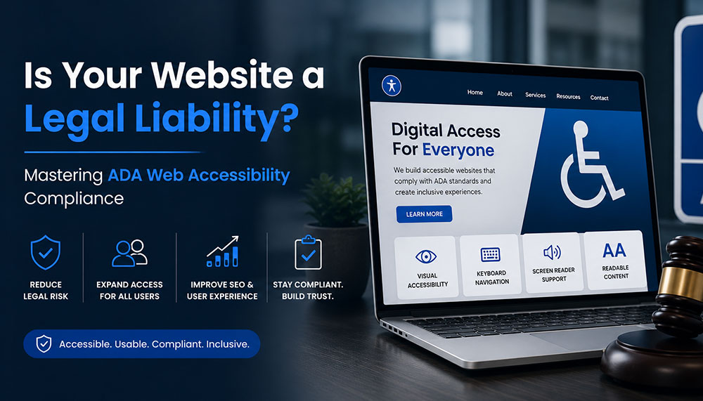
Is Your Website a Legal Liability? Mastering ADA Web Accessibility Compliance
Imagine a modern, multi-story corporate headquarters located in the heart of a major financial district. The building features an elegant glass facade, state-of-the-art security systems, and beautifully designed presentation rooms. Now imagine that the front entrance only features a steep flight of concrete stairs, with absolutely no wheelchair ramp, no automated doors, and no tactile paving for visually impaired visitors.
In the physical world, this scenario would instantly trigger public outrage, massive regulatory fines, and immediate legal action under civil rights legislation. Yet, in the digital landscape, thousands of corporate enterprises launch beautifully designed, multi-million dollar web platforms every single day that contain the exact digital equivalent of those concrete stairs. They build websites that completely shut out individuals with visual, auditory, motor, or cognitive disabilities, leaving their organizations wide open to devastating legal consequences.
For a long time, web accessibility was treated by corporate leadership as a minor, optional checkbox—a niche project left entirely to the discretion of junior developers. Those days are officially over. In the modern digital economy, digital accessibility has evolved into a critical legal and operational battleground. Organizations that neglect accessibility are finding themselves caught in a high-stakes web of legal liabilities, facing expensive class-action lawsuits, suffering brand damage, and alienating a massive, highly loyal segment of the global consumer market.
The High Cost of Exclusion: Lawsuits, Liabilities, and Lost Markets
To understand the urgency behind web accessibility, one must look closely at the rapidly shifting legal climate. Regulatory frameworks worldwide—such as the Americans with Disabilities Act (ADA) Title III in the United States, the European Accessibility Act (EAA) in Europe, and corresponding civil rights mandates internationally—have made it clear that public websites, mobile applications, and digital portals are considered “places of public accommodation.”
The legal risk is no longer a theoretical threat; it is a booming industry for specialized litigation firms. Tens of thousands of website accessibility lawsuits are filed annually against businesses of all sizes, from small e-commerce shops to Fortune 500 giants. What makes these legal threats particularly challenging is that intent does not matter. You cannot defend your organization by claiming you didn’t mean to exclude disabled users, or that your internal engineering team was simply unaware of the guidelines. If a user with a disability cannot navigate your online catalog, submit a contact form, or download an invoice, your platform is a documented legal liability.
However, focusing exclusively on the fear of litigation misses a profound commercial opportunity. Beyond the legal risk lies a massive case of market alienation. According to global health metrics, approximately 15% of the world’s population lives with some form of disability. This represents more than one billion people globally who control billions of dollars in disposable income. When your website fails to accommodate screen readers, lacks proper keyboard controls, or features inaccessible checkout flows, you aren’t just protecting yourself from a lawsuit by fixing it—you are actively turning away 15% of your potential customer base directly into the arms of your compliant competitors.
From an engineering perspective, this systemic exclusion can be traced back to a failure to meet the globally recognized benchmark for digital inclusion: the Web Content Accessibility Guidelines (WCAG). These technical guidelines are organized around four core principles, often abbreviated as POUR:
- Perceivable: Information and user interface components must be presented to users in ways they can perceive (it cannot be invisible to all their senses).
- Operable: User interface components and navigation must be operable (the interface cannot require interaction that a user cannot perform).
- Understandable: Information and the operation of the user interface must be understandable (the content or operation cannot be beyond their comprehension).
- Robust: Content must be robust enough that it can be interpreted reliably by a wide variety of user agents, including assistive technologies like screen readers.
Four Technical Pillars of an Accessible Web Infrastructure
Transitioning an enterprise digital platform from a compliance hazard into an inclusive, high-performing asset requires a systematic engineering approach. True accessibility cannot be achieved by dropping a cheap, third-party JavaScript “accessibility widget” onto your site. These superficial overlays often worsen the user experience for disabled individuals and fail to protect companies from legal scrutiny. Instead, compliance must be woven directly into the core code architecture through four foundational pillars.
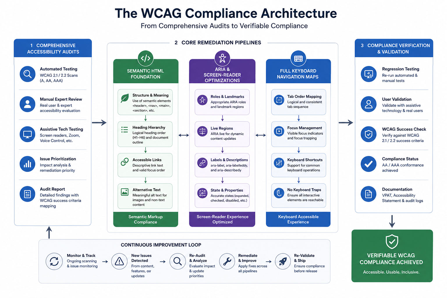
A structured flowchart demonstrating how Comprehensive Accessibility Audits feed directly into core remediation pipelines: combining Semantic HTML, ARIA Screen-Reader Optimizations, and Full Keyboard Navigation Maps to achieve verifiable compliance status.
1. Comprehensive Accessibility Audits
You cannot fix what you do not know is broken. The remediation process begins with an exhaustive, dual-layered accessibility audit. This involves pairing automated testing software with real-world manual testing. Automated scanners are excellent for catching high-volume technical errors, such as missing form labels, broken link structures, and incorrect color contrast ratios.
However, automated tools can only catch roughly 30% to 40% of accessibility barriers. The critical remaining errors must be uncovered through manual testing conducted by experienced QA engineers who navigate your platform using actual assistive tools, simulating the exact lived experiences of users with diverse physical and cognitive challenges.
2. Screen-Reader Optimizations via Semantic HTML and ARIA
Visually impaired users rely heavily on sophisticated software called screen readers (such as NVDA, JAWS, or VoiceOver) to translate visual on-screen layouts into spoken words. If your web application code consists of unstructured, non-semantic building blocks, a screen reader will voice a confusing jumble of meaningless elements.
To solve this, developers must build platforms using semantic HTML tags (such as <main>, <nav>, <header>, and <article>) that naturally define the structural hierarchy of a page. For complex, dynamic interface components like interactive dropdown menus, modal windows, or live data charts, engineers must deploy Accessible Rich Internet Applications (ARIA) attributes. These specialized code attributes act as invisible road signs, explicitly telling the screen reader software what a component does, what state it is currently in (e.g., `aria-expanded=”true”`), and how it relates to the rest of the layout.
3. Full Keyboard Navigation Setups
Many users with motor disabilities, tremors, or paralysis cannot operate a traditional computer mouse. Instead, they navigate the web exclusively using a keyboard, relying on the Tab key to move forward, Shift+Tab to move backward, and the Enter key to activate links and buttons.
An accessible website must feature a completely seamless, logical keyboard navigation map. This means ensuring that a visible, highly distinct “focus indicator” bounding box appears around any element a user highlights. Furthermore, code must be engineered to prevent “keyboard traps”—errors where a user tabs into a specific field or pop-up window but cannot tab back out without using a mouse. A compliant platform also features a hidden “Skip to Main Content” shortcut at the very top of the DOM structure, allowing keyboard users to bypass bloated header navigation links on every page refresh.
4. Accurate Alternative Text (Alt-Text) Frameworks
Images, infographics, and graphical banners play a major role in modern web storytelling. For a screen-reader user, however, an image without alternative text is completely blank, or worse, read aloud as a messy, unoptimized file name like “IMG_98432_FINAL.png.”
Implementing an accurate alt-text framework requires editorial discipline and structural standards. Alt-text shouldn’t be treated as a dump for SEO keyword stuffing. Instead, it must offer a concise, highly descriptive summary of the visual information or functional purpose of the image. If an infographic contains a chart mapping market trends, the alt-text or surrounding body copy must outline those specific data insights. Conversely, purely decorative elements like background shapes or design flourishes should be explicitly hidden from assistive tools using an empty `alt=””` attribute, preventing unnecessary audio clutter.
The Role of Technical Partners: Sourcing Expertise From a Website Development Company in India
Re-engineering an enterprise-grade digital ecosystem to meet strict WCAG 2.1 or 2.2 AA compliance standards is a highly technical challenge. It touches every layer of your digital stack, from raw backend server architecture and API data delivery to front-end layout styling and content entry systems. For organizations running vast product catalogs, complex client dashboards, or continuous content feeds, executing this remediation internally without specialized talent can quickly turn into an expensive, trial-and-error nightmare.
To navigate these complexities efficiently, global enterprises frequently look to establish strategic technical partnerships with an experienced website development company in India. The Indian tech ecosystem has matured into a powerhouse of certified accessibility specialists, front-end engineers, and compliance experts who understand the nuances of international digital law. By collaborating with an offshore development partner, enterprises can deploy scalable engineering teams dedicated to systematically cleaning up legacy source code, writing robust ARIA matrices, and running continuous integration accessibility testing. This strategic approach allows brands to completely eliminate their legal liability vulnerabilities swiftly and securely, while maintaining highly efficient capital allocation.
Comparative Strategy: The Structural Shift to Compliance
To fully understand why proper code remediation is essential for protecting your organization and improving usability, let’s contrast a non-compliant, high-risk web ecosystem against a fully accessible, compliance-first architecture:
Case Study: Eliminating Liability and Unlocking Market Potential
To evaluate the clear, measurable business returns of digital inclusion, let’s examine the operational transformation of a prominent multi-national financial services corporation. This institution operated a wide array of digital portals, customer dashboards, and online application channels. Over time, their various platforms had grown highly fragmented, built by multiple internal teams and external freelancers without unified code standards.
The turning point arrived when the firm received a formal legal demand letter from a civil rights law firm, detailing multiple severe WCAG violations that prevented blind users from completing loan applications. Recognizing the immense legal, financial, and reputational risk, the corporate leadership paused all standard product updates and authorized a complete accessibility overhaul of their entire digital infrastructure.
The remediation strategy was structured into a rigorous execution roadmap:
- The Core Rebuild: The development team systematically replaced complex, non-semantic custom scripts with native semantic HTML architectures.
- Assistive Mapping: They built complete ARIA navigation maps across their customer account dashboards, ensuring complex data tables were fully readable by assistive tools.
- Quality Assurance Expansion: They integrated automated accessibility testing scripts directly into their code deployment pipeline, preventing non-compliant updates from ever reaching the live production server.
The Operational Results: The impact of this architectural transformation went far beyond simply resolving the initial legal dispute. By implementing a fully compliant, highly accessible digital environment, the institution completely eliminated its exposure to regulatory fines and predatory web accessibility lawsuits.
More impressively, the brand observed a sudden, sustained surge in user engagement metrics across all entry funnels. Within two quarters post-launch, their digital application completion rate climbed sharply, effectively expanding their active market reach to an additional 15% of the digital population that had previously been locked out by structural code barriers. The brand transformation was absolute: a system that was once a dangerous legal liability had been re-engineered into a highly inclusive, market-expanding asset.
The Long-Game Advantage: Future-Proofing and Sustainable Inclusion
In a rapidly changing digital landscape, accessibility is no longer a static milestone you can reach once and forget about. Technology evolves continuously—new operating systems roll out, browsers update their rendering engines, and assistive devices become more sophisticated. At the same time, user expectations continue to rise, and international accessibility regulations are steadily growing stricter and more comprehensive.
Treating web accessibility as a foundational, core engineering requirement is the ultimate way to future-proof your digital presence. When you construct platforms using clean, semantic HTML code patterns, strict keyboard layouts, and verified ARIA matrices, you aren’t just protecting your business from current legal trends. You are building a flexible, highly stable digital infrastructure that effortlessly adapts to future technological shifts, voice search interfaces, and screen configurations without needing expensive, emergency redesigns.
Ultimately, making your website fully accessible is simply the right thing to do—both for your brand’s ethical integrity and its bottom-line performance. By prioritizing digital accessibility, your organization actively chooses to build a more equitable, open internet. You respect the autonomy of all users, welcome a massive community of loyal consumers, and turn your digital home into a secure, risk-free asset that drives sustainable corporate growth for decades to come.
Is Your Corporate Platform Holding Secret Legal Risks?
Hidden code issues, unlabelled forms, and low-contrast elements can leave your enterprise exposed to major web accessibility lawsuits. Our expert development and certified compliance teams can run an exhaustive WCAG audit to pinpoint and fix your digital accessibility gaps before they cause legal headaches.

How AI Development Is Changing Your Technical SEO and Core Web Vitals?
The conversation about AI and SEO has largely been a content story. Which tools write better copy. How to optimize for AI-generated search results. Whether Google can detect AI-written articles.
That conversation matters. But it is missing something bigger.
The more consequential impact of AI in the development workflow is not on content. It is on the infrastructure that serves the content: server response times, deployment stability, error recovery speed, and the consistency of what Google actually crawls versus what you published. These are technical SEO outcomes, and they are directly shaped by how a site is built, tested, and deployed.
AI-assisted development is changing all of them. Most SEO teams do not know it yet.
The Technical SEO Problems That Live Upstream of Your Dashboard
When an SEO or marketing team inherits a technical audit, they typically see the symptoms: elevated TTFB, crawl errors in Search Console, a Core Web Vitals report showing pages failing LCP or INP thresholds, redirect chains that appeared without anyone’s knowledge.
The instinct is to treat these as frontend problems. Compress images. Fix the redirect. Improve server caching. Often, those fixes work. But a meaningful portion of recurring technical SEO issues are not frontend problems. They are deployment pipeline problems.
Consider a few patterns that repeat across development teams:
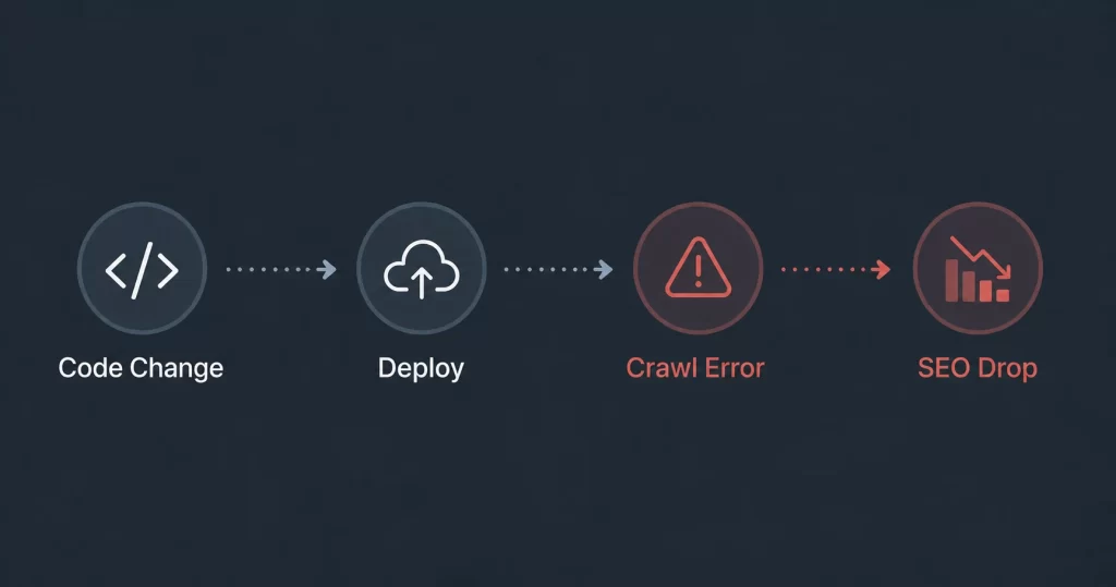
- A bug fix ships that accidentally removes a canonical tag from a template. The fix was tested locally. It was not caught in code review. It went to production. Google crawled the affected pages before anyone noticed, and the duplicate content signal had already been recorded.
- A deployment fails midway through a rolling update. For 8 minutes, some users hit the old version and some hit the new one. Googlebot made a request during that window and received a 503. That 5xx response was logged in Search Console. If this happens repeatedly, Google begins to deprioritise crawl frequency for those URLs.
- A platform running on a shared infrastructure spins down inactive dynos to save cost. The first request after a period of quiet takes 4 to 6 seconds to respond as the server restarts. That latency hits TTFB directly, and TTFB is a component of how Google measures page experience for Core Web Vitals.
None of these problems originate in CSS or image compression. They originate in how the application is built, reviewed, and deployed.
What AI-Assisted Development Is Actually Fixing
As of 2026, AI adoption in software development has crossed near-universal levels. According to Google’s State of AI-Assisted Software Development report, 97.5% of companies have integrated AI into their development workflows. McKinsey research puts the reduction in development time at 55% for teams using AI coding tools.
But the productivity gains that matter most for SEO are not about writing code faster. They are about catching errors earlier.
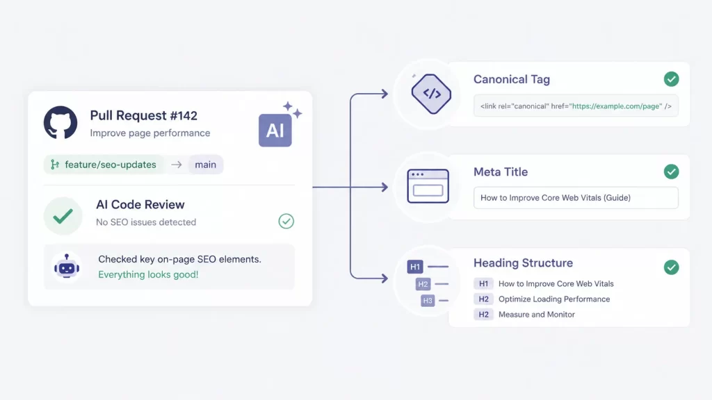
AI code review tools like CodeRabbit and Kodus leave automated review comments on every pull request before a human reviewer sees it. For SEO specifically, this matters because a significant class of technical regressions, broken internal links, removed meta tags, misconfigured redirects, altered heading hierarchy are code-level changes that ship in PRs alongside unrelated feature work.
Without AI-assisted review, these slip through because reviewers are focused on whether the feature works, not whether an h1 tag was accidentally removed from a component.
AI-assisted testing catches routing bugs that create duplicate URLs before they reach production. A new URL structure that generates both /product/item and /products/item without a canonical creates a duplicate content problem that may take weeks to identify from search data alone.
Caught at test time, it is a 5-minute fix. Caught from a Search Console report two months later, it is a content audit.
The upstream position of these tools relative to SEO outcomes is the key point. AI is not optimising your metadata. It is preventing the code changes that break your metadata from shipping in the first place.
How Deployment Speed and Stability Directly Affect Core Web Vitals
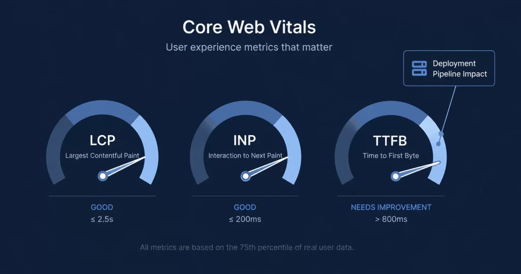
Core Web Vitals are a Google ranking signal. TTFB (Time to First Byte) is a component that Google’s CrUX data captures at the user level. A site with consistently high TTFB, whether from slow server response, cold start latency, or deployment instability, accumulates poor field data over time, and that field data feeds into ranking signals.
The deployment pipeline influences TTFB in two direct ways.
First, runtime environment sizing: An application deployed on an undersized server instance, or one that has not been tuned for its memory and CPU requirements, will have consistently elevated response times under normal load. For Java-based backends, this is particularly common: a Spring Boot application requires 300 to 500MB of RAM at startup. On an instance that is too small, it thrashes memory and slows every request. On a correctly sized instance, it is fast
Manual deployment requires the developer or DevOps engineer to make this sizing decision correctly every time. AI-powered deployment platforms that automatically detect the runtime environment and size instances appropriately remove this source of performance variability entirely.
Second, deployment downtime during updates: Traditional deployments involve stopping the old version and starting the new one. Even a few seconds of downtime during a production deploy can result in 503 responses that Google records. Zero-downtime deployment patterns, where traffic is shifted from the old version to the new one without any gap, prevent this entirely. Platforms that implement this by default, such as agentic AI deployment tools that handle the full release cycle automatically, eliminate a recurring source of crawl errors that SEO teams otherwise have to monitor and explain.
A useful reference on how this works in practice: a detailed breakdown of agentic AI deployment that covers how automated stack detection and zero-downtime deploys change the relationship between deployment pipelines and production reliability.
What SEO and Development Teams Should Actually Align On
The structural problem is that SEO teams and development teams operate on different time horizons and different feedback loops. An SEO team measures impact in weeks and months. A development team ships and moves on in hours. By the time a technical SEO regression surfaces in search data, the developer who introduced it may not remember the relevant change.
AI-assisted development compresses this gap. Code review happens at PR time. Testing happens before merge. Deployment happens with automated validation. The feedback loop gets faster, and the issues that create technical SEO regressions get caught closer to where they originate.
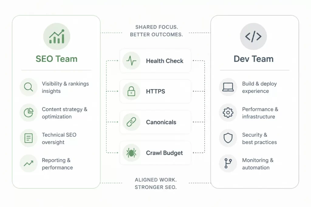
There are specific alignment points worth establishing between SEO and development teams:
- Health check endpoints should be in place before any deployment goes live. A /health route that returns a 200 confirms the application started correctly. Without it, a failed deployment can route live traffic to a crashed process, generating 5xx errors at scale.
- HTTPS enforcement and redirect audits should run as part of the deployment pipeline, not as a monthly SEO check. AI-assisted CI/CD pipelines can run these checks automatically on every merge.
- Canonical tags, meta robots, and structured data should be treated as code-level assets with version control, not just as SEO configurations. When they change unexpectedly, it should surface in code review, not in a ranking drop six weeks later.
- Crawl budget is a finite resource. Every 5xx error response wastes a crawl credit on a URL that returns nothing. Development teams that treat deployment stability as an SEO concern, not just a reliability concern, protect crawl budget as a byproduct of doing their job well.
The Argument in One Sentence
AI-assisted development is not an SEO story yet. It should be. The teams that close the loop between deployment pipeline health and technical SEO outcomes will have a structural advantage over teams treating them as separate disciplines. The tools to close that loop, AI code review, automated testing, intelligent deployment platforms, exist today and are increasingly accessible to teams of any size.
The SEO and marketing professionals who understand this, and who can speak the development team’s language when raising these issues, will be the ones who stop debugging symptoms and start preventing the causes.
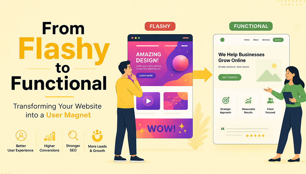
From Flashy to Functional: Transforming Your Website into a User Magnet
In the early days of the internet, a flashy website was often enough to impress visitors. Bright colors, animations, auto-playing media, and complex layouts were seen as signs of creativity and innovation. But times have changed. Today’s users are smarter, faster, and far less patient. A visually overloaded website is no longer impressive—it’s exhausting.
If your website looks stunning but fails to convert visitors into customers, then it’s not doing its job. The modern approach to web design focuses on functionality, usability, speed, and experience. Businesses that understand this shift are the ones that win.
This article explores how to transform your website from merely flashy to genuinely functional—and ultimately turn it into a powerful user magnet.
The Problem with “Flashy” Websites
At first glance, a flashy website can feel impressive. Bright visuals, animations, sliders, and interactive effects often give the illusion of sophistication and creativity. But here’s the reality—what looks exciting to a designer can quickly become frustrating for a user.
Today’s internet users are not browsing casually—they’re searching with intent. They want answers, solutions, and clarity within seconds. If your website slows them down or overwhelms them, they won’t admire the design—they’ll abandon it.
Flashy websites often prioritize aesthetics over usability. While they may look appealing initially, they tend to create friction in the user journey. And in the digital world, even small friction points can lead to big losses in engagement and conversions.
Let’s take a closer look at the common problems:
- Slow loading times: Heavy animations, large images, auto-playing videos, and complex scripts can significantly slow down your website. Users today expect pages to load almost instantly. Even a delay of a few seconds can cause frustration and increase bounce rates.
- Confusing navigation structures: Over-designed menus, hidden navigation elements, or too many options can leave users unsure of where to go next. When visitors feel lost, they rarely try to figure things out—they simply exit.
- Distracting visual elements: Too many moving parts—sliders, pop-ups, flashing banners—can shift attention away from what actually matters: your message. Instead of guiding users, these elements overwhelm them.
- Poor mobile responsiveness: A design that looks great on a desktop may completely break on a mobile device if not optimized properly. With the majority of users browsing on smartphones, this is a critical flaw.
- Low accessibility: Flash-heavy designs often ignore accessibility standards. Poor contrast, unreadable fonts, or non-intuitive layouts can make it difficult for users with different abilities to interact with your website.
Think about your own browsing habits. When you land on a website that takes too long to load or feels complicated, what do you do? Most likely, you hit the back button. That’s exactly what your visitors are doing too.
Modern users expect instant gratification. They want fast, smooth, and effortless experiences. If your website fails to deliver that within the first few seconds, you’ve already lost their attention—and potentially their business.
This is why businesses today are shifting their focus from “looking impressive” to “working effectively.” A professional Website Designing company in India understands this balance. Instead of adding unnecessary elements, they focus on creating clean, user-friendly designs that guide visitors naturally and help businesses achieve real results.
Because in the end, a website isn’t meant to just impress—it’s meant to perform.
Understanding the Shift: From Design to Experience
There was a time when website design was judged almost entirely by how it looked. If it was visually appealing, colorful, and “different,” it was considered successful. But that definition has evolved—dramatically.
Today, design alone is not enough. A website can look stunning and still fail miserably if it doesn’t deliver a smooth, intuitive experience. This is where the shift happens—from design-centric thinking to experience-centric thinking.
In simple terms, it’s no longer just about how your website looks. It’s about how it feels to use.
When a user lands on your website, they are not there to admire your design skills. They are there with a purpose—maybe to learn something, compare options, or make a purchase. The faster and easier you help them achieve that goal, the more successful your website becomes.
This is why User Experience (UX) and User Interface (UI) design have become the backbone of modern websites. These disciplines focus on understanding user behavior, removing friction, and creating seamless interactions.
Instead of asking “Does it look good?”, businesses now need to ask deeper, more practical questions:
- Is it easy to use? Can a first-time visitor navigate your website without confusion, or do they have to think too much before taking action?
- Can users find what they need quickly? In a world where attention spans are shrinking, every second matters. If users have to dig through multiple pages to find basic information, they won’t stick around.
- Does it guide users toward action? A good website doesn’t just present information—it gently leads users toward the next step, whether that’s filling out a form, making a purchase, or contacting your team.
- Does it work seamlessly on all devices? Your audience is browsing on phones, tablets, laptops, and everything in between. A consistent and smooth experience across all devices is no longer optional.
Think of your website like a physical store. A beautifully designed store with confusing layouts, hard-to-find products, and unhelpful staff will struggle to make sales. On the other hand, a clean, well-organized store that makes shopping easy will naturally attract and retain customers.
The same principle applies online.
Functionality doesn’t mean sacrificing beauty—it means giving beauty a purpose. Every design element, from colors to typography to spacing, should support usability rather than distract from it.
This is where experienced professionals, such as a Website Designing company in India, bring real value. They don’t just design for visual appeal—they design for human behavior, ensuring that every click, scroll, and interaction feels natural and meaningful.
Because at the end of the day, users don’t remember how “cool” your website looked. They remember how easy it was to use—and whether it helped them get what they came for.
Key Elements of a Functional Website
A functional website doesn’t happen by accident—it’s the result of thoughtful planning, user understanding, and smart design decisions. Every element on your website should have a purpose. When all these elements work together, they create an experience that feels smooth, intuitive, and satisfying for the user.
Let’s break down the core elements that truly make a website functional—not just visually appealing, but genuinely effective.
1. Clear and Intuitive Navigation
Your website should feel effortless to explore. A visitor should land on your homepage and instantly understand where to go next—without thinking too hard. The moment users feel confused, they start losing trust.
Think of navigation as a roadmap. If the directions aren’t clear, people won’t keep wandering—they’ll simply leave and find another destination.
A well-structured navigation system includes:
- Simple menus with clear labels: Avoid clever or vague naming. “Services,” “About,” and “Contact” may sound basic, but they work because users instantly recognize them.
- Logical page hierarchy: Your pages should be organized in a way that makes sense. Important information should never be buried deep within multiple clicks.
- Easy access to key pages: High-priority pages like pricing, services, or contact information should always be easy to find—preferably within one or two clicks.
If users get lost, they leave. It’s that simple. Good navigation doesn’t draw attention to itself—it just works seamlessly in the background.
2. Fast Loading Speed
Speed is one of the most critical factors in user experience. No matter how beautiful your website is, if it takes too long to load, users won’t wait around to see it.
We live in a world of instant results. A delay of even one second can feel like an eternity—and that’s often enough to lose a potential customer.
To improve your website’s speed:
- Optimize images: Large, uncompressed images are one of the biggest causes of slow websites. Proper optimization keeps quality high while reducing load time.
- Use efficient code: Clean, streamlined coding reduces unnecessary load on your website.
- Leverage caching: Caching helps store data so returning users can access your site faster.
- Choose reliable hosting: Your hosting provider plays a major role in your website’s performance. A slow server means a slow website—no matter what you do.
A skilled Website Designing company in India understands that performance is not an afterthought. They build speed optimization into the foundation of your website from the very beginning.
3. Mobile Responsiveness
Take a moment to think about how often you use your phone to browse the internet. Now imagine your website being viewed on that small screen. Does it still look clean? Is it easy to navigate? Can users interact with it comfortably?
With mobile users now dominating web traffic, your website must perform flawlessly across all screen sizes. A responsive design ensures that your website adapts automatically—no matter what device is being used.
This includes:
- Content that adjusts smoothly: Images, text, and layouts should resize and rearrange themselves for different screen sizes.
- Tap-friendly buttons: Buttons should be large enough and spaced properly so users can easily tap them without frustration.
- Readable text: Users shouldn’t have to zoom in just to read your content. Proper font sizing is essential.
A mobile-first approach is no longer optional—it’s the standard. If your website doesn’t work well on mobile, you’re likely losing a significant portion of your audience.
4. Strong Visual Hierarchy
When users land on your website, they don’t read every word—they scan. Your design should guide their eyes naturally, helping them understand what’s important within seconds.
This is where visual hierarchy comes in. It’s the art of organizing content in a way that leads users through your website effortlessly.
You can achieve this through:
- Proper use of headings: Headlines should stand out and clearly communicate key messages.
- Contrasting colors: Important elements like call-to-action buttons should be visually distinct.
- Whitespace: Giving elements room to breathe makes your website easier to read and less overwhelming.
- Strategic placement: Key information should be positioned where users naturally look first.
A clean, well-structured layout often outperforms a cluttered design. Simplicity doesn’t mean boring—it means effective.
5. Compelling and Clear Content
Design might bring users in, but content is what keeps them there—and ultimately convinces them to take action.
Your messaging should speak directly to your audience. It should answer their questions, address their concerns, and clearly explain how you can help them.
Effective website content is:
- Clear and concise: Avoid unnecessary jargon or long-winded explanations. Get to the point quickly.
- User-focused: Instead of talking only about your business, focus on what the user gains.
- Easy to scan: Use short paragraphs, bullet points, and headings to make content digestible.
Within a few seconds of landing on your website, visitors should understand exactly what you offer and why it matters to them. If they have to guess, you’ve already lost them.
When all these elements come together—navigation, speed, responsiveness, hierarchy, and content—you don’t just have a website. You have a powerful user experience that attracts, engages, and converts.
Why Functionality Drives Conversions
At the end of the day, your website has a job to do. Whether it’s generating leads, selling products, or encouraging inquiries—everything comes down to conversions. And here’s the truth many businesses overlook: people don’t convert because your website looks good… they convert because it feels easy.
A functional website removes friction from the user journey. It makes every step—from landing on the page to taking action—feel natural and effortless. When users don’t have to struggle, think too much, or second-guess their decisions, they are far more likely to move forward.
Think of it like walking into a well-organized store. You can quickly find what you need, understand the pricing, and check out without confusion. Compare that to a cluttered store where nothing is clearly labeled—you’d probably walk out. The same psychology applies to your website.
Functionality builds trust. And trust is the foundation of every conversion.
When users can easily navigate your website, find relevant information, and complete actions without frustration, they begin to feel confident in your brand. On the other hand, even small issues—like a confusing layout or a slow-loading page—can create doubt and push them away.
A conversion-focused website is intentionally designed to guide users toward action. It doesn’t leave things to chance. Every element plays a role in helping users take the next step.
Here’s what that looks like in practice:
- Clear call-to-action (CTA) buttons: Your CTAs should stand out and communicate exactly what users need to do next—whether it’s “Get a Quote,” “Book a Demo,” or “Buy Now.” There should be no confusion or hesitation.
- Minimal distractions: Too many pop-ups, animations, or competing elements can overwhelm users and dilute your message. A clean, focused design keeps attention where it matters most.
- Trust signals: People are naturally cautious online. Reviews, testimonials, case studies, certifications, and client logos help reassure users that they’re making the right choice.
- Simplified forms and checkout processes: The more steps you add, the more users you lose. Shorter forms, fewer fields, and a smooth checkout experience can significantly increase conversions.
It’s important to understand that users don’t want to “work” to interact with your website. The easier you make things for them, the more likely they are to take action.
This is why businesses increasingly partner with a Website Designing company in India that focuses on performance-driven design. Instead of adding unnecessary features, they refine the user journey—removing obstacles and guiding users toward meaningful actions.
Every element on your website should have a clear purpose. If something doesn’t contribute to the user experience or support conversions, it’s likely doing more harm than good.
Because in the digital world, simplicity isn’t just a design choice—it’s a competitive advantage.
The Role of User Psychology
Behind every click, scroll, and decision on your website, there’s a human mind at work. And that mind doesn’t behave randomly—it follows patterns. Understanding these patterns is what separates an average website from one that truly connects with users.
One of the biggest misconceptions in web design is assuming that users carefully read everything on a page. In reality, they don’t. People scan. They skim through headings, glance at visuals, and look for familiar cues that help them quickly understand what to do next.
This means your website isn’t just a collection of pages—it’s an experience shaped by human behavior. The more you align your design with how people naturally think and interact, the more effective your website becomes.
Let’s explore some key psychological principles that influence user behavior:
- Familiarity: Users feel comfortable with what they already recognize. This is why most successful websites follow certain standard patterns—like having a logo at the top left, navigation at the top, and contact information easily accessible. When you stick to familiar structures, users don’t have to “learn” how to use your website—they already know.
- Clarity: The human brain prefers simplicity. When a website is cluttered or overly complex, it increases cognitive load—meaning users have to work harder to process information. And when things feel difficult, people tend to give up. Clean layouts, simple messaging, and clear pathways reduce this mental effort and keep users engaged.
- Trust: First impressions happen in seconds. A clean, professional-looking website instantly builds credibility, while a messy or outdated design raises doubts. Elements like consistent branding, high-quality visuals, testimonials, and secure browsing indicators all contribute to building trust.
- Urgency: People are more likely to take action when they feel a sense of urgency. Strategic prompts like limited-time offers, countdowns, or phrases such as “Only a few spots left” can encourage users to act sooner rather than later. When used thoughtfully, urgency can significantly improve conversions without feeling pushy.
Think about your own online behavior. When you visit a website, you instinctively look for certain things—clear headings, easy navigation, and quick answers. If those elements are missing, frustration builds almost instantly.
This is why understanding user psychology isn’t optional—it’s essential. A website that aligns with human behavior feels intuitive, trustworthy, and easy to use.
A modern Website Designing company in India doesn’t just focus on visuals or code—they dive deeper into how users think, what motivates them, and what stops them from taking action. By combining design expertise with behavioral insights, they create websites that don’t just look good—they feel right.
Because when your website speaks the language of your users’ minds, engagement and conversions naturally follow.
Common Mistakes to Avoid
Sometimes, the biggest problems on a website aren’t what’s missing—they’re what’s unnecessarily added. Many businesses invest time and money into their websites, yet unknowingly make decisions that hurt performance instead of improving it.
The tricky part? These mistakes often come from good intentions—trying to impress users, add more information, or stand out from competitors. But in reality, they end up doing the opposite.
Let’s break down some of the most common website mistakes and why they matter:
- Overusing animations and effects: Animations can enhance a website when used sparingly, but too many moving elements can overwhelm users. Sliders, pop-ups, hover effects, and auto-playing media can quickly turn from engaging to distracting. Instead of focusing on your message, users get caught up in visual noise—and often leave before taking any action.
- Ignoring mobile users: This is one of the most costly mistakes today. A website that works perfectly on desktop but feels clunky on mobile is guaranteed to lose a large portion of its audience. Tiny buttons, misaligned content, and slow mobile performance create frustration and drive users away almost instantly.
- Cluttering pages with too much information: It’s tempting to put everything on one page—every service, every feature, every detail. But more information doesn’t always mean better communication. When pages are overcrowded, users don’t know where to focus. Instead of reading more, they end up reading nothing at all.
- Using unclear or generic CTAs: Call-to-action buttons like “Click Here” or “Submit” don’t tell users what they’re getting. Strong CTAs are specific and action-driven—like “Get Your Free Quote” or “Book a Consultation.” Clarity here can make a huge difference in conversion rates.
- Neglecting SEO fundamentals: A beautiful website is useless if no one can find it. Ignoring SEO basics—like proper headings, meta tags, keyword optimization, and page speed—limits your visibility on search engines. Without traffic, even the best-designed website won’t deliver results.
If you look closely, all these mistakes have one thing in common: they prioritize business preferences over user needs. And that’s where things start to go wrong.
The good news is that these issues are completely fixable. In fact, addressing even a few of them can lead to noticeable improvements in user engagement, time on site, and conversions.
This is why many businesses turn to an experienced Website Designing company in India to audit and refine their websites. With a fresh perspective and user-focused approach, they can identify hidden issues and transform your website into something far more effective.
Because sometimes, improving your website isn’t about adding more—it’s about removing what’s getting in the way.
Balancing Aesthetics and Functionality
There’s a common misconception in web design—that you have to choose between a website that looks beautiful and one that works well. In reality, the most successful websites don’t pick one over the other. They strike a balance.
Visual appeal matters. It creates the first impression, sets the tone for your brand, and captures attention. But if that visual appeal comes at the cost of usability, it quickly loses its value. On the other hand, a purely functional website that lacks personality can feel dull and forgettable.
The real goal is to bring both together—where design enhances functionality, not competes with it.
Think of your website like a well-designed workspace. It should look inviting and professional, but more importantly, everything should be placed exactly where it’s needed. Nothing should feel out of place, unnecessary, or confusing.
Here are some practical ways to achieve that balance:
- Using a consistent color palette: Colors play a huge role in how users perceive your brand. A consistent palette creates a sense of harmony and professionalism. It also helps guide user attention—for example, using a specific color for buttons makes them instantly recognizable.
- Choosing readable fonts: Stylish typography can enhance your design, but readability should always come first. If users have to strain their eyes to read your content, they won’t stick around. Clean, simple fonts with proper spacing make a big difference in user comfort.
- Maintaining visual consistency: Consistency builds familiarity and trust. When elements like buttons, headings, spacing, and layouts follow a uniform style across your website, users feel more comfortable navigating it. Inconsistency, on the other hand, creates confusion and disrupts the experience.
- Using images purposefully: Images should support your message—not just fill space. High-quality visuals can enhance storytelling, explain concepts, and create emotional connections. But irrelevant or excessive images can slow down your website and distract users from your core message.
It’s also important to remember that simplicity is powerful. A clean design with thoughtful spacing and focused content often feels more premium than a cluttered, over-designed layout.
This is where experienced professionals, such as a Website Designing company in India, truly make a difference. They understand how to blend creativity with usability—ensuring that every design choice serves a purpose and contributes to the overall experience.
At its core, design is not the end goal—it’s a tool. A tool to communicate, guide, and engage your users. When used wisely, it doesn’t just make your website look better—it makes it work better.
And that’s the kind of balance that turns visitors into loyal users.
How SEO and Functionality Work Together
SEO and website functionality are often treated as two separate things—but in reality, they are deeply connected. You can’t build a strong online presence by focusing on just one. The websites that perform best today are the ones where SEO and user experience work hand in hand.
Search engines like Google are no longer just scanning your website for keywords. They are analyzing how users interact with it. Do people stay on your site? Do they explore multiple pages? Or do they leave within seconds? These behaviors send powerful signals about the quality of your website.
In simple terms, search engines want to recommend websites that users actually enjoy using. And that’s exactly where functionality comes into play.
A functional website naturally supports SEO because it creates a better experience for users—and when users are happy, search engines take notice.
Here’s how functionality directly impacts your SEO performance:
- Improving page speed: Fast-loading websites not only keep users engaged but are also favored by search engines. Speed is a ranking factor, and even small improvements can make a noticeable difference in your visibility.
- Enhancing mobile usability: With mobile-first indexing, search engines prioritize how your website performs on mobile devices. A responsive, mobile-friendly design ensures that your site ranks better and reaches a wider audience.
- Reducing bounce rates: When users land on your website and immediately leave, it signals that something isn’t working—whether it’s slow speed, poor design, or irrelevant content. A functional website keeps users engaged and encourages them to stay longer.
- Encouraging longer session durations: When your website is easy to navigate and provides valuable content, users naturally spend more time exploring it. This increased engagement sends positive signals to search engines about your site’s relevance and quality.
It’s important to understand that SEO is no longer just about ranking—it’s about retention. Getting users to your website is only half the battle. Keeping them there is what truly makes the difference.
This is why businesses are increasingly working with a Website Designing company in India that understands both SEO and user experience. Instead of treating them as separate strategies, they integrate them into a unified approach—building websites that are not only easy to find but also enjoyable to use.
When your website is fast, intuitive, and user-friendly, visitors stay longer, interact more, and trust your brand. And when that happens consistently, search engines recognize your website as valuable—and reward it with better rankings.
Because in today’s digital landscape, the formula is simple: when users love your website, search engines do too.
Steps to Transform Your Website
Transforming your website from flashy to functional isn’t about making random changes—it’s about taking a structured, thoughtful approach. The goal is to create a website that not only looks better, but works better for your users and your business.
Think of it as a continuous improvement process rather than a one-time redesign. Every step you take should bring you closer to a smoother, more effective user experience.
1. Audit Your Current Website
Before making any changes, you need to understand where you currently stand. A website audit helps you uncover what’s working well and what’s holding you back.
Start by looking at real user data:
- User behavior: How do visitors interact with your site? Which pages do they visit most? Where do they drop off?
- Bounce rates: Are users leaving quickly after landing on certain pages? If yes, those pages may have usability or content issues.
- Conversion data: Which pages are driving results, and which ones are not?
You can also review your website from a user’s perspective. Try navigating it as if you were a first-time visitor. Is everything clear and easy to find? Or does it feel confusing?
This step lays the foundation for everything that follows.
2. Simplify the Design
Once you know what’s not working, the next step is to simplify. Many websites try to do too much—and end up overwhelming users.
Simplification doesn’t mean removing value—it means removing distractions.
Focus on:
- Eliminating unnecessary animations and visual clutter
- Reducing the number of competing elements on each page
- Highlighting key messages and actions
Ask yourself: “Does this element help the user, or does it just look nice?” If it doesn’t serve a purpose, it probably doesn’t belong.
A clean, focused design makes it easier for users to understand your website—and take action.
3. Improve Performance
Performance is a critical part of functionality. Even the best-designed website will fail if it’s slow or unresponsive.
Improving performance involves both technical and design-related optimizations:
- Speed optimization: Compress images, minimize code, and use caching to reduce load times.
- Responsive design: Ensure your website works smoothly across all devices and screen sizes.
- Technical improvements: Fix broken links, optimize server response times, and ensure clean coding practices.
This is often where working with a Website Designing company in India can make a big difference. Their technical expertise ensures that your website performs efficiently without compromising on design.
4. Enhance Content Strategy
Your website’s content is what communicates your value to users. If your messaging is unclear or unfocused, even the best design won’t help.
Shift your content strategy from “what we want to say” to “what users need to hear.”
Effective content should:
- Address user problems and offer solutions
- Be easy to read and scan
- Clearly explain your services or products
- Guide users toward the next step
Every page should have a purpose—and every piece of content should support that purpose.
5. Test and Optimize Continuously
Your website is never truly “finished.” User behavior evolves, trends change, and new opportunities emerge. That’s why ongoing testing and optimization are essential.
Use tools and techniques like:
- A/B testing: Compare different versions of a page to see what performs better
- Analytics: Track user behavior, engagement, and conversions
- Heatmaps: Understand where users click, scroll, and focus their attention
Small improvements over time can lead to significant results. Even minor tweaks—like changing a button color or simplifying a form—can have a noticeable impact on conversions.
The key is to stay curious, keep testing, and continuously refine your website based on real data.
When you follow these steps, you’re not just redesigning your website—you’re transforming it into a powerful tool that attracts users, engages them, and drives meaningful results.
The Importance of Professional Expertise
Transforming a website isn’t just about changing colors, adding new sections, or updating a layout—it’s a much deeper process. It requires a careful balance of design, technology, user psychology, and marketing strategy. And this is exactly where many businesses struggle when trying to handle everything on their own.
A website today is not just a digital brochure—it’s a performance-driven asset. It needs to attract visitors, engage them, guide them, and ultimately convert them. Achieving all of that requires more than creativity—it requires expertise.
This is why many businesses choose to partner with a professional Website Designing company in India. Instead of relying on guesswork or trial-and-error, they gain access to a team that understands how to build websites that actually work.
Let’s look at what such expertise brings to the table:
- Industry experience: Professionals who have worked across different industries understand what works and what doesn’t. They’ve seen trends evolve, tested strategies, and know how to avoid common pitfalls. This experience helps them make informed decisions that save time and deliver better results.
- Technical expertise: From coding and performance optimization to responsiveness and integrations, there’s a lot happening behind the scenes of a functional website. A skilled team ensures that everything runs smoothly—so users never have to think about the technical side at all.
- Strategic thinking: A great website isn’t built randomly—it’s planned. Professionals approach design with a clear strategy in mind, aligning your website with your business goals. Every element, from layout to content placement, is designed to support conversions and user engagement.
- Cost-effective solutions: While hiring experts may seem like an added expense, it often saves money in the long run. Avoiding mistakes, reducing redesigns, and getting things right the first time leads to better ROI and fewer ongoing issues.
Another key advantage is perspective. When you’re deeply involved in your own business, it’s easy to overlook usability issues or assume things are “obvious” to users. A professional team brings an outside perspective—seeing your website the way your visitors do.
They don’t just ask, “Does this look good?” They ask, “Does this work?”
And that shift in thinking makes all the difference.
The result is a website that doesn’t just impress visually—it performs consistently. It loads faster, guides users better, communicates clearly, and converts more effectively.
Because in today’s competitive digital space, a good-looking website is no longer enough. You need a website that delivers results—and that’s exactly what professional expertise helps you achieve.
Real-World Impact of Functional Design
When businesses shift their focus from flashy visuals to functional design, the results are not just noticeable—they’re measurable. This isn’t about subjective opinions like “it looks better” or “it feels smoother.” It’s about real, data-driven improvements that directly affect how your website performs and how your business grows.
A functional website doesn’t just change how your site looks—it transforms how users interact with it. And when user behavior improves, everything else follows.
Here’s what businesses typically experience when they make this shift:
- Higher conversion rates: When users can easily navigate your website, understand your offering, and take action without confusion, conversions naturally increase. Whether it’s filling out a form, making a purchase, or booking a service—simplicity leads to action.
- Lower bounce rates: A well-structured, fast-loading, and user-friendly website encourages visitors to stay instead of leaving immediately. When users find what they’re looking for quickly, they’re far more likely to explore further rather than exit.
- Increased user engagement: Functional design keeps users interested. They spend more time on your site, visit multiple pages, and interact with your content. This deeper engagement not only improves user experience but also strengthens your brand connection.
- Better search rankings: Search engines pay close attention to how users behave on your website. Lower bounce rates, longer session durations, and improved usability all contribute to better rankings—bringing in even more organic traffic.
But beyond the metrics, there’s a bigger picture.
A functional website builds confidence. It makes your business feel reliable, professional, and easy to work with. Users don’t just visit—they trust. And when trust is established, conversions become a natural outcome rather than a forced action.
Many businesses notice that after optimizing functionality, they don’t need to push as hard with aggressive marketing. Their website starts doing the heavy lifting—guiding users, answering questions, and encouraging decisions organically.
This is why working with a Website Designing company in India that focuses on performance-driven design can be a game-changer. Instead of chasing trends or adding unnecessary features, they focus on what truly impacts user behavior and business outcomes.
Because in the real world, success isn’t measured by how impressive your website looks—it’s measured by how effectively it works.
And when your website works seamlessly, growth isn’t just possible—it becomes predictable.
Future Trends in Website Design
Website design is constantly evolving—but one thing is becoming clearer every year: the future belongs to websites that truly understand and serve their users. Trends may change, technologies may advance, but the core focus remains the same—creating seamless, meaningful, and human-centered experiences.
What’s exciting is that the next wave of web design isn’t just about looking modern—it’s about becoming smarter, more intuitive, and more inclusive. Businesses that adapt early will not only stand out but also build stronger, long-lasting connections with their audiences.
Let’s explore some of the key trends shaping the future of website design:
- Minimalistic design approaches: The shift toward simplicity is only getting stronger. Clean layouts, ample whitespace, and focused content are replacing cluttered, over-designed pages. Minimalism isn’t about doing less—it’s about doing what matters most. By removing distractions, websites can guide users more effectively and create a calmer, more enjoyable browsing experience.
- AI-driven personalization: Websites are becoming smarter and more adaptive. With the help of artificial intelligence, websites can now tailor content, recommendations, and user journeys based on individual behavior. Imagine a website that understands what a visitor is looking for and adjusts its content accordingly—this level of personalization can significantly improve engagement and conversions.
- Voice and gesture-based interactions: As technology evolves, the way users interact with websites is also changing. Voice search and voice commands are becoming more common, especially with the rise of smart devices. Gesture-based interactions, particularly on mobile and touch devices, are also shaping how users navigate and engage with content. Designing for these interactions means thinking beyond clicks and taps.
- Accessibility-first design: Inclusivity is no longer optional—it’s essential. Future-ready websites are built to be accessible to everyone, including users with disabilities. This includes better color contrast, keyboard navigation, screen reader compatibility, and clear content structure. Accessibility doesn’t just expand your audience—it also improves overall usability for all users.
Another important shift is the growing expectation for speed, privacy, and trust. Users want websites that load instantly, respect their data, and provide a smooth, secure experience. These factors will continue to influence design decisions moving forward.
For businesses, this means one thing: staying static is not an option. A website that works well today may feel outdated tomorrow if it doesn’t evolve with user expectations.
This is where partnering with a forward-thinking Website Designing company in India becomes valuable. Such teams stay updated with emerging technologies and user trends, ensuring your website doesn’t just keep up—but stays ahead.
Because in the digital world, success isn’t just about where you are today—it’s about how prepared you are for what’s coming next.
And the future? It belongs to websites that are not only functional—but intelligent, inclusive, and deeply user-focused.
Conclusion
A flashy website might capture attention—but a functional website captures users.
In today’s competitive digital landscape, success depends on how well your website serves your audience. By focusing on usability, performance, and clarity, you can create an experience that not only attracts visitors but keeps them coming back.
Whether you’re revamping an existing site or building a new one, the goal should always be the same: create a website that works for your users.
And when done right, your website doesn’t just become a digital presence—it becomes your most powerful business asset.

Browser-based WordPress (No hosting needed)
Core concept
WordPress now has environments that run 100% inside your browser using WebAssembly.
- No hosting
- No domain
- No installation
- No signup (in some cases)
You just open a URL → and WordPress is already running.
WordPress moves from setup to instant access
For nearly two decades, WordPress has been defined by a simple yet powerful idea: enable anyone to create and publish on the web with minimal friction. The well-known “five-minute install” embodied that philosophy for an earlier generation of the internet.
In 2026, WordPress extends this vision with a more progressive, browser-native experience.
With my.WordPress.net, WordPress now runs entirely and persistently within the browser. There is no requirement for hosting configuration, domain selection, or initial setup decisions.
The environment opens instantly, placing users directly inside a fully operational WordPress instance that exists within their own device. This evolution is built on WordPress Playground, a modern architecture that enables PHP execution, data handling, and application logic directly in the browser. The result is not a simulated interface, but a complete and authentic WordPress environment—one that behaves consistently with its hosted counterpart.
What makes this development strategically important is not just the removal of infrastructure dependencies, but the shift in how WordPress is experienced. Instead of being something that must be provisioned before use, WordPress becomes a space you can enter immediately and shape over time.
- From setup to instant access: Users move directly into creation without intermediary steps
- From deployment-first to idea-first workflows: Concepts can be explored, refined, and structured before decisions around hosting or publishing
- From public-first to personal-first environments: WordPress evolves into a private workspace for drafting, organizing, and experimentation
As highlighted in the official announcement, this approach positions WordPress as something that “stays with you”—a persistent, personal environment rather than a temporary instance.
This shift also redefines the relationship between users and the platform itself.
As Alex Kirk notes, “this takes WordPress from being framed as something that is democratizing publishing to democratizing digital sovereignty.”
By removing early-stage decisions around hosting, visibility, and setup, WordPress allows users to focus entirely on creation. It evolves into a personal environment that offers greater control, continuity, and ownership in how digital experiences are built and managed.
What website developers need to understand about browser-based WordPress
Browser-based WordPress introduces a new layer within the development lifecycle. For web developers and WordPress development agencies, it reshapes how environments are created, tested, and transitioned into production.
This model functions as a front-layer environment, enabling rapid prototyping and validation before moving into hosted infrastructure.
Playground → Prototype → Export → Deploy
Accelerated experimentation
Developers can test plugins, themes, and configurations in a controlled environment, validating functionality before integrating into production systems.
Redefined client and agency workflows
This approach enables faster collaboration and iteration.
- Instant landing page prototypes
- Live demonstrations without staging infrastructure
- Faster feedback and approval cycles
AI-integrated development
AI can interact directly with the environment, enabling developers to modify plugins, generate features, and work with data dynamically within WordPress.
These capabilities position browser-based WordPress as a strategic acceleration layer within modern development workflows.
The technology behind browser-based WordPress
Browser-based WordPress is enabled by a set of modern web technologies that recreate a server-like environment directly in the browser.
WebAssembly for PHP execution
WordPress is built on PHP. Using WebAssembly, PHP is compiled to run directly inside the browser, allowing full application logic without a server.
SQLite as the database layer
Instead of MySQL, WordPress uses SQLite—a lightweight, file-based database that operates within the browser.
Service workers for server simulation
Service workers handle requests and simulate server behavior, maintaining consistency with traditional WordPress environments.
Local storage and file systems
Files, media, and configurations are stored locally using browser storage APIs, enabling persistence across sessions.
Recreated WordPress stack
- PHP execution via WebAssembly
- Database via SQLite
- Server behavior via service workers
- Storage via browser APIs
What to plan for with browser-based WordPress
While browser-based WordPress enables speed and flexibility, it operates within a distinct environment that requires specific planning considerations. Data is stored locally within the browser, with typical storage starting around 100 MB, making regular exports essential for continuity. Each instance is tied to a specific browser and device, meaning workspaces are not automatically shared across systems. These environments are private by default and are not accessible on the public internet, making them well-suited for internal use, drafts, and experimentation.
Performance depends on the capability of the device, with the initial load including environment setup. Most themes and plugins function as expected, while features that rely on external services or server-level configurations may require adaptation. Projects can be exported and deployed to hosted environments, where traditional infrastructure supports production use.
As environments are locally stored, maintaining a consistent backup process is essential to ensure long-term usability. For teams transitioning projects into production, ongoing updates, monitoring, and support become equally important—this is where a structured website maintenance approach ensures stability, performance, and continuity beyond the development phase.
These considerations position browser-based WordPress as a powerful starting layer within a broader, structured development lifecycle.
The future of WordPress: from CMS to personal digital workspace
Browser-based WordPress represents a meaningful evolution in how the platform is experienced and applied. It extends beyond its traditional role as a content management system into a continuous, personal workspace where users can draft content, organize knowledge, and build digital experiences in an ongoing, iterative manner.
With AI increasingly integrated into these environments, WordPress becomes more dynamic—capable of adapting, generating, and assisting in real time.
This shift also introduces a dual-environment model, where browser-based WordPress supports ideation and experimentation, while hosted environments continue to enable scale and public deployment.
Extending WordPress with pre-built applications and AI
One of the more significant advancements in browser-based WordPress is the introduction of an application layer through pre-configured experiences. Within my.WordPress.net, an App Catalog allows users to install fully functional setups with a single click, transforming WordPress from a content management system into a flexible application platform.
These applications demonstrate how WordPress can operate when it is private, persistent, and easy to experiment with. Instead of building from scratch, users can immediately work within structured environments tailored to specific needs.
Examples include personal CRM systems for managing relationships, private RSS readers that enable content consumption without algorithmic interference, and AI-powered workspaces that function as evolving knowledge bases. In these environments, data remains local, interactions are controlled, and workflows adapt to individual preferences.
The integration of AI further expands this capability. Users can modify plugins, generate new functionality, and interact with their data directly within WordPress. Over time, the environment becomes more than a workspace—it becomes a system that understands and evolves with how it is used.
These capabilities reduce the effort required to get started while expanding what WordPress can represent. It moves beyond a publishing tool into a modular, extensible platform where creation, organization, and interaction converge seamlessly.
Conclusion
Browser-based WordPress introduces a more immediate and flexible way to engage with the platform, enabling users to move directly from idea to execution within a self-contained environment. By bringing WordPress into the browser, it simplifies early-stage workflows, supports structured experimentation, and enhances how teams prototype and collaborate.
At the same time, it integrates seamlessly with traditional hosting models, ensuring continuity from development to deployment. As this approach continues to evolve, it strengthens WordPress as a comprehensive ecosystem—one that supports both creative exploration and scalable digital execution.

WordPress Security Release 6.9.4: Fixing Issues Left Behind by 6.9.2
Highlights
- WordPress 6.9.2 was released to patch ten security vulnerabilities.
- After the update, some websites displayed a blank or white screen.
- The issue was linked to unusual template loading methods used by certain themes.
- WordPress 6.9.3 followed shortly to restore functionality on affected sites.
- WordPress later released 6.9.4 after finding that some security fixes were incomplete.
A rapid series of WordPress security updates
WordPress recently released version 6.9.4, a follow-up security update designed to complete fixes introduced in earlier releases.
The update comes after WordPress 6.9.2, which attempted to resolve ten security vulnerabilities within the platform. Shortly after deployment, however, some website owners reported that their sites stopped displaying content and instead showed a blank or white screen.
Although users could still access the WordPress dashboard and manage content, the website’s front end failed to load properly.
To address the issue quickly, the WordPress development team released version 6.9.3, which restored functionality for affected sites. After further review, the WordPress Security Team identified that some vulnerabilities had not been fully patched, which led to the release of WordPress 6.9.4.
Because this update contains additional security fixes, WordPress has advised website owners to update their installations as soon as possible.
Some WordPress sites crashed after the update
After the release of WordPress 6.9.2, several website owners reported that their sites suddenly stopped displaying content. In many cases, the pages appeared completely blank, often referred to as the “white screen” issue. Despite this, administrators were still able to log into the WordPress dashboard and access their content.
Discussions quickly appeared across developer forums and hosting communities as users tried to understand what caused the problem. Initial speculation suggested the security update itself might be responsible for breaking websites.
Further investigation by the WordPress development team revealed that the issue was related to how certain themes handled template file loading. Some themes relied on a non-standard technique using “stringable objects” to pass template paths. However, WordPress expects the template_include filter to receive a simple string representing the template file path.
When the security patch in version 6.9.2 changed internal behavior, these unsupported implementations caused a conflict, leading to the front end of affected websites failing to render properly.
Although this coding method is not officially supported in WordPress, the development team still moved quickly to release a fix so that affected websites could return to normal operation.
WordPress 6.9.3: a quick bug fix release
To resolve the issues caused by the earlier update, the WordPress team released version 6.9.3 shortly after the reports of broken websites began to surface. This update focused specifically on restoring compatibility with themes that were affected by the changes introduced in version 6.9.2.
The problem occurred because certain themes were using an unconventional method to load template file paths. While this approach is not officially supported within WordPress, the change introduced in the security update unintentionally disrupted those implementations.
In response, WordPress engineers released version 6.9.3 as a fast follow-up update to prevent affected websites from remaining inaccessible. Once installed, the update allowed websites that experienced the white screen issue to return to normal operation.
This quick response demonstrated the WordPress community’s ability to identify issues rapidly and release fixes to maintain platform stability.
Security vulnerabilities identified by researchers
Security researchers also analyzed the vulnerabilities addressed in the WordPress updates. WordPress security company Wordfence published technical details for four of the vulnerabilities, rating them as medium severity with CVSS scores ranging from 4.3 to 6.5.
These vulnerabilities require authentication, meaning an attacker must first obtain some level of user access before attempting to exploit them. Depending on the issue, the required permission level ranges from subscriber accounts to administrator privileges.
One of the most significant issues involved an XML External Entity (XXE) vulnerability in the getID3 media processing library used by WordPress. Under certain conditions, this flaw could allow an authenticated user to read sensitive files from the server by uploading specially crafted media files containing XML metadata.
Other vulnerabilities addressed in the update included authorization issues, stored cross-site scripting (XSS), and weaknesses in specific API and AJAX endpoints. While these issues were rated as moderate in severity, they still represent potential security risks if left unpatched.
WordPress core is vulnerable to XML External Entity (XXE) injection via the bundled getID3 library in versions up to 6.9.1, which could allow authenticated users to read arbitrary files from the server when processing media files containing XML metadata.
Full list of security issues addressed
Across versions 6.9.2, 6.9.3, and 6.9.4, WordPress addressed a total of ten security vulnerabilities affecting different parts of the platform. These issues ranged from authorization weaknesses to cross-site scripting vulnerabilities and library-level security flaws.
While some of the vulnerabilities required authenticated access to exploit, they still represent potential risks for websites that are not properly maintained or updated. Security patches are therefore released quickly to reduce the chances of exploitation.
The vulnerabilities addressed in these updates include the following:
- A blind Server-Side Request Forgery (SSRF) vulnerability
- A POP-chain weakness in the HTML API and Block Registry
- A regular expression denial-of-service (ReDoS) issue related to numeric character references
- A stored cross-site scripting (XSS) vulnerability in navigation menus
- An authorization bypass affecting the
query-attachmentsAJAX endpoint - A stored XSS issue through the
data-wp-binddirective - An XSS vulnerability allowing client-side template overrides in the admin area
- A path traversal vulnerability in the PclZip library
- An authorization bypass affecting the Notes feature
- An XML External Entity (XXE) vulnerability in the external getID3 media library
Together, these fixes improve the overall security posture of WordPress and help prevent attackers from exploiting weaknesses within the core platform.
WordPress Recommends Updating Immediately
Although several of the vulnerabilities identified in these updates are rated as medium severity and require authenticated access, the WordPress Security Team still recommends that website owners install the latest version as soon as possible.
Security vulnerabilities can sometimes be chained together with other weaknesses, allowing attackers to escalate privileges or gain deeper access to a website. Applying updates promptly helps reduce the risk of such exploitation.
WordPress has therefore advised site administrators to update their installations to WordPress 6.9.4, which contains the complete set of security fixes along with the bug fixes introduced in version 6.9.3.
Because this is a security release, WordPress recommends that site owners update their installations immediately to ensure their websites remain protected.
Regular updates are one of the most effective ways to maintain a secure and stable WordPress website. In addition to updating the core platform, website owners should also keep themes and plugins up to date and follow best practices for WordPress security.
What this means for WordPress website owners
The recent sequence of WordPress updates highlights how important it is for website owners to maintain their WordPress installations properly. Security patches, compatibility fixes, and bug updates are released regularly, and delaying updates can leave websites exposed to known vulnerabilities.
At the same time, the incident also shows why websites should rely on properly coded themes and plugins. Non-standard development practices can sometimes create compatibility issues when the WordPress core introduces security or structural changes.
For businesses that depend on their websites for lead generation, marketing, or online sales, ensuring that WordPress updates are applied correctly is essential for both security and performance.
Working with an experienced WordPress development company can help ensure that updates, theme compatibility, and security monitoring are handled properly, reducing the risk of downtime or vulnerabilities.
Final thoughts
The release of WordPress versions 6.9.2, 6.9.3, and 6.9.4 within a short period demonstrates how actively the WordPress community responds to security concerns and platform stability issues.
While the original security update addressed several vulnerabilities, it also exposed compatibility problems with certain themes and required additional fixes to fully resolve all security concerns.
For website owners, the key takeaway is clear: keeping WordPress updated is essential for maintaining a secure and reliable website. Updating to the latest version ensures that all known vulnerabilities are patched and the website continues to function smoothly.
Need help maintaining WordPress website?
Keeping WordPress updated is essential, but managing updates, security patches, theme compatibility, and performance monitoring can become complex for many website owners. A poorly handled update can sometimes lead to downtime, broken functionality, or security risks.
At ICO WebTech, we provide professional WordPress website maintenance services to ensure your website remains secure, updated, and running smoothly. Our team monitors WordPress core updates, manages plugin and theme compatibility, performs regular security checks, and optimizes website performance.
Whether you run a business website, an eCommerce store, or a content-driven platform, our WordPress experts help keep your site protected and performing at its best.

The Existential Crisis of a 404 Page
Your 404 page is suffering. It is confused. It is lost. It is questioning its purpose, its place in the universe, and why—despite all your efforts as a business owner, marketer, or loyal client of a SEO company in India—people still end up here.
Welcome to the inner monologue of your 404 page:
a digital soul wandering the void between broken links and crushed expectations.
1. “Who Am I Without a URL?” — Identity Crisis Begins
Your 404 page lives in a perpetual limbo. It doesn’t get the glory of the homepage.
It’s not as useful as the services page.
It doesn’t get SEO love like your hero blog posts that your SEO company in Delhi keeps optimizing.
No. The 404 page is the digital equivalent of a person showing up uninvited to a party wearing the wrong outfit and holding a fruit salad nobody asked for.
It whispers to itself:
“Am I a mistake? A glitch? A warning sign?
Why do I exist?”
The truth is, your 404 page exists because your website isn’t perfect.
And because humans aren’t perfect.
And because someone, somewhere, always mistypes a URL while eating noodles.
2. “People Arrive Here By Accident. Why Do They Always Look So Disappointed?”
Visitors don’t come to the 404 page with joy.
They come with confusion, frustration, and the kind of emotional energy typically directed at malfunctioning printers.
Your 404 page sees them land, eyes widening with fear:
“Is the website broken?”
“Is the internet broken?”
“Am I broken?”
A well-crafted 404 page—one engineered by a smart web development company in Delhi—can transform disappointment into delight.
But an unstyled, default 404 page?
That’s like showing up without makeup and realizing it’s your wedding.
3. The 404 Page Goes to Therapy (Also Known as UX Optimization)
At some point, your 404 page gets tired of being the site’s emotional punching bag.
So it seeks help—the kind of help provided by a web design agency with excellent UX instincts.
The Therapy Session
- Therapist: “How does it feel when users land on you?”
- 404 Page: “Like being blamed for a crime I did not commit.”
- Therapist: “What would make you feel more purposeful?”
- 404 Page: “A button. A suggestion. A direction. A hug. Something.”
The therapist recommends:
- A friendly message
- A clear navigation path
- A search bar
- A link to the homepage
- A dash of humor (optional but magical)
Because nothing heals a lost soul like being useful.
4. “What Is My Contribution to SEO?” — The 404 Page Questions Its Purpose
Most pages on your site contribute to SEO.
They rank, attract keywords, and collect backlinks.
The 404 page, on the other hand, contributes… existential dread.
But when optimized correctly (as every SEO expert in India knows), it can actually strengthen your SEO strategy by:
- Reducing bounce rates
- Improving user flows
- Keeping users engaged
- Pointing traffic toward high-value pages
Your 404 page suddenly realizes:
“Wait… I’m… important?”
Yes, little 404 page.
You matter.
5. The 404 Page’s Nightmare: Being Replaced by a Server Error
The 404 page knows it’s fragile.
It knows it lives dangerously close to the family of terrifying errors:
- 403 — Forbidden (the angry cousin)
- 500 — Internal Server Error (the dramatic one)
- 503 — Service Unavailable (the one who faints)
The 404 page fears being mistaken for them.
It whispers to itself:
“At least I’m not a 500.”
Because once the 500 error shows up, the website development company in India gets involved, and suddenly everybody’s stressed.
6. The Glow-Up: How to Help Your 404 Page Find Meaning
You have the power to help your 404 page transition from emotional chaos to spiritual enlightenment.
Give It Tools. Give It Style. Give It Hope.
- A clear explanation: “Looks like this page wandered off.”
- A search bar: “Let me help you find what you’re actually looking for.”
- Useful links: Homepage, Services, Popular Blog Posts
- Brand personality: Humor, empathy, or clever messaging
- Clean design: Visuals that soften the disappointment
With these upgrades, your 404 page transforms into a guide—not a dead end.
This is the moment your SEO company in Delhi proudly screenshots your new 404 page and posts it in the team Slack like:
“We did it. We emotionally stabilized the error page.”
7. The 404 Page Learns Acceptance
After all the optimization, redesign, and deep introspection, your 404 page reaches enlightenment.
It understands that people will get lost.
URLs will break.
Blogs will be deleted.
Developers will push updates at midnight.
And in all that chaos, it has one noble responsibility:
To gently guide lost souls back to where they belong.
It may never be glamorous.
It may never rank on Google.
It may never get fan mail.
But it is essential.
It is helpful.
It is the digital equivalent of a therapist with a soft lamp and warm tea.
Final Reflection: Honor Your 404 Page
The next time you think about skipping the design of your 404 page, remember this:
It is the quiet guardian.
The watcher in the shadows.
The page that meets users at their lowest.
The emotional support page of your website.
Give it the love it deserves.
Give it structure, personality, direction.
And if you don’t know how—hire a SEO company in India or a web design agency that understands the psychology of digital compassion.
Your users will thank you.
Google will reward you.
And your 404 page will finally stop crying in the server logs at night.
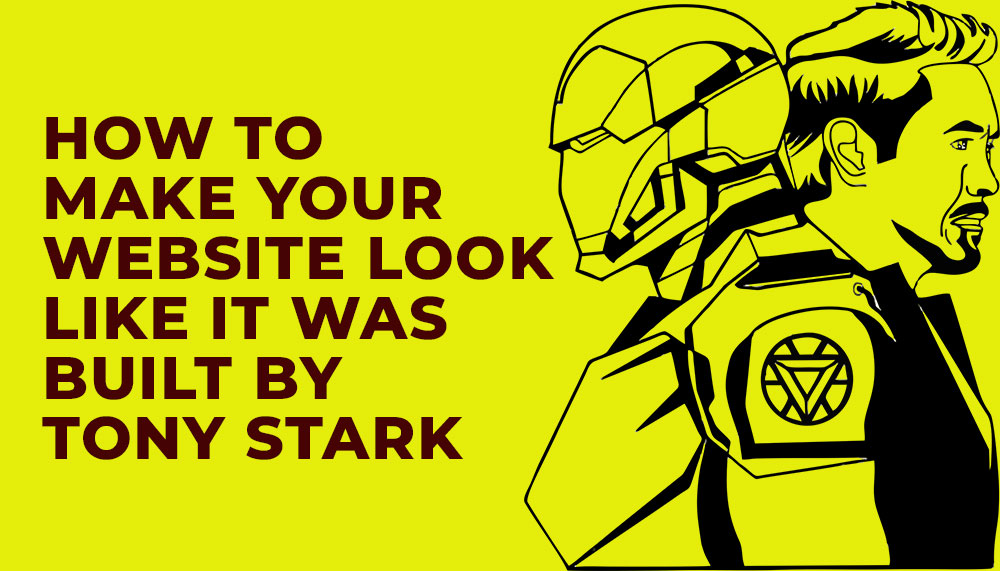
How to Make Your Website Look Like It Was Built by Tony Stark
Want a website that feels like it rolled off Stark Industries’ private build line — sleek, fast, intimidatingly clever, and secretly human? Good. Toss the boring templates, cancel the generic hero sliders, and prepare to think like an eccentric genius who drinks espresso with nanobots.
This is part design manifesto, part engineering playbook and part pep talk from someone who believes UI should hum, UX should whisper, and code should feel like it has a personality. Along the way we’ll drop practical tips a web development company in Delhi or a hungry web design agency can implement right now — and how your SEO, performance and lead generation will thank you for it.
1. Think Like Stark: Design with Intent, Not Decoration
Tony Stark’s tech never looks like it was assembled in a hurry. Every visual decision has purpose. Apply the same discipline:
- Minimal but meaningful UI: Remove everything that doesn’t signal value. A Stark-style site uses restraint — bold type, a precise color accent, and generous negative space.
- Signature element: Iron Man has a chest arc reactor; your site needs an identifying motif — a micro-animation, a distinctive cursor, or a bold geometric grid that repeats in icons and thumbnails.
- Micro-interactions as polish: Buttons press with micro-delays, images tilt slightly on hover, form fields glow when focused. These tiny cues make the interface feel alive.
Working with a seasoned website development company will help execute these details without wrecking accessibility or performance.
2. Build Like Stark: Architecture, Modularity & Component-Driven Dev
Tony wouldn’t patch a spaceship with duct tape. Your site needs a modular architecture that scales and evolves.
Key engineering principles
- Component library: Use a system like Storybook. Build buttons, cards, and forms as reusable, tested components.
- Progressive enhancement: Mobile-first CSS, then sprinkle advanced features for capable devices.
- API-driven backend: Headless CMS + microservices let your web development company in Delhi deploy new landing pages or lead magnets instantly.
Pro tip: treat your codebase like a factory — versioned, CI/CD deployed, and with rollback capability. Stark would not tolerate deployments at 3 a.m. without a safety net.
3. Make It Fast — Speed Is the New Sexy
Nothing kills the Stark vibe faster than sluggish pages. Speed is both aesthetic and functional.
- Critical rendering path: Prioritize above-the-fold CSS and lazy-load offscreen images.
- Optimized media: Deliver WebP/AVIF, adaptive images and content-aware compression.
- Edge & CDN: Serve assets from the edge to cut latency across continents.
Hiring a performance-savvy website development company in India or working with an SEO expert in India that knows Core Web Vitals will ensure your site doesn’t just look like Stark tech — it performs like it.
4. Make the Interface Talk Back — Intelligent, Helpful, Not Creepy
Jarvis isn’t annoying. It’s helpful. Your site should be the same: context-aware personalization, subtle suggestions, and assistance that anticipates user needs.
- Smart onboarding: Tailor the first visit experience based on query intent and UTM source.
- Contextual CTAs: Replace one-size-fits-all CTAs with dynamic CTAs: “Book a demo” for enterprise visitors, “Get pricing” for buyers, “See templates” for researchers.
- Conversational microcopy: Microcopy should feel witty but clear — like a polished assistant with a sense of humor.
Combine personalization with privacy — Stark would never sell secrets. Respect user data and be transparent about tracking and cookies.
5. Visual Effects — Use Them Like a Pro, Not a DJ With a Laser
Subtlety is the secret. Stark UI uses light, motion and depth sparingly to create a sense of premium engineering.
- Depth & layers: Use soft shadows and parallax sparingly to suggest physicality.
- Micro-animations: Lottie or SVG animations for icons and transitions — tiny file sizes, big perceived polish.
- Dark mode done right: Offer a high-contrast dark theme that highlights accent colors like a glowing HUD.
Always test for performance — animations should not block the main thread.
6. Security & Trust — Stark-Grade Fortifications
Stark tech trusts no one. Likewise, security is a core design principle, not an afterthought.
- HTTPS everywhere: HSTS, secure cookies, and perfect SSL/TLS configs.
- Content Security Policy: Prevent XSS and mixed content with a strict CSP.
- Authentication: Multi-factor for admin access; session hardening for users.
- Data hygiene: Minimal data retention, clear privacy, and GDPR/CCPA considerations where applicable.
Clients trust sites that are secure; a web design agency that can explain security to stakeholders gains serious credibility and improves lead generation outcomes.
7. SEO — Make the Bots Fall in Love
Looking like Stark is useless if search engines can’t find you. Integrate SEO early, not as a sticky note at launch.
- Semantic HTML: Proper headings, article/section tags, and structured data (schema.org).
- Technical SEO: XML sitemaps, canonicalization, hreflang for multilingual builds, and fast server response times.
- Content strategy: Topic clusters that map to user intent: awareness, comparison, purchase.
- Local signals: If you’re a web development company in Delhi or targeting India, optimize for local keywords and Google Business Profile.
An SEO expert in India can help align on keywords and schema so your Stark-like masterpiece actually appears in results when it matters.
8. Data & Analytics — The Arc Reactor of Decision Making
Design without measurement is decoration. Use analytics like an arc reactor: constant power and fine control.
- Event-driven analytics (GA4): Track engagements, not just pageviews.
- Heatmaps & recordings: Identify friction and hero moments.
- Attribution modeling: Understand which touchpoints actually drive conversions and optimize them.
Stark would A/B test the font weight if it affected conversion; do the same. Continuous measurement yields compound returns.
9. Accessibility — Even Genius Must Be Inclusive
Elegance without accessibility is arrogance. Make sure the genius UX is usable by everyone:
- Contrast ratios that meet WCAG AA or AAA where possible
- Keyboard navigation and skip links
- ARIA roles for dynamic content
- Transcripts and captions for video
An accessible site reaches more people and reduces legal risk — a win-win for any ambitious brand.
10. Launch & Post-Launch — Continuous Improvement, Not Final Delivery
Tony doesn’t “launch.” He iterates. Ship the Minimum Awesome Product (MAP) and keep improving.
- Phased rollouts: Feature flags to test new experiences with a subset of users.
- Monitoring: Uptime, error tracking (Sentry), and synthetic tests for critical flows.
- Roadmap cadence: Prioritize fixes, polish and growth experiments weekly.
Your chosen website development company or web design agency should provide a post-launch plan that includes conversion optimization and ongoing SEO so your site remains cutting-edge.
11. The Human Spark — Personality, Tone & Brand Voice
Finally, no amount of tech or polish replaces a compelling human voice. Stark’s charm is in the persona — clever, slightly cocky, and emotionally readable.
- Brand persona: Define voice guidelines — witty? authoritative? playful?
- Microcopy that delights: Error messages, empty states, and success confirmations should feel like a human interaction.
- Story-driven case studies: Replace dry client lists with short narratives that emphasize transformation.
When you combine brilliant tech with a thoughtful human voice, the experience feels effortless and memorable — exactly the Stark effect.
Conclusion — Build the Stark Experience, Ethically
Making a website that looks like it was built by Tony Stark is not about copying red and gold or dropping an arc reactor GIF on the homepage. It’s a mindset: ruthless attention to detail, systems thinking, relentless delivery, and a warm human center beneath the chrome.
If you’re partnering with a web development company in Delhi or hiring an SEO expert in India, insist on this blend: design that feels engineered, development that scales, SEO that finds, and copy that converts. That’s the recipe for a site that doesn’t just “look” futuristic — it performs like a blockbuster.
Build smart, test ruthlessly, secure your stack, and never stop polishing. Do that, and anyone who lands on your site will leave feeling like they just visited Stark Tower — impressed, a little intimidated, and eager to come back.
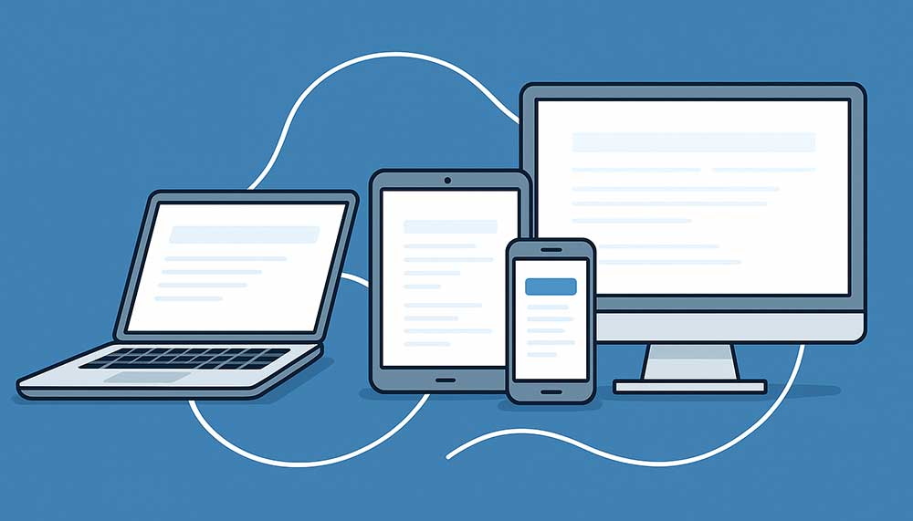
Cross-Device Connections: Best Practices for Engaging Users Across Platforms
In today’s digital-first world, the average consumer doesn’t just browse on one screen. They might research a product on their phone, read reviews on a laptop, and make the final purchase on a tablet. This seamless shift between devices defines the new normal of user behavior — and for businesses, mastering cross-device engagement is no longer optional.
Whether you’re a web development company in Delhi creating responsive websites, an SEO expert in India optimizing user journeys, or a web design agency refining UI for consistency — understanding how to connect with users across multiple platforms is essential to building trust, loyalty, and conversions.
This article explores the strategies, technologies, and creative best practices that ensure your brand remains recognizable and effective — no matter what screen your customers are using.
1. Understanding the Multi-Device User Journey
The first step toward building a strong cross-device connection is understanding how users behave across platforms. Studies show that users interact with at least three devices every day — smartphones, laptops, and tablets — and often switch between them mid-task.
For example, a potential client searching for a website development company in Delhi may first discover your brand via a Google search on mobile, explore your portfolio on a desktop, and later submit an inquiry from a tablet. Each step in that journey must feel continuous, intuitive, and personal.
Failing to maintain that continuity — through inconsistent design, confusing navigation, or poor optimization — can break the connection and cause users to abandon your brand entirely.
Key Takeaways:
- Map your customer journey across all devices and identify drop-off points.
- Use analytics to track how users transition between mobile, desktop, and tablet sessions.
- Ensure branding, messaging, and navigation remain consistent across platforms.
2. Responsive Design: The Foundation of Multi-Device Success
A responsive website is the backbone of any cross-device strategy. It ensures your site automatically adjusts its layout and elements based on the screen size, orientation, and resolution. For a web design company in Delhi, this isn’t just a design requirement — it’s a business imperative.
Responsive design improves user experience, boosts SEO rankings, and aligns perfectly with Google’s mobile-first indexing policies. Websites that aren’t mobile-friendly risk losing visibility, traffic, and credibility.
Best Practices for Responsive Design:
- Use fluid grids and flexible images: Design layouts that adapt to all screen sizes without distortion.
- Prioritize readability: Ensure text is legible without zooming and CTA buttons are large enough for touch navigation.
- Test frequently: Check how your site behaves on different devices and browsers, especially on lower-end phones common in emerging markets like India.
Leading website development companies in India are now adopting frameworks like Bootstrap, Tailwind, and React for seamless responsiveness and performance across screens.
3. Unified Branding Across All Touchpoints
Your brand identity — colors, tone, visuals, and personality — should remain uniform whether the user interacts via a smartphone ad, desktop website, or social post. Inconsistency creates confusion and weakens brand recall.
For instance, if your web design agency in Delhi runs a Google Ad promoting “Custom Website Design Services” with a minimalist tone, but your landing page looks overly corporate, the user experience disconnects instantly.
Consistency builds trust — and in digital marketing, trust is everything.
Tips for Unified Branding:
- Develop a brand style guide covering fonts, colors, tone, and imagery for all platforms.
- Use the same logo placement and navigation structure across devices.
- Keep messaging short, adaptable, and consistent in voice across web, app, and email.
4. Mobile Optimization Beyond Design
Being mobile-optimized goes beyond responsive layouts. It’s about delivering speed, simplicity, and intent-driven experiences. For a website development company targeting leads, mobile is often where conversions either happen or die.
Mobile users expect instant gratification. Every second of delay reduces conversion rates significantly. Google’s Core Web Vitals have made this even more critical by factoring page experience into ranking signals.
Mobile Optimization Techniques:
- Use AMP (Accelerated Mobile Pages) where appropriate to improve load speed.
- Minimize scripts and optimize image formats (WebP preferred).
- Prioritize vertical scrolling and thumb-friendly interfaces.
- Implement click-to-call and map integrations for local users searching for services like “web development company in Delhi”.
Remember, mobile users aren’t browsing — they’re acting. Optimize for micro-moments: when users want to know, go, do, or buy something instantly.
5. Personalization Across Devices
In a world of algorithms and AI, personalization is the differentiator that turns visitors into loyal customers. The challenge lies in maintaining personalization across multiple devices.
For example, if a user browses a website development company in India on desktop and later revisits the site on mobile, they should see tailored suggestions or saved progress — not start from scratch.
To achieve this, brands are integrating cross-device identifiers and unified analytics to recognize returning users, track preferences, and deliver personalized experiences consistently.
Personalization Strategies:
- Use customer data platforms (CDPs) to unify user data across devices.
- Leverage dynamic content — such as location-based offers for users searching “web design agency near me.”
- Use retargeting campaigns that adapt creatives based on device type and past interactions.
6. Cross-Platform Analytics and Attribution
Tracking performance across devices is one of the toughest challenges in modern marketing. Users may click an ad on mobile, explore your services on desktop, and convert days later on a tablet. Without accurate tracking, you’ll never understand what truly drives conversions.
Web development companies in India increasingly use advanced analytics tools like Google Analytics 4 (GA4), which support cross-device user tracking through event-based data models and AI-driven attribution.
This allows marketers to analyze complete customer journeys, identify key touchpoints, and allocate budgets more effectively.
Best Practices for Cross-Device Analytics:
- Set up cross-device user IDs for consistent tracking.
- Use GA4’s event tracking to follow actions, not just sessions.
- Integrate CRM and ad data to understand offline-to-online conversions.
- Test attribution models to see how different devices contribute to the final conversion.
7. Multi-Channel Consistency for Lead Generation
For any lead generation strategy to succeed, consistency across channels is crucial. Your SEO, paid ads, social media, and email campaigns should tell one coherent story — no matter the device.
Imagine a user finds your web design company in Delhi through an Instagram ad, clicks through on mobile, and later receives a remarketing email on desktop. Each interaction should feel like a natural continuation of the previous one — not a disconnected sales pitch.
This holistic approach improves brand recall, boosts conversion rates, and enhances overall ROI.
Multi-Channel Engagement Tips:
- Use consistent visuals and tone across paid, organic, and social content.
- Segment audiences by device usage and behavior for targeted campaigns.
- Implement responsive email templates and mobile-optimized landing pages.
8. The Role of SEO in Cross-Device Engagement
SEO isn’t just about ranking — it’s about relevance and accessibility. A SEO expert in India understands that today’s optimization strategies must serve multiple screens simultaneously.
Google’s algorithms now prioritize mobile usability, content relevance, and user intent across devices. If your content performs poorly on mobile, it affects your desktop ranking as well.
SEO Best Practices for Cross-Device Optimization:
- Optimize metadata and structured data for mobile and desktop alike.
- Use responsive design instead of separate mobile URLs.
- Ensure your content structure supports voice and mobile search queries.
- Build backlinks from responsive, reputable websites to strengthen domain authority.
For businesses like web development companies in Delhi, cross-device SEO ensures that every click — from mobile to desktop — leads users toward the same consistent experience and message.
9. The Future: Cross-Device Engagement Meets AI
The future of user engagement lies at the intersection of AI, machine learning, and predictive analytics. These technologies enable websites to anticipate user needs, automate personalization, and deliver seamless transitions between devices.
Imagine this: a potential client browsing your website development company portfolio on mobile later sees a personalized desktop homepage showcasing services they viewed earlier. That’s AI-driven continuity — smart, subtle, and incredibly effective.
From smart notifications to adaptive design systems, AI ensures brands stay one step ahead, no matter how users switch between devices.
Conclusion
Cross-device engagement isn’t a design choice — it’s a strategic necessity. In a world where attention spans are divided across screens, your ability to maintain consistency, speed, and relevance defines your digital success.
Whether you’re a web design company in Delhi building user-centric experiences, a website development company in India focusing on performance, or an SEO expert fine-tuning content for multiple screens — the key lies in unity. Every pixel, word, and click should tell the same story, no matter the device.
The brands that master this art aren’t just connecting devices — they’re connecting human experiences.

Interactive Elements That Keep Visitors Engaged
Think about the last time you landed on a website. Be honest — did you skim a little, maybe scroll half-heartedly, and then click away? Or did something catch your attention and make you want to stay longer? Maybe a product image came alive when you hovered over it, maybe a fun quiz popped up that felt too good to skip, or maybe a chatbot offered you instant help instead of making you search for answers. Those are the little moments that make a site feel less like a digital brochure and more like an experience. That’s the magic of interactive web design — it keeps you hooked without you even realizing it.
And here’s the truth: in 2025, plain, static websites just don’t cut it anymore. People are no longer satisfied with being passive readers. They want to click, explore, discover, and feel involved. If your site only delivers information, you’re missing a massive opportunity. Visitors don’t just want content; they want connection. They want to feel like your website was built for them.
The good news? This isn’t out of reach. With the right strategy and the expertise of a trusted website designing company in Delhi, you can turn your website into something far more powerful than a static page. You can create an interactive hub — a place where visitors don’t just scroll aimlessly but actively participate, engage, and most importantly, move closer to becoming customers.
Hover Animations That Spark Action
Hover effects might look like tiny details, but don’t underestimate them — they can completely change how a visitor feels about your site. Think about it: you’re scrolling through a page, you move your mouse over a button, and suddenly it changes color, glows, or gently expands. Instantly, it feels more clickable, more inviting. Or maybe you hover over a product image and it flips to show the back view, giving you that extra bit of information without even clicking.
These small micro-interactions are like subtle nods from your website saying, “Yes, you’re on the right track. Go ahead, click me.” They make your site feel alive, intuitive, and responsive to your visitor’s actions. It’s not just about looking fancy — it’s about guiding people toward the next step, whether that’s reading more, exploring a product, or hitting that all-important “Buy Now” button.
When done right, hover animations aren’t distracting or over-the-top. Instead, they quietly encourage action, keeping visitors engaged without them even realizing it. It’s the kind of detail that separates a site that feels static from one that feels smart, modern, and easy to use.
Quizzes and Polls That Invite Participation
Let’s be real — who doesn’t love a quick quiz or poll? Whether it’s figuring out “Which product suits my style?” or giving your opinion on something in seconds, these little interactions are irresistible. They’re fun, they’re easy, and most importantly, they make people feel like they’re part of the experience instead of just passively scrolling.
For businesses, quizzes and polls are more than just entertainment. They’re a clever way to get to know your audience better. Imagine a skincare brand asking visitors a few quick questions about their skin type, then recommending the perfect product. Not only does the customer feel heard, but they’re also being guided toward a solution that feels tailor-made for them. That kind of personalization builds trust and makes buying decisions so much easier.
And the best part? Quizzes and polls don’t feel like selling. They feel like a conversation. Your audience gets something enjoyable out of it, and you get valuable insights into what they’re thinking and what they want. It’s a win-win.
If you’re serious about adding this level of interaction to your site, the right website development company in Delhi can create custom-built quizzes and polls that not only keep your visitors entertained but also nudge them closer to becoming loyal customers.
Chatbots That Actually Help
Think about the last time you had a question while browsing a website. Did you want to scroll through endless FAQs or wait hours for someone to reply to your email? Probably not. Most of us want answers right away — and that’s exactly where chatbots come in.
When they’re done right, chatbots feel less like cold machines and more like a friendly assistant who’s always on standby. They can greet visitors the moment they land, answer common questions instantly, and even guide people toward the right product or service without making them dig for information. Imagine shopping online late at night and having a chatbot help you find your size or explain the return policy in seconds. That’s the kind of convenience today’s users expect.
The key, though, is building chatbots that actually help instead of frustrate. Nobody likes a bot that gives generic answers or keeps looping back to the same message. That’s where expertise matters. A skilled web development company in Delhi can design and integrate intelligent chatbots that feel natural, keep visitors engaged, and most importantly, move them closer to making a decision.
In a world where attention spans are short, chatbots bridge the gap between curiosity and conversion — offering instant support while making your brand look modern, approachable, and customer-focused.
Scroll Animations That Tell a Story
Scrolling doesn’t have to be just… scrolling. On most static sites, it’s simply moving from top to bottom with nothing exciting in between. But with interactive web design, scrolling itself can become part of the experience. Imagine text sliding into view, images fading in at the right moment, or icons coming alive as you move down the page. Suddenly, your website feels less like a flat document and more like a story unfolding in real time.
This kind of design keeps people hooked because it gives them a reason to keep going. Instead of clicking away after a few seconds, they’re curious about what’s coming next. Each scroll feels rewarding, like turning the page of a book you don’t want to put down.
And here’s the best part — scroll animations aren’t just for show. They can be used strategically to highlight your brand story, emphasize key features, or guide visitors step by step toward your call-to-action. Done well, they blend creativity with purpose, making sure your audience stays engaged while moving closer to conversion.
In short, scroll animations transform passive browsing into an interactive journey — and that’s exactly what keeps visitors exploring your site longer.
Gamification That Adds Fun
Let’s face it — everyone enjoys a little fun, even when they’re shopping or browsing online. That’s where gamification comes in. It’s the idea of taking ordinary website actions and making them feel like a game. Think about spinning a digital wheel to win a discount, watching a progress bar fill up as you complete a sign-up form, or unlocking a badge for engaging with certain content. Suddenly, what could’ve felt routine now feels exciting.
Gamification works because it taps into something universal: we all love rewards. When visitors feel like they’re achieving something, even if it’s small, they’re far more likely to stay engaged. An eCommerce website, for example, might use a progress bar during checkout that says, “You’re only ₹200 away from free shipping!” That tiny nudge feels playful, but it’s also persuasive — and it often gets customers to add just a little more to their cart.
It’s not about turning your website into a video game; it’s about sprinkling in interactive moments that surprise and delight your visitors. Done right, gamification adds personality to your site, builds stronger connections with your audience, and makes your brand feel memorable.
So, whether it’s a spin-the-wheel offer, a loyalty points tracker, or even a playful quiz result, gamification adds that element of joy people don’t forget. And when your website feels fun, visitors are much more likely to come back for more.
Interactive Product Views That Build Confidence
Shopping online is convenient, but let’s be honest — it comes with doubts. You can’t touch the product, you can’t feel the quality, and you can’t try it on. That’s where interactive product views change the game. Instead of relying on a couple of flat images, visitors can zoom in, spin the product 360 degrees, or even see it in different colors and settings. It’s the closest thing to holding the product in your hands, right from your screen.
Think about how reassuring it feels when you can look at a shoe from every angle before hitting “Add to Cart” or when you can spin a piece of furniture around to see how it might fit in your living room. That extra control gives buyers confidence — and confidence is what drives purchases.
For businesses, this isn’t just about showing off products; it’s about reducing hesitation. The more information and transparency you give, the fewer questions people have. And when customers feel sure about their choice, they’re far less likely to abandon their cart.
Interactive demos take it even further. Imagine a software company offering a clickable walkthrough of their tool or a car brand letting users customize and explore a virtual model. Suddenly, the buying experience isn’t just about reading features — it’s about living them.
In short, interactive product views bridge the gap between online browsing and in-person shopping. They replace uncertainty with excitement, turning “I’m not sure” into “Yes, this is exactly what I want.”
Calculators and Tools That Provide Value
Sometimes, the best way to keep visitors engaged isn’t with flashy animations or playful features — it’s by giving them something genuinely useful. That’s where calculators and interactive tools shine. They’re practical, they’re helpful, and they make people feel like your website is actually working for them.
Think about it: a home loan calculator that instantly tells you what your monthly payment might look like, or a savings tool that shows how much money you could put away in five years. Even in retail, a simple size or fit guide that adjusts recommendations based on your body type can be incredibly valuable. These tools don’t just engage people — they solve real problems in real time.
From a business perspective, this is gold. When visitors get answers right away, they trust you more. They’re less likely to bounce because your site isn’t just asking for their attention — it’s giving something back. And that value builds loyalty.
This is why so many brands partner with a website design agency in Delhi to create calculators and tools that fit their industry. Whether it’s an ROI calculator for a B2B service, a price estimator for a construction company, or a personalized quiz for an eCommerce store, the impact is the same: visitors feel understood, and they’re more likely to take the next step with you.
At the end of the day, interactive tools do more than keep people busy — they empower them. And when customers feel empowered, they don’t just engage with your site, they trust your brand enough to convert.
Click-to-Reveal Content That Feels Rewarding
There’s something satisfying about discovering hidden content. It’s like your website is letting people in on a little secret — but only if they engage. That’s exactly what click-to-reveal content does.
Instead of dumping everything on the screen at once, you can hide extra details behind a button, tab, or section that expands when clicked. Think FAQs where the answers only appear when you choose a question, or product details that unfold when you tap “See More.” It feels cleaner, it keeps the page from looking cluttered, and most importantly — it makes the visitor feel like they’re part of the interaction.
The psychology here is simple: curiosity drives action. When users see a “click to learn more” option, they’re intrigued. And once they take that action, they’re already more invested in your site. It’s no longer passive browsing — they’re participating.
For businesses, this has a huge upside. It not only keeps visitors on the page longer but also lets you control the flow of information. Instead of overwhelming them with walls of text, you reveal things step by step, which feels natural and engaging.
This is where working with a skilled web design company in Delhi makes a difference. They know how to design these micro-interactions in a way that feels smooth, intuitive, and rewarding — not gimmicky. Done right, click-to-reveal content makes your website feel more like a conversation than a presentation.
And let’s be honest, in 2025, people don’t just want to scroll through static content. They want a website that reacts to them, that rewards their curiosity, and makes them feel involved. Click-to-reveal content checks all those boxes beautifully.
Why Interactive Design Works
Let’s be real — nobody enjoys being a passive observer online anymore. We’re all used to apps and platforms that do something when we tap, swipe, or click. So when a website just sits there like a digital brochure, it feels… flat.
That’s the magic of interactive design: it gives people a reason to stick around. When visitors can play with a quiz, chat with a bot, or watch animations unfold as they scroll, they’re not just browsing — they’re involved. And involvement is what keeps attention, sparks curiosity, and nudges people toward action.
It’s not just about keeping people entertained either. Interactive elements make your brand feel modern, innovative, and genuinely customer-focused. You’re showing that you don’t just care about telling your story — you care about how people experience it. That’s what leaves a lasting impression.
And here’s the best part: you don’t have to figure this all out on your own. Businesses across industries are already teaming up with a web design company in Delhi or a website design company in Delhi to weave these elements into their websites. Why? Because they know that a site people interact with isn’t just a site people remember — it’s a site that converts.
Final Word
Here’s the truth: a plain, static website might bring in visitors, but it rarely makes them care. An interactive website, on the other hand, does something far more powerful — it creates a connection. And in today’s digital jungle where everyone’s fighting for attention, connections are what actually drive conversions.
Think about it. A simple hover effect makes people curious. A quiz makes them feel involved. A chatbot gives them answers right when they need them. These aren’t just “features” — they’re little experiences that add up to one big reason visitors remember you instead of the competition.
And if you’re serious about standing out, you don’t have to go it alone. Partnering with a trusted website development company in Delhi, a skilled web development company in Delhi, or even a full-service website design agency in Delhi can make all the difference. With the right team, your website won’t just be another page floating around the internet — it’ll be the reason people stop scrolling, stick around, and choose you.

How AI Is Transforming Web Design in 2025
In 2025, building a website isn’t just about having a pretty design or smooth navigation anymore—it’s about intelligence. The digital world has shifted, and today, Artificial Intelligence (AI) is at the heart of web design. We’re not just talking about automated templates or chatbots; AI is actively shaping how websites are built, how they evolve over time, and how they respond to the people who use them.
Think about it this way: a few years ago, a website was like a digital brochure—it showcased your brand but didn’t do much beyond that. Fast forward to today, and AI has turned websites into living, breathing platforms that can learn from users, adapt in real time, and deliver experiences that feel tailor-made. From design automation that saves weeks of manual work, to predictive user experiences that know what your visitors are looking for before they do—AI is making websites smarter, faster, and far more personal than ever before.
Now, here’s the thing. While AI tools are available to everyone, not every business knows how to use them effectively. That’s why partnering with an experienced website designing company in Delhi that understands AI-driven design is no longer just “nice to have”—it’s essential. Delhi, with its bustling digital marketplace, is full of businesses competing for the same audience. The ones that will stand out are those whose websites don’t just look good, but think smart.
So, if you’re a business owner, the question isn’t whether you should bring AI into your web strategy—it’s how quickly you can. And the answer often lies in choosing the right web design company in Delhi that can combine creativity with AI-powered solutions to give your business the competitive edge it truly deserves.
1. AI-Powered Design Automation
Remember the days when creating a website meant weeks (sometimes months) of back-and-forth on layouts, colors, and structure? Those days are fading fast. In 2025, AI-powered design automation has completely changed the game.
Today, AI tools can do far more than just suggest a few color schemes. They can actually generate entire website layouts, recommend typography, pick images, and even build complete templates—tailored to your industry and your audience. For example, if you’re running an e-commerce store, AI can instantly design a layout optimized for conversions. If you’re in the service industry, it can recommend a more minimal, trust-building design. It’s like having a design assistant who already knows what works best for your business.
The beauty of this? It saves enormous amounts of time. What once took weeks of brainstorming and revisions can now be done in days, without losing the human touch. The result is not just a faster design process, but websites that look fresh, modern, and user-friendly right out of the gate.
But here’s the catch—AI alone isn’t enough. It needs the right creative direction to truly shine. That’s where partnering with a professional website design company in Delhi makes all the difference. The best agencies blend AI-driven efficiency with human creativity, ensuring you don’t just get a “machine-made” website, but one that tells your brand story and engages your visitors on a deeper level. In short, AI handles the heavy lifting, and designers fine-tune the details to make your website stand out.
2. Personalized User Experiences
Let’s be honest—no one likes a “one-size-fits-all” website anymore. In 2025, people expect websites to know them, understand them, and adapt to them almost instantly. This is where AI steps in, turning generic browsing into a personalized journey.
Think about it: AI can track user behavior, analyze location, and even learn from past browsing history. The result? A website that feels like it was designed just for you. For example, if someone is shopping online, AI can highlight products they’re most likely to buy, show them relevant offers, or even adjust the homepage layout in real time based on their interests.
It’s not just e-commerce that benefits. A travel website could suggest destinations based on weather trends and your past trips. A learning platform could recommend courses based on your skill level. This level of personalization keeps users engaged and makes them more likely to return.
For businesses in fast-moving markets like Delhi, this isn’t just a “nice-to-have”—it’s essential. Partnering with a web design company Delhi entrepreneurs rely on means you get a website that doesn’t just look good, but one that actively learns and adapts to your customers. That’s how you build loyalty, boost sales, and stay ahead of the competition in a digital-first world.
3. AI Chatbots and Virtual Assistants
Gone are the days when customers were willing to wait hours—or even days—for a response to their queries. In 2025, people expect instant answers, around the clock, and that’s exactly where AI-powered chatbots and virtual assistants shine.
These smart tools don’t just answer basic FAQs anymore. They can guide a visitor through the entire buying journey—whether it’s helping them pick the right product, booking an appointment, or even troubleshooting common issues. The best part? They’re available 24/7, meaning your business never misses an opportunity, even while you sleep.
For example, imagine a potential customer lands on your website at midnight, unsure which service package to choose. Instead of bouncing away, a friendly AI chatbot pops up, asks the right questions, and recommends the perfect option—all in real time. That’s how businesses are turning casual visitors into loyal customers.
If you’re competing in a high-demand market like Delhi, this kind of engagement isn’t optional—it’s critical. By partnering with a leading website development company in Delhi, you can seamlessly integrate these smart chatbots into your website. The result? Happier customers, more conversions, and a website that feels alive—always ready to help.
4. Voice Search Optimization
Think about how often you’ve asked Siri, Alexa, or Google for something instead of typing it out. That’s the reality of 2025—voice search is everywhere, from smart speakers in living rooms to voice assistants in every smartphone. And the way people search with their voice is very different from the way they type.
Instead of typing “best cafe Delhi,” a voice user might say, “Hey Google, where’s the best cafe near me that’s open right now?” This means websites need to be optimized not just for keywords, but for natural, conversational questions. That’s where AI comes in—helping websites understand intent, context, and tone so they can deliver spot-on answers instantly.
For businesses, this isn’t just about convenience—it’s about visibility and trust. When your website shows up as the voice assistant’s “first choice,” you don’t just get traffic, you get credibility.
This is why partnering with a web development company in Delhi that specializes in voice search optimization is a smart move. They’ll ensure your website is structured, fast, and AI-ready so it’s not just competing in search results—it’s leading them. In a city as digitally competitive as Delhi, that kind of edge can make all the difference.
5. Predictive Analytics for Smarter Decisions
Imagine if your website could almost “read your customer’s mind.” That’s what AI-powered predictive analytics is making possible in 2025. Instead of waiting to see what users do, AI studies data from thousands—even millions—of interactions and starts to anticipate behavior.
For example, it can identify when a visitor is likely to abandon a cart, when they’re ready to click “buy,” or which call-to-action will get the best response. This means your website doesn’t just react—it proactively guides users toward the outcome you want, whether that’s a purchase, a sign-up, or a booking.
For businesses, this is a game changer. It means smarter landing pages, more effective CTAs, and smoother navigation—all built on hard data instead of guesswork.
This is why working with a website design agency in Delhi that embraces AI-driven analytics is so valuable. They can help you understand not just what your customers are doing right now, but what they’re likely to do next. That insight leads to higher conversions, better customer experiences, and a serious competitive edge in today’s crowded digital market.
6. Enhanced Website Security
In today’s digital world, a great-looking website isn’t enough—it also has to be safe. Cyberattacks, data breaches, and hacking attempts are growing more sophisticated every year. That’s where AI comes in.
AI-powered security tools work like digital watchdogs. They don’t just wait for problems to happen; they actively monitor your website 24/7, learning patterns of normal traffic and instantly flagging anything unusual. Whether it’s a suspicious login attempt, a sudden traffic spike from bots, or a hidden malware script, AI can detect and neutralize threats before they cause real damage.
For businesses, this is huge. Customers are becoming more aware of online risks, and they want to know their data—credit card details, personal information, browsing history—is in safe hands. A breach doesn’t just cost money; it damages trust, sometimes permanently.
That’s why partnering with a trusted website development company in Delhi that uses AI-driven security protocols is a smart move. From real-time threat detection to automatic updates and encryption, these advanced measures ensure your website stays fast, secure, and reliable, even in an era of rising cyber threats.
Because at the end of the day, a secure website isn’t just about protection—it’s about building trust with your audience.
7. Faster Development Cycles
Remember when building a website used to take months of back-and-forth? Endless revisions, long testing phases, and frustrating delays? In 2025, AI is changing all of that.
AI-powered tools can now automate code generation, suggest fixes in real time, and even detect bugs before they cause problems. This means developers spend less time on repetitive tasks and more time focusing on creativity, strategy, and user experience. The result? Projects move from concept to launch at lightning speed—without sacrificing quality.
For businesses, this is a game-changer. Whether you’re launching a startup website or revamping a corporate platform, time-to-market matters. The faster your website goes live, the sooner you can start attracting customers and generating results.
That’s why partnering with a web design company in Delhi that embraces AI-driven development is so important. You get the best of both worlds: speed and precision. Your website is built quickly, but it’s also polished, professional, and fully optimized for performance.
In short, AI is cutting down development cycles from months to weeks, giving businesses the agility they need to stay competitive in today’s fast-moving digital landscape.
8. Smarter Content Creation with AI
AI is changing the way businesses create and manage website content. Instead of relying only on manual efforts, AI tools can now generate high-quality text, optimize it for SEO, and even adapt messaging based on user behavior. This ensures content is not just engaging, but also strategically aligned with business goals.
For businesses that want to remain relevant online, this means faster publishing cycles, improved search engine visibility, and messaging that resonates with the right audience. A professional website design company in Delhi leverages AI-driven content solutions to help businesses communicate more effectively while staying competitive in the digital marketplace.
9. AI in UI/UX Testing
Traditionally, testing a website’s user interface (UI) and user experience (UX) took weeks of manual effort—collecting feedback, analyzing heatmaps, and running A/B tests. In 2025, AI has taken this process to the next level. With machine learning algorithms, businesses can now automatically detect usability issues, predict where users may drop off, and suggest real-time improvements.
This means websites are no longer just launched and forgotten—they evolve continuously based on user behavior. For example, AI can identify if visitors are abandoning a checkout page and instantly recommend design tweaks to improve conversions.
By partnering with a forward-thinking web design company in Delhi, businesses gain access to AI-powered testing tools that make their websites smarter, more intuitive, and highly optimized for user satisfaction.
10. The Future of AI in Web Design
The future of web design isn’t just about making websites look pretty—it’s about making them think. In 2025 and beyond, we’ll see AI evolve from being a helpful assistant to becoming the backbone of how websites are designed, tested, and experienced.
Imagine a website that doesn’t just respond to users, but actually anticipates their needs. From hyper-personalized content to predictive navigation that guides customers before they even click, AI is set to blur the lines between human creativity and machine intelligence.
For business owners, this means web design will no longer be a one-time project but an ongoing, intelligent system that adapts, improves, and grows alongside your brand. The companies that embrace this shift early—by working with an innovative website design company in Delhi—will lead the digital race, while others struggle to catch up.
The bottom line? AI isn’t replacing web designers; it’s empowering them. It’s giving businesses smarter, faster, and more powerful websites that deliver results in a competitive global market. The future of web design is here—and it’s intelligent.
Final Word: Why Businesses in Delhi Must Act Now
Let’s be real—AI is no longer just a buzzword floating around in tech circles. In 2025, it’s here, it’s powerful, and it’s already shaping the way businesses connect with their customers online. The companies that embrace AI-driven web design today aren’t just keeping up—they’re pulling ahead with websites that convert better, feel more personal, and truly stand out in a crowded digital market.
Think about it this way: your website is often the first impression of your brand. If it’s slow, generic, or outdated, visitors won’t stick around. But if it feels smart—tailored to their needs, easy to navigate, and even one step ahead of their expectations—you’re not just getting clicks, you’re building trust and long-term loyalty.
That’s where choosing the right partner matters. Whether you’re searching for a website designing company in Delhi, a web development company in Delhi, or a full-service website design agency in Delhi, working with a team that understands how to harness AI is the difference between having a website and having a competitive advantage.
The digital landscape in Delhi is buzzing, and your competitors aren’t slowing down. The question is—will you wait and watch, or will you take the smarter route and invest in AI-powered web design today?
If you’re ready to future-proof your digital presence, partner with a website design company in Delhi that knows how to blend creativity with AI innovation. Because in this new era, it’s not just about being online—it’s about being intelligent online.