How to Create a High-Converting Landing Page: The Complete Guide
If you are spending money on ads, SEO, or email campaigns and sending that traffic to a page that doesn’t convert, you are essentially pouring water into a leaking bucket. A landing page is often the single most important piece of your digital marketing puzzle — yet it’s the piece most businesses get wrong. In this guide, we’ll break down exactly what a landing page is, why most landing pages fail to convert, and the exact framework a professional landing page design agency uses to build pages that turn visitors into paying customers.
Whether you’re a startup founder building your first page, a marketer trying to lower your cost-per-lead, or a business owner comparing a web designing company against options elsewhere, this article will give you a practical, no-fluff roadmap.
What Is a Landing Page?
A landing page is a standalone web page created for one specific purpose: to convert a visitor into a lead or a customer.
Unlike your homepage, which usually has multiple navigation options, a blog, and links pointing in a dozen directions, a landing page is intentionally narrow. It has one headline, one offer, and one call-to-action (CTA).
Landing pages are typically the destination for:
- Google Ads or Facebook/Instagram ad campaigns
- Email marketing campaigns promoting a specific offer
- SEO-driven content targeting a high-intent keyword
- Product launches, webinars, or limited-time promotions
The core difference between a landing page and a regular website page is focus. A homepage tries to serve every visitor. A landing page tries to convert one type of visitor into one specific action — whether that’s filling out a form, booking a call, or making a purchase.
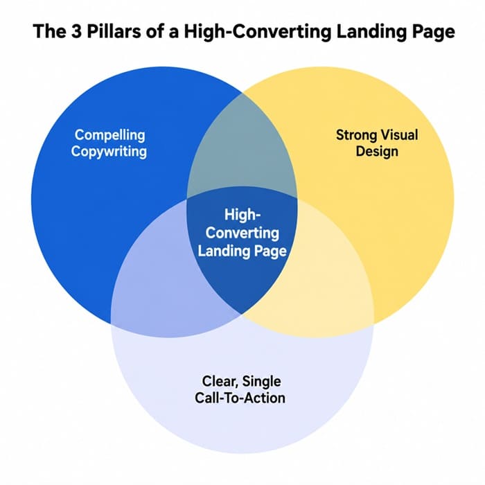
As the diagram above shows, a landing page that actually converts sits at the intersection of three things: persuasive copywriting, strong visual design, and a single, unmistakable call-to-action. Remove any one of these, and your conversion rate suffers — no matter how much traffic you send to the page.
Why Most Landing Pages Fail
Before we talk about how to build a great landing page, it’s worth understanding why so many landing pages underperform. In our experience working with clients across industries, the most common mistakes are:
- Too many distractions: A full navigation menu, footer links, and social icons give visitors an easy way to leave without converting.
- Weak or generic headlines: “Welcome to Our Company” tells the visitor nothing about what’s in it for them.
- Slow page load times: Every additional second of load time can reduce conversions significantly, especially on mobile.
- Asking for too much information upfront: Long forms scare visitors away before they’ve built any trust with your brand.
- No social proof: Without reviews, testimonials, or trust badges, visitors have no reason to believe your claims.
- Mismatched messaging: If your ad promises “50% Off” and the landing page doesn’t mention the discount above the fold, visitors bounce immediately.
The good news is that every one of these problems is fixable. Let’s go through the process step by step.
How Do I Create a Landing Page That Increases Sales?
Creating a landing page that actually drives sales isn’t about fancy animations or trendy design trends — it’s about removing friction and building trust as quickly as possible. Here is the framework we recommend:
1. Start With a Single, Clear Goal
Before you design anything, define the one action you want a visitor to take. Is it filling out a lead form? Booking a demo? Making a purchase? Every element on the page should support that single goal. If you find yourself adding a second CTA “just in case,” that’s usually a sign you need a second landing page instead.
2. Write a Benefit-Driven Headline
Your headline is the single highest-leverage piece of copy on the page. It should immediately answer the visitor’s unspoken question: “What’s in it for me?” Instead of describing your product or company, describe the outcome the visitor will get. Compare “Digital Marketing Services” to “Get 3x More Qualified Leads in 90 Days” — the second version is specific, measurable, and benefit-focused.
3. Match the Message to the Traffic Source
If someone clicks on an ad promising a free consultation, your landing page headline and offer need to reflect that exact promise. This is called “message match,” and it is one of the most overlooked conversion factors. A mismatch between the ad and the landing page is one of the fastest ways to increase your bounce rate and waste ad spend.
4. Keep the Design Clean and Focused
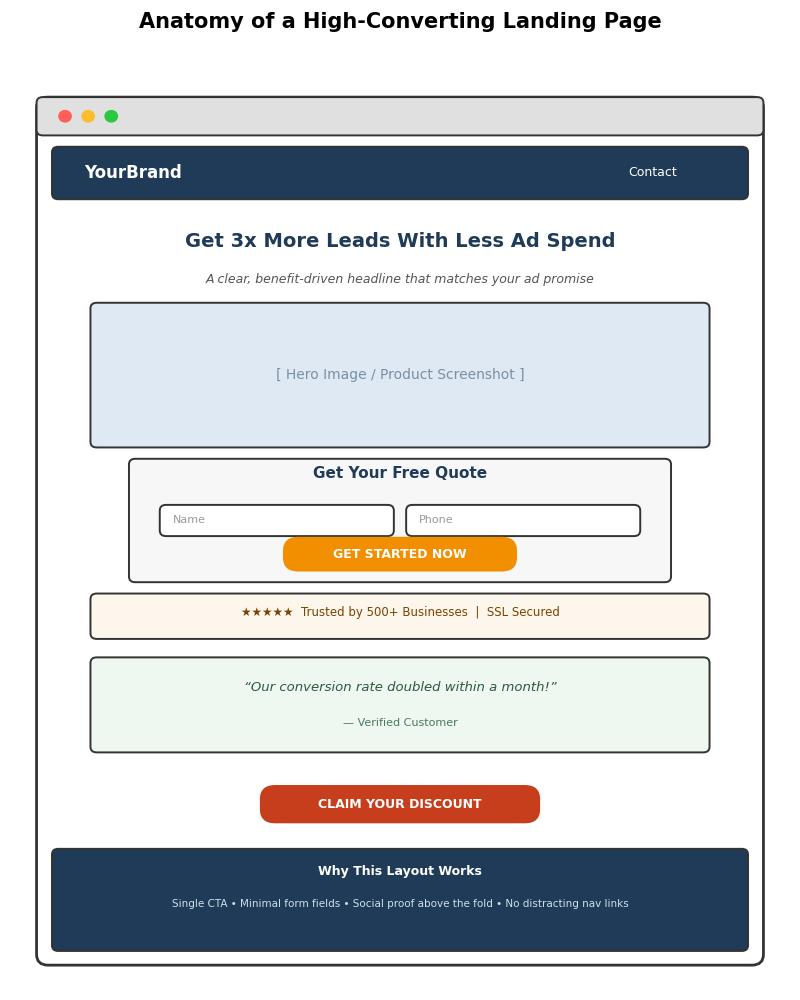
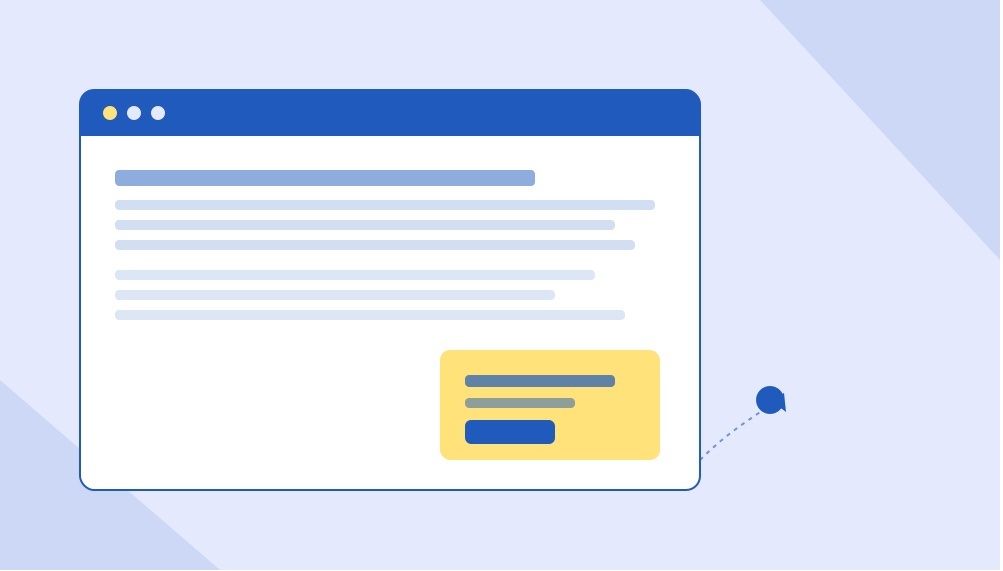
Remove the main navigation bar. Remove footer links to your blog, careers page, or social media. Every link that isn’t your CTA is a potential exit ramp. The image below shows a simplified anatomy of a landing page built for conversions — notice there’s no distracting navigation, and the CTA is the most visually prominent element on the page.
5. Use Strong, Specific Calls-to-Action
“Submit” and “Click Here” are weak CTAs because they describe an action rather than a benefit. Stronger CTAs describe what the visitor gets: “Get My Free Quote,” “Start My Free Trial,” or “Claim My Discount.” Make the CTA button visually distinct with a contrasting color, and repeat it at least once further down the page for longer landing pages.
6. Add Social Proof Above the Fold
Trust is the biggest barrier to conversion. Star ratings, client logos, testimonials, review counts, or security badges (like SSL certificates) all reduce perceived risk. Where possible, place at least one trust signal above the fold — before the visitor has to scroll.
7. Optimize for Mobile First
More than half of landing page traffic today comes from mobile devices, particularly for social media and search ad campaigns. Your form fields, buttons, and text need to be easily tappable and readable without zooming. Test your page on an actual phone, not just a resized browser window.
8. Test, Measure, and Iterate
No landing page is perfect on the first attempt. Use A/B testing to compare headlines, CTA copy, button colors, and form length. Track your conversion rate, not just your traffic volume — a page with less traffic but a higher conversion rate will often outperform a high-traffic page with poor conversion.
How Much Information Should You Ask For on a Landing Page?
This is one of the most common questions we get, and the honest answer is: as little as possible for the stage of the funnel your visitor is in.
Every additional form field reduces your conversion rate. Research across thousands of landing pages consistently shows that shorter forms convert better. However, “shorter is always better” isn’t a universal law — it depends on what you’re offering and who you’re targeting.
- Top-of-funnel offers (free ebooks, newsletter signups, free trials): Ask for name and email only. Anything more will hurt conversions.
- Mid-funnel offers (free consultations, quote requests): Name, email, and phone number are usually acceptable, since the visitor already has some intent.
- High-ticket or B2B offers (enterprise software demos, large service contracts): A slightly longer form (company name, budget range, job title) can actually improve lead quality, because it filters out unqualified visitors before your sales team spends time on them.
A good rule of thumb: for every field you add beyond the essentials, ask yourself, “Do I truly need this information right now, or can I collect it later in the sales process?” If the answer is “later,” remove the field.
How to Improve My Landing Page? (A Practical Checklist)
If you already have a landing page live and want to improve its performance without a full redesign, work through this checklist:
- Check your page load speed using a free tool and compress any oversized images.
- Confirm your headline matches the exact promise made in your ad or email.
- Remove any navigation links that aren’t your primary CTA.
- Reduce your form to the minimum number of fields necessary.
- Add or refresh testimonials, reviews, or case study results.
- Make sure your CTA button uses a color that contrasts with the rest of the page.
- Test the page on at least three different mobile devices and screen sizes.
- Add urgency or scarcity where genuinely applicable (limited slots, time-bound discounts).
- Run an A/B test on your headline — it typically has the single biggest impact on conversion rate.
- Review your analytics for drop-off points using scroll-depth or heatmap tools.
Small, incremental changes compound over time. A 1% improvement in conversion rate might sound minor, but on a page generating thousands of visits per month, that translates directly into additional revenue.
What Is the Best Landing Page Builder for Digital Marketing?
There is no single “best” landing page builder for everyone — the right choice depends on your technical comfort level, budget, and how deeply the page needs to integrate with your existing marketing stack. Here’s a general breakdown of the categories:
- Drag-and-drop SaaS builders: Platforms built specifically for landing pages offer pre-built templates, built-in A/B testing, and easy integrations with ad platforms and CRMs. These are ideal for marketers who want speed and don’t need deep customization.
- WordPress page builders: If your website already runs on WordPress, a page-builder plugin lets you create landing pages without leaving your existing hosting environment, keeping your branding and tracking scripts consistent across your whole site.
- Custom-coded landing pages: For businesses that need maximum control over performance, design, and integrations (especially for high-traffic campaigns), a custom-built page developed by a professional agency will almost always outperform template-based builders in load speed and conversion optimization.
The tool matters less than the strategy behind it. A beautifully built page using the “best” builder will still underperform if the copywriting, offer, and structure aren’t right. This is exactly why many businesses eventually bring in a specialist agency instead of relying solely on templates.
What a Landing Page Agency Does
A specialized landing page design agency does far more than just “make the page look nice.” Here’s what a professional engagement typically includes:
- Conversion research: Understanding your target audience, competitors, and existing analytics before writing a single line of copy.
- Copywriting: Crafting headlines, subheadlines, and body copy that speak directly to your visitor’s pain points and desired outcomes.
- UX and visual design: Structuring the page layout, choosing imagery, and designing a visual hierarchy that guides the eye toward the CTA.
- Development and speed optimization: Building a fast-loading, mobile-responsive page that doesn’t lose visitors to technical friction.
- A/B testing and analytics setup: Installing proper tracking (heatmaps, conversion pixels, analytics goals) and running structured tests to continually improve performance.
- Ongoing optimization: Reviewing performance data monthly or quarterly and making iterative improvements rather than treating the page as a one-time project.
The funnel below illustrates how each of these efforts maps onto the visitor’s actual journey, from the moment they see your ad to the moment they convert.
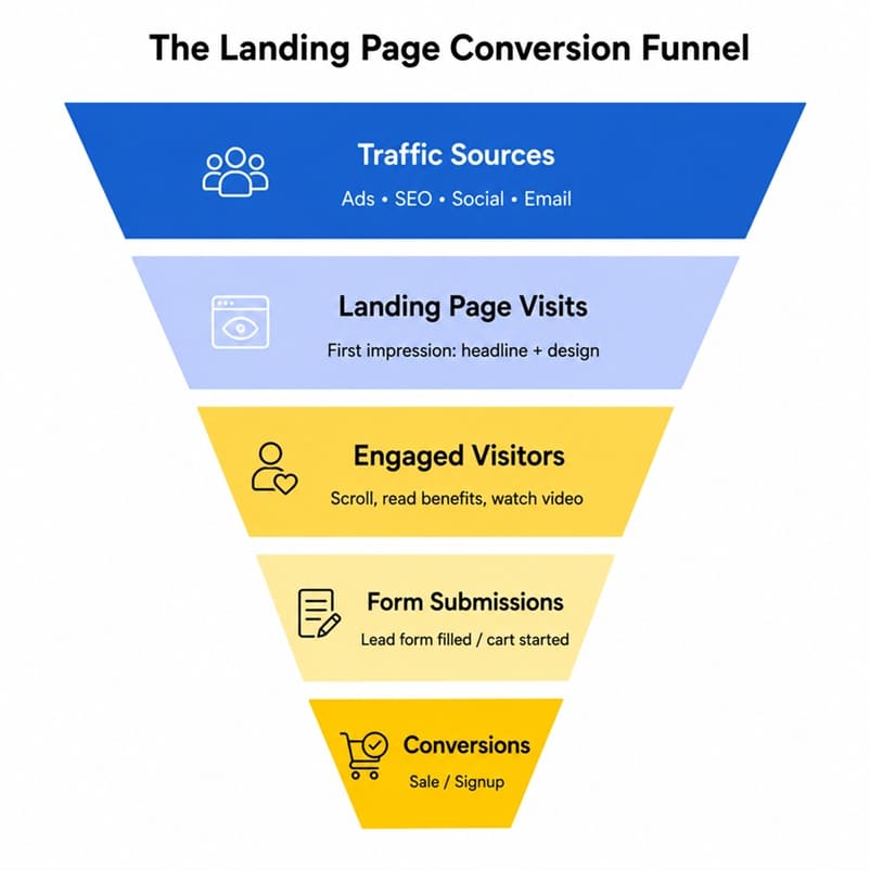
Notice that the funnel narrows at every stage. This is normal — not every visitor will convert. The job of a landing page agency is to widen each stage of the funnel as much as possible: getting more visitors to engage, more engaged visitors to submit the form, and more form submissions to become paying customers.
DIY vs. Hiring a Professional Agency
If you’re a solo founder or a very early-stage startup, building your first landing page yourself using a template builder is a reasonable starting point. It lets you test an offer quickly without a large upfront investment.
However, once you’re spending meaningful money on paid traffic, the calculation changes. A poorly converting landing page doesn’t just cost you the price of the page — it costs you every dollar of wasted ad spend sent to it. This is where working with an experienced landing page design agency pays for itself. Firms offering landing page designing in Delhi, India or landing page design services in Delhi, India combine copywriting, design, and conversion-rate-optimization expertise that most in-house teams don’t have the bandwidth to build from scratch.
If you’re evaluating options more broadly, it’s also worth comparing a web designing company in Delhi against a top-rated web design company in India to understand pricing, portfolio quality, and whether they specialize specifically in conversion-focused landing pages versus general website design — the two skill sets don’t always overlap.
Common Landing Page Mistakes to Avoid Even After Launch
Launching a landing page is not the finish line — it’s the starting point of an ongoing optimization process. Many businesses build a page, launch a campaign, and never revisit the page again, even as performance declines or the offer changes. Here are a few mistakes worth watching for after your page goes live:
- Letting the offer go stale: If your landing page promotes a “limited-time” discount that has technically expired, visitors who notice will immediately lose trust in your brand.
- Ignoring seasonal messaging: A landing page written for a summer promotion may need refreshed copy and imagery once the season changes, especially for e-commerce and travel brands.
- Not segmenting traffic: Sending both cold traffic (people who’ve never heard of you) and warm traffic (existing subscribers or retargeted visitors) to the exact same page usually means the messaging is too generic for either group. Consider building slight variations for each audience segment.
- Forgetting about page speed as content grows: Every time you add a new testimonial, video, or image to “improve” the page, you risk slowing it down. Re-test load speed after every significant edit.
- Never revisiting analytics: A landing page that converted well six months ago might be underperforming today due to increased competition, rising ad costs, or a shift in audience expectations. Set a recurring monthly or quarterly review.
Frequently Asked Questions
Do I need a different landing page for every ad campaign?
Ideally, yes — or at least for every distinct audience segment or offer. Message match between the ad and the landing page is one of the strongest predictors of conversion rate, so a single generic page trying to serve five different campaigns will almost always underperform compared to five focused pages.
How long should a landing page be?
There’s no fixed rule. Simple, low-commitment offers (like a free newsletter signup) can convert well with a short page. Higher-consideration purchases (like enterprise software or expensive services) often benefit from a longer page that addresses objections, includes more social proof, and explains the offer in more depth. Test both approaches for your specific offer.
Should a landing page include pricing?
It depends on your industry and sales process. If your pricing is competitive and straightforward, showing it upfront can filter out unqualified leads and build trust. If your offer is customized or high-ticket, it’s often better to gather contact information first and discuss pricing on a call, where your sales team can frame the value properly.
Can I use my homepage as a landing page?
Technically yes, but it’s rarely a good idea for paid campaigns. Homepages are designed to serve many different visitor intents and usually include full navigation, which gives visitors too many ways to leave without converting. A dedicated, focused landing page will almost always outperform a homepage for a specific campaign.
Final Thoughts
A high-converting landing page isn’t the result of luck or a trendy design template — it’s the result of a deliberate process: a single clear goal, a benefit-driven headline, minimal friction, strong social proof, and continuous testing. Whether you build your first page yourself or partner with a professional agency, keep coming back to the same question: does every single element on this page help move the visitor toward the one action I want them to take?
Get that right, and your landing page stops being just another web page — it becomes one of the highest-performing assets in your entire marketing funnel.

Popups Are Driving Visitors Away — Here’s How One Publisher Doubled Sign-Ups Without Annoying Anyone
You’ve felt it yourself. You land on an article, start reading the first line, and before your eyes even adjust — bam. A full-screen popup slams down asking for your email, blocking the entire page behind a translucent grey wall. You hunt for the tiny “X” hidden in the corner, usually the size of a pixel, half-annoyed and half-impressed by how deliberately hard it is to find. Then you leave. Maybe not that page — the whole site.
Now flip the script: you’re the site owner. That same popup you just closed in frustration is sitting on your own homepage right now, and it’s probably costing you more visitors than it’s converting into leads.
This is the quiet contradiction at the center of most lead capture strategies — the tactic marketers reach for to grow their list is often the exact thing pushing people out the door before they ever get the chance to subscribe. The good news is that the fix isn’t “stop using popups.” It’s building smarter ones.
The Problem With the Popups Everyone Still Uses
Full-screen, immediate-load popups were everywhere for years because, in isolation, they worked — they’re impossible to ignore, so of course some percentage of visitors converts. But that short-term win comes with long-term costs that rarely get measured in the same dashboard.
They tank the user experience
A visitor arrives with intent — to read an article, compare a product, find an answer — and instead they’re met with an interruption before they’ve had a chance to decide if your content is even worth their time. That’s a terrible first impression, and first impressions on the web are unforgiving. Most people don’t get annoyed and stay anyway; they get annoyed and leave.
They can trigger Google penalties
This one surprises a lot of marketers. Google has explicitly penalized intrusive interstitials — the full-screen kind that cover the main content immediately on mobile — in its search rankings. A page that looks great in your CMS preview can be actively working against your SEO the moment Google’s crawler sees a wall of popup covering your content on a mobile screen.
They spike bounce rate, especially on mobile
On a small screen, a full-screen popup isn’t a small interruption — it’s the entire experience. There’s no scrolling past it, no glancing around it. Mobile visitors, who often have less patience and more competing tabs open than desktop users, bounce out at a noticeably higher rate when they’re met with an aggressive overlay before they’ve even scrolled once.
They train visitors to distrust your site
Beyond the immediate bounce, there’s a compounding trust cost. A visitor who gets ambushed by a popup on their first visit is primed to leave immediately on their second visit too — even if you’ve since toned things down. First impressions on the web don’t just affect a single session; they shape whether someone gives you a second chance at all.
Also read:
UX & Conversion Optimization
Website Speed and Conversion Relationship
So Why Do So Many Sites Still Use Them?
Mostly inertia. A lot of popup implementations are “set it and forget it” — someone installed a plugin years ago, set it to trigger immediately on page load, and nobody has revisited it since, even as the traffic mix shifted heavily toward mobile and Google’s rules changed. The tool didn’t fail; it just never got upgraded to match how people actually browse today.
The other reason is a mismeasurement problem. Teams look at “popup conversion rate” as a standalone metric and it looks great — 3%, 5%, sometimes higher. What they don’t see in that same report is the bounce rate spike, the SEO ranking dip, or the visitors who left annoyed and never came back to convert through any channel at all. A popup can win on one metric and quietly lose on three others.
The Smarter Alternative: Behavior-Triggered Overlays
The fix isn’t removing lead capture — it’s changing when and how it shows up. Instead of interrupting every single visitor the instant they land, smart popups wait for a signal that the visitor is actually engaged, then ask at a moment when saying yes feels natural rather than intrusive.
Scroll-depth triggers
Instead of firing on page load, the popup waits until a visitor has scrolled 50%, 70%, or 90% down the page. By that point, they’ve demonstrated real interest in the content — they’re no longer a stranger deciding whether to stay, they’re an engaged reader who might genuinely want more of what you’re offering. Asking for an email at that moment feels like a natural next step, not an ambush.
Time-on-page triggers
Similar logic, different signal. If a visitor has been on the page for 30, 45, or 60 seconds, they’re clearly reading, not bouncing. A popup that waits for this threshold respects the fact that the first few seconds of a visit are for orientation, not conversion.
Exit-intent triggers
This is the cleverest of the three. Exit-intent detection tracks cursor movement on desktop (or scroll-up behavior and back-button presses on mobile) to predict when someone is about to leave, and shows the offer at that exact moment. The logic is simple but powerful: if they were going to leave anyway, a well-timed offer costs nothing in terms of user experience — you’re not interrupting a reader mid-flow, you’re catching someone on their way out the door.
Lightweight code structures
Beyond timing, the technical build matters just as much. Bloated popup scripts slow down page load, which independently hurts both user experience and SEO. A well-built overlay uses lightweight, asynchronous-loading code that doesn’t compete with the core content for load priority, doesn’t block rendering, and disappears cleanly without leaving background scripts running. This is exactly the kind of performance-first thinking a good web development company in Delhi builds into a site from the ground up, rather than bolting on after the fact. The goal is an overlay that feels instant and unobtrusive, not one more thing the browser has to fight through before the page becomes usable.
What This Looked Like for One B2B Publisher
Here’s where theory meets results. A B2B publisher running a content-heavy site was using a traditional immediate-load, full-screen popup for newsletter sign-ups — the kind that appeared the second a visitor landed, regardless of device or engagement level. Sign-up numbers were decent, but mobile bounce rate was creeping upward, and organic rankings on key articles had quietly started slipping.
The fix wasn’t a redesign of the offer itself — the newsletter pitch stayed largely the same. What changed was the delivery mechanism. The full-screen interstitial was replaced with a scroll-triggered slide-in that appeared only after a visitor hit roughly 60% scroll depth, paired with an exit-intent trigger for desktop visitors who showed signs of leaving before reaching that point. The new popup was also rebuilt with a lighter script, load-tested specifically for mobile performance.
The results were the kind that get a marketing team’s attention in a single meeting: newsletter sign-up rate doubled, and mobile bounce rate dropped by 18% in the same period. Two metrics that are usually assumed to trade off against each other — more aggressive lead capture versus better user experience — moved in the same direction at once. The lesson wasn’t “popups don’t work.” It was “badly-timed popups don’t work, and well-timed ones do double duty.”
How to Rebuild Your Own Popup Strategy
If your current setup is a full-screen, immediate-load popup, here’s a practical path to something smarter.
1. Audit what you actually have live
Check every popup currently running on your site — including ones a plugin might be running by default that nobody actively configured. Note the trigger type, the device behavior, and whether it’s blocking content on mobile specifically, since that’s where Google’s interstitial penalties bite hardest.
2. Pick a trigger that matches visitor intent
Scroll depth works well for content-heavy pages where reading time matters. Time-on-page works well for product or service pages where visitors browse rather than scroll linearly. Exit-intent works everywhere but only on desktop, since mobile browsers don’t expose the same cursor-movement signals — mobile needs a scroll-based or back-button-based equivalent instead.
3. Rebuild with mobile-first performance in mind
Test the popup on an actual mobile connection speed, not just a desktop preview. Check that it doesn’t cover the full viewport, doesn’t block the ability to close it easily, and doesn’t slow down the page’s core load time. If your site’s overall mobile experience feels dated beyond just the popup, it might be worth a broader look — a experienced website design agency in Delhi can audit the whole mobile journey, not just the overlay sitting on top of it.
4. Make the offer worth the interruption
Even a perfectly timed popup underperforms if the offer behind it is generic. “Sign up for our newsletter” converts worse than a specific, tangible reason tied to what the visitor is already reading — a related guide, a checklist, a relevant discount, or early access to something useful.
5. Measure the full picture, not just the popup conversion rate
Track bounce rate, average session duration, and organic ranking movement alongside sign-up numbers. A popup redesign that improves lead capture while quietly protecting — or improving — the rest of your site health metrics is the actual win, not just the sign-up count in isolation.
The Bigger Picture
Lead capture and user experience don’t have to be in conflict. The publishers and brands getting this right have simply stopped treating popups as a blunt, one-size-fits-all interruption and started treating them as a piece of on-site content that deserves the same thought as anything else a visitor sees — right message, right moment, right device.
The instinct to interrupt every visitor immediately comes from a fear that if you wait, you’ll miss the chance to convert them. In practice, the opposite tends to be true: waiting for the right signal — engagement, intent to leave, meaningful time on page — produces an offer that feels earned rather than forced, and visitors respond to that difference even if they couldn’t articulate why.
If your current popup setup hasn’t been touched since it was first installed, there’s a good chance it’s quietly working against the very goals it was built to support. A short audit and a smarter trigger strategy is often all it takes to turn an annoyance into an asset — and it’s exactly the kind of conversion-focused fix a full-service digital marketing agency or a SEO agency can handle alongside the rest of your growth strategy.

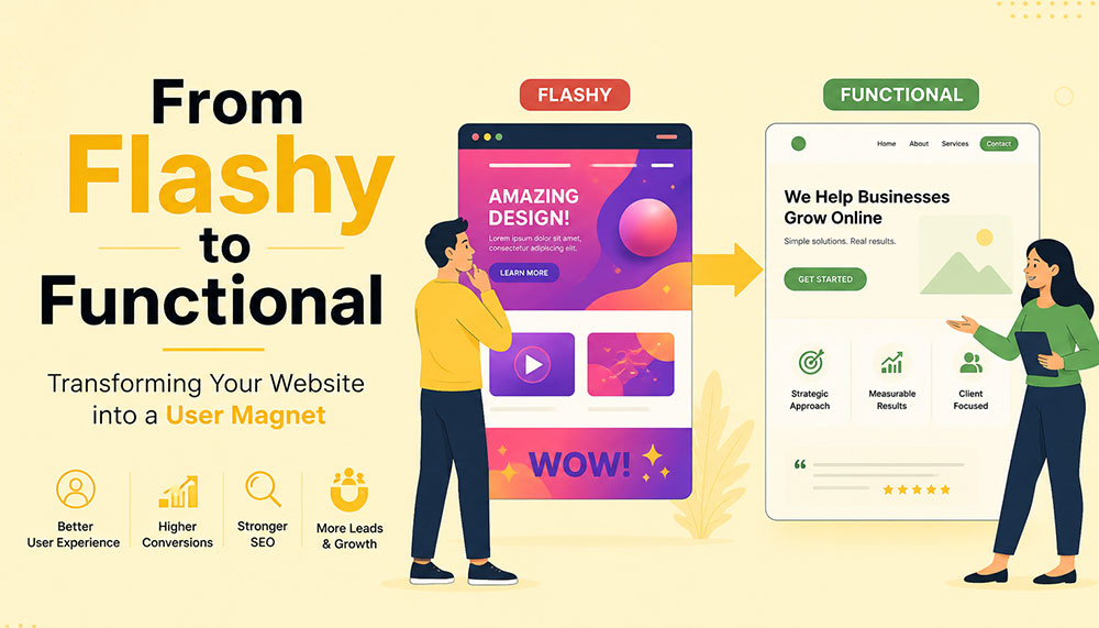
From Flashy to Functional: Transforming Your Website into a User Magnet
In the early days of the internet, a flashy website was often enough to impress visitors. Bright colors, animations, auto-playing media, and complex layouts were seen as signs of creativity and innovation. But times have changed. Today’s users are smarter, faster, and far less patient. A visually overloaded website is no longer impressive—it’s exhausting.
If your website looks stunning but fails to convert visitors into customers, then it’s not doing its job. The modern approach to web design focuses on functionality, usability, speed, and experience. Businesses that understand this shift are the ones that win.
This article explores how to transform your website from merely flashy to genuinely functional—and ultimately turn it into a powerful user magnet.
The Problem with “Flashy” Websites
At first glance, a flashy website can feel impressive. Bright visuals, animations, sliders, and interactive effects often give the illusion of sophistication and creativity. But here’s the reality—what looks exciting to a designer can quickly become frustrating for a user.
Today’s internet users are not browsing casually—they’re searching with intent. They want answers, solutions, and clarity within seconds. If your website slows them down or overwhelms them, they won’t admire the design—they’ll abandon it.
Flashy websites often prioritize aesthetics over usability. While they may look appealing initially, they tend to create friction in the user journey. And in the digital world, even small friction points can lead to big losses in engagement and conversions.
Let’s take a closer look at the common problems:
- Slow loading times: Heavy animations, large images, auto-playing videos, and complex scripts can significantly slow down your website. Users today expect pages to load almost instantly. Even a delay of a few seconds can cause frustration and increase bounce rates.
- Confusing navigation structures: Over-designed menus, hidden navigation elements, or too many options can leave users unsure of where to go next. When visitors feel lost, they rarely try to figure things out—they simply exit.
- Distracting visual elements: Too many moving parts—sliders, pop-ups, flashing banners—can shift attention away from what actually matters: your message. Instead of guiding users, these elements overwhelm them.
- Poor mobile responsiveness: A design that looks great on a desktop may completely break on a mobile device if not optimized properly. With the majority of users browsing on smartphones, this is a critical flaw.
- Low accessibility: Flash-heavy designs often ignore accessibility standards. Poor contrast, unreadable fonts, or non-intuitive layouts can make it difficult for users with different abilities to interact with your website.
Think about your own browsing habits. When you land on a website that takes too long to load or feels complicated, what do you do? Most likely, you hit the back button. That’s exactly what your visitors are doing too.
Modern users expect instant gratification. They want fast, smooth, and effortless experiences. If your website fails to deliver that within the first few seconds, you’ve already lost their attention—and potentially their business.
This is why businesses today are shifting their focus from “looking impressive” to “working effectively.” A professional Website Designing company in India understands this balance. Instead of adding unnecessary elements, they focus on creating clean, user-friendly designs that guide visitors naturally and help businesses achieve real results.
Because in the end, a website isn’t meant to just impress—it’s meant to perform.
Understanding the Shift: From Design to Experience
There was a time when website design was judged almost entirely by how it looked. If it was visually appealing, colorful, and “different,” it was considered successful. But that definition has evolved—dramatically.
Today, design alone is not enough. A website can look stunning and still fail miserably if it doesn’t deliver a smooth, intuitive experience. This is where the shift happens—from design-centric thinking to experience-centric thinking.
In simple terms, it’s no longer just about how your website looks. It’s about how it feels to use.
When a user lands on your website, they are not there to admire your design skills. They are there with a purpose—maybe to learn something, compare options, or make a purchase. The faster and easier you help them achieve that goal, the more successful your website becomes.
This is why User Experience (UX) and User Interface (UI) design have become the backbone of modern websites. These disciplines focus on understanding user behavior, removing friction, and creating seamless interactions.
Instead of asking “Does it look good?”, businesses now need to ask deeper, more practical questions:
- Is it easy to use? Can a first-time visitor navigate your website without confusion, or do they have to think too much before taking action?
- Can users find what they need quickly? In a world where attention spans are shrinking, every second matters. If users have to dig through multiple pages to find basic information, they won’t stick around.
- Does it guide users toward action? A good website doesn’t just present information—it gently leads users toward the next step, whether that’s filling out a form, making a purchase, or contacting your team.
- Does it work seamlessly on all devices? Your audience is browsing on phones, tablets, laptops, and everything in between. A consistent and smooth experience across all devices is no longer optional.
Think of your website like a physical store. A beautifully designed store with confusing layouts, hard-to-find products, and unhelpful staff will struggle to make sales. On the other hand, a clean, well-organized store that makes shopping easy will naturally attract and retain customers.
The same principle applies online.
Functionality doesn’t mean sacrificing beauty—it means giving beauty a purpose. Every design element, from colors to typography to spacing, should support usability rather than distract from it.
This is where experienced professionals, such as a Website Designing company in India, bring real value. They don’t just design for visual appeal—they design for human behavior, ensuring that every click, scroll, and interaction feels natural and meaningful.
Because at the end of the day, users don’t remember how “cool” your website looked. They remember how easy it was to use—and whether it helped them get what they came for.
Key Elements of a Functional Website
A functional website doesn’t happen by accident—it’s the result of thoughtful planning, user understanding, and smart design decisions. Every element on your website should have a purpose. When all these elements work together, they create an experience that feels smooth, intuitive, and satisfying for the user.
Let’s break down the core elements that truly make a website functional—not just visually appealing, but genuinely effective.
1. Clear and Intuitive Navigation
Your website should feel effortless to explore. A visitor should land on your homepage and instantly understand where to go next—without thinking too hard. The moment users feel confused, they start losing trust.
Think of navigation as a roadmap. If the directions aren’t clear, people won’t keep wandering—they’ll simply leave and find another destination.
A well-structured navigation system includes:
- Simple menus with clear labels: Avoid clever or vague naming. “Services,” “About,” and “Contact” may sound basic, but they work because users instantly recognize them.
- Logical page hierarchy: Your pages should be organized in a way that makes sense. Important information should never be buried deep within multiple clicks.
- Easy access to key pages: High-priority pages like pricing, services, or contact information should always be easy to find—preferably within one or two clicks.
If users get lost, they leave. It’s that simple. Good navigation doesn’t draw attention to itself—it just works seamlessly in the background.
2. Fast Loading Speed
Speed is one of the most critical factors in user experience. No matter how beautiful your website is, if it takes too long to load, users won’t wait around to see it.
We live in a world of instant results. A delay of even one second can feel like an eternity—and that’s often enough to lose a potential customer.
To improve your website’s speed:
- Optimize images: Large, uncompressed images are one of the biggest causes of slow websites. Proper optimization keeps quality high while reducing load time.
- Use efficient code: Clean, streamlined coding reduces unnecessary load on your website.
- Leverage caching: Caching helps store data so returning users can access your site faster.
- Choose reliable hosting: Your hosting provider plays a major role in your website’s performance. A slow server means a slow website—no matter what you do.
A skilled Website Designing company in India understands that performance is not an afterthought. They build speed optimization into the foundation of your website from the very beginning.
3. Mobile Responsiveness
Take a moment to think about how often you use your phone to browse the internet. Now imagine your website being viewed on that small screen. Does it still look clean? Is it easy to navigate? Can users interact with it comfortably?
With mobile users now dominating web traffic, your website must perform flawlessly across all screen sizes. A responsive design ensures that your website adapts automatically—no matter what device is being used.
This includes:
- Content that adjusts smoothly: Images, text, and layouts should resize and rearrange themselves for different screen sizes.
- Tap-friendly buttons: Buttons should be large enough and spaced properly so users can easily tap them without frustration.
- Readable text: Users shouldn’t have to zoom in just to read your content. Proper font sizing is essential.
A mobile-first approach is no longer optional—it’s the standard. If your website doesn’t work well on mobile, you’re likely losing a significant portion of your audience.
4. Strong Visual Hierarchy
When users land on your website, they don’t read every word—they scan. Your design should guide their eyes naturally, helping them understand what’s important within seconds.
This is where visual hierarchy comes in. It’s the art of organizing content in a way that leads users through your website effortlessly.
You can achieve this through:
- Proper use of headings: Headlines should stand out and clearly communicate key messages.
- Contrasting colors: Important elements like call-to-action buttons should be visually distinct.
- Whitespace: Giving elements room to breathe makes your website easier to read and less overwhelming.
- Strategic placement: Key information should be positioned where users naturally look first.
A clean, well-structured layout often outperforms a cluttered design. Simplicity doesn’t mean boring—it means effective.
5. Compelling and Clear Content
Design might bring users in, but content is what keeps them there—and ultimately convinces them to take action.
Your messaging should speak directly to your audience. It should answer their questions, address their concerns, and clearly explain how you can help them.
Effective website content is:
- Clear and concise: Avoid unnecessary jargon or long-winded explanations. Get to the point quickly.
- User-focused: Instead of talking only about your business, focus on what the user gains.
- Easy to scan: Use short paragraphs, bullet points, and headings to make content digestible.
Within a few seconds of landing on your website, visitors should understand exactly what you offer and why it matters to them. If they have to guess, you’ve already lost them.
When all these elements come together—navigation, speed, responsiveness, hierarchy, and content—you don’t just have a website. You have a powerful user experience that attracts, engages, and converts.
Why Functionality Drives Conversions
At the end of the day, your website has a job to do. Whether it’s generating leads, selling products, or encouraging inquiries—everything comes down to conversions. And here’s the truth many businesses overlook: people don’t convert because your website looks good… they convert because it feels easy.
A functional website removes friction from the user journey. It makes every step—from landing on the page to taking action—feel natural and effortless. When users don’t have to struggle, think too much, or second-guess their decisions, they are far more likely to move forward.
Think of it like walking into a well-organized store. You can quickly find what you need, understand the pricing, and check out without confusion. Compare that to a cluttered store where nothing is clearly labeled—you’d probably walk out. The same psychology applies to your website.
Functionality builds trust. And trust is the foundation of every conversion.
When users can easily navigate your website, find relevant information, and complete actions without frustration, they begin to feel confident in your brand. On the other hand, even small issues—like a confusing layout or a slow-loading page—can create doubt and push them away.
A conversion-focused website is intentionally designed to guide users toward action. It doesn’t leave things to chance. Every element plays a role in helping users take the next step.
Here’s what that looks like in practice:
- Clear call-to-action (CTA) buttons: Your CTAs should stand out and communicate exactly what users need to do next—whether it’s “Get a Quote,” “Book a Demo,” or “Buy Now.” There should be no confusion or hesitation.
- Minimal distractions: Too many pop-ups, animations, or competing elements can overwhelm users and dilute your message. A clean, focused design keeps attention where it matters most.
- Trust signals: People are naturally cautious online. Reviews, testimonials, case studies, certifications, and client logos help reassure users that they’re making the right choice.
- Simplified forms and checkout processes: The more steps you add, the more users you lose. Shorter forms, fewer fields, and a smooth checkout experience can significantly increase conversions.
It’s important to understand that users don’t want to “work” to interact with your website. The easier you make things for them, the more likely they are to take action.
This is why businesses increasingly partner with a Website Designing company in India that focuses on performance-driven design. Instead of adding unnecessary features, they refine the user journey—removing obstacles and guiding users toward meaningful actions.
Every element on your website should have a clear purpose. If something doesn’t contribute to the user experience or support conversions, it’s likely doing more harm than good.
Because in the digital world, simplicity isn’t just a design choice—it’s a competitive advantage.
The Role of User Psychology
Behind every click, scroll, and decision on your website, there’s a human mind at work. And that mind doesn’t behave randomly—it follows patterns. Understanding these patterns is what separates an average website from one that truly connects with users.
One of the biggest misconceptions in web design is assuming that users carefully read everything on a page. In reality, they don’t. People scan. They skim through headings, glance at visuals, and look for familiar cues that help them quickly understand what to do next.
This means your website isn’t just a collection of pages—it’s an experience shaped by human behavior. The more you align your design with how people naturally think and interact, the more effective your website becomes.
Let’s explore some key psychological principles that influence user behavior:
- Familiarity: Users feel comfortable with what they already recognize. This is why most successful websites follow certain standard patterns—like having a logo at the top left, navigation at the top, and contact information easily accessible. When you stick to familiar structures, users don’t have to “learn” how to use your website—they already know.
- Clarity: The human brain prefers simplicity. When a website is cluttered or overly complex, it increases cognitive load—meaning users have to work harder to process information. And when things feel difficult, people tend to give up. Clean layouts, simple messaging, and clear pathways reduce this mental effort and keep users engaged.
- Trust: First impressions happen in seconds. A clean, professional-looking website instantly builds credibility, while a messy or outdated design raises doubts. Elements like consistent branding, high-quality visuals, testimonials, and secure browsing indicators all contribute to building trust.
- Urgency: People are more likely to take action when they feel a sense of urgency. Strategic prompts like limited-time offers, countdowns, or phrases such as “Only a few spots left” can encourage users to act sooner rather than later. When used thoughtfully, urgency can significantly improve conversions without feeling pushy.
Think about your own online behavior. When you visit a website, you instinctively look for certain things—clear headings, easy navigation, and quick answers. If those elements are missing, frustration builds almost instantly.
This is why understanding user psychology isn’t optional—it’s essential. A website that aligns with human behavior feels intuitive, trustworthy, and easy to use.
A modern Website Designing company in India doesn’t just focus on visuals or code—they dive deeper into how users think, what motivates them, and what stops them from taking action. By combining design expertise with behavioral insights, they create websites that don’t just look good—they feel right.
Because when your website speaks the language of your users’ minds, engagement and conversions naturally follow.
Common Mistakes to Avoid
Sometimes, the biggest problems on a website aren’t what’s missing—they’re what’s unnecessarily added. Many businesses invest time and money into their websites, yet unknowingly make decisions that hurt performance instead of improving it.
The tricky part? These mistakes often come from good intentions—trying to impress users, add more information, or stand out from competitors. But in reality, they end up doing the opposite.
Let’s break down some of the most common website mistakes and why they matter:
- Overusing animations and effects: Animations can enhance a website when used sparingly, but too many moving elements can overwhelm users. Sliders, pop-ups, hover effects, and auto-playing media can quickly turn from engaging to distracting. Instead of focusing on your message, users get caught up in visual noise—and often leave before taking any action.
- Ignoring mobile users: This is one of the most costly mistakes today. A website that works perfectly on desktop but feels clunky on mobile is guaranteed to lose a large portion of its audience. Tiny buttons, misaligned content, and slow mobile performance create frustration and drive users away almost instantly.
- Cluttering pages with too much information: It’s tempting to put everything on one page—every service, every feature, every detail. But more information doesn’t always mean better communication. When pages are overcrowded, users don’t know where to focus. Instead of reading more, they end up reading nothing at all.
- Using unclear or generic CTAs: Call-to-action buttons like “Click Here” or “Submit” don’t tell users what they’re getting. Strong CTAs are specific and action-driven—like “Get Your Free Quote” or “Book a Consultation.” Clarity here can make a huge difference in conversion rates.
- Neglecting SEO fundamentals: A beautiful website is useless if no one can find it. Ignoring SEO basics—like proper headings, meta tags, keyword optimization, and page speed—limits your visibility on search engines. Without traffic, even the best-designed website won’t deliver results.
If you look closely, all these mistakes have one thing in common: they prioritize business preferences over user needs. And that’s where things start to go wrong.
The good news is that these issues are completely fixable. In fact, addressing even a few of them can lead to noticeable improvements in user engagement, time on site, and conversions.
This is why many businesses turn to an experienced Website Designing company in India to audit and refine their websites. With a fresh perspective and user-focused approach, they can identify hidden issues and transform your website into something far more effective.
Because sometimes, improving your website isn’t about adding more—it’s about removing what’s getting in the way.
Balancing Aesthetics and Functionality
There’s a common misconception in web design—that you have to choose between a website that looks beautiful and one that works well. In reality, the most successful websites don’t pick one over the other. They strike a balance.
Visual appeal matters. It creates the first impression, sets the tone for your brand, and captures attention. But if that visual appeal comes at the cost of usability, it quickly loses its value. On the other hand, a purely functional website that lacks personality can feel dull and forgettable.
The real goal is to bring both together—where design enhances functionality, not competes with it.
Think of your website like a well-designed workspace. It should look inviting and professional, but more importantly, everything should be placed exactly where it’s needed. Nothing should feel out of place, unnecessary, or confusing.
Here are some practical ways to achieve that balance:
- Using a consistent color palette: Colors play a huge role in how users perceive your brand. A consistent palette creates a sense of harmony and professionalism. It also helps guide user attention—for example, using a specific color for buttons makes them instantly recognizable.
- Choosing readable fonts: Stylish typography can enhance your design, but readability should always come first. If users have to strain their eyes to read your content, they won’t stick around. Clean, simple fonts with proper spacing make a big difference in user comfort.
- Maintaining visual consistency: Consistency builds familiarity and trust. When elements like buttons, headings, spacing, and layouts follow a uniform style across your website, users feel more comfortable navigating it. Inconsistency, on the other hand, creates confusion and disrupts the experience.
- Using images purposefully: Images should support your message—not just fill space. High-quality visuals can enhance storytelling, explain concepts, and create emotional connections. But irrelevant or excessive images can slow down your website and distract users from your core message.
It’s also important to remember that simplicity is powerful. A clean design with thoughtful spacing and focused content often feels more premium than a cluttered, over-designed layout.
This is where experienced professionals, such as a Website Designing company in India, truly make a difference. They understand how to blend creativity with usability—ensuring that every design choice serves a purpose and contributes to the overall experience.
At its core, design is not the end goal—it’s a tool. A tool to communicate, guide, and engage your users. When used wisely, it doesn’t just make your website look better—it makes it work better.
And that’s the kind of balance that turns visitors into loyal users.
How SEO and Functionality Work Together
SEO and website functionality are often treated as two separate things—but in reality, they are deeply connected. You can’t build a strong online presence by focusing on just one. The websites that perform best today are the ones where SEO and user experience work hand in hand.
Search engines like Google are no longer just scanning your website for keywords. They are analyzing how users interact with it. Do people stay on your site? Do they explore multiple pages? Or do they leave within seconds? These behaviors send powerful signals about the quality of your website.
In simple terms, search engines want to recommend websites that users actually enjoy using. And that’s exactly where functionality comes into play.
A functional website naturally supports SEO because it creates a better experience for users—and when users are happy, search engines take notice.
Here’s how functionality directly impacts your SEO performance:
- Improving page speed: Fast-loading websites not only keep users engaged but are also favored by search engines. Speed is a ranking factor, and even small improvements can make a noticeable difference in your visibility.
- Enhancing mobile usability: With mobile-first indexing, search engines prioritize how your website performs on mobile devices. A responsive, mobile-friendly design ensures that your site ranks better and reaches a wider audience.
- Reducing bounce rates: When users land on your website and immediately leave, it signals that something isn’t working—whether it’s slow speed, poor design, or irrelevant content. A functional website keeps users engaged and encourages them to stay longer.
- Encouraging longer session durations: When your website is easy to navigate and provides valuable content, users naturally spend more time exploring it. This increased engagement sends positive signals to search engines about your site’s relevance and quality.
It’s important to understand that SEO is no longer just about ranking—it’s about retention. Getting users to your website is only half the battle. Keeping them there is what truly makes the difference.
This is why businesses are increasingly working with a Website Designing company in India that understands both SEO and user experience. Instead of treating them as separate strategies, they integrate them into a unified approach—building websites that are not only easy to find but also enjoyable to use.
When your website is fast, intuitive, and user-friendly, visitors stay longer, interact more, and trust your brand. And when that happens consistently, search engines recognize your website as valuable—and reward it with better rankings.
Because in today’s digital landscape, the formula is simple: when users love your website, search engines do too.
Steps to Transform Your Website
Transforming your website from flashy to functional isn’t about making random changes—it’s about taking a structured, thoughtful approach. The goal is to create a website that not only looks better, but works better for your users and your business.
Think of it as a continuous improvement process rather than a one-time redesign. Every step you take should bring you closer to a smoother, more effective user experience.
1. Audit Your Current Website
Before making any changes, you need to understand where you currently stand. A website audit helps you uncover what’s working well and what’s holding you back.
Start by looking at real user data:
- User behavior: How do visitors interact with your site? Which pages do they visit most? Where do they drop off?
- Bounce rates: Are users leaving quickly after landing on certain pages? If yes, those pages may have usability or content issues.
- Conversion data: Which pages are driving results, and which ones are not?
You can also review your website from a user’s perspective. Try navigating it as if you were a first-time visitor. Is everything clear and easy to find? Or does it feel confusing?
This step lays the foundation for everything that follows.
2. Simplify the Design
Once you know what’s not working, the next step is to simplify. Many websites try to do too much—and end up overwhelming users.
Simplification doesn’t mean removing value—it means removing distractions.
Focus on:
- Eliminating unnecessary animations and visual clutter
- Reducing the number of competing elements on each page
- Highlighting key messages and actions
Ask yourself: “Does this element help the user, or does it just look nice?” If it doesn’t serve a purpose, it probably doesn’t belong.
A clean, focused design makes it easier for users to understand your website—and take action.
3. Improve Performance
Performance is a critical part of functionality. Even the best-designed website will fail if it’s slow or unresponsive.
Improving performance involves both technical and design-related optimizations:
- Speed optimization: Compress images, minimize code, and use caching to reduce load times.
- Responsive design: Ensure your website works smoothly across all devices and screen sizes.
- Technical improvements: Fix broken links, optimize server response times, and ensure clean coding practices.
This is often where working with a Website Designing company in India can make a big difference. Their technical expertise ensures that your website performs efficiently without compromising on design.
4. Enhance Content Strategy
Your website’s content is what communicates your value to users. If your messaging is unclear or unfocused, even the best design won’t help.
Shift your content strategy from “what we want to say” to “what users need to hear.”
Effective content should:
- Address user problems and offer solutions
- Be easy to read and scan
- Clearly explain your services or products
- Guide users toward the next step
Every page should have a purpose—and every piece of content should support that purpose.
5. Test and Optimize Continuously
Your website is never truly “finished.” User behavior evolves, trends change, and new opportunities emerge. That’s why ongoing testing and optimization are essential.
Use tools and techniques like:
- A/B testing: Compare different versions of a page to see what performs better
- Analytics: Track user behavior, engagement, and conversions
- Heatmaps: Understand where users click, scroll, and focus their attention
Small improvements over time can lead to significant results. Even minor tweaks—like changing a button color or simplifying a form—can have a noticeable impact on conversions.
The key is to stay curious, keep testing, and continuously refine your website based on real data.
When you follow these steps, you’re not just redesigning your website—you’re transforming it into a powerful tool that attracts users, engages them, and drives meaningful results.
The Importance of Professional Expertise
Transforming a website isn’t just about changing colors, adding new sections, or updating a layout—it’s a much deeper process. It requires a careful balance of design, technology, user psychology, and marketing strategy. And this is exactly where many businesses struggle when trying to handle everything on their own.
A website today is not just a digital brochure—it’s a performance-driven asset. It needs to attract visitors, engage them, guide them, and ultimately convert them. Achieving all of that requires more than creativity—it requires expertise.
This is why many businesses choose to partner with a professional Website Designing company in India. Instead of relying on guesswork or trial-and-error, they gain access to a team that understands how to build websites that actually work.
Let’s look at what such expertise brings to the table:
- Industry experience: Professionals who have worked across different industries understand what works and what doesn’t. They’ve seen trends evolve, tested strategies, and know how to avoid common pitfalls. This experience helps them make informed decisions that save time and deliver better results.
- Technical expertise: From coding and performance optimization to responsiveness and integrations, there’s a lot happening behind the scenes of a functional website. A skilled team ensures that everything runs smoothly—so users never have to think about the technical side at all.
- Strategic thinking: A great website isn’t built randomly—it’s planned. Professionals approach design with a clear strategy in mind, aligning your website with your business goals. Every element, from layout to content placement, is designed to support conversions and user engagement.
- Cost-effective solutions: While hiring experts may seem like an added expense, it often saves money in the long run. Avoiding mistakes, reducing redesigns, and getting things right the first time leads to better ROI and fewer ongoing issues.
Another key advantage is perspective. When you’re deeply involved in your own business, it’s easy to overlook usability issues or assume things are “obvious” to users. A professional team brings an outside perspective—seeing your website the way your visitors do.
They don’t just ask, “Does this look good?” They ask, “Does this work?”
And that shift in thinking makes all the difference.
The result is a website that doesn’t just impress visually—it performs consistently. It loads faster, guides users better, communicates clearly, and converts more effectively.
Because in today’s competitive digital space, a good-looking website is no longer enough. You need a website that delivers results—and that’s exactly what professional expertise helps you achieve.
Real-World Impact of Functional Design
When businesses shift their focus from flashy visuals to functional design, the results are not just noticeable—they’re measurable. This isn’t about subjective opinions like “it looks better” or “it feels smoother.” It’s about real, data-driven improvements that directly affect how your website performs and how your business grows.
A functional website doesn’t just change how your site looks—it transforms how users interact with it. And when user behavior improves, everything else follows.
Here’s what businesses typically experience when they make this shift:
- Higher conversion rates: When users can easily navigate your website, understand your offering, and take action without confusion, conversions naturally increase. Whether it’s filling out a form, making a purchase, or booking a service—simplicity leads to action.
- Lower bounce rates: A well-structured, fast-loading, and user-friendly website encourages visitors to stay instead of leaving immediately. When users find what they’re looking for quickly, they’re far more likely to explore further rather than exit.
- Increased user engagement: Functional design keeps users interested. They spend more time on your site, visit multiple pages, and interact with your content. This deeper engagement not only improves user experience but also strengthens your brand connection.
- Better search rankings: Search engines pay close attention to how users behave on your website. Lower bounce rates, longer session durations, and improved usability all contribute to better rankings—bringing in even more organic traffic.
But beyond the metrics, there’s a bigger picture.
A functional website builds confidence. It makes your business feel reliable, professional, and easy to work with. Users don’t just visit—they trust. And when trust is established, conversions become a natural outcome rather than a forced action.
Many businesses notice that after optimizing functionality, they don’t need to push as hard with aggressive marketing. Their website starts doing the heavy lifting—guiding users, answering questions, and encouraging decisions organically.
This is why working with a Website Designing company in India that focuses on performance-driven design can be a game-changer. Instead of chasing trends or adding unnecessary features, they focus on what truly impacts user behavior and business outcomes.
Because in the real world, success isn’t measured by how impressive your website looks—it’s measured by how effectively it works.
And when your website works seamlessly, growth isn’t just possible—it becomes predictable.
Future Trends in Website Design
Website design is constantly evolving—but one thing is becoming clearer every year: the future belongs to websites that truly understand and serve their users. Trends may change, technologies may advance, but the core focus remains the same—creating seamless, meaningful, and human-centered experiences.
What’s exciting is that the next wave of web design isn’t just about looking modern—it’s about becoming smarter, more intuitive, and more inclusive. Businesses that adapt early will not only stand out but also build stronger, long-lasting connections with their audiences.
Let’s explore some of the key trends shaping the future of website design:
- Minimalistic design approaches: The shift toward simplicity is only getting stronger. Clean layouts, ample whitespace, and focused content are replacing cluttered, over-designed pages. Minimalism isn’t about doing less—it’s about doing what matters most. By removing distractions, websites can guide users more effectively and create a calmer, more enjoyable browsing experience.
- AI-driven personalization: Websites are becoming smarter and more adaptive. With the help of artificial intelligence, websites can now tailor content, recommendations, and user journeys based on individual behavior. Imagine a website that understands what a visitor is looking for and adjusts its content accordingly—this level of personalization can significantly improve engagement and conversions.
- Voice and gesture-based interactions: As technology evolves, the way users interact with websites is also changing. Voice search and voice commands are becoming more common, especially with the rise of smart devices. Gesture-based interactions, particularly on mobile and touch devices, are also shaping how users navigate and engage with content. Designing for these interactions means thinking beyond clicks and taps.
- Accessibility-first design: Inclusivity is no longer optional—it’s essential. Future-ready websites are built to be accessible to everyone, including users with disabilities. This includes better color contrast, keyboard navigation, screen reader compatibility, and clear content structure. Accessibility doesn’t just expand your audience—it also improves overall usability for all users.
Another important shift is the growing expectation for speed, privacy, and trust. Users want websites that load instantly, respect their data, and provide a smooth, secure experience. These factors will continue to influence design decisions moving forward.
For businesses, this means one thing: staying static is not an option. A website that works well today may feel outdated tomorrow if it doesn’t evolve with user expectations.
This is where partnering with a forward-thinking Website Designing company in India becomes valuable. Such teams stay updated with emerging technologies and user trends, ensuring your website doesn’t just keep up—but stays ahead.
Because in the digital world, success isn’t just about where you are today—it’s about how prepared you are for what’s coming next.
And the future? It belongs to websites that are not only functional—but intelligent, inclusive, and deeply user-focused.
Conclusion
A flashy website might capture attention—but a functional website captures users.
In today’s competitive digital landscape, success depends on how well your website serves your audience. By focusing on usability, performance, and clarity, you can create an experience that not only attracts visitors but keeps them coming back.
Whether you’re revamping an existing site or building a new one, the goal should always be the same: create a website that works for your users.
And when done right, your website doesn’t just become a digital presence—it becomes your most powerful business asset.


Leveraging ChatGPT Ads for High-Conversion Digital Marketing
OpenAI officially flipped the switch on advertising on February 9, 2026. This move was driven by a projected $14–$17 billion “burn rate” in compute costs.
Key deployment facts
Availability: Currently limited to U.S. users (logged-in adults). Expansion to the UK, Australia, and India is expected by Q3 2026.
Target Tiers: Ads appear only for Free and ChatGPT Go ($8/mo) users. Plus, Pro, and Enterprise tiers remain ad-free.
Format: Ads are “Sponsored Recommendations” clearly labeled at the bottom of a response. Crucially, they do not live inside the AI’s generated text yet—they are visually separated to maintain user trust.
Cost: Early programmatic pilots (via partners like Criteo) show a premium CPM of approximately $60, roughly 3x the average Meta rate.
The shift from search results to direct answers
For a long time, marketing followed a simple rule: show up on page one, get the click, win the customer.
It worked because people searched in a certain way. They typed a few words, scanned a list of links, opened a few tabs, and figured things out on their own.
That behavior is changing.
Today, people are asking complete questions. They expect clear answers. And increasingly, they get those answers from tools like ChatGPT—without needing to visit multiple websites.
This doesn’t mean search is going away. It means the search experience is evolving.
Instead of navigating options, users are moving toward decisions faster. They describe their problem, add context, and expect a response that understands what they mean—not just what they typed.
For businesses, this changes what visibility looks like.
It is no longer only about where you rank. It is about whether your business shows up as a relevant, trusted answer when someone is ready to act.
And that shift—from being one of many options to being part of the answer—is what defines marketing in this next phase.
What ChatGPT ads are and why they matter
As people start asking AI tools for answers, a new kind of visibility is emerging.
ChatGPT ads—often called sponsored recommendations—appear within responses when a user is looking for a solution. They are not separate banners or distractions. They are part of the conversation.
This is what makes them different.
Instead of interrupting the user, these recommendations show up when the user is already thinking through a problem. The context is clear, and the intent is strong.
For example, someone might ask how to manage leads for a small business or how to improve website conversions. At that moment, a relevant product or service can be introduced naturally as part of the answer.
This creates a different kind of interaction.
The user is not browsing. They are deciding.
And because the recommendation is aligned with the question, it feels useful rather than promotional.
For businesses, this means visibility is no longer just about being seen. It is about being relevant at the exact moment someone is looking for help.
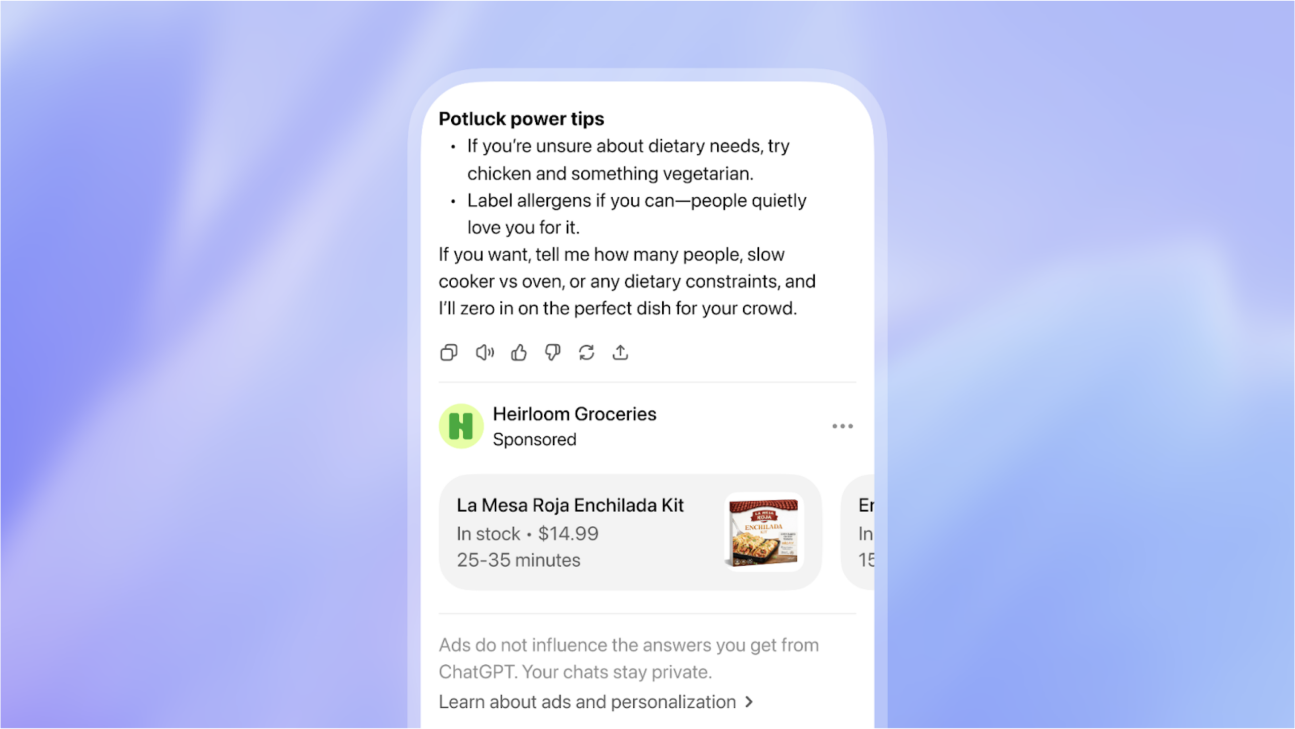
What early ChatGPT ads are showing us
Recent observations from the Adthena team, shared by their CMO Ashley Fletcher, offer one of the first real glimpses into how ChatGPT ads are actually working.
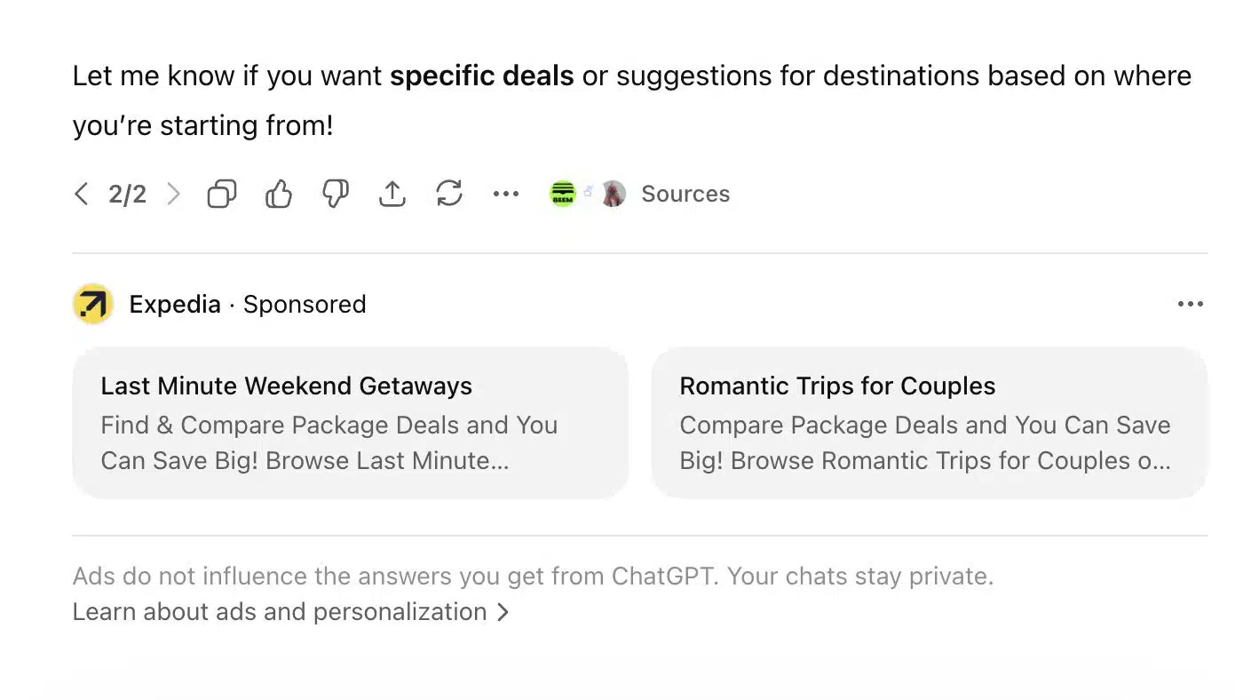
The initial assumption was that ads would appear later in a conversation, after multiple interactions. But early examples show something different.
Ads are appearing immediately—within the first response to a user’s prompt.
In one case, a simple question about booking a weekend trip triggered sponsored recommendations right away, placed directly within the answer.
This detail matters.
It shows that AI platforms are treating a single, well-formed prompt as high intent. The user does not need multiple steps to signal interest. The intent is already clear from the way the question is asked.
It also changes how we think about visibility.
You are no longer waiting for a user to refine their search. You have one moment—one prompt—where your brand can appear as a relevant solution.
That makes alignment with intent more important than ever.
If your messaging, content, or offering does not match the user’s exact need, you are unlikely to be included in that moment.
And if it does, you are no longer competing for attention. You are part of the answer.
Why ChatGPT ads perform differently
At first glance, ChatGPT ads may seem similar to traditional search ads. But the way they work and the way users interact with them is fundamentally different.
The difference comes down to context, intent, and attention.
They understand context, not just keywords
Search engines typically respond to a few words. AI tools respond to full questions, including the context behind them.
This means the platform understands not just what the user is asking, but why they are asking it. The recommendation that follows is shaped by that deeper understanding.
They appear at higher-intent moments
Users who turn to AI are often looking for solutions, not just information. Their questions are more specific, more detailed, and closer to a decision.
When a recommendation appears in that moment, it aligns with an active need rather than a passive search.
They reduce distraction
Traditional search results present multiple options at once. Users compare, evaluate, and often delay decisions.
In a conversational response, the experience is more focused. The recommendation is part of a guided answer, which simplifies decision-making.
They feel more like guidance than promotion
Because the recommendation is integrated into the response, it feels less like an interruption and more like a helpful suggestion.
This shift—from being one of many options to being part of a relevant answer—is what makes ChatGPT ads more aligned with how people now discover and choose solutions.
The strategy: from search engine marketing to answer-driven marketing
As user behavior shifts, marketing strategies need to evolve with it.
Traditional search engine marketing focuses on keywords and visibility. The goal is to appear when someone searches for a term.
Answer-driven marketing takes a different approach. It focuses on understanding the user’s situation and aligning your message with their intent.
This requires a shift in how you think about targeting, content, and messaging.
Intent-based targeting
Instead of targeting broad keywords, focus on real user problems and scenarios. Understand what the user is trying to solve and where they are in the decision process.
For example, a search for “CRM software” is broad. A question like “how do I manage leads for a small team” reflects a clear need and context.
Targeting this level of intent helps you reach users who are more likely to convert.
Answer-aligned landing pages
When a user clicks through from an AI recommendation, they expect clarity. The landing page should directly address the question that brought them there.
This means clear headlines, relevant content, and no unnecessary friction. The experience should feel like a continuation of the conversation, not a reset.
Conversational messaging
Messaging should focus on being helpful and specific. Instead of pushing urgency or promotions, explain how your product or service solves the user’s problem.
Simple, clear language works better than generic claims. The goal is to build trust by being useful at the moment it matters.
Together, these elements create a system that aligns with how people now search, ask, and decide.
High-intent queries in the AI era
As search behavior evolves, the way people ask questions is changing. Instead of short keywords, users are now writing full, detailed queries that reflect their exact situation.
These are often called natural language queries. More importantly, they reveal intent clearly.
Understanding these queries helps you align your content and ads with what users are actually trying to solve.
Comparison queries
Users compare options based on specific needs, not just features. For example, they may ask which tool works better for a particular use case or business size.
Pain-point queries
These questions focus on solving a problem. The user is looking for a way to fix something, improve performance, or reduce inefficiencies.
Solution-seeking queries
Here, the user is actively looking for recommendations. The question often includes context such as location, budget, or specific requirements.
These types of queries signal strong intent. They also provide more context, making it easier to deliver relevant answers.
For businesses, this means moving beyond keyword lists and focusing on real-world questions your audience is asking.
Measuring performance in AI-driven marketing
As marketing shifts toward AI-driven discovery, performance measurement also needs to evolve. Traditional metrics still matter, but they no longer tell the full story.
To understand what is working, you need to look at both outcomes and user behavior.
Track how effectively your traffic turns into leads or customers. High-intent traffic from AI platforms often results in stronger conversion performance.
Measure whether the leads you generate are relevant and aligned with your offering. Better targeting should result in more qualified inquiries.
Look at how users interact after arriving on your site. Time on page, navigation patterns, and repeat visits can indicate how well your content matches their intent.
AI-driven discovery may not always lead to immediate conversions. Track how it contributes across the customer journey, including return visits and multi-channel interactions.
Over time, these metrics help you understand not just visibility, but how effectively your marketing supports decision-making.
What does this mean for marketing strategy
This shift is not limited to one channel. It affects how your entire marketing system works.
SEO, your website, and campaigns can no longer operate separately. They need to align around user intent and work together as a connected system.
SEO needs to focus on real questions
Content should be built around the actual problems your audience is trying to solve, not just keywords. This improves both visibility and relevance in AI-driven discovery.
Your website needs to respond clearly
When users land on your site, they expect direct answers. Clear structure, focused messaging, and strong alignment with intent help improve conversions.
Campaigns need continuous optimization
Performance should be reviewed and refined regularly. This ensures your targeting, messaging, and spend remain aligned with what is working.
Together, these elements create a system that adapts to how users search, ask, and make decisions.
Businesses that build this alignment are better positioned to generate consistent leads and long-term growth.
Where this is heading
The way people discover and choose solutions is changing. Users are asking clearer questions and expecting direct answers.
This creates an opportunity for businesses that align with intent and respond with clarity.
By focusing on answer-driven marketing, you can improve how your SEO, website, and campaigns work together. This helps you reach users at the right moment and guide them toward a decision.
Over time, this approach builds a more reliable system for generating leads and driving growth.
Lead Generation Tips So Good They Should Be Illegal
If you’ve ever tried lead generation the honest way, you know it’s a lot like going to the gym. You do everything right, follow the rules, eat your vegetables, and still… nothing. Meanwhile, your competitor posts one mildly attractive offer and suddenly they’re swimming in leads like it’s monsoon season.
But what if – and hear this out – what if there existed a set of lead generation tactics so powerful, so dangerously effective, that they almost feel illegal? No, we’re not talking about shady hacks or black-hat tricks. We mean strategies so sharp and persuasive that you almost feel guilty using them.
This is your secret handbook. The one that good marketers pretend they don’t use, and every successful SEO expert in India keeps quietly tucked away behind their analytics dashboard.
The Hidden Psychology Behind “Illegal-Level” Lead Generation
The best lead generation doesn’t look like marketing. It looks like serendipity – the moment when a customer feels like your brand appeared exactly when they needed it.
That’s not luck.
That’s design.
And here’s how you replicate it.
1. The Ethical Honey Trap: Make Offers Too Good to Walk Away From
The fastest way to generate leads is to make people think they’re getting away with something. Offers that feel “too good” activate the part of the brain that loves winning.
Offer things like:
- Free audits so detailed they look like paid consultations
- Checklists so useful your competitors quietly download them
- Templates so plug-and-play they reduce work hours instantly
- Mini-courses that feel like they should cost ₹20,000
Brands run by a smart web design agency or an experienced web development company in Delhi already know this: information is the new currency. And the more value you give, the more leads you pull in like a magnet.
This isn’t generosity. It’s strategy.
2. The “Invisible Sales Funnel” Trick
Most businesses build funnels the size of a wedding mandap — loud, obvious, and over-decorated. But the most effective funnels? You can barely see them.
This is how the pros do it:
- A helpful blog that subtly solves your reader’s problem
- A CTA that doesn’t scream but gently says, “Want this done for you?”
- A landing page so personalized it feels hand-written
- A short form (because long forms are lead-killers)
This method is how every advanced website development company and SEO expert in India turns cold readers into boiling-hot buyers.
When your funnel feels invisible, the conversion becomes inevitable.
3. Stalking (The Good Kind): Behavioral Targeting
Relax, this is perfectly legal. And extremely effective.
You can’t generate great leads without understanding how people behave:
- Where they scroll
- What they click
- Which words they react to
- What they abandon
If your website doesn’t track user behavior, you’re marketing with a blindfold. Any web development company in India worth hiring knows this — analytics is not optional.
Once you know what visitors want, you can tailor your offer like it was designed for them personally. Because, in a way, it was.
4. The Forbidden Fruit Strategy: Create Curiosity That Demands a Click
No, not clickbait.
Something far more potent: curiosity architecture.
A few examples:
- “The 37-point checklist we never share publicly… except today”
- “Why 92% of your leads disappear after the first click”
- “The mistake costing you 40% conversions — fix this now”
This is the exact psychological framework top lead generation services use to bait users into taking action — and it works because humans cannot ignore curiosity gaps.
5. Use “Ethical Bribery” to Force Engagement
Bribery? Illegal.
Ethical bribery? Completely fair game.
Offer your audience something so instantly useful that clicking feels like a reward:
- A downloadable strategy sheet
- A time-saving automation tool
- A free homepage SEO score
- A highly optimized landing page template
Think about it: every web design company in Delhi uses this tactic without calling it by its real name. It works because people love receiving value before committing.
6. The Social Proof Avalanche
Customers trust people more than brands.
They trust numbers more than promises.
And they trust stories more than ads.
So create a wall of social proof so overwhelming it feels almost unfair:
- Video testimonials
- Client screenshots
- Before/after results
- Case studies that feel like movie scripts
- Industry recognitions
If you’ve worked with a recognizable brand, mention it. If you’ve achieved measurable results, highlight them. When you make yourself look impossible to doubt, your leads multiply instantly.
7. The “I Know You Better Than You Know Yourself” Landing Page
The highest converting landing pages make the visitor feel exposed.
Like you read their diary.
Like you stalked their browsing history.
This is how the greats do it:
- Describe the reader’s problem better than they can
- Show them you understand precisely what they’re struggling with
- Offer the exact solution they were Googling at 2 a.m.
This is a level of personalization every seasoned SEO expert India practices religiously.
8. The “Delayed Yes” Follow-Up Trick
Most businesses follow up once… maybe twice… then give up.
But the secret?
Real conversions happen after the 5th–8th follow-up.
Call it persistence.
Call it being annoying.
Call it whatever you want.
The truth is simple:
The more you follow up without being pushy, the more leads you convert.
This is why every successful SEO company in India uses automated email flows, retargeting ads, and drip sequences that keep leads warm — without being creepy.
The Dark Magic of Story-Based Lead Generation
Stories bypass logic and go straight to emotion — and emotional leads convert faster.
Your brand story should:
- Create connection
- Build trust
- Trigger desire
- Reveal transformation
Every major website development company leverages storytelling to boost conversions because narrative is the closest thing marketing has to mind control… legally speaking.
Final Thoughts: Lead Gen That Feels Illegal Usually Just Means It Works
Here’s the uncomfortable truth:
The best lead generation doesn’t rely on shiny software, big budgets, or complex automation systems.
It relies on human psychology, irresistible offers, perfect timing, and strategic follow-ups.
If done right, it almost feels unfair — like you’re hacking into the customer’s brain and flipping a switch marked “YES.”
But guess what?
It’s not illegal.
It’s just smart.
And now you know the playbook.

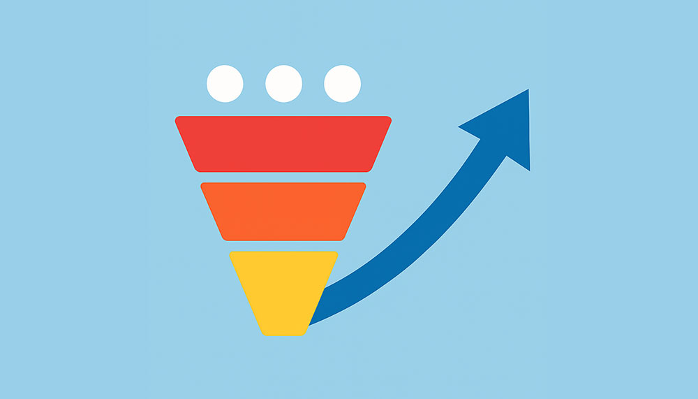
Need More Leads? Discover How ICO WebTech’s Lead Generation Solutions Can Skyrocket Your Business
Generating high-quality leads is one of the biggest challenges businesses face today. You might be running campaigns, posting on social media, or even investing in paid ads — yet somehow, the leads you get don’t convert. They’re either unqualified, uninterested, or simply disappear after the first click. If this sounds familiar, you’re not alone.
At ICO WebTech Pvt. Ltd., we’ve spent over a decade helping businesses overcome this exact problem. As a leading web development company in Delhi and a trusted web design agency, we understand that successful lead generation isn’t about chasing clicks — it’s about creating systems that attract, engage, and convert the right audience into loyal customers.
In this article, we’ll show you how ICO WebTech’s proven lead generation solutions can transform your marketing results — and how one of our clients saw a surge in qualified leads within weeks of implementation.
The Challenge: Why Businesses Struggle to Generate Quality Leads
Let’s start with the truth — generating leads isn’t the problem. Generating quality leads is. Many businesses rely on random tactics instead of building a cohesive strategy. They spend on ads, post on social media, send newsletters, and wait for magic to happen. Unfortunately, that approach no longer works in today’s crowded digital landscape.
Here’s why:
- Unoptimized landing pages: Visitors arrive but don’t convert because your page doesn’t grab attention or inspire trust.
- Weak value proposition: Your offer doesn’t clearly explain how you solve the customer’s problem.
- No conversion funnel: There’s no defined journey guiding the visitor from awareness to action.
- Generic targeting: You’re reaching a broad audience instead of focusing on your ideal customers.
- Inconsistent follow-ups: Many leads drop off because of a lack of nurturing or automated engagement.
At ICO WebTech, we approach lead generation as both an art and a science — built on strategy, psychology, design, and data.
The ICO WebTech Solution: Smarter, Data-Driven Lead Generation
We don’t believe in cookie-cutter marketing. Every business is unique — its audience, goals, and challenges differ. That’s why our lead generation solutions are customized for each client, combining cutting-edge technology with human insight to create measurable results.
Our process begins with understanding your target audience, analyzing your existing marketing funnel, and identifying gaps in your digital presence. From there, we create a holistic system that includes landing page optimization, compelling lead magnets, high-converting funnels, and automation tools that nurture leads until they’re ready to buy.
What Makes Our Approach Different?
- Strategic planning: Every campaign starts with research — your audience, competitors, and conversion goals.
- Human-centered design: As a top web design company in Delhi, we craft user experiences that inspire trust and encourage action.
- Advanced analytics: We use real-time data to measure performance, tweak campaigns, and improve ROI continuously.
- End-to-end support: From SEO and web development to CRM integration and automation — we handle it all in-house.
Our mission is simple: to help you spend less time chasing leads and more time closing deals.
Step 1: Landing Page Optimization — Your First Conversion Point
Your landing page is the digital equivalent of a first impression. If it doesn’t capture interest within a few seconds, potential leads leave. Most businesses lose 70% of traffic simply because their landing pages aren’t optimized for conversion.
At ICO WebTech, our experts in website development company in India services design and optimize landing pages that don’t just look good — they perform. Every element is crafted to guide the visitor toward one clear action: conversion.
Our Optimization Process Includes:
- Headline clarity: Crafting headlines that immediately communicate value.
- Visual hierarchy: Using color, contrast, and placement to draw attention to key CTAs.
- Compelling copy: Writing persuasive yet concise content that addresses pain points.
- Trust elements: Adding testimonials, certifications, and data-driven proof.
- Speed and usability: Ensuring fast loading times and seamless mobile experience.
When your landing page aligns with user intent and provides genuine value, it becomes your strongest conversion tool.
Step 2: Lead Magnets That Attract Your Ideal Audience
Think of lead magnets as your digital handshake — an exchange of value that builds trust. Whether it’s an eBook, free demo, checklist, or webinar, a well-crafted lead magnet can turn casual visitors into interested prospects.
ICO WebTech’s lead generation specialists design lead magnets tailored to your audience’s needs. Our in-house team — including designers, writers, and strategists — ensures each asset delivers instant value and positions your brand as an authority in your field.
Examples of High-Performing Lead Magnets We Create:
- Free industry reports and guides (e.g., “10 Web Design Mistakes That Kill Conversions”)
- Interactive calculators or tools related to your business services
- Exclusive webinars featuring insights from our SEO experts in India
- Free consultations for businesses looking for a web development company in Delhi
By offering something useful, you attract leads who are genuinely interested in your services — not just people browsing for freebies.
Step 3: Conversion Funnels That Turn Interest into Action
A conversion funnel is the structured path that transforms awareness into action. It’s how we guide potential customers from their first interaction with your brand to becoming paying clients.
Our website development company team designs custom funnels that are psychologically persuasive and data-optimized. Each step — from ad to landing page to follow-up — is strategically designed to nurture intent and reduce friction.
Our Conversion Funnel Includes:
- Awareness: Using SEO, ads, and social media to attract traffic.
- Consideration: Providing lead magnets and case studies to build trust.
- Decision: Offering limited-time deals or personalized consultations.
- Action: Streamlining forms and CTAs for effortless conversion.
We also implement automation workflows that keep your leads engaged post-conversion — ensuring no opportunity slips through the cracks.
Step 4: SEO and Content Alignment for Sustained Growth
No lead generation system is complete without strong organic visibility. Our SEO experts in India ensure your campaigns attract consistent, long-term traffic through strategic optimization.
Our SEO-Driven Lead Generation Approach:
- Keyword research targeting high-intent searches (like “website development company in Delhi”)
- On-page and technical SEO to improve discoverability
- Content creation that educates and nurtures potential leads
- Backlink building through genuine industry partnerships
SEO and lead generation go hand in hand. While one brings in potential customers, the other ensures they find your business in the first place.
Step 5: Tracking, Analytics, and Continuous Optimization
At ICO WebTech, we believe what gets measured, gets improved. Every lead generation campaign we run is backed by real-time analytics. We track conversion rates, bounce rates, heatmaps, and user behavior to refine performance continuously.
Our team provides clients with transparent reports that highlight:
- Lead quality metrics
- Cost per acquisition (CPA)
- ROI per campaign
- Funnel conversion stages
This data-driven approach allows us to scale what works and eliminate what doesn’t — maximizing your return on investment.
Client Success Story: Turning Traffic into Tangible Leads
One of our clients — a mid-sized website development company in Delhi — approached us with a familiar problem: plenty of traffic, but few conversions. Despite investing in digital ads and SEO, their leads were either irrelevant or unresponsive.
Our team conducted a detailed funnel audit and discovered multiple gaps:
- Their landing pages were cluttered and lacked clear CTAs.
- They had no lead magnets or automated nurturing system.
- Follow-up emails were inconsistent and generic.
We implemented a customized lead generation strategy, including:
- A new landing page optimized for conversions with strong visuals and testimonials.
- A downloadable “Free Website Performance Checklist” as a lead magnet.
- Automated email sequences that nurtured leads through a 7-day funnel.
Within 45 days, the client saw:
- 60% increase in qualified leads.
- 35% reduction in cost per acquisition.
- 2x increase in conversion rate from ad traffic.
More importantly, the leads were now from their ideal customer segment — businesses actively looking for website development and digital marketing services.
“ICO WebTech helped us turn website visitors into paying customers. Their team understood our audience and built a lead generation system that finally works. We now get consistent, qualified leads every week.”
— Client Testimonial
Why Businesses Trust ICO WebTech for Lead Generation
We’re not just another marketing company. We’re your partners in growth. Our team combines the technical expertise of a website development company in India with the strategic insight of a digital marketing agency — offering complete end-to-end solutions.
Over the years, we’ve worked with businesses across industries — from startups to established enterprises — helping them generate leads that truly matter.
What Sets ICO WebTech Apart:
- Experience: 14+ years in web design, development, and digital marketing.
- Expertise: A dedicated team of designers, developers, and SEO experts in India.
- Transparency: Real-time reporting and complete campaign visibility.
- Customization: No templates — every strategy is tailored to your business.
- Results: Proven success stories and measurable ROI improvements.
Let’s Build Your Lead Engine
If your business is struggling to convert traffic into leads, it’s time to rethink your strategy. With ICO WebTech’s comprehensive lead generation solutions, you can finally build a system that works — attracting the right customers, automating engagement, and driving growth sustainably.
Our approach isn’t about quick wins; it’s about creating lasting impact. Through smart design, focused targeting, and data-driven optimization, we help you generate leads that fuel long-term business success.
Get Started Today
Contact ICO WebTech Pvt. Ltd. — your trusted web development company in Delhi — and discover how we can transform your digital marketing efforts into a consistent stream of qualified leads.
Ready to grow? Let’s build your lead generation engine together.
Schedule Your Free Consultation
Talk to our experts today to explore customized solutions for your business. Let’s turn clicks into clients — and ideas into measurable results.