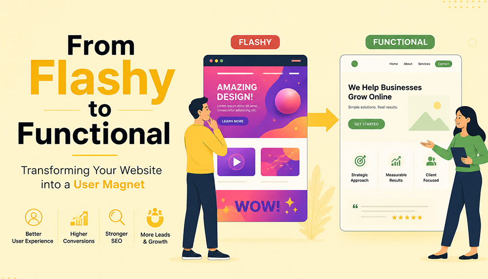
From Flashy to Functional: Transforming Your Website into a User Magnet
In the early days of the internet, a flashy website was often enough to impress visitors. Bright colors, animations, auto-playing media, and complex layouts were seen as signs of creativity and innovation. But times have changed. Today’s users are smarter, faster, and far less patient. A visually overloaded website is no longer impressive—it’s exhausting.
If your website looks stunning but fails to convert visitors into customers, then it’s not doing its job. The modern approach to web design focuses on functionality, usability, speed, and experience. Businesses that understand this shift are the ones that win.
This article explores how to transform your website from merely flashy to genuinely functional—and ultimately turn it into a powerful user magnet.
The Problem with “Flashy” Websites
At first glance, a flashy website can feel impressive. Bright visuals, animations, sliders, and interactive effects often give the illusion of sophistication and creativity. But here’s the reality—what looks exciting to a designer can quickly become frustrating for a user.
Today’s internet users are not browsing casually—they’re searching with intent. They want answers, solutions, and clarity within seconds. If your website slows them down or overwhelms them, they won’t admire the design—they’ll abandon it.
Flashy websites often prioritize aesthetics over usability. While they may look appealing initially, they tend to create friction in the user journey. And in the digital world, even small friction points can lead to big losses in engagement and conversions.
Let’s take a closer look at the common problems:
- Slow loading times: Heavy animations, large images, auto-playing videos, and complex scripts can significantly slow down your website. Users today expect pages to load almost instantly. Even a delay of a few seconds can cause frustration and increase bounce rates.
- Confusing navigation structures: Over-designed menus, hidden navigation elements, or too many options can leave users unsure of where to go next. When visitors feel lost, they rarely try to figure things out—they simply exit.
- Distracting visual elements: Too many moving parts—sliders, pop-ups, flashing banners—can shift attention away from what actually matters: your message. Instead of guiding users, these elements overwhelm them.
- Poor mobile responsiveness: A design that looks great on a desktop may completely break on a mobile device if not optimized properly. With the majority of users browsing on smartphones, this is a critical flaw.
- Low accessibility: Flash-heavy designs often ignore accessibility standards. Poor contrast, unreadable fonts, or non-intuitive layouts can make it difficult for users with different abilities to interact with your website.
Think about your own browsing habits. When you land on a website that takes too long to load or feels complicated, what do you do? Most likely, you hit the back button. That’s exactly what your visitors are doing too.
Modern users expect instant gratification. They want fast, smooth, and effortless experiences. If your website fails to deliver that within the first few seconds, you’ve already lost their attention—and potentially their business.
This is why businesses today are shifting their focus from “looking impressive” to “working effectively.” A professional Website Designing company in India understands this balance. Instead of adding unnecessary elements, they focus on creating clean, user-friendly designs that guide visitors naturally and help businesses achieve real results.
Because in the end, a website isn’t meant to just impress—it’s meant to perform.
Understanding the Shift: From Design to Experience
There was a time when website design was judged almost entirely by how it looked. If it was visually appealing, colorful, and “different,” it was considered successful. But that definition has evolved—dramatically.
Today, design alone is not enough. A website can look stunning and still fail miserably if it doesn’t deliver a smooth, intuitive experience. This is where the shift happens—from design-centric thinking to experience-centric thinking.
In simple terms, it’s no longer just about how your website looks. It’s about how it feels to use.
When a user lands on your website, they are not there to admire your design skills. They are there with a purpose—maybe to learn something, compare options, or make a purchase. The faster and easier you help them achieve that goal, the more successful your website becomes.
This is why User Experience (UX) and User Interface (UI) design have become the backbone of modern websites. These disciplines focus on understanding user behavior, removing friction, and creating seamless interactions.
Instead of asking “Does it look good?”, businesses now need to ask deeper, more practical questions:
- Is it easy to use? Can a first-time visitor navigate your website without confusion, or do they have to think too much before taking action?
- Can users find what they need quickly? In a world where attention spans are shrinking, every second matters. If users have to dig through multiple pages to find basic information, they won’t stick around.
- Does it guide users toward action? A good website doesn’t just present information—it gently leads users toward the next step, whether that’s filling out a form, making a purchase, or contacting your team.
- Does it work seamlessly on all devices? Your audience is browsing on phones, tablets, laptops, and everything in between. A consistent and smooth experience across all devices is no longer optional.
Think of your website like a physical store. A beautifully designed store with confusing layouts, hard-to-find products, and unhelpful staff will struggle to make sales. On the other hand, a clean, well-organized store that makes shopping easy will naturally attract and retain customers.
The same principle applies online.
Functionality doesn’t mean sacrificing beauty—it means giving beauty a purpose. Every design element, from colors to typography to spacing, should support usability rather than distract from it.
This is where experienced professionals, such as a Website Designing company in India, bring real value. They don’t just design for visual appeal—they design for human behavior, ensuring that every click, scroll, and interaction feels natural and meaningful.
Because at the end of the day, users don’t remember how “cool” your website looked. They remember how easy it was to use—and whether it helped them get what they came for.
Key Elements of a Functional Website
A functional website doesn’t happen by accident—it’s the result of thoughtful planning, user understanding, and smart design decisions. Every element on your website should have a purpose. When all these elements work together, they create an experience that feels smooth, intuitive, and satisfying for the user.
Let’s break down the core elements that truly make a website functional—not just visually appealing, but genuinely effective.
1. Clear and Intuitive Navigation
Your website should feel effortless to explore. A visitor should land on your homepage and instantly understand where to go next—without thinking too hard. The moment users feel confused, they start losing trust.
Think of navigation as a roadmap. If the directions aren’t clear, people won’t keep wandering—they’ll simply leave and find another destination.
A well-structured navigation system includes:
- Simple menus with clear labels: Avoid clever or vague naming. “Services,” “About,” and “Contact” may sound basic, but they work because users instantly recognize them.
- Logical page hierarchy: Your pages should be organized in a way that makes sense. Important information should never be buried deep within multiple clicks.
- Easy access to key pages: High-priority pages like pricing, services, or contact information should always be easy to find—preferably within one or two clicks.
If users get lost, they leave. It’s that simple. Good navigation doesn’t draw attention to itself—it just works seamlessly in the background.
2. Fast Loading Speed
Speed is one of the most critical factors in user experience. No matter how beautiful your website is, if it takes too long to load, users won’t wait around to see it.
We live in a world of instant results. A delay of even one second can feel like an eternity—and that’s often enough to lose a potential customer.
To improve your website’s speed:
- Optimize images: Large, uncompressed images are one of the biggest causes of slow websites. Proper optimization keeps quality high while reducing load time.
- Use efficient code: Clean, streamlined coding reduces unnecessary load on your website.
- Leverage caching: Caching helps store data so returning users can access your site faster.
- Choose reliable hosting: Your hosting provider plays a major role in your website’s performance. A slow server means a slow website—no matter what you do.
A skilled Website Designing company in India understands that performance is not an afterthought. They build speed optimization into the foundation of your website from the very beginning.
3. Mobile Responsiveness
Take a moment to think about how often you use your phone to browse the internet. Now imagine your website being viewed on that small screen. Does it still look clean? Is it easy to navigate? Can users interact with it comfortably?
With mobile users now dominating web traffic, your website must perform flawlessly across all screen sizes. A responsive design ensures that your website adapts automatically—no matter what device is being used.
This includes:
- Content that adjusts smoothly: Images, text, and layouts should resize and rearrange themselves for different screen sizes.
- Tap-friendly buttons: Buttons should be large enough and spaced properly so users can easily tap them without frustration.
- Readable text: Users shouldn’t have to zoom in just to read your content. Proper font sizing is essential.
A mobile-first approach is no longer optional—it’s the standard. If your website doesn’t work well on mobile, you’re likely losing a significant portion of your audience.
4. Strong Visual Hierarchy
When users land on your website, they don’t read every word—they scan. Your design should guide their eyes naturally, helping them understand what’s important within seconds.
This is where visual hierarchy comes in. It’s the art of organizing content in a way that leads users through your website effortlessly.
You can achieve this through:
- Proper use of headings: Headlines should stand out and clearly communicate key messages.
- Contrasting colors: Important elements like call-to-action buttons should be visually distinct.
- Whitespace: Giving elements room to breathe makes your website easier to read and less overwhelming.
- Strategic placement: Key information should be positioned where users naturally look first.
A clean, well-structured layout often outperforms a cluttered design. Simplicity doesn’t mean boring—it means effective.
5. Compelling and Clear Content
Design might bring users in, but content is what keeps them there—and ultimately convinces them to take action.
Your messaging should speak directly to your audience. It should answer their questions, address their concerns, and clearly explain how you can help them.
Effective website content is:
- Clear and concise: Avoid unnecessary jargon or long-winded explanations. Get to the point quickly.
- User-focused: Instead of talking only about your business, focus on what the user gains.
- Easy to scan: Use short paragraphs, bullet points, and headings to make content digestible.
Within a few seconds of landing on your website, visitors should understand exactly what you offer and why it matters to them. If they have to guess, you’ve already lost them.
When all these elements come together—navigation, speed, responsiveness, hierarchy, and content—you don’t just have a website. You have a powerful user experience that attracts, engages, and converts.
Why Functionality Drives Conversions
At the end of the day, your website has a job to do. Whether it’s generating leads, selling products, or encouraging inquiries—everything comes down to conversions. And here’s the truth many businesses overlook: people don’t convert because your website looks good… they convert because it feels easy.
A functional website removes friction from the user journey. It makes every step—from landing on the page to taking action—feel natural and effortless. When users don’t have to struggle, think too much, or second-guess their decisions, they are far more likely to move forward.
Think of it like walking into a well-organized store. You can quickly find what you need, understand the pricing, and check out without confusion. Compare that to a cluttered store where nothing is clearly labeled—you’d probably walk out. The same psychology applies to your website.
Functionality builds trust. And trust is the foundation of every conversion.
When users can easily navigate your website, find relevant information, and complete actions without frustration, they begin to feel confident in your brand. On the other hand, even small issues—like a confusing layout or a slow-loading page—can create doubt and push them away.
A conversion-focused website is intentionally designed to guide users toward action. It doesn’t leave things to chance. Every element plays a role in helping users take the next step.
Here’s what that looks like in practice:
- Clear call-to-action (CTA) buttons: Your CTAs should stand out and communicate exactly what users need to do next—whether it’s “Get a Quote,” “Book a Demo,” or “Buy Now.” There should be no confusion or hesitation.
- Minimal distractions: Too many pop-ups, animations, or competing elements can overwhelm users and dilute your message. A clean, focused design keeps attention where it matters most.
- Trust signals: People are naturally cautious online. Reviews, testimonials, case studies, certifications, and client logos help reassure users that they’re making the right choice.
- Simplified forms and checkout processes: The more steps you add, the more users you lose. Shorter forms, fewer fields, and a smooth checkout experience can significantly increase conversions.
It’s important to understand that users don’t want to “work” to interact with your website. The easier you make things for them, the more likely they are to take action.
This is why businesses increasingly partner with a Website Designing company in India that focuses on performance-driven design. Instead of adding unnecessary features, they refine the user journey—removing obstacles and guiding users toward meaningful actions.
Every element on your website should have a clear purpose. If something doesn’t contribute to the user experience or support conversions, it’s likely doing more harm than good.
Because in the digital world, simplicity isn’t just a design choice—it’s a competitive advantage.
The Role of User Psychology
Behind every click, scroll, and decision on your website, there’s a human mind at work. And that mind doesn’t behave randomly—it follows patterns. Understanding these patterns is what separates an average website from one that truly connects with users.
One of the biggest misconceptions in web design is assuming that users carefully read everything on a page. In reality, they don’t. People scan. They skim through headings, glance at visuals, and look for familiar cues that help them quickly understand what to do next.
This means your website isn’t just a collection of pages—it’s an experience shaped by human behavior. The more you align your design with how people naturally think and interact, the more effective your website becomes.
Let’s explore some key psychological principles that influence user behavior:
- Familiarity: Users feel comfortable with what they already recognize. This is why most successful websites follow certain standard patterns—like having a logo at the top left, navigation at the top, and contact information easily accessible. When you stick to familiar structures, users don’t have to “learn” how to use your website—they already know.
- Clarity: The human brain prefers simplicity. When a website is cluttered or overly complex, it increases cognitive load—meaning users have to work harder to process information. And when things feel difficult, people tend to give up. Clean layouts, simple messaging, and clear pathways reduce this mental effort and keep users engaged.
- Trust: First impressions happen in seconds. A clean, professional-looking website instantly builds credibility, while a messy or outdated design raises doubts. Elements like consistent branding, high-quality visuals, testimonials, and secure browsing indicators all contribute to building trust.
- Urgency: People are more likely to take action when they feel a sense of urgency. Strategic prompts like limited-time offers, countdowns, or phrases such as “Only a few spots left” can encourage users to act sooner rather than later. When used thoughtfully, urgency can significantly improve conversions without feeling pushy.
Think about your own online behavior. When you visit a website, you instinctively look for certain things—clear headings, easy navigation, and quick answers. If those elements are missing, frustration builds almost instantly.
This is why understanding user psychology isn’t optional—it’s essential. A website that aligns with human behavior feels intuitive, trustworthy, and easy to use.
A modern Website Designing company in India doesn’t just focus on visuals or code—they dive deeper into how users think, what motivates them, and what stops them from taking action. By combining design expertise with behavioral insights, they create websites that don’t just look good—they feel right.
Because when your website speaks the language of your users’ minds, engagement and conversions naturally follow.
Common Mistakes to Avoid
Sometimes, the biggest problems on a website aren’t what’s missing—they’re what’s unnecessarily added. Many businesses invest time and money into their websites, yet unknowingly make decisions that hurt performance instead of improving it.
The tricky part? These mistakes often come from good intentions—trying to impress users, add more information, or stand out from competitors. But in reality, they end up doing the opposite.
Let’s break down some of the most common website mistakes and why they matter:
- Overusing animations and effects: Animations can enhance a website when used sparingly, but too many moving elements can overwhelm users. Sliders, pop-ups, hover effects, and auto-playing media can quickly turn from engaging to distracting. Instead of focusing on your message, users get caught up in visual noise—and often leave before taking any action.
- Ignoring mobile users: This is one of the most costly mistakes today. A website that works perfectly on desktop but feels clunky on mobile is guaranteed to lose a large portion of its audience. Tiny buttons, misaligned content, and slow mobile performance create frustration and drive users away almost instantly.
- Cluttering pages with too much information: It’s tempting to put everything on one page—every service, every feature, every detail. But more information doesn’t always mean better communication. When pages are overcrowded, users don’t know where to focus. Instead of reading more, they end up reading nothing at all.
- Using unclear or generic CTAs: Call-to-action buttons like “Click Here” or “Submit” don’t tell users what they’re getting. Strong CTAs are specific and action-driven—like “Get Your Free Quote” or “Book a Consultation.” Clarity here can make a huge difference in conversion rates.
- Neglecting SEO fundamentals: A beautiful website is useless if no one can find it. Ignoring SEO basics—like proper headings, meta tags, keyword optimization, and page speed—limits your visibility on search engines. Without traffic, even the best-designed website won’t deliver results.
If you look closely, all these mistakes have one thing in common: they prioritize business preferences over user needs. And that’s where things start to go wrong.
The good news is that these issues are completely fixable. In fact, addressing even a few of them can lead to noticeable improvements in user engagement, time on site, and conversions.
This is why many businesses turn to an experienced Website Designing company in India to audit and refine their websites. With a fresh perspective and user-focused approach, they can identify hidden issues and transform your website into something far more effective.
Because sometimes, improving your website isn’t about adding more—it’s about removing what’s getting in the way.
Balancing Aesthetics and Functionality
There’s a common misconception in web design—that you have to choose between a website that looks beautiful and one that works well. In reality, the most successful websites don’t pick one over the other. They strike a balance.
Visual appeal matters. It creates the first impression, sets the tone for your brand, and captures attention. But if that visual appeal comes at the cost of usability, it quickly loses its value. On the other hand, a purely functional website that lacks personality can feel dull and forgettable.
The real goal is to bring both together—where design enhances functionality, not competes with it.
Think of your website like a well-designed workspace. It should look inviting and professional, but more importantly, everything should be placed exactly where it’s needed. Nothing should feel out of place, unnecessary, or confusing.
Here are some practical ways to achieve that balance:
- Using a consistent color palette: Colors play a huge role in how users perceive your brand. A consistent palette creates a sense of harmony and professionalism. It also helps guide user attention—for example, using a specific color for buttons makes them instantly recognizable.
- Choosing readable fonts: Stylish typography can enhance your design, but readability should always come first. If users have to strain their eyes to read your content, they won’t stick around. Clean, simple fonts with proper spacing make a big difference in user comfort.
- Maintaining visual consistency: Consistency builds familiarity and trust. When elements like buttons, headings, spacing, and layouts follow a uniform style across your website, users feel more comfortable navigating it. Inconsistency, on the other hand, creates confusion and disrupts the experience.
- Using images purposefully: Images should support your message—not just fill space. High-quality visuals can enhance storytelling, explain concepts, and create emotional connections. But irrelevant or excessive images can slow down your website and distract users from your core message.
It’s also important to remember that simplicity is powerful. A clean design with thoughtful spacing and focused content often feels more premium than a cluttered, over-designed layout.
This is where experienced professionals, such as a Website Designing company in India, truly make a difference. They understand how to blend creativity with usability—ensuring that every design choice serves a purpose and contributes to the overall experience.
At its core, design is not the end goal—it’s a tool. A tool to communicate, guide, and engage your users. When used wisely, it doesn’t just make your website look better—it makes it work better.
And that’s the kind of balance that turns visitors into loyal users.
How SEO and Functionality Work Together
SEO and website functionality are often treated as two separate things—but in reality, they are deeply connected. You can’t build a strong online presence by focusing on just one. The websites that perform best today are the ones where SEO and user experience work hand in hand.
Search engines like Google are no longer just scanning your website for keywords. They are analyzing how users interact with it. Do people stay on your site? Do they explore multiple pages? Or do they leave within seconds? These behaviors send powerful signals about the quality of your website.
In simple terms, search engines want to recommend websites that users actually enjoy using. And that’s exactly where functionality comes into play.
A functional website naturally supports SEO because it creates a better experience for users—and when users are happy, search engines take notice.
Here’s how functionality directly impacts your SEO performance:
- Improving page speed: Fast-loading websites not only keep users engaged but are also favored by search engines. Speed is a ranking factor, and even small improvements can make a noticeable difference in your visibility.
- Enhancing mobile usability: With mobile-first indexing, search engines prioritize how your website performs on mobile devices. A responsive, mobile-friendly design ensures that your site ranks better and reaches a wider audience.
- Reducing bounce rates: When users land on your website and immediately leave, it signals that something isn’t working—whether it’s slow speed, poor design, or irrelevant content. A functional website keeps users engaged and encourages them to stay longer.
- Encouraging longer session durations: When your website is easy to navigate and provides valuable content, users naturally spend more time exploring it. This increased engagement sends positive signals to search engines about your site’s relevance and quality.
It’s important to understand that SEO is no longer just about ranking—it’s about retention. Getting users to your website is only half the battle. Keeping them there is what truly makes the difference.
This is why businesses are increasingly working with a Website Designing company in India that understands both SEO and user experience. Instead of treating them as separate strategies, they integrate them into a unified approach—building websites that are not only easy to find but also enjoyable to use.
When your website is fast, intuitive, and user-friendly, visitors stay longer, interact more, and trust your brand. And when that happens consistently, search engines recognize your website as valuable—and reward it with better rankings.
Because in today’s digital landscape, the formula is simple: when users love your website, search engines do too.
Steps to Transform Your Website
Transforming your website from flashy to functional isn’t about making random changes—it’s about taking a structured, thoughtful approach. The goal is to create a website that not only looks better, but works better for your users and your business.
Think of it as a continuous improvement process rather than a one-time redesign. Every step you take should bring you closer to a smoother, more effective user experience.
1. Audit Your Current Website
Before making any changes, you need to understand where you currently stand. A website audit helps you uncover what’s working well and what’s holding you back.
Start by looking at real user data:
- User behavior: How do visitors interact with your site? Which pages do they visit most? Where do they drop off?
- Bounce rates: Are users leaving quickly after landing on certain pages? If yes, those pages may have usability or content issues.
- Conversion data: Which pages are driving results, and which ones are not?
You can also review your website from a user’s perspective. Try navigating it as if you were a first-time visitor. Is everything clear and easy to find? Or does it feel confusing?
This step lays the foundation for everything that follows.
2. Simplify the Design
Once you know what’s not working, the next step is to simplify. Many websites try to do too much—and end up overwhelming users.
Simplification doesn’t mean removing value—it means removing distractions.
Focus on:
- Eliminating unnecessary animations and visual clutter
- Reducing the number of competing elements on each page
- Highlighting key messages and actions
Ask yourself: “Does this element help the user, or does it just look nice?” If it doesn’t serve a purpose, it probably doesn’t belong.
A clean, focused design makes it easier for users to understand your website—and take action.
3. Improve Performance
Performance is a critical part of functionality. Even the best-designed website will fail if it’s slow or unresponsive.
Improving performance involves both technical and design-related optimizations:
- Speed optimization: Compress images, minimize code, and use caching to reduce load times.
- Responsive design: Ensure your website works smoothly across all devices and screen sizes.
- Technical improvements: Fix broken links, optimize server response times, and ensure clean coding practices.
This is often where working with a Website Designing company in India can make a big difference. Their technical expertise ensures that your website performs efficiently without compromising on design.
4. Enhance Content Strategy
Your website’s content is what communicates your value to users. If your messaging is unclear or unfocused, even the best design won’t help.
Shift your content strategy from “what we want to say” to “what users need to hear.”
Effective content should:
- Address user problems and offer solutions
- Be easy to read and scan
- Clearly explain your services or products
- Guide users toward the next step
Every page should have a purpose—and every piece of content should support that purpose.
5. Test and Optimize Continuously
Your website is never truly “finished.” User behavior evolves, trends change, and new opportunities emerge. That’s why ongoing testing and optimization are essential.
Use tools and techniques like:
- A/B testing: Compare different versions of a page to see what performs better
- Analytics: Track user behavior, engagement, and conversions
- Heatmaps: Understand where users click, scroll, and focus their attention
Small improvements over time can lead to significant results. Even minor tweaks—like changing a button color or simplifying a form—can have a noticeable impact on conversions.
The key is to stay curious, keep testing, and continuously refine your website based on real data.
When you follow these steps, you’re not just redesigning your website—you’re transforming it into a powerful tool that attracts users, engages them, and drives meaningful results.
The Importance of Professional Expertise
Transforming a website isn’t just about changing colors, adding new sections, or updating a layout—it’s a much deeper process. It requires a careful balance of design, technology, user psychology, and marketing strategy. And this is exactly where many businesses struggle when trying to handle everything on their own.
A website today is not just a digital brochure—it’s a performance-driven asset. It needs to attract visitors, engage them, guide them, and ultimately convert them. Achieving all of that requires more than creativity—it requires expertise.
This is why many businesses choose to partner with a professional Website Designing company in India. Instead of relying on guesswork or trial-and-error, they gain access to a team that understands how to build websites that actually work.
Let’s look at what such expertise brings to the table:
- Industry experience: Professionals who have worked across different industries understand what works and what doesn’t. They’ve seen trends evolve, tested strategies, and know how to avoid common pitfalls. This experience helps them make informed decisions that save time and deliver better results.
- Technical expertise: From coding and performance optimization to responsiveness and integrations, there’s a lot happening behind the scenes of a functional website. A skilled team ensures that everything runs smoothly—so users never have to think about the technical side at all.
- Strategic thinking: A great website isn’t built randomly—it’s planned. Professionals approach design with a clear strategy in mind, aligning your website with your business goals. Every element, from layout to content placement, is designed to support conversions and user engagement.
- Cost-effective solutions: While hiring experts may seem like an added expense, it often saves money in the long run. Avoiding mistakes, reducing redesigns, and getting things right the first time leads to better ROI and fewer ongoing issues.
Another key advantage is perspective. When you’re deeply involved in your own business, it’s easy to overlook usability issues or assume things are “obvious” to users. A professional team brings an outside perspective—seeing your website the way your visitors do.
They don’t just ask, “Does this look good?” They ask, “Does this work?”
And that shift in thinking makes all the difference.
The result is a website that doesn’t just impress visually—it performs consistently. It loads faster, guides users better, communicates clearly, and converts more effectively.
Because in today’s competitive digital space, a good-looking website is no longer enough. You need a website that delivers results—and that’s exactly what professional expertise helps you achieve.
Real-World Impact of Functional Design
When businesses shift their focus from flashy visuals to functional design, the results are not just noticeable—they’re measurable. This isn’t about subjective opinions like “it looks better” or “it feels smoother.” It’s about real, data-driven improvements that directly affect how your website performs and how your business grows.
A functional website doesn’t just change how your site looks—it transforms how users interact with it. And when user behavior improves, everything else follows.
Here’s what businesses typically experience when they make this shift:
- Higher conversion rates: When users can easily navigate your website, understand your offering, and take action without confusion, conversions naturally increase. Whether it’s filling out a form, making a purchase, or booking a service—simplicity leads to action.
- Lower bounce rates: A well-structured, fast-loading, and user-friendly website encourages visitors to stay instead of leaving immediately. When users find what they’re looking for quickly, they’re far more likely to explore further rather than exit.
- Increased user engagement: Functional design keeps users interested. They spend more time on your site, visit multiple pages, and interact with your content. This deeper engagement not only improves user experience but also strengthens your brand connection.
- Better search rankings: Search engines pay close attention to how users behave on your website. Lower bounce rates, longer session durations, and improved usability all contribute to better rankings—bringing in even more organic traffic.
But beyond the metrics, there’s a bigger picture.
A functional website builds confidence. It makes your business feel reliable, professional, and easy to work with. Users don’t just visit—they trust. And when trust is established, conversions become a natural outcome rather than a forced action.
Many businesses notice that after optimizing functionality, they don’t need to push as hard with aggressive marketing. Their website starts doing the heavy lifting—guiding users, answering questions, and encouraging decisions organically.
This is why working with a Website Designing company in India that focuses on performance-driven design can be a game-changer. Instead of chasing trends or adding unnecessary features, they focus on what truly impacts user behavior and business outcomes.
Because in the real world, success isn’t measured by how impressive your website looks—it’s measured by how effectively it works.
And when your website works seamlessly, growth isn’t just possible—it becomes predictable.
Future Trends in Website Design
Website design is constantly evolving—but one thing is becoming clearer every year: the future belongs to websites that truly understand and serve their users. Trends may change, technologies may advance, but the core focus remains the same—creating seamless, meaningful, and human-centered experiences.
What’s exciting is that the next wave of web design isn’t just about looking modern—it’s about becoming smarter, more intuitive, and more inclusive. Businesses that adapt early will not only stand out but also build stronger, long-lasting connections with their audiences.
Let’s explore some of the key trends shaping the future of website design:
- Minimalistic design approaches: The shift toward simplicity is only getting stronger. Clean layouts, ample whitespace, and focused content are replacing cluttered, over-designed pages. Minimalism isn’t about doing less—it’s about doing what matters most. By removing distractions, websites can guide users more effectively and create a calmer, more enjoyable browsing experience.
- AI-driven personalization: Websites are becoming smarter and more adaptive. With the help of artificial intelligence, websites can now tailor content, recommendations, and user journeys based on individual behavior. Imagine a website that understands what a visitor is looking for and adjusts its content accordingly—this level of personalization can significantly improve engagement and conversions.
- Voice and gesture-based interactions: As technology evolves, the way users interact with websites is also changing. Voice search and voice commands are becoming more common, especially with the rise of smart devices. Gesture-based interactions, particularly on mobile and touch devices, are also shaping how users navigate and engage with content. Designing for these interactions means thinking beyond clicks and taps.
- Accessibility-first design: Inclusivity is no longer optional—it’s essential. Future-ready websites are built to be accessible to everyone, including users with disabilities. This includes better color contrast, keyboard navigation, screen reader compatibility, and clear content structure. Accessibility doesn’t just expand your audience—it also improves overall usability for all users.
Another important shift is the growing expectation for speed, privacy, and trust. Users want websites that load instantly, respect their data, and provide a smooth, secure experience. These factors will continue to influence design decisions moving forward.
For businesses, this means one thing: staying static is not an option. A website that works well today may feel outdated tomorrow if it doesn’t evolve with user expectations.
This is where partnering with a forward-thinking Website Designing company in India becomes valuable. Such teams stay updated with emerging technologies and user trends, ensuring your website doesn’t just keep up—but stays ahead.
Because in the digital world, success isn’t just about where you are today—it’s about how prepared you are for what’s coming next.
And the future? It belongs to websites that are not only functional—but intelligent, inclusive, and deeply user-focused.
Conclusion
A flashy website might capture attention—but a functional website captures users.
In today’s competitive digital landscape, success depends on how well your website serves your audience. By focusing on usability, performance, and clarity, you can create an experience that not only attracts visitors but keeps them coming back.
Whether you’re revamping an existing site or building a new one, the goal should always be the same: create a website that works for your users.
And when done right, your website doesn’t just become a digital presence—it becomes your most powerful business asset.
How to benefit from responsive web design
Before we dig in to the details of how to benefit from responsive web design, let us first refresh our memory about what exactly is a responsive design.
A Responsive web design seamlessly fits to any screen size, without compromising the quality of a web page.
The quality here is measured in terms of comfort in readability, navigation, clickable buttons and the overall look and feel.
As per studies there is a stratospheric increase in the percentage of internet surfs on mobile devices. Therefore it is absolutely essential for all business owners to develop a website which fits mobiles, tablets, desktops or basically screen size of any resolution.
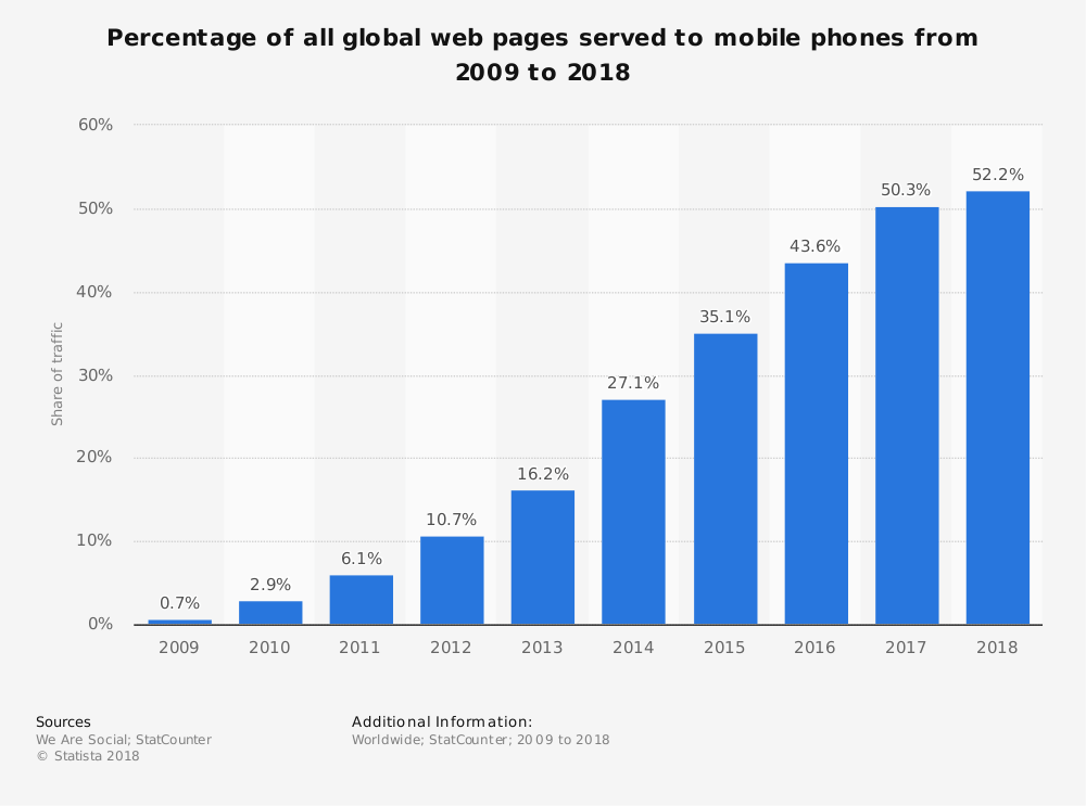
From the above study it is clear that there is a constant increase in the share of mobile phone website traffic worldwide. In fact as of February 2017, mobile holds 65.1 percent of all web traffic in Asia. This is huge.
Note: Mobile website is different from Responsive Website
Learn more about optimizing your website for mobile phones.
Planning to create a responsive website?
Read these responsive web design essentials for better insight.
Now that we know about the basics of a responsive web design, let us learn about how to benefit from responsive website design.
How can a Business Benefit from Responsive Web Design?
For a business the convenience of an online user while browsing the website is crucial. Because if the user is not comfortable to browse your website, then your potential sales goes down. And this is not a good news for any business.
Therefore it’s time to get your business loaded with benefits of using a responsive website.
How?
Read on for answers.
#1. Higher Search Engine Ranking
One of the most important benefits of a responsive website is higher SERPS. Google clearly states one of the reason for choosing responsive website design, i.e.,
A responsive website helps Google’s algorithms to precisely assign indexing rules to a web page. Rather than requiring to point directions towards the existence of related desktop/mobile pages.
Hence, making responsive web design an important Google Ranking Factor.
When you have only one strategic URL to focus on, your SEO efforts become more fruitful. Thereby giving better results in terms of search engine rankings.
#2. Increased Sales and Revenue
Just like it’s important for every business to have a website; it is equally important for a website to attract traffic and convert it into sales. So how does a business benefit from responsive web design?
Well, as said in #1, when you are making SEO efforts towards only one URL, then the outcome is better as compared to efforts towards multiple URLs.
And, second, a responsive website design allows a single compatible cascading style sheet (CSS) for a great user experience.
Further, a great user experience on your website means less bounce rate and more conversions.
#3. Easy to link
Responsive design makes it convenient for the users to share and link to your website’s content with a single URL. Unlike a website which has different websites for mobile, desktop, tablet and other devices.
If the users find the content interesting they do not have to go through the hassle of first identifying the URL and then its matching platform. One URL and you are sorted.
The sharing of content is also helpful for SEO as it gets you a genuine backlink – another reason for SEO boost.
#4. Reduces load time
You must have noticed that sometimes when you try opening a business website it redirects to a mobile version (m.website.com) and then it opens.
This is because that website is not responsive and has a different site and a different URL for mobiles.
This is not a good practice because users hate to wait. If a website redirects to a mobile version then it will obviously increase the load time. Moreover Google says that a user agent-based redirection is error-prone and can upset your site’s user experience.
Therefore shift towards a responsive website to cut down redirection and load the website quickly.
#5. Better indexing of business website
Every business website needs to be indexed by Google or other search engines so as to be found in search results. And in case of Google it’s web crawling bot discovers new and updated web pages for the purpose of indexing.
The advantage with responsive web design pages is that only a single Googlebot user agent is needed to crawl your page once. Unlike with multiple versions of a website where the Googlebot user agents have to crawl multiple times to extract all versions of the content.
Therefore it is clear that with responsive websites Google crawlers can find updates in a website more efficiently. Thereby helping in the indexing of your site’s updated content and keeping it fresh.
#6. No penalty for duplicate content
Multiple versions of a website end up creating duplicate content of your website. And Google does not like duplicate content at all. Therefore, it penalizes the website, or worst de-indexes it.
Though revoking the penalization is a tough task but upgrading to a responsive website can surely help.
Redesign your website to be a responsive one. Then request Google to re-index your website. This time Googlebot crawlers will find only one website, therefore no scope for duplicate content.
#7. Low cost development, maintenance and SEO
Responsive website designing service is the perfect solution to cut down on the money spent loosely. This is because developing a website , maintaining it and running a SEO campaign for one website is any day cheaper. In comparison to doing all this for multiple versions of a website.
Apart from the cost factor another benefit from responsive web design is the time-saving factor. By choosing responsive design you save a lot of time which can be utilized for working on core competencies of your business.
#8. Easy to track and study Google Analytics
For effective digital marketing it is important to study various factors like audiences’ behavioral flow, device used, demographics etc. And all this information can be gained from Google analytics account of a website.
Now imagine how difficult it becomes to study multiple versions of a website and collect all the info from their Analytics account and then form a strategy.
It is very confusing, unnecessary and very time consuming.
Therefore switch to a responsive website for easing and fast-tracking the monitoring process. With Google Analytics you can study how your website is performing on various devices like desktop, mobile, tablets and others.
#9. Great User Experience
The most loved benefit of responsive designing is the awesome user experience. Forget about pinching-in and out to zoom the text, or click a button.
Give your users the same experience and convenience they have while browsing your website on a desktop. They will reward you for this with the sales they make on your website.
#10. Offline browsing made easy
Majority of the smartphones and tablets in the market are HTML5 enabled. This makes them capable for offline browsing.
Therefore the responsive website users can continue viewing web content in HTML5 even when they do not have an internet connection.
Conclusion
Test your site on Google.
If you end in the green zone you are good to go.
But if your are in the red zone, contact your website designing company to quickly upgrade your website to a responsive one so as to reap its benefits.

6 Questions You Must Ask When Optimize Your Website For Mobile Phones
There is no need to explain that your website should be mobile friendly or have a responsive design or compatible with small screen sizes. With so much information available on internet we all are aware that how important it is to keep your website optimized for mobile phone devices.
Those who are not aware here is the mobile traffic data from first quarter 2017 to second quarter 2018.
Hover the bars to see the percentage traffic on mobile phones.
It is imperative that these numbers will keep on growing.
Since the advent of internet on mobile phones it is becoming easier for consumers to search for services and products and buy them on a click. It is only possible for you to reap the benefits of growing mobile traffic if you website keeps the users engaging on mobile devices and give them a smooth experience.
Here are 6 important questions you must ask when you optimize your website for mobile phone users.
1. My website looks fine on mobile phones. Is that enough for optimizing website for mobile users?
Are you using a ready made responsive theme? Like there are thousands of them available at a fraction of the cost. WordPress gives you thousands of themes which the sellers claim are fully responsive.
In realty they are just only responsive website themes which just rearrange the sections as the size of the device screens. Many of them are very poorly coded which is not possible for you to figure out until your are an experienced WordPress developer.
As per the latest Google’s research around 61% of mobile visitors don’t return to a mobile website where they had problem while browsing and almost 40% move to your competitor’s website.
There are many important aspects of a mobile friendly or responsive website which are critical to the performance of your website on mobile phone. Here are some of them.
- Mobile page speed optimization.
- Images optimization
- Plugins optimization
- Web hosting
- Website layout
If you are not a developer then you can take help from professional WordPress design agency. You can also hire dedicated WordPress developer at an affordable price
2. Should I have a separate mobile website or make my existing running website responsive in design?
These are two options you have while optimizing your website for mobile devices, first option means you make another website for mobile phones apart from your existing website. The second option is to make your website have responsive design which displays same content differently on the screens of different sizes.
Having two website means for desktops and laptops users will see www.example.com and on mobiles or tablets users will see something like m.example.com where m means mobile version of your main website.
Our experience as a web design company for over 10 years now says always go for responsive web design. We have experienced that even major search engines too like one responsive website.
3. What are the important features of a mobile phone optimized website?
There are many features of a responsive web design. Below are some of the critical ones.
User-friendly website design: Make the pages of your website user friendly as much as you can. There are thousands of mobile phone variants available and customers will invest their time on those websites which give them the best user experience on their mobile phone. Best responsive websites open perfect on every device no matter what the screen size is being used.
Prominent display of address: You need to make sure your business address is displayed very prominently to make it easy for your customers to find your information.
Click to call on phone numbers: Your business phone number should also be displayed big and bold and make sure they have click to call active on them. Users should be able to call you on a click from their phones. It is always irritating to copy the phone number from a website and pasting it in your phone to make a call.
Include a map: Always include a map for the directions to your business office. With the increasing use of GPS and services like Google maps people find it easier if they get a map on the website for directions.
4. How to make my website talk with social media?
Social media integration is the best way to advertise your business for free and get traffic to your website. If you write articles on your website make sure it can be shared smoothly with a click. If your website visitors like you articles they are most likely to share it on their social networks provided if they can do it smoothly and quick.
If you have a membership site or an ecommerce website then social login is the best and the fastest way to get users registered on your website as compared to filling up annoying registration forms on a website.
It is always advised not to overdo social media integration.
5. How will I test my website for mobile phone optimization before making it live?
You can simply check your website on different browsers to make sure it looks good on all the browsers available on mobile phones as some codes like CSS have different performance on different browsers.
You also need to check your website on as many mobile phones as possible. This doesn’t means you have to buy all these phones. These days there are so many responsive checker tools available online. Just type the keyword, ‘online responsive checker’ in Google and you will get a lot of tools available for free.
6. Should I hire a professional web design company?
There should not be a second thought on hiring a professional web designer instead of trying it yourself and messing it all. We don’t say you can’t do it but you may take months to study and then make your website responsive.
There are good website design agencies who offer web design services at an affordable cost. You can even hire dedicated web designer on a minimal monthly price.
But make sure who you are hiring, here are some FAQs on outsourcing your web design work.
What is AMP? What are its benefits? (…and how to implement it?)
Absolute guide about AMP
Google has very clear guidelines about a website’s loading speed and time. And also marks it as a ranking factor. Therefore accelerating mobile pages (AMP) has gained much importance recently.
Ideally a page load time should be 2-3 seconds
Because a user or search engines do not have all the time in the world to go through your website. And if at all it takes more than 3 seconds to load. Then unfortunately you lose both; your users and your SEO rankings.
As per Kissmetrics a one second page delay for an ecommerce website can cause a loss of $2.5 million sales per year, considering it makes $100,000 per day.
Therefore check your websites’ page load time and performance now using any of the online tools like:
https://developers.google.com/speed/pagespeed/insights/
Furthermore the page load time has to be fast (as in really fast) when it comes to Mobile pages.
That is where the Accelerate Mobile Pages comes into use.
Let’s first understand what is AMP. And then we’ll dive in deeper.
So what is AMP?
The collaboration between Google and Twitter gave birth to the AMPs plugin.
AMP is an open-source initiative led by Google to increase the performance and speed of the websites across multiple devices and distribution platforms.
Moreover it benefits the performance of web content and advertisements by stripping the HTML down to the basics. In simple words, it’s about using an already created mobile friendly page, and stripping it down to bare-bones to load quicker.
In fact Google reports that AMP pages load in less than 1 second and uses 10 times less data in comparison with the similar non-AMP pages.
Additionally this case study further proves the point that AMP pages load faster by 387% as compared to non-AMP pages.
In addition to this by Feb 1, 2018 Google expects that the content on canonical pages should match the content displayed through AMPs. So as to enhance the user experience while browsing the website pages on mobiles.
Accelerated Mobile Pages renders simplified and fast mobile user experience. Ensuring fast load time, optimized ad pop-ups and better performance with a site’s static content.
The best way to understand an AMP page is by example. Here’s one from BBC news by dbushell.com
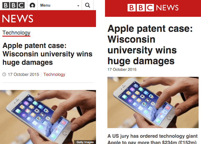
In the above image the left image is a responsive page and the right one is an AMP page.
The responsive page on left is 410KB and the AMP page is 115KB. (Woahhh…that’s huge)
The AMP page is a bare-minimum page. Whereas the responsive page has a header, footer and other article related component.
While the AMPs are more user friendly it has gained more popularity in News websites as of now.

In the above image from The Guardian, the AMP on the right side has more content above the footer. While the responsive page on left has search, breadcrumbs and lesser content.
And now the difference in size.
While the responsive page is 454kb, the AMP page is 127kb. So its quite obvious that AMPs increases the speed of mobile pages.
AMPs are structured with three fundamental workings:
1. AMP HTML
AMP HTML is basically HTML stretched with custom AMP tags. Though most tags in AMP HTML page are HTML tags. But certain HTML tags are substituted with AMP HTML components.
2. AMP JS
AMP JS does not allow any author written JavaScript. Instead it allows only asynchronous JavaScript. So as to allow JavaScript from delaying page rendering.
3. AMP Cache
The Google AMP cache is used to provide cached AMP HTML pages. It searches the AMP HTML pages, caches them, and increase the page performance automatically.
Points to keep in mind with AMPs
- Use a updated version of CSS
- No author JavaScript. Use only JavaScript library of AMP
- Ensure proper validation of websites for AMP to work fine
- AMP plugin pages do not support forms
- Set height and width to avoid strange-looking images
- For videos use AMP approved extensions
- Custom fonts have to be specially loaded for enhanced readability
Is AMP a ranking factor?
Well the answer is a yes and no combination.
No because AMP is not a direct ranking factor as per Google.
And Yes because AMP is associated with mobile friendly ranking signals of increased page speed and user experience. Hence it becomes a ranking factor indirectly.
It cannot become an individual ranking factor because…
…it has nothing to do with desktop rankings.
Therefore it isn’t becoming a ranking factor anytime soon.
Benefits of Accelerated Mobile Pages
SEO experts have observed a significant relation between website’s speed, page views and mobile rankings.
In fact when a web page loads quickly, the percentage of mobile users will view more pages of your website. Thereby decreasing your website’s bounce rate. Furthermore Google rewards such websites for delivering a great user experience, by increasing their rankings.
So while browsing you will come across AMP plugin pages with better ranking as compared to non-AMPs.
Well there are many reasons to incorporate AMP in websites. But we have tried to condense them in the below 5 reasons.
#1. Faster Page Load Speed and Time
The very obvious (as it is in the name itself) benefit of accelerated mobile pages is a fast loading page on mobile.
While a great composed content is significant for a website. But it would be of no use if the user cannot access it due to slow page load speed.
As per a study done regarding mobile load time a one second delay
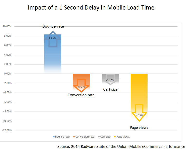
So this makes it imperative for mobile speed load time to be as low as possible. And AMP makes it easier to achieve this goal.
Start accelerating your mobile pages like now if your aim is to capture customer attention on mobiles too.
#2. Higher Rankings in Mobile Search Engine
There is a direct proportional relation between site speed, sessions and conversion rate of a web page.
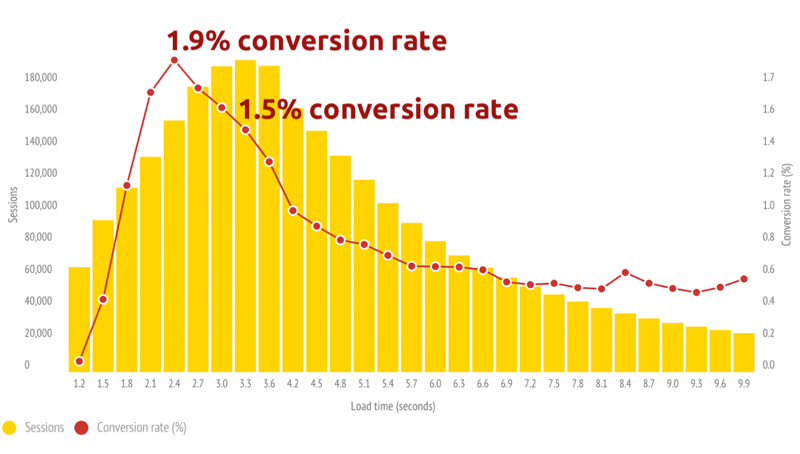
As demonstrated by a case study it is evident that a fast loading site will have more session. Thus more customers will be interested in buying your services or subscribing to your products. Thereby increasing the conversion ratio.
Although AMP is not a direct Google ranking factor. But it is very closely and significantly related to mobile page speed and user friendliness. Hence it becomes an indirect ranking factor.
#3. Supports Ads and increases ROI
What is the main motive behind starting a business???
Money, right!
So AMP extends its support by minimizing the distractions on a website page. These distractions can be the header image, sidebar, social share buttons, pop-ups and other elements. Such unnecessary elements can lose user interest.
Thus bringing down your conversion rate and the ROI.
But AMP gets you sorted for these non-essential elements on a web page.
As discussed earlier the AMPs are much light in size and uses bare HTML coding with almost no JavaScript. This makes the AMPs to be 6x lighter as compared to the desktop version of the page.
An AMP HTML page is 6x lighter in code and 5x less trackers.
Hence you get a chance to make more money from ads running in your site.
Its easier to click on the ads for the users who scroll on accelerated mobile pages.
Here’s an example
In the above image the ad is folded neat and clean and the user can click on it without any hassle.
Moreover when you decide to display ads from a third party on AMPs. Just make sure that you offer ads that take practically no time to load. And in the same time are user friendly too.
#4. Increased visibility for publishers and bloggers
Google has now started to display the results with AMP green sign, when a visitor searches for a query in mobiles.

This surely has a positive impact on the click through rate. Because it grabs more attention, which leads to more clicks.
In fact some mobile users particularly look for AMP results. Because they know these pages are going to be fast and user friendly.
#5. Track the traffic source easily
It becomes more advantageous when you are able to identify that the traffic which you are getting is from which source.
Tracking the traffic from AMPs is quite simple. Because of the analytics tools where you can get the reports and study the performance in detail.
The publishers can track the tags to monitor clicks and conversions, videos and links, new and returning visitors and more.
Responsive vs Accelerate Mobile Page
First, NO these are not similar.
While,
Responsive Design is about optimizing your desktop site for mobiles and tablets. It uses all the original tags, JavaScript, sidebars, CTAs, and all other on-page elements.
AMP on the other hand show the bare minimum. It strips down the CTAs, sidebars, header image etc, to a lighter AMP HTML version.
Responsive website design is a must for all the websites now-a-days. But accelerated mobile pages are recommended for blog and articles or primarily the publishers. Basically AMPs make more sense for content websites, newspapers and blogs.
And it is not advised to implement AMP to the whole site as it can disturb your CTAs, particularly for landing pages.
How to implement AMP?
Implementing AMPs can be quite simple with the ready to use plug-ins for WordPress websites. However for non-WordPress websites like Drupal or Magento it can be a bit thorny to implement.
You can dive in deep into the details of implementing AMP on the official site here.
Conclusion
AMP is really powerful.
If you are a content prime website then AMP is a must for you. But for other genres of website use it wisely. Because nobody likes to get hurt by losing the call-to-action buttons and the traffic associated with those clicks.
If you are looking to make your website mobile friendly, we as a website design company in India can help you achieve the goal by implementing AMP for you.