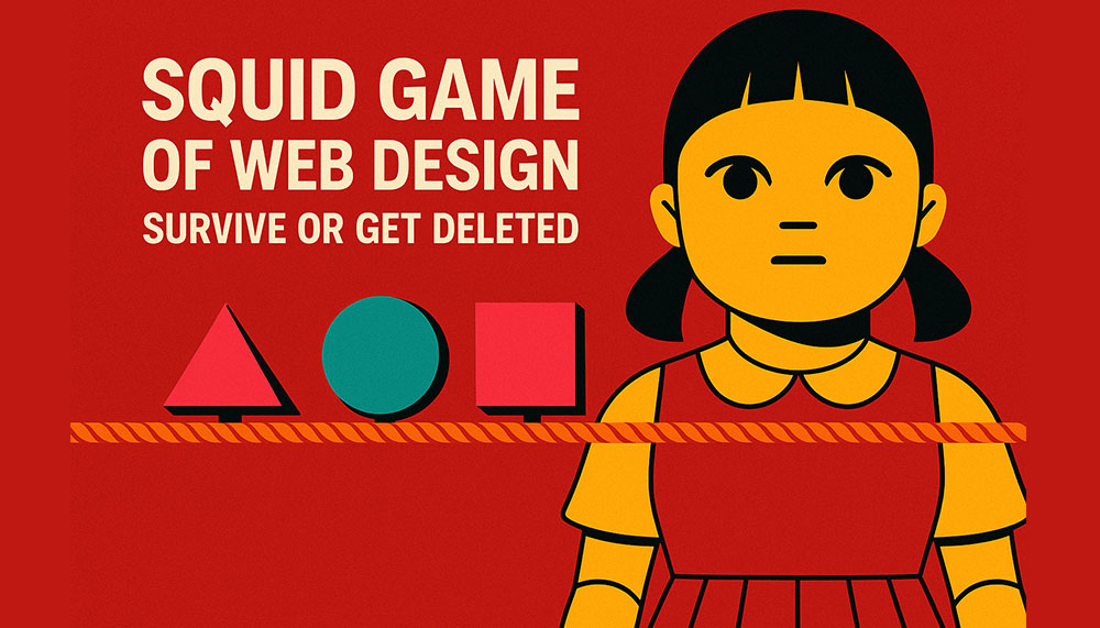
If you think web design is just picking fonts, adding sliders, and praying your client doesn’t ask for “just one more small change,” welcome to the arena.
Here, designers don’t get feedback — they get ultimatums. Developers don’t debug — they fight for survival. And UX strategists? They’re the philosophers who either predict user behavior… or die trying.
This is the Squid Game of Web Design — where one wrong UI decision can eliminate you faster than an unoptimized plugin on shared hosting.
Round 1: Red Light, Green Light — Load Time Edition
The giant animatronic doll isn’t saying “Red Light, Green Light.”
She’s saying:
“Load Fast, or I Will DELETE Your Entire Page.”
Visitors freeze the moment your page hesitates.
Three seconds of lag? Bang.
Uncompressed hero image? Bang.
Too many scripts fighting for the same millisecond? Bang, bang, bang.
The slow, lumbering websites fall first — images loading pixel by pixel like wounded soldiers.
The survivors?
They’re the ones using lightweight frameworks, optimized images, lazy loading, and enough caching to survive the apocalypse.
Lesson:
Speed is life. Lag is death. GTmetrix is the judge, jury, and executioner.
Round 2: Sugar Honeycomb — CSS Version
Instead of carving shapes out of candy, designers here carve layouts out of CSS grids.
A perfect circle made with border-radius? Easy.
A star using only CSS? Risky.
A responsive, fluid layout that doesn’t break on that one random Android phone from 2014?
Impossible.
One wrong flexbox property, and your layout collapses into an abstract modern art piece your client did NOT approve.
You look around:
- One designer got eliminated by
position:absolutepulling his header into oblivion. - Another lost because she used
!importantone too many times. - A third tried to center a div using margin auto… and was never seen again.
Lesson:
CSS isn’t a stylesheet. It’s a psychological experiment.
Round 3: Tug of War — UX vs. Aesthetics
On one side:
Designers who want full-screen videos, neon gradients, animated cursors, and buttons that sparkle when you hover.
On the other side:
UX strategists clutching their usability books, screaming:
“NO MORE CAROUSELS! USERS DON’T WANT SPINNY THINGS!”
It’s a brutal battle.
One side wants boldness, the other wants clarity.
One wants fireworks, the other wants form.
The rope?
Your homepage.
Sometimes aesthetics win and your site becomes a visual masterpiece… that converts at 0.2%.
Sometimes UX wins and your site looks like it was designed by an accountant from 1998.
The true winners are the ones who combine both:
Simple, clean UX with a little sparkle — enough enchantment to delight users, not overwhelm them.
Lesson:
Design is a tug-of-war. Good websites know how to balance the rope.
Round 4: Marbles — Client Meetings Edition
“You have 30 minutes to survive the client’s feedback. Good luck.”
You sit with your marbles (a.k.a your pride, sanity, and coffee).
Your client has theirs (a.k.a unrealistic expectations).
Client:
“I want the website to feel modern but classic. Futuristic but timeless. Elegant but funky. Minimal but dramatic.”
You:
“So… contradictory?”
Client:
“No. Creative.”
The clock ticks. You lose a marble every time you hear phrases like:
- “Can we make the logo bigger?”
- “I showed it to my cousin, he’s not a designer but he has thoughts.”
- “The blue looks too blue.”
- “I thought the changes would be free.”
Survive the meeting with your sanity intact, and you advance to the next round.
Lesson:
The real Squid Game isn’t on the screen. It’s in the conference room.
Round 5: The Glass Bridge — Plugin Edition
The path forward is two rows of identical glass panels.
Underneath one row: lightweight, well-coded plugins.
Under the other: bloated plugin disasters ready to crash your site.
Every step is a risk.
One path is:
- clean code
- regular updates
- high compatibility
- minimal conflicts
The other path is:
- 500 kb CSS files
- jQuery dependencies from 2009
- mysterious warnings
- support forums filled with crying emojis
Pick the wrong plugin… and your site plunges into a void of “Critical Error on Line 67.”
Lesson:
Not all plugins are your friends. Some want you dead.
Round 6: Squid Game — Final Client Review
You’ve survived every round.
Now you face the final challenge:
The client’s last review.
This is the stage where:
- all the copy they “loved” suddenly doesn’t feel right
- they want to add 6 new pages
- they remembered a color they saw once in a hotel lobby
- they decide they want a completely different layout AFTER approval
- they ask, “Why doesn’t it look like Apple’s website?”
You dodge each request like an action hero.
The final blow comes when they say:
“Actually… my nephew can do it cheaper.”
You pause.
Your soul leaves your body.
Time slows down.
But then — you survive.
Because real web designers don’t die.
They respawn with more sarcasm, more caffeine, and a rewritten contract.
Lesson:
Survival is not about skill alone. It’s about boundaries.
Bonus Round: Easter Eggs Hidden in Web Design
Like Squid Game, web design has secret rules that keep you alive:
- Never trust a client who says, “It’s a simple site.”
- If the brief says “just replicate this reference website,” run.
- If your developer says “it works on my machine,” cry.
- The number of browser tabs you have open is directly proportional to your stress level.
- Figma crashes only when you haven’t saved for 27 minutes.
Final Verdict: Will You Survive or Get Deleted?
Web design isn’t a profession — it’s a survival sport with:
- psychological traps
- emotional landmines
- unexpected sabotage
- and the constant threat of deadlines, bugs, and client edits
Every project is a test.
Every page is a battlefield.
Every designer is a competitor.
But the ones who survive aren’t the fastest or the flashiest — they’re the ones who embrace the chaos, adapt under pressure, and somehow still deliver brilliant, functional, user-focused experiences.
In the Squid Game of Web Design…
You win not by staying alive — but by keeping your website alive.
And that, my friend, is the ultimate prize.


Related items
Somewhere in the multiverse, right between a collapsing timeline and a slightly delayed po
Your 404 page is suffering. It is confused. It is lost. It is questioning its purpose, its
Want a website that feels like it rolled off Stark Industries’ private build line — sleek,