How to use images on your business website for competitive edge
Images have a significant impact on your business website design. Images can make your website look great but images can also downgrade your website design.
If not used carefully images can hamper your website speed, leave a bad impression on your customers. Images can make your super website design look less than ordinary.
It doesn’t matters how good you are with color psychology. If the right images are not used at right places all your efforts to build an awesome website will go in vain.
On the other hand if used wisely images can enhance your brand image and can easily convey the message of the text on your business website. Lets start with the concept of using images.
Why to use images on your website?
There are a number of benefits of using images on your website. Below are some of the important ones.
1) Images attract people
Visuals always draw attention and what is better than images to add visuals to your business website easily. Websites with images attract more visitors than websites with no images.
You can test it yourself by adding few good relevant images in some of your pages and leave some without any image. You can easily get the test statistics from Google Analytics. If you are not familiar with Google Analytics, you can learn it in our comprehensive guide on Google Analytics.
2) Boost conversions
It doesn’t matters if you have an ecommerce store or a membership website or may be a personal blog. Images always help your website reach its goals and that is what conversion is all about.
Images on product pages in and ecommerce website can impress customers and persuade them to make a purchase.
Images on membership websites on right places can pursue your website visitors to sign up for your services.
If blog posts have good images then there are very good chances you get more and mores subscribers to your blog.
3) Images help in SEO
Images can boost your Search Engine Optimization if you have named your website images properly, provided them with a good caption, alt text and descriptions.
Your web pages can come up in web search results and images search results in Google or any other search engine.
Including original photos or info-graphics gives you a chance of it getting placed on other relevant quality blogs giving you quality backlinks.
4) Images give your website more social shares
If your images are meaningful and attractive then you get more social shares and drive more traffic from social media.
If you share your blog posts on social networks like Facebook, Google+, LinkedIn or Twitter then there are more chance of getting it shared further and get more traffic if your featured image is good.
Good images or info-graphics create more engagement on social media. Social audience prefer visual posts over boring text.
WordPress is a good platform to get ready to use tools for adding images to your website, optimize them for search engines and social networks. Give your website more exposure by making optimal use of images on your website. Learn why you should use WordPress to build your business website.
5) Images spread your message better
Your image represents your content and message on your website. On social networks the images are noticed first. Images can convey your message in one view, arouse interest in audience to click on image and land on the actual post on your website.
If you have chosen your images wisely then they will generate interest in users and compel them to read more about the topic and eventually you get one more visitor to your website.
6) Images make your topic easy to remember
People tend to memorize images better as compared to the text they read. Your website should make a point and represent your message. More influential the images more chances are for users to remember it.
You get more returning customers or visitors as they remember the images on your website. They may also refer your images further directly or through social shares or by word of mouth.
Images give free publicity to your business website and help promote your business in a better and economical way than any other medium.
7) Images help you build an emotional connect with audience
You get more loyal online audience and customers if you manage to connect with them emotionally. Emotional connect with audiences is a must for any brand.
Images play a major role to establish an emotional connect with your target audience. Single image is as good as 1000 words of text when it comes to emotional connections.
Images can make your audience feel happy. They feel more connected to your brand and get your message in a more clear way thereby giving you returning visitors and more sales and more subscribers.
How To Use Images On Your Business Website
Images can do wonders for your business website. But you should be very careful in using images because if they are not use wisely on your website then they can backfire and make you loose your visitors leaving a very bad impression.
Images can build your brand but at the same time they can destroy it completely. All your SEO efforts and hardwork can go in vain if you don’t use your images carefully.
Here are the important things to keep in mind while using images on your business website to get better results, generate more traffic and build an amazing brand which is loved both by visitors and search engines.
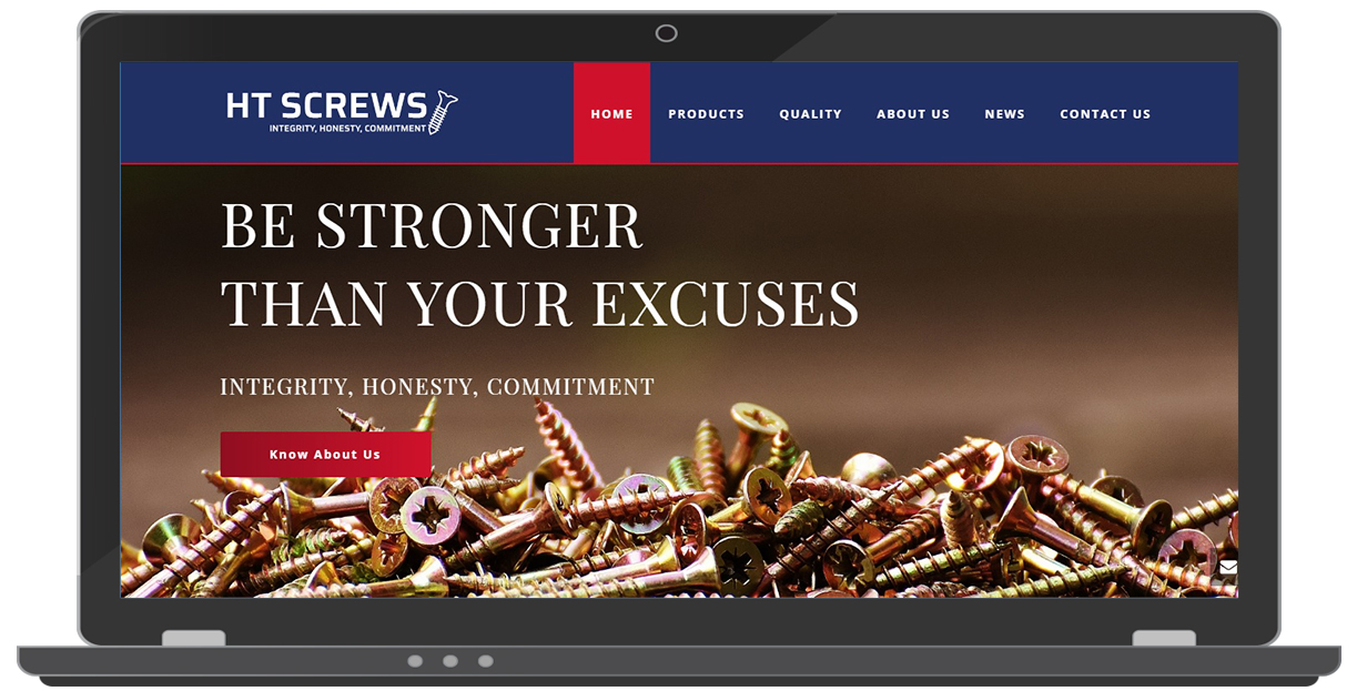
1) Images should complement your website colors
Colors too play a vital role in attracting website visitors and pursue them to give you a sale. If images are used which complement your website colors then the combination can do wonders. Read about color psychology here.
Images should go with the website theme. This means images used on the website should complement the color scheme. If not then they might simply look odd and mess up the complete website design
A good example of a combination of color and images is an website we have developed.
2) Images should be interactive
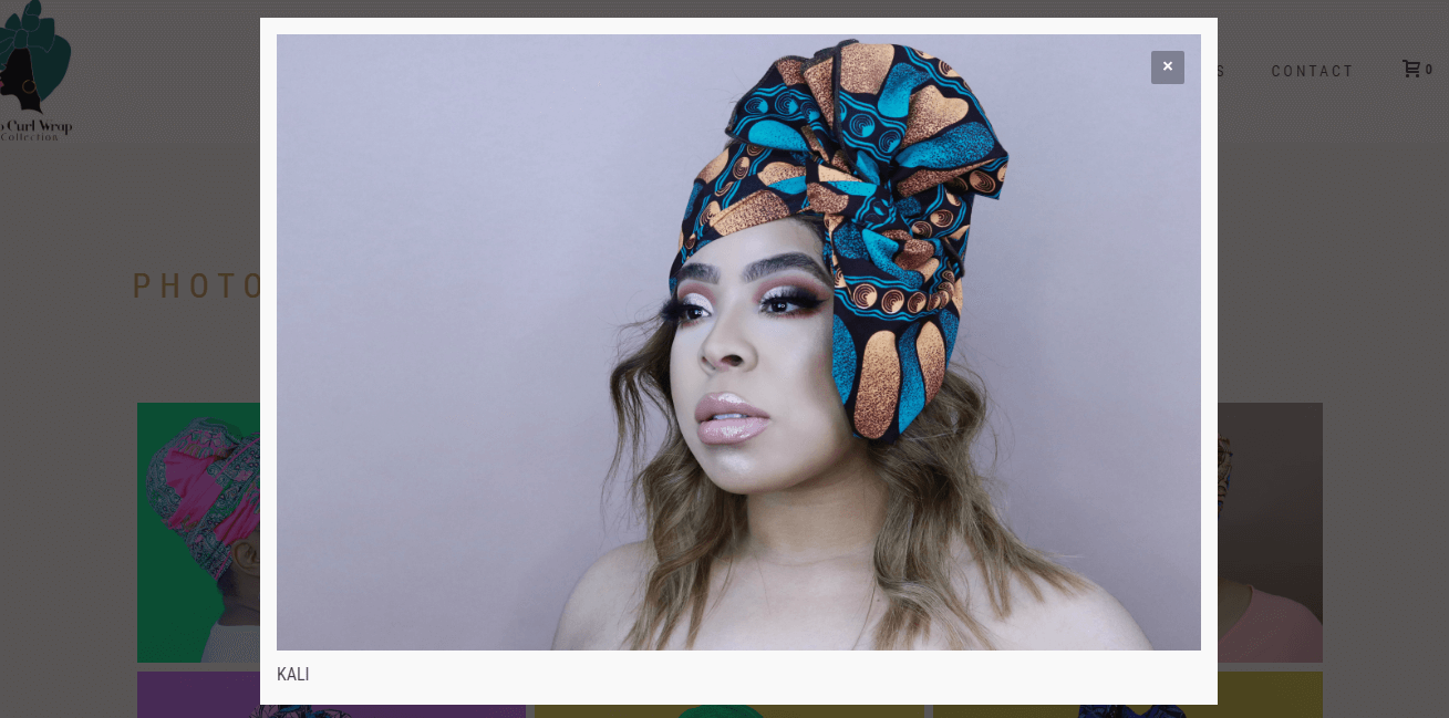
Interactive images means users should be able to do something with the images. Image can be clickable to see a larger version in a light box.
Or may be it shows a call to action with some text on hover. Or simple an image can be a part of a call to action.
More interaction an image can provide more user engagement it creates. Reduces the bounce rate
Here is a nice example of interactive image on a website.
On hover

On Click
3) Unleash the power of photo galleries
We always recommend all our client to include a photo gallery in the website.
Photo gallery is a good way to showcase large groups pictures or images and categorize them. This makes it easier for users to browse through.
Photo gallery is also a nice way to showcase your portfolio and present it beautifully to your clients and impress them.
An example of a photo gallery we have used in a website design we have made for our client who is into catering services business and partnered with us for website designing services in Delhi from USA.

4) Use images to catch attention
Images should always be catching attention otherwise images are of no use. Images can be use of people doing something relevant to your business in your business website.
People showing excitement about your service or looking happy with your product are some examples of catching attention of your online visitors and increase conversions.
Or may be your employees doing something. Here is another example of how we have done it for one of our client based in USA who is into heating and cooling services.
 .
.
5) Use captions in your images
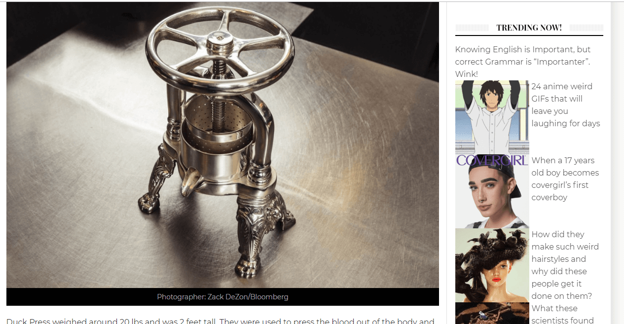
It is a psychology that users tend to read the captions with images. It is another good thing to write some catchy captions for your images and display them right below the images on your website.
You should ask your website developers to include the caption along with images when the website is built.
It also gives you an opportunity to include your keywords in the captions which is good for the website SEO.
Here is an example of a viral news website we have built. This website is our own product which generates a lot of traffic.
6) Use alt tags in your images
Using alt tags in your website images is very important for the overall SEO of your business website.
Alt tags are meta content and always crawled by search engine bots. They are very critical for your website images to appear in image search results when someone is looking for your products or services online.
Alt tags for the images should contain keywords and present the message of your business.
Images without alt tags are of no use for search engines.
7) Optimize your images
High quality images at times are very large and heavy in their size. This can make your website pages load slow. Users normally leave a slow website in seconds. This may cost you loosing an interested customer or prospect.
In order for website page speed optimization, you must optimize and compress all of the images on your website.
You can optimize your images online for free by using tools like tinyPNG and reduce the size of the images considerably.
This will help your website pages to load fast and provide a better user experience to users on your business website.
8) Use images which connect emotionally
Arousing emotions can help you win a customer. Images can be a strong way to arouse emotions in your customers.
Use images of people relaxing if you have a spa website. Maybe you can use images of people smiling if you have a healthcare website.
We always recommend our clients looking for website designing company to use happy faces in the website. If you can show your product and service creating happiness then it will evoke same type of emotions in your customers and people will buy from you.
9) Use images in testimonials
Always use images in testimonials. Using images in testimonials on your business website will build trust and credibility for your brand.
Images will make your testimonials look more genuine and will leave a significant impact on your customer’s mind.
Building trust for a brand is very difficult and images used with testimonials can do it very easily for your business website.
10) Use images in your subscription boxes
If you are running a blog or looking to start one then your ultimate goal will be to get more and more subscribers for your blog.
This is the only way you can generate revenue from your blog. Driving traffic to your blog is not easy. It becomes more depressing if you get traffic and still no one subscribe to your blog.
Using images in subscription boxes can be extremely helpful in pushing your website visitors to subscribe to your blog.
As explained above use images in subscription boxes which connect emotionally with your website visitors and catch their attention.
Conclusion
You can use this article as a checklist on how to use images on your business website. Images are extremely important for the success of your blog or business website.
Using right images at right places is the key to get more sales or subscribers. Never use images just for the heck of using them.
Images which are not relevant to your business or images which do not give any message are of no use. It is a waste of time setting up those type of images on your website.
For more conversions always use nice optimized images at important places. This will not only give your more customers but also build the trust your brand is always looking for.
Images also give you a competitive edge and stay ahead of your competitors.
For more information on how to use images you can also contact our website specialists anytime.
15 Top Reasons Why Visitors Leave your Website Too Soon!
Know the Top 15 Reasons why people leave your website soon
If seeking Attention is difficult, then creating interest is rare on the Web.
When you build your website from any professional website design company, you have the criteria of grabbing the attention, on your checklist. Right?
So now that you have the attention of the desired web users, it is your primary job to create engaging content for the users to develop their interest.
The content on your site should be easy to navigate and simple to understand. If at all it is confusing or clichéd, the user will get either bored or frustrated and will take the exit door.
In the initial web surfing days, “if you build it (website), it will work” tune worked. But now, to swing in thoroughly and to get the visitors stick to your site is a whole new episode. You have to set a combination of a various factors to generate interest in the visitors.
I have listed the top 15 reasons to be worked on if you want visitors to stay for longer time on your site.
People might be leaving your website because of these reasons:
1) Outdated Design
Even though looks are deceptive, but they also cast the first impression which typically is the last impression. Designs which were a hit 10 years back are looked as outdated and uninteresting now.
Make sure when a visitor visits your website he stays there, at least for the strong and attractive visuals of your website. Of course, this won’t be the only thing to keep your visitors hanging to your website. But it is a great valid point to begin with.
Website redesigning is an important aspect to keep at pace with the changing trends. Nobody would be interested in a clichéd design, so obviously they will leave your website soon.
So, update or redesign your website to match the current trends or to give it a fresh look.

Source: https://goo.gl/KF7NrX
2) Do not Overdo Your Content
The fonts, color, design everything matters when you style your content. But some designers overdo the styling which gives a very unprofessional and cheap look to your website. And trust me it does not give a very positive feedback for your website/company.

Source: https://goo.gl/BYcmgf
Style your content but remember it should not hinder while reading the text on your website.
The fonts you use should
- Be easily readable
- Have high contrast color combination
- Clean presentation
One font which you should absolutely avoid is “Comic Sans”. As an alternative, choose ornamentation-free serif or sans serif fonts for best results.
And for font size, it’s better to opt for larger fonts so that the visitors have a great experience and ease to read while they are visiting you on a desktop or a mobile device.
3) Outdated Plugins
If you are still using flash to display the most important message for your visitors, then my dear friend you will be waiting for forever. Because the users have no time or interest to install the updated versions of Flash plugins to view the content of your website.
Result; the bounce rate increases and your conversion rate will fall down further.
If your website or posts demand videos or animations then it’s better to use HTML5. In addition to this, include a summary or a transcript of the video for the users who can’t or don’t want to play the video. This is also beneficial to add on to the SEO benefits of your website.
4) Too many Ads
It would not be possible to run an ad-driven model website without ads. Comprende!
But it is totally unnecessary and very frustrating to place the ads all over the website in a greed to make more money. This is a very thoughtless way as instead of making you win (by making money), it will make you lose (as visitors will leave your site early).

Source: https://goo.gl/qK6GXf
If a visitor visits your website then he is there for some particular information. But if it becomes difficult for the visitor to go through that information because of ads hanging everywhere, he will leave the website in no time.
Running the ads is fine. But see to it that it’s not covering the entire volume of your website. Ads should not be the first thing that a visitor notices when he visits your website. Rather it should be the real content of your website which grabbed his attention.
5) Auto-play Videos/Animations
It is very annoying (and sometimes embarrassing) when a video on a website auto-plays. The immediate reaction to this unwanted, forced auto-play would be – hitting the back key.

Source: https://goo.gl/Wvj4q3
Never set the videos on auto-play mode. Allow the user to choose whether he wants to or not play the video. Doing this you also give a certain level of control to the user which is by and large loved by all.
This way you earn some brownie points and the thus spray some glue to the visitor to stick to your website.
6) Site’s navigation
Do not take this lightly.
If your site has a confusing navigation and multiple sub-levels then the user will not waste his time to find the page he is looking for.

Source: https://goo.gl/xnHqN7
Think of this as a scenario where you land on the website of your choice for the desired information. Now you are struggling to find the piece of information for which you visited that website but could not find it. What would you do?
Leave it, right?
This is why a site’s navigation has to be clear, precise and easy to locate. Reorganize your site’s navigation levels to match a user’s expectation. If you are unsure of rearranging your site’s navigation yourself, contact a good website design company and they will help you out.
7) Lengthy and Unnecessary Registration Forms
Creating gated content is great for driving genuine leads to increase the sales of the company. But doesn’t it get annoying when you have to fill lengthy registration forms for accessing everything and anything on the website? It sure does irritate me.

Source: https://goo.gl/daPQox
Do create gated content but stick to its actual purpose. Do not just restrict everything from a user. He will run away.
Protecting important documents like whitepaper, PDFs, or some videos is fine otherwise keep your website accessible to all.
Another important aspect is Registration forms. Make it a point to keep only those fields which are actually important. Other than that do not waste your as well as your visitor’s point. More important, the will not only skip registration, they will take an exit door immediately.
So avoid pointless and prolonged registration forms.
8) Slow Loading Speed
According to Hobo Web, the page loading speed difference (in seconds) hugely impacts the percentage of page abandonment.

Do not ignore this or better make this your priority. Because even after attracting users, your website takes too much time to open then no matter how good your website’s content is, user will take a U-turn.
9) Irrelevant and unappealing offers
I have noticed sometimes companies give all the attention to the graphics and designing of the offer. But this should be absolutely discouraged.
Visuals are great, but what inside it is of greater value. It should be designed and explained in a way to attract the customers. If at all you experience that visitors are coming to your website but leaving soon. Then this definitely shows a lack of connection between them and the offer.
Create an appealing offer on a landing page with a connecting call to action button, explaining the visitor the next step and the resulting benefits of taking that step.
10) Vague product/offer benefits
If the product benefits which you display on your website are not appealing and clear then obviously it would not take more than some seconds for the visitors to move away.
Think through the typical instance of the Apple iPod. The iPod features could have been in two diverse ways, like below:

Image Credit: Help Scout
The smarter way to display the features is the second one. Because iPhone buyers will not care much about 1GB or mp3. But the feature of carrying 10,000 songs with them is what will attract them.
See the difference?
This is a crucial understanding to improve the conversion ratio.
11) Missing Call-to-action button
According to smallbiztrends.com, 70% of small business B2B websites don’t have CTA or Call-To-Action buttons.
Isn’t this strange?
Why will the visitors be interested in your products or services if you aren’t even asking them to buy it from you? The fact that the CTA has to be compelling and relevant comes secondary. But more important is for you to have a CTA button after every products page, blog page or any other relevant page.
12) Fake landing page promises
Never ever create fake promises on the ad just for the sake of driving the visitors to click on your landing page. Even if you get successful on getting the visitors to your landing page, it won’t be of much use to you.

Source: https://goo.gl/N3jJ9x
Just as they find out that the information rolled on the landing page is not relevant nor does it solves their purpose they will take no time to hit the back button.
Your ultimate goal is sales, which will only happen when you share actual offers or information with the visitors. Do not confuse traffic with conversions.
13) Website is not responsive
According to official Google statements, more than 50 percent of search queries globally now come from mobile devices.
Now imagine if your site is not responsive how much potential sales/traffic/conversion you would be losing.
It is imperative for all the small, medium or large business to have a responsive website if they aim for the ultimate goal – high ROI.
14) Not using Exit Intent Technology
As per omniconvert.com the ‘Exit Intent Technology‘ can be defined as an intelligent technology or an innovative tool designed to help marketers turn and transform their abandoning website visitors into paying customers.
The website owners can make a final try to convince the abandoning website visitors to stay back and reconsider what the website has to offer.
By using a tool track if the visitor is about to leave your website. Just when he is about to click the back button present a message or an offer to make them stay on the website to learn what the website can do for them.
15) Website hacked
Everything fine still losing on the numbers?
Check your website’s admin thoroughly. It might be hacked. According to Forbes contributor James Lyne, an estimated 30,000 sites are compromised every day.
If it is not possible for you to observe your website code every day. Then introduce a monitoring tool to retain the most important factor of a user’s trust that’s essential for website conversions.
By working on the above issues you will most likely see an increase in the conversion ratio and a decrease in the bounce rate. But still if you cannot make it through contact a professional SEO company to dig in deep.

