6 Questions You Must Ask When Optimize Your Website For Mobile Phones
There is no need to explain that your website should be mobile friendly or have a responsive design or compatible with small screen sizes. With so much information available on internet we all are aware that how important it is to keep your website optimized for mobile phone devices.
Those who are not aware here is the mobile traffic data from first quarter 2017 to second quarter 2018.
Hover the bars to see the percentage traffic on mobile phones.
It is imperative that these numbers will keep on growing.
Since the advent of internet on mobile phones it is becoming easier for consumers to search for services and products and buy them on a click. It is only possible for you to reap the benefits of growing mobile traffic if you website keeps the users engaging on mobile devices and give them a smooth experience.
Here are 6 important questions you must ask when you optimize your website for mobile phone users.
1. My website looks fine on mobile phones. Is that enough for optimizing website for mobile users?
Are you using a ready made responsive theme? Like there are thousands of them available at a fraction of the cost. WordPress gives you thousands of themes which the sellers claim are fully responsive.
In realty they are just only responsive website themes which just rearrange the sections as the size of the device screens. Many of them are very poorly coded which is not possible for you to figure out until your are an experienced WordPress developer.
As per the latest Google’s research around 61% of mobile visitors don’t return to a mobile website where they had problem while browsing and almost 40% move to your competitor’s website.
There are many important aspects of a mobile friendly or responsive website which are critical to the performance of your website on mobile phone. Here are some of them.
- Mobile page speed optimization.
- Images optimization
- Plugins optimization
- Web hosting
- Website layout
If you are not a developer then you can take help from professional WordPress design agency. You can also hire dedicated WordPress developer at an affordable price
2. Should I have a separate mobile website or make my existing running website responsive in design?
These are two options you have while optimizing your website for mobile devices, first option means you make another website for mobile phones apart from your existing website. The second option is to make your website have responsive design which displays same content differently on the screens of different sizes.
Having two website means for desktops and laptops users will see www.example.com and on mobiles or tablets users will see something like m.example.com where m means mobile version of your main website.
Our experience as a web design company for over 10 years now says always go for responsive web design. We have experienced that even major search engines too like one responsive website.
3. What are the important features of a mobile phone optimized website?
There are many features of a responsive web design. Below are some of the critical ones.
User-friendly website design: Make the pages of your website user friendly as much as you can. There are thousands of mobile phone variants available and customers will invest their time on those websites which give them the best user experience on their mobile phone. Best responsive websites open perfect on every device no matter what the screen size is being used.
Prominent display of address: You need to make sure your business address is displayed very prominently to make it easy for your customers to find your information.
Click to call on phone numbers: Your business phone number should also be displayed big and bold and make sure they have click to call active on them. Users should be able to call you on a click from their phones. It is always irritating to copy the phone number from a website and pasting it in your phone to make a call.
Include a map: Always include a map for the directions to your business office. With the increasing use of GPS and services like Google maps people find it easier if they get a map on the website for directions.
4. How to make my website talk with social media?
Social media integration is the best way to advertise your business for free and get traffic to your website. If you write articles on your website make sure it can be shared smoothly with a click. If your website visitors like you articles they are most likely to share it on their social networks provided if they can do it smoothly and quick.
If you have a membership site or an ecommerce website then social login is the best and the fastest way to get users registered on your website as compared to filling up annoying registration forms on a website.
It is always advised not to overdo social media integration.
5. How will I test my website for mobile phone optimization before making it live?
You can simply check your website on different browsers to make sure it looks good on all the browsers available on mobile phones as some codes like CSS have different performance on different browsers.
You also need to check your website on as many mobile phones as possible. This doesn’t means you have to buy all these phones. These days there are so many responsive checker tools available online. Just type the keyword, ‘online responsive checker’ in Google and you will get a lot of tools available for free.
6. Should I hire a professional web design company?
There should not be a second thought on hiring a professional web designer instead of trying it yourself and messing it all. We don’t say you can’t do it but you may take months to study and then make your website responsive.
There are good website design agencies who offer web design services at an affordable cost. You can even hire dedicated web designer on a minimal monthly price.
But make sure who you are hiring, here are some FAQs on outsourcing your web design work.
Why every small business should have a website?
Importance of a website for small business
Online market for every industry is booming. And almost every large and medium size business is making huge profits out of their websites. Simply because they understand the importance of a website and the benefits they can reap out of a good website.
Being one of the top website design company in Delhi NCR India we provide Website design and digital marketing services to businesses of all sizes.
We have realised that there is still a big room to create awareness among the small business about the importance of a website for their business.
Often our sales guys get excuses from many small business owners that they do not need a website. Because they think it is a waste of time and they believe in the traditional marketing .
Almost 80% of small business owners in Delhi NCR alone are not aware of the importance of a website for their business.
Our promotional campaigns are more intended towards creating awareness about internet and why is it important to have a website.
Below are the top 4 reasons citing the importance of a website for a business and its success.
#1. A good website increases your customer reach.
In this era of online world customers look for product and services online. Because they can do online shopping, reach out for service providers like plumbers, carpenters, etc from the comfort of their home and time.
More than 20 million customers are online every time either doing online shopping, looking for online help or services. These customers could be online even during midnight from anywhere.
Businesses which have a website and a good online presence have more chances of these potential customers contacting them from the websites, even when their shops or offices are closed.
Customers search for the services or products mostly on Google and they most often click on the websites which appear on first page of Google search result.
If you do not have a website with strong online presence then you are loosing these potential customers to your competitors who have a website and have 24 by 7 visibility online for their business.
A website acts as a 24 by 7 shop for your business.
Wonder how much sales and money you are loosing without a website.
#2. A good website increases the credibility of your business.
Customers these days judge the credibility of any business by their website.
A website makes your business look credible and professional.
People don’t even consider a business as an option if they do not have a website. A good website professionally explains your services and products. Thereby leaving a good first impression about your business.
Website is the face for any business.
If you can impress your potential customers with your website then half of the battle is won. Once you have a website with a strong online presence you will see how it helps grow your sales and how you can earn huge money from your website.
#3. Website is the most cost effective marketing method for your services and solutions.
Most of the small businesses make excuses and give cost as a reason for not getting a website for their business. They find traditional print advertising more tempting.
This is simply because they are not aware of the importance of a website for their business.
Compared to the traditional print media expenses, website can help you reach more customers and 24 hours in a day.
For example:
If you give a newspaper ad for your service or product, it is not guaranteed it may reach the customers you are looking for.Because a newspaper can be read by students, elderly people, house wife. Therefore it is not sure your advertisement reaches the customers you are targeting.
On the other hand if you have good website for your business which is a Search Engine Optimized website then your target customers who are looking for your type of services will reach you through your website.
Read more about Search Engine optimization here.
#4. Website works round the clock for you.
As mentioned above a good website never stops working for your and attracting customers 24 hours a day round the year.
A customer can fill a simple short contact form on your website and you will get an email with the questions or inquiry from your potential customers. And you never ever miss a single customer even when you are sleeping.
A website makes your business grow day and night.
A customer can reach your website from anywhere like from a coffee shop, while having a walk, while traveling or whatever you can think about.
And a website promises only potential targeted customers who actually are in need for your services or products.
Bottom Line: A website is very important for any size business
You just need to make sure that your website is done the right way.
Keeping the basics right will give you a good professional looking website with a strong online web presence.
There are many free services which can give you a website but you need to do the hard work yourself. It is always suggested that let the experts do the job for you and you concentrate on your core business.
To get the the website that works for your business hire the best website design company. You should choose the web design company who can also give you a strong web presence. And that too at a very affordable and cost effective way.
Learn more about how to choose the best website design company.
We will help you in a cost effective way to grow your business through your website.
Contact our small business website experts today and discuss your business requirements.
Affordable Websites Design Service Might Go Wrong For Your Business
Are Affordable websites truly affordable?
Every business needs a website and there are thousands of website design companies in Delhi NCR alone which offer Affordable websites. Business owners are tempted with the very low priced affordable websites and sign up for the website design services offered at a very cheap price.
Being one of the top website design company in Delhi NCR India we come across clients everyday who are offered website design and development services at unbelievable low price. Often businesses with low budget are tempted by such cheap offers.
But are these affordable websites really affordable?
Do you think these websites provide the online recognition which your business deserves?
Are you sure the visitors on your website will not leave too soon once they are there on your website?
Do these affordable website design companies provide guarantee on increase in traffic on your website?
Do they guarantee the website will not be penalized by Google at any point in time?
There are few basic things you can check before you sign up for an affordable website design service so that you get value for the money you invest in getting your website build.
How can they give website design service at a very low price?
This is a very important question to ask before you sign up for an affordable website design service. We have been in this business for over 7 years so we know the efforts required to build a unique website which is exactly what your business needs.
So it is important to ask what efforts they will put in to get the website ready for you. If they cannot answer this simple question then there is no point to sign up with them.
Compare the answers from other companies and do a little research on Google also. This will give you an understanding about the services you are offered for a low price.
Is the website responsive?
70% of internet searches happen on mobile phones these days. The websites which do not show properly on smartphones and other internet devices never get a visitor converted into a customer.
Website should be compatible with every device so that it gives the same user experience as it gives on a desktop or a laptop.
Google will not index the websites which are not mobile friendly. This means if the website is not responsive it will not show up in Google search results. And Google will boost the ranking of a website which is mobile friendly or responsive in nature.
Never sign up with a website design company which do not offer responsive website design.
Do they give content writing service or advice?
Website is nothing without good quality content. Your website should provide real value to the visitors looking for your type of services or products. You may have the best product or you may be providing the best service in your industry. But if it is not presented well on your website then you will loose the potential customers who would genuinely buy from you.
Quality content is also important for your website’s search engine rankings. Here is what Google says about high quality websites.
Everything comes for a price. Companies may additionally charge for writing quality content for your website. But since these affordable website design service companies promise quality websites so they should provide quality content for your website.
In worse scenario they should atleast guide you on writing quality content yourself. If they can’t do it then probably the affordable website design service is affordable on the cost of your online reputation and business.
Do they build SEO Friendly websites?
It is understood they cannot do the Search Engine Optimization for your website for the website design cost. But do they build Search Engine Friendly website.
It is very important that a website should be search engine friendly so that when you actually start promoting your website online, search engines like Google do have any issues in showing your website up in search results.
If a website should have responsive design along with quality content but making it search engine friendly is equally important because search engines should be able to crawl through your website easily. If the website is not SEO friendly then Search Engine will not be able to crawl and they will not see the website in the way users see it.
So your website will not be indexed and it will not show up in Google Search Results. The affordable website service may go wrong here.
Do they provide unique design for your website?
Your website should stand out of your competition. Since you have a unique business so the website should be exactly as your business.
Affordable website companies often use ready to use templates. They just change the colors and the images and get the website ready. What is the point of having a website, where thousands of similar looking websites already exist.
For a better user engagement on your website your website should have a custom unique design. So that your visitors do not get bored and find every page of your website fresh and interesting.
We truly believe in the value of money. We earn it the hard way so do you. Website is the most important asset in the marketing of your business. If website go wrong then whole of your online marketing will never fall in place and it will be a huge loss of time and money.
Be careful and research before you sign up for an affordable website design service
Read More About :
How to choose the best website design company?
Looking for a website that works for you?. Contact us now for a FREE consultation
How to choose the best website design company?
So you are looking to hire a web designer in India
And like every other business you might be confused about how to make a decision about selecting the best website design company. One who can design a great website and also make it visible on top searches on Google.
There so many website design companies in Delhi NCR alone so think about if you look to select the best one in India. You may end up spending more time in choosing your website design partner than the time needed to build the website itself.
Landing Page or Squeeze Page. Which one should you use?
Understanding Landing Page, Squeeze Page and Home Page
Terms like landing pages, home page or squeeze pages often leave non technical people confused. These are website design industry specific terms so it is normal if you are not aware of the difference between these three.
To my amusement I came to know that many website designers or developers are not able to differentiate between these three types of pages.
Even the experts in online marketing companies are not able to understand the difference between the home page, landing page and squeeze page.
Where do visitors land on your website?
As assumed by many web designing experts that visitors land only on homepage but that is not the case always. A visitor may land on any of your services pages or product pages or home page depending upon the search query they type in Google search.
It is not necessary that the search engines may always show homepages of websites in their search results.
Basic difference between a home page and a landing page.
A home page is the first page of your website. It appears when the visitors type your website url in a web browser.
By typing the URL directly in web browsers, visitors always land on home page of the website.
Visitors may also land on your homepage by typing a query in search engine but it depends if there is a relevant content present in your website’s home page and in the meta title and description.
On the other hand…
…a landing page is the first page of your website where visitors land if your website appears in the search results.
It could be the homepage or any other page on your website.
For example while running a Google Adwords campaign you decide where the potential customer should land if he clicks on your ad.
So a home page could be a landing page but it is not necessary that a landing page is always a homepage.
Importance of good landing pages
As compared to home page of a website, the landing pages are more focused on a specific product or service. So it is extremely important to have a robust landing pages design in your website.
Since the visitors may anytime land on the landing pages so they must be well structured and designed with
- call to actions
- sign up forms
- internal links
- share buttons
- feedback forms
to provide good visitors engagement to make sure visitors do not leave instantly.
The goal of a landing page should be making a visitor become a customer. Which means visitors should not leave the website without signing up for the service our buy your product.
Well design landing pages help in decreasing the bounce rate for a website and act as a sales rep for your company.
How does a squeeze page differ from a landing page?
It happens sometimes that you do not want any of your website information to get visible to your website visitors until they fill up a small form.
Here come the Squeeze pages into picture.
A squeeze is a landing page which gets the website visitor to take only one action. If he is not willing to take that action then the only other option is to leave the website.
For example:
Some websites provide a free e-book or a video or a webinar but before that they want users to fill a short form. They cannot get to the free stuff without taking the action of filling the short form.
So Squeeze page is used when you want to squeeze some information out of website visitors.
Which one is better to use?
Homepage?
One thing is clear that the home page of your website can never be a good landing page because it has a bit of everything and it is not at all specific.
But that doesn’t means that homepage is not important. It is the face of your website so you should ask your website designers or the website design company you have hired to make it as interactive as any other landing page of your website.
Squeeze page or a landing page?
Both these pages solve different purposes and both these pages should be used wisely if you want to boost your sales through your website.
It also depends where the visitors are coming from to your website and what they are looking for.
Do they want to buy something or looking for information for a specific problem.
To conclude:
A Squeeze page should be used where you want your website visitor to take a specific action before they can access any information or links on your website.
A landing page should be used when you want your website visitors to buy something or sign up for your services through your website.
Contact South Delhi – India Website Design Company
If you have any requirement of building a website or a landing page development or a squeeze page, then contact our sales team and we will get back to you in less than 24 hours.
Why Google Doesn’t Displays Meta Description Correctly?
Being an Internet Marketing and SEO company in Delhi, NCR we often come across clients worried about the meta description of their website pages is not displayed correctly in Google search results.
There are many scenarios, some common ones are:
- Google doesn’t display meta description correctly
- Google display content from my page instead of meta description I defined.
- Google displays a combination of my meta description and page content.
- Is SEO Yoast plugin creating problem with my site title, meta description?
- Is any plugin in my WordPress Website conflicting with SEO Yoast plugin?
- Is it due a fault in the website coding that my meta description is not displayed by Google.
And the list goes on.
I would suggest not to panic in any of the situations above and just check the basics
To start, check the page source of your website page in any browser.
See if this piece of code is there
<meta name=”description” content=”We are a full service website design company in Delhi. Delivered over 1000 web design, SEO, data entry and content writing projects across USA & India.”/>
It is obvious that the content of the meta description will be different for your website.
If the meta description is present in your page source and Google still doesn’t displays it
Then there is nothing wrong the website code or plugin (plugin, if you have a WordPress Website)
This is because Google displays search results according to the search term used by any user.
If the search term used by any user has a combination of words which are present in your meta description then it will display the meta description in search snippets.
If the keywords are present in any part of your page content then Google will display the portion of your page content in Search result snippets.
Or in case the keywords used by the user are partially available in your meta description and page content then Google may display both the meta description and some part of your page content.
This is because Google provides the most relevant information to the users searching for information so it checks meta description and page content to match the search term used by the users and displays the result accordingly.
You can do anything about it but to improve the website content and write the correct meta titles and meta description which define your products or services.
If you need professional help you can contact a SEO content writing company in Delhi NCR, India.
If this piece of code is not there
<meta name=”description”
Then probably you need to check your website theme and page template or if some plugin is conflicting with your SEO plugin.
Plugin allows different variables in the title templates you can set so that your website pages never miss meta description or title.
If you want to use page or post title, you can follow below variables.
%%title%% | %%sitename%%
If you want to use title and the site description:
%%title%% | %%sitedesc%%
For, site name, site description
%%title%% | %%sitename%% | %%sitedesc%%
You can use the help link under the Title & Meta sections you will find complete list of variables you can use.
You can also customize individual posts and pages in your posts and page settings.
If your website is an HTML of a custom PHP or any other type and you are not a techie then we would recommend consulting a professional and best website design company.
For free consultation contact Top Website Design company in Delhi NCR, India
Crazy about WordPress website development? Beware of plugins you use.
How plugins can adversely affect your wordpress website.
Installing a plugin usually installs someone else’s code into your website. It may be a risk as you cannot judge the quality of the code used in various plugins. I am not saying all plugins are like that. Some are really good and excellent in quality and some are not coded up to the standards of a quality secured website.
Top Responsive Blog WordPress Themes
Responsive web design is a way of crafting websites so that it looks good across devices like PC’s, Phones, and tablets. It basically uses CSS and HTML to resize, enlarge, shrink,move the content to make it look good everywhere. Responsive web design is becoming more important as the number of people who use internet on the phone has increased dramatically. So if your website is not mobile friendly it can be a great concern for your business as it is an important search engine ranking signal.
Here are a few great responsive blog WordPress themes.
Genesis WordPress Theme

So here is a advanced, fast, flexible and secure WordPress theme Genesis by StudioPress. The state of the art code and smart design architecture has made it popular among the developers. And to add on to the positive features of the theme it also offers a mobile responsive design and includes convenient inbuilt layout, design and SEO options.
Genesis offers a lot of inbuilt features like option to change the layout of the theme, or may the colour scheme. Not only this wordpress widgets give that little extra to the functionality of your website.You can also update your site instantly. To ensure safety from hackers and virus Genesis also follows all word press security best practices.
Master Blog WordPress Theme

If you you are looking for a personal blog or may be even a professional blog this is the one best for you. To make the content look good and stand out it has a bold, modern design with big featured images along with large typography. The theme also offers a very wide with width of 1180 px which fills large displays nicely for a professional look. Because of which it give you same results for all the devices without any hitches.
Some of the other features include an optional feature posts section, support for WordPress post formats, useful custom page templates, various widget areas through the theme, built in options to easily add your own logo, change the lead and menu colours and more.
WP-Radiance WordPress Theme
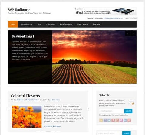
Now this is a theme that can do wonders to you and your work as it caters to any type of website including professional blogs, online magazines and business websites. Its an excellent responsive premium WordPress theme from Solostream. This flexible, multi-purpose theme is packed with features and has a clean and professional design along with a responsive layout which adjusts for any screen and device . WP-Radiance comes with multiple homepage layouts: a default blog / magazine structure as well as an optional business homepage template. Briefly some of the other features include features posts and pages sliders, portfolio templates, lots of pages templates, in-built banner ad locations, theme settings page for easy customisation and more.
Dolce WordPress Theme
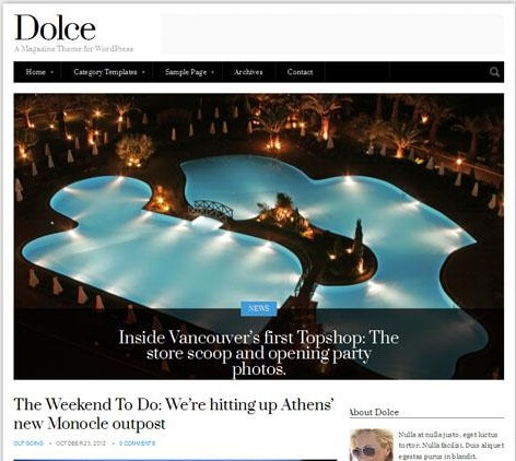
Dolce is a simple but stylish responsive blog / magazine WordPress theme from cssigniter. The premium has a minimal but sophisticated design and hence is best for blog or a magazine website. It has 6 homepage layout options from a traditional blog layout to various magazine style designs with slider and featured articles sections.It gives you an option of selecting between articles, galleries, and vidoes for your posts. Some other features are- numerous custom widgets, shortcodes, settings options panel and of course the responsive design so it will look perfect on tablets, mobile phones and all other devices.
WP Professional WordPress Theme

WP Professional is a clean and versatile premium WordPress theme from Solostream ideal for consultants, coaches, professional and personal bloggers. Now this one has a mobile responsive design hence it automatically adjust to fit any screen size and device. The theme also has a never ending list of features including: an alternative business homepage layout, email capture form, featured slider, multiple post and page layout options, video and portfolio templates etc.
Personal WordPress Theme
Now this is the one for you if you are a writer, journo, videographer or a blogger .Personal is a super clean, minimalist WordPress theme. The premium theme from Obox has a customisable, content-first design to promote your work and help you shocase the same to th e workd with an ease. The theme has a flexible homepage layout with a simple drag and drop widget system to give you endless layout possibilities.
One need not worry about the vastness of your content beacuse it has as many content categories in different layouts and orders as you like on the homepage. And as if it was less there are more features including: a visual customizer to make changes to your theme without needing to code, Obox Typography Manager to change all the fonts, social links and social widget, custom background, logo and menu options and much more.
Elemin
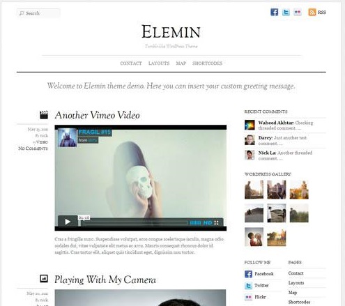
A stylish minimal and responsive WordPress premium theme from Themify. This one comes with a good white balance, less graphics, and has beautiful typography. The layout automatically adapts based on the user’s viewport. It works on all desktop and most mobile devices such as iPhone, iPad, Android, and Blackberry. Other features include list view or multiple grid view layouts, WordPress post formats support, 11 colour skins, comprehensive options panel and more.
WP Clear Video
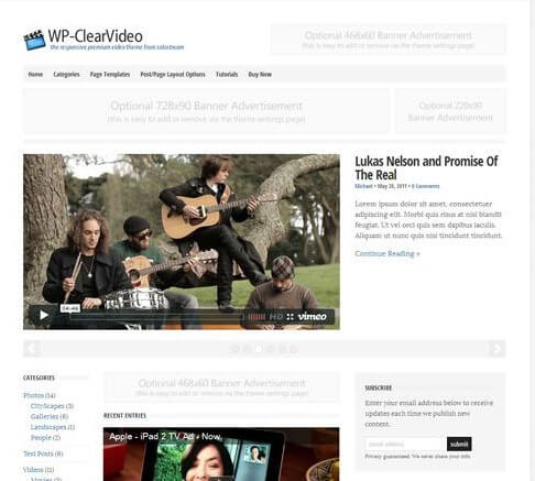
A responsive WordPress theme from Solostream for bloggers or video bloggers. The premium theme has a clean and professional design with a responsive layout delivering an optimized design on whatever device it’s being viewed on. Featured include an alternative business homepage layout option, featured posts slider, YouTube videos page template, portfolio page template, multiple post and page layout options, theme setting panel and more.
ICO WebTech Pvt. Ltd. pioneers in creating website using WordPress , just contact us and leave all the design and development related worries to us!
Understanding and Comparing Responsive, Adaptive and Fluid Design
Planning to create a Responsive Design strategy?
The information below will give you all the necessary information to start.
This article will throw light on terms such as responsive design, fluid design, adaptive design, mobile first and content first. This article will also lay the foundation and give you a better understanding of how responsive design can save you time, money and frustration while giving you a website that clearly and effectively communicates with your clients.
Fluid Design
Fluid Design was in use long before Responsive Design. There was an eminence debate in the web community to compare which between fixed or fluid designs is more beneficial. Fixed width offered designers greater amounts of control, but fluid design was more flexible to the needs of the user’s experience. Even before the onslaught of smartphones and tablets, believers of fluid design alleged all users would have a different experience of the web, depending on variables such as monitor size and browser window size.
The web, by nature, is fluid. HTML, without applied CSS, will flow to be 100% of the width of the page’s body. As a browser window shrinks, text adjusts. Fluid Design embraced this fluidity before Responsive Design was even a possibility.
HTML text on the web is fluid by nature. Fluid Design (and Responsive Design) embrace this fluidity.
Adaptive Design vs Responsive Design
Responsive Design and Adaptive Design often get mixed together, but they have some major differences. Adaptive design sets fixed width breakpoints.
Adaptive Design will serve different versions of the site to different devices based on common screen sizes and resolutions. This approach is considered less future-proof than responsive design because the screen sizes of common devices are constantly changing. Responsive Design is built around a fluid grid vs. adaptive design’s fixed grid. If you’re on an iPhone you get one design, and if you’re on an iPad you get another.
The reason adaptive design is not future-proof is because screen sizes and resolutions of popular devices are constantly changing. The argument about responsive design vs. adaptive design, in many ways, mirrors the older debate around fixed width vs. flexible layouts. Proponents of fixed width and adaptive designs like the control of knowing the size of the canvas they will be designing for. Proponents of fluid and responsive designs feel that any attempt at guessing the users viewing experience is illusory.
Responsive Design
Rather than setting breakpoints at common screen sizes (like adaptive design), Responsive design makes decisions based on the needs of the content.
Web designers will often grow and shrink their browser windows to analyze type, margins, padding, line-height, and other layout considerations. When a line of text or an image is uncomfortably squished or has too much space, a breakpoint will be added via a CSS media query. The text, image or layout will change size based on the needs of the content.
Responsive design also uses flexible images so that images scale depending on the width of the browser window or device. There is actually a lot more to talk about in the world of responsive images as working groups are currently working out specifications for how to best handle image sizes, but that is for another blog post.
Fluid Grid + Flexible Images = Responsive Design
In short, responsive design is defined as having a fluid grid, flexible images and CSS media queries. Responsive Design has become the current industry standard for how a website should be built.
While not always the best or most practical solution, a responsive site is often the best solution to ensure you reach your customers, no matter their device. Responsive Design requires a new mindset for how to design for a web that constantly changes size and dimensions. Some of the following terms and concepts evolved to help re-envision how to think about the responsive design process.
Responsive Web Design: Content First
Content First is often part of a responsive design strategy. Design can no longer afford to be decoration. It needs to be information that quickly loads and gets users to reap the benefits of your business.
If your navigation menu or company message is not clear, concise, and fast-loading on a smartphone; you may be losing clients, trust, credibility and money. Having a content first strategy, respects your clients/users time and attention. Content first helps you focus your messaging, navigation patterns, branding and site structure. It is all about directly communicating with your customers. Design decisions around typography, color and imagery are all meant to serve the needs of the content.
Responsive Web Design: Mobile First
Mobile First is about designing for the smallest sized device first. From a development perspective, mobile first means all of the initial CSS styling that gets coded will be targeting small screen devices first.
Mobile First requires a dedication to precise language, clear information architecture and a desire to have a lean highly usable website. This isn’t to say the site has to be minimal. As larger screen breakpoints are added, there is more room for larger images and varying layout possibilities. But even at these greater screen sizes, mobile first concepts can still help guide design decisions.
What is your feedback for Responsive Web Design? Do you agree with the fact that all sites should be responsive?
We would be happy to serve you with our services of web design and development. Contact us to know more.
