Imagine this: you own a physical store. You’re standing behind the counter, but instead of just watching customers wander around, you suddenly have superpowers. You can see exactly which shelves people walk straight to, which products they pick up, hold, and admire, and which ones they glance at for half a second before moving on. You’d know if your new display by the entrance is a hit or if that product you thought would sell like hotcakes is actually gathering dust.
Now, think about how much easier it would be to improve your store layout with that knowledge. You could move the bestsellers to prime spots, give more attention to products people hesitate over, and stop wasting valuable space on items no one cares about. Pretty powerful, right?
Well, that’s essentially what heatmaps do for your website. They give you that same “superpower,” but in the digital world. A heatmap is like having a behind-the-scenes look at your visitors’ behavior—what grabs their attention, where they pause, what they click on, and what they completely ignore.
And here’s the best part: instead of scratching your head and wondering, “Why are people leaving without buying?” you finally get clear, visual answers. Heatmaps let you see, not just assume, what’s working and what isn’t.
So, rather than guessing or endlessly tweaking things at random, you can make smarter, data-backed changes that actually move the needle.
Let’s break it down and explore how heatmaps work—and more importantly, how you can use them to turn curious visitors into loyal customers.
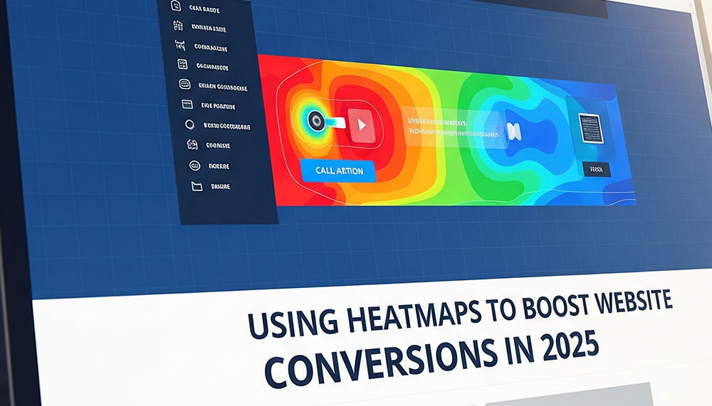
What Exactly Is a Heatmap?
Think of a heatmap as your website’s mood ring—but instead of showing emotions, it shows how your visitors behave.
Here’s how it works: heatmaps take all the clicks, scrolls, and mouse movements happening on your site and turn them into a colorful picture. The “hot” areas—glowing in shades of red, orange, or yellow—are the spots where people are most engaged. Maybe it’s a button they can’t resist clicking, a headline that catches their eye, or an image that pulls them in.
On the flip side, the “cold” areas—usually in blue—are the forgotten corners of your site, the places where visitors hardly stop, scroll, or interact.
In other words, a heatmap is like shining a spotlight on what’s working and leaving the rest in the shadows. Instead of guessing, you can clearly see:
- Where people click the most
- How far they scroll before losing interest
- Where their mouse tends to hover
It’s simple, visual, and super intuitive. With just a glance, you’ll know what’s stealing attention and what’s being ignored—no spreadsheets or confusing analytics dashboards required.
For example, imagine you run an online store and notice everyone is clicking the “Add to Cart” button but completely skipping the “Shipping Info” section. That’s a clear sign you might need to make shipping details more visible—or maybe customers find them confusing. Without a heatmap, you’d be left guessing. With one, the answer is right in front of you.
Why Heatmaps Are Game-Changers for Conversions
Let’s be real—most business owners and marketers are constantly tweaking things on their websites. You move a button here, change a headline there, maybe even redesign a whole page… but half the time, you’re guessing. You think you know what visitors care about, but the data says otherwise.
That’s where heatmaps flip the script. Instead of stabbing in the dark, you get a front-row seat to your visitors’ behavior.
Here’s why they’re a total game-changer:
Spot Missed Opportunities
Ever seen visitors click an image that doesn’t do anything? Or try to highlight text that isn’t linked? Heatmaps expose those hidden clues. If people expect something to be clickable, it’s a chance to add a link, button, or call-to-action you didn’t realize was missing. It’s like discovering money left on the table.
Understand Drop-Off Points
Scroll heatmaps are brutally honest. They show exactly where people lose interest. Imagine placing your big, shiny “Buy Now” button at the bottom of the page—only to find out that 70% of visitors never even scroll that far. Ouch. With heatmaps, you’ll know where attention drops off and can move key elements higher up.
Optimize CTAs for More Clicks
If your call-to-action isn’t getting love, don’t just blame the copy. A heatmap might reveal that it’s blending in with other elements, sitting in the wrong spot, or buried under distractions. Small tweaks—like changing the placement or color—can suddenly make that button irresistible.
Test Layouts with Real Data
A/B testing is useful, but it only tells you which version performs better, not why. Heatmaps fill in the blanks. They let you see the behavior behind the numbers—why people click one design over another. It’s like having X-ray vision for your A/B tests.
Boost User Experience (UX)
At the end of the day, people stick around when your site feels natural and easy to use. Heatmaps help you design around real habits. Instead of forcing users into your flow, you adapt to theirs—and that’s when conversions skyrocket.
Think of it this way: instead of guessing what aisle in your store people like, you’re literally watching them walk through it. No surveys, no assumptions—just clear, visual proof of what matters most.
Types of Heatmaps You Should Use
Not all heatmaps are the same—each type gives you a different kind of insight. Think of them like different lenses on a camera: one zooms in on clicks, another on scrolling, and another on eye movement. Together, they give you the full picture of how visitors interact with your site.
Here are the big ones you’ll want to know about:
Click Heatmaps
These are probably the most popular type. They show you exactly where users are clicking—whether that’s a button, an image, a link, or even something you didn’t expect them to click. Want to know if your CTA button is really catching attention? A click heatmap will spill the truth. Sometimes, you’ll even discover users are obsessively clicking something that isn’t clickable, which is a golden opportunity to make a change.
Scroll Heatmaps
Ever wonder how far people actually scroll on your page before they bail? Scroll heatmaps reveal that story. They’re perfect for blogs, landing pages, and long sales pages where you need to know if your message is being read—or if most people drop off halfway. If your CTA is at the bottom and heatmaps show only 25% of users make it there, you instantly know why conversions are low.
Move Heatmaps
These track mouse movements and hovering behavior. Now, while a moving cursor isn’t exactly the same as eye movement, it’s often a pretty close indicator of where people’s attention goes. If visitors keep hovering over a product description but don’t click “Buy,” that’s a sign you may need a stronger CTA or better copy in that area.
Eye-Tracking Heatmaps (Advanced)
This one takes things to the next level. Instead of just clicks and scrolls, eye-tracking shows you where people are actually looking on your site. It’s super powerful for testing layouts, headlines, and images—especially if you’re serious about conversions. The downside? It usually requires special tools and isn’t as easy (or affordable) as the others. But if you can get your hands on it, the insights are worth it.
The bottom line? Each type of heatmap answers a different question. Use them together, and you’ll uncover the real story behind how people interact with your site.
Practical Ways to Use Heatmaps for Higher Conversions
Okay, so you’ve got your heatmaps running. Now what? The real magic happens when you take those colorful insights and turn them into action. Here are some practical, tried-and-true ways to use heatmaps to boost conversions on your site:
Fix CTA Placement
Imagine putting up a big sign in your store, but placing it in the basement where hardly anyone goes—that’s what happens when your CTA is buried at the bottom of your page. A scroll heatmap shows you exactly how far visitors are scrolling, so if most of them never make it down, simply move your “Buy Now” or “Sign Up” button higher. Sometimes, shifting a CTA just a few scrolls up can completely change your conversion numbers.
Clean Up Distractions
Click heatmaps are great at exposing the “shiny objects” stealing attention from your main goal. Maybe visitors keep clicking on an image that isn’t linked or on a menu item that doesn’t matter. Every unnecessary click is a lost conversion. By removing or minimizing these distractions, you can guide users straight to the action you want them to take.
Improve Form Completion
Forms are one of the biggest conversion killers when not optimized. If you notice users consistently dropping off midway through a form, heatmaps can show you the exact field causing friction. Maybe it’s too long, maybe it asks for unnecessary info, or maybe the layout feels overwhelming. By simplifying, reordering, or even removing fields, you can smooth the path and see more completions.
Optimize Content Layout
If your scroll heatmap shows a lot of visitors stopping mid-page, that’s a red flag that your content isn’t holding attention. This is where better storytelling, sharper headlines, or even adding visuals can work wonders. Think of your page as a conversation—if people are walking away halfway through, it’s time to rethink how you’re talking to them.
Enhance Mobile Experience
Here’s the thing: mobile visitors don’t behave the same way as desktop users. Small screens, thumbs instead of cursors, and different navigation habits mean your design has to work twice as hard. Heatmaps let you compare mobile vs. desktop behavior. Maybe that button looks fine on desktop but is impossible to tap on a phone. Fixing these small but critical issues can massively improve conversions from mobile traffic.
The takeaway? Heatmaps don’t just give you data—they give you direction. By acting on what you learn, you make your site more intuitive, less frustrating, and far more likely to convert visitors into customers.
Best Tools for Heatmaps
So you’re ready to dive in and actually see what your visitors are doing? Great—because the right tool makes all the difference. Here are some of the most popular (and beginner-friendly) heatmap tools you can start using today:
Hotjar – The go-to choice for many marketers and business owners. It’s super easy to set up and comes with click, scroll, and move heatmaps. Bonus: you also get session recordings to watch real user journeys play out.
Crazy Egg – A classic in the conversion toolkit. Along with heatmaps, it offers session replays and even A/B testing so you can experiment with different layouts and instantly see what performs better.
Microsoft Clarity – Want something powerful and free? Clarity gives you heatmaps, behavior analytics, and detailed session recordings without costing a dime. Perfect if you’re just starting out or running on a budget.
Lucky Orange – More than just heatmaps. It combines user tracking with live chat, conversion funnels, and polls, so you can both see what’s happening and talk to visitors in real-time.
Quick Comparison: Best Heatmap Tools at a Glance
| Tool | Best For | Key Features | Pricing |
| Hotjar | Beginners & small businesses | Click, scroll, move heatmaps + recordings | Free plan + Paid from ~$39/mo |
| Crazy Egg | Marketers testing layouts | Heatmaps, A/B testing, session replays | Paid plans from ~$29/mo |
| Microsoft Clarity | Anyone on a budget | Heatmaps, behavior analytics, recordings | 100% Free |
| Lucky Orange | Businesses wanting all-in-one tools | Heatmaps, live chat, conversion funnels | Paid plans from ~$39/mo |
Pro tip: Start with Clarity if you’re new and just want to test the waters for free. Once you’re hooked on the insights, tools like Hotjar or Lucky Orange give you more advanced features to scale.
Heatmaps + Analytics = Conversion Powerhouse
Here’s the truth: heatmaps alone show you what’s happening, but not always the full story. Traditional analytics tells you the numbers — heatmaps reveal the why. Put them together, and you’ve got a conversion superpower.
- Google Analytics (GA4): Use it to spot where visitors are dropping off. Example: maybe 70% of people abandon your checkout at Step 2.
- Heatmaps: Now dig deeper. Are users ignoring the “Next” button? Is it buried too low? Too small? Competing with other elements?
Think of it like this:
- Analytics = the doctor’s test results (what’s wrong)
- Heatmaps = the X-ray (where and why it’s happening)
When you combine the two, you don’t just see problems — you know exactly how to fix them. That’s how smart businesses boost conversions without wasting months guessing.
Example:
- GA4 shows a high bounce rate on your landing page.
- Your scroll heatmap shows users stop halfway because the headline isn’t strong enough.
- Fix the headline, move the CTA higher, and bounce rate drops while conversions climb.
Takeaway: Numbers tell you what’s broken, visuals show you why it’s broken — and together, they give you the blueprint to fix it fast.
Final Word
Heatmaps take the mystery out of conversion optimization. No more scratching your head wondering, “Why aren’t people clicking?” — the answers are right there in front of you, visual and undeniable.
By seeing how visitors truly interact with your site — where they click, where they stop scrolling, and what grabs (or loses) their attention — you get the clarity to make smart changes. Move CTAs to the right spot, cut out distractions, streamline forms, and create a browsing experience that feels effortless.
At the end of the day, that’s the real power of heatmaps: turning insights into action, and clicks into customers.


Related items
Some marketers call it science. Others call it psychology. But anyone who has stared at a

In the ever-changing world of digital marketing, content is still king, but not all conten

Let’s be honest—getting noticed as a small business these days isn’t easy. The digital wor