With people becoming more tech savvy it has left the web design industry with no other option but to come up with new things every now or then. Be it the way the websites look or the way they function. Hence all of us have to keep coming up with something new and trendy that can attract more audience towards your website and increase the traffic.
But then again is it feasible to incorporate all the ongoing trends to your website or to even keep changing the look of it every now or then? I think its not necessary to actually bring about changes in your website every month or two but yes you can not stick with it for a long time too. Then the second thing that comes to our mind is which elements will be best for websites.
Don’t worry I have tried to pen down some elements for you :
- First I think the so called Card design can do wonders to your website. It simply puts every thing into cards, making the website look organized and tidy. Also with the card design element you can make your content look good.
- Your website design should be done in such a way that it is viewed the same way no matter on what medium one is using. That is it should be a responsive layout.
- One can also use some kind of movement. Animation can definitely help you with this. Also it will help you get that break from all content only website which can lead to unhappy or distracted audience.
- One thing that is really working these days is the background videos. That is even if you don’t click on a video the video will play on itself and keep teasing you to actually click it and see what’s more for you. Isn’t that a cool element to get that attention from your audience you have always been wanting.
- Similarly background images can do wonders to your site with text overlaid on top. With one big image in the background you can convey your message to the audience loud and clear.
- If you use Apple products or have seen their latest models you must be very much aware of the ghost buttons. Well they are trending too. If you are a internet buff you might have noticed many other companies using the same on their websites. Basically this gives your customer that freedom to view the product image without any distractions while he can use those invisible (ghost) buttons as and when he wants.
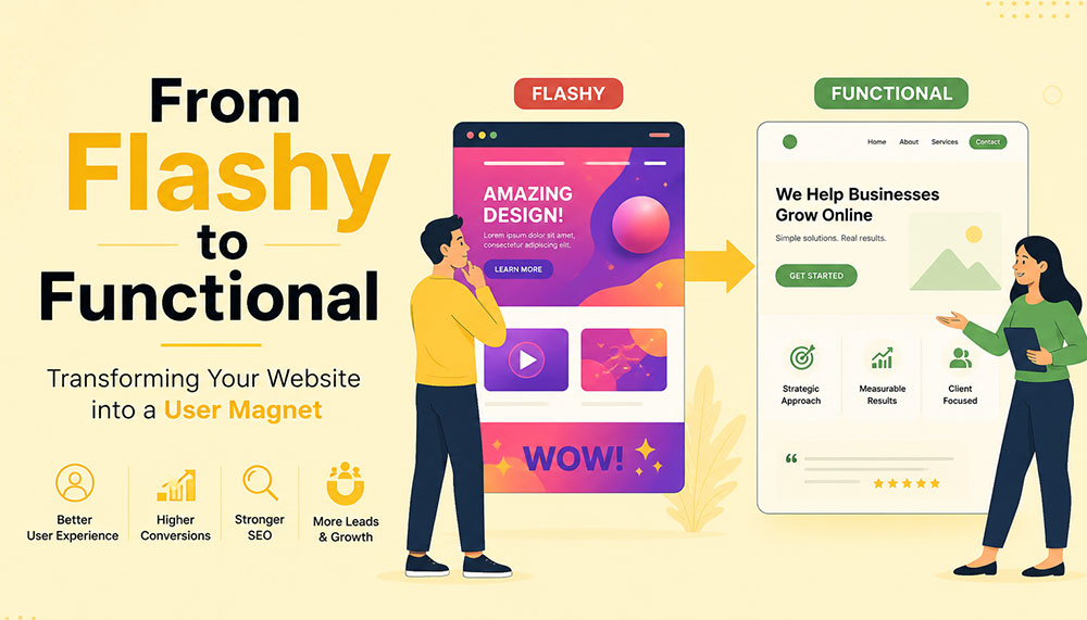
- Last but not the least you should never forget the golden rule which is to keep your website simple and clean. It should be designed in such a way that it is both user friendly and tech savvy.
Well we all know its not a easy task to do incorporate all the elements in your website so choose wisely. Select what you think is good for you and your audience and design your website accordingly, I hope the above points will be of some help to you.
At ICO, we regularly train our staff with the latest trends and technology, for this reason you can trust us for clean and user friendly website design. Contact us to know more.


