Your company logo is more than just a visual representation of your brand; it’s a powerful communication tool that can convey your brand’s personality, values, and essence.
The type of logo you choose plays a significant role in shaping the perception of your brand among consumers.
In this blog post, we will explore various logotypes and what they say about your brand.
-
Wordmark Logos
Wordmark logos consist of the company name or initials presented in a stylized and unique font. They focus primarily on typography to create a memorable and recognizable brand identity. Companies like Google, Coca-Cola, and FedEx have successfully adopted wordmark logos.
 What it says about your brand:
- Confidence and professionalism: Wordmark logos often indicate that your brand is established, reliable, and confident in its offerings.
- Clarity and simplicity: These logos convey a clear and straightforward message, emphasizing the importance of your brand name.
-
Lettermark Logos
Similar to wordmark logos, lettermark logos focus on typography, but they condense the company name into initials or a monogram. Well-known examples include IBM, HBO, and NASA.
 What it says about your brand:
- Legacy and tradition: Lettermark logos often imply a long-standing history and tradition associated with the brand.
- Innovation and modernity: By simplifying the brand name, lettermark logos convey a sense of contemporary thinking and innovation.
-
Brandmark Logos
Brandmark logos, also known as pictorial or symbol logos, use a unique and recognizable symbol or icon to represent the brand. Examples include Apple, Nike, and Twitter.
 What it says about your brand:
- Distinct identity: Brandmark logos emphasize visual recognition, suggesting that your brand is unique and easily identifiable.
- Emotion and storytelling: By using symbols, these logos evoke emotions and can tell a story associated with your brand.
-
Combination Logos
Combination logos combine both text and symbol elements to create a comprehensive representation of the brand. They often feature a distinctive symbol alongside the brand name. Companies like Adidas, Starbucks, and Burger King utilize combination logos.
 What it says about your brand:
- Versatility and adaptability: Combination logos offer flexibility for different applications, making them ideal for brands with diverse offerings.
- Established and reputable: The combination of text and symbol suggests that your brand is well-established and has a strong reputation.
-
Emblem Logos
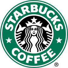
Emblem logos have a traditional and intricate design, with the brand name encased within a symbol or emblem. These logos often have a vintage or classic appearance, and examples include Harley-Davidson, Starbucks, and BMW.
 What it says about your brand:
- Authority and heritage: Emblem logos exude a sense of authority, expertise, and deep-rooted tradition.
- Attention to detail: The intricate design of emblem logos showcases your brand’s commitment to quality and craftsmanship.
What Your Company Logo Color Says About Your Brand
Color is a powerful element in logo design, as it can evoke emotions, convey meaning, and shape perceptions about your brand. Different colors carry distinct messages and associations, allowing you to communicate specific qualities and values to your audience.
Here are a few examples of what different logo colors say about your brand:
- Red: Red is associated with energy, passion, and excitement. It can create a sense of urgency and stimulate strong emotions. Brands that use red in their logos, such as Coca-Cola and Netflix, often want to convey a sense of boldness, vitality, and enthusiasm.
- Blue: Blue is a color that represents trust, reliability, and calmness. It is often used by brands in the technology, finance, and healthcare industries to convey a sense of professionalism and stability. Companies like IBM and Facebook incorporate blue into their logos to inspire confidence and a sense of security.
- Green: Green is strongly associated with nature, growth, and sustainability. It represents harmony, freshness, and eco-consciousness. Brands that use green in their logos, like Starbucks and Whole Foods, often want to convey a commitment to the environment, health, and well-being.
- Yellow: Yellow is a vibrant and optimistic color that symbolizes happiness, positivity, and creativity. It can grab attention and evoke a sense of joy. Brands like McDonald’s and IKEA incorporate yellow in their logos to create a cheerful and welcoming image.
- Black: Black is often associated with sophistication, elegance, and authority. It conveys a sense of professionalism and timelessness. Many luxury brands, such as Chanel and Mercedes-Benz, use black in their logos to exude a sense of exclusivity and refinement.
These are just a few examples, and the perception of color can vary depending on cultural and personal contexts. When choosing colors for your logo, you must consider your brand’s personality, target audience, industry, and the emotions and associations you want to evoke.
What Your Company Logo Shape Says About Your Brand
The shape of your company logo also plays a significant role in communicating messages about your brand. Different shapes evoke different emotions and carry distinct associations, allowing you to convey specific qualities and characteristics to your audience. Here are a few examples of what different logo shapes say about your brand:
- Rectangles/Squares: Rectangular or square logos convey stability, balance, and professionalism. They suggest a structured and reliable brand that pays attention to detail. Companies like Microsoft and Adobe utilize rectangular or square shapes in their logos to emphasize their authority and expertise in their respective industries.
- Circles: Circular logos symbolize unity, inclusivity, and harmony. They evoke a sense of community and connection. Brands like Target and BMW incorporate circular shapes in their logos to create a friendly and approachable image, inviting customers to be part of their brand experience.
- Triangles: Triangular logos represent energy, progress, and innovation. They convey a sense of direction and momentum. Companies like Delta Airlines and Mitsubishi use triangular shapes in their logos to express their commitment to forward thinking and advancement in their fields.
- Curved/Fluid Shapes: Curved or fluid shapes in logos evoke a sense of creativity, flexibility, and friendliness. They suggest a brand that is approachable and adaptable. Examples include the Nike swoosh and the Coca-Cola ribbon, both of which use flowing lines to create a sense of movement and dynamism.
- Geometric Shapes: Geometric shapes, such as hexagons, pentagons, or octagons, can convey precision, structure, and innovation. They suggest a brand that is forward-thinking and meticulous in its approach. Companies like Honeywell and Siemens incorporate geometric shapes in their logos to emphasize their technical expertise and cutting-edge solutions.
It’s important to note that the perception of shapes can also be influenced by cultural and personal associations. Additionally, combining different shapes or using abstract shapes can create unique and memorable logo designs that convey a more personalized message about your brand.
Why These Elements Are Important in Logo Design
The elements of color, shape, and logo type are essential in logo design because they serve as visual cues that quickly communicate your brand’s identity and values to your target audience. Here’s why these elements are crucial:
- Brand Differentiation: In a crowded marketplace, your logo should help your brand stand out from competitors. By strategically choosing colors, shapes, and logo types that align with your brand’s unique identity, you can create a distinctive visual representation that sets you apart.
- Emotional Connection: Colors and shapes have the power to evoke emotions and create a subconscious connection with your audience. When the visual elements of your logo align with your brand’s personality and values, they can elicit specific emotional responses that resonate with your target market.
- Brand Recognition: A well-designed logo that combines colors, shapes, and logotypes can enhance brand recognition. When consumers consistently associate your logo with positive experiences and emotions, it becomes a powerful symbol of your brand’s presence and reputation.
- Communication of Values: Your logo is an opportunity to communicate your brand’s values and characteristics at a glance. By carefully selecting the visual elements, you can convey messages about your brand’s professionalism, innovation, eco-consciousness, or any other qualities that are important to your target audience.
- Versatility and Consistency: The elements of color, shape, and logotype should be chosen with versatility and scalability in mind. A well-designed logo can be adapted to various marketing materials, from digital platforms to print collateral, while maintaining its visual impact and brand recognition.
Which Is the Best Logo For Your Company?
Choosing the best logo design for your company depends on various factors, including your brand’s personality, target audience, industry, and long-term goals. Each logotype has its strengths and characteristics that can align with different brand identities.
If your brand has a distinctive name or initials, a wordmark or lettermark logo may be the best choice. These logo types focus on typography and can effectively communicate the professionalism and clarity associated with your brand. They work well for companies that want to establish a strong presence based on their name recognition.
On the other hand, if your brand wants to convey its unique personality and stand out from the competition, a brandmark or combination logo might be more suitable. Brandmark logos utilize symbols or icons to create a visual representation that is easily recognizable and memorable. Combination logos provide the best of both worlds by combining a distinctive symbol with the brand name, allowing versatility and adaptability.
If your brand has a rich heritage, a classic appearance, or wants to emphasize authority and attention to detail, an emblem logo can be a great choice. Emblem logos combine a symbol or emblem with the brand name, often with a vintage or traditional aesthetic. They are ideal for brands that want to evoke a sense of heritage, craftsmanship, and expertise.
Ultimately, the best logo for your company should capture the essence of your brand, resonate with your target audience, and differentiate you from competitors.
It’s crucial to work with a professional logo designer who understands your brand values and can translate them into a visually compelling logo.
Conclusion
Your company logo is a visual representation of your brand’s identity, values, and aspirations. Each logo type carries distinct messages and associations that can influence how your brand is perceived by consumers. Whether you opt for a wordmark, lettermark, brandmark, combination, or emblem logo, it’s crucial to consider how it aligns with your brand’s personality and resonates with your target audience.
Remember, a well-designed logo can make a lasting impression, evoke emotions, and help differentiate your brand from competitors. By understanding what your chosen logo type says about your brand, you can create a visual identity that effectively communicates your brand’s essence and leaves a memorable impact on your audience.
ICO WebTech: Your Trusted Logo Designing Company in Delhi for Exceptional Brand Identity
At ICO WebTech, we specialize in providing comprehensive logo design services in Delhi. As a leading website designing company in South Delhi, we understand the importance of creating visually appealing and impactful logos that effectively represent your brand identity. Our expertise lies in crafting unique and customized logos that align with your brand’s values and resonate with your target audience.
As the best website designing company in Delhi, we recognize that your logo is a crucial component of your overall branding strategy. It serves as the visual representation of your business and plays a significant role in creating a strong first impression. Our team of experienced designers collaborates closely with you to understand your brand’s personality, target market, and industry. By incorporating your vision and input, we create logos that capture the essence of your brand and make it stand out in the competitive market.
As a logo designing company in Delhi, we emphasize the importance of creating logos that are not only visually appealing but also aligned with your business objectives. We consider factors such as color psychology, shape symbolism, and logo type to ensure that the design effectively communicates your brand’s values and messages. Whether you prefer a wordmark, lettermark, brandmark, combination, or emblem logo, we tailor our approach to meet your specific requirements.
Being the best website designing company in South Delhi, we understand the significance of a cohesive brand identity across all digital platforms. Your logo plays a crucial role in establishing that identity. We ensure that the logos we design are versatile and adaptable, allowing for seamless integration across your website, social media profiles, marketing materials, and more.
At ICO WebTech, we combine our expertise in website design and logo design to provide comprehensive branding solutions for businesses in Delhi. Our aim is to help you create a strong and memorable brand presence that resonates with your target audience and sets you apart from your competitors. We take pride in our ability to deliver high-quality logo designs that capture the essence of your brand and leave a lasting impact.
If you’re looking for a reliable logo designing and web design company in Delhi, ICO WebTech is here to help.
Contact us today to discuss your logo design needs and let us assist you in creating a visually stunning and meaningful logo that represents your brand’s identity with excellence.
