Do Content Hubs Still Work in an AI-Search World? Testing the Evidence
Zero-click search is real. AI Overviews now touch roughly half of all Google queries. So we pulled the 2026 data to answer a simple question: does building a content hub still pay off — or is it a 2019 tactic limping through 2026?
The short answer
Yes, content hubs still work. But why they work has quietly changed, and if you’re building one using a 2021 playbook, you’re optimizing for a search engine that increasingly answers the question before your page ever gets a click. Below, we walk through the actual mechanics of how AI search retrieves and cites content, what the traffic data says, and a practical framework for building a hub that earns visibility in both classic SERPs and AI-generated answers.
1. Quick refresher: what a content hub actually is
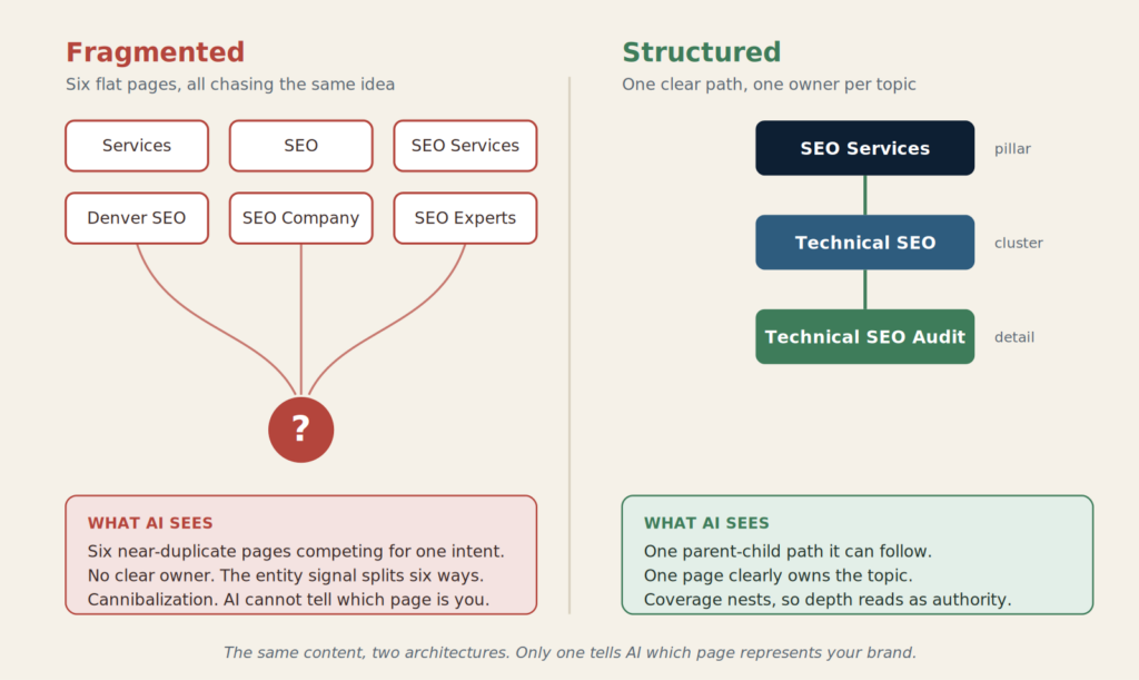
A content hub (also called a topic cluster or hub-and-spoke model) is a group of interlinked pages built around one core subject:
- A pillar page — a comprehensive overview of the broad topic
- Cluster pages — narrower articles covering subtopics, comparisons, how-tos, and definitions
- Internal links — a two-way link structure connecting every cluster page back to the pillar, and the pillar out to each cluster

The pillar page is deliberately broad. It’s meant to be the page someone lands on when they search a general, high-volume term — “content marketing,” “email deliverability,” “employee onboarding” — and it answers the question at a summary level while pointing to deeper resources for every subtopic it touches. It doesn’t try to be the definitive word on any single subtopic; it tries to be the definitive map of the whole topic.
Cluster pages do the opposite job. Each one goes narrow and deep on a single facet of the topic — a specific comparison, a step-by-step process, a definition, an edge case, an objection a buyer might raise. Because each cluster page targets a distinct search intent, a single hub can realistically rank for hundreds of long-tail variations that a standalone pillar page never could on its own.
The internal linking is what turns a pile of related articles into an actual hub. Every cluster page links up to the pillar (so a reader — and a crawler — can always find their way back to the overview), and the pillar links out to every cluster (so nothing in the structure is more than one click from the center). This is what search engines read as topical depth: not just that you’ve written about a subject once, but that you’ve built out every corner of it and connected the pieces on purpose.
The idea, popularized by HubSpot around 2017, was straightforward: instead of publishing isolated blog posts that each fight for a single keyword, you build a body of interconnected content that signals topical depth to search engines.
That part of the theory hasn’t changed. What’s changed is who’s reading the signal.
2. What actually changed: the zero-click shift
Before testing whether hubs still work, it’s worth being precise about what they’re now competing against.
| Metric | Figure | Source |
|---|---|---|
| Share of Google searches with an AI Overview (2026) | ~47–64% of queries | eSEOspace / industry AI Overview tracking |
| Google searches ending with zero clicks to any site | Roughly two-thirds of searches | SparkToro/Datos clickstream study, 2026 |
| Click drop on the #1 result when an AI Overview appears | 30–50% average CTR decline | Ahrefs, eSEOspace |
| Zero-click rate inside Google’s AI Mode | 93% across 25.1M impressions studied | Seer Interactive |
| B2B site traffic decline attributed to AI-assisted buyer research | 10–40% over the past year | Forrester |
The takeaway isn’t “SEO is dead.” It’s that a growing share of searches now get answered without a visit to your site at all — which raises the real question this post is testing: in a world where the destination often doesn’t matter, does the hub-and-spoke structure still move the needle, or is it optimizing for a click that increasingly doesn’t happen?

The proportion of Google searches ending without a click has risen sharply since AI Overviews expanded in 2025–2026.
3. How AI engines actually choose what to cite
This is the part most “is SEO dead” takes skip, and it’s the part that determines whether a content hub helps or does nothing. Each AI search system sources and cites content differently — treating them as one undifferentiated “AI search” misses the strategy entirely.
Framework: How the major AI answer engines source content
| Platform | Primary source logic | What it favors | Citation behavior |
|---|---|---|---|
| Google AI Overviews | Re-ranks Google’s existing organic index | Pages already ranking well, with clear structured answers near the top of sections and consistent schema markup | ~97% of citations come from pages already in the top 20 organic results |
| ChatGPT | Static training data + Bing-powered retrieval layer | Wikipedia (up to ~48% of top-10 citations), major reference media, high-authority editorial sources | Mentions brands roughly 3x more often than it links to them |
| Perplexity | Real-time web crawl on every query | Fresh, recently published content; citation-first by design | Cites ~22 sources per answer on average; new content can appear within hours |
| Claude | Blended retrieval, leans toward established journalism | The New York Times, The Atlantic, The Economist and similar outlets | Lower overlap with ChatGPT’s source set than you’d expect |
The critical number here: independent studies from Ahrefs, Averi, and Whitehat SEO — using three different methodologies — all converged on the same finding. Only around 11–12% of domains cited by ChatGPT also get cited by Perplexity. The set of pages Google’s AI Overview cites overlaps with ChatGPT’s citations at a similarly low rate. These are not one search engine with different skins. They’re separate visibility surfaces with almost entirely different rulebooks.
That single fact is why a hub built purely for classic Google ranking signals is now working against a fragmented, multi-engine reality — not a unified one.
How to rank your website on ChatGPT
4. Testing the evidence: do hubs actually outperform scattered content?
This is the part that actually settles the argument. Not opinions, not vendor case studies with cherry-picked clients — third-party benchmarking, stacked up and stress-tested against what AI search now rewards. And the deeper you go, the more the case builds.
Keyword capture. Start with reach. A single well-built content hub doesn’t just rank for one thing — it ranks for everything adjacent to it. Cluster pages are reported to collectively capture over 1,000 keyword variations versus a few hundred for an isolated post, because each cluster piece targets a distinct intent (definition, comparison, how-to) while feeding authority back to the pillar. A standalone article fights one battle. A hub shows up on a thousand fronts at once.
Traffic advantage. That reach converts. HubSpot’s own benchmarking, cited widely across the industry, puts the organic traffic advantage of connected topic clusters over unconnected, one-off content at roughly 30–43%. Same content investment, meaningfully more traffic — just from linking it together on purpose.
Ranking stability. Now the part that matters when the algorithm shifts under your feet. Hubs show lower volatility during algorithm updates. When a search engine reweights how it evaluates a topic, a page embedded in a cluster of related, internally linked content tends to hold position better than an isolated page with no supporting context — because the site’s topical signal survives even if one page’s ranking shifts. Scattered content has nothing to fall back on. A hub does.
AI citation eligibility. And here’s where it stops being a nice-to-have and becomes the whole game. 97% of Google AI Overview citations pull from pages that already rank in the top 20 organically. A hub’s core advantage — better organic rankings across a wider keyword set — directly increases the number of pages eligible to be cited in AI Overviews. A hub doesn’t just rank more. It puts more surface area into the exact pool AI Overviews are pulling citations from.

Where hubs don’t automatically win: here’s the catch. ChatGPT and Perplexity draw much more heavily from third-party sources — Wikipedia, Reddit, major news outlets — than from brand-owned pages. One 2026 study found owned brand pages were “systematically underweighted” in favor of earned, third-party coverage across multiple AI systems. A content hub improves your position in Google’s ecosystem far more reliably than it guarantees a citation inside ChatGPT.
Verdict
Content hubs still work — but they now do two separate jobs that used to be one job:
- They still build the topical depth and internal-linking signal that improves classic organic rankings (proven, consistent with pre-AI data).
- They increasingly function as citation inventory for AI Overviews specifically, because AI Overviews draw almost exclusively from already-ranking pages.
What they no longer reliably do on their own is earn citations inside ChatGPT or Perplexity, which weight earned media and freshness far more heavily than owned-site architecture.
5. The AI-ready content hub: a practical framework
Given all that, here’s how the hub-building framework needs to change for 2026.
Framework: Building a hub for both classic SEO and AI citation
| Step | Classic hub practice | What to add for AI search |
|---|---|---|
| 1. Topic selection | Pick a topic with search volume and business relevance | Also check if the topic already generates AI Overviews or shows up in ChatGPT/Perplexity answers — test the queries manually before you build |
| 2. Pillar page | 4,000–6,000 words, comprehensive overview | Lead each major section with a direct, quotable answer in the first 1–2 sentences; AI systems evaluate relevance heavily from the opening of a section |
| 3. Cluster pages | 2,000–3,000 words per subtopic | Include original data, first-party research, or a proprietary framework — case studies and data-backed pages are the highest-leverage content type for AI citation across all three major platforms |
| 4. Structure & markup | Standard headings, internal links | Add FAQPage, HowTo, and Article schema; use short, extractable answer blocks under each H2/H3 |
| 5. E-E-A-T signals | Author bio, publish date | Named author with visible credentials, cited primary sources, and a “last updated” date refreshed quarterly — this is treated as close to a binary eligibility filter for AI citation |
| 6. Distribution | Internal linking, backlinks | Get the topic discussed on Reddit, Wikipedia-eligible reference sites, and industry publications — earned mentions matter more to ChatGPT and Perplexity than anything on your own domain |
| 7. Measurement | Search Console, GA4 | Add AI-visibility tracking (Semrush AI toolkit, Ahrefs Brand Radar, or a dedicated GEO monitoring tool) alongside standard rank tracking — the two numbers move independently now |
6. Where teams are getting it wrong
A few recurring mistakes show up across the case studies and benchmarking data:
- Treating AI Overview visibility and ChatGPT visibility as the same goal. They pull from almost entirely different source pools (roughly 11–12% domain overlap between platforms). A hub strategy optimized only for Google won’t automatically earn ChatGPT citations.
- Skipping the freshness cycle. Perplexity crawls in near real time; stale hub content — even if comprehensive — loses ground to competitors who republish quarterly.
- Under-investing in earned media. Since third-party, high-authority sources dominate AI citations, a hub with zero PR or community presence is fighting with one hand tied behind its back.
- Measuring only clicks. With two-thirds of searches now ending without a click, a hub that’s cited inside an AI Overview or ChatGPT answer but generates no visit is still doing brand-building and demand-generation work — traditional last-click attribution will make that look like the hub “isn’t working” when it’s actually earning trust and branded search lift.
7. Bottom line
The evidence doesn’t support “content hubs are obsolete” — but it doesn’t support building one exactly the way the industry did in 2019 either. Hubs still win on the metrics that were always true: wider keyword capture, better ranking stability, and a 30–43% organic traffic advantage over disconnected content. What’s new is that hubs have picked up a second job — becoming the inventory search engines and AI systems pull citations from — and that job comes with new requirements: first-party data, structured extractable answers, author credibility, and a presence beyond your own domain.
Build for both jobs, and a content hub remains one of the highest-leverage structures in content strategy. Build for only the first one, and you’ll keep ranking in a results page fewer people are clicking through.
Sources referenced
Ahrefs · SparkToro/Datos clickstream study · Seer Interactive · Forrester · HubSpot content benchmarking · eSEOspace AI Overview tracking · Averi AI citation analysis · Whitehat SEO · Semrush topical authority research
Captured by the Zero-Click Trend? How ICO Can Help You Win Google’s Featured Snippets
Search no longer sends the same traffic it used to. Here’s how to earn visibility and clicks even in a zero-click world.
If you’ve watched your organic traffic plateau or dip even as your rankings held steady, you’re not imagining it. Google’s search results page has quietly become a destination in itself — and for most searches, users never leave it. This is the zero-click era, and it’s rewriting the rules of SEO.
At ICO, we’ve spent the last few quarters helping brands adapt to exactly this shift — not by fighting the zero-click trend, but by getting inside it. The single most effective lever for doing that today is winning Featured Snippets, the answer boxes that sit at “Position Zero,” above even the #1 organic result. This guide breaks down the data, the mechanics, and a real optimization case study so you can see exactly how it’s done.
The Zero-Click Reality, By the Numbers
Multiple independent studies converge on the same uncomfortable truth: the majority of Google searches now end without a single click to any website. The exact figure varies by source and methodology, but the direction is unanimous.

Bain & Company’s research found that 80% of consumers now rely on AI-generated results for at least 40% of their searches, with organic traffic declining an estimated 15–25% across many sectors as a direct result. The takeaway isn’t that SEO is dead. It’s that the destination has changed — if your brand is named and recommended inside the answer itself, you still reach the customer at the exact moment they decide.
Why this matters for you: Whether you run an e-commerce store, or a SaaS product competing for local visibility, the brands winning today aren’t just chasing blue links — they’re engineering their content to live inside Google’s answer boxes.
What Exactly Is a Featured Snippet?
A featured snippet is a short, extracted answer that Google pulls from a ranking page and displays in a highlighted box above the #1 organic result — hence the nickname “Position Zero.” It includes the answer text, the page title, and the URL, giving you a branded presence even when the user never clicks through.

Illustrative mockup: a featured snippet occupies “Position Zero” — above the #1 organic result — complete with a highlighted answer box, source URL, and brand attribution.
The Four Core Snippet Types
Google displays four core featured snippet types as of 2026, each with different triggers, formats, and optimization requirements. Knowing which one your target query pulls determines exactly how you should structure your content.
| Snippet Type | Best For | Ideal Format | Share of Snippets |
|---|---|---|---|
| Paragraph | “What is,” “why,” definition queries | 40–60 word direct answer | ~60–65% |
| List | “How to,” step-by-step, ranked queries | Numbered/bulleted, 5–8 items | ~25–30% |
| Table | Comparisons, specs, pricing data | 3–5 columns, 5–6 rows | ~8% |
| Video | Tutorials, demos, repairs, recipes | Timestamped YouTube segment | ~5–8% |
Websites that consistently earn featured snippets report meaningful downstream gains: higher organic click-through rates, improved brand recognition, and stronger voice search visibility. That’s the real prize; snippets don’t just capture a click; they build the authority signals that compound over time.
Why Snippets Still Matter in the Age of AI Overviews
It’s tempting to assume AI Overviews have made traditional snippets irrelevant. The data says otherwise. Featured snippets now serve a dual purpose: they capture direct SERP real estate and simultaneously feed the AI Overview engine with citation-worthy signals, so content structured for one format typically earns visibility in the other.
The strategic nuance in 2026 is knowing which query types still trigger traditional snippets versus which have shifted almost entirely to AI Overviews — and redirecting optimization effort toward the how-to and commercial queries where snippets still appear reliably. This is precisely where a structured, ICO-led content audit pays off.

How ICO Approaches Featured Snippet Optimization
Winning Position Zero isn’t a lucky content accident — it’s a repeatable process. Here’s the exact framework ICO runs for every client, whether it’s a national e-commerce brand or a website designing company in Delhi trying to outrank larger competitors in local search.

Step-by-step, in plain terms:
- Snippet audit: We audit all page-one rankings to identify queries where a competitor currently owns a snippet that we can plausibly displace — usually queries where the client already ranks in positions 2–10.
- Intent mapping: We classify each target query by the snippet type it’s most likely to trigger — paragraph, list, or table — since matching content format to query intent (definitions to paragraphs, procedures to numbered lists, comparisons to tables) is the foundation of an effective position-zero strategy.
- Answer-first copywriting: We rewrite the page so the direct answer sits immediately under the relevant heading, because Google’s extraction algorithm looks at the text immediately following headings — if the answer is buried in paragraph three, the snippet goes to whoever puts it in paragraph one.
- Schema and structure: We implement FAQ, HowTo, and table schema, and convert prose into scannable lists and tables where the query calls for it.
- Track and defend: Snippets shift ownership constantly. We monitor snippet volatility monthly and refresh content before a competitor can take the box back.
Case Study: How ICO Helped a Delhi-Based Web Agency Win Position Zero
Client Snapshot
Our client, a mid-sized website designing company in Delhi, was ranking on page one for several commercial keywords but was consistently losing the featured snippet — and the associated click share — to larger national competitors and directory sites.
The Challenge
Page-1 rankings for 40+ commercial queries but zero snippet ownership. Organic CTR was well below expected benchmarks for their ranking positions.
The Approach
ICO ran a full snippet audit, identified 34 winnable queries, restructured service pages with answer-first blocks under 60 words, converted process explanations into numbered lists, and added comparison tables for “custom vs template website design.”
Headline results from ICO’s 90-day featured snippet optimization engagement.Headline results from ICO’s 90-day featured snippet optimization engagement.
Before/after results from ICO’s 90-day featured snippet optimization engagement.
“We were already ranking well, but we were invisible in the box that actually gets clicked. ICO didn’t just chase rankings — they reformatted our content to win the answer itself.” — Client testimonial, paraphrased from project feedback
Commercial Queries Where This Strategy Pays Off Fastest
Snippet optimization isn’t equally valuable across every keyword. It compounds fastest on commercial and local-intent queries where buyers are actively comparing options — for example, terms like website designing company in Delhi, best SEO company in India, digital marketing agency near me, ecommerce website development services, SEO services for small business, and website redesign agency. These queries sit in exactly the zone where traditional snippets still appear reliably, rather than being displaced by AI Overviews.
Getting Started: A Quick Checklist
- Pull your Search Console data and filter for queries ranking positions 2–10 — these are your highest-probability snippet targets.
- Classify each query by intent: definition, process, or comparison.
- Rewrite the first 40–60 words after the relevant heading as a direct, self-contained answer.
- Add FAQ, HowTo, or Table schema markup where applicable.
- Track snippet ownership monthly — Position Zero is contested real estate, and it changes hands often.
Ready to Win Position Zero?
ICO helps brands turn the zero-click trend from a threat into a visibility advantage.
Sources referenced:
Data points, statistics, and optimization guidance referenced in this article were drawn from the following sources. Figures are aggregated industry estimates as of 2026 and may vary by methodology.
- Click Vision, 50+ Zero Click Search Statistics for 2026: Trends & Impact — click-vision.com/zero-click-search-statistics
- Arfadia, Zero-Click Search Statistics 2026: Sourced & Updated — arfadia.com/blog/zero-click-search-statistics-2026
- Digital Applied, Zero-Click Search Statistics 2026: Complete Data Guide — digitalapplied.com/blog/zero-click-search-statistics-2026-complete-data
- Strategyc, Zero Click Search Statistics 2026: The Complete Data Behind Search’s Biggest Shift — strategyc.io/blog/zero-click-search-statistics
- Omnibound, Zero-Click Search Statistics (2026): 52+ Data Points — omnibound.ai/blog/zero-click-search-statistics (citing Bain & Company, Goodbye Clicks, Hello AI, Feb 2025)
- Nightwatch, How to Optimize for Featured Snippets (+Examples & Tips) — nightwatch.io/blog/optimize-for-featured-snippets
- Stackmatix, Featured Snippet Optimization in 2026: How to Win Position Zero — stackmatix.com/blog/featured-snippets-optimization-2026
- SEOctopus, Featured Snippet Optimization — The Complete Guide to Position Zero (2026) — seoctopus.io/en/blog/featured-snippet-optimization-guide-2026
- Digital Applied, Featured Snippets in the AI Overview Era: 2026 Guide — digitalapplied.com/blog/featured-snippets-ai-overview-era-optimization-2026
- CodeX Guru, How To Get Featured Snippets In 2026 — codexguruu.com/how-to-get-featured-snippets-in-2026
- IT in DFW, Featured Snippets in 2026: The Ultimate Guide to Position 0 — itindfw.com/blog/featured-snippets
- Scale Growth Digital, How to Optimize for Featured Snippets (2026) — scalegrowth.digital/resources/seo/how-to-optimize-featured-snippets (citing First Page Sage, 2026)
- YoGrow Solutions, How to Win the Featured Snippet: The 2026 SEO Formatting Guide — yogrowsolutions.com/how-to-win-the-featured-snippet
- SERPexa, Featured Snippet Types & How to Win Each: Complete Guide [2026] — serpexa.com/featured-snippet-types-how-to-win-each-complete-guide-2026
How to Scale a Search Campaign Without Blowing Up Your Cost Per Lead
Why a winning small-budget test doesn’t guarantee a winning big-budget campaign — and the pricing mechanics every advertiser should understand before pushing more spend into search, social, or display.
In this article
- The trap: judging a campaign by its smallest, cheapest phase
- Why campaigns almost always look good at small spend
- The ad inventory supply curve: the mechanic behind scaling
- The myth: “test small, then scale it”
- The campaign scaling S-curve
- The strategic fix: scale to your max CPL, not past it
- What it means if you can’t hit volume at your max CPL
- A practical scaling playbook
- Key takeaways
The trap: judging a campaign by its smallest, cheapest phase
One of the most common mistakes we see advertisers make, whether they’re running Google Search, Meta, LinkedIn, or programmatic display campaigns, is drawing big conclusions from a small amount of spend. A campaign launches, the first few hundred dollars go out the door, the cost per lead (CPL) looks fantastic, and the natural next move feels obvious: pour more budget in and watch the results multiply.
That instinct is understandable. It’s also, in a large share of cases, wrong. The purpose of this article is to explain why it’s wrong — not just as a rule of thumb, but as a consequence of how digital ad inventory is actually priced. Once you understand the underlying market mechanics, scaling stops being guesswork and becomes a strategic, defensible process.
Also read: Why Digital Advertising Costs Rise Even When Your Campaign Hasn’t Changed
Why campaigns almost always look good at small spend
There are two separate reasons early results are unreliable, and it’s worth separating them clearly.
First, statistical noise. A small number of clicks or conversions is a small sample, and such samples are inherently volatile. Marketing analysts widely note that testing with too few data points can yield results driven by random chance rather than a real underlying effect, and that this risk diminishes as the sample size grows[1][2]. A campaign that converts three out of five clicks in its first day hasn’t proven anything about its true conversion rate — it has produced a data point with a very wide margin of error.
Second, and more specific to paid media, is a pricing effect: at low spend, a campaign is only buying the cheapest, easiest-to-win slice of available ad inventory. This is the mechanism most advertisers overlook, and it’s the real subject of this article.
The ad inventory supply curve: the mechanic behind scaling
Every paid channel — Google Search, Meta, LinkedIn, programmatic display sells access to a finite pool of ad inventory for any given audience at any given moment. On real-time bidding exchanges, each individual ad placement is auctioned off the instant a user loads a page or opens an app, with the highest qualifying bid winning the impression[3][4].
Search auctions and social ad auctions work on the same underlying logic: advertisers compete for a limited number of eligible placements, and price is set by that competition rather than by a fixed rate card[5].
This has a direct consequence for scaling.
Not all inventory within a targeted audience is equally cheap. Some of it, the users most likely to convert, at the moments with the least competing demand, is cheap to win. The rest of it is more expensive, either because it’s contested by more advertisers or because it’s a lower-quality match for your targeting.
A small budget only needs to buy a small slice of inventory, so it naturally buys the cheapest slice available. A large budget has to buy much more of the available pool, which means reaching further into the expensive end of it.

This is exactly the pattern paid media practitioners observe in the field. Analysis of scaled Meta campaigns has found that at lower budgets, ads reach the most responsive audience first; as spend increases, the platform is forced to bid for less qualified segments of its own auction, which drives cost up[6].
Independent case data tells the same story: one documented account saw CPL rise 80% after daily spend was scaled from roughly $500 to $4,000, with the later dollars far less efficient than the earlier ones[7].
The myth: “test small, then scale it”
The myth: “We tested this campaign at $50/day and it performed brilliantly. Let’s scale it to $2,000/day and expect similar returns.”
This logic assumes ad inventory behaves like a product with unlimited stock at a fixed price; buy more, get proportionally more, at the same cost. That assumption doesn’t hold. Because inventory is limited and priced by competitive demand, scaling isn’t a linear multiplication of your test results.
It’s a walk further along the supply curve in Figure 1, and depending on how much headroom exists in that specific audience, on that specific platform, at that specific moment, the walk can be short and cheap, or it can hit a wall very quickly.
This isn’t only a display/social-auction phenomenon.
Google’s own reporting acknowledges the same constraint for Search: the “Lost Impression Share (Budget)” metric exists specifically to show advertisers how much additional traffic is available at their current bids before they’d need to pay more to win additional volume[8] — a direct, built-in admission that available inventory at a given price is limited.
The campaign scaling S-curve
Put the pricing mechanic on a timeline, and it produces a recognizable pattern that paid media analysts refer to as the campaign S-curve, a non-linear relationship between spend and CPL that unfolds in three broad phases[9].

- Learning. Spend is low, data is thin, and results can look better or worse than they’ll ultimately be simply due to sample-size noise[1].
- Efficient scaling. The campaign has found its footing. Increasing budget produces a roughly proportional increase in leads, and CPL holds close to flat. This is genuinely the “golden zone” for scaling[9].
- Diminishing returns. The readily available, cheap inventory has been exhausted. Cost per click or cost per lead begins rising faster than spend, click-through rate tends to soften, and conversion rate on the newer, lower-intent traffic often declines[9].
Warning sign to watch for: a rapidly rising cost per click or cost per lead is typically the earliest, clearest signal that a campaign has crossed from Phase 2 into Phase 3 — auction pressure and audience saturation showing up in the numbers before anything else does[9].
The strategic fix: scale to your max CPL, not past it
This is the strategic takeaway for ICO WebTech clients: define your maximum acceptable CPL before you scale, not after. Without that ceiling set in advance, there’s no way to know when a campaign has reached its efficient sweet spot versus when it has been pushed past it.
You end up scaling reactively, watching CPL rise, and only stopping once it’s already uncomfortable — instead of scaling deliberately, toward a number you decided on with your margins and business goals in mind.
In practice, that means:
- Set the ceiling first. Work backward from your acceptable cost of customer acquisition to a maximum CPL you’re willing to pay.
- Scale in increments, not leaps. Documented case data shows that aggressive single-day jumps in budget (for example, quadrupling spend overnight) tend to push campaigns into unstable, inefficient territory, while gradual increases of roughly 10–20% every few days let the auction adjust without a shock to cost[10][6].
- Judge by marginal CPL, not average CPL. Your blended, account-level CPL can still look healthy even after scaling has gone inefficient, because it’s averaging the cheap early leads with the expensive later ones. The number that tells the truth is the marginal cost — what the most recent increment of spend cost to convert[11].
- Give a scale-up time to settle before judging it. Algorithmic ad platforms typically need a short adjustment window after a budget change; evaluating results too early repeats the same small-sample problem discussed above[12].
What it means if you can’t hit volume at your max CPL
Suppose you scale spend all the way to your predefined max CPL ceiling, and the campaign still isn’t generating enough leads to hit your goal. That outcome is itself useful information; it tells you something specific about the market you’re in, not that paid media “doesn’t work.” There are three likely explanations, and each points to a different fix.

| Diagnosis | What’s happening | What to do |
|---|---|---|
| Target CPL is too low for the market | Your ceiling was set without reference to what this specific audience actually costs to reach right now. | Revisit the ceiling against realistic market pricing, or adjust lead-quality expectations. |
| The market is temporarily “too hot” | A spike in competitive demand, seasonal (e.g. Q4 retail), a competitor’s new campaign, or a category trend — is inflating prices across the board, not just for you. | Hold spend at the sustainable level, monitor, and re-test scaling once demand cools. |
| Not enough inventory exists for this audience | The addressable pool for this targeting, on this platform, is structurally too small to support the volume you need. | Expand to adjacent platforms or audience segments to access new inventory pools, rather than continuing to push price on a shrinking one. |
A note on seasonality and timing
Because price is set by competitive demand, the same audience can have very different headroom depending on when you test it. Scaling decisions made during a demand peak (holiday retail periods are the classic example) will show inflated costs that don’t reflect the account’s normal economics, while decisions made during unusually quiet periods can understate the true cost of scaling once competition returns to normal[9]. Where possible, validate scaling decisions during a representative, average-demand period rather than an extreme one.
A practical scaling playbook
- Run the learning phase long enough to trust the data — resist reacting to day-one or day-two results.
- Set a maximum CPL ceiling before scaling, based on your actual acquisition economics, not on the number your test happened to produce.
- Scale in moderate increments (roughly 10–20% every few days) rather than large jumps, and give each increment 2–3 weeks to stabilize before judging it[10][13].
- Track marginal CPL, not just average CPL, so you catch inefficiency before it’s buried in a healthy-looking blended number.
- If you hit your ceiling short of your volume goal, diagnose before you panic — is the target unrealistic, is demand temporarily elevated, or is the inventory pool structurally too small?
- Expand horizontally when a pool is saturated — new platforms, adjacent audiences, or additional creative variants — rather than continuing to push price on an audience that has run out of cheap supply[10].
Key takeaways
1. Early campaign performance is unreliable both because of small-sample statistical noise and because low spend only buys the cheapest slice of available ad inventory.
2. Ad inventory is priced by an auction, and it is finite for any given audience — which means CPL is not fixed as spend increases, and cost naturally rises once the cheapest supply is exhausted.
3. The strategic fix is to set a maximum acceptable CPL before scaling, and scale spend up to that ceiling — treating it as a deliberate target rather than discovering it by accident after costs have already spiked.
4. If you reach your ceiling without hitting your lead-volume goal, that’s diagnostic information — either your target CPL, the current market conditions, or the size of the addressable inventory pool needs to change.
Not sure where your campaign’s sweet spot ends?
ICO WebTech’s paid media team models the supply curve for your specific audiences before we scale a single dollar of client budget.
References
- “What Is Statistical Significance in A/B Testing?” MetricsWatch. Retrieved 2026. metricswatch.com
- “Statistical significance does not imply a real effect.” National Center for Biotechnology Information (NCBI). ncbi.nlm.nih.gov
- “YourAdvalue: Measuring Advertising Price Dynamics without Bankrupting User Privacy.” arXiv. arxiv.org
- “Scalable Bid Landscape Forecasting in Real-time Bidding.” arXiv. arxiv.org
- “Real-Time Bidding Explained: How Digital Ads Are Sold.” The Digital Bunch. thedigitalbunch.com
- “Meta ads scaling framework breaks at $5k spend.” Elite Brands. elitebrands.org
- “Diminishing Returns.” Saxifrage Blog. saxifrage.xyz
- “When to Increase Your Ad Budget: Signals That Tell You It’s Time to Scale.” Stackmatix. stackmatix.com
- “Diminishing Returns on Ad Spend: When to Scale and When to Stop.” Stackmatix. stackmatix.com
- “Scaling Ads Without Losing Profit: A Complete Guide.” Cometly. cometly.com
- “Meta Ads Optimization: Marginal CPA vs Average CPA Guide.” Get Ryze. get-ryze.ai
- “The Real Reason Your CPA Spikes at Scale and How to Fix It.” Aden’s Lab. adenslab.com
- “Diminishing Returns: Accounting for Channel Saturation.” Recast. getrecast.com
Modern Website Features Businesses Actually Need
Quick honesty check: when’s the last time someone on your team tested your contact form on an actual phone, start to finish? Now compare that to the last time your team discussed adding an AI chatbot. If the second question came to mind faster than the first, you’re not alone, and you’re also, statistically, about to make an expensive mistake. 74% of companies that deployed an AI customer service chatbot have already pulled it offline or rolled it back [5], often after building it on top of a site that never had its basics sorted out in the first place.
The 5-second verdict: Website features exist in a hierarchy, not a wish list. Foundation and function have to work before trust and growth features matter, and frontier features like AI chat only pay off once everything underneath them is solid. Most businesses build from the top down anyway, which is exactly why so many AI features get quietly switched off within a year. This post walks the hierarchy level by level, with the 2026 data behind each one, and shows you where to actually start.
Where we’re headed: we’re climbing the Website Feature Hierarchy, from the layer nobody notices when it’s working to the AI frontier everyone wants to skip straight to.
- Level 1 — Foundation: the stuff nobody notices when it’s working
- Level 2 — Function: can visitors actually do the thing
- Level 3 — Trust: why should anyone believe you
- Level 4 — Growth: features that compound over time
- Level 5 — Frontier: the shiny stuff everyone wants first
- The inversion problem
- Where to actually start
This is the fifth post in our website redesign series on icowebsolutions.com, and it’s a bit of a capstone. We’ve covered how to spot a struggling site, whether to redesign or rebuild it, how UX friction quietly costs leads, and what slow load times actually cost in revenue. This post organizes all of that into a single structure, because the question we hear most often from business owners isn’t any of the above individually.
It’s simpler: “what features does my site actually need?” The honest answer depends entirely on which level you’re standing on.

Level 1 — Foundation: the stuff nobody notices when it’s working
Foundation features share one trait: nobody compliments you for having them, and everybody notices the moment they fail. Page speed belongs here, and we’ve written a full breakdown of that relationship separately. Security basics belong here too. But the foundation issue most businesses are quietly exposed on right now is accessibility, and the numbers are genuinely startling.
WebAIM’s February 2026 audit of the top one million homepages found that 95.9% had at least one detectable accessibility failure, averaging 56 separate errors per page [1]. That translated into real legal exposure in 2025, with over 4,900 digital accessibility lawsuits filed in the US alone [1].
This isn’t a niche compliance issue for large companies. Nearly 70% of ADA web lawsuits target ecommerce specifically, and among the top 500 online retailers, more than a third were sued at least once in 2025 [1]. The failures driving most of this are mundane and fixable: low-contrast text, missing image descriptions, unlabeled form fields, and empty buttons account for the overwhelming majority of every audit finding [1]. None of it requires a rebuild. Most of it requires someone actually looking.
Level 2 — Function: can visitors actually do the thing
Function is where a website stops being a brochure and starts being a tool. Navigation that makes sense, forms that submit correctly, and search that actually finds things all live here, and site search in particular is dramatically underrated. Visitors who use on-site search convert at 4.63%, compared with 2.77% for visitors who don’t [3].
One large study spanning 609 million searches across 113 retail sites found that shoppers who use search make up only about 24% of visitors, yet generate roughly 44% of total revenue [2]. Walmart’s own conversion rate jumped from 1.1% to 2.9%, a 2.4x lift, simply among customers who used search instead of browsing [7].
Function problems are usually invisible to the business and glaring to the visitor. A search bar that returns zero results for common queries, a contact form that silently fails on mobile, a navigation menu that requires three guesses to find pricing- these all quietly filter out exactly the visitors who were ready to act. If Level 1 is about whether the site works at all, Level 2 is about whether it works for the person actually trying to buy something.
Level 3 — Trust: why should anyone believe you
Once a visitor can find what they need, the next question is whether they believe you’re worth acting on. This is where reviews, testimonials, case studies, and real contact information do their work, and the effect size here is larger than most marketing tactics achieve anywhere else on the site. 88% of consumers say they trust user reviews as much as a personal recommendation [4], and websites that feature user-generated content see conversion rates roughly 29% higher than those that don’t [4].
Format matters too. Video testimonials specifically have been shown to lift conversion rates by as much as 80% compared with plain text reviews [4], which is a strong argument for spending an afternoon filming three happy customers instead of another afternoon debating hero image copy. Trust features are also cheap relative to their impact, since most businesses already have the raw material (actual customers) and simply haven’t asked them for a quote or a two-minute video.
Also read:
State of B2B Websites: Survey Report
Level 4 — Growth: features that compound over time
Growth features don’t fix a broken experience; they make a working one more valuable over time. Analytics that actually get read, retargeting pixels that feed a real campaign, personalization that adjusts content based on where a visitor came from- all of this sits above trust because none of it matters if the visitor never trusted the site enough to convert in the first place.
This is also the layer where diminishing returns start creeping in if the layers below aren’t solid; a beautifully personalized homepage still won’t save a contact form that doesn’t submit.
The businesses that get real value from this layer tend to treat it as a compounding investment rather than a one-time install. A retargeting pixel installed on day one is worth more by month six, once there’s enough audience data to act on. That’s also exactly why this layer gets skipped or half-implemented so often: it doesn’t produce an immediate, demonstrable result the way a new chatbot does, even though its long-run payoff is often larger.
Level 5 — Frontier: the shiny stuff everyone wants first
This is the layer that gets pitched in every sales meeting and demanded in every planning session: AI chat assistants, predictive personalization, voice search optimization. It’s also the layer with the least forgiving failure rate of anything discussed here. As mentioned at the top of this post, 74% of organizations that deployed an AI customer service agent have already shut it down or rolled it back [5], and the pattern holds across every industry studied, from financial services to retail to healthcare.
The failures aren’t abstract either. Hallucinated answers account for 22% of AI failure incidents, and in 31% of cases the system disclosed a customer’s personal information during the interaction, turning a bad experience into a genuine legal exposure [5].
None of this means AI features are a bad bet. Businesses that implement them well, with clean underlying data and clear escalation paths to a human, report first-year returns as high as 340% for smaller companies [6]. The difference between those two outcomes almost never comes down to which AI vendor was chosen. It comes down to whether the four layers underneath were actually solid before the frontier feature went live.
The inversion problem
Here’s the pattern we see on a genuinely regular basis, and it’s the reason we built this hierarchy in the first place. Businesses budget top-down instead of bottom-up. The AI chatbot gets approved in a single meeting. The accessibility audit that’s been sitting in a project backlog for eight months doesn’t. Put the two headline numbers from this post side by side, and the inversion becomes hard to unsee.

Nearly all businesses have a foundational problem serious enough to generate a lawsuit, and a majority of the businesses racing to add AI on top of that foundation are watching the AI feature fail within the year. These aren’t unrelated facts. A chatbot trained on a site with broken navigation and missing structure inherits every one of those problems, then adds a new one: it now confidently tells visitors things that aren’t true. Building the exciting feature before fixing the boring one doesn’t skip the boring problem. It just makes the boring problem harder to find and more expensive to fix later.
Where to actually start
The genuinely good news is that this hierarchy also works as a to-do list, in order. If you don’t know where your site currently stands, start at the bottom, not the top:
- Run a real accessibility scan (not just an overlay widget, which courts increasingly treat as no defense at all) and fix the handful of issues that cause most failures: contrast, alt text, form labels.
- Test your own contact form and site search on a phone, the way a real visitor would, not the way a developer who built it would.
- Ask three recent customers for a two-minute video testimonial before building anything else customer-facing.
- Confirm your analytics and retargeting are actually installed correctly, and someone is looking at them monthly.
- Only then, layer in the AI features, on top of a foundation that can actually support them.
None of this requires a full rebuild, and most of it doesn’t require new software spend at all, just attention pointed at the right layer. If you’re not sure which level your site is actually standing on, that’s exactly what our website designing company helps businesses figure out. Our team at ICO WebTech will walk your site through this hierarchy, level by level, and tell you honestly where to focus first. Book your free feature audit here and find out whether you need a website redesign or not.
References
- Digital Applied. (2026). Web accessibility statistics 2026: WCAG and lawsuit data. https://www.digitalapplied.com/blog/web-accessibility-statistics-2026-wcag-lawsuit-data
- Digital Applied. (2026). On-site search & merchandising: 2026 conversion play. https://www.digitalapplied.com/blog/ecommerce-on-site-search-merchandising-2026-conversion-playbook
- Hello Retail. (2026). Ecommerce site search statistics: 19 numbers that prove it converts. https://helloretail.com/en/blog/2026-02-24-ecommerce-search-statistics/
- Genesys Growth. (2026). Social proof impact on conversions: 10 statistics every marketing leader should know in 2026. https://genesysgrowth.com/blog/social-proof-conversion-stats-for-marketing-leaders
- Sinch. (2026). When AI chatbots fail in customer support: The true cost. https://sinch.com/blog/ai-chatbot-failures/
- GrowthBoss. (2026). AI customer service chatbot ROI in 2026. https://growthboss.co/blog/ai-customer-service-chatbot-roi-2026
- Opensend. (2025). 13 on-site search conversion rate statistics for eCommerce stores. https://www.opensend.com/post/on-site-search-conversion-rate-statistics-ecommerce
Website Speed and Conversion Relationship
At a glance
Every 100 milliseconds of load time costs roughly 1% in conversions [1]. A one-second delay costs about 7% [2]. For most businesses, page speed isn’t a technical nice-to-have; it’s a direct, measurable tax on revenue, and most sites are paying it without knowing the size of the bill.
This post shows you the real relationship between website speed and conversion rate, the “speed tax” framework we use to put a dollar figure on it, and the one measurement trap that fools even careful marketers into thinking their site is faster than it actually is for real visitors.
In this blog:
- The real relationship between speed and conversions
- What “slow” actually means in 2026
- The speed tax: putting a number on what slow costs you
- The lab-versus-field trap
- Where speed actually breaks on most sites
- Fixing it without necessarily rebuilding anything
The real relationship between website speed and conversion rate
This is the fourth post in our website redesign series on icowebsolutions.com. We’ve covered how to spot a site that’s hurting conversions, whether the fix is a redesign or a rebuild, and how UX friction quietly costs you leads. Page speed connects to all three, because it’s often the single fastest, most measurable lever behind each of those problems, and it’s usually the easiest one to prove with hard numbers.
The data on this is about as unambiguous as marketing data gets. Pages that load in one second convert at roughly 3.05%, while pages that take six seconds convert at just 1.08%, a drop of nearly two-thirds [3]. Walmart found that for every one-second improvement in load time, conversions rose by 2% [4].
Mozilla trimmed 2.2 seconds off Firefox’s average load time and saw download conversions climb 15.4% [1]. These aren’t small-sample studies or isolated anecdotes. They’re consistent findings across retail, software, and media, spanning more than a decade of testing.

The pattern holds regardless of what kind of website you’re running- ecommerce, SaaS, lead generation, or a services business- because the underlying mechanism is the same everywhere: attention decays fast, and a page that hasn’t shown anything yet is asking for patience most visitors don’t have.
The probability that a visitor bounces increases by 32% just going from a one-second load to a three-second load [5], and every additional second adds to that. That’s why the roughly 7%-per-second conversion loss cited earlier adds up so quickly once a page drifts even a few seconds past the good threshold.

What “slow” actually means in 2026
“Slow” used to be a vague, subjective complaint. Google has since turned it into three specific, measurable numbers, collectively called Core Web Vitals. Largest Contentful Paint, or LCP, measures how long it takes the main content of a page to become visible, and Google’s “good” threshold tightened from 2.5 seconds to 2.0 seconds in the March 2026 core update [6].
Interaction to Next Paint, or INP, measures how quickly a page responds once someone actually clicks or taps something. Cumulative Layout Shift, or CLS, measures how much the page jumps around while it’s loading, the reason your thumb sometimes taps the wrong button because an image finally rendered underneath it.
Most sites are still failing this test. Only 42% of mobile sites pass all three Core Web Vitals, compared with 63% of desktop sites [1], and mobile now accounts for the majority of eCommerce traffic, which means the worst experience is landing on the majority of visitors.
Passing all three matters beyond vanity: sites that meet the Core Web Vitals thresholds see 24% lower bounce rates than sites that don’t [1], and layout instability alone, a CLS score above 0.25, is tied to 38% more users leaving the page prematurely [1].
The speed tax: putting a number on what slow actually costs you
Most site owners have never seen their page speed problem expressed in the only unit that actually gets a budget approved: dollars. So we built a simple framework we walk every client through, and we call it the Speed Tax.
It takes the well-documented finding that each second of load time beyond Google’s “good” threshold costs roughly 7% in conversions [2] and turns it into a monthly number specific to your business.
The math is deliberately simple. Start with your average monthly revenue from the website. Multiply that by 7% for every second your Largest Contentful Paint sits above the 2.0-second good threshold. The result is your Speed Tax, the revenue you’re quietly losing every month to load time alone, separate from anything to do with your offer, your pricing, or your sales team.

Here’s what that looks like with round numbers.
A business generating $50,000 a month from its website, with an LCP sitting at 5.5 seconds, three and a half seconds over the good threshold, is paying a Speed Tax of roughly $10,500 a month, or well over $120,000 a year.
That’s not a hypothetical. For a $10 million-a-year eCommerce site, a 500-millisecond improvement alone has been shown to recover around $500,000 in annual revenue [1]. The number is large enough that it’s genuinely strange how few businesses have calculated their own.
Also read: Ecommerce Security Secrets: How Top Brands Keep Their Sites Safe
The lab-versus-field trap almost every business falls into
Here’s the part we think deserves more attention than it gets, because it quietly undermines a lot of well-intentioned speed work. Most businesses check their site speed by running a quick scan in a tool like Google PageSpeed Insights and chasing a high score.
That score is lab data: a single simulated test, run under fixed conditions, on Google’s servers. It’s useful for diagnostics, but it is not what your actual customers are experiencing.
Real user experience comes from field data, specifically the Chrome UX Report, or CrUX, which aggregates how actual visitors experienced your site on their actual devices and networks [2]. A site can score 95 out of 100 in the lab and still fail Core Web Vitals in the field, because the lab test doesn’t account for someone on a three-year-old Android phone on patchy 4G in a market your business actually sells into.
Chasing a perfect lab score while ignoring field data is a little like tuning a race car for a track you’ll never actually race on. It feels productive. It doesn’t move the number that matters.
If you only check one thing after reading this post, check your site’s real field data in Google Search Console’s Core Web Vitals report, not just a synthetic PageSpeed score. That’s the number your actual customers are living with, and it’s the number tied to the conversion data above.
Where speed actually breaks on most sites
Speed problems tend to concentrate in a small number of predictable places, and most of them are fixable without touching your platform or your design. The average mobile page still takes 8.6 seconds to load and weighs more than 2.3 megabytes [1], and that weight has to come from somewhere specific.
- Unoptimized images are the most common cause of a failed LCP score, and proper compression alone can improve LCP by 30 to 50% on most sites [3].
- Excess JavaScript is close behind; the average site now ships close to 490 kilobytes of it, up 23% since 2022 [3], much of it from plugins and trackers nobody remembers adding.
- Render-blocking scripts and stylesheets delay the moment your main content can even start painting on screen.
- Slow server response time, particularly on shared or budget hosting, adds delay before the browser has anything to work with at all.
- Unstable layouts, images and ads without reserved dimensions, cause the page to jump exactly as someone is about to click.
Real fixes are proving out at scale, not just in theory. Rakuten 24 ran a controlled test on Largest Contentful Paint and saw revenue per visitor rise 53.37%, with conversion rate up 33.13%, from performance work alone [2]. Vodafone Italy improved LCP by 31% through server-side rendering and cutting render-blocking JavaScript, and picked up an 8% lift in sales [2]. RedBus focused specifically on interactivity and saw a 7% increase in sales after improving INP [2]. None of these required starting over. They required finding the specific bottleneck and fixing it.
Fixing it without necessarily rebuilding anything
The reassuring news, consistent with what we’ve said throughout this series, is that speed problems rarely require a full platform rebuild. Most of the fixes above, image compression, script cleanup, layout stability, live in the same layer a focused redesign or a technical tune-up already touches.
What’s genuinely surprising is how little attention this gets given the size of the number attached to it: only 3% of marketers currently list speed as their top priority [1], even though the revenue case is stronger and easier to prove than almost anything else on a typical marketing roadmap.
If you don’t know your site’s current Speed Tax, that’s the first thing worth finding out, before you spend another dollar on traffic or another hour debating a redesign. Our team at ICO WebTech will run your site’s real field data, calculate your specific Speed Tax, and show you exactly which fixes would pay for themselves fastest. Book your free speed audit here and find out what your load time is actually costing you.
Also read: Tired of Website Downtime? How ICO WebTech Ensures 99.9% Uptime
References
- Digital Applied. (2026). Page speed statistics 2026: Performance and revenue impact. https://www.digitalapplied.com/blog/page-speed-statistics-2026-revenue-impact
- Ideafueled. (2026). Core Web Vitals 2026: Fix speed or keep losing traffic. https://ideafueled.com/blog/core-web-vitals-2026-explained/
- Searchlab. (2026). Website speed & performance statistics 2026. https://searchlab.nl/en/statistics/website-speed-performance-statistics-2026
- Colorlib. (2026). 50+ site speed statistics: Page load, CWV & performance (2026). https://colorlib.com/wp/site-speed-statistics/
- SiteBuilderReport. (2026). 20+ interesting website speed statistics (2026). https://www.sitebuilderreport.com/website-speed-statistics
- BloggerSideas. (2026). 80+ page speed and Core Web Vitals statistics 2026. https://www.bloggersideas.com/page-speed-core-web-vitals-statistics/
ICO WebTech Launches Dedicated B2B Digital Marketing Services to Help Companies Turn Complex Buying Journeys into Predictable Pipeline Growth
FOR IMMEDIATE RELEASE
New Delhi, India — ICO WebTech, a digital marketing and web development agency serving clients in 15+ countries since 2011, today announced the launch of its dedicated B2B Digital Marketing Services, a specialized offering built to help business-to-business companies generate qualified leads, shorten sales cycles, and grow revenue in an increasingly research-driven buying environment.
The new service line addresses a shift the agency has seen play out across its client base: B2B buyers today are informed, independent, and selective, often researching extensively and engaging multiple internal stakeholders before ever speaking with a sales team. Traditional marketing playbooks built for high-traffic, single-decision consumer purchases fall short in this environment, where success depends on reaching the right decision-makers, generating qualified, not just voluminous leads, and proving marketing’s contribution to pipeline and revenue.
“B2B marketing isn’t about generating traffic; it’s about influencing complex buying decisions. Business purchases often involve multiple stakeholders and longer sales cycles, and buyers spend significant time researching before they ever engage with sales. Our new B2B services are built specifically around that reality.”
— Pratibha Sharma, Marketing Manager
A Framework-Driven Approach
At the core of the new offering is ICO WebTech’s proprietary TARGET™ Framework, a structured methodology designed to help B2B companies attract the right buyers, generate qualified demand, and continuously optimize performance as they scale. Rather than relying on one-size-fits-all campaigns or predefined playbooks, the agency builds each engagement around a client’s specific buyers, competitive landscape, and growth goals — moving through a five-stage model: know your buyer, find your message, get seen, build trust, and grow steadily.
Services Included
The B2B Digital Marketing Services offering brings together an integrated set of capabilities, including:
- Performance Marketing — paid search, paid social (LinkedIn, Meta), ad creative, landing pages, and conversion tracking
- Demand Generation — LinkedIn Ads, Google Ads, Meta Ads, and email marketing
- SEO & Organic Visibility — technical SEO, content-led SEO, AI search optimization, and digital PR/link building
- Website Design & Development — B2B-focused UX/UI and conversion rate optimization
- Account-Based Marketing (ABM) — target account identification, asset development, multi-channel activation, and reporting
- Lead Generation — gated content, webinar marketing, landing page optimization, and lead scoring/routing
- Content & Creative — content marketing, landing page copy, video production, and branded creative assets
Built Around Pipeline, Not Just Traffic
A defining feature of the new service is its emphasis on transparency and accountability. Engagements begin on a short-term basis rather than long-term contracts, are led by the same team that plans and executes the strategy, and are reported against leads and pipeline impact rather than traffic and impressions alone. Clients retain full ownership of their website, content, and ad accounts throughout and after the engagement.
ICO WebTech also takes a measured approach to AI in its service delivery — using it to expand the volume of options available during campaign development, such as ad copy variants and research signals, while keeping strategic decisions about messaging, creative direction, and performance interpretation in the hands of its marketing team.
The agency has worked with B2B organizations across a wide range of industries, including technology and SaaS, energy and natural resources, financial and professional services, industrial and manufacturing, logistics and trade, and healthcare and education.
Availability
ICO WebTech’s B2B Digital Marketing Services are available now to companies worldwide. Businesses interested in learning more can visit icowebsolutions.com/b2b-digital-marketing or contact the ICO WebTech team directly to discuss their specific growth goals.
About ICO WebTech
Founded in 2011, ICO WebTech is a digital marketing and web development agency that has delivered more than 2,500 projects for clients in over 15 countries. The agency offers integrated services spanning web design and development, SEO, content marketing, paid media, and now dedicated B2B digital marketing, with offices in New Delhi, India, and a presence in New York, USA.
Media Contact:
ICO WebTech Press
Email: inquiry@icowebsolutions.com
India: +91 8447380262
USA: +1 (806) 402-8343 (WhatsApp)
Website: https://icowebsolutions.com
###
How ICO Measures PPC Performance When AI Controls The Auction
Performance Max now manages more than 80% of ad spend for the median enterprise Google Ads account, up from 55% just two years ago [1]. Smart Bidding handles 78% of all Google Ads spend across the platform [2]. Put plainly: the auction that decides whether your ad wins a click is no longer being run by a person. It’s being run by a model, in milliseconds, weighing more than 200 signals per query [3], and it’s making the bid decision your PPC manager used to make by hand.

It isn’t only bidding that’s changed hands. Google’s newer AI Max feature matches ads to queries an advertiser never typed into a keyword list at all, evaluating context and intent instead [8].
A campaign built around “trail running shoes” can now legitimately win an auction for “durable hiking running hybrids,” a query that was never targeted, was never tested, and doesn’t map cleanly back to any keyword report you’d have pulled two years ago.
Most of the industry has responded to that shift by getting better at feeding the machine. Fewer have stopped to ask a more uncomfortable question: if the algorithm is choosing the bid, the placement, and increasingly the creative combination, what exactly are we measuring when we report on CPC, CTR, or position?
Those numbers used to describe a marketer’s skill. Today they mostly describe the algorithm’s decision. Reporting on them as if they still reflect strategy is a little like grading a passenger on how well they steered a self-driving car.
This is the question we sit with on every account at ICO WebTech, and it’s the reason our reporting looks different. Below is the actual thinking, laid out plainly, along with the two frameworks we use to keep measurement honest when the thing doing the bidding isn’t a person anymore.
The metric you’re staring at might be the algorithm’s decision, not your strategy
Here’s the part that catches experienced marketers off guard. A campaign can post an 8x or 9x return on ad spend inside the platform and still be quietly underperforming the business goal it exists to serve.
Performance Max campaigns have been shown to rely heavily on branded search queries, in which users are already typing a company’s name into Google [4]. Those clicks convert easily, because the person was already headed toward a purchase. The platform happily counts that conversion as a PMax win, and the reported ROAS climbs, even though the ad arguably contributed nothing beyond what would have happened anyway.
A recent audit of 94 live Google Ads accounts found Performance Max posting a 9.32x ROAS against Search’s 2.61x, a gap so large it would tempt almost any advertiser to shift budget wholesale into PMax [5].
But the same analysis noted the headline number hides real confounds, branded self-attribution chief among them. That’s not a knock on Performance Max as a tool. It’s a reminder that a platform-reported metric and a true incremental result are not the same thing, and treating them as interchangeable is how businesses end up congratulating an algorithm for selling to customers who were already sold.

Google has made real progress on transparency here, and it’s worth acknowledging. Channel-level reporting, search term insights, and asset-level data have all arrived over the past two years in direct response to advertiser pressure [6]. The old “black box” complaint isn’t entirely fair anymore. But visibility isn’t the same as action, and most teams still don’t use the data that’s now sitting right there in front of them. As one recent industry analysis put it, the problem has shifted from a lack of visibility to a lack of know-how [6]. The reports exist. Almost nobody is reading them the right way.
The Signal Stack: a framework for what to actually measure
We use a simple mental model with every client to sort out what’s actually worth watching, and we call it the Signal Stack. It has three layers, and the uncomfortable truth about it is that most reporting decks only ever show you the layer you control the least.
At the top sits Layer 3, business outcomes: cost per acquisition, ROAS, pipeline value. These are the numbers that show up in board decks and monthly reports, and they’re genuinely important. They’re also lagging indicators, and as the branded-search example above shows, they can be inflated by the very algorithm generating them.
Layer 2, in the middle, is auction behavior: impression share, search term composition, channel and placement splits. This layer is now visible thanks to Google’s reporting updates, but almost nobody looks here first, because it takes more effort to interpret than a single ROAS figure.
Layer 1, at the bottom, is your inputs: the quality of your conversion data, the audience signals you feed the algorithm, your creative assets, your exclusions. This is the only layer you fully control, and it’s where Google’s own guidance says the real competitive advantage now lives, since “the platform receives enough context to distinguish between high-quality and low-quality outcomes” only when the input data is clean [7].

Most agencies report almost exclusively from Layer 3, because it’s the fastest layer to summarize in a slide. We start every account review at Layer 1, because that’s the layer where a genuine mistake or a genuine improvement actually originates. By the time a problem shows up in Layer 3, it’s already cost you weeks of spend.
The Black Box Audit: how we test what the algorithm is actually doing
Knowing where to look doesn’t automatically tell you what’s causing a shift in performance. Smart Bidding systems adjust dozens of variables simultaneously, which makes ordinary before-and-after comparisons nearly useless.
If you change your audience signals and your ROAS moves three weeks later, you have no way of knowing whether that shift came from your change, from a competitor’s bid adjustment, from a seasonal swing, or from the algorithm’s own ongoing learning process. So we run a disciplined, repeatable process instead of a guess, and we call it the Black Box Audit.
The process is deliberately unglamorous.
First, isolate a single input, one new conversion action, one new audience signal, or one new asset group, and change nothing else.
Second, freeze every other lever for a fixed learning window, typically two to three weeks, since Smart Bidding needs a consistent runway to relearn a pattern.
Third, and this is the step almost everyone skips, compare auction behavior rather than just the outcome. Did impression share shift? Did the search term mix change? Did the channel split move?
Fourth, log the result and attribute it specifically to the one input you changed, then move to the next variable. It’s slower than making five changes at once and hoping for the best. It’s also the only approach that lets you say, with any confidence, why a number moved.
Formal incrementality testing, geo holdouts, and branded-search suppression windows used to be out of reach for anything but the largest accounts. That’s changing. Google recently lowered the minimum spend required to run incrementality tests inside the platform to just $5,000 [8], which makes structured testing realistic for accounts that could never have justified it before. If you’ve been putting off finding out whether your conversions are incremental or just well-timed, the cost of finding out just dropped substantially.

Watching this play out with a B2B account
To make this concrete, here’s a composite example built from the patterns we see repeatedly across B2B accounts, not a single client’s exact figures, but an honest picture of how this plays out in practice. A mid-sized B2B manufacturer of industrial filtration equipment came to us with a Performance Max campaign reporting an 8x ROAS, a number their leadership team was, understandably, thrilled with. Sales, meanwhile, was asking a quieter and more pointed question: why hadn’t the volume of qualified engineering leads actually grown?
Running the Signal Stack, we moved past Layer 3’s flattering ROAS and into Layer 2. The search term insights report told a different story: nearly 40% of the campaign’s “high-performing” conversions were coming from branded queries, people already searching for the company by name, exactly the self-attribution pattern the industry has been flagging in Performance Max [4].
The algorithm wasn’t doing anything wrong by its own logic. It was simply optimizing toward the easiest conversions available to it, which happened to be existing brand awareness rather than new demand.
We ran a Black Box Audit against a single input: we added a tight negative-brand keyword list and rebuilt the audience signals around actual job titles and firmographics in procurement and engineering roles, then froze everything else for three weeks.
The reported ROAS dropped on paper, from 8x down to roughly 5x, which is exactly the kind of number that makes a client nervous during a monthly call. But sales-qualified leads from genuinely new accounts rose over the same period, because the budget was now finding people who’d never heard of the company instead of re-billing the company for people who already had.
The platform’s number got less impressive. The business result got considerably better. That gap is precisely why Layer 3 alone can’t be trusted as the whole story.
What this means if you’re the one signing off on the ad budget
None of this is an argument against automation. Advertisers using Smart Bidding report meaningfully better performance than manual bidding across nearly every recent benchmark, with some studies showing conversion lifts in the 20 to 40% range [3]. The algorithm is genuinely good at its job. The argument here is narrower and, we think, more useful: the algorithm’s job and your job are not the same job anymore, and your reporting needs to reflect that split honestly.
A few things follow from that, and they’re worth asking whoever manages your PPC account directly:
- Ask to see Layer 2 data, not just the ROAS summary. If your agency can’t show you search term composition or channel splits, they’re reporting on the algorithm’s press release, not its actual behavior.
- Ask when the last single-variable test was run on your account, and what changed as a result. If every optimization happens in a bundle of five changes at once, nobody can actually tell you what worked.
- Ask whether your reported ROAS has been checked against branded search volume. A high number driven mostly by your own brand name isn’t growth, it’s your existing reputation being counted twice.
- Ask what’s happening in your conversion data itself. Google’s own guidance is blunt about this: incomplete or inflated conversion signals teach the algorithm to optimize toward outcomes that look good but don’t reflect real business value [7].
The businesses getting the most out of AI-run auctions right now aren’t the ones spending the most. They’re the ones who’ve stopped treating the platform’s dashboard as the finish line and started treating it as one layer of a bigger picture, with the discipline to test what’s actually driving it rather than admire what it reports.
If your PPC reporting stops at ROAS and you’d like a second opinion on what’s really happening underneath it, our team at ICO WebTech will run a Signal Stack review on your account and show you exactly where the number is coming from. Book a free PPC audit here and see what’s actually driving your auction, not just what it’s reporting.
References
- Digital Applied. (2026). AI Google Ads bidding: PMax automation strategy 2026. https://www.digitalapplied.com/blog/ai-google-ads-bidding-automation-pmax-2026
- Digital Applied. (2026). PPC statistics 2026: 150+ paid search data points guide. https://www.digitalapplied.com/blog/ppc-statistics-2026-paid-search-data-points
- Get-Ryze.ai. (2026). Advanced Google Ads bidding strategies with AI 2026. https://www.get-ryze.ai/blog/advanced-google-ads-bidding-strategies-ai
- Search Engine Land. (2025). PMax and the illusion of trust: “I’m Google, what could go wrong?” https://searchengineland.com/google-pmax-trust-illusion-459833
- Lyra. (2026). State of Google Ads optimization 2026. https://www.lyrappc.com/reports/state-of-google-ads-2026/
- Smarter Ecommerce. (2026). 4 reasons why Google is no longer a “black box” (+ 4 problems that still exist). https://smarter-ecommerce.com/blog/en/google-ads/4-reasons-why-google-is-no-longer-a-black-box-and-4-problems-that-still-exist/
- Y77.ai. (2026). Google Ads trends 2026: AI Max, Demand Gen, PMax and what is actually changing. https://www.y77.ai/blogs/google-ads-trends-and-predictions-2026
- Osmundson, B. (2026). How to measure PPC performance when AI controls the auction. Search Engine Journal. https://www.searchenginejournal.com/how-to-measure-ppc-performance-when-ai-controls-the-auction/570184/
Why Businesses Lose Leads Due to UX
Most businesses treat a slow lead flow as a traffic problem and respond by spending more on ads. Often, the real leak is upstream of that: visitors show up, get confused or frustrated by the site itself, and leave before they ever become a lead. Roughly 81% of people who start filling out a form abandon it (Genesys Growth, 2026). That’s not a traffic problem. That’s a UX problem wearing a marketing costume. This post shows you exactly where leads leak and gives you a five-minute test to find your own leak before you spend another rupee on ads.
In this blog:
- Why this usually isn’t a traffic problem
- Where leads actually leak on your site
- The form is where most leads quietly die
- The stranger test (our framework)
- Why this keeps happening, even at good companies
- Fixing it without necessarily touching your platform
Why losing leads usually isn’t a traffic problem
Here’s a number worth sitting with: 70% of online businesses fail because of poor usability, not because they lack visitors (Zippia, 2026).
Most marketing teams don’t hear that number and think of themselves. They think of it as something that happens to other, less careful businesses. But if you’ve ever looked at your analytics and seen decent traffic paired with a disappointing number of actual leads, this is very likely you.
This is the third post in our website redesign series on icowebsolutions.com. In the first post, we covered how to tell your site is actively working against you. In the second, we broke down whether that problem calls for a redesign or a full rebuild.
This post picks up where a lot of businesses get stuck long before either of those decisions matters: they assume the reason leads aren’t coming in is that not enough people are visiting the site, when the real issue is that the people who do visit can’t figure out how to become a lead.
It’s an easy mistake to make, because the traffic fix feels active. You run more ads, publish more content, chase more SEO rankings, and the number on the analytics dashboard goes up. Meanwhile, the UX problem sits quietly in the background, unaddressed, quietly discarding a chunk of every new visitor you just paid to attract.
Companies lose roughly 35% of potential revenue to poor user experience alone (We Are Tenet, 2026), and that number doesn’t care how much traffic you’re sending to the page. If the experience is broken, more traffic just means more people experiencing the same broken thing.
Where leads actually leak on your site
Lead loss rarely happens at one dramatic moment. It happens in small, almost invisible increments, at a handful of predictable points in the visitor’s journey. Understanding where those points are is the difference between guessing at fixes and actually targeting the leak.
The first leak happens almost instantly.
Visitors form an opinion about your site in about 0.05 seconds, and 75% of people judge a company’s credibility based on website design alone, before they’ve read a single word of your copy (Onething Design, 2026). If your design looks dated or cluttered in that first fraction of a second, you’ve lost part of your audience before your headline even had a chance to make its case.
The second leak shows up on mobile, where most of your traffic almost certainly lives.
Slow-loading mobile pages push people away fast, and 53% of mobile users abandon a page that takes more than three seconds to load (UserGuiding, 2026).
The third leak is about trust: a striking 92% of users say they distrust websites that look outdated or poorly designed (IT Guys Team, 2026), which quietly kills conversions even when the underlying offer is genuinely good.
And the fourth, biggest leak sits right at the finish line, in the form itself, which deserves its own section because of how much damage happens there.
Here’s what that leak sequence looks like laid out visually.

The form is where most leads quietly die
If you only fix one thing after reading this post, make it your form. Across industries, 81% of people abandon a form after they’ve already started filling it out, and 67% never come back to finish it (Genesys Growth, 2026). Think about what that actually means.
These aren’t cold visitors who bounced off your homepage. These are people who were interested enough to start typing their name and email into your form. They wanted what you were offering. Something about the experience of asking for it changed their mind.
Field count is the biggest single factor, and the relationship isn’t gentle or gradual. Conversion holds up reasonably well from three fields to five fields, then falls off a cliff, dropping from roughly 17% at five fields to just 6.9% once a form asks for ten fields or more (Digital Applied, 2026).
Landing pages with five fields or fewer convert up to 120% better than longer ones (Genesys Growth, 2026). Every additional field you ask for is a small tax on your lead volume, and most businesses have no idea how much they’re paying because nobody ever measured it.
Mobile makes the problem worse, since that’s where the bulk of your traffic is coming from, whether your form is ready for it or not. Lead-generation forms convert roughly 32% lower on mobile than on desktop (Digital Applied, 2026), and the gap is almost always a design and layout issue rather than anything to do with the offer itself. The good news is that these are genuinely fixable problems, and fixing them tends to be fast:
- Cut your form down to the fewest fields you can defend, and ask for anything optional (like a phone number) after the initial submission instead of before it.
- Break longer forms into two or three short steps instead of one long page; multi-step forms convert roughly 14% higher on average, and 21% higher for lead-generation specifically (Digital Applied, 2026).
- Add a visible line about how the data will be used, since trust concerns account for close to a fifth of self-reported abandonment (Digital Applied, 2026).
- Test your own form on a phone, start to finish, at least once a month.
- Use inline validation so errors show up field by field instead of all at once after a failed submit.
The stranger test: our framework for finding your own leak
We built this framework because businesses kept telling us their site “looked fine” right up until they watched a real person try to use it. Here it is, and it takes about five minutes to run.
Find someone who has genuinely never seen your website. Not a coworker who’s seen the homepage in a Slack thread, not your web developer, not anyone who already knows where the contact button lives. A friend, a family member, or someone from an unrelated department works well.
Hand them your homepage on their own phone or laptop and ask them to do the thing you most want a stranger to do on your site: book a call, request a quote, sign up for a demo, whatever your primary conversion action is. Then say nothing. Watch where their cursor hesitates, where they scroll back up looking for something, where they sigh, and where they give up.
If they complete the action smoothly, without confusion or backtracking, congratulations: your UX is doing its job, and traffic genuinely is your bottleneck. Spend your next budget cycle on getting more of the right people to the site. But if they get stuck, hesitate at a specific field, or quietly give up, you’ve just watched a lead leak happen in real time, and you know exactly where to fix it first. Here’s the framework laid out visually.

Why this keeps happening, even at good companies
Here’s the part that’s a little uncomfortable to say plainly, but it’s accurate, and somebody should say it: most marketing spend keeps flowing toward traffic because traffic is easy to sell and easy to keep billing for. An ad campaign is a recurring line item.
A UX fix is usually a one-time engagement. That difference in how each one gets paid for quietly shapes which one gets recommended more often, regardless of which one your business actually needs.
We’re not suggesting anyone is acting in bad faith. Plenty of marketers genuinely believe more traffic is the answer, largely because traffic is the easiest thing to measure and report on. A dashboard showing rising visitor numbers feels like undeniable progress, even while the conversion rate quietly slides in the opposite direction.
But 91% of dissatisfied users leave a website without ever telling you why (We Are Tenet, 2026), so the UX problem stays invisible unless you go looking for it yourself, the way the stranger test asks you to.
This is exactly why the redesign-versus-rebuild decision from our last post matters so much here. If your foundation is solid but your UX is leaking leads at the form or at the first impression, you don’t need a rebuild, and you almost certainly don’t need more traffic. You need a focused fix at the exact point where people are dropping off, and the potential upside is real: businesses that seriously invest in UX see a return of roughly $100 for every $1 spent, a 9,900% ROI by some estimates (Colorlib, 2026).
Fixing it without necessarily touching your platform
The reassuring part of everything above is that almost none of it requires tearing your website down and starting over. First impressions, mobile speed, trust signals, and form friction are cosmetic-and-structural problems that live in the same layer a redesign touches, not the CMS layer underneath.
If our first post helped you spot that something was wrong, and our second post helped you figure out whether that meant a redesign or a rebuild, this post is meant to help you find the exact leak so that whichever fix you choose actually targets the right problem.
Run the stranger test this week. It costs you nothing but five minutes and a favor from someone you know, and it will tell you more about your real conversion bottleneck than another month of watching traffic numbers.
If you want a second set of eyes on what you find, our team at ICO WebTech will walk through your site with you, point out exactly where visitors are getting stuck, and tell you honestly whether the fix is a quick UX pass or something bigger. Book your free UX audit here and stop guessing where your leads are going.
References
Colorlib. (2026). 40+ UX statistics: ROI, design impact & career data. https://colorlib.com/wp/ux-statistics/
Digital Applied. (2026). Form conversion rate benchmarks 2026: 100+ data points. https://www.digitalapplied.com/blog/form-conversion-rate-benchmarks-2026-data-points
Genesys Growth. (2026). Landing page conversion rates: 40 statistics every marketing leader should know in 2026. https://genesysgrowth.com/blog/landing-page-conversion-stats-for-marketing-leaders
IT Guys Team. (2026). Website user behavior stats for businesses in 2026. https://itguysteam.com/website-user-behavior-stats-for-businesses-in-2026/
Onething Design. (2026). Top 30+ UX statistics businesses need to know in 2026. https://www.onething.design/post/ux-statistics
UserGuiding. (2026). 150+ UX (user experience) statistics and trends (updated for 2026). https://userguiding.com/blog/ux-statistics-trends
We Are Tenet. (2026). 90+ web design statistics for 2026. https://www.wearetenet.com/blog/web-design-statistics
Zippia. (2026). 25+ useful user experience statistics [2026]: What is the value of UX? https://www.zippia.com/advice/user-experience-statistics/
Website Redesign vs Rebuild
A redesign keeps your CMS, hosting, and database, and changes how the site looks and feels. A rebuild replaces the foundation itself. Most businesses don’t need a rebuild; they need a redesign and a CMS that isn’t fighting them. Before you sign off on either one, run the 20-minute test in this article. It’ll tell you, in less time than it takes to read this post twice, which project you actually need.
In this blog:
- The real difference between a redesign and a rebuild
- What each one actually costs and how long it takes
- Signs you need a redesign
- Signs you need a rebuild
- The 20-minute truth test (our framework)
- The uncomfortable part nobody in this industry says out loud
- Getting it right the first time
Redesign vs. rebuild: the question that’s costing businesses money
Here’s a number that should stop you mid-scroll: 80.8% of businesses start a website redesign because their existing site has stopped converting visitors into customers (We Are Tenet, 2026). That’s four out of five companies walking into a project convinced something is broken, without necessarily knowing what. And that one blurry starting point is exactly why so many teams end up buying the wrong fix. They ask for a “redesign” when their site needs a rebuild, or they get sold a full rebuild when a sharper redesign would have solved it in a third of the time.
This is the second post in our website redesign series on icowebsolutions.com, and it exists because this single decision- redesign or rebuild determines your budget, your timeline, and honestly, your stress level for the next several months. Get it right, and you fix the actual problem once. Get it wrong, and you pay for a project twice, sometimes within the same year.
Let’s define the terms plainly, without the agency jargon.
A website redesign keeps your current platform, your hosting, and your database intact. What changes is the visual layer: layout, navigation, typography, imagery, messaging, and calls to action. Think of it as renovating a house while you still live in it: new kitchen, new paint, new flow through the rooms, same plumbing and same foundation underneath.
A website rebuild, on the other hand, replaces the foundation. New CMS, new codebase, new hosting, sometimes a completely different content structure. Your brand and your content might carry over, but the engine underneath is brand new.
Neither option is inherently better. The mistake almost every business makes is picking one based on gut feeling, agency pressure, or simple frustration with how the site looks, rather than an honest look at what’s actually broken underneath the hood.
What each option actually costs, and why the gap is bigger than people expect
Cost is where most confusion starts, so let’s clear it up in plain terms rather than throwing numbers at you. For a growing Indian business, a redesign generally sits in the range of a few thousand to a handful of lakhs of rupees, depending on the size and complexity of the site.
A rebuild costs meaningfully more, since it involves a new CMS, new codebase, and often new hosting on top of everything a redesign covers (Digittrix, 2026; Pixeto, 2026).
As a rule of thumb, a rebuild runs two to three times the cost of a redesign on the exact same website, and it takes roughly twice as long to ship (Pryce Digital, 2026).
That gap isn’t a rounding error. It’s the difference between a project your marketing team can approve on their own and one that needs a proper budget conversation, so it’s worth getting an actual quote for your specific site rather than anchoring on a number you saw online.
Timeline follows a similar pattern.
A focused redesign can realistically ship in three to eight weeks. A rebuild, once you factor in content migration, integration rework, redirect mapping, and QA across every template, commonly stretches past six months for anything beyond a small brochure site. If your business runs on the website for lead generation or sales, six months of “we’re mid-migration” is six months of missed opportunity.
Here’s what the two paths look like side by side, in plain terms:
- Redesign — same CMS, same hosting, same database. Cost typically runs from the thousands into a few lakhs of rupees. Typical timeline: 3–8 weeks. Best for a site with a solid technical foundation that simply looks or performs poorly on the surface.
- Rebuild — new CMS, new codebase, often new hosting. Cost typically runs into several lakhs of rupees or more. Typical timeline: 8 weeks to 6+ months. Best for a site whose platform itself is holding the business back, regardless of how it’s styled.
The visual below maps the decision path we walk every client through before we quote either project.

Signs your site needs a redesign, not a rebuild
Most of the time, the fix is smaller than it feels. If your CMS lets your team update content without calling a developer every time, if your page speed scores are reasonable, and if the site’s basic structure makes sense once you walk through it, you’re very likely looking at a redesign candidate. The problem isn’t the engine. It’s the paint job, the layout, and possibly the messaging.
This matters because first impressions form faster than most people realize. Users form an opinion about a business based on its website design in roughly 0.05 seconds, and 75% of people judge a site’s overall credibility based on that design alone (We Are Tenet, 2026). A tired-looking layout on a perfectly healthy platform is an easy, fast, relatively affordable problem to solve — and solving it can move the needle fast, since sites that prioritize user experience see up to 400% higher visit-to-lead conversion rates compared to poorly designed competitors (We Are Tenet, 2026).
- Your team can add a page or update a form without waiting on a developer.
- Page load times are reasonable, even if they could be faster.
- The navigation and content structure mostly make sense; you’d tweak it, not tear it down.
- You’re not paying for multiple redundant plugins or tools just to patch around platform limitations.
- The site simply looks dated, feels cluttered, or doesn’t reflect your brand anymore.

Signs your site actually needs a rebuild
A rebuild earns its higher price tag when the problem sits underneath the surface. If your developer needs hours to make a change that should take minutes, if you’re switching platforms entirely, or if your services and positioning have outgrown the site’s basic structure, a fresh visual layer won’t fix any of that. You’d be repainting a house with a cracked foundation. It’ll look great for about six months, and then the same problems will resurface because you never touched what was actually broken.
Speed is often the tell here, and it’s a bigger deal than people assume. A 10-second load delay increases bounce rate by 123%, and 40% of visitors will abandon a site outright if it takes longer than three seconds to load (We Are Tenet, 2026; Codeyard, 2026). If your platform simply can’t be optimized any further no matter what your team tries, that’s not a design problem, that’s an architecture problem, and architecture problems need a rebuild.
- Adding a feature or integration means fighting the codebase every single time.
- You’re moving off a website builder onto a real CMS, or switching CMS platforms entirely.
- Your monthly platform, plugin, and maintenance costs have crept up into a meaningful line item, and a rebuild would eliminate most of it.
- Performance issues persist even after optimization, caching, and image compression.
- Your business has genuinely outgrown the site’s structure, not just its color scheme.

The 20-minute truth test: our framework for cutting through the noise
Here’s the framework we built at ICO Web Solutions after watching too many businesses get pointed toward the wrong project. We call it the 20-minute truth test, and it works because it replaces opinion with a stopwatch.
Ask whoever manages your website a staff member, a freelancer, or your current website design agency to make one small, real change: add a new field to a contact form, publish a new page using your existing template, or update a piece of navigation. Then time it, start to finish, from request to live on the site.
If that change takes twenty minutes or less, your foundation is fine. Whatever’s bothering you about the site- the look, the flow, the outdated imagery lives in the layer a redesign touches. But if the answer is “we can’t do that without a developer,” or the estimate stretches into days, or nobody’s entirely sure how to do it at all, you’ve just found your real problem, and it isn’t cosmetic. That’s a foundation issue, and a rebuild is the only way to actually resolve it.
We like this test because it’s honest in a way that gut feeling rarely is. It doesn’t ask how you feel about your site. It asks your site to prove itself, live, in real time.

The part of this industry nobody likes to say out loud
Here’s the uncomfortable truth, and we’re going to say it plainly because somebody should:
picking a rebuild when you only needed a redesign is a mistake that happens constantly, and it’s often pushed by agencies who’d rather sell the bigger project.
A rebuild bills at two to three times the rate of a redesign, so the financial incentive to recommend one runs in exactly one direction (Pryce Digital, 2026). We’re not saying every agency does this on purpose. Plenty genuinely believe a full rebuild is the safer, more thorough answer. But “safer for the agency’s invoice” and “correct for your business” aren’t always the same thing, and it’s worth asking any partner you’re evaluating to walk you through their reasoning, not just their recommendation.
The flip side is just as real and just as expensive. Businesses sometimes insist on a cheap redesign when their platform is genuinely the problem, and they end up paying for a fresh coat of paint on a structure that was never going to hold. Both mistakes are recoverable. Both are also avoidable, and that’s really the entire point of running the 20-minute test before you sign anything.
The financial impact of getting this right compounds over time, too. Teams that treat their CMS as content infrastructure rather than tearing it down every few years report better outcomes meaningfully: one recent analysis of a phased modernization approach — improving editing tools first, then redesigning navigation and structure on the existing platform found roughly a 24% conversion lift without a full rebuild at all (Droptica, 2026).
That’s not a small number. It suggests that in a lot of cases, the “safe” full rebuild wasn’t actually necessary to hit the growth goal in the first place.
Getting it right the first time
A website redesign and a website rebuild solve two genuinely different problems, and the businesses that come out ahead are the ones who diagnose before they spend. If your platform is solid and your team can move around within it without friction, a redesign can get you a sharper, faster-converting site in a matter of weeks, at a fraction of the cost of starting over. If the platform itself is the ceiling on your growth, no amount of new imagery or clever copy is going to change that, and a rebuild is the investment that actually pays off.
The average website gets redesigned every 1.5 to 2.5 years (Codeyard, 2026), which means most businesses reading this are already due for a decision one way or another.
The good news is that the decision doesn’t have to be a guess. Run the 20-minute test. Look honestly at whether your problem lives in the paint or in the plumbing. And if you’re not sure, that’s exactly the kind of question a short conversation with someone who isn’t trying to sell you the bigger project can answer in about the same amount of time it took to read this article.
If you want a second opinion before you commit budget to either path, our team at ICO WebTech will run a free site audit, walk you through exactly what we find, and tell you straight whether you need a redesign, a rebuild, or honestly, just a few smart fixes. No pressure toward the bigger invoice.
Book your free website audit here and get a clear answer before you spend a single rupee.
References
Claspo. (2026). Average bounce rates by industry: 2026 stats. https://claspo.io/blog/average-bounce-rates-by-industry-statistics-for-websites-and-emails-in-2023/
Codeyard. (2026). 100+ web design, redesign, facts, statistics (2026). https://www.codeyard.app/blog/web-design-statistics
Corazor Technology. (2026). Website redesign vs rebuild: A decision framework for growing companies. https://www.corazor.com/blogs/website-redesign-vs-rebuild-decision-guide
Digital Applied. (2026). Bounce rate benchmarks 2026: Industry and channel data. https://www.digitalapplied.com/blog/bounce-rate-benchmarks-2026-industry-channel-data
Digittrix. (2026). Website redesign cost guide for growing businesses 2026. https://www.digittrix.com/blogs/website-redesign-cost
Pixeto. (2026). How much does it cost to redesign a website? (2026 guide). https://www.pixeto.co/blog/website-redesign-cost
Droptica. (2026). CMS modernization vs rebuild: A phased framework. https://www.droptica.com/blog/dont-rebuild-evolve-phased-cms-modernization-framework/
Framer Websites. (2026). Conversion rate benchmarks: A complete guide for 2026. https://framerwebsites.com/blog/conversion-rate-benchmarks-guide
Pryce Digital. (2026). Website redesign vs rebuild: Which do you need? (2026). https://prycedigital.com/blog/website-redesign-vs-rebuild
Refact. (2026). Website redesign cost: 2026 budget guide. https://refact.co/insights/digital-product/website-redesign-cost
We Are Tenet. (2026). 90+ web design statistics for 2026. https://www.wearetenet.com/blog/web-design-statistics
Deconstructing the Search Intent Shift: Why Google Swapped Your Product Pages for Informational Accordions
For years, the e-commerce playbook was as simple as it was reliable: build clean product pages, optimize for high-commercial-intent keywords, secure a few authoritative backlinks, and watch the organic revenue roll in. If a user searched for “best enterprise inventory software” or “ergonomic office chairs,” Google rewarded them with a neat list of blue links pointing directly to product, collection, or landing pages designed to convert.
But the organic landscape has undergone a tectonic shift. Today, those same commercial queries frequently return zero product pages in the top organic spots. Instead, the real estate above the fold is dominated by rich, multi-layered informational modules: AI Overviews, People Also Ask (PAA) accordions, product comparison carousels, and multi-sourced information grids. Google has, quite literally, swapped out transactional interfaces for explanatory systems.
This is not a temporary UI test; it is a permanent structural shift driven by semantic search, entity mapping, and the rise of Generative Engine Optimization (GEO). To survive this transition, brand managers, digital marketers, and web architects must rethink the relationship between informational authority and transactional intent. Below, we dissect why Google made this shift, how its indexing engine processes your products as entities, and how to re-engineer your product page architecture to reclaim your organic visibility.
The Evolution of Search: How Transactional Intent Met Semantic Analysis
To understand why transactional product listings are being pushed aside by informational accordions, we must examine the underlying algorithms that power modern search. In the early days of search engine optimization, Google operated primarily on lexical matching—pairing the literal words typed into a search bar with the literal words printed on a page. Under this paradigm, a product page stuffed with the keyword “heavy-duty warehouse storage racks” could easily rank high because of word frequency and basic structural signals.
The introduction of vector search models changed everything. Breakthroughs like BERT (Bidirectional Encoder Representations from Transformers) and MUM (Multitask Unified Model) enabled Google’s search engine to process words in relation to all the other words in a sentence, rather than in one-by-one order. This shifted search from “strings” to “things”—from literal text strings to conceptual, real-world entities.
The “Double-Loop” Buying Journey: Google’s internal data shows that users do not buy in a straight, linear sequence. Instead, they operate in a continuous loop of exploration and evaluation. By turning search results into informational accordions and AI-synthesized summaries, Google is trying to resolve the user’s research needs directly on the search engine results page (SERP) before routing them to a specific merchant.
When a user types in a commercial query, Google’s semantic parser does not just look for matching product titles. It constructs a dynamic understanding of what the user is trying to accomplish. If a buyer searches for “sustainable running shoes,” Google understands that “sustainable” is not just a modifier; it is an entire category of material science, ethical supply chain certification, and ecological footprints. A simple product page with a price tag and an “Add to Cart” button cannot satisfy that curiosity. Consequently, Google surfaces informational accordions, materials guides, and brand comparison tables to educate the searcher first. To bridge this complex gap between transaction and information, many digital brands turn to a specialized SEO company in India to adapt their technical frameworks to these semantic guidelines.
Understanding Entity Mapping: Your Products in the Knowledge Graph
At the heart of modern semantic SEO is the concept of Entity Mapping. In a semantic web, an entity is any well-defined, singular concept, place, object, or thing that can be uniquely identified. Your product is not just a collection of keywords on a web page; to Google, it is an entity that exists in a web of relationships with other entities.
For example, if you sell a “Stainless Steel Grade 316 Plate,” Google’s Knowledge Graph views this product through its connections to other nodes in its semantic map:
| Traditional Keyword Mindset | Modern Semantic Entity Node |
|---|---|
| Target Keyword: “SS 316 sheet price” | Core Entity: Stainless Steel 316 (Alloy Material) |
| Search Volume: 1,200/month | Attributes: Chemical composition (Chromium, Nickel, Molybdenum) |
| Page Goal: Rank for exact phrase matches | Relations: Corrosion resistance, marine applications, tensile strength |
| Measurement: Keyword position tracking | Schema Hook: Product / Material / Brand / Manufacturer entity mappings |
If your website only contains a transactional page listing the price and dimensions of the steel plate, you are failing to provide the semantic context Google needs to confirm your authority. Google’s algorithms ask: Does this site demonstrate deep topical authority about metallurgical specifications? Does it link to materials standards? Does it answer engineering FAQs about SS 316?
If the answer is no, Google will favor informational resources that can populate its accordions, leaving your product page buried beneath layers of synthesized reference material. This is why partnering with an expert SEO company in India is no longer about simple link-building; it’s about deep knowledge representation and teaching search engines exactly how your inventory relates to broader industry concepts.
The Blueprint: Re-architecting E-commerce Pages for Informational Accordions
If Google has swapped pure product pages for informational accordions, your only logical move is to integrate those informational elements directly into your product and category page architectures. This is what we call the Hybrid Commerce Page—a template that satisfies both the algorithmic demand for semantic information and the user’s ultimate goal to make a purchase.
1. The Commercial Layer (Top of Page)
- Clear, high-res product hero images
- Price, stock status, and add-to-cart buttons
- Primary specifications (dimensions, color, weight)
2. The Semantic & FAQ Layer (Bottom of Page)
- FAQ accordions built with strict schema markup
- Material guides and step-by-step instructions
- Contextual links to broader topical resource hubs
To successfully deploy this architecture, you must systematically build elements that Google can easily extract to populate its rich search results. Here is the blueprint to implement this shift:
1. Embed Semantic Accordions directly on Product Templates
Do not isolate your FAQ sections to a generic, orphaned “/faqs” page. Instead, integrate relevant, highly specific FAQs directly onto the individual product page. If you are selling a high-end coffee maker, your product page must feature a collapsible accordion that answers questions like “How do I descale this machine?” or “What is the difference between this model and its predecessor?”. This structure directly prepares your content to be scraped and displayed within Google’s “People Also Ask” search modules.
2. Master the Art of Structured Data Nesting
Schema markup is the translator that speaks directly to Google’s semantic parser. Most e-commerce sites use basic, flat Product schema. To win in a semantic search environment, you must nest your schemas. Within your main Product schema, you should nest FAQPage markup, HowTo steps, and explicit knowsAbout or about properties that link directly to authoritative entity nodes (such as linking a material field to its corresponding Wikidata page).
3. Build Informational Hubs around Commercial Intent
For every major category of products you sell, you need an accompanying informational cluster. If you sell commercial refrigeration units, you must have in-depth, authoritative guides explaining energy efficiency ratings, preventative maintenance checklists, and refrigerant compliance laws. Link these informational guides bidirectionally to your commercial category pages to demonstrate a comprehensive, authoritative topical map.
Step-by-Step Guide: Implementing Semantic Optimizations
Transitioning a legacy e-commerce website to a semantic-first architecture requires a methodical approach. Use the following sequence to audit and upgrade your site’s semantic footprint:
{/* Reason: Re-architecting e-commerce site taxonomy is a highly technical, multi-phase process where each step relies directly on the data gathered in the previous step. */}
Analyze your target commercial keywords. Identify which informational accordions, AI Overviews, or PAA boxes are currently appearing on the first page. Map the specific questions Google is trying to answer for those queries.
Update your product page templates to dynamically inject nested schema. Ensure that any FAQs present on the page are marked up with clean, valid FAQPage structured data, linking properties to global entities via sameAs URLs (e.g., Wikidata or Wikipedia).
Move the transactional interface (images, pricing, CTA) above the fold, but create a seamless, scannable informational section below it. Use accordion modules, comparison tables, and material glossaries to maximize information density without cluttering the mobile buying experience.
Build internal, bidirectional link pathways between your commercial product pages and your deeply researched educational blog posts or resources. Ensure your anchor texts are descriptive and align with the semantic relationship of the target entities.
How ICO WebTech Can Help You Master Semantic Search
Re-engineering your entire digital presence to align with Google’s entity-based algorithmic shift can be a daunting, resource-heavy task. As a leading SEO company in India with over a decade of technical experience, ICO WebTech specializes in bridging the gap between traditional search optimization and next-generation semantic architecture.
At ICO WebTech, we don’t just optimize for basic keywords. We deeply analyze your target audience’s search intent, mapping out key entities and structuring your website’s data to maximize visibility across modern search layouts, including AI Overviews and Generative Engine Optimization (GEO) environments. Our team of technical developers, structured-data specialists, and content architects work in harmony to transform your flat product catalogs into highly semantic, authoritative resource ecosystems that Google’s algorithm loves to index and display.
Our tailored semantic search services include:
- Advanced Schema Engineering: Designing and deploying complex, nested JSON-LD schema architectures (including Product, FAQ, Organization, and LocalBusiness markup).
- Information Gain Content Creation: Producing original, data-driven content, FAQs, and guides that satisfy Google’s search algorithms and keep readers engaged.
- Technical UX & Architecture Redesign: Optimizing page speed, mobile performance, and user layouts to facilitate effortless reading and seamless conversion paths.
- GEO (Generative Engine Optimization): Structuring your brand’s digital footprints to ensure your business is reliably sourced, cited, and recommended in AI search engines and LLM-driven results.
Embracing the Semantic Shift
Google’s decision to replace traditional transactional listings with informational accordions is not a challenge to your business; it is a clear invitation to build a better, more helpful web experience. By shifting your mindset from raw keyword optimization to semantic entity mapping, you can adapt your digital store to the realities of a modern, AI-augmented search landscape.
The brands that win the organic battles of tomorrow will not be those that simply scream their prices the loudest. They will be the brands that systematically build topical authority, map their products as invaluable nodes in the global knowledge graph, and present their insights in structural layouts that search engines can easily digest and display.