
Most businesses treat their website like a finished product. They launch it, move on, and assume it’s working because it exists. Meanwhile, 89% of consumers will quietly leave and buy from a competitor the moment your site gives them a reason to (Oracle, 2023). No complaint. No feedback. Just gone. The brutal irony is that most of those reasons are invisible to the business owner — not because they’re subtle, but because familiarity hides friction. You’ve seen your own site so many times you no longer see it at all.
What follows isn’t a list of design tips; it’s a diagnostic. These are the patterns that show up repeatedly in websites that get traffic but don’t convert — the structural and experiential failures that quietly bleed revenue while the business keeps pouring money into ads and SEO, wondering why nothing sticks. If more than two or three of these describe your site, you’re not dealing with a marketing problem. You’re dealing with a website problem, and no amount of spend upstream fixes a leaking funnel at the bottom.
Your Page Takes More Than 3 Seconds to Load
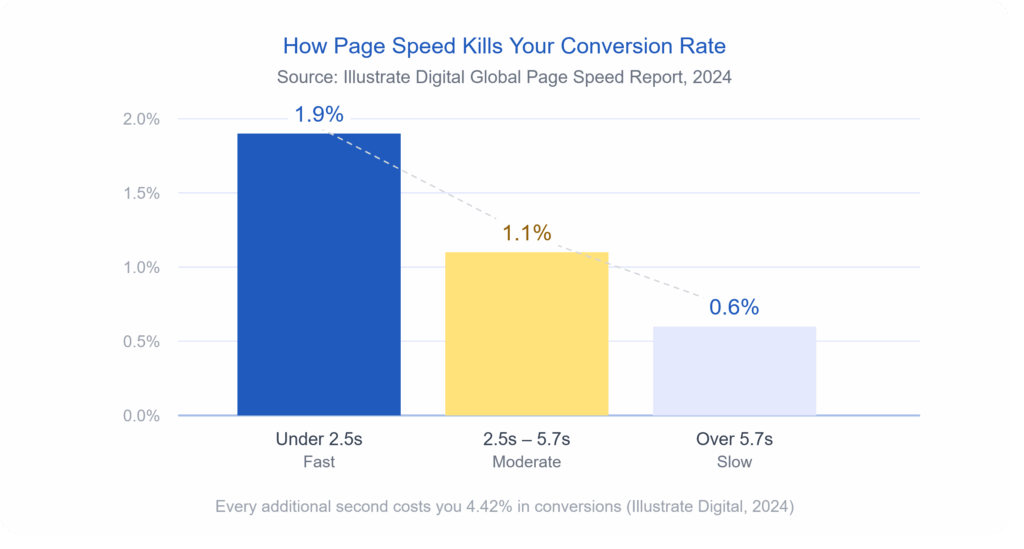
Speed is not a technical issue. It’s a revenue issue. Research from Illustrate Digital’s 2024 Global Page Speed report found that websites lose an average of 4.42% in conversions for every additional second a visitor has to wait. Pages loading in under 2.5 seconds average a 1.9% conversion rate. Pages that drag past 5.7 seconds? That number drops to 0.6%. That’s not a gradual slide — that’s your potential customers walking out the door while your homepage is still loading a hero image.
The biggest speed killers are usually uncompressed images, too many third-party scripts running at once (think chat widgets, analytics tags, and ad pixels all loading simultaneously), and cheap hosting that can’t handle traffic spikes. You can test your site right now using Google PageSpeed Insights — and if your score isn’t green, you already have your answer.
Your Navigation Makes People Think
Good navigation should be invisible. When someone lands on your site, they shouldn’t have to figure out where to go. If they do, they’ll leave.
This sounds simple, but an overwhelming number of small-business websites have menus crammed with eight or ten items, dropdown submenus within other dropdowns, and page labels that sound clever but say nothing. “Solutions” means nothing. “Our Journey” means nothing. “Get Started” sitting next to “Learn More” next to “Request a Demo” creates choice paralysis that kills action.
The data backs this up. A navigation restructure for one company led to a 43% drop in bounce rate and a 67% increase in contact form submissions (Wauu Creative, 2026). Nobody noticed the navigation changed — that’s the point. When it works, users just find what they need and move forward. When it doesn’t work, they bounce, and you never know why.
A few specific things that signal broken navigation on your site:
- More than five or six items in your main menu
- No clear path from the homepage to your primary service or product
- A search bar that returns poor results or doesn’t exist at all on content-heavy sites
- Links that go nowhere or return a 404 error
Your Homepage Is Trying to Do Everything
There’s a version of your homepage that exists in the mind of the person who designed it — the one that tells the whole story, showcases every service, features testimonials, explains the team’s background, and has a contact form all above the fold. That version doesn’t convert. It overwhelms. When a visitor has to work to figure out what you do and who you do it for, they’re already halfway out.
Your homepage has one job: answer three questions in under five seconds. What do you do? Who is it for? What should I do next? Everything else — the awards, the detailed process, the team bios — belongs deeper in the site, not fighting for attention on page one. Research from Adobe found that 38% of users stop engaging with a website if the layout or content feels unattractive or cluttered (Adobe, cited in Red Website Design, 2023). Clutter isn’t just an aesthetic problem. It’s a conversion problem.
You Don’t Have a Clear Call to Action
This one is almost embarrassing in how common it is.
Seventy percent of small business websites have no call to action at all (Sagapixel, cited in Sixth City Marketing, 2024). None. Not a weak one — literally none. And even among sites that do have a CTA button, many bury it, make it the same color as everything else, or write something vague like “Submit” or “Click Here.”
Your CTA is the moment you ask the visitor to do something. And if you don’t ask — clearly, visibly, and with language that tells them exactly what happens next — they won’t do it. Research shows that changing vague button text to action-oriented, specific copy like “Shop Now” instead of “Learn More” can meaningfully move conversion rates (Business.com, 2026). Your CTA button should be impossible to miss, and the words on it should tell the user exactly what they’re getting.
Your Site Isn’t Built for Mobile
As of 2023, mobile devices account for 78% of retail and e-commerce website traffic (Statista, cited in Sixth City Marketing, 2024). If your site was designed primarily for desktop and then “made to fit” mobile, that’s not a mobile experience — that’s a shrunken desktop experience. Buttons too small to tap. Text that requires pinching and zooming. Forms that don’t autofill. Images that push sideways off the screen.
Mobile users are 67% more likely to convert on a mobile-friendly site versus one that isn’t optimized (We Are Tenet, 2026). That’s not a marginal difference. And given that Google ranks mobile-first, a poor mobile experience doesn’t just cost you conversions — it costs you search visibility too. The two problems compound each other.
Your Visitors Don’t Trust What They’re Looking At
Trust is built fast and lost faster.
Visitors form a first impression of your website in just 50 milliseconds — that’s 0.05 seconds — well before they’ve read a single word (Google, cited in Hostinger, 2026).
In that half-blink, they’re making a judgment about whether your business is legitimate. The visual signals that trigger distrust are usually one or more of
the following:
- Outdated design that looks like it was built before 2015
- Stock photos that feel generic and impersonal
- No visible contact information or physical address
- Missing or hard-to-find testimonials and reviews
- No security badge or SSL certificate (your URL should start with https://)
Seventy-five percent of users judge a company’s credibility based on its website design alone (Kinesis, cited in Sixth City Marketing, 2024). You can have the best service in your industry, but if your site looks untrustworthy, visitors are gone before they ever read your pitch.
You Have Traffic But No Conversions
Here’s the sign that ties everything together: if your analytics show decent traffic but your inquiry rate or sales are low, that gap is the loudest alarm bell your website can send you. Traffic getting to your site and doing nothing is not a traffic problem — it’s a conversion problem. And conversion problems live in your design, your messaging, your page speed, your mobile experience, and your trust signals.
A well-designed site focused on superior user experience can have a visit-to-lead conversion rate more than 400% higher than a poorly designed one (Forrester Research, cited in Sixth City Marketing, 2024). That’s not a tweak — that’s a transformation. It means the exact same number of visitors, producing four times the leads, simply because the site is built to work for the person using it.
If you’re investing in marketing but not seeing results, the issue is rarely the marketing. It’s the landing zone. And no amount of ad spend fixes a website that loses people the moment they arrive.
Read case study: Website Redesign for Tertiary Education Advisors
So What Do You Do About It?
Start by being honest with yourself. Pull up your site on your phone. Try to do what a stranger would do: find your main service, understand what you offer, and take the next step. How long does it take? Notice what frustrates you. That experience — unfiltered by familiarity — is what your potential customers are having every day.
The signs above aren’t a checklist of optional improvements. They’re symptoms of a website that is actively working against your business. And the hard truth is that patching them one by one with small fixes often isn’t enough. Sometimes the structure, the navigation, the messaging, and the visual design need to be rebuilt from the ground up with conversion in mind from the very first decision.
That’s exactly what a strategic website redesign looks like.
Ready to find out what’s really happening on your site? Get a free website review from the icowebsolutions team and we’ll show you exactly where your site is losing people — and what it would take to fix it.
References
Adobe. (2023). State of content report. Cited in Red Website Design. https://red-website-design.co.uk/24-stats-showing-how-your-website-design-affects-your-conversions-and-profits/
Business.com. (2026, January 16). 7 website design mistakes that can hurt conversion. https://www.business.com/articles/7-website-design-mistakes-that-can-hurt-conversion/
Forrester Research. (n.d.). The business impact of customer experience. Cited in Sixth City Marketing. https://www.sixthcitymarketing.com/web-design-stats/
Google. (n.d.). Think with Google: Mobile speed research. Cited in Hostinger. https://www.hostinger.com/tutorials/web-design-statistics
Illustrate Digital. (2024). Global page speed report 2024. Cited in Business.com. https://www.business.com/articles/7-website-design-mistakes-that-can-hurt-conversion/
Kinesis. (n.d.). Website credibility research. Cited in Sixth City Marketing. https://www.sixthcitymarketing.com/web-design-stats/
Oracle. (2023). Customer experience impact report. Cited in Sixth City Marketing. https://www.sixthcitymarketing.com/web-design-stats/
Sagapixel. (n.d.). Website redesign statistics. Cited in Sixth City Marketing. https://www.sixthcitymarketing.com/web-design-stats/
Sixth City Marketing. (2024, April 27). 65+ website design statistics & facts. https://www.sixthcitymarketing.com/web-design-stats/
Statista. (2024). Share of website traffic from mobile devices in retail and ecommerce. Cited in Sixth City Marketing. https://www.sixthcitymarketing.com/web-design-stats/
Wauu Creative. (2026, March 16). How bad website design can kill conversions and sales. https://www.wauu-creative.com/blogs/how-bad-website-design-can-kill-conversions-and-sales
We Are Tenet. (2026). 90+ web design statistics. https://www.wearetenet.com/blog/web-design-statistics


Related items

For years, the e-commerce playbook was as simple as it was reliable: build clean product p

Take a look at your website analytics right now. If your digital footprint matches global
Imagine a modern, multi-story corporate headquarters located in the heart of a major finan