
Most businesses treat a slow lead flow as a traffic problem and respond by spending more on ads. Often, the real leak is upstream of that: visitors show up, get confused or frustrated by the site itself, and leave before they ever become a lead. Roughly 81% of people who start filling out a form abandon it (Genesys Growth, 2026). That’s not a traffic problem. That’s a UX problem wearing a marketing costume. This post shows you exactly where leads leak and gives you a five-minute test to find your own leak before you spend another rupee on ads.
In this blog:
- Why this usually isn’t a traffic problem
- Where leads actually leak on your site
- The form is where most leads quietly die
- The stranger test (our framework)
- Why this keeps happening, even at good companies
- Fixing it without necessarily touching your platform
Why losing leads usually isn’t a traffic problem
Here’s a number worth sitting with: 70% of online businesses fail because of poor usability, not because they lack visitors (Zippia, 2026).
Most marketing teams don’t hear that number and think of themselves. They think of it as something that happens to other, less careful businesses. But if you’ve ever looked at your analytics and seen decent traffic paired with a disappointing number of actual leads, this is very likely you.
This is the third post in our website redesign series on icowebsolutions.com. In the first post, we covered how to tell your site is actively working against you. In the second, we broke down whether that problem calls for a redesign or a full rebuild.
This post picks up where a lot of businesses get stuck long before either of those decisions matters: they assume the reason leads aren’t coming in is that not enough people are visiting the site, when the real issue is that the people who do visit can’t figure out how to become a lead.
It’s an easy mistake to make, because the traffic fix feels active. You run more ads, publish more content, chase more SEO rankings, and the number on the analytics dashboard goes up. Meanwhile, the UX problem sits quietly in the background, unaddressed, quietly discarding a chunk of every new visitor you just paid to attract.
Companies lose roughly 35% of potential revenue to poor user experience alone (We Are Tenet, 2026), and that number doesn’t care how much traffic you’re sending to the page. If the experience is broken, more traffic just means more people experiencing the same broken thing.
Where leads actually leak on your site
Lead loss rarely happens at one dramatic moment. It happens in small, almost invisible increments, at a handful of predictable points in the visitor’s journey. Understanding where those points are is the difference between guessing at fixes and actually targeting the leak.
The first leak happens almost instantly.
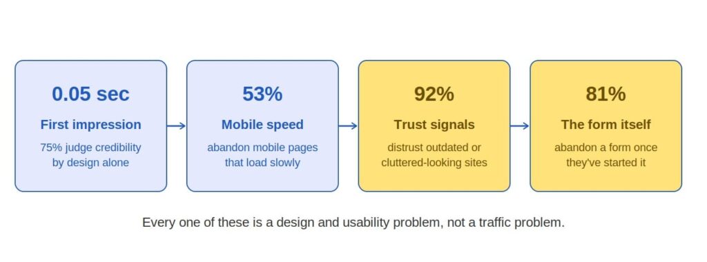
Visitors form an opinion about your site in about 0.05 seconds, and 75% of people judge a company’s credibility based on website design alone, before they’ve read a single word of your copy (Onething Design, 2026). If your design looks dated or cluttered in that first fraction of a second, you’ve lost part of your audience before your headline even had a chance to make its case.
The second leak shows up on mobile, where most of your traffic almost certainly lives.
Slow-loading mobile pages push people away fast, and 53% of mobile users abandon a page that takes more than three seconds to load (UserGuiding, 2026).
The third leak is about trust: a striking 92% of users say they distrust websites that look outdated or poorly designed (IT Guys Team, 2026), which quietly kills conversions even when the underlying offer is genuinely good.
And the fourth, biggest leak sits right at the finish line, in the form itself, which deserves its own section because of how much damage happens there.
Here’s what that leak sequence looks like laid out visually.
The form is where most leads quietly die
If you only fix one thing after reading this post, make it your form. Across industries, 81% of people abandon a form after they’ve already started filling it out, and 67% never come back to finish it (Genesys Growth, 2026). Think about what that actually means.
These aren’t cold visitors who bounced off your homepage. These are people who were interested enough to start typing their name and email into your form. They wanted what you were offering. Something about the experience of asking for it changed their mind.
Field count is the biggest single factor, and the relationship isn’t gentle or gradual. Conversion holds up reasonably well from three fields to five fields, then falls off a cliff, dropping from roughly 17% at five fields to just 6.9% once a form asks for ten fields or more (Digital Applied, 2026).
Landing pages with five fields or fewer convert up to 120% better than longer ones (Genesys Growth, 2026). Every additional field you ask for is a small tax on your lead volume, and most businesses have no idea how much they’re paying because nobody ever measured it.
Mobile makes the problem worse, since that’s where the bulk of your traffic is coming from, whether your form is ready for it or not. Lead-generation forms convert roughly 32% lower on mobile than on desktop (Digital Applied, 2026), and the gap is almost always a design and layout issue rather than anything to do with the offer itself. The good news is that these are genuinely fixable problems, and fixing them tends to be fast:
- Cut your form down to the fewest fields you can defend, and ask for anything optional (like a phone number) after the initial submission instead of before it.
- Break longer forms into two or three short steps instead of one long page; multi-step forms convert roughly 14% higher on average, and 21% higher for lead-generation specifically (Digital Applied, 2026).
- Add a visible line about how the data will be used, since trust concerns account for close to a fifth of self-reported abandonment (Digital Applied, 2026).
- Test your own form on a phone, start to finish, at least once a month.
- Use inline validation so errors show up field by field instead of all at once after a failed submit.
The stranger test: our framework for finding your own leak
We built this framework because businesses kept telling us their site “looked fine” right up until they watched a real person try to use it. Here it is, and it takes about five minutes to run.
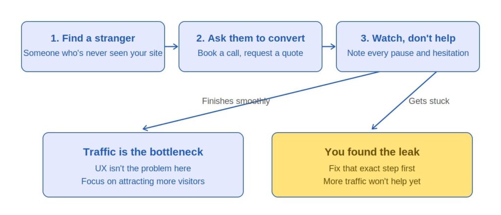
Find someone who has genuinely never seen your website. Not a coworker who’s seen the homepage in a Slack thread, not your web developer, not anyone who already knows where the contact button lives. A friend, a family member, or someone from an unrelated department works well.
Hand them your homepage on their own phone or laptop and ask them to do the thing you most want a stranger to do on your site: book a call, request a quote, sign up for a demo, whatever your primary conversion action is. Then say nothing. Watch where their cursor hesitates, where they scroll back up looking for something, where they sigh, and where they give up.
If they complete the action smoothly, without confusion or backtracking, congratulations: your UX is doing its job, and traffic genuinely is your bottleneck. Spend your next budget cycle on getting more of the right people to the site. But if they get stuck, hesitate at a specific field, or quietly give up, you’ve just watched a lead leak happen in real time, and you know exactly where to fix it first. Here’s the framework laid out visually.
Why this keeps happening, even at good companies
Here’s the part that’s a little uncomfortable to say plainly, but it’s accurate, and somebody should say it: most marketing spend keeps flowing toward traffic because traffic is easy to sell and easy to keep billing for. An ad campaign is a recurring line item.
A UX fix is usually a one-time engagement. That difference in how each one gets paid for quietly shapes which one gets recommended more often, regardless of which one your business actually needs.
We’re not suggesting anyone is acting in bad faith. Plenty of marketers genuinely believe more traffic is the answer, largely because traffic is the easiest thing to measure and report on. A dashboard showing rising visitor numbers feels like undeniable progress, even while the conversion rate quietly slides in the opposite direction.
But 91% of dissatisfied users leave a website without ever telling you why (We Are Tenet, 2026), so the UX problem stays invisible unless you go looking for it yourself, the way the stranger test asks you to.
This is exactly why the redesign-versus-rebuild decision from our last post matters so much here. If your foundation is solid but your UX is leaking leads at the form or at the first impression, you don’t need a rebuild, and you almost certainly don’t need more traffic. You need a focused fix at the exact point where people are dropping off, and the potential upside is real: businesses that seriously invest in UX see a return of roughly $100 for every $1 spent, a 9,900% ROI by some estimates (Colorlib, 2026).
Fixing it without necessarily touching your platform
The reassuring part of everything above is that almost none of it requires tearing your website down and starting over. First impressions, mobile speed, trust signals, and form friction are cosmetic-and-structural problems that live in the same layer a redesign touches, not the CMS layer underneath.
If our first post helped you spot that something was wrong, and our second post helped you figure out whether that meant a redesign or a rebuild, this post is meant to help you find the exact leak so that whichever fix you choose actually targets the right problem.
Run the stranger test this week. It costs you nothing but five minutes and a favor from someone you know, and it will tell you more about your real conversion bottleneck than another month of watching traffic numbers.
If you want a second set of eyes on what you find, our team at ICO WebTech will walk through your site with you, point out exactly where visitors are getting stuck, and tell you honestly whether the fix is a quick UX pass or something bigger. Book your free UX audit here and stop guessing where your leads are going.
References
Colorlib. (2026). 40+ UX statistics: ROI, design impact & career data. https://colorlib.com/wp/ux-statistics/
Digital Applied. (2026). Form conversion rate benchmarks 2026: 100+ data points. https://www.digitalapplied.com/blog/form-conversion-rate-benchmarks-2026-data-points
Genesys Growth. (2026). Landing page conversion rates: 40 statistics every marketing leader should know in 2026. https://genesysgrowth.com/blog/landing-page-conversion-stats-for-marketing-leaders
IT Guys Team. (2026). Website user behavior stats for businesses in 2026. https://itguysteam.com/website-user-behavior-stats-for-businesses-in-2026/
Onething Design. (2026). Top 30+ UX statistics businesses need to know in 2026. https://www.onething.design/post/ux-statistics
UserGuiding. (2026). 150+ UX (user experience) statistics and trends (updated for 2026). https://userguiding.com/blog/ux-statistics-trends
We Are Tenet. (2026). 90+ web design statistics for 2026. https://www.wearetenet.com/blog/web-design-statistics
Zippia. (2026). 25+ useful user experience statistics [2026]: What is the value of UX? https://www.zippia.com/advice/user-experience-statistics/



Related items

Websites were built around a human operating the interface. A visitor reads the page, comp


In a Harvard Business Review audit of 2,241 US companies, only 37% answered an online inqu


If you are new to websites, deciding how many pages to build can feel surprisingly high-st
