Depending on which 2026 survey you read, somewhere between 34% and 77% of US shoppers have already used AI to help them buy something, yet the most common amount people said they would let an AI spend for them on its own was $0 (TechWyse, 2026; Supermarket News, 2026). Read that again, because it holds the whole opportunity: shoppers are happy to let AI build the shortlist, but they still want to see the product with their own eyes before they pay. That moment of looking is your product page, and it has quietly become the most valuable real estate in your store.
If you run an online store, this is good news. You do not need to chase every new AI feature to benefit from this shift. You need product pages that a machine can understand in a second and a human can trust in five, and that is a problem we know how to solve.
TL;DR
AI assistants are now part of how people find products, but shoppers still make the final call on your product page.
Every product page has two readers: a machine that checks your facts and a person who decides whether to trust you.
Strong basics (accurate product data, clear photos, honest answers, fast loading) beat clever tricks.
Fix your product pages first, then spend on anything labeled “AI optimization.”
It is easy to read the headlines and conclude that AI is about to swallow online shopping whole, with bots comparing prices, picking winners, and checking out without a human anywhere in sight. The data tells a calmer and, for store owners, a more encouraging story. A Semrush-owned research platform surveyed 1,009 US consumers and found that 77.6% had used AI to help with a shopping decision in the previous six months, while the most common spending limit they would authorize for fully autonomous AI purchases was zero dollars (TechWyse, 2026).
Forrester’s March 2026 community survey points the same direction: people who regularly use answer engines said that finishing a purchase inside the chat was their least-adopted use, far behind asking general questions and researching product rankings (TechWyse, 2026).
Trust is the reason, and it shows up in other studies too. McKinsey’s State of the Consumer 2026 report found that 26% of consumers use generative AI for shopping, which makes shopping the top use of the technology, yet shoppers still place more trust in personal recommendations, experts, traditional search engines, and online stores than in AI-generated answers (Modaes, 2026).
Acosta Group’s study found that only 22% of shoppers who use AI for shopping trust agents to make purchases for them (Supermarket News, 2026), and Omnisend reports that a significant share of consumers worry AI favors sponsored or paid products (Omnisend, 2026).
Put those findings side by side and a clear picture forms. AI is becoming the front door to product discovery, but people still walk through your door to buy, and when they arrive they are better informed and more demanding than a typical browser. Adobe’s numbers show how quickly that has changed. In early 2025, visitors arriving from generative AI sources were 9% less likely to convert than other traffic (Adobe, 2025).
By the 2025 holiday season, Adobe measured AI referrals converting 31% better than other sources, with visitors 33% less likely to leave right away, and traffic to retail sites from AI tools up 693% year over year (Pandya, n.d.). Those visitors arrive with a short list and a purpose, which means your page has less room for vague copy and more reason to shine.
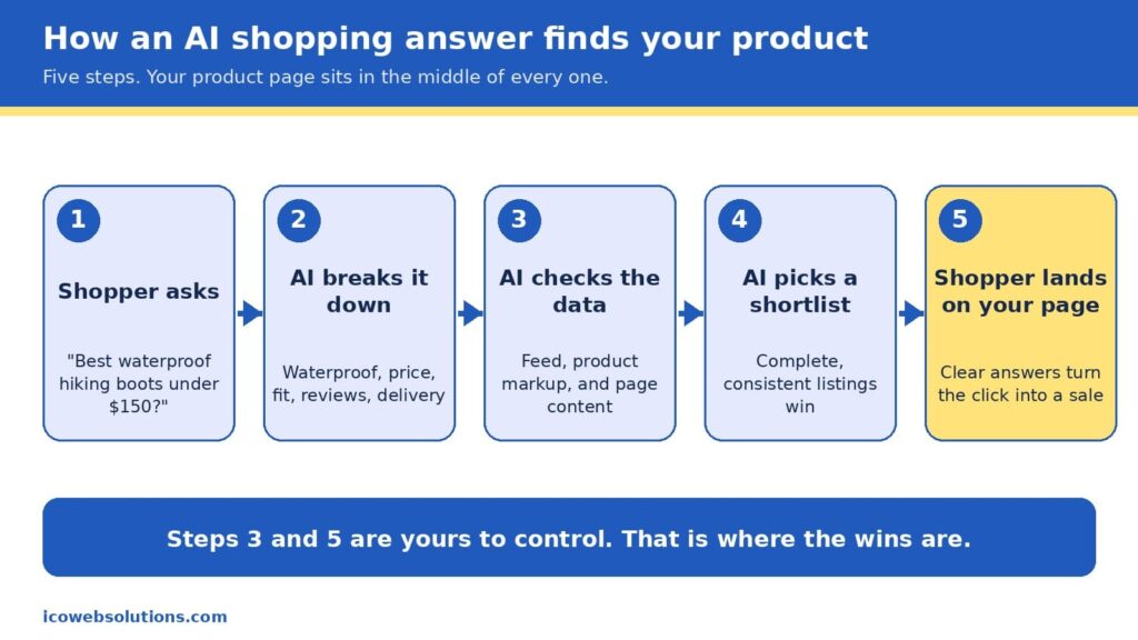
Two of the five steps in an AI shopping journey belong entirely to you.
How an AI shopping answer finds your product
When a shopper types something like “best waterproof hiking boots under $150 that ship by Friday,” the assistant does not browse the web the way a person would. It breaks the request into pieces (waterproof, price ceiling, delivery date, fit, reviews), then looks for products whose data matches every piece. In Google’s case, that data comes from the Shopping Graph, a product database that, according to reporting on Google’s own figures, holds more than 50 billion listings, with about 2 billion updated every hour (Channable, n.d.). The graph is filled by the product feeds merchants submit and by the product markup on their pages, which is the hidden labeling that tells machines what a page is selling, what it costs, and whether it is in stock.
It is worth being precise here, because plenty of vendors are not. Google has not confirmed that Merchant Center data works as a direct ranking signal in AI Mode, but the product graph that feed data builds is shared infrastructure behind several of its shopping surfaces, so accurate and consistent data helps in both places (Alhena, n.d.). There is also no secret “AI schema” to install. The same product markup that has helped pages earn rich results for years is what machines read today, and the real difference is that AI systems tolerate gaps and contradictions far less than a human shopper skimming a page.
That is why the phrase “AI shopping is built on the basics” is more than a slogan. The assistant is choosing from what you have published, so the quality of your product title, price, availability, images, reviews, and return policy decides whether you make the shortlist at all. Once you do make it, the shopper clicks through and your page has to confirm what the assistant promised. In other words, the machine opens the door and the page closes the sale, which is exactly why we think of every product page as having two readers.
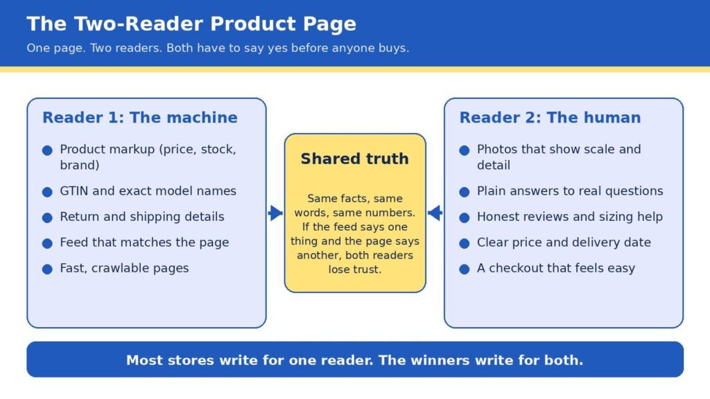
The Two-Reader Product Page
Here is the framework we use with ecommerce clients at ICO Web Solutions, and it is simple enough to remember in five seconds: every product page is read twice, once by a machine and once by a human, and it only sells when both say yes. The machine asks whether your facts are complete, consistent, and easy to verify. The human asks whether you are believable, whether the product fits their situation, and whether buying will be easy. Most stores are written for one of these readers. Some are crammed with keywords and markup but read like a spec sheet, while others are beautiful and persuasive but invisible to anything that cannot see the design.
The bridge between the two is what we call shared truth, meaning the same facts, the same words, and the same numbers everywhere they appear. If your feed says a jacket is in stock, your page says it ships in two weeks, and your reviews mention a different color, then a machine sees a conflict and a person feels a doubt, and both of them move on to the next listing. Shared truth is not glamorous work, but it is the closest thing to a free advantage in ecommerce right now, because most of your competitors have not done it.
The Two-Reader Product Page: one set of facts, written for a machine and a person at the same time.
Reader one: make the machine’s job easy
Machines are literal, patient, and unforgiving, so the best way to help them is to remove every reason to guess. Start with the basics a product page must state clearly: an exact product name that includes brand, model, and the attributes people search for, the current price and currency, availability, the barcode number (known as a GTIN) where one exists, and clear shipping and return terms. Then make sure those same details appear in your product markup, not just in the visible copy, because that markup is what many systems read first. Return policy information has also been required for Google merchant listings since 2025, so this is one of those details that has moved from nice to have into required territory (Xictron, 2026).
The next step is consistency across systems. Your store platform, your Merchant Center feed, your marketplace listings, and your on-page markup should all pull from a single source of truth, ideally a product information system or at least one carefully maintained spreadsheet that feeds everything else. A feed that disagrees with the page is one of the most common reasons good products underperform, and it is also one of the cheapest to fix. If you are rebuilding or replatforming, this is the ideal time to get it right, and our team handles it as part of ecommerce website design and development so that structured data is built into the templates rather than patched on later.
Finally, give machines something worth quoting. AI assistants tend to favor pages that answer real questions in plain language, so a short section covering what the product is best for, who it is not for, how it compares with the obvious alternative, and what customers most often ask will serve both readers at once. If you want help seeing how your catalog currently appears in AI answers,our AI visibility and GEO services can show you how your catalog appears today, and our SEO company in Delhi team makes sure the traditional search foundations are just as strong.
Reader two: make the human’s decision easy
People decide quickly, and they decide with their eyes first. In Baymard Institute’s large-scale product page testing, 56% of users began by exploring the product images, even in cases where reading the description would have been faster (Baymard Institute, n.d.-b). The same research found that 52% of sites do not add descriptive text or graphics to the images of their top-selling products, which leaves shoppers guessing about scale, weight, material, or fit. That gap is an opportunity, since a few well-chosen captions, a size comparison, or a close-up of the stitching can answer a question before it becomes a reason to leave.
Speed is the other half of the human experience, and it is more forgiving to fix than most owners expect. Google’s research found that as mobile page load time goes from one second to three seconds, the probability of a visitor bouncing rises by 32%, and from one second to ten seconds it rises by 123% (Think with Google, n.d.). Heavy images, bloated apps, and unnecessary scripts are the usual culprits, and trimming them tends to lift every other metric on the page. If your store feels slow on a phone, a fresh look from a website design company in Delhi that builds with performance in mind can pay for itself quickly.
Trust is the third piece. Honest reviews (including a few critical ones), clear sizing help, visible return terms, and a price and delivery date that never change between the search result and the cart all tell a shopper that you mean what you say. This matters even more now, because the shopper arriving from an AI answer has often already been told your product is a good fit and is simply looking for a reason to believe it. Baymard’s benchmark of leading US and European sites found that 44% had mediocre or worse product page experiences in one update (Baymard Institute, n.d.-a), so a store that gets these details right stands out quickly.
The take few agencies will say out loud
Here is the part that may make some of our own industry uncomfortable: if your product pages are thin, inconsistent, or slow, you should not buy an “AI optimization” package yet. Every month a new vendor promises to make your brand visible to chatbots, and some of them offer real value, but none of them can compensate for a catalog with missing sizes, mismatched prices, and photos that do not show the product. AI systems prioritize products with complete, structured data over products backed by bigger marketing budgets, and that rewards the patient work of cleaning up the basics over any shortcut (Xictron, 2026).
We say this as an agency that sells AI visibility work, and we say it because it is true and because it builds better long-term relationships. Acosta Group’s advisors reached a similar conclusion in their 2026 shopper study, recommending that brands begin with what they call the brilliant basics of retailer readiness before layering on AI discoverability and experiments (Supermarket News, 2026). The sequence matters: fix the page, align the data, then amplify. Reverse that order and you pay to send more visitors to a page that is not ready for them.
The ten-point scorecard
Before you spend another dollar, open your top five best-selling product pages and check each one against this list. Every yes is worth roughly a point, and anything under eight tells you where to start.
The product title includes brand, model, and the one or two attributes shoppers actually search for.
Price, currency, and availability match across your page, feed, and markup.
Product markup is present and passes a rich results test.
The barcode number (GTIN) and brand are filled in wherever they exist.
Shipping time and return terms are visible without scrolling or clicking.
Photos show scale, detail, and the product in use, with captions where words help.
A short “best for, not for” section answers the top three customer questions.
Reviews are visible, recent, and include honest critical feedback.
The page loads in about three seconds or less on a mid-range phone.
Checkout is reachable in two taps from the product page.
The foundation under the page
A great product page sits on top of technology, and three parts of that foundation deserve attention because they quietly shape both readers’ experience. The first is security. Shoppers who arrive from an AI recommendation are trusting someone else’s judgment, and one warning screen or suspicious checkout can undo that trust instantly. If you want a practical overview, our guides on how top brands keep their sites safe and AI-powered cybersecurity for ecommerce stores walk through the habits that protect revenue and reputation together.
The second is architecture. Flexible, fast storefronts make it far easier to keep data clean and pages light, which is one reason we have seen that headless ecommerce is no longer just for big brands, and why progressive web apps for ecommerce deserve a fair look if your shoppers are mostly on phones. Neither is right for every store, so the honest answer is to match the build to your catalog size, team, and budget rather than chase the trend.
The third is learning from your own numbers. Once the basics are in place, AI-powered predictive analytics can show you which products are about to trend, which pages leak the most visitors, and where a small fix would lift sales most. Used in that order (basics first, prediction second), the technology amplifies a strong page instead of masking a weak one.
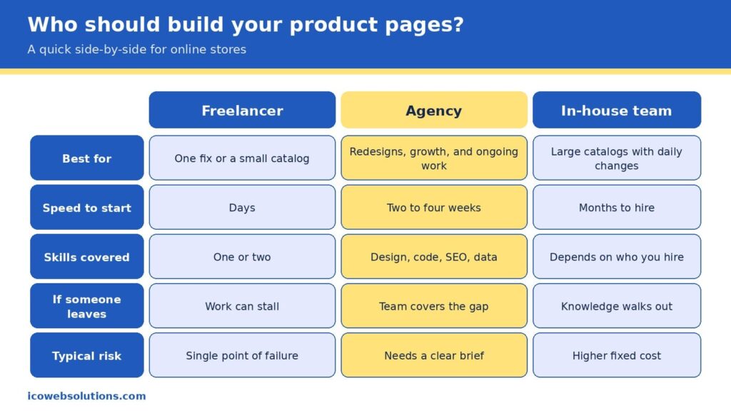
A fair side-by-side of the three common ways to build and maintain product pages.
Freelancer, agency, or in-house team?
Once you know what your pages need, the practical question becomes who should do the work, and the honest answer depends on the size of the job and how long it will last. A freelancer is often the fastest and most affordable way to fix one specific problem, such as rewriting a batch of product descriptions or cleaning up markup on a small catalog, and a great one can be a joy to work with. The risk is concentration, since one person carries the design, code, search, and data knowledge in a single head, so a sick day, a new client, or a career change can stall your project right when it matters.
An in-house team gives you the deepest knowledge of your products and the tightest day-to-day control, which is ideal for large catalogs that change every day. It also brings the highest fixed cost, a hiring timeline measured in months, and the challenge of keeping specialists current in fields that change quickly. Many in-house teams do their best work when they have a partner to lend extra capacity and fresh perspective during redesigns and launches.
An agency sits in the middle by covering design, development, search, and data under one roof, so the work moves in parallel, and the knowledge does not live in one person. The trade-off is that you need to give a clear brief and choose a partner who understands ecommerce rather than websites in general. Our view is simple: pick the smallest option that can fully own the outcome. If you have a single contained fix, hire a freelancer. If you run a large operation with steady needs, build in-house. If you are redesigning, replatforming, or trying to grow visibility across search and AI at the same time, an agency usually gets you there faster and with fewer surprises.
You do not need a six-month roadmap to make progress, and a focused month can change how both readers experience your best products. In the first week, run the scorecard on your top five pages and write down every mismatch between your page, feed, and markup, because that list becomes your repair queue. In the second week, fix the facts: titles, prices, availability, barcode numbers, and return details, in the single source your systems share. In the third week, upgrade the human experience with better photos and captions, a short “best for, not for” section, and a speed pass that removes anything the page does not need.
In the final week, measure and expand. Compare conversion, bounce rate, and revenue per visit on the updated pages with the ones you have not touched yet, then roll the winning pattern to the rest of the catalog. By the end of the month you will have a repeatable template, evidence of what works for your customers, and a clean foundation that makes any later AI visibility work far more effective.
Quick answers
Do I need special markup for AI shopping?
No special AI-only markup exists. The standard product markup used for search and Google Shopping is what machines read, so the priority is making it complete, accurate, and consistent with your feed and page.
Will AI shopping replace my product pages?
The data suggests not soon. Shoppers are comfortable letting AI research and compare, but most are not ready to let it complete purchases, so your page remains the place where the decision is confirmed.
How long does it take to see results?
Fixes to speed, photos, and on-page answers can influence conversion within weeks, while changes to how search and AI systems understand your catalog tend to build over a longer period as the data is recrawled and refreshed.
Ready to make your product pages work for both readers?
If you would like a second set of eyes on your store, the ICO Web Solutions team can walk through your top product pages with you using the Two-Reader framework and help you turn the findings into a short, prioritized fix list, whether you build it with us or on your own. Start by telling us about your store on our ecommerce website design and development page and we will suggest clear next steps. Your shoppers are already asking AI for recommendations, and with the right product pages you can be the answer they click.
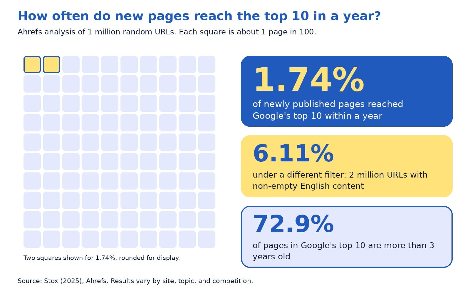
Ahrefs studied one million random web pages and found that only 1.74% of newly published pages reached Google’s top 10 within a year. Under a different filter, which looked at 2 million pages with non-empty English content, the figure was 6.11%. The same study found that 72.9% of pages in the top 10 were more than three years old (Stox, 2025).
Those numbers describe something owners often sense: search engine optimization, or SEO, rewards steady work over time. That is also why owners ask a very reasonable question once they start paying for SEO services: what exactly does the agency do each month, and how will I know it is working?
This guide answers both parts in plain English. You will see a month-by-month roadmap of what a good SEO agency typically does, an example of a clear monthly report, the questions Google itself suggests asking before you hire, and a few warning signs worth knowing. The schedule below reflects a common rhythm, and every site’s plan depends on its starting point, goals, and competition, so please treat it as a guide for your own conversations.
The quick answer
In month one, a good SEO agency audits your site, sets up measurement, and agrees on goals with you. Months two and three focus on fixing technical issues and improving your most important pages. From month four onward, the work shifts toward creating helpful content, earning trust signals such as reviews and links, and refining what the data shows. Every month you should receive a plain report with results, the work completed, and next month’s plan.
A few terms appear throughout this guide. Here is what they mean:
Organic traffic: visitors who arrive from unpaid search results.
SEO audit: a review of your site that finds what helps and what holds back your visibility in search.
Technical SEO: behind-the-scenes fixes, such as speed, mobile layout, and making pages easy for search engines to find.
On-page SEO: improving the content of each page, including titles, headings, and links to related pages.
Backlink: a link to your site from another website.
Search Console: a free Google tool that shows how your site appears in Google Search.
What SEO services usually include
It helps to know the full menu before you read a proposal. Google’s guidance on hiring an SEO lists the kinds of services providers commonly offer: reviewing your site’s content and structure, technical advice on topics such as hosting, redirects, and JavaScript, content development, keyword research, management of online business development campaigns, expertise in specific markets and regions, and optimizing for generative AI search (Google Search Central, 2026a).
We group these into four buckets, which makes monthly reports easier to read.
Foundation covers the technical health of your site.
Content covers the pages and articles that answer customer questions.
Authority covers the signals that show your business is trusted, such as reviews, mentions, and links earned the right way.
Measurement covers the tracking and reporting that tie it all to leads. A healthy plan touches each bucket, and the mix changes as the months go by.
The monthly SEO loop: check, fix, create, earn, report
Behind the month-by-month schedule sits a simple loop that repeats every month. We call it the monthly SEO loop, and it gives you a quick way to see whether your agency is doing the work that matters.
Check: review Search Console and analytics for changes in clicks, queries, and conversions, and scan for new technical issues.
Fix: resolve the highest-impact problems first, such as pages that are not indexed, slow pages, or broken links.
Create: publish or improve pages and articles that answer real customer questions.
Earn: build trust signals, including reviews, local listings, and mentions that come from useful work.
Report: explain what changed, why it matters, and what comes next.
The proportions shift over time. Early months lean toward check and fix, later months lean toward create and earn, and report appears every month without exception. If you ever wonder what your agency did last month, the loop gives you five specific questions to ask.
A six-month roadmap
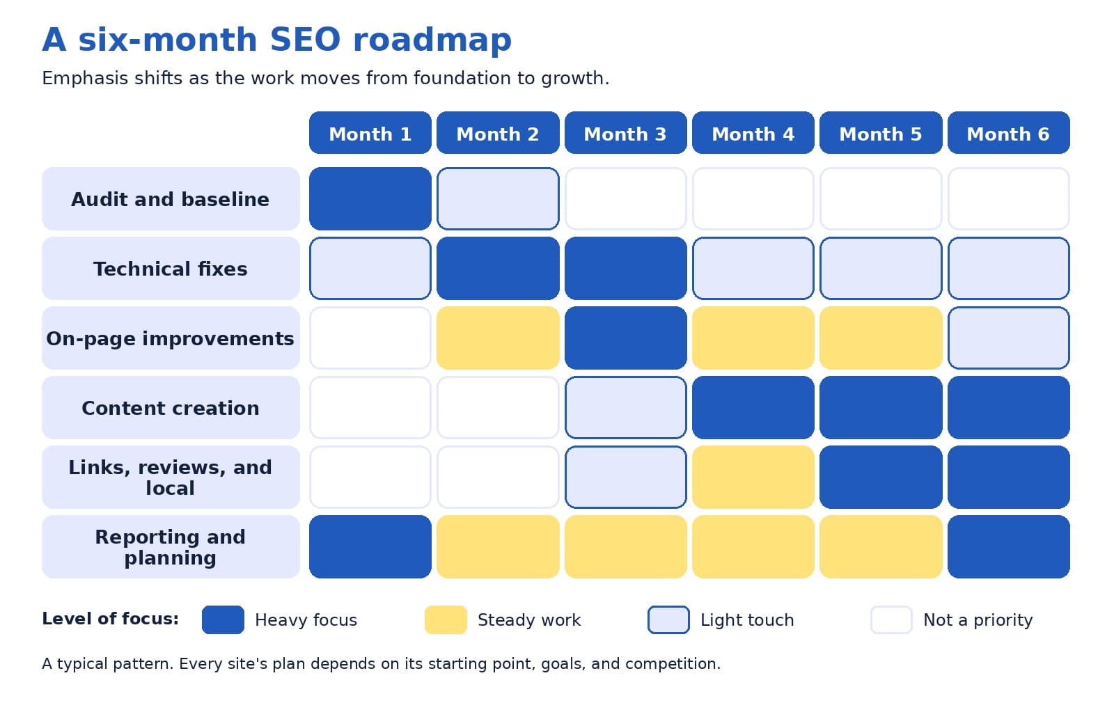
The grid below shows how emphasis typically moves from foundation to growth across the first six months. Darker blue means heavy focus, yellow means steady work, and light cells mean a light touch.
A typical six-month pattern, with emphasis moving from foundation work to content and authority.
Month 1: audit and baseline
The first month is about understanding where you stand. The agency reviews how your site is indexed, how pages are organized, which pages bring in visitors, and what competitors are doing.
It also sets up measurement, including Google Analytics tracking for the actions that matter to you, such as contact form submissions and phone calls. Google advises granting only read access to Search Console while an audit is being considered (Google Search Central, 2026a).
The month ends with a baseline report and an agreed set of goals, so you can measure progress against a clear starting point.
Months 2 and 3: fix and strengthen
With the audit complete, the agency works through the highest-impact fixes. Technical work might include improving page speed, repairing broken links, setting up redirects, and resolving pages that Google cannot index.
On-page work includes sharpening page titles and headings, strengthening internal links, and updating the pages closest to revenue, such as service pages. Local businesses also tidy up their business profile and listings. These months often feel quiet from the outside, yet they build the platform that later content depends on.
Months 4 and 5: create and earn
Once the foundation is steady, the work moves toward growth. The agency publishes or improves content that answers the questions your customers ask, such as guides, comparison pages, and service area pages with genuinely local detail. It also helps your business earn trust signals, including customer reviews, local citations, and mentions from relevant websites.
Ethical link building belongs here, and the section on warning signs explains what to avoid. Teams also begin watching Google’s generative AI performance reporting in Search Console, since optimizing for AI features builds on the same SEO fundamentals (Google Search Central, 2026b).
Month 6 and beyond: review and refine
By month six, there is enough data to make informed decisions. The agency compares results with the baseline, identifies which pages and topics are gaining traction, and decides where to invest next. Ahrefs suggests that after about six months, content that has not reached the top 10 may benefit from an update, because chances tend to decline unless something changes (Stox, 2025).
From here, the loop continues, with each quarter informed by the one before.
How the plan changes by type of business
The roadmap bends to fit the business. A local service company, such as a clinic or a contractor, usually puts extra weight on its business profile, customer reviews, and pages for the areas it serves. An online store tends to focus on category and product pages, site speed, and clear product information.
A business-to-business firm often leans on content that answers longer research questions, along with case studies that show how it solves problems. The loop stays the same, while the mix of tasks follows how your customers search and decide.
What to ask for in your monthly report
A good report is short enough to read in ten minutes and clear enough to share with a colleague. Google’s guidance on measuring search performance offers a useful starting point: Search Console shows how your site performs in Google Search, including clicks, impressions, and queries, while Google Analytics shows what visitors do after they arrive, including conversions such as lead generation form fills (Google Search Central, 2026c).
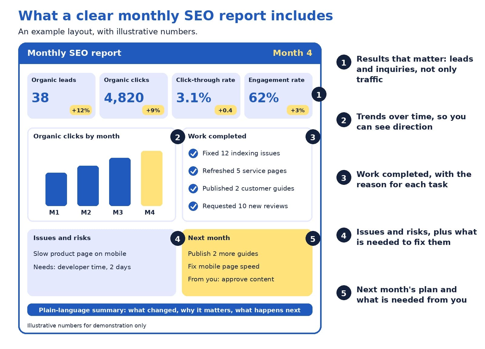
The two tools count things differently, so the numbers will never match exactly. Google suggests focusing on the overall pattern of trends, and it names Search Console as the source of truth for search performance and Google Analytics as the source of truth for behavior on your site (Google Search Central, 2026c). The example below shows one way to bring those views together, using illustrative numbers.
An example monthly SEO report, with illustrative numbers and five numbered parts.
Here is how to read the example, following the numbers:
Results that matter come first. Leads and inquiries from organic search sit beside clicks, click-through rate, and engagement rate, so you see business outcomes next to search activity.
A trend chart shows direction. One month can fluctuate, so a simple chart of several months tells you more.
The work completed list comes with reasons. Each item should explain why the task mattered, which fits Google’s suggestion to ask whether your SEO will share every change made along with the reasoning behind it (Google Search Central, 2026a).
Issues and risks are stated openly. A report that names problems, and what is needed to fix them, is easier to trust than one that shows only good news.
Next month’s plan includes what is needed from you. Approvals, photos, and customer stories often decide how quickly work moves.
A good monthly report explains what changed, why it matters, and what happens next.
Questions to ask before you hire
Google publishes a list of questions to ask any SEO provider, and they work equally well as a monthly check-in with an agency you already use (Google Search Central, 2026a). These are the most useful ones:
Can you show me examples of your previous work and share some success stories?
Do you follow Google Search Essentials?
What results do you expect to see, in what timeframe, and how do you measure success?
What is your experience in my industry and in my country or city?
How can I expect to communicate with you, and will you share every change you make along with your reasoning?
Do you cite official Google documentation for your recommendations?
Google adds two more suggestions that are easy to overlook. Ask past clients whether the provider was useful and easy to work with, and notice whether the provider asks about your business, your competitors, and how your customers find you. A provider who is curious about your business is usually one who will tailor the work to it (Google Search Central, 2026a).
Warning signs to know
Most agencies do honest work, and a few warning signs are worth knowing so you can spot the exceptions. Google’s guidance is direct on the most important one:
“No one can guarantee a #1 ranking on Google.”
Google Search Central (2026a)
The same guidance suggests being cautious about providers who claim a special relationship with Google, who are secretive about what they plan to do, who email you unprompted, or who talk about link popularity schemes. It also notes that you should never have to link to an SEO, and that you remain responsible for what companies you hire do on your site, because techniques that break Google’s spam policies can lead to a negative adjustment of your presence in search (Google Search Central, 2026a). A quick filter is this: if you cannot explain in a sentence what the agency is doing and why, ask until you can.
How long does SEO take?
The honest answer is that it varies with your competition, your site’s history, and the topics you want to be found for. The Ahrefs data gives a sense of scale. It also contains encouraging detail: among pages that did reach the top 10, 40.82% got there within a month, and ranking for lower-volume, more specific topics tends to happen sooner than ranking for high-volume terms (Stox, 2025). That is one reason agencies often start with specific, high-intent pages before aiming at the most competitive terms.
Ahrefs data on how often new pages reach the top 10 within a year, and how old top-ranking pages tend to be.
For your own monthly reviews, early signals matter as much as rankings. Google’s SEO Starter Guide suggests waiting a few weeks to see whether changes had a beneficial effect (Google Search Central, 2025). In the meantime, look for leading indicators such as more pages indexed, growing impressions, a wider set of queries bringing visitors, and improving engagement. Those signs often appear before leads grow, and a good agency will point them out.
A bolder view: judge your agency by decisions, not dashboards
Here is a perspective that a few providers may find uncomfortable, since it asks for more than a tidy dashboard: the most valuable part of a monthly SEO report is the decisions behind the numbers. Charts with rising lines are pleasant to look at, and they say little about whether the agency is choosing the right work.
Try treating the report as a short decision memo. What did we learn this month? What are we changing because of it? What did we decide not to do, and why? What do we need from the business? When an agency can answer those four questions clearly, you see judgment, and judgment is what you are paying for. Rankings and traffic are useful signals along the way, and leads and revenue are the reason the work exists, so it helps when every report connects the first group to the second.
What you can do each month to help
SEO works best as a partnership, and a few simple habits on your side can speed things up:
Share what your sales team hears from customers, since those questions often become the best content.
Approve drafts quickly, because waiting is one of the most common causes of delay.
Keep your address, hours, and services accurate everywhere they appear.
Reply to new inquiries promptly, since fast replies turn search visibility into customers. Our guide to the contact page explains how.
Quick answers to common questions
How much work happens each month? It depends on your plan and your site’s needs, so ask for a written list of deliverables and the hours or tasks it covers. A clear scope makes it easy to compare what you receive with what you were promised.
Should I hire an agency or do SEO myself? Google notes that if you run a small local business, you can probably do much of the work yourself, starting with its SEO Starter Guide, and that hiring a professional can help when you want extra expertise or time savings (Google Search Central, 2026a). Many owners start with the basics in-house and bring in an agency for the heavier technical and content work.
When is the best time to hire? Google suggests that a site redesign or a new site launch is a great moment, because the site can be built to be search engine-friendly from the start (Google Search Central, 2026a).
Do I need to give full access to my accounts? During an audit, Google advises read access to Search Console only (Google Search Central, 2026a). Later access depends on the work involved, and any provider should be willing to explain every change they make.
What about AI search? Google describes optimizing for generative AI features as part of SEO, and it suggests checking whether any AEO or GEO advice you receive lines up with its official guidance (Google Search Central, 2026a, 2026b). Our earlier guide to moving budget between SEO and GEO covers this in more detail.
What if results feel slow? Look at leading indicators first, such as indexed pages, impressions, and query variety, then ask your agency what they expect to change and when. If a few months pass without clear signals, a candid review of the plan is a healthy next step.
Are third-party SEO tools reliable? They can be useful, and Google notes that it does not evaluate or endorse them, so recommendations from any tool are worth checking against official guidance before you make big changes (Google Search Central, 2026a).
At the end of any month, a quick self-check shows whether the partnership is working. You should be able to say yes to each of these:
I know which tasks were completed and why they mattered.
I can see leads or inquiries from organic search, beyond traffic alone.
Problems and risks were stated openly.
I know what next month will focus on and what is needed from me.
I could explain the plan to a colleague in a minute.
If you would like to see how this schedule would apply to your own site, we are happy to review your current setup and outline a first three months of work with a sample report.
Good SEO services follow a rhythm: check, fix, create, earn, and report. The first months build the foundation, the middle months add content and trust, and every month ends with a clear report on what changed and what comes next. With the right questions, a plain-language report, and a realistic view of timing, you can judge your SEO agency by the progress that matters, which is more qualified leads for your business.
Google Search Central. (2025, December 10). Search engine optimization (SEO) starter guide. Google for Developers. https://developers.google.com/search/docs/fundamentals/seo-starter-guide
Google Search Central. (2026a, June 5). Do you need an SEO? Google for Developers. https://developers.google.com/search/docs/fundamentals/do-i-need-seo
Google Search Central. (2026b, July 10). Optimizing your website for generative AI features on Google Search. Google for Developers. https://developers.google.com/search/docs/fundamentals/ai-optimization-guide
Google Search Central. (2026c, January 7). Using Search Console and Google Analytics data for SEO. Google for Developers. https://developers.google.com/search/docs/monitor-debug/google-analytics-search-console
Stox, P. (2025, May 15). How long does it take to rank in Google? And how old are top ranking pages? Ahrefs. https://ahrefs.com/blog/how-long-does-it-take-to-rank-in-google-and-how-old-are-top-ranking-pages/
It is Monday morning, and a new proposal has landed in your inbox. It includes a fresh line item called GEO. A few paragraphs later, the SEO retainer is slightly smaller. Nobody planned a trick. The market moved quickly, and the paperwork followed.
The urgency behind that proposal is real. Pew Research Center (2025) found that Google users clicked a traditional search result in 8% of visits when an AI summary appeared, compared with 15% of visits when none appeared. Fewer clicks make any owner or marketing lead ask the same thing: should money move from SEO to generative engine optimization, or GEO?
Here is the short answer. Some of it may move, and the share is often smaller than a proposal first suggests, because a good portion of GEO is work that a healthy SEO plan already covers. The longer answer takes about fifteen minutes to read, and it ends with a five-minute method for reviewing any GEO line item you receive. We will also point out where the work is truly new, since that is where fresh budget earns its place.
In 60 Seconds
Google says optimizing for its AI features is part of SEO, and most marketers surveyed by Semrush agree. A smaller slice of GEO is new: measuring AI answers, building your reputation beyond your own website, and testing across AI platforms. The Keep, Extend, Add Test sorts each line item into shared work you pay for once, light adjustments that deserve a modest add-on, and new activities that deserve a pilot with a clear measure.
Three forces arrived at the same time. The first is behavior. AI summaries now answer many questions at the top of the results page, and Pew Research Center (2025) found that people clicked a link inside the summary itself in only 1% of visits. When fewer people reach your pages, every reporting dashboard feels different.
The second force is budget. Gartner’s 2025 CMO Spend Survey put marketing budgets at 7.7% of company revenue, flat for the year, and 59% of CMOs said their budgets could not fully support their strategy (Gartner, 2025). When the total stays level, a new priority has to be funded from an existing line. SEO is the most common donor.
The third force is momentum. In Digiday’s reporting on a Scribewise survey of 205 marketing leaders, 55% said they already had dollars set aside for GEO, and agency executives described moving part of existing SEO budgets in that direction (McCoy, 2026). That is a lot of activity around a term many teams met only recently, so a careful look before moving money is time well spent.
GEO in One Minute
SEO helps your pages appear when people search on Google, Bing, and similar engines. GEO helps your business appear inside answers written by AI systems such as Google’s AI Overviews and AI Mode, ChatGPT, and Perplexity. You may also see the term answer engine optimization, or AEO, used for the same idea. Both serve one business goal: the right buyer finds you at the moment of need, then calls, books, or buys.
Who needs it: businesses whose customers research with AI assistants as well as search engines.
How it works: AI systems retrieve pages and other sources, summarize them, and name the ones that look relevant and reliable.
Why it matters: a mention inside an answer can shape a buyer’s shortlist before anyone visits your website.
What Google Says, in Its Own Guide
Google Search Central published a dedicated guide in 2026, titled Optimizing your website for generative AI features on Google Search, and updated it in July. It describes how AI Overviews and AI Mode work. Google’s systems retrieve relevant pages from the search index to ground each answer, a technique called retrieval-augmented generation, and they run several related searches at once, a technique called query fan-out (Google Search Central, 2026). In other words, the AI layer sits on top of the same index and quality systems that SEO has always served.
The guide addresses the acronyms directly. From Google’s perspective, optimizing for generative AI search is still SEO (Google Search Central, 2026). It then lists tactics that are not required for Google’s AI features:
Rewriting pages in a special style for AI systems.
Collecting mentions that are not authentic.
Special schema markup, although structured data continues to help with rich results.
What does the guide recommend instead?
Original, helpful pages that offer a point of view readers cannot find everywhere else, a clear technical structure, a good page experience, and accurate business details in tools such as Merchant Center and Google Business Profiles. It even offers a one-line test for any page: would a visitor find this satisfying? You can already check your own results in the Generative AI performance report inside Search Console.
One caution keeps the picture honest. The guide describes Google. ChatGPT, Perplexity, and other assistants run their own retrieval systems, so a portion of GEO reaches beyond what Google covers. We will get to that portion shortly.
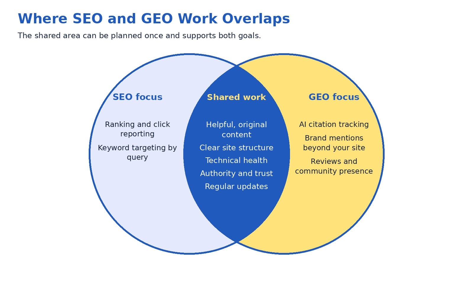
The shared area supports both search results and AI answers, so it can be planned once.
Do Marketers See It the Same Way?
Mostly, yes.
A Semrush survey of 481 marketers, business owners, and SEO professionals found that 77% describe AI search as part of SEO, while 15% treat it as a separate channel (Loktionova, 2026). The more interesting result concerns execution.
Only 22% of respondents ran SEO and AI search fully integrated across strategy, execution, and reporting. Teams that ran the two as one integrated effort were far more likely to report AI-driven traffic or leads: 81%, against 36% of teams working in separate tracks (Loktionova, 2026). Semrush sells search software, so it helps to read the survey as one informed perspective, and it points the same way as Google’s guide.
Digiday’s reporting adds some history.
SEO veterans quoted there compared GEO with earlier waves such as AMP and featured snippets, which were once presented as separate disciplines and later turned out to be extensions of familiar search logic.
One agency chief executive estimated that about 80% of GEO is fundamental SEO. Others pointed out that retrieval systems and presence across platforms are new territory, and one expert argued that AI search may eventually earn its own dedicated team, the way social media did (Guaglione, 2026). That 80% figure is a professional estimate, not a measured result, so treat it as a handy rule of thumb.
When you line these sources up, three points stand out:
Strong SEO foundations lift visibility in AI answers.
A real, smaller set of GEO activities is new.
Outcomes in AI platforms vary by prompt, so pilots with clear measures make sense.
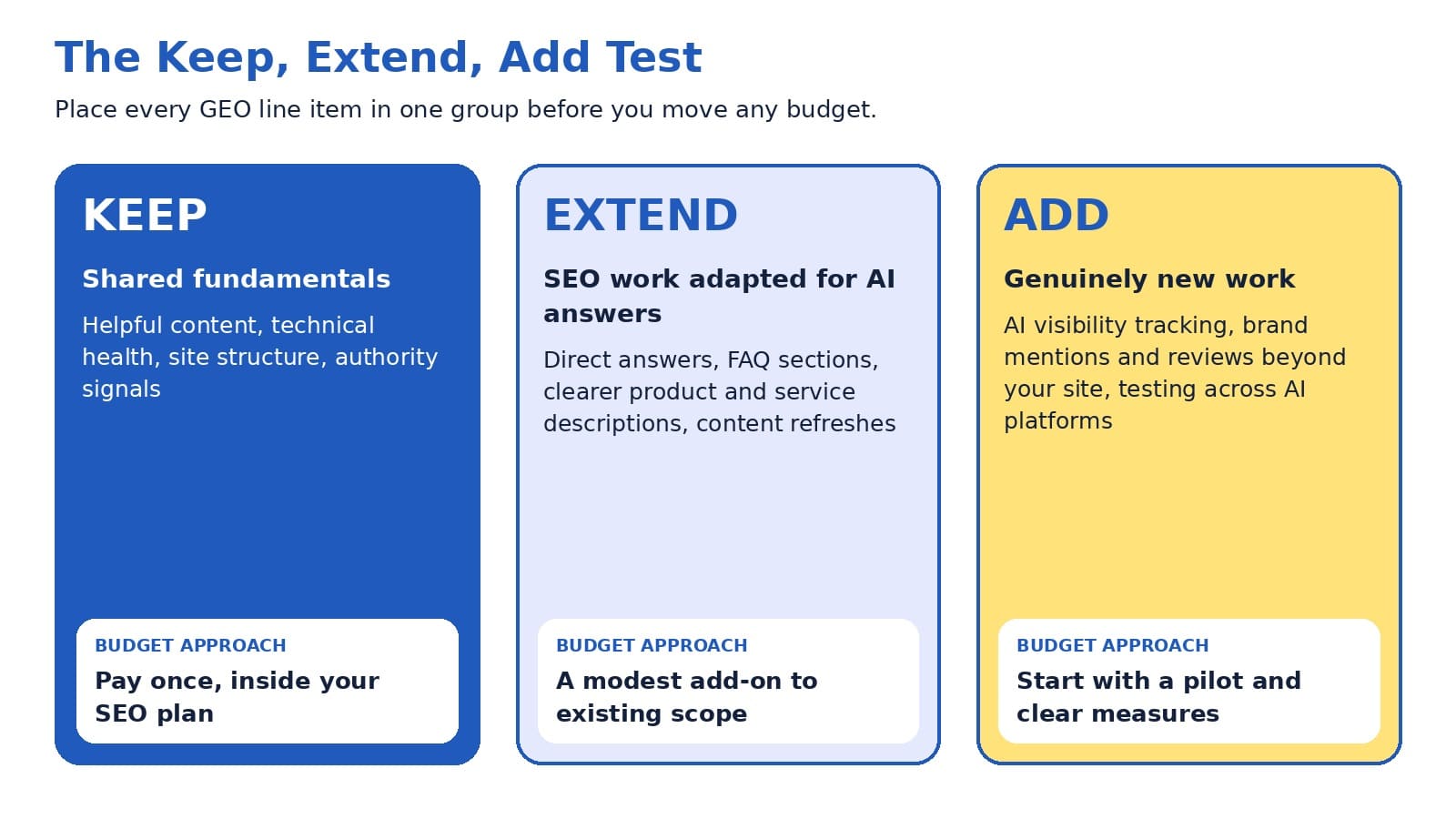
The Keep, Extend, Add Test
Proposals tend to arrive as a single line that says GEO. The Keep, Extend, Add Test turns that one line into three honest groups, and each group gets its own budget logic.
Keep: shared fundamentals such as helpful content, technical health, site structure, and authority building. They support search results and AI answers alike, so you fund them once, inside the SEO plan.
Extend: SEO work adapted for AI answers, such as direct answers near the top of a page, richer FAQ sections, clearer service descriptions, and refreshed older content. These usually justify a modest add-on.
Add: new activities such as tracking your visibility in AI answers, earning reviews and mentions beyond your site, and testing how each AI platform describes you. These fit a pilot.
Here is Extend in action. Picture an accounting firm with a page about small business tax planning. The page already exists, so the team adds a short opening summary that says who the service helps, what it includes, and what a client can expect.
Then it answers the four questions prospects ask most, updates the details, and adds a clear next step. One edit helps searchers on Google and gives AI systems clean, relevant passages to draw from. Nobody built a new page, and nobody needed a new retainer.
Now picture the Add side. A regional home services company decides to pilot. It picks a short list of questions homeowners ask before hiring, such as how to choose a contractor and what a repair should cost. Each month, the team checks how the major AI assistants answer those questions, notes whether the company is named, and compares that with calls and form submissions.
At the same time, it asks recent customers for honest reviews. The pilot has a small budget, a named owner, and a review date, so the learning arrives before the larger spend does.
The test also gives owners and marketers a shared vocabulary. Owners see which parts of a proposal overlap with work already funded. Marketers show where fresh effort is required. Providers explain what is new with confidence, because the framework makes the case on its own.
Each GEO line item lands in one of three groups, and each group has its own budget approach.
Where the New Work Really Is
A fair review gives credit to the new parts of GEO, because that is where fresh budget has the best case. The Semrush survey and Digiday’s reporting point to four areas:
Your reputation beyond your website. AI answers draw on reviews, community discussions, video, and press coverage. Yet only 8% of surveyed marketers used digital PR for AI visibility, 9% managed online reviews, and 11% built mentions through communities and social platforms (Loktionova, 2026). That is an open field.
Access and readability for AI systems. Which AI crawlers may reach your content, and how easily they can read your pages, are decisions worth making on purpose.
Measurement. Answers vary by prompt and platform, and many tracking tools estimate results from simulated prompts instead of real user queries (Guaglione, 2026). In the Semrush survey, 49% of marketers named the effect of AI on pipeline or revenue as a leading measurement challenge, and 40% relied mainly on manual spot checks in ChatGPT.
Platform differences. Each assistant may retrieve and cite differently, so results from one platform may need confirming on another.
What about traffic? AI platforms currently send a small share of visits to many publishers. Similarweb data cited by Digiday showed less than 1% of overall traffic for the news outlets it examined, while one publisher reported a markedly higher subscription conversion rate among visitors arriving from AI platforms (Guaglione, 2026).
Small volume with strong intent is a classic reason to run a pilot first, measure leads and revenue, and scale what works.
Your Proposal Review in Five Minutes
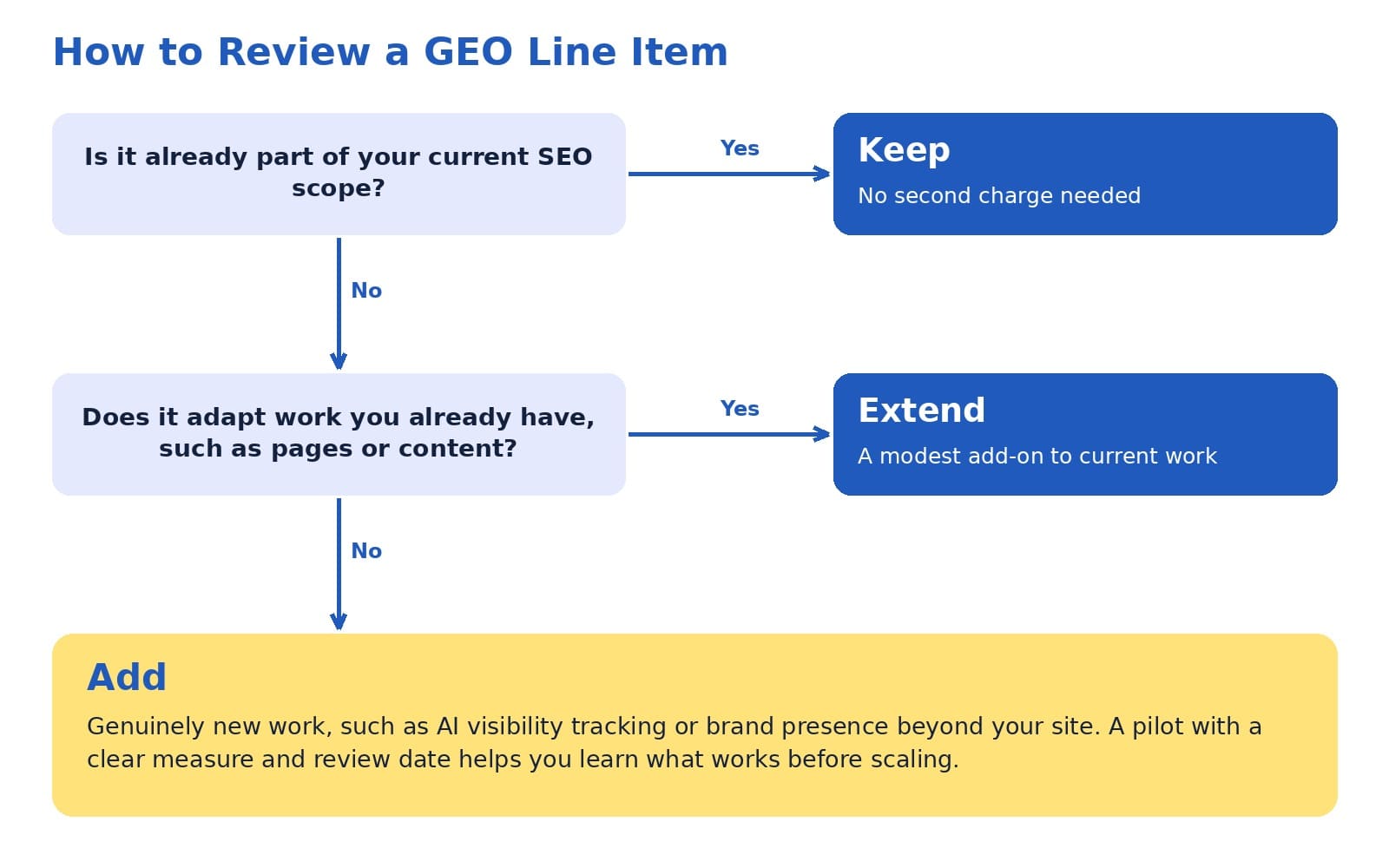
Take the GEO proposal on your desk and read each line item against two questions. Is it already part of the current SEO scope? Does it adapt something you already have? Anything left over is new, and new work deserves a pilot with an owner, a measure, and a review date.
Two questions place any GEO line item in Keep, Extend, or Add.
Bring these questions to the conversation with any provider, whether an agency, a freelancer, or an internal teammate:
Which part of this work already sits inside our current SEO scope?
Which pages or technical items will change, and how will we confirm it?
What counts as success: qualified leads, calls, form submissions, revenue, or AI mentions?
How long does the pilot run, and when do we review it together?
What do we own at the end, including content, reports, and data?
Will SEO and GEO appear in one report with one baseline?
Good answers build trust quickly. They also give you a tidy summary to share with a colleague who missed the meeting.
Questions Owners Ask Before Moving Budget
Should we pause SEO to fund GEO? A pause removes the work that GEO builds on. Google’s guide ties AI feature eligibility to the same indexing and quality systems that SEO serves (Google Search Central, 2026), so most teams do better by keeping the foundation funded and adding a pilot on top.
How much should a GEO budget be? No universal figure exists. In the Scribewise survey reported by Digiday, 70% of marketers with GEO dollars said it made up 11 to 20% of that budget (McCoy, 2026). Treat that range as one data point from one survey. A pilot sized to what your team can measure and manage is a sound starting point.
How will we know it works? Set a baseline before anything changes. Track leads, conversion rate, and branded search alongside AI visibility, and use the Generative AI performance report in Search Console for Google’s features. When AI mentions rise and qualified leads follow, you have found a pattern worth funding.
A Bolder Idea: Fix the Foundation First
Here is a thought that rarely appears in budget meetings. For many businesses, the highest-return GEO investment is an SEO repair. Google’s guide states that a page must be indexed and eligible to appear in Search with a snippet before it can be shown in AI features (Google Search Central, 2026). A page that search systems struggle to find or understand has little to offer an AI answer, whatever name appears on the invoice.
So the order of spending matters. Start by confirming that your core pages are crawlable, indexed, and clear about who you serve and what you sell. Next, extend the strongest pages with direct answers and current details. Then fund a defined pilot for the new activities, drawn from a modest slice of the search line and expanded when the evidence supports it. We call this protect the base, pilot the extension.
Moving a large share of SEO budget before any pilot has produced results may weaken the very foundation that AI visibility relies on. A steadier path keeps leads flowing today and gives you your own data for tomorrow. Since AI visibility is still measured imperfectly across the industry, learning at a measured pace is a competitive advantage.
What Changes for B2B and B2C
The Keep, Extend, Add mix shifts with your audience. B2B buyers often research a purchase through many questions over several weeks, and an AI assistant may help build their shortlist along the way. Clear service pages, case studies, and consistent descriptions of your offer carry extra weight in that journey.
B2C and local businesses may find accurate business details matter most. Google notes that Merchant Center and Google Business Profiles help products and services appear in AI responses and other search results (Google Search Central, 2026).
Reviews and customer feedback add another layer, because AI answers can draw on them. In both cases, the first move is the same: learn the questions your best customers ask, answer them clearly on your own site, and keep your details accurate everywhere they appear. Those tasks live in Keep and Extend, which is why the Add budget may come out smaller than expected.
A 90-Day Starter Plan
You can run this plan inside most existing engagements, and each step produces something you can show your team:
Weeks 1 and 2, baseline: review indexing, site structure, your top pages by leads, and the Generative AI performance report in Search Console.
Weeks 3 to 6, extend: add direct answers, FAQ sections, current service details, customer proof, and accurate business profiles to priority pages.
Weeks 6 to 12, pilot: choose a focused list of customer questions, record how AI platforms answer them each month, and begin earning reviews and credible mentions.
End of quarter, decide: compare leads, conversion rate, and AI mentions with your baseline, then set the next budget.
By day ninety, you hold real evidence from your own business. That makes the next budget conversation shorter and a lot more confident.
AI search is a genuine opportunity, and exploring it is a smart move. The evidence from Google, Semrush, and Digiday tells one consistent story: most of GEO stands on SEO, and a smaller set of activities is new. Keep what is shared, extend what can be adapted, and pilot what is new. When you follow that order, each dollar has a clear job, and every stage aims at leads and sales you can count.
Ready to see where your own budget stands? Share your current SEO scope and any GEO proposal you have received, and we will map every line to Keep, Extend, or Add in a one-page summary for your team.
Gartner, Inc. (2025, May 12). Gartner 2025 CMO spend survey reveals marketing budgets have flatlined at 7.7% of overall company revenue [Press release]. https://www.gartner.com/en/newsroom/press-releases/2025-05-12-gartner-2025-cmo-spend-survey-reveals-marketing-budgets-have-flatlined-at-seven-percent-of-overall-company-revenue
Google Search Central. (2026, July 10). Optimizing your website for generative AI features on Google Search. Google for Developers. https://developers.google.com/search/docs/fundamentals/ai-optimization-guide
Guaglione, S. (2026, March 10). GEO hype busted: How it differs (and how it doesn’t) from SEO. Digiday. https://digiday.com/media/geo-hype-busted-experts-call-it-more-seo-than-new-discipline/
Loktionova, M. (2026, June 3). Only 22% of marketers have fully integrated AI search and SEO. They’re pulling ahead. [Study]. Semrush Blog. https://www.semrush.com/blog/the-operational-gap-ai-seo-study/
McCoy, K. (2026, March 25). Marketers shift growing shares of search spending to GEO. Digiday. https://digiday.com/marketing/marketers-shift-growing-shares-of-search-spending-to-geo/
Pew Research Center. (2025, July 22). Google users are less likely to click on links when an AI summary appears in the results. https://www.pewresearch.org/short-reads/2025/07/22/google-users-are-less-likely-to-click-on-links-when-an-ai-summary-appears-in-the-results/
Gartner’s 2025 CMO Spend Survey found that marketing budgets average 7.7% of company revenue, and 59% of the marketing leaders surveyed reported budgets that fall short of what their strategy requires (Gartner, 2025). The survey focused mostly on larger companies, yet the pattern is likely familiar to owners and marketers at any size: there is usually more worth doing than there are hours, people, or dollars to do it. That is why the question of who does the work carries so much weight.
This guide walks through freelancers, agencies, and in-house teams in plain language. It introduces a three-question tool we call the 3C Fit Framework, and it shares a perspective that many providers may hesitate to mention: the best answer often changes as your business grows, so a thoughtful sequence can work better than one permanent choice.
As a website design and digital marketing agency, we are glad to say that the right starting point for many businesses is a freelancer or an internal hire. Our goal is for you to finish this article with a clear sense of which structure fits your next twelve months, whether or not that includes working with us.
The short version
Freelancers tend to fit defined projects and quick starts. Agencies tend to fit businesses that need SEO, website design, content, and paid media to work as one plan. In-house teams tend to fit companies with steady daily marketing work and the budget for a full compensation package. The 3C Fit Framework (Capacity, Coordination, Continuity) can help you decide, and many growing businesses find that one internal owner supported by external specialists offers a strong balance.
Choosing between a freelancer, an agency, and an in-house hire influences more than your budget. It affects how quickly campaigns launch, how well your website, SEO, and advertising work together, and how much of your own time goes into managing the work. A team that matches your stage of growth can make each of those areas smoother, while a mismatch can slow results even when everyone involved is talented.
Talent is rarely the only variable. In many cases, a capable professional placed in a setting that suits the business need will produce more than an equally capable professional in a setting that does not. For this reason, we encourage owners and marketing managers to begin with the shape of the work and compare prices afterward.
Your answer may also evolve. A founder launching a first website may benefit from a freelancer. A company running SEO, content, and paid media together may benefit from an agency. An established business with daily campaign needs may benefit from an in-house team. Each can be the right call at the right moment, and the sections below help you recognize which moment you are in.
It also helps to define what success means before comparing options. For most businesses, success comes down to a steady flow of qualified leads, a healthy conversion rate on the website, and a cost per lead that supports profitable growth. When those targets are written down, each structure can be evaluated against them, and the conversation becomes more objective and more productive for everyone involved.
What each option looks like in plain language
The Freelancer
A freelancer is an independent professional who usually specializes in one discipline, such as copywriting, web design, SEO, or paid search. Three points summarize how this option tends to work:
Who it suits: businesses with a defined project or a specific skill gap.
How it works: you agree on scope, timeline, and price, and the freelancer delivers while working directly with you.
Why owners choose it: speed, deep specialization, and the flexibility to engage help only when it is needed.
The talent pool is broad. The Upwork Research Institute (2023) estimated that 64 million Americans, or 38% of the U.S. workforce, performed freelance work in 2023, and 47% of freelancers provided knowledge services such as marketing and programming. That range gives businesses plenty of choice, and it also means that careful selection is worthwhile.
The Agency
A digital marketing agency is a team of specialists, often including strategists, SEO professionals, designers, developers, writers, and paid media managers, working within one process.
Who it suits: businesses that need several disciplines to support one goal, such as lead generation.
How it works: engagements usually run on a monthly retainer or a defined project, with account management and regular reporting.
Why owners choose it: breadth of skills, shared tools, and coverage when one person is unavailable.
The In-House Team
An in-house team is made up of employees who work solely for your company.
Who it suits: businesses with steady, daily marketing work and the budget for salaries, benefits, software, and management.
How it works: you recruit, onboard, and lead the team, and in return they learn your products, customers, and culture in depth.
Why owners choose it: communication is quick, and priorities can shift the same day a conversation with sales or customer service suggests a new direction.
The 3C fit framework: capacity, coordination, continuity
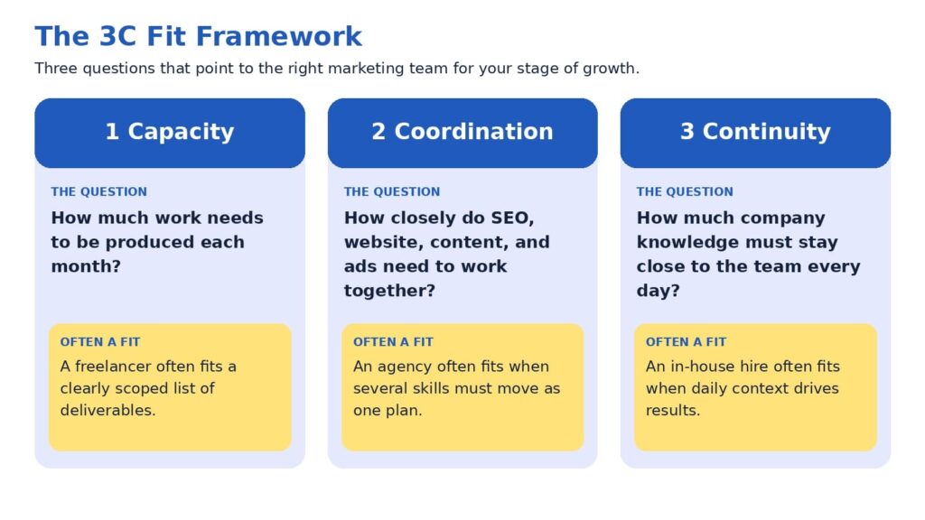
A useful way to compare the three options is to look at what your marketing needs from the team rather than at the team type itself. Three questions usually point toward an answer, and we call them the 3C Fit Framework.
Capacity asks how much work needs to be produced each month, such as a set of service pages, a number of articles, a few ad campaigns, or a website rebuild. When the list of deliverables is clear and finite, a freelancer can often handle it efficiently.
Coordination asks how closely your SEO, website, content, advertising, and analytics need to work together. Search intent informs page structure, page structure influences conversion rate, and conversion rate determines how much paid traffic is worth buying. When disciplines depend on one another this way, an agency’s shared process can reduce handoffs and keep decisions consistent.
Continuity asks how much company knowledge needs to stay close to the work every day. Product details, sales feedback, and customer conversations all shape strong marketing, and an in-house team has the most direct access to them.
Most businesses start with one of the three C’s as their main need, and growth then adds the others. That progression is a big reason why the right structure shifts over time.
The 3C Fit Framework pairs each business need with the structure that often serves it well.
When a freelancer is a strong choice
Freelancers often shine when the goal is specific: a new landing page, a set of service pages, a technical SEO cleanup, or an email sequence. Because they work directly with you, feedback loops can be short, and many bring deep experience in a single craft. For a business testing a new offer or launching a first website, this can be an efficient way to move forward.
A few practices help the engagement go smoothly:
Define the deliverables, the timeline, and what success looks like before work begins.
Confirm availability for revisions and for questions after launch.
Plan how the work connects to your other marketing channels, since one specialist typically covers one of them.
Because a freelancer usually covers one discipline, you or a teammate often serve as the coordinator who connects the pieces. Owners who enjoy that role may find this arrangement rewarding. Owners with limited time may prefer to review the Owner Hours Test later in this guide before deciding.
When an agency is a strong choice
An agency can be a strong choice when marketing outcomes depend on several disciplines moving together. Lead generation is a good example. Search visibility brings the right visitors, website design and messaging encourage them to act, paid media extends reach, and analytics show which efforts contribute to revenue. When those elements sit within one team, decisions can be made with the full picture in view.
It is also worth acknowledging that expectations of agencies are rising. In Gartner’s 2025 survey, 39% of CMOs planned to reduce agency budgets, and 22% said generative AI had lessened their reliance on external agencies for creativity and strategy. Among the top actions CMOs cited for saving on agency costs were ending unproductive relationships and streamlining agency rosters (Gartner, 2025). We see this as a healthy development, because it encourages agencies to demonstrate clear process, transparent reporting, and measurable contribution to leads and sales.
An agency may be a good fit when:
Your goals involve more than one channel, such as SEO, website design, and paid media.
You prefer a regular reporting rhythm and a named team over a single point of contact.
You would like to scale activity up or down without recruiting.
The strongest agency relationships tend to feel like a partnership, with shared goals, open access to data, and honest conversations about what is working.
When an in-house team is a strong choice
An in-house team can be an excellent choice when marketing work is steady, varied, and closely tied to daily business activity. Team members learn your products, hear sales conversations firsthand, and can respond quickly when priorities change. For businesses with consistent campaign needs, that proximity can make marketing feel like a natural extension of the company.
The cost picture deserves a full view. The U.S. Bureau of Labor Statistics (2026) reports that benefits made up 30.0% of employer compensation costs for private industry workers in June 2026, with wages and salaries making up the remaining 70.0%. Using those averages for illustration, a role with $70,000 in wages would represent roughly $100,000 in total employer compensation. Recruiting adds to that figure, and the Society for Human Resource Management (SHRM, 2022) reported an average cost per hire of nearly $4,700 before any salary is paid. Software subscriptions, training, and management time are additional considerations.
A second factor is range. A single marketing hire usually brings one primary strength, such as content, paid media, or analytics, while growing businesses often need several. Many companies address this by pairing a first hire with external specialists, which leads naturally to the hybrid approach discussed below.
An in-house team may be a good fit when:
Marketing work fills a full week, every week.
You have a leader who can set priorities and review results.
Your budget covers compensation, tools, and room to grow the team.
The three options side by side
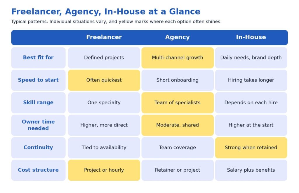
The comparison below summarizes the patterns discussed so far. Individual freelancers, agencies, and companies vary, so please treat it as a starting point for your own evaluation.
Yellow cells mark where each option often performs especially well.
You may notice that no option leads in every row. That balance is exactly why the decision benefits from a framework instead of a ranking.
The owner hours test: a cost that rarely appears on an invoice
Every option has a price on the proposal and another one on the calendar. The calendar cost is the number of hours you and your team spend briefing, reviewing, coordinating, and following up. This cost is easy to overlook, yet it often decides whether an engagement feels smooth or demanding.
A simple test can bring it into focus. Estimate how many hours per week you are able to dedicate to directing marketing, and compare that with what each option typically asks of you. A freelancer working on several separate projects may rely on you to connect them. An agency usually supplies a project manager, which can reduce your coordination load. An in-house hire needs onboarding and ongoing leadership, especially in the first months.
If your calendar has room for hands-on direction, a freelancer or an in-house hire may fit comfortably. If your calendar is full, the coordination an agency provides may be worth more than it first appears on a proposal. Considering this early often leads to better satisfaction on both sides, because expectations match reality from the first week.
A perspective worth considering: rent execution first, then decide what to own
Here is a view that some providers may hesitate to share, because it can reduce their own project volume: many businesses may achieve better results by validating what works through external execution before building an internal team. The reasoning is practical. Early marketing involves a great deal of learning, such as which keywords bring buyers, which pages convert, and which channels produce qualified leads at a sustainable cost. External specialists can test those questions at a pace that fits your budget, and the answers then shape what a first internal hire should be responsible for.
A first hire made before those answers exist is often asked to cover strategy, writing, analytics, design coordination, and advertising at once. That is a wide range for one person, and even an excellent candidate may find it demanding to excel at every part. Starting with external execution gives the future hire a clearer job description, better data, and a stronger chance to succeed.
The same logic works as a business matures. Once you know which activities run every day and produce results, bringing a marketing leader in-house can strengthen continuity, while freelancers and agencies continue to supply specialist capacity. In short, direction can live inside the company while execution stays flexible. We find this structure tends to protect marketing ROI, since fixed costs grow only when the evidence supports it.
This perspective sometimes leads us to recommend a freelancer or an internal hire rather than our own services. We share it because clients tend to do well when the structure fits, and that outcome is good for everyone involved.
A simple path to decide
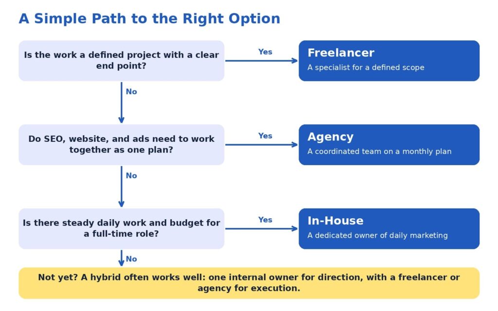
If you would like a quick way to apply the 3C Fit Framework, the path below turns three questions into a suggested starting point. It is intended as a guide for discussion with your team, so feel free to adapt it to your circumstances.
Three questions lead to a suggested starting structure, with a hybrid option when the answers are mixed.
A few reminders can make the path even more useful:
Plan around the next twelve months of goals, which is a longer horizon than the next few weeks.
Select the option that matches your largest need, then add support where gaps appear.
Revisit the decision once a year, since goals and budgets evolve.
Mixed answers are common and entirely fine. A business that needs defined projects today and daily management next year can begin with a freelancer or agency and plan an internal role for later, using results from the first phase to guide the hire.
Questions worth asking any provider
Whether you are speaking with a freelancer, an agency, or a candidate for an internal role, the conversation goes further when it includes specific questions. The following list can help you compare options consistently:
Which results have you helped similar businesses achieve, and what process produced them?
How will we measure success, and how often will we review it together?
Who will do the daily work, and how can I reach that person?
How will SEO, website, content, and advertising decisions be coordinated?
What do you need from me each week to keep progress steady?
Which numbers will you report, such as leads, conversion rate, cost per lead, and revenue influenced?
What happens to my accounts, content, and data if we conclude our work together?
Thoughtful answers to these questions usually reveal how a provider thinks about results, communication, and long-term value. They also give you a fair way to compare very different proposals side by side.
How this applies to SEO, website design, and lead generation
SEO, website design, and lead generation make a useful case study because they depend on each other. SEO services attract the right audience by aligning pages with search intent. Website design services turn those visitors into leads or customers through clear structure, messaging, and user flow. Conversion optimization services then refine pages using real behavior data, so the same traffic produces more leads over time.
A freelancer can deliver any one of these areas with skill. An in-house marketer can manage them day to day. An agency can connect all of them into one system with shared reporting, so each improvement supports the next. At ICO WebTech, we build marketing systems that help businesses attract the right audience, convert visitors, and grow consistently, and we are glad to collaborate with freelancers and in-house teams whenever that is the best structure for a client.
If you would like a second opinion on which structure fits your goals, we would be happy to review your current setup and share what we see, including where an existing freelancer or internal team is already doing well.
Freelancers, agencies, and in-house teams can each be the right answer. Freelancers bring focused skill and fast starts, agencies bring coordinated expertise across channels, and in-house teams bring daily context and continuity. The 3C Fit Framework helps you match those strengths to what your business needs now, and the Owner Hours Test helps you account for the time each option asks of you.
Many businesses grow best through a sequence: external execution to learn what works, an internal owner to guide direction, and specialists to keep capacity flexible. High expectations pair well with this approach, because each stage is designed to produce measurable leads and sales before the next investment is made.
If you are weighing these options for your own business, our team at ICO WebTech would enjoy helping you map the next twelve months. You can learn more about our web design agency work, our SEO agency approach, and our digital marketing agency approach to see how the pieces fit together.
References
Gartner, Inc. (2025, May 12). Gartner 2025 CMO spend survey reveals marketing budgets have flatlined at 7.7% of overall company revenue [Press release]. https://www.gartner.com/en/newsroom/press-releases/2025-05-12-gartner-2025-cmo-spend-survey-reveals-marketing-budgets-have-flatlined-at-seven-percent-of-overall-company-revenue
Society for Human Resource Management. (2022). The real costs of recruitment. https://www.shrm.org/topics-tools/news/talent-acquisition/real-costs-recruitment
U.S. Bureau of Labor Statistics. (2026). Compensation costs for private industry workers averaged $46.89 per hour worked in June 2026. The Economics Daily. https://www.bls.gov/opub/ted/2026/compensation-costs-for-private-industry-workers-averaged-46-89-per-hour-worked-in-june-2026.htm
Upwork Research Institute. (2023, December 12). Freelance Forward 2023. Upwork. https://www.upwork.com/research/freelance-forward-2023
A practical, step-by-step walkthrough of the process we actually run with clients, including where AI Overviews change the decisions we make and where they don’t.
Most SEO content roadmaps fail for a boring reason. Not because the writing was bad or the keyword research was sloppy, but because the plan was built to chase visibility instead of the thing that visibility was supposed to lead to.
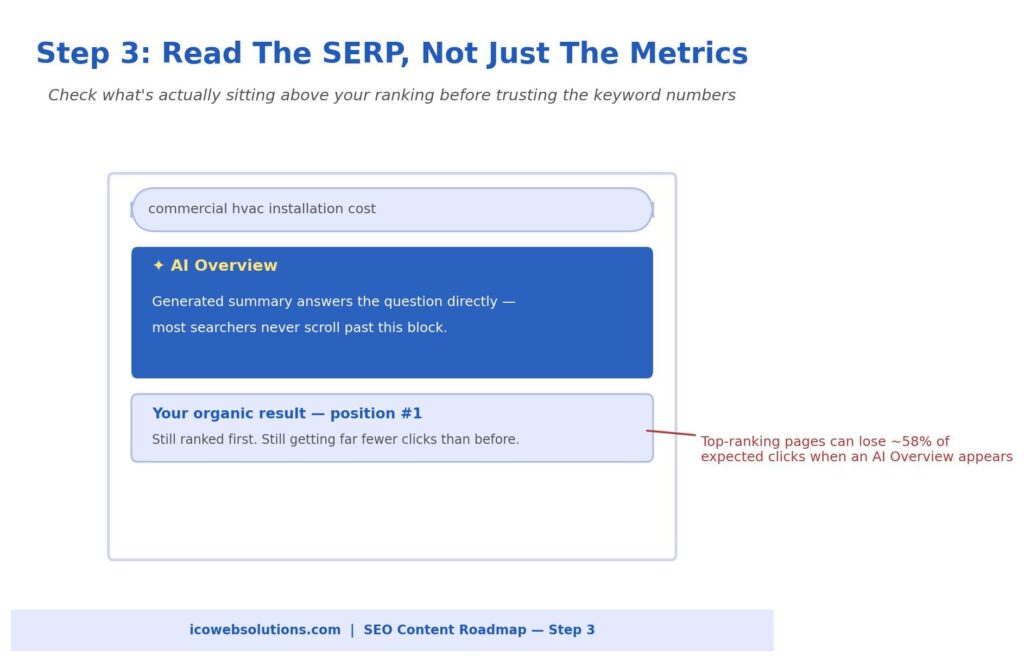
A ranking or a spike in impressions feels like progress, and it can be, right up until you look at the pipeline six months later and realize none of it turned into actual leads or revenue. AI Overviews have made this problem worse, not better, because now a page can rank well and still get almost no clicks if an AI-generated summary is sitting above it answering the question for free.
So when we build a content roadmap for a client now, the AI search layer isn’t an add-on step at the end. It’s built into the plan from the first decision we make. Below is the process itself, walked through with a real kind of example so you can see how each step actually plays out, not just what it’s called.
To keep things concrete, I’ll use a composite example throughout: a mid-size commercial HVAC equipment distributor that sells to contractors and facility managers, not homeowners.
It’s a good example because the buying decision is relationship-driven and technical, which means a wrong keyword priority can waste months of content production on traffic that was never going to turn into a sales conversation.
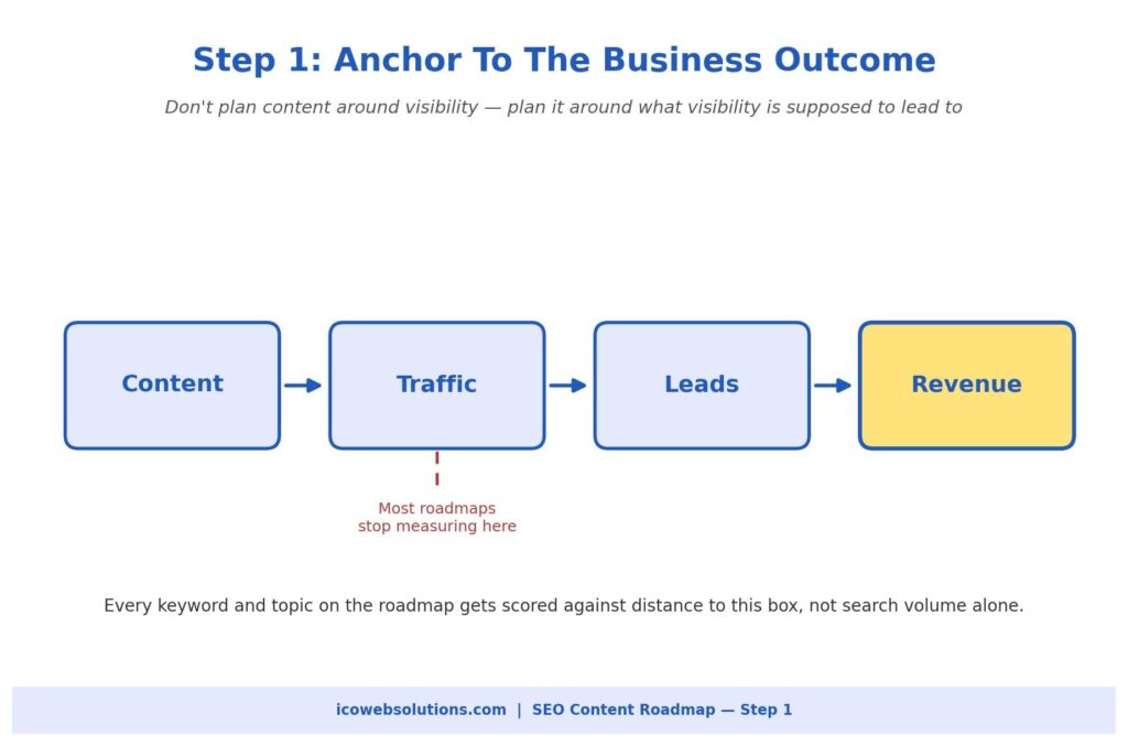
Step 1: Get Specific About What the Content Is Actually For
Before any keyword research happens, we force a conversation that sounds simple but gets skipped constantly: what does a “win” actually look like for this content, in terms the business already tracks? Not traffic.
Not rankings. The thing after that.
For our HVAC distributor, a win isn’t someone reading a blog post about ventilation standards. It’s that person filling out a quote request form, and that form eventually turning into a signed equipment contract worth tens of thousands of dollars.
This matters because it changes what “good” means for every decision downstream. If you skip this step, you end up with a roadmap optimized for a vague idea of relevance instead of the specific outcome the business actually needs.
A media company selling ad impressions genuinely wants raw traffic and pageviews, and that’s a fine goal for them. Almost nobody else should be optimizing for that. If your business model depends on booked meetings, signed contracts, or completed purchases, every keyword you consider should get measured against how close it sits to that outcome, not how many people search for it.
For the HVAC distributor, this meant writing down plainly that we were chasing contractors and facility managers with a real, current need, not general curiosity about HVAC systems. That single sentence ended up ruling out a surprising number of high-volume topics later in the process, including some that would have looked great in a traffic report and done nothing for the sales team.
It’s worth being honest about how uncomfortable this step can feel the first time you do it properly. Marketing teams are used to defending their work with traffic and ranking numbers, because those numbers are easy to produce quickly.
Tying every topic back to pipeline or revenue means some of your favorite ideas, the ones that would clearly perform well in search, have to get cut or deprioritized because they don’t actually move the business forward.
That’s a harder conversation to have internally, but skipping it just moves the hard conversation to six months later, when the roadmap is finished and the numbers don’t add up to anything the leadership team cares about.
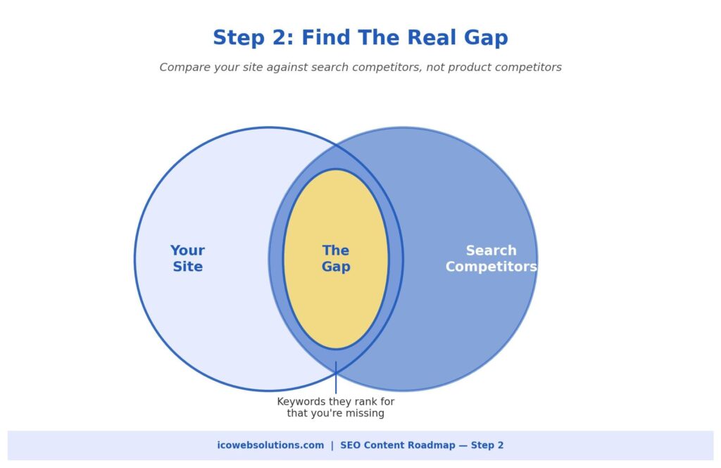
Step 2: Build the Full Keyword List, Then Find What You’re Actually Missing
With the goal nailed down, the next step is mapping out every term your buyers might realistically search, and then comparing that against which of those terms you already show up for.
We use a standard SEO research tool for this part, something like Ahrefs or Semrush works fine, by pulling our own domain alongside three or four competitors who we know we’re actually losing visibility to in search, not just competitors the sales team talks about internally.
Those two lists are often different, and conflating them wastes time chasing SEO fights you were never actually in.
The output at this stage is messy on purpose. You’ll get a long list of keyword opportunities, a decent chunk of which will be irrelevant, branded, or far too broad to be useful. That’s expected. The real work here is in the filtering.
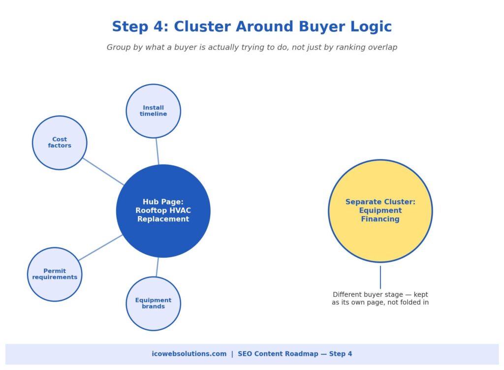
For the HVAC distributor, the obvious head term was something like “commercial HVAC equipment,” a huge, broad, expensive-to-rank-for phrase. But sitting right next to it were much more specific, much more winnable terms like “rooftop HVAC unit replacement for commercial buildings” and “HVAC equipment financing for contractors,” both with a fraction of the search volume but an enormous amount more buying intent behind them.
Pick search competitors based on who you actually compete with in results, not who sales considers a rival
Expect most of the raw keyword export to be noise, and budget real time for manually trimming it
Specific, narrower terms with clear intent are usually worth more than broad terms with bigger volume
Step 3: Look at the Actual Search Results Page, Not Just the Keyword Numbers
This is the step that didn’t exist in quite the same form a few years ago, and it’s the one most roadmaps still skip. Search volume and keyword difficulty tell you whether you can rank. They don’t tell you what that ranking is actually worth anymore, because the page itself might look completely different depending on whether an AI Overview, a shopping carousel, or a stack of ads sits above the organic results.
Ahrefs has published research showing that the top-ranking organic result can lose roughly 58% of its expected clicks when an AI Overview appears on that search page.
That’s a massive difference, and it means two keywords with identical volume and difficulty scores can be worth wildly different amounts depending on what else is occupying that results page.
So at this stage, we manually check the SERP for every shortlisted keyword, not just the metrics report, and note which ones already trigger an AI Overview, a People Also Ask block, or heavy ad placement.
This isn’t automatically a reason to avoid a keyword. It’s a reason to decide, deliberately, what you’re actually trying to win there.
For our HVAC distributor, nearly every broad, informational term, things like “how commercial HVAC systems work”, triggered an AI Overview that fully answered the question without anyone needing to click through.
We didn’t abandon those topics entirely, because getting cited inside that AI summary still has brand value, but we stopped expecting them to drive form fills, and we shifted our click-focused effort toward the narrower, more technical, bottom-of-funnel terms where AI Overviews were far less dominant.
Step 4: Group Keywords Into Topics the Way a Buyer Actually Thinks
A spreadsheet full of individual keywords isn’t a plan, it’s just a longer list. The next step is organizing those keywords into topic clusters, groups of related terms that can realistically be served by one well-built page, or that clearly need separate pages because they represent different stages of the buying journey.
Most research tools will suggest a clustering based on which pages currently rank for overlapping terms, and that’s a useful starting point, but it’s not the final word.
The judgment call here is making sure the clusters reflect how a real buyer thinks, not just how a crawler groups similar phrases. In the HVAC example, a tool-based clustering initially lumped general commercial HVAC terms together with equipment financing terms, because there was some ranking overlap between them.
But those are genuinely different buyer situations. Someone researching how commercial HVAC systems work is early and exploring. Someone searching for equipment financing options has already decided what they need and is now trying to figure out how to pay for it.
We split those into two separate clusters with two separate pages, because treating them as one topic would have buried a high-intent, close-to-purchase audience inside a general awareness page.
Step 5: Decide What Gets Built First, Using More Than One Filter
Once the clusters exist, you still have to decide what order to build them in, and this is where a lot of roadmaps quietly go wrong by picking the biggest, most tempting keyword first instead of the smartest one. We score every cluster against four things at once: how difficult it would be to rank, how much it’s genuinely worth if we win it, how close the searcher’s intent sits to an actual purchase decision, and what we learned in Step 3 about whether a click there is even realistic.
No single one of those four factors should make the decision alone. A term can have huge volume and still be a poor first choice if it’s dominated by an AI Overview and sits at the very top of the awareness stage. A term with modest volume can jump to the front of the line if it’s realistically winnable and sits one step away from someone filling out a form.
For the HVAC distributor, that meant pushing the broad “commercial HVAC equipment” topic further down the roadmap, even though it had the biggest search volume by far, and prioritizing “rooftop HVAC unit replacement” and the equipment financing cluster first, because both were realistically winnable, clearly tied to a buying decision already in motion, and far less crowded out by AI-generated summaries.
Score clusters on difficulty, potential value, buyer intent, and SERP reality together, not one at a time
Be willing to deprioritize your biggest, most obvious keyword if it’s dominated by an AI Overview and sits too early in the buying journey
Let a cluster’s closeness to an actual purchase decision outweigh raw search volume when the two conflict
Step 6: Turn the Priority List Into Briefs Built to Be Found and Quoted
A roadmap only matters once it turns into content someone can actually read, and by this point we know enough to write a genuinely useful brief instead of a vague topic assignment. Each brief includes the primary keyword, the supporting terms from that cluster, where the buyer sits in their decision process, what we learned about the SERP for that term, and a specific angle the piece needs to take to stand out.
The writing itself needs to work for two audiences at once now: the human reader and the AI system that might lift a chunk of it into a summary somewhere else.
In practice, that means answering the core question directly within the first sentence or two of each section rather than building up to it slowly, using headings phrased the way someone would actually ask the question out loud, and backing claims with real, specific detail rather than vague generalities.
For the HVAC distributor’s financing page, that meant opening with a direct, plain explanation of how equipment financing actually works for commercial HVAC purchases, then supporting it with real numbers and terms, rather than easing into the topic with a long introduction before getting to the useful part.
This is also where genuine expertise becomes a real advantage rather than a nice-to-have. AI systems and careful human readers both tend to notice the difference between a page written by someone who clearly understands the subject and a page that’s technically correct but generic. Specific numbers, named standards, real customer situations, and a clear point of view are much harder for a rushed competitor to copy quickly, which is exactly the kind of advantage a content roadmap should be protecting.
Why We Still Write for Topics an AI Overview Will Swallow Whole
One objection comes up almost every time we walk a client through this process: if a topic is clearly going to get answered by an AI Overview before anyone reaches the organic results, why bother writing about it at all? It’s a fair question, and the honest answer is that we still write those pieces, just with a different goal attached to them and a different way of measuring whether they worked.
Getting cited as a source inside an AI Overview isn’t nothing, even without the click. It puts your brand name in front of someone at the exact moment they’re asking the question your business answers for a living, and repeated exposure like that builds a kind of familiarity that shows up later when they’re ready to actually buy.
There’s also a practical reason to keep showing up on these broader topics: the clustering from Step 4 only works if the awareness-stage content exists to link into the bottom-of-funnel pages, since a hub page with no supporting content around it tends to carry less authority than one surrounded by a genuinely useful cluster.
For the HVAC distributor, the broad educational pages stayed in the roadmap, just later in the build order and measured by brand visibility and assisted conversions rather than direct form fills.
What This Looks Like Once It’s Running
Once a roadmap like this is built, it’s tempting to feel like the hard part is over, but there are two things worth doing immediately rather than filing it away. The first is capturing an honest baseline: your current rankings, your current organic traffic, and ideally your current click-through rates on the terms that matter most, before you start making changes.
AI Overviews and SERP layouts keep shifting, and without a clear “before” snapshot, it becomes very hard to prove later whether the work actually moved anything. This is particularly important for businesses investing in emerging areas such as AI search, where visibility increasingly depends on how clearly a brand, its expertise, and its content can be understood by generative search systems.
The second is resisting the urge to overhaul every piece of content at once. Pick one cluster, run it through this exact process, publish it, and give it a few weeks to settle before comparing its performance against content you built the old way.
That comparison is genuinely more useful than any amount of planning, because it tells you, with your own real data, whether this approach is actually earning more qualified attention for your specific business, not just in theory but in practice. The same principle applies whether you’re working with an in-house team or a content marketing agency: the goal is not simply to produce more content, but to understand which content contributes to meaningful business outcomes.
It’s also worth revisiting the whole roadmap on a regular schedule rather than treating it as a one-time document. Search results keep shifting, AI Overviews expand into new categories of queries every few months, and a cluster that was a smart priority six months ago might already be crowded out by competitors who went through a similar process after watching you succeed.
Building in a quarterly check-in, even a short one, to re-run the SERP checks from Step 3 and confirm the priority order from Step 5 still makes sense keeps the roadmap from quietly going stale while everyone’s attention moves on to the next project. If your website, content architecture, or technical foundation also needs attention, this is often the right point to assess whether improvements from a specialist in website design in Delhi could support the broader search strategy rather than treating design and SEO as separate initiatives.
None of this requires a massive team or an enormous budget to start. It requires picking a real business outcome, being disciplined about checking what the search results actually look like before committing to a topic, and being willing to build the less exciting, narrower pages first if that’s genuinely where the buyers already are.
That discipline is really the whole difference between a content roadmap that produces a nice-looking report and one that produces an actual pipeline of people ready to talk to your sales team.
If you’d rather have a second set of eyes build this roadmap with you, or run it on your behalf from the keyword research through the finished, publish-ready briefs, that’s exactly the kind of work our team takes on at ICO WebTech. We can also help businesses adapt their broader organic strategy for the changing search landscape as an AI search company, combining content strategy, SEO, website expertise, and AI visibility into one practical roadmap. We’re happy to walk through what a first roadmap would look like for your specific business before you commit to anything.
Google’s fourth spam update of 2026 is live. The pattern across all four says more than the announcement does.
On September 24, Google’s Search Status Dashboard logged the release of the September 2026 spam update. The entry is brief: the update applies globally, covers every language, and may take up to two weeks to finish. Google’s own social post called it a normal spam update, and nothing more was disclosed.
That leaves site owners with the same question they face after every spam update: what changed, and does it affect my site? The announcement cannot answer it. The history of the year can help.
The four spam updates of 2026, at a glance
Update
Started
Rollout time
Google’s stated window
March 2026
March 24
About 19.5 hours
A few days
June 2026
June 24
About 2 days 1 hour
A few days
August 2026
August 18
About 2 days 16 hours
A few days
September 2026
September 24
In progress
Up to two weeks
Google’s four 2026 spam updates: rollouts got longer and the gaps got shorter.
Each rollout ran longer than the one before it. March finished in under a day. June took a little over two days, and August took more than two and a half. Google described all three as taking a few days. September is the first to carry a two-week allowance.
What Google has said, and what it hasn’t
Google describes spam updates as improvements to its automated spam-detection systems, including SpamBrain. Sites that violate its spam policies can rank lower or disappear from results. Google’s spam update documentation also says a site that changes course may recover, but only after those systems observe compliance over a period of months.
What Google has not said is more useful to know. The status dashboard entry names no policy, no tactic and no affected share of queries. The last time Google announced new spam categories alongside an update was March 2024, when scaled content abuse, expired domain abuse and site reputation abuse were introduced. None of the 2026 updates came with a policy announcement.
The gaps are shrinking
Counting from the dates above, 92 days passed between the March and June updates. Then 55 days passed before August, and 37 days before September. Momentic’s update tracker notes that 2025 produced a single spam update all year, and 2024 produced three. Four in the first nine months of 2026 is a different rhythm.
The implication is practical. Spam enforcement now arrives roughly every five to eight weeks, so compliance cannot be a once-a-year audit. A site that was clean in March can drift by September: a plugin goes unpatched, a page gets compromised, a link profile fills with paid or automated links. Each update re-tests the site as it stands that day.
A two-week window is a ceiling, not a forecast
Google’s estimate is the maximum time it expects, not a prediction. The earlier three updates finished well inside their few-day windows. Long rollouts do have precedent, though. PPC Land, citing DemandSphere’s tracking, reports that the August 2025 spam update ran for 27 days, from August 26 to September 22.
Counting from September 24, the two-week ceiling falls on October 8. As of September 28, no completion note had appeared on Google’s dashboard. Any ranking movement seen before completion is provisional, because the update is still being applied.
Where spam policy meets website maintenance
Google’s spam policies cover more than content tricks. They also include hacked content, meaning pages placed on a site through security holes, and sneaky redirects. Neglected sites are the easiest to compromise. An unpatched plugin, an unsupported PHP version or a forgotten admin account can let someone inject pages and links the owner never wrote.
Google has not said this update targets hacked sites, so this is about exposure, not diagnosis. But the exposure is real, and it is a maintenance problem. ICO WebTech’s post on PHP version debt explains how old code leaves sites unprotected, and the post on how maintenance decides whether AI search can use your website covers the same neglect from the visibility side. A website maintenance company in Delhi that monitors for injected content and unexpected redirects is doing spam-policy work, whether or not it uses that label.
What site owners should do during and after a rollout
Compare Search Console performance data against the rollout dates rather than the announcement date, and annotate changes so cause and effect stay separable. Avoid rewriting large parts of the site while the rollout is running, because it muddies the data. If traffic changed, review Google’s spam policies against the affected pages before changing anything.
Three areas deserve a look regardless of movement. First, security: check Search Console’s security issues report and search your own domain for pages you did not create. Second, links: paid, automated or manipulative links are a classic exposure, and toxic backlink removal exists for cleaning up a profile that has accumulated them. Earned links are the safer route, as ICO WebTech’s guide to white-hat link building strategies for 2026 outlines. Third, content: thin pages produced in bulk are the pattern spam systems were built to catch.
The bottom line
The September 2026 spam update tells site owners little on its own. The four updates together tell them plenty: enforcement is more frequent, rollouts are getting longer, and Google is not naming its targets. The safest position is a site that stays compliant all year, not one that reacts to each announcement.
Content earns citations. Maintenance decides whether your site is even eligible for them.
Most advice on AI search visibility starts with content: write clearer answers, add structure, earn mentions elsewhere. All of it assumes something that rarely gets checked: that the AI system can actually use your website.
Maintenance decides whether it can. That makes it a visibility issue, not a housekeeping one.
For a website maintenance company in Delhi, or anywhere else, this changes the brief. The job used to end at updates, backups and uptime. Keeping a site eligible for search engines and AI tools is now part of it.
Maintenance cannot buy you a citation. It decides whether you are eligible for one.
The four gates between a prompt and a citation
When someone asks an AI assistant a question that needs current information, the system searches, fetches pages, reads them and writes an answer from the sources it trusts. Your page has to pass four gates in order: reach, read, trust and cite.
Three of the four gates depend on the condition of your website. Only the last is decided by your content and reputation. That is why the order matters: a failure at an early gate cannot be repaired at a later one. The best-written page on the internet scores nothing if the crawler receives an error.
Gate 1: Reach
Before anything is read, the crawler has to get a response. The server must answer quickly, without errors, and without demanding proof that the visitor is human. Slow shared hosting, a database overloaded after an update, an expired SSL certificate or a redirect that loops each end the visit before it begins. Retrieval systems work under time limits and have plenty of other sources to try, so they move on.
Gate 2: Read
Reaching a page is not the same as reading it. The system needs clean, extractable text: headings, paragraphs, prices, contact details. Content that appears only after scripts run, text baked into images and layouts broken by a theme update all leave the crawler with less than a human visitor sees. Consent walls and login prompts that hide the content until someone clicks can leave it with an empty page.
Gate 3: Trust
A system that quotes a source puts its own credibility behind it, so it has reason to avoid pages that look unsafe or unreliable. Security warnings, injected spam and details that disagree with each other all lower a page’s standing. Trust is the gate where a neglected site fails slowly, one unpatched plugin at a time.
Gate 4: Cite
Only here do the quality of your writing, the originality of your insight and the reputation of your brand matter. This gate is competitive: several eligible pages may answer the same question, and the system picks among them. Maintenance gets you into that group. It has no say in who is chosen from it.
The invisible outage
The most damaging maintenance failures are the ones the owner never sees. The owner opens the homepage in a browser, often logged in, often from a cached session, and it loads. A crawler makes a fresh request from a data-centre address with an unfamiliar user agent. These are different requests, and they can get different answers.
Security plugins, CDN rules, and hosting firewalls are tightened during updates, and bot protection exists to block unfamiliar automated traffic. Unless AI crawlers are deliberately allowed, a site can turn away the exact visitors it wants to attract, and nothing on the website announces it.
Here is how it happens in practice. A security plugin is updated and switches on stricter bot rules. The homepage is checked afterwards and looks fine. Weeks later, crawlers are still being challenged or rate-limited, and every failed request is a missed chance to be used. The other causes are just as ordinary: a CDN setting that treats unknown user agents as threats, a rule that blocks data-centre IP ranges, a rate limit set too low, or a robots.txt file copied over from a staging site that blocks everything.
Some businesses block AI crawlers on purpose, and that is a legitimate decision. The failure is blocking them by accident. Uptime monitoring that only loads the homepage will never catch it, because the homepage is up. It is a maintenance question, and it belongs to whoever looks after the server.
Six ways neglect removes a site from consideration
Firewall or security rules. Rules that protect a site from attacks cannot tell a hostile bot from a helpful one unless they are told which is which. Every rule added or tightened during an update is a chance to block legitimate crawlers, and the change is rarely tested from a crawler’s side.
Slow or unstable hosting. A server that answers in a few hundred milliseconds today can take seconds after a database grows, a plugin adds queries or a hosting plan is oversold. Intermittent 5xx errors are worse than a clean outage, because they pass casual checks but fail when a crawler arrives at the wrong moment.
Redirect chains and broken links. Every redesign, URL change and removed product leaves old addresses behind. Chains of redirects waste a crawler’s patience, and broken internal links leave whole sections of a site undiscovered. Our internal linking guide covers the mechanics of both.
Content that needs JavaScript. Many AI crawlers fetch raw HTML and do not run JavaScript, so a page that builds its text in the browser can look empty to them. A theme or plugin update that moves content into scripts changes what machines can read, and often nobody re-checks.
Hacked pages and stale details. A hacked site can carry injected spam links or malware warnings, which is exactly the kind of signal that makes a source unsafe to cite. And when your pricing, address or services are correct on one page and stale on another, a system has to choose between contradicting sources. Consistency is a maintenance outcome.
None of the six is dramatic. Each begins as a small deferred task. Together they decide which gate the site stops at.
Why content-first AI visibility work stalls
Content is written once and then left alone. Eligibility decays continuously. Every plugin update, hosting change, and security rule alters the conditions the content depends on, so treating AI visibility as a publishing project leaves the site exposed to the one kind of failure publishing cannot fix.
Consider a business that commissions a dozen well-researched service pages. Six months later, a routine update changes a firewall rule, a theme change pushes the main text into scripts, and the contact page still lists an old phone number. The pages have not changed, yet they are less usable than on the day they went live. The money spent on content is intact. The return on it is not.
The sequence matters. Secure eligibility first, then invest in content. Doing it the other way round means paying to produce pages that machines cannot fetch.
What maintenance cannot do?
The fourth gate belongs to other work. Clear content, original insight, genuine authority, and mentions elsewhere on the web decide whether an eligible page is the one an assistant cites. No maintenance plan changes that, and no provider can guarantee citations. Maintenance clears the way. It does not choose the destination.
A plan that updates plugins and takes backups keeps a site running. It does not keep it eligible. That distinction is easy to miss, because both kinds of plans produce the same monthly report: updates applied, backups taken, uptime at 99.9%. None of those numbers say anything about what an AI crawler received when it last requested a page. A plan built for AI search has to check for that directly, and it does so by answering five questions.
The standard a maintenance plan should now meet
Does monitoring test pages the way a crawler requests them?
A browser check proves the site works for people. A request with a crawler user agent, from outside your own network, proves it works for machines. These are not the same test, because a browser carries a logged-in session, cached files and a familiar IP address, while a crawler arrives as a stranger. A maintenance plan built for this sends a plain HTTP request, with a known crawler user agent such as GPTBot or PerplexityBot, from an outside server, on a regular schedule, and records the status code and response time it gets back. Anything other than a clean 200 response is a finding, not background noise.
Are firewall, CDN and robots rules reviewed after every update?
Updates are when rules change. A security plugin update, a new CDN feature or a theme change can silently add a bot-blocking rule, and a short review after each one catches accidental blocks before they run for weeks. In practice this means checking three things every time something changes on the server: the robots.txt file, for a line that quietly blocks more than intended; the firewall or security plugin’s bot-management settings, for a rule switched on by default; and the CDN’s bot-protection dashboard, for anything set to “block” rather than “monitor” for crawlers you want to allow. Five minutes after each update is enough, but it has to happen every time, not only when something looks wrong.
Are error rates for automated visitors read from server logs?
Logs show what crawlers actually received, including errors no browser check would ever reveal. A browser-based uptime check only ever sees the homepage, loaded the way a browser loads it. Server logs show every request from every visitor, including the ones identifying themselves as AI crawlers, and the status code each one got. Filtering logs by known crawler user agents and watching for a rise in 403, 429 or 5xx responses turns an invisible outage into a visible one. This is the single most direct way to know whether a site is reachable by the systems it needs to reach, and most maintenance plans never look at it.
Is the rendered HTML compared before and after theme or plugin changes?
If the text a machine can read shrinks after an update, a comparison shows it. A screenshot never will, because a screenshot only captures what a browser renders after running every script, while a crawler that skips JavaScript sees the raw HTML underneath. Saving a copy of a page’s rendered HTML before a theme, plugin or page-builder update, and diffing it against the same page afterwards, shows exactly what content moved into scripts, what text disappeared, and what markup broke. This turns a subjective “does it look fine” check into a specific, checkable difference.
Is business information kept consistent across pages and profiles?
Prices, hours, addresses and service names should match everywhere they appear, including the website, Google Business Profile, directory listings and social profiles. A system weighing several sources against each other treats agreement between them as a signal of accuracy, and disagreement as a reason for caution. A short quarterly pass that checks contact details, pricing and service descriptions against each source they appear on catches the drift that builds up naturally as pages are edited at different times by different people.
Answering yes to all five takes more than a checklist ticked once. Reach and consistency can drift within weeks of the last review, so these checks belong in the maintenance schedule itself, alongside updates and backups, not in a one-off audit. Until a plan can answer yes to these on an ongoing basis, it maintains a website. It does not maintain visibility.
Choosing a website maintenance company in Delhi
If you are comparing providers, judge them on the five questions above, not only on price. Ask how they monitor, what they review after each update, and what they report back. Fast response, regular backups and clear reporting are the baseline, not the pitch.
The real difference is whether a provider treats your site’s ability to be found as part of the job. A company that only keeps plugins current will keep the site running. One that also checks what crawlers receive will keep it eligible.
Is your website eligible?
Looking for a website maintenance company in Delhi that treats visibility as part of the job? ICO WebTech can review whether your site can be reached, read, and trusted by search engines and AI tools.
What internal links are, how to plan them, and how to find and fix the problems already on your site.
You can publish great pages and still watch them go unnoticed. Often the reason is simple: nothing on your own site points to them. Internal links are how you tell Google, AI tools and visitors which pages matter and how your content fits together.
This guide covers what internal links are, why they matter, how to build a linking plan, and how to audit the links you already have. The steps work on any site, with notes for WordPress and Shopify, the two platforms we build on most at ICO WebTech.
What are internal links?
An internal link is a hyperlink from one page of your website to another page on the same website. In code it looks like this:
<a href="/seo-company-in-delhi/">SEO services</a>
The clickable words are called anchor text. The page it points to is the target. Search engines follow these links to discover pages and to judge how pages relate to each other.
Internal links vs. external links
Internal links
External links
Points to
Another page on your domain
A page on a different domain
Main job
Navigation, crawling, passing authority between your pages
Citing sources, adding context, building trust
You control
Both the link and the anchor text
Only your outgoing links; backlinks come from others
Example
A blog post linking to your SEO service page
A post citing a Google documentation page
Types of internal links
Some links stay the same on every page. Others depend on the content of each page.
Navigation links: Your main menu. Usually your most important pages.
Footer links: Sitewide links to key services, contact and policies.
Breadcrumbs: Show where a page sits, such as Home > Services > SEO.
In-content links: Links inside blog posts and service pages. The most flexible type.
CTA links: Buttons or text that push a visitor to enquire, buy or book.
Image links: Product images or banners that link to another page.
Why internal links matter
1. They help search engines find and understand your pages
Google discovers most pages by following links from pages it already knows. A page with no links pointing to it, often called an orphan page, is hard to find and often stays out of the index.
2. They pass authority to the pages that need it
Some pages on your site earn more backlinks than others. When those pages link to relevant pages that have fewer, some of that strength carries over. Only part of it passes on, and relevance matters, so link where it makes sense for the reader.
Internal links pass part of a page’s authority to the pages they link to.
3. They keep visitors moving toward action
Someone reading about website redesign may want to see your portfolio or ask for a quote. A well-placed link answers the next question before they leave.
4. They help AI tools see your structure
AI search tools pull answers from pages they can read and connect. A clear cluster of related pages that all link to one main guide shows which page covers a topic in the most depth. It also helps if your menus are plain HTML links, because some crawlers may not run JavaScript.
How to build an internal linking strategy in 7 steps
Start with the shape of your site, then work down to individual links.
Hub and spoke: the pillar links out to each supporting page, and each supporting page links back to the pillar.
What a good site structure looks like
Picture your site as a tree. The homepage sits at the top, category pages branch off it, and detailed pages sit at the bottom. Every page should be reachable by following links down from the homepage.
An ideal site structure: each level links to the next.
How a topic cluster works
A pillar page covers a broad topic. Cluster pages cover related sub-topics in more detail. Each cluster page links to the pillar, and the pillar links back to each cluster.
The topic cluster model.
Before you write anything, map your clusters in a simple table. Here is what one looks like for an SEO pillar:
A topic cluster planning template.
The 7 steps
Plan your site structure. Think in three levels: the homepage, main service or category pages, and detailed pages such as blog posts or products. Keep your key pages within two or three clicks of the homepage.
Choose your pillar pages. A pillar is a broad, in-depth page on a topic you want to be known for, such as SEO or website design. Each service page is a natural pillar.
Build topic clusters. Write supporting posts on narrower questions and link each one to its pillar. Link the pillar back to them, and link related posts to each other.
Link from strong pages to weaker ones. Find the pages with the most backlinks in Google Search Console (Links report) and add relevant links from them to pages that need a boost.
Support every new page. Before you publish, find two or three existing pages where a link would help the reader. Search Google for site:yourdomain.com keyword to find them fast.
Write clear anchor text. Covered in the next section.
Get your navigation right. Keep menus consistent, use real HTML links, and add breadcrumbs. On WordPress this is under Appearance > Menus, and on Shopify under Online Store > Navigation.
Pro tip: Aim for at least two or three internal links pointing to every new page. Add them on the day you publish, not “later”. Later rarely comes.
How to choose anchor text
Anchor text tells readers and search engines what to expect on the other side. Keep it short, descriptive and natural.
Anchor text is the clickable part of the link.
Avoid
Use instead
Why
Click here
website redesign services
Says what the page is about
Read this post about how a company can improve its SEO in 2026
SEO checklist
Short anchors are easier to scan
The same exact phrase on every link
Slight variations of the same topic
Repeating one phrase looks forced
Full raw URLs in the text
Descriptive words
Readable and more useful
Keep internal links followed, which is the default. Use rel="nofollow" only for low-value utility pages such as carts or login pages.
In the code, the only difference is the rel attribute:
A followed link and a nofollow link.
How to audit your existing internal links
An audit shows what is broken and which pages are underlinked. You can do a basic one with free tools:
Crawl your site. Use Screaming Frog (free up to 500 URLs) or a similar crawler. Export the list of pages, their status codes, and their inbound links.
Compare against your sitemap. Any page in the sitemap that the crawler did not reach through links is an orphan.
Check Google Search Console. Open the Links report to see which pages have the most and fewest internal links. Check the Pages report for pages that were discovered but not indexed.
Sort by importance. List your money pages first: services, top products, and best-converting posts. Make sure each has plenty of relevant links pointing to it.
Common internal linking mistakes and how to fix them
Mistake
Why it hurts
Fix
Broken links (404)
Wastes crawl time and frustrates visitors
Update the link to a live page, or remove it
Orphan pages
Crawlers and users can’t find them
Link to them from a related page or your menu
Pages with only one link
Look less important
Add links from relevant posts and pillar pages
Pages buried too deep
Far from the homepage, so weaker signals
Link from top-level pages so they sit within about 3 clicks
Links to redirected URLs
Adds an extra hop on every click
Point the link straight to the final URL
Redirect chains and loops
Slow pages and lost signals
Redirect the old URL directly to the final one
Nofollow on internal links
Blocks authority from passing
Remove nofollow unless the page is low value
Vague anchor text
Gives no clue about the target page
Rewrite with short, descriptive anchors
HTTP links on HTTPS pages
Extra redirects and security warnings
Update every link to the HTTPS version
Menus built only in JavaScript
Some crawlers can’t see them
Check the menu appears in view-source; use plain HTML links
Too many links on a page
Dilutes focus and confuses readers
Keep links relevant and cut the rest
WordPress tip: when you change a page URL, update old links in posts as well as adding the redirect. A plugin like Redirection can show broken links and 404s.
Shopify tip: Shopify creates a redirect when you change a handle, but links in your menus, blogs and collections still point to the old one until you edit them.
Orphan pages
An orphan page has no internal links pointing to it. Crawlers can’t reach it by following links, and visitors can’t find it either. The red boxes show two kinds: a single page, and a group of pages cut off from the rest of the site.
Orphan pages sit outside your linked site structure.
Link to each orphan from a page that is already part of your site, or add it to your menu if it is important. Make sure the page you link from is not an orphan too.
Internal links to redirected pages
When a page moves, the old URL is usually redirected (301) to the new one. If links on your site still point to the old URL, every click takes an extra step, which slows the page and wastes crawl time.
An internal link that points to a redirected page.
Update the link so it goes straight to the new page:
The fix: link directly to the live page.
Redirect chains and loops
A redirect chain happens when one redirect leads to another. It often builds up after several redesigns or migrations. Each extra hop slows the page down.
A redirect chain.
A redirect loop is worse. Two pages redirect to each other, so the visitor never reaches a page and sees an error instead.
A redirect loop.
To fix a chain, redirect every old URL straight to the final page. To fix a loop, remove or correct one of the redirects so both pages end at one live URL.
The fix: one redirect, straight to the final URL.
Internal linking checklist
Every important page is reachable within three clicks of the homepage
Every service page has a supporting cluster of blog posts
Every blog post links to its pillar page and to at least one related post
Every new page gets 2 to 3 links from existing pages on publish day
Anchor text is short, descriptive and varied
No broken links, redirect chains or orphan pages
Menus and breadcrumbs use plain HTML links
Audit repeated every quarter
Frequently asked questions
Do internal links help SEO?
Yes. They help search engines find pages, understand how they relate and decide which are most important. They also send visitors to useful pages.
How many internal links should a page have?
There is no fixed number. Link where it helps the reader and skip links that add nothing. Pages packed with hundreds of links tend to be harder to use.
Should internal links open in a new tab?
Usually not. Keep visitors in the same tab so the back button works as expected.
How often should I audit my internal links?
Every three months is a good habit, and always after a redesign, migration or big content update.
Do internal links matter for AI search?
They help. A clear structure makes it easier for AI tools to find your best page on a topic, though no one can guarantee citations.
Brands are stripping their websites down to almost nothing — skinny sans-serif type, oceans of white space, one button, one message — and it’s not laziness; it’s leverage. Done right, this “barely there” style builds trust in seconds, keeps visitors on the page longer, and pushes more of them toward a purchase. Done wrong, it’s just an empty page pretending to be a strategy. This post breaks down why the shift is happening, how to tell the difference between confident minimalism and a design cop-out, and how to bring it to your own brand without losing your personality.
Here’s a number that should stop your scroll for a second:
75% of people decide whether they trust a business based on how its website looks, not on what the website says (Fahrenheit Marketing, 2025).
Not the pricing page. Not the “About Us” story you spent three weeks writing. The look. And that judgment happens fast — most visitors form an opinion of your brand within seconds of landing on your homepage. If your site is busy, cluttered, or trying to say twelve things at once, you’ve probably already lost them before they read a single word.
That’s exactly why the loudest trend in design right now is, ironically, quiet. Hyper-minimalist interfaces — thin, elegant sans-serif fonts, massive white space, one clear call to action — are showing up everywhere from Apple’s product pages to tiny D2C startups that can’t afford a design team. This isn’t a passing aesthetic. It’s a response to how overwhelmed people actually feel online, and the brands getting it right are turning that quiet look into real revenue.
What “Barely There” UI Actually Means
Let’s clear something up first, because this is where a lot of brands get it wrong. “Barely there” doesn’t mean empty. It doesn’t mean a white page with a logo and a vague sentence floating in the middle, hoping it looks expensive. True hyper-minimalism is an editing decision, not an absence of decisions. Every element that survives the cut is there because it’s doing real work — a headline that tells you exactly what the product does, one button that tells you exactly what to do next, and enough breathing room that your eye actually lands on both.
Think of it less like an empty room and more like a well-organized one. A minimalist living room isn’t a room with nothing in it — it’s a room where every object earns its place. The couch is there because you sit on it. The lamp is there because you need light. Nothing is there just to fill space. Barely-there UI works the same way. The white space isn’t a lack of content; it’s a spotlight pointed at the content that matters.
Why This Is Happening Right Now
A few forces are colliding at once to push brands toward this style, and none of them are about fashion. They’re about behavior. People are scrolling faster, reading less, and getting less patient with anything that asks for extra effort. According to research cited by Fahrenheit Marketing (2025), the average consumer attention span has dropped to roughly eight seconds, and mobile shopping now makes up nearly half of all eCommerce activity, which means your design has to work on a five-inch screen just as well as it does on a laptop. There’s simply less room, and less patience, for visual noise.
Speed plays a huge role too. A cluttered page with heavy images, animations, and plugins takes longer to load, and load time is not a small detail anymore — it’s a dealbreaker. Google’s own research shows that 53% of mobile visitors will abandon a site if it takes longer than three seconds to load (as cited in Mapletree Studio, 2025). Minimalist pages, with fewer elements to download and render, tend to load dramatically faster, which keeps people around long enough to actually convert.
Then there’s the psychology of choice itself, which is where things get genuinely interesting. A famous study out of Columbia University found that shoppers offered 24 varieties of jam were ten times less likely to actually buy one than shoppers offered just six varieties (Iyengar & Lepper, 2000). Too many options doesn’t feel like freedom — it feels like friction.
The same thing happens on a website.
A homepage with fifteen navigation links, six competing banners, and three different calls to action doesn’t give visitors more power. It gives them decision fatigue, and tired brains don’t buy things. They leave.
Consumer attention spans are shrinking, and mobile browsing now dominates most traffic
Faster-loading, simpler pages directly reduce bounce rates and cart abandonment
More choices on a page can actually lower conversions, not raise them
75% of first impressions are driven by visual design, not written content
If you’ve noticed that almost every modern brand seems to use the same thin, clean, slightly stretched-out font, you’re not imagining it. Skinny sans-serif typefaces have become the unofficial uniform of modern branding, and there’s a real reason beyond trend-chasing. Thin type feels calm. It doesn’t shout, and in a digital landscape full of shouting, calm reads as confident. A brand that doesn’t need bold, heavy, all-caps type to grab your attention is quietly telling you it doesn’t need to try that hard, because the product speaks for itself.
There’s a practical side to this too. Sans-serif fonts, especially lighter weights, render cleanly at almost any size, which matters enormously now that your typography has to look sharp on everything from a smartwatch to a 4K monitor. Serif fonts with their little decorative strokes can start to look fussy or even blurry at small sizes, while a clean sans-serif line stays legible and modern no matter where it shows up. Combine that with generous letter spacing, and you get type that feels less like “reading text” and more like “absorbing a message,” which is exactly the sensation most brands are chasing.
None of this means every brand should look identical, and that’s actually a real risk worth naming honestly. When everyone reaches for the same thin blue-gray sans-serif and the same amount of white space, brands start blurring together. The fix isn’t to abandon minimalism — it’s to use color, one distinctive shape, or a signature interaction to keep your barely-there design from looking like a template. Minimal doesn’t have to mean identical.
White Space Is Not Empty Space
This is the part that trips up the most brands, so it’s worth sitting with. White space, sometimes called negative space, gets treated like wasted real estate by people who haven’t studied how attention actually works. But research from Wichita State University found that strategic white space between paragraphs and in page margins increased reader comprehension by nearly 20% (as cited in Ovane Theme, n.d.). That’s not a small effect. That means the empty space around your words is doing measurable work to help people actually understand what you’re saying.
Here’s the honest case study that makes this concrete.
Underwater Audio, an eCommerce brand, tested a busy, detail-packed homepage against a stripped-down, minimal version with less copy and fewer competing images. The simplified version increased conversions by 261% (Speckyboy, n.d.). That’s not a rounding error — that’s the difference between a page that works and a page that quietly loses money every single day it stays online.
White space works because it gives the brain somewhere to rest. Every image, button, and paragraph on a page is competing for a visitor’s limited attention, and when everything is fighting to be noticed, nothing actually wins. Space between elements acts like punctuation for the eyes. It tells a visitor where one idea ends and the next begins, and it makes the one thing you actually want them to notice — your product, your headline, your button — impossible to miss.
My Framework: The Signal-to-Space Ratio
Here’s where I’ll say something a little controversial, because it needs to be said. Most brands calling their redesign “minimalist” aren’t practicing minimalism at all. They’re hiding indecision behind a nice-looking template. There’s a difference between a brand that removed forty elements because none of them mattered, and a brand that never had a clear message to begin with and used white space to cover for it. One is strategy. The other is a blank canvas mistaken for confidence.
To help separate the two, I use a simple mental model I call the Signal-to-Space Ratio, or SSR. Every screen has two ingredients: signal, meaning anything that actually communicates value — your headline, your CTA, your product image — and space, meaning everything left open around it. The goal isn’t to maximize space and it isn’t to maximize signal either. It’s to find the ratio where every remaining element is doing real work, and the space around it is amplifying that work instead of hiding a lack of it.
When the ratio skews too far toward signal, you get clutter — too many messages competing at once, and visitors leave confused about what you actually want them to do. When it skews too far toward space, you get what I call ghost design — a page that looks expensive and says almost nothing, leaving visitors with no real reason to act. The sweet spot sits in between: one confident message, one clear action, and just enough space to make both impossible to miss. That’s the zone where the highest-converting, most trusted brands actually live.
You can run this test on your own homepage right now. Ask yourself honestly: if you removed any single element on the page, would visitors understand your offer less clearly? If the answer is no, that element isn’t signal, it’s clutter, and it should probably go. If you added more space around your existing elements, would it help them stand out or just make the page feel abandoned? That answer tells you which side of the ratio you’re actually on.
What a Barely-There Screen Looks Like in Practice
It helps to see the anatomy of this laid out, because the theory is simple but the execution takes discipline. A well-built minimalist screen usually follows the same quiet structure: a short, confident headline set in a light-weight sans-serif font, a generous buffer of open space that takes up more than half the visible screen, and a single, unmissable call to action that isn’t competing with three other buttons for attention. Nothing is fighting for the spotlight because there’s only one spotlight to begin with.
This structure also happens to be why minimalist pages tend to perform so well on mobile. When there’s only one message and one action, there’s nothing to accidentally tap, nothing to horizontally scroll past, and nothing competing with your thumb for space on a small screen. The design that looks almost too simple on a desktop monitor is often the one that actually works best in someone’s hand.
Real Websites Already Doing This Well
Reading about this concept is one thing, but it clicks a lot faster once you actually look at a live site built this way. A few brands are worth pulling up in a new tab as you read this, because they show the Signal-to-Space Ratio in action rather than just in theory.
Apple.com is probably the most studied example of this style, and for good reason. A typical Apple product page opens with one product shot, one short headline, and one link to learn more, with enormous white margins on either side. There’s no navigation clutter competing for attention above the fold. The page trusts the product photo and a handful of words to do the entire job.
Aesop, the skincare brand, takes the same logic even further. Product pages use almost entirely black text on a cream or white background, with thin typography and wide line spacing that makes the copy feel more like reading a well-designed book than browsing an online store. The restraint itself has become part of the brand’s premium positioning — the design says “considered” before you’ve read a single ingredient list.
Stripe shows how this works for a much more technical product. Despite selling a complex payments infrastructure, Stripe’s marketing pages lean on short, confident headlines, soft gradients, and generous vertical spacing between sections, so a genuinely complicated product still feels approachable and easy to scan.
Visit any of these three sites and try the Signal-to-Space Ratio test from the framework above: look at the homepage, then ask what you’d lose if you removed any single visible element. On a well-built minimal site, the honest answer is usually “quite a lot” — which is exactly the point.
Proof in the Wild: Brands Betting Big on Less
This shift isn’t limited to websites — it’s rewriting logo design too, and the pace of change over the last two years has been genuinely fast. Pentagram’s redesign of PayPal reduced the brand’s identity down to essentially just a clean wordmark, stripping away extra visual elements that had accumulated over the years (UX Studio Team, n.d.). The automotive industry tells an even bigger story: at least 14 major car brands, including Mercedes-Benz, BMW, Audi, Volkswagen, and Cadillac, have unveiled flattened, simplified logos since 2024, moving away from chrome, gradients, and 3D effects in favor of thin lines and two-dimensional marks built to look sharp on an app icon or an LED dashboard (Holloway, 2025).
What’s notable is that these aren’t small, cash-strapped startups making the shift because they can’t afford anything fancier. These are some of the most recognizable, resource-rich brands on the planet, deliberately choosing to say less. That should tell you something important: minimalism at this scale isn’t a budget decision, it’s a trust decision. When a brand strips away the extras, it’s making a quiet promise that the product underneath is strong enough to stand on its own.
PayPal reduced its identity to a clean, simplified wordmark under Pentagram’s redesign
Mercedes-Benz, BMW, Audi, Volkswagen, and Cadillac have all flattened their emblems since 2024
Case studies like Underwater Audio show conversion gains over 250% from simplification alone
Minimalist sites reliably show lower bounce rates and longer time-on-page across multiple studies
Where Minimalism Backfires
To be fair and balanced about this, hyper-minimalism isn’t automatically a win, and pretending otherwise would do you a disservice. The most common mistake is confusing “simple” with “vague.” A page can be gorgeously minimal and still fail completely if a visitor lands on it and can’t figure out, within a few seconds, what the company actually does or why they should care. Style without a clear message is just an expensive-looking dead end.
The other trap is sameness. Because so many brands are pulling from the same visual playbook right now — light blue accents, thin gray type, oceans of white — it’s genuinely easy to end up looking indistinguishable from your competitor down the street. Minimalism should sharpen your brand’s personality, not erase it. A signature color, a distinctive shape, or a slightly unexpected word choice in your headline can keep a clean design from feeling generic.
Removing content without replacing it with a clearer message leaves visitors confused, not convinced
Overused “safe” minimalist templates can make distinct brands look interchangeable
Accessibility matters here too — light gray text on white backgrounds can be genuinely hard to read for many users
Minimalism should highlight your personality, not flatten it into something forgettable
How to Bring This to Your Own Brand
The good news is that you don’t need a total rebuild to start applying this thinking. Most of the impact comes from ruthless editing rather than expensive redesigns, which means this is genuinely achievable for a small business just as much as it is for a Fortune 500 company. Start by picking the single most important action you want a visitor to take on your homepage, and then ask what’s actually standing in the way of that action being obvious.
Pick one primary call to action per page, and remove or visually soften every competing button
Cut your homepage headline down until it says exactly what you do in under ten words
Increase the margin and padding around your key sections by at least 30 to 40%
Choose one lightweight sans-serif font for headlines and stick with it across every page
Test load speed after simplifying — faster pages keep more visitors around to convert
Run the Signal-to-Space Ratio test: if removing it doesn’t hurt clarity, remove it
None of this has to happen overnight, and it shouldn’t. The brands that pull off “barely there” design well tend to treat it as an ongoing editing process, not a one-time redesign project. Every few months, look at your site again and ask what’s still there simply out of habit rather than purpose. That single question, asked consistently, will do more for your conversions than almost any other design change you could make.
The Bottom Line
Hyper-minimalist design isn’t about making your brand look trendy for the sake of it. It’s about respecting how little time and patience people actually have, and using every remaining pixel to earn their trust faster. The brands winning right now aren’t the ones saying the most — they’re the ones saying exactly enough, backed by real research on attention, comprehension, and conversion, and confident enough to let white space do some of the talking. That’s not emptiness. That’s editing with intention, and it’s one of the highest-leverage design decisions a brand can make in 2026.
If your website is currently trying to say everything at once, there’s a good chance it’s actually saying nothing clearly. A confident, barely-there redesign, done with the right strategy behind it, can be the difference between visitors bouncing in five seconds and visitors sticking around long enough to buy. That’s exactly the kind of work our team lives for at ICO WebTech — turning cluttered, outdated sites into clean, fast, high-converting experiences that make your brand look as sharp as it actually is.
Fahrenheit Marketing. (2025). Minimalist web design: The future of eCommerce. https://www.fahrenheitmarketing.com/services/ecommerce/minimalist-design-future-ecommerce
Holloway, M. (2025). Latest car logos reveal a bold shift fans aren’t ready for. https://www.shop.bottegadelsarto.com/feed/latest-car-logos-672716
Iyengar, S. S., & Lepper, M. R. (2000). When choice is demotivating: Can one desire too much of a good thing? Journal of Personality and Social Psychology, 79(6), 995–1006.
Mapletree Studio. (2025). Less really is more: Web design 2025. https://mapletree.studio/blog/less-really-is-more-web-design-2025
Ovane Theme. (n.d.). The art of minimalist web design. https://ovane-theme.jkdevstudio.com/?p=24
If you are spending money on ads, SEO, or email campaigns and sending that traffic to a page that doesn’t convert, you are essentially pouring water into a leaking bucket. A landing page is often the single most important piece of your digital marketing puzzle — yet it’s the piece most businesses get wrong. In this guide, we’ll break down exactly what a landing page is, why most landing pages fail to convert, and the exact framework a professional landing page design agency uses to build pages that turn visitors into paying customers.
Whether you’re a startup founder building your first page, a marketer trying to lower your cost-per-lead, or a business owner comparing a web designing company against options elsewhere, this article will give you a practical, no-fluff roadmap.
What Is a Landing Page?
A landing page is a standalone web page created for one specific purpose: to convert a visitor into a lead or a customer.
Unlike your homepage, which usually has multiple navigation options, a blog, and links pointing in a dozen directions, a landing page is intentionally narrow. It has one headline, one offer, and one call-to-action (CTA).
Landing pages are typically the destination for:
Google Ads or Facebook/Instagram ad campaigns
Email marketing campaigns promoting a specific offer
SEO-driven content targeting a high-intent keyword
Product launches, webinars, or limited-time promotions
The core difference between a landing page and a regular website page is focus. A homepage tries to serve every visitor. A landing page tries to convert one type of visitor into one specific action — whether that’s filling out a form, booking a call, or making a purchase.
As the diagram above shows, a landing page that actually converts sits at the intersection of three things: persuasive copywriting, strong visual design, and a single, unmistakable call-to-action. Remove any one of these, and your conversion rate suffers — no matter how much traffic you send to the page.
Why Most Landing Pages Fail
Before we talk about how to build a great landing page, it’s worth understanding why so many landing pages underperform. In our experience working with clients across industries, the most common mistakes are:
Too many distractions: A full navigation menu, footer links, and social icons give visitors an easy way to leave without converting.
Weak or generic headlines: “Welcome to Our Company” tells the visitor nothing about what’s in it for them.
Slow page load times: Every additional second of load time can reduce conversions significantly, especially on mobile.
Asking for too much information upfront: Long forms scare visitors away before they’ve built any trust with your brand.
No social proof: Without reviews, testimonials, or trust badges, visitors have no reason to believe your claims.
Mismatched messaging: If your ad promises “50% Off” and the landing page doesn’t mention the discount above the fold, visitors bounce immediately.
The good news is that every one of these problems is fixable. Let’s go through the process step by step.
How Do I Create a Landing Page That Increases Sales?
Creating a landing page that actually drives sales isn’t about fancy animations or trendy design trends — it’s about removing friction and building trust as quickly as possible. Here is the framework we recommend:
1. Start With a Single, Clear Goal
Before you design anything, define the one action you want a visitor to take. Is it filling out a lead form? Booking a demo? Making a purchase? Every element on the page should support that single goal. If you find yourself adding a second CTA “just in case,” that’s usually a sign you need a second landing page instead.
2. Write a Benefit-Driven Headline
Your headline is the single highest-leverage piece of copy on the page. It should immediately answer the visitor’s unspoken question: “What’s in it for me?” Instead of describing your product or company, describe the outcome the visitor will get. Compare “Digital Marketing Services” to “Get 3x More Qualified Leads in 90 Days” — the second version is specific, measurable, and benefit-focused.
3. Match the Message to the Traffic Source
If someone clicks on an ad promising a free consultation, your landing page headline and offer need to reflect that exact promise. This is called “message match,” and it is one of the most overlooked conversion factors. A mismatch between the ad and the landing page is one of the fastest ways to increase your bounce rate and waste ad spend.
4. Keep the Design Clean and Focused
Remove the main navigation bar. Remove footer links to your blog, careers page, or social media. Every link that isn’t your CTA is a potential exit ramp. The image below shows a simplified anatomy of a landing page built for conversions — notice there’s no distracting navigation, and the CTA is the most visually prominent element on the page.
5. Use Strong, Specific Calls-to-Action
“Submit” and “Click Here” are weak CTAs because they describe an action rather than a benefit. Stronger CTAs describe what the visitor gets: “Get My Free Quote,” “Start My Free Trial,” or “Claim My Discount.” Make the CTA button visually distinct with a contrasting color, and repeat it at least once further down the page for longer landing pages.
6. Add Social Proof Above the Fold
Trust is the biggest barrier to conversion. Star ratings, client logos, testimonials, review counts, or security badges (like SSL certificates) all reduce perceived risk. Where possible, place at least one trust signal above the fold — before the visitor has to scroll.
7. Optimize for Mobile First
More than half of landing page traffic today comes from mobile devices, particularly for social media and search ad campaigns. Your form fields, buttons, and text need to be easily tappable and readable without zooming. Test your page on an actual phone, not just a resized browser window.
8. Test, Measure, and Iterate
No landing page is perfect on the first attempt. Use A/B testing to compare headlines, CTA copy, button colors, and form length. Track your conversion rate, not just your traffic volume — a page with less traffic but a higher conversion rate will often outperform a high-traffic page with poor conversion.
How Much Information Should You Ask For on a Landing Page?
This is one of the most common questions we get, and the honest answer is: as little as possible for the stage of the funnel your visitor is in.
Every additional form field reduces your conversion rate. Research across thousands of landing pages consistently shows that shorter forms convert better. However, “shorter is always better” isn’t a universal law — it depends on what you’re offering and who you’re targeting.
Top-of-funnel offers (free ebooks, newsletter signups, free trials): Ask for name and email only. Anything more will hurt conversions.
Mid-funnel offers (free consultations, quote requests): Name, email, and phone number are usually acceptable, since the visitor already has some intent.
High-ticket or B2B offers (enterprise software demos, large service contracts): A slightly longer form (company name, budget range, job title) can actually improve lead quality, because it filters out unqualified visitors before your sales team spends time on them.
A good rule of thumb: for every field you add beyond the essentials, ask yourself, “Do I truly need this information right now, or can I collect it later in the sales process?” If the answer is “later,” remove the field.
How to Improve My Landing Page? (A Practical Checklist)
If you already have a landing page live and want to improve its performance without a full redesign, work through this checklist:
Check your page load speed using a free tool and compress any oversized images.
Confirm your headline matches the exact promise made in your ad or email.
Remove any navigation links that aren’t your primary CTA.
Reduce your form to the minimum number of fields necessary.
Add or refresh testimonials, reviews, or case study results.
Make sure your CTA button uses a color that contrasts with the rest of the page.
Test the page on at least three different mobile devices and screen sizes.
Add urgency or scarcity where genuinely applicable (limited slots, time-bound discounts).
Run an A/B test on your headline — it typically has the single biggest impact on conversion rate.
Review your analytics for drop-off points using scroll-depth or heatmap tools.
Small, incremental changes compound over time. A 1% improvement in conversion rate might sound minor, but on a page generating thousands of visits per month, that translates directly into additional revenue.
What Is the Best Landing Page Builder for Digital Marketing?
There is no single “best” landing page builder for everyone — the right choice depends on your technical comfort level, budget, and how deeply the page needs to integrate with your existing marketing stack. Here’s a general breakdown of the categories:
Drag-and-drop SaaS builders: Platforms built specifically for landing pages offer pre-built templates, built-in A/B testing, and easy integrations with ad platforms and CRMs. These are ideal for marketers who want speed and don’t need deep customization.
WordPress page builders: If your website already runs on WordPress, a page-builder plugin lets you create landing pages without leaving your existing hosting environment, keeping your branding and tracking scripts consistent across your whole site.
Custom-coded landing pages: For businesses that need maximum control over performance, design, and integrations (especially for high-traffic campaigns), a custom-built page developed by a professional agency will almost always outperform template-based builders in load speed and conversion optimization.
The tool matters less than the strategy behind it. A beautifully built page using the “best” builder will still underperform if the copywriting, offer, and structure aren’t right. This is exactly why many businesses eventually bring in a specialist agency instead of relying solely on templates.
What a Landing Page Agency Does
A specialized landing page design agency does far more than just “make the page look nice.” Here’s what a professional engagement typically includes:
Conversion research: Understanding your target audience, competitors, and existing analytics before writing a single line of copy.
Copywriting: Crafting headlines, subheadlines, and body copy that speak directly to your visitor’s pain points and desired outcomes.
UX and visual design: Structuring the page layout, choosing imagery, and designing a visual hierarchy that guides the eye toward the CTA.
Development and speed optimization: Building a fast-loading, mobile-responsive page that doesn’t lose visitors to technical friction.
A/B testing and analytics setup: Installing proper tracking (heatmaps, conversion pixels, analytics goals) and running structured tests to continually improve performance.
Ongoing optimization: Reviewing performance data monthly or quarterly and making iterative improvements rather than treating the page as a one-time project.
The funnel below illustrates how each of these efforts maps onto the visitor’s actual journey, from the moment they see your ad to the moment they convert.
Notice that the funnel narrows at every stage. This is normal — not every visitor will convert. The job of a landing page agency is to widen each stage of the funnel as much as possible: getting more visitors to engage, more engaged visitors to submit the form, and more form submissions to become paying customers.
DIY vs. Hiring a Professional Agency
If you’re a solo founder or a very early-stage startup, building your first landing page yourself using a template builder is a reasonable starting point. It lets you test an offer quickly without a large upfront investment.
However, once you’re spending meaningful money on paid traffic, the calculation changes. A poorly converting landing page doesn’t just cost you the price of the page — it costs you every dollar of wasted ad spend sent to it. This is where working with an experienced landing page design agency pays for itself. Firms offering landing page designing in Delhi, India or landing page design services in Delhi, India combine copywriting, design, and conversion-rate-optimization expertise that most in-house teams don’t have the bandwidth to build from scratch.
If you’re evaluating options more broadly, it’s also worth comparing a web designing company in Delhi against a top-rated web design company in India to understand pricing, portfolio quality, and whether they specialize specifically in conversion-focused landing pages versus general website design — the two skill sets don’t always overlap.
Common Landing Page Mistakes to Avoid Even After Launch
Launching a landing page is not the finish line — it’s the starting point of an ongoing optimization process. Many businesses build a page, launch a campaign, and never revisit the page again, even as performance declines or the offer changes. Here are a few mistakes worth watching for after your page goes live:
Letting the offer go stale: If your landing page promotes a “limited-time” discount that has technically expired, visitors who notice will immediately lose trust in your brand.
Ignoring seasonal messaging: A landing page written for a summer promotion may need refreshed copy and imagery once the season changes, especially for e-commerce and travel brands.
Not segmenting traffic: Sending both cold traffic (people who’ve never heard of you) and warm traffic (existing subscribers or retargeted visitors) to the exact same page usually means the messaging is too generic for either group. Consider building slight variations for each audience segment.
Forgetting about page speed as content grows: Every time you add a new testimonial, video, or image to “improve” the page, you risk slowing it down. Re-test load speed after every significant edit.
Never revisiting analytics: A landing page that converted well six months ago might be underperforming today due to increased competition, rising ad costs, or a shift in audience expectations. Set a recurring monthly or quarterly review.
Frequently Asked Questions
Do I need a different landing page for every ad campaign?
Ideally, yes — or at least for every distinct audience segment or offer. Message match between the ad and the landing page is one of the strongest predictors of conversion rate, so a single generic page trying to serve five different campaigns will almost always underperform compared to five focused pages.
How long should a landing page be?
There’s no fixed rule. Simple, low-commitment offers (like a free newsletter signup) can convert well with a short page. Higher-consideration purchases (like enterprise software or expensive services) often benefit from a longer page that addresses objections, includes more social proof, and explains the offer in more depth. Test both approaches for your specific offer.
Should a landing page include pricing?
It depends on your industry and sales process. If your pricing is competitive and straightforward, showing it upfront can filter out unqualified leads and build trust. If your offer is customized or high-ticket, it’s often better to gather contact information first and discuss pricing on a call, where your sales team can frame the value properly.
Can I use my homepage as a landing page?
Technically yes, but it’s rarely a good idea for paid campaigns. Homepages are designed to serve many different visitor intents and usually include full navigation, which gives visitors too many ways to leave without converting. A dedicated, focused landing page will almost always outperform a homepage for a specific campaign.
Final Thoughts
A high-converting landing page isn’t the result of luck or a trendy design template — it’s the result of a deliberate process: a single clear goal, a benefit-driven headline, minimal friction, strong social proof, and continuous testing. Whether you build your first page yourself or partner with a professional agency, keep coming back to the same question: does every single element on this page help move the visitor toward the one action I want them to take?
Get that right, and your landing page stops being just another web page — it becomes one of the highest-performing assets in your entire marketing funnel.