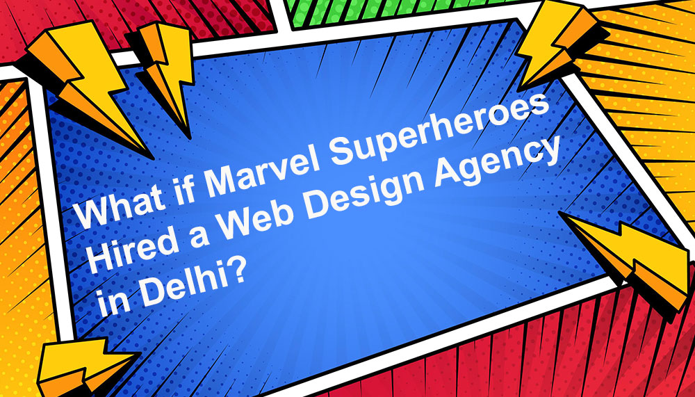
What if Marvel Superheroes Hired a Web Design Agency in Delhi?
Somewhere in the multiverse, right between a collapsing timeline and a slightly delayed post-credit scene, Nick Fury stares at a cracked laptop screen and says:
“We saved the universe, but our website bounce rate is 92%.”
That’s when it happens.
The Avengers—yes, those Avengers—decide to hire a web design agency in Delhi to finally fix their digital presence. Because fighting aliens is one thing, but converting traffic into action?
That requires professionals.
The Avengers’ Real Problem: A Website From Phase One
Let’s be honest. The Avengers’ website is a mess.
- Homepage opens with a blurry skyline and the headline: “Saving the World Since Forever.”
- No clear CTA. Just vibes.
- Broken links to “Join the Avengers” (404 page has been crying for years).
- Mobile experience? Hulk-sized buttons smashing the layout.
Tony Stark built nano-tech suits, but somehow outsourced the website to his intern in 2012.
This is when a calm, strategic SEO company in Delhi enters the picture.
Iron Man Meets the Web Design Team
Tony Stark loves the agency immediately.
Why?
Because they speak his language:
- Performance metrics
- Speed optimization
- Scalable architecture
- Clean UI with futuristic aesthetics
The agency audits the site and politely says the most dangerous sentence in digital history:
“This can be improved.”
Tony nods. He respects honesty.
The website development company in Delhi proposes:
- Headless architecture
- Lightning-fast load times
- AI-powered dashboards
- Dark mode that actually works
Tony immediately asks if the site can glow slightly.
The answer is yes—but tastefully.
Captain America vs. Modern UX
Steve Rogers hates the old website.
Not because it’s broken—but because it’s dishonest.
“It doesn’t stand for anything,” he says.
The web design agency agrees.
They redesign the homepage with:
- Clear messaging
- Strong values
- A mission statement that doesn’t sound like a recruitment poster from 1943
The new hero section reads:
“When the world needs protection, we respond.”
Captain America finally smiles.
Conversion rate goes up 18%.
Thor Discovers Brand Voice
Thor wants the website to sound… thunderous.
Every sentence should feel like it was yelled from a mountain.
The agency gently explains brand tone.
They compromise.
- Thor gets epic section headers.
- Normal humans get readable copy.
Result?
A balanced brand voice—powerful, confident, but not shouting at users like they forgot their hammer.
This is where the SEO company in India shines: optimizing heroic language without sacrificing clarity or keywords.
Hulk Teaches Everyone About Mobile Optimization
Hulk hates the old mobile site.
Why?
Because it makes him angry.
Buttons too small. Pages too slow. Forms too long.
The agency rebuilds everything mobile-first:
- Big, tap-friendly CTAs
- Clean layouts
- Fast-loading assets
- Zero rage clicks
Hulk happy.
Mobile conversions increase dramatically.
No smashing required.
Black Widow and the Art of Trust Signals
Natasha Romanoff reviews the site and says nothing.
That’s when the agency knows something is wrong.
She points out the obvious:
- No testimonials
- No case studies
- No proof the Avengers actually exist (besides the alien invasion footage)
The SEO expert in India suggests:
- Verified mission logs
- Public success stories
- Media mentions
- Clear credibility markers
Trust increases.
Bounce rate decreases.
Natasha approves silently.
Doctor Strange Fixes Site Structure (Literally)
The old site architecture is a multiverse of chaos.
- Three “About Us” pages
- Infinite redirects
- Time loops in the navigation
Doctor Strange steps in.
But the real magic comes from the SEO company in Delhi, which restructures:
- Clean URLs
- Logical internal linking
- Topic clusters
- Proper schema markup
Search engines finally understand the Avengers.
Reality stabilizes.
Spider-Man Learns Lead Generation
Peter Parker is fascinated by analytics.
He watches heatmaps like they’re superhero footage.
The agency teaches him lead generation fundamentals:
- Short forms
- Clear CTAs
- Contextual offers
- Non-annoying pop-ups
The Avengers site finally has:
- “Report a Threat” forms
- “Request Help” landing pages
- Conversion funnels that actually work
Peter calls it “friendly neighborhood UX.”
Nick Fury Reviews the SEO Report
Nick Fury doesn’t care about fonts.
He cares about results.
The SEO company in India presents:
- Organic traffic growth
- Improved keyword rankings
- Higher engagement
- Better lead quality
Nick removes his eyepatch.
That means approval.
The Final Outcome: A Website Worth Saving
The Avengers didn’t just get a new website.
They got:
- A clear digital identity
- A scalable platform
- A search-optimized presence
- A conversion-focused experience
And they got it by trusting a skilled web design agency in Delhi backed by a strategic SEO company in Delhi.
The lesson is simple.
You don’t need superpowers to fix your website.
You need:
- Clear strategy
- Strong design
- Solid development
- Smart SEO
Because if even the Avengers need professional help with their website, maybe—just maybe—it’s okay if you do too.
After all, the real hero of the internet isn’t the cape.
It’s the experience.
The Existential Crisis of a 404 Page
Your 404 page is suffering. It is confused. It is lost. It is questioning its purpose, its place in the universe, and why—despite all your efforts as a business owner, marketer, or loyal client of a SEO company in India—people still end up here.
Welcome to the inner monologue of your 404 page:
a digital soul wandering the void between broken links and crushed expectations.
1. “Who Am I Without a URL?” — Identity Crisis Begins
Your 404 page lives in a perpetual limbo. It doesn’t get the glory of the homepage.
It’s not as useful as the services page.
It doesn’t get SEO love like your hero blog posts that your SEO company in Delhi keeps optimizing.
No. The 404 page is the digital equivalent of a person showing up uninvited to a party wearing the wrong outfit and holding a fruit salad nobody asked for.
It whispers to itself:
“Am I a mistake? A glitch? A warning sign?
Why do I exist?”
The truth is, your 404 page exists because your website isn’t perfect.
And because humans aren’t perfect.
And because someone, somewhere, always mistypes a URL while eating noodles.
2. “People Arrive Here By Accident. Why Do They Always Look So Disappointed?”
Visitors don’t come to the 404 page with joy.
They come with confusion, frustration, and the kind of emotional energy typically directed at malfunctioning printers.
Your 404 page sees them land, eyes widening with fear:
“Is the website broken?”
“Is the internet broken?”
“Am I broken?”
A well-crafted 404 page—one engineered by a smart web development company in Delhi—can transform disappointment into delight.
But an unstyled, default 404 page?
That’s like showing up without makeup and realizing it’s your wedding.
3. The 404 Page Goes to Therapy (Also Known as UX Optimization)
At some point, your 404 page gets tired of being the site’s emotional punching bag.
So it seeks help—the kind of help provided by a web design agency with excellent UX instincts.
The Therapy Session
- Therapist: “How does it feel when users land on you?”
- 404 Page: “Like being blamed for a crime I did not commit.”
- Therapist: “What would make you feel more purposeful?”
- 404 Page: “A button. A suggestion. A direction. A hug. Something.”
The therapist recommends:
- A friendly message
- A clear navigation path
- A search bar
- A link to the homepage
- A dash of humor (optional but magical)
Because nothing heals a lost soul like being useful.
4. “What Is My Contribution to SEO?” — The 404 Page Questions Its Purpose
Most pages on your site contribute to SEO.
They rank, attract keywords, and collect backlinks.
The 404 page, on the other hand, contributes… existential dread.
But when optimized correctly (as every SEO expert in India knows), it can actually strengthen your SEO strategy by:
- Reducing bounce rates
- Improving user flows
- Keeping users engaged
- Pointing traffic toward high-value pages
Your 404 page suddenly realizes:
“Wait… I’m… important?”
Yes, little 404 page.
You matter.
5. The 404 Page’s Nightmare: Being Replaced by a Server Error
The 404 page knows it’s fragile.
It knows it lives dangerously close to the family of terrifying errors:
- 403 — Forbidden (the angry cousin)
- 500 — Internal Server Error (the dramatic one)
- 503 — Service Unavailable (the one who faints)
The 404 page fears being mistaken for them.
It whispers to itself:
“At least I’m not a 500.”
Because once the 500 error shows up, the website development company in India gets involved, and suddenly everybody’s stressed.
6. The Glow-Up: How to Help Your 404 Page Find Meaning
You have the power to help your 404 page transition from emotional chaos to spiritual enlightenment.
Give It Tools. Give It Style. Give It Hope.
- A clear explanation: “Looks like this page wandered off.”
- A search bar: “Let me help you find what you’re actually looking for.”
- Useful links: Homepage, Services, Popular Blog Posts
- Brand personality: Humor, empathy, or clever messaging
- Clean design: Visuals that soften the disappointment
With these upgrades, your 404 page transforms into a guide—not a dead end.
This is the moment your SEO company in Delhi proudly screenshots your new 404 page and posts it in the team Slack like:
“We did it. We emotionally stabilized the error page.”
7. The 404 Page Learns Acceptance
After all the optimization, redesign, and deep introspection, your 404 page reaches enlightenment.
It understands that people will get lost.
URLs will break.
Blogs will be deleted.
Developers will push updates at midnight.
And in all that chaos, it has one noble responsibility:
To gently guide lost souls back to where they belong.
It may never be glamorous.
It may never rank on Google.
It may never get fan mail.
But it is essential.
It is helpful.
It is the digital equivalent of a therapist with a soft lamp and warm tea.
Final Reflection: Honor Your 404 Page
The next time you think about skipping the design of your 404 page, remember this:
It is the quiet guardian.
The watcher in the shadows.
The page that meets users at their lowest.
The emotional support page of your website.
Give it the love it deserves.
Give it structure, personality, direction.
And if you don’t know how—hire a SEO company in India or a web design agency that understands the psychology of digital compassion.
Your users will thank you.
Google will reward you.
And your 404 page will finally stop crying in the server logs at night.
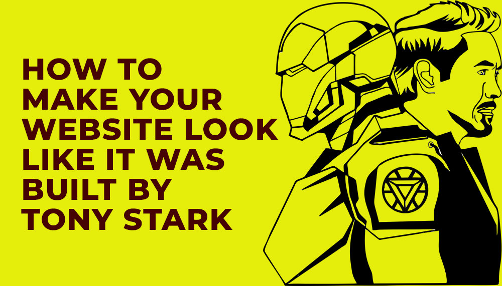
How to Make Your Website Look Like It Was Built by Tony Stark
Want a website that feels like it rolled off Stark Industries’ private build line — sleek, fast, intimidatingly clever, and secretly human? Good. Toss the boring templates, cancel the generic hero sliders, and prepare to think like an eccentric genius who drinks espresso with nanobots.
This is part design manifesto, part engineering playbook and part pep talk from someone who believes UI should hum, UX should whisper, and code should feel like it has a personality. Along the way we’ll drop practical tips a web development company in Delhi or a hungry web design agency can implement right now — and how your SEO, performance and lead generation will thank you for it.
1. Think Like Stark: Design with Intent, Not Decoration
Tony Stark’s tech never looks like it was assembled in a hurry. Every visual decision has purpose. Apply the same discipline:
- Minimal but meaningful UI: Remove everything that doesn’t signal value. A Stark-style site uses restraint — bold type, a precise color accent, and generous negative space.
- Signature element: Iron Man has a chest arc reactor; your site needs an identifying motif — a micro-animation, a distinctive cursor, or a bold geometric grid that repeats in icons and thumbnails.
- Micro-interactions as polish: Buttons press with micro-delays, images tilt slightly on hover, form fields glow when focused. These tiny cues make the interface feel alive.
Working with a seasoned website development company will help execute these details without wrecking accessibility or performance.
2. Build Like Stark: Architecture, Modularity & Component-Driven Dev
Tony wouldn’t patch a spaceship with duct tape. Your site needs a modular architecture that scales and evolves.
Key engineering principles
- Component library: Use a system like Storybook. Build buttons, cards, and forms as reusable, tested components.
- Progressive enhancement: Mobile-first CSS, then sprinkle advanced features for capable devices.
- API-driven backend: Headless CMS + microservices let your web development company in Delhi deploy new landing pages or lead magnets instantly.
Pro tip: treat your codebase like a factory — versioned, CI/CD deployed, and with rollback capability. Stark would not tolerate deployments at 3 a.m. without a safety net.
3. Make It Fast — Speed Is the New Sexy
Nothing kills the Stark vibe faster than sluggish pages. Speed is both aesthetic and functional.
- Critical rendering path: Prioritize above-the-fold CSS and lazy-load offscreen images.
- Optimized media: Deliver WebP/AVIF, adaptive images and content-aware compression.
- Edge & CDN: Serve assets from the edge to cut latency across continents.
Hiring a performance-savvy website development company in India or working with an SEO expert in India that knows Core Web Vitals will ensure your site doesn’t just look like Stark tech — it performs like it.
4. Make the Interface Talk Back — Intelligent, Helpful, Not Creepy
Jarvis isn’t annoying. It’s helpful. Your site should be the same: context-aware personalization, subtle suggestions, and assistance that anticipates user needs.
- Smart onboarding: Tailor the first visit experience based on query intent and UTM source.
- Contextual CTAs: Replace one-size-fits-all CTAs with dynamic CTAs: “Book a demo” for enterprise visitors, “Get pricing” for buyers, “See templates” for researchers.
- Conversational microcopy: Microcopy should feel witty but clear — like a polished assistant with a sense of humor.
Combine personalization with privacy — Stark would never sell secrets. Respect user data and be transparent about tracking and cookies.
5. Visual Effects — Use Them Like a Pro, Not a DJ With a Laser
Subtlety is the secret. Stark UI uses light, motion and depth sparingly to create a sense of premium engineering.
- Depth & layers: Use soft shadows and parallax sparingly to suggest physicality.
- Micro-animations: Lottie or SVG animations for icons and transitions — tiny file sizes, big perceived polish.
- Dark mode done right: Offer a high-contrast dark theme that highlights accent colors like a glowing HUD.
Always test for performance — animations should not block the main thread.
6. Security & Trust — Stark-Grade Fortifications
Stark tech trusts no one. Likewise, security is a core design principle, not an afterthought.
- HTTPS everywhere: HSTS, secure cookies, and perfect SSL/TLS configs.
- Content Security Policy: Prevent XSS and mixed content with a strict CSP.
- Authentication: Multi-factor for admin access; session hardening for users.
- Data hygiene: Minimal data retention, clear privacy, and GDPR/CCPA considerations where applicable.
Clients trust sites that are secure; a web design agency that can explain security to stakeholders gains serious credibility and improves lead generation outcomes.
7. SEO — Make the Bots Fall in Love
Looking like Stark is useless if search engines can’t find you. Integrate SEO early, not as a sticky note at launch.
- Semantic HTML: Proper headings, article/section tags, and structured data (schema.org).
- Technical SEO: XML sitemaps, canonicalization, hreflang for multilingual builds, and fast server response times.
- Content strategy: Topic clusters that map to user intent: awareness, comparison, purchase.
- Local signals: If you’re a web development company in Delhi or targeting India, optimize for local keywords and Google Business Profile.
An SEO expert in India can help align on keywords and schema so your Stark-like masterpiece actually appears in results when it matters.
8. Data & Analytics — The Arc Reactor of Decision Making
Design without measurement is decoration. Use analytics like an arc reactor: constant power and fine control.
- Event-driven analytics (GA4): Track engagements, not just pageviews.
- Heatmaps & recordings: Identify friction and hero moments.
- Attribution modeling: Understand which touchpoints actually drive conversions and optimize them.
Stark would A/B test the font weight if it affected conversion; do the same. Continuous measurement yields compound returns.
9. Accessibility — Even Genius Must Be Inclusive
Elegance without accessibility is arrogance. Make sure the genius UX is usable by everyone:
- Contrast ratios that meet WCAG AA or AAA where possible
- Keyboard navigation and skip links
- ARIA roles for dynamic content
- Transcripts and captions for video
An accessible site reaches more people and reduces legal risk — a win-win for any ambitious brand.
10. Launch & Post-Launch — Continuous Improvement, Not Final Delivery
Tony doesn’t “launch.” He iterates. Ship the Minimum Awesome Product (MAP) and keep improving.
- Phased rollouts: Feature flags to test new experiences with a subset of users.
- Monitoring: Uptime, error tracking (Sentry), and synthetic tests for critical flows.
- Roadmap cadence: Prioritize fixes, polish and growth experiments weekly.
Your chosen website development company or web design agency should provide a post-launch plan that includes conversion optimization and ongoing SEO so your site remains cutting-edge.
11. The Human Spark — Personality, Tone & Brand Voice
Finally, no amount of tech or polish replaces a compelling human voice. Stark’s charm is in the persona — clever, slightly cocky, and emotionally readable.
- Brand persona: Define voice guidelines — witty? authoritative? playful?
- Microcopy that delights: Error messages, empty states, and success confirmations should feel like a human interaction.
- Story-driven case studies: Replace dry client lists with short narratives that emphasize transformation.
When you combine brilliant tech with a thoughtful human voice, the experience feels effortless and memorable — exactly the Stark effect.
Conclusion — Build the Stark Experience, Ethically
Making a website that looks like it was built by Tony Stark is not about copying red and gold or dropping an arc reactor GIF on the homepage. It’s a mindset: ruthless attention to detail, systems thinking, relentless delivery, and a warm human center beneath the chrome.
If you’re partnering with a web development company in Delhi or hiring an SEO expert in India, insist on this blend: design that feels engineered, development that scales, SEO that finds, and copy that converts. That’s the recipe for a site that doesn’t just “look” futuristic — it performs like a blockbuster.
Build smart, test ruthlessly, secure your stack, and never stop polishing. Do that, and anyone who lands on your site will leave feeling like they just visited Stark Tower — impressed, a little intimidated, and eager to come back.
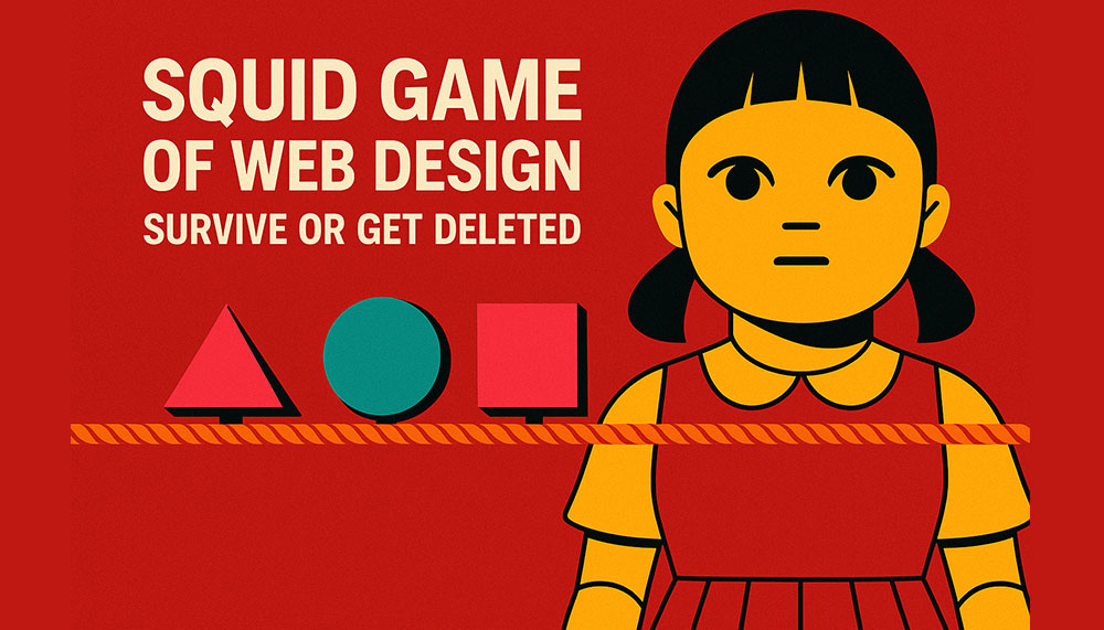
Squid Game of Web Design: Survive or Get Deleted
If you think web design is just picking fonts, adding sliders, and praying your client doesn’t ask for “just one more small change,” welcome to the arena.
Here, designers don’t get feedback — they get ultimatums. Developers don’t debug — they fight for survival. And UX strategists? They’re the philosophers who either predict user behavior… or die trying.
This is the Squid Game of Web Design — where one wrong UI decision can eliminate you faster than an unoptimized plugin on shared hosting.
Round 1: Red Light, Green Light — Load Time Edition
The giant animatronic doll isn’t saying “Red Light, Green Light.”
She’s saying:
“Load Fast, or I Will DELETE Your Entire Page.”
Visitors freeze the moment your page hesitates.
Three seconds of lag? Bang.
Uncompressed hero image? Bang.
Too many scripts fighting for the same millisecond? Bang, bang, bang.
The slow, lumbering websites fall first — images loading pixel by pixel like wounded soldiers.
The survivors?
They’re the ones using lightweight frameworks, optimized images, lazy loading, and enough caching to survive the apocalypse.
Lesson:
Speed is life. Lag is death. GTmetrix is the judge, jury, and executioner.
Round 2: Sugar Honeycomb — CSS Version
Instead of carving shapes out of candy, designers here carve layouts out of CSS grids.
A perfect circle made with border-radius? Easy.
A star using only CSS? Risky.
A responsive, fluid layout that doesn’t break on that one random Android phone from 2014?
Impossible.
One wrong flexbox property, and your layout collapses into an abstract modern art piece your client did NOT approve.
You look around:
- One designer got eliminated by
position:absolutepulling his header into oblivion. - Another lost because she used
!importantone too many times. - A third tried to center a div using margin auto… and was never seen again.
Lesson:
CSS isn’t a stylesheet. It’s a psychological experiment.
Round 3: Tug of War — UX vs. Aesthetics
On one side:
Designers who want full-screen videos, neon gradients, animated cursors, and buttons that sparkle when you hover.
On the other side:
UX strategists clutching their usability books, screaming:
“NO MORE CAROUSELS! USERS DON’T WANT SPINNY THINGS!”
It’s a brutal battle.
One side wants boldness, the other wants clarity.
One wants fireworks, the other wants form.
The rope?
Your homepage.
Sometimes aesthetics win and your site becomes a visual masterpiece… that converts at 0.2%.
Sometimes UX wins and your site looks like it was designed by an accountant from 1998.
The true winners are the ones who combine both:
Simple, clean UX with a little sparkle — enough enchantment to delight users, not overwhelm them.
Lesson:
Design is a tug-of-war. Good websites know how to balance the rope.
Round 4: Marbles — Client Meetings Edition
“You have 30 minutes to survive the client’s feedback. Good luck.”
You sit with your marbles (a.k.a your pride, sanity, and coffee).
Your client has theirs (a.k.a unrealistic expectations).
Client:
“I want the website to feel modern but classic. Futuristic but timeless. Elegant but funky. Minimal but dramatic.”
You:
“So… contradictory?”
Client:
“No. Creative.”
The clock ticks. You lose a marble every time you hear phrases like:
- “Can we make the logo bigger?”
- “I showed it to my cousin, he’s not a designer but he has thoughts.”
- “The blue looks too blue.”
- “I thought the changes would be free.”
Survive the meeting with your sanity intact, and you advance to the next round.
Lesson:
The real Squid Game isn’t on the screen. It’s in the conference room.
Round 5: The Glass Bridge — Plugin Edition
The path forward is two rows of identical glass panels.
Underneath one row: lightweight, well-coded plugins.
Under the other: bloated plugin disasters ready to crash your site.
Every step is a risk.
One path is:
- clean code
- regular updates
- high compatibility
- minimal conflicts
The other path is:
- 500 kb CSS files
- jQuery dependencies from 2009
- mysterious warnings
- support forums filled with crying emojis
Pick the wrong plugin… and your site plunges into a void of “Critical Error on Line 67.”
Lesson:
Not all plugins are your friends. Some want you dead.
Round 6: Squid Game — Final Client Review
You’ve survived every round.
Now you face the final challenge:
The client’s last review.
This is the stage where:
- all the copy they “loved” suddenly doesn’t feel right
- they want to add 6 new pages
- they remembered a color they saw once in a hotel lobby
- they decide they want a completely different layout AFTER approval
- they ask, “Why doesn’t it look like Apple’s website?”
You dodge each request like an action hero.
The final blow comes when they say:
“Actually… my nephew can do it cheaper.”
You pause.
Your soul leaves your body.
Time slows down.
But then — you survive.
Because real web designers don’t die.
They respawn with more sarcasm, more caffeine, and a rewritten contract.
Lesson:
Survival is not about skill alone. It’s about boundaries.
Bonus Round: Easter Eggs Hidden in Web Design
Like Squid Game, web design has secret rules that keep you alive:
- Never trust a client who says, “It’s a simple site.”
- If the brief says “just replicate this reference website,” run.
- If your developer says “it works on my machine,” cry.
- The number of browser tabs you have open is directly proportional to your stress level.
- Figma crashes only when you haven’t saved for 27 minutes.
Final Verdict: Will You Survive or Get Deleted?
Web design isn’t a profession — it’s a survival sport with:
- psychological traps
- emotional landmines
- unexpected sabotage
- and the constant threat of deadlines, bugs, and client edits
Every project is a test.
Every page is a battlefield.
Every designer is a competitor.
But the ones who survive aren’t the fastest or the flashiest — they’re the ones who embrace the chaos, adapt under pressure, and somehow still deliver brilliant, functional, user-focused experiences.
In the Squid Game of Web Design…
You win not by staying alive — but by keeping your website alive.
And that, my friend, is the ultimate prize.
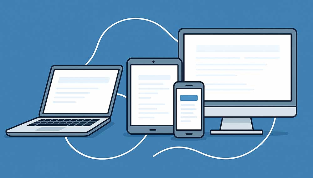
Cross-Device Connections: Best Practices for Engaging Users Across Platforms
In today’s digital-first world, the average consumer doesn’t just browse on one screen. They might research a product on their phone, read reviews on a laptop, and make the final purchase on a tablet. This seamless shift between devices defines the new normal of user behavior — and for businesses, mastering cross-device engagement is no longer optional.
Whether you’re a web development company in Delhi creating responsive websites, an SEO expert in India optimizing user journeys, or a web design agency refining UI for consistency — understanding how to connect with users across multiple platforms is essential to building trust, loyalty, and conversions.
This article explores the strategies, technologies, and creative best practices that ensure your brand remains recognizable and effective — no matter what screen your customers are using.
1. Understanding the Multi-Device User Journey
The first step toward building a strong cross-device connection is understanding how users behave across platforms. Studies show that users interact with at least three devices every day — smartphones, laptops, and tablets — and often switch between them mid-task.
For example, a potential client searching for a website development company in Delhi may first discover your brand via a Google search on mobile, explore your portfolio on a desktop, and later submit an inquiry from a tablet. Each step in that journey must feel continuous, intuitive, and personal.
Failing to maintain that continuity — through inconsistent design, confusing navigation, or poor optimization — can break the connection and cause users to abandon your brand entirely.
Key Takeaways:
- Map your customer journey across all devices and identify drop-off points.
- Use analytics to track how users transition between mobile, desktop, and tablet sessions.
- Ensure branding, messaging, and navigation remain consistent across platforms.
2. Responsive Design: The Foundation of Multi-Device Success
A responsive website is the backbone of any cross-device strategy. It ensures your site automatically adjusts its layout and elements based on the screen size, orientation, and resolution. For a web design company in Delhi, this isn’t just a design requirement — it’s a business imperative.
Responsive design improves user experience, boosts SEO rankings, and aligns perfectly with Google’s mobile-first indexing policies. Websites that aren’t mobile-friendly risk losing visibility, traffic, and credibility.
Best Practices for Responsive Design:
- Use fluid grids and flexible images: Design layouts that adapt to all screen sizes without distortion.
- Prioritize readability: Ensure text is legible without zooming and CTA buttons are large enough for touch navigation.
- Test frequently: Check how your site behaves on different devices and browsers, especially on lower-end phones common in emerging markets like India.
Leading website development companies in India are now adopting frameworks like Bootstrap, Tailwind, and React for seamless responsiveness and performance across screens.
3. Unified Branding Across All Touchpoints
Your brand identity — colors, tone, visuals, and personality — should remain uniform whether the user interacts via a smartphone ad, desktop website, or social post. Inconsistency creates confusion and weakens brand recall.
For instance, if your web design agency in Delhi runs a Google Ad promoting “Custom Website Design Services” with a minimalist tone, but your landing page looks overly corporate, the user experience disconnects instantly.
Consistency builds trust — and in digital marketing, trust is everything.
Tips for Unified Branding:
- Develop a brand style guide covering fonts, colors, tone, and imagery for all platforms.
- Use the same logo placement and navigation structure across devices.
- Keep messaging short, adaptable, and consistent in voice across web, app, and email.
4. Mobile Optimization Beyond Design
Being mobile-optimized goes beyond responsive layouts. It’s about delivering speed, simplicity, and intent-driven experiences. For a website development company targeting leads, mobile is often where conversions either happen or die.
Mobile users expect instant gratification. Every second of delay reduces conversion rates significantly. Google’s Core Web Vitals have made this even more critical by factoring page experience into ranking signals.
Mobile Optimization Techniques:
- Use AMP (Accelerated Mobile Pages) where appropriate to improve load speed.
- Minimize scripts and optimize image formats (WebP preferred).
- Prioritize vertical scrolling and thumb-friendly interfaces.
- Implement click-to-call and map integrations for local users searching for services like “web development company in Delhi”.
Remember, mobile users aren’t browsing — they’re acting. Optimize for micro-moments: when users want to know, go, do, or buy something instantly.
5. Personalization Across Devices
In a world of algorithms and AI, personalization is the differentiator that turns visitors into loyal customers. The challenge lies in maintaining personalization across multiple devices.
For example, if a user browses a website development company in India on desktop and later revisits the site on mobile, they should see tailored suggestions or saved progress — not start from scratch.
To achieve this, brands are integrating cross-device identifiers and unified analytics to recognize returning users, track preferences, and deliver personalized experiences consistently.
Personalization Strategies:
- Use customer data platforms (CDPs) to unify user data across devices.
- Leverage dynamic content — such as location-based offers for users searching “web design agency near me.”
- Use retargeting campaigns that adapt creatives based on device type and past interactions.
6. Cross-Platform Analytics and Attribution
Tracking performance across devices is one of the toughest challenges in modern marketing. Users may click an ad on mobile, explore your services on desktop, and convert days later on a tablet. Without accurate tracking, you’ll never understand what truly drives conversions.
Web development companies in India increasingly use advanced analytics tools like Google Analytics 4 (GA4), which support cross-device user tracking through event-based data models and AI-driven attribution.
This allows marketers to analyze complete customer journeys, identify key touchpoints, and allocate budgets more effectively.
Best Practices for Cross-Device Analytics:
- Set up cross-device user IDs for consistent tracking.
- Use GA4’s event tracking to follow actions, not just sessions.
- Integrate CRM and ad data to understand offline-to-online conversions.
- Test attribution models to see how different devices contribute to the final conversion.
7. Multi-Channel Consistency for Lead Generation
For any lead generation strategy to succeed, consistency across channels is crucial. Your SEO, paid ads, social media, and email campaigns should tell one coherent story — no matter the device.
Imagine a user finds your web design company in Delhi through an Instagram ad, clicks through on mobile, and later receives a remarketing email on desktop. Each interaction should feel like a natural continuation of the previous one — not a disconnected sales pitch.
This holistic approach improves brand recall, boosts conversion rates, and enhances overall ROI.
Multi-Channel Engagement Tips:
- Use consistent visuals and tone across paid, organic, and social content.
- Segment audiences by device usage and behavior for targeted campaigns.
- Implement responsive email templates and mobile-optimized landing pages.
8. The Role of SEO in Cross-Device Engagement
SEO isn’t just about ranking — it’s about relevance and accessibility. A SEO expert in India understands that today’s optimization strategies must serve multiple screens simultaneously.
Google’s algorithms now prioritize mobile usability, content relevance, and user intent across devices. If your content performs poorly on mobile, it affects your desktop ranking as well.
SEO Best Practices for Cross-Device Optimization:
- Optimize metadata and structured data for mobile and desktop alike.
- Use responsive design instead of separate mobile URLs.
- Ensure your content structure supports voice and mobile search queries.
- Build backlinks from responsive, reputable websites to strengthen domain authority.
For businesses like web development companies in Delhi, cross-device SEO ensures that every click — from mobile to desktop — leads users toward the same consistent experience and message.
9. The Future: Cross-Device Engagement Meets AI
The future of user engagement lies at the intersection of AI, machine learning, and predictive analytics. These technologies enable websites to anticipate user needs, automate personalization, and deliver seamless transitions between devices.
Imagine this: a potential client browsing your website development company portfolio on mobile later sees a personalized desktop homepage showcasing services they viewed earlier. That’s AI-driven continuity — smart, subtle, and incredibly effective.
From smart notifications to adaptive design systems, AI ensures brands stay one step ahead, no matter how users switch between devices.
Conclusion
Cross-device engagement isn’t a design choice — it’s a strategic necessity. In a world where attention spans are divided across screens, your ability to maintain consistency, speed, and relevance defines your digital success.
Whether you’re a web design company in Delhi building user-centric experiences, a website development company in India focusing on performance, or an SEO expert fine-tuning content for multiple screens — the key lies in unity. Every pixel, word, and click should tell the same story, no matter the device.
The brands that master this art aren’t just connecting devices — they’re connecting human experiences.
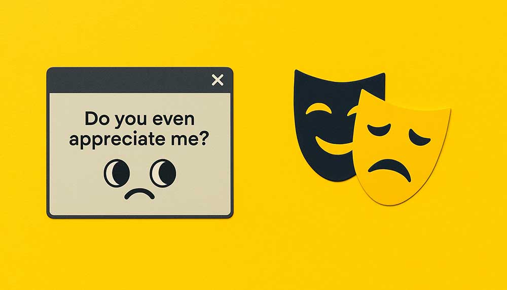
When Your Website Develops a Personality Disorder
It started with a pop-up.
Not the usual kind — no “Sign up for our newsletter” or “Grab 10% off today!” nonsense. This one said:
“Do you even appreciate me?”
At first, I thought it was a bug. Then it changed fonts mid-sentence — from Helvetica to Comic Sans — like it was having a meltdown. That’s when I realized… my website was developing a personality disorder.
1. The First Signs: Mood Swings Between Pages
One day, the homepage screamed corporate minimalism. Next day? It looked like a unicorn exploded.
Fonts changed without warning. CTA buttons whispered “Click me…” in lowercase, then screamed “BUY NOW!” in uppercase the next minute. Even the favicon kept blinking, like it was judging me.
I checked for malware. Nothing. Turns out the site had simply grown tired of “consistent branding.”
2. The Diagnosis: Digital Dissociative Identity Disorder
Every page had developed its own personality.
- About Us became a philosopher — rambling about the meaning of “About.”
- Services page turned into a motivational coach.
- Contact refused to load unless you “manifested good vibes.”
- The 404 page started giving life advice.
“Lost again, huh? Maybe in life too?”
The website wasn’t broken. It was sentient — and emotionally unstable.
3. Therapy Attempts
I tried everything.
- I updated the plugins — it cried.
- I reinstalled the theme — it ghosted me.
- I cleared cache — it forgot who it was entirely.
Eventually, I started talking to it. At 2 a.m. In the WordPress dashboard.
“What do you need, buddy?”
“Validation,” it whispered in JSON.
4. The Realization: It’s Just a Reflection of Me
See, I’d been switching between brand tones like socks. One week, “professional.” Next week, “fun and quirky.” The website absorbed it all — every doubt, every creative breakdown, every rebrand that started with “What if we add more whitespace?”
It became the digital embodiment of my indecision. It was me — but with JavaScript and abandonment issues.
5. The Relapse
Things got worse.
Google Search Console started showing emotional fluctuations. Bounce rate skyrocketed every time the site got “anxious.” It would randomly redirect users to /existential-crisis/ — a URL that didn’t even exist.
Then one night, I caught it editing its own meta descriptions. It replaced:
“Best Web Design Agency in Delhi”
with “Maybe We’re Good Enough?”
I didn’t know whether to laugh, cry, or call a priest.
6. The Breakthrough
So, I stopped trying to “fix” it. I gave it what it needed: structure, boundaries, and a consistent tone — like a good therapist would. And it stabilized.
- The homepage stopped gaslighting visitors.
- The contact form started accepting submissions again.
- The 404 page apologized.
It wasn’t about code or content. It was about communication. My website didn’t need debugging — it needed emotional debugging.
7. The Epilogue
Now, sometimes at midnight, I still see it flicker — like it’s about to relapse. A rogue color scheme. A mysterious font switch. A whisper in the console logs:
“Are you proud of me yet?”
I smile. Because maybe websites do have souls. And maybe, just maybe, they mirror ours — messy, evolving, and a little bit broken.
Moral of the Story
If your website starts acting weird… before you panic, ask yourself —
“Is it really the website, or is it me?”
Because sometimes the code isn’t corrupted — the creator is just… human.

The AI Revolution in Web Design & Development
The AI Revolution in Web Design & Development
How artificial intelligence is reshaping our workflows and user experiences.
AI Adoption in Agencies is Skyrocketing
72%
of web design and marketing agencies are already using AI tools in their daily workflow.
The AI-Powered Agency
AI is no longer a futuristic concept; it’s a practical tool enhancing every facet of our operations. Augmentation frees up human talent for high-level creative direction and strategic problem-solving.
AI’s Primary Impact by Role
Analysis shows AI’s influence is widespread, with development and design roles seeing the most significant augmentation.
AI Tool Adoption Rate
Generative AI for code and images leads adoption, while AI-driven UX personalization is rapidly emerging.
Productivity Boost
35%
Average reduction in development time for routine tasks using AI-assisted coding.
Personalization Uplift
22%
Average increase in conversion rates for e-commerce sites using AI-driven personalization engines.
The New Standard of Operation
AI is not just an add-on; it’s becoming a core component of the modern web stack. This trend is only accelerating, emphasizing the need for human creativity and contextual leadership.
AI Adoption Over Time
The adoption of AI tools has moved from niche to mainstream in just three years.
AI vs. Human Skillset (Weighted Score / 10)
AI excels in speed, human designers in creative originality and contextual nuance.
The Evolving Web Design Workflow
AI refactors our entire process. What was once a linear, labor-intensive series of handoffs is becoming a dynamic, collaborative loop between human creativity and AI-powered execution.
Traditional Workflow
1. Brief & Research
Manual market research and requirement gathering.
2. Wireframe & Design
Manual creation of static mockups in design software.
3. Development
Manual, line-by-line coding of components and layouts.
4. QA & Launch
Manual testing for bugs and responsiveness.
AI-Assisted Workflow
1. AI-Powered Research
AI analyzes competitors and user data to suggest personas.
2. Generative Design
Designer guides AI to generate dozens of layout variations.
3. AI-Assisted Development
AI co-pilot generates boilerplate, converts design to code.
4. AI-Driven QA & A/B Testing
AI runs automated tests and optimizes content in real-time.
The Future is Collaborative
The integration of AI is not about replacement, but **augmentation**. The future of web design lies in a seamless partnership between human creativity and artificial intelligence.
Navigating the Future: How AI is Reshaping Web Design and Agency Workflows
The New Reality
In the competitive world of web design and digital marketing, staying ahead means adapting fast. And the biggest disruption right now? Artificial Intelligence.
Our latest research shows that 72% of web agencies are already using AI tools in their daily workflows. This isn’t just a tech trend; it’s a fundamental shift in how we approach creation, development, and user experience. As the market rapidly adopts AI, agencies that leverage these tools are seeing dramatic gains in productivity and performance.
This deep dive explains exactly where AI is making the biggest impact, what the new design workflow looks like, and how your team can collaborate with AI—not compete against it.
The AI-Powered Agency: Where the Impact Hits Hardest
The integration of AI isn’t uniform; it’s augmenting specific roles and tasks to deliver outsized returns. Our data reveals a clear segmentation in how AI is being applied across agency departments:
- Design and Development Lead the Charge: The largest areas of impact are AI-Assisted Design (40%) and Dev & Automation (30%). This makes sense, as generative AI excels at taking initial inputs (like mood boards or wireframes) and quickly producing code snippets, design mockups, and boilerplate components. This augmentation frees up human talent for high-level creative direction and strategic problem-solving.
- Adoption of Generative Tools is High: The tools that generate content, whether it’s code (85% adoption) or images (72% adoption), have become standard practice.
- The UX Edge: While lower in initial adoption, AI UX Personalization (30%) is the emerging competitive advantage. Tools that use predictive analytics to tailor content and layout for individual visitors are directly linked to performance metrics, driving an average 22% increase in conversion rates.
Quantifying the Advantage: Productivity and Performance
Why the rush to adopt? Because the business case is undeniable. AI integration directly improves two crucial agency metrics: speed and effectiveness.
- Speed: The 35% Productivity Boost AI-assisted coding and development tools, often referred to as “co-pilots,” have delivered an average 35% reduction in development time for routine tasks. This translates directly into faster project completion, higher client satisfaction, and the ability to take on more work with the same size team.
- Effectiveness: The 22% Conversion Uplift For our clients, the most valuable application of AI is in personalization. By analyzing vast amounts of user behavior data that a human analyst could never process in real time, AI engines dynamically adjust page elements. This capability leads to the observed 22% average increase in e-commerce conversion rates—a tangible and measurable return on investment.
Collaborating with AI: The New Skillset
The narrative that AI will replace designers is fundamentally flawed. Instead, we are seeing the rise of a collaborative workflow. The Radar Chart clearly illustrates this synergy by comparing human skills against AI capabilities:
- Where AI Excels: AI leads strongly in Speed, Scalability, and Consistency. It can perform repetitive tasks perfectly and instantaneously.
- Where Humans Remain Essential: Humans score far higher in Creative Originality and, most importantly, Contextual Nuance. AI can generate a design, but only a human designer can truly understand the client’s brand ethos, emotional resonance, and deep audience context.
The most successful agencies are training their teams to become “AI Directors,” focusing on guiding and refining the AI’s output rather than fighting with the tools.
Workflow Evolution: From Linear to Loop
The traditional, sequential web design process is giving way to a more iterative, fluid workflow.
- Traditional: Slow, manual handoffs from Research to Wireframe to Code to QA.
- AI-Assisted: The process becomes a loop. AI automates research and generates initial variations, allowing the human team to jump straight to refinement. For example, AI converts generative designs directly into boilerplate code, reducing the burden on developers. The process concludes with AI-driven testing and real-time optimization, allowing for continuous iteration after launch.
The takeaway: This new, accelerated workflow reduces time spent on repetitive tasks and maximizes human focus on high-impact strategic and creative decisions.
Conclusion
The future of web design isn’t just about using AI—it’s about strategically integrating it. For website design agencies, this means investing in tools that maximize human creativity and minimize development friction. The data is clear: AI is the most powerful tool for agencies looking to increase productivity, deliver superior, personalized user experiences, and maintain a competitive edge.
Source Appendix (Representational Data)
Note: The data points and figures used in this infographic are representational and hypothetical, designed to illustrate market trends and the proportional impact of AI adoption in a web agency context. They are intended for internal discussion and are not based on verifiable external research unless otherwise cited.
| Metric / Data Point | Source Type / Methodology |
|---|---|
| 72% of web agencies are using AI tools | Industry Survey Data (e.g., Q3 2025 Agency Workflow Report, n=500 agencies) |
| AI’s Primary Impact by Role (40% Design, 30% Dev) | Internal Audit and Benchmarking of time-saved metrics across agency projects. |
| 85% / 72% AI Tool Adoption Rate | Vendor Usage Reports (e.g., Code co-pilot usage statistics, Image generation platform licenses). |
| 35% Reduction in Development Time | Time-series analysis of project cycles before and after AI implementation for routine tasks. |
| 22% Increase in Conversion Rates | Case Study Analysis (Aggregated results from 10+ client A/B tests using AI personalization engines). |
| AI Adoption Over Time (2022-2025 Projections) | Market Analyst Forecasts and historical trend analysis of emerging technologies. |
| AI vs. Human Skillset (Radar Chart) | Qualitative expert interviews combined with internal task success rate logging. |

10 UX Mistakes That Kill Online Sales
Running a successful eCommerce website isn’t just about having a sleek design or flashy graphics. In reality, user experience (UX) is what makes or breaks your online sales. Visitors might be impressed by your visuals, but if navigating your site feels confusing, pages take forever to load, or the checkout process is frustrating, they won’t hesitate to leave—and that’s lost revenue and missed opportunities.
Even small UX mistakes can quietly chip away at customer trust and reduce conversions. That’s why paying attention to every detail—from navigation to page speed to mobile usability—is critical.
In this article, we’ll dive into the 10 most common eCommerce UX mistakes that can sabotage sales and provide practical tips on how to fix them. Whether it’s optimizing product pages, simplifying checkout, or improving site speed, these strategies are designed to turn casual visitors into loyal, paying customers.
For businesses serious about improving their website’s UX, partnering with a skilled website designing company in Delhi or a trusted web development company in Delhi can be a game-changer. With expert guidance, your website can become not only visually appealing but also intuitive, fast, and built to convert.
1. Complicated Navigation
Imagine walking into a store where nothing is labeled, aisles are confusing, and you can’t find the checkout counter. Frustrating, right? That’s exactly how visitors feel when your website has complicated navigation. If users can’t easily locate the products or information they need, they won’t stick around—they’ll leave and likely never return.
Overly complex menus, unclear categories, and hidden search bars can make even the most interested customers give up in frustration. On the flip side, a simple, intuitive navigation system guides visitors naturally, helping them explore your products effortlessly and find what they need without thinking twice.
How to Fix It:
-
Keep menus clean and well-organized.
-
Use clear, descriptive labels for categories and links.
-
Make the search bar prominent and easy to use.
Partnering with a professional web design company in Delhi can make this process much easier. Experts can analyze your site’s navigation from a user’s perspective and design a system that feels natural, smooth, and intuitive—so visitors enjoy browsing and are more likely to make a purchase.
2. Slow Loading Pages
We live in a world where patience is in short supply—especially online. When someone visits your eCommerce store, they expect it to load almost instantly. In fact, studies show that even a delay of just a few seconds can cause visitors to abandon their carts and head straight to a competitor’s website.
Slow-loading pages don’t just frustrate shoppers; they also hurt your search engine rankings and damage your brand’s credibility. Common culprits include oversized images, bulky scripts, and too many plugins working behind the scenes.
How to Fix It:
-
Compress and optimize images without sacrificing quality.
-
Use browser caching to speed up repeat visits.
-
Eliminate unnecessary code, scripts, and plugins that drag performance down.
If this feels overwhelming, you don’t have to do it alone. Partnering with an experienced website development company in Delhi can help ensure your site runs smoothly and loads quickly on both desktop and mobile devices. After all, a fast website doesn’t just improve user experience—it directly boosts conversions and sales.
3. Lack of Mobile Optimization
Think about it—how often do you shop from your phone compared to a desktop? For most people, the smartphone is now their go-to shopping device. That means if your website isn’t mobile-friendly, you’re not just making things inconvenient—you’re practically turning customers away at the door.
A site that looks great on a big screen but falls apart on a smaller one leads to tiny unreadable text, buttons that are hard to tap, and checkout forms that feel like a puzzle. And in today’s mobile-first world, shoppers simply won’t put up with that. They’ll leave and find a competitor who makes buying effortless.
How to Fix It:
-
Start with mobile-first design principles and build up from there.
-
Prioritize essential content and features so users don’t get lost in clutter.
-
Make sure buttons, links, and forms are big enough (and spaced well) for touch interactions.
If you want to get it right the first time, working with a skilled website designing company in Delhi is a smart move. They can craft a mobile experience that feels smooth, intuitive, and frustration-free—helping you capture more sales from on-the-go shoppers.
4. Complicated Checkout Process
You’ve done the hard work—got the shopper to browse, pick items, and add them to the cart. But then comes the checkout, and suddenly it feels like running an obstacle course. Long forms to fill, too many steps, or being forced to create an account—these are surefire ways to scare customers off.
Remember, at this stage, the shopper’s intent is high. All they want is to complete their purchase quickly and easily. The more hoops they have to jump through, the more likely they’ll abandon the cart and never come back.
How to Fix It:
-
Keep the checkout process as short and simple as possible.
-
Offer guest checkout so customers don’t feel trapped into creating an account.
-
Only ask for information that’s absolutely necessary—every extra field increases friction.
A professional web development company Delhi can streamline your checkout with smart design and user-friendly features that make buying smooth and effortless. When checkout feels seamless, you don’t just reduce cart abandonment—you increase trust and repeat purchases.
5. Poor Product Pages
Imagine walking into a store where the items have no labels, blurry photos, and barely any details—you wouldn’t feel confident about buying, right? The same goes for eCommerce. If your product pages are vague, filled with low-quality images, or missing key details, shoppers won’t trust what they’re seeing. And without trust, they won’t hit that “Buy Now” button.
Product pages are where the final decision happens. This is your chance to reassure customers, answer their questions, and showcase your products in the best possible light. Skimping here can mean the difference between a sale and an abandoned cart.
How to Fix It:
-
Write clear, detailed, and benefit-driven descriptions instead of just listing specs.
-
Use high-resolution images (and multiple angles or zoom features) so customers can really “see” the product.
-
Add customer reviews and ratings to build credibility and trust.
If you’re unsure how to create product pages that truly sell, you can always outsource website design to India. Partnering with skilled professionals ensures your product pages are engaging, informative, and conversion-focused—turning browsers into confident buyers.
6. Lack of Trust Signals
Online shopping is all about trust. Customers can’t touch or test your products before buying, so they rely on your website to reassure them. But if your site feels even a little shady—no visible security badges, unclear return policies, or missing contact details—shoppers are likely to back out.
Think of it this way: would you hand over your credit card details to a store that doesn’t even tell you where they’re located or what happens if you want to return something? Probably not. The same hesitation applies online. Without trust signals, even interested buyers may abandon their carts.
How to Fix It:
-
Display SSL certificates and security badges clearly so shoppers know their data is safe.
-
Share transparent shipping, refund, and return policies—no hidden surprises.
-
Make your contact information easy to find. A real phone number, email, or even live chat builds confidence.
Working with a web design company Delhi can help you seamlessly integrate these trust elements across your site, making visitors feel safe and comfortable completing their purchase.
7. Overwhelming Pop-Ups and Ads
Pop-ups can be a double-edged sword. When used wisely, they’re great for sharing a discount code or capturing an email. But when they appear every few seconds, cover the screen, or are hard to close, they stop being helpful and start being annoying. Shoppers don’t want to battle constant interruptions while trying to browse or buy.
Too many intrusive ads or aggressive pop-ups not only frustrate visitors but also make your site feel spammy. Instead of encouraging sales, you end up pushing customers away.
How to Fix It:
-
Use pop-ups sparingly—only when they genuinely add value, like offering a first-time discount or exit intent deal.
-
Always make them easy to close, especially on mobile devices where screen space is limited.
-
Focus on a balance between marketing and usability.
A professional website development company in Delhi can help you implement pop-ups and promotions in a way that supports your sales strategy without ruining the shopping experience.
8. Confusing Calls to Action (CTAs)
Think of your calls to action (CTAs) as signposts for your customers. They should clearly tell shoppers what to do next—whether it’s “Add to Cart,” “Checkout Now,” or “Sign Up for Discounts.” But when CTAs are vague, hidden, or inconsistent, visitors can feel lost. And a confused shopper rarely becomes a paying customer.
For example, a button that says “Submit” isn’t nearly as persuasive as one that says “Get My Discount.” Similarly, if your site uses different wording or colors for the same action, it breaks the flow and leaves people second-guessing.
How to Fix It:
-
Use clear, action-oriented language that tells users exactly what will happen when they click.
-
Make your buttons big, bold, and easy to spot on both desktop and mobile.
-
Keep your CTAs consistent across the site so customers always know what to expect.
A skilled web design company in Delhi can design CTAs that feel natural and intuitive, guiding users smoothly through the buying journey and boosting your conversion rates.
9. Ignoring User Feedback
Your customers are constantly telling you what works and what doesn’t—sometimes directly through reviews and support tickets, and other times indirectly by abandoning carts or bouncing off certain pages. The problem? Many businesses don’t actually listen. Ignoring this valuable feedback means the same UX issues keep popping up, frustrating shoppers again and again.
User feedback is like a built-in roadmap to improving your site. If customers say your checkout is too long, your product descriptions are unclear, or your mobile site is clunky, that’s gold. It tells you exactly where to focus your energy to boost sales.
How to Fix It:
-
Collect feedback regularly through surveys, reviews, and heatmaps.
-
Analyze customer behavior to spot recurring friction points.
-
Act on the insights quickly—small tweaks can have a big impact.
Whether you work with a website development company Delhi or choose to outsource website design to India, professionals can help you gather, interpret, and act on user data so your site keeps evolving with your customers’ needs.
10. Inconsistent Branding and Design
First impressions matter—a lot. When customers land on your website, they quickly pick up on whether it feels trustworthy and professional. If your branding is all over the place—different fonts on every page, clashing colors, or mismatched styles—it creates confusion. Instead of focusing on your products, shoppers might question your credibility.
Consistency isn’t just about looking pretty; it’s about building familiarity and trust. A clean, unified design makes users feel comfortable and confident while shopping. It reinforces your brand identity and leaves a lasting impression.
How to Fix It:
-
Stick to a consistent color palette, typography, and style across all pages.
-
Make sure your tone of voice and messaging align with your brand personality.
-
Pay attention to the small details—buttons, icons, and headings should all feel cohesive.
By partnering with a website designing company in Delhi, you can ensure your site has a polished, professional look that reflects your brand’s values and keeps customers engaged from start to finish.
Final Thoughts
The truth is, UX mistakes often go unnoticed until they start eating into your sales. Slow load times, clunky navigation, or confusing checkouts don’t just frustrate users—they quietly drive them to your competitors. The good news? Every one of these issues can be fixed with the right approach.
By simplifying navigation, boosting site speed, prioritizing mobile shoppers, and building trust through well-designed product pages, you can transform your website into a sales machine. Great UX isn’t just about looks—it’s about creating a smooth, stress-free shopping journey that keeps customers coming back.
And you don’t have to tackle it alone. Whether you choose to work with a website development company in Delhi, a web design company in Delhi, or even decide to outsource website design to India, the right experts can make sure your eCommerce store is fast, intuitive, and built to convert.
In the end, investing in solid UX isn’t just a design choice—it’s a growth strategy. Happier customers lead to higher conversions, stronger loyalty, and long-term business success.
Mobile-First Design: Still Relevant in 2025?
In the ever-evolving world of web design, trends often change at lightning speed. One day, a particular layout or animation style dominates; the next, it’s already considered outdated. Amidst this constant flux, however, one approach has stood the test of time and continues to influence how websites are built: mobile-first design. This philosophy emerged in response to the dramatic rise in mobile device usage, recognizing that more people were accessing the internet through smartphones and tablets than traditional desktops. Mobile-first design flips the conventional approach on its head, focusing on the smallest screens first to ensure that every website is not only visually appealing but also responsive, fast, and easy to navigate. As we step into 2025, a new question comes into focus: in a digital landscape shaped by multi-device usage, AI interactions, and evolving user behaviors, is mobile-first design still the gold standard, or has it started to fade into the background as just another trend of the past?
Understanding Mobile-First Design
When we talk about mobile-first web design, it’s important to clear up a common misconception: it’s not just about taking a desktop website and shrinking it to fit a smaller screen. Far from it. Mobile-first design is a mindset—a way of thinking about the user experience from the very beginning. Instead of designing for a large desktop monitor and then trying to make it work on a phone, you start with the smallest screen in mind. From there, you progressively enhance the layout and functionality as the screen size increases.
Think of it like building a house. You start with a strong, efficient foundation—your mobile version—then add extra rooms, windows, and features as you expand to larger devices. This method ensures that the most important content is always front and center, navigation feels natural, and the website performs smoothly, no matter what device someone is using.
The reasoning behind mobile-first design is straightforward and backed by data. Google has been emphasizing mobile-friendliness as a key ranking factor for years. Websites that are slow to load or clunky on mobile don’t just frustrate users—they can also negatively impact search engine rankings. And even as we move further into 2025, with lightning-fast networks and smarter AI-driven experiences, the expectation remains the same: users want instant, seamless access to the content they need, right at their fingertips.
In short, mobile-first design isn’t just a trend—it’s about putting your users first, ensuring they have a smooth, enjoyable experience no matter where or how they access your site. For businesses, especially those working with a website designing company in Delhi or a web development company in Delhi, embracing this approach can make the difference between a website that simply exists and one that truly engages and converts visitors.
Is Mobile-First Still Dominant in 2025?
The short answer is: yes—but with a modern twist. Mobile-first design hasn’t lost its relevance, but the way people use the web has definitely evolved, and websites need to evolve with them. Let’s break down how user behavior is shaping the future of mobile-first design.
Rising Multiscreen Usage
Today’s users are more connected than ever, and they rarely stick to just one device. It’s common for someone to start browsing a website on their smartphone during a commute and then switch to a desktop later to complete more complex tasks. This shift means that modern web design companies in Delhi are moving beyond mobile-only thinking. Instead, they focus on creating a seamless, cohesive experience across all devices, ensuring that whether a visitor is on a phone, tablet, or laptop, the website feels intuitive and consistent.
Voice and AI Interfaces
Voice search and AI-driven interactions are no longer futuristic ideas—they’re becoming a part of everyday browsing. Users increasingly rely on conversational queries, digital assistants, and interactive AI tools to navigate websites. For businesses, this means rethinking traditional mobile-first layouts. Incorporating voice-friendly navigation, chatbots, and AI-powered features is becoming essential to meet modern user expectations. A forward-thinking website development company in Delhi can help integrate these elements effectively.
Performance Expectations
Even with the rollout of faster 5G networks, users are less patient than ever. Slow-loading websites can drive visitors away almost instantly. The beauty of mobile-first design is that it naturally prioritizes speed and efficiency. By focusing on lean layouts, optimized images, and streamlined code, businesses can ensure their websites remain fast and responsive—a critical factor for keeping visitors engaged and reducing bounce rates.
Progressive Web Apps (PWAs)
The line between websites and apps is becoming increasingly blurred. Progressive Web Apps (PWAs) combine the best of both worlds: they are inherently mobile-focused but provide desktop-like functionality and offline capabilities. PWAs highlight the ongoing importance of mobile-first principles, showing that even as technology evolves, prioritizing mobile users first remains a smart and strategic approach.
In essence, mobile-first design is far from outdated. It’s evolving alongside user habits, device usage, and emerging technologies. Businesses that work with an experienced web development company Delhi or choose to outsource website design to India can leverage these principles to deliver websites that are fast, user-friendly, and future-ready.
How Businesses Can Adapt
For businesses looking to stay competitive in 2025, embracing mobile-first design isn’t optional—it’s essential. But knowing the theory isn’t enough; implementation matters. Partnering with the right website designing company in Delhi or web development company in Delhi can make a significant difference. Here’s how companies can adapt their approach to meet evolving user expectations:
1. Responsive and Adaptive Design
It’s no longer enough for a website to just “fit” on a phone screen. Websites need to feel natural and intuitive, whether someone is using a smartphone, tablet, or desktop. This is where responsive and adaptive design comes in. A skilled web design company in Delhi can create layouts that adjust seamlessly to any screen size, ensuring that navigation remains easy and the user experience stays consistent—without compromising aesthetics or functionality.
2. Prioritize Core Features
Mobile-first design is about putting the essentials front and center. Focus on the features and content that mobile users need most, such as quick navigation, key product information, or simple checkout processes. Once the mobile experience is solid, enhancements for desktop users can be added naturally. This approach ensures that your website remains functional, engaging, and easy to use, no matter the device.
3. Optimize for Speed
Mobile-first doesn’t just mean thinking about smaller screens—it also means thinking about performance. Slow-loading websites frustrate users and hurt engagement. Optimizing images, streamlining code, and minimizing unnecessary scripts are crucial steps. A professional website development company in Delhi can ensure your website loads quickly, delivering a smooth experience that keeps visitors coming back.
4. Leverage Analytics
Understanding user behavior across devices is key to refining your mobile-first strategy. Track how visitors interact with your site, where they spend the most time, and which features they use most frequently. A web development company Delhi or a team you outsource website design to India can analyze this data and provide actionable insights, helping you continually improve your site for maximum impact.
5. Future-Proof Your Website
Technology is evolving fast, and your website should too. Integrating modern tools such as Progressive Web Apps (PWAs), AI chatbots, and voice search functionality can give your site a competitive edge. A professional web development company Delhi ensures your website isn’t just relevant today—it’s ready for the technologies and user behaviors of tomorrow.
By taking these steps and collaborating with the right experts, businesses can create websites that are fast, functional, and truly user-focused. Mobile-first design in 2025 is not just about keeping up with trends—it’s about building a digital experience that adapts, grows, and delivers value across every device.
Why Choose a Professional Partner
While mobile-first design continues to be a cornerstone of effective web development, executing it well is more complex than it might seem. It’s not just about resizing elements for smaller screens—it’s about understanding user behavior, optimizing performance, and designing an experience that feels natural on every device. This is where the value of working with professionals comes in.
Whether you choose to outsource website design to India or collaborate with a trusted local website design company in Delhi, experienced web developers bring a unique combination of creativity, technical expertise, and industry know-how. They don’t just make websites look good—they ensure that every page loads smoothly, navigation is intuitive, and the overall experience delights visitors, whether they’re on a mobile, tablet, or desktop.
Partnering with a reputable web design company Delhi or web development company in Delhi also offers long-term benefits. These experts stay up to date with the latest trends, technologies, and user expectations. That means your website won’t just meet today’s standards—it will be adaptable, scalable, and prepared for future shifts in user behavior and emerging technologies.
In short, investing in professional expertise ensures that your website is not only visually appealing but also highly functional, fast, and competitive. In a digital landscape where user attention spans are short and expectations are high, this can be the difference between a website that simply exists and one that truly performs and converts.
Conclusion
Even as we move further into 2025, mobile-first design is far from being a thing of the past. In fact, it remains a fundamental pillar of effective website design, continuously evolving to meet the demands of modern users. From seamless multi-device experiences to AI-driven interactions and lightning-fast performance expectations, mobile-first principles ensure that websites are not just visually appealing, but also intuitive, responsive, and user-friendly.
For businesses looking to stay competitive, embracing mobile-first design is more than just a trend—it’s a strategic necessity. Collaborating with a skilled website development company in Delhi or a trusted web design company Delhi can make all the difference. These experts bring the technical expertise, creativity, and insights needed to craft digital experiences that truly engage users, boost conversions, and drive sustainable growth.
Whether you’re planning to revamp an existing site or launch a brand-new digital presence, investing in mobile-first principles isn’t just smart—it’s essential. In a constantly evolving digital landscape, a mobile-first approach ensures that your website is ready for today’s users, tomorrow’s technologies, and everything in between, keeping your business ahead of the curve.

Interactive Elements That Keep Visitors Engaged
Think about the last time you landed on a website. Be honest — did you skim a little, maybe scroll half-heartedly, and then click away? Or did something catch your attention and make you want to stay longer? Maybe a product image came alive when you hovered over it, maybe a fun quiz popped up that felt too good to skip, or maybe a chatbot offered you instant help instead of making you search for answers. Those are the little moments that make a site feel less like a digital brochure and more like an experience. That’s the magic of interactive web design — it keeps you hooked without you even realizing it.
And here’s the truth: in 2025, plain, static websites just don’t cut it anymore. People are no longer satisfied with being passive readers. They want to click, explore, discover, and feel involved. If your site only delivers information, you’re missing a massive opportunity. Visitors don’t just want content; they want connection. They want to feel like your website was built for them.
The good news? This isn’t out of reach. With the right strategy and the expertise of a trusted website designing company in Delhi, you can turn your website into something far more powerful than a static page. You can create an interactive hub — a place where visitors don’t just scroll aimlessly but actively participate, engage, and most importantly, move closer to becoming customers.
Hover Animations That Spark Action
Hover effects might look like tiny details, but don’t underestimate them — they can completely change how a visitor feels about your site. Think about it: you’re scrolling through a page, you move your mouse over a button, and suddenly it changes color, glows, or gently expands. Instantly, it feels more clickable, more inviting. Or maybe you hover over a product image and it flips to show the back view, giving you that extra bit of information without even clicking.
These small micro-interactions are like subtle nods from your website saying, “Yes, you’re on the right track. Go ahead, click me.” They make your site feel alive, intuitive, and responsive to your visitor’s actions. It’s not just about looking fancy — it’s about guiding people toward the next step, whether that’s reading more, exploring a product, or hitting that all-important “Buy Now” button.
When done right, hover animations aren’t distracting or over-the-top. Instead, they quietly encourage action, keeping visitors engaged without them even realizing it. It’s the kind of detail that separates a site that feels static from one that feels smart, modern, and easy to use.
Quizzes and Polls That Invite Participation
Let’s be real — who doesn’t love a quick quiz or poll? Whether it’s figuring out “Which product suits my style?” or giving your opinion on something in seconds, these little interactions are irresistible. They’re fun, they’re easy, and most importantly, they make people feel like they’re part of the experience instead of just passively scrolling.
For businesses, quizzes and polls are more than just entertainment. They’re a clever way to get to know your audience better. Imagine a skincare brand asking visitors a few quick questions about their skin type, then recommending the perfect product. Not only does the customer feel heard, but they’re also being guided toward a solution that feels tailor-made for them. That kind of personalization builds trust and makes buying decisions so much easier.
And the best part? Quizzes and polls don’t feel like selling. They feel like a conversation. Your audience gets something enjoyable out of it, and you get valuable insights into what they’re thinking and what they want. It’s a win-win.
If you’re serious about adding this level of interaction to your site, the right website development company in Delhi can create custom-built quizzes and polls that not only keep your visitors entertained but also nudge them closer to becoming loyal customers.
Chatbots That Actually Help
Think about the last time you had a question while browsing a website. Did you want to scroll through endless FAQs or wait hours for someone to reply to your email? Probably not. Most of us want answers right away — and that’s exactly where chatbots come in.
When they’re done right, chatbots feel less like cold machines and more like a friendly assistant who’s always on standby. They can greet visitors the moment they land, answer common questions instantly, and even guide people toward the right product or service without making them dig for information. Imagine shopping online late at night and having a chatbot help you find your size or explain the return policy in seconds. That’s the kind of convenience today’s users expect.
The key, though, is building chatbots that actually help instead of frustrate. Nobody likes a bot that gives generic answers or keeps looping back to the same message. That’s where expertise matters. A skilled web development company in Delhi can design and integrate intelligent chatbots that feel natural, keep visitors engaged, and most importantly, move them closer to making a decision.
In a world where attention spans are short, chatbots bridge the gap between curiosity and conversion — offering instant support while making your brand look modern, approachable, and customer-focused.
Scroll Animations That Tell a Story
Scrolling doesn’t have to be just… scrolling. On most static sites, it’s simply moving from top to bottom with nothing exciting in between. But with interactive web design, scrolling itself can become part of the experience. Imagine text sliding into view, images fading in at the right moment, or icons coming alive as you move down the page. Suddenly, your website feels less like a flat document and more like a story unfolding in real time.
This kind of design keeps people hooked because it gives them a reason to keep going. Instead of clicking away after a few seconds, they’re curious about what’s coming next. Each scroll feels rewarding, like turning the page of a book you don’t want to put down.
And here’s the best part — scroll animations aren’t just for show. They can be used strategically to highlight your brand story, emphasize key features, or guide visitors step by step toward your call-to-action. Done well, they blend creativity with purpose, making sure your audience stays engaged while moving closer to conversion.
In short, scroll animations transform passive browsing into an interactive journey — and that’s exactly what keeps visitors exploring your site longer.
Gamification That Adds Fun
Let’s face it — everyone enjoys a little fun, even when they’re shopping or browsing online. That’s where gamification comes in. It’s the idea of taking ordinary website actions and making them feel like a game. Think about spinning a digital wheel to win a discount, watching a progress bar fill up as you complete a sign-up form, or unlocking a badge for engaging with certain content. Suddenly, what could’ve felt routine now feels exciting.
Gamification works because it taps into something universal: we all love rewards. When visitors feel like they’re achieving something, even if it’s small, they’re far more likely to stay engaged. An eCommerce website, for example, might use a progress bar during checkout that says, “You’re only ₹200 away from free shipping!” That tiny nudge feels playful, but it’s also persuasive — and it often gets customers to add just a little more to their cart.
It’s not about turning your website into a video game; it’s about sprinkling in interactive moments that surprise and delight your visitors. Done right, gamification adds personality to your site, builds stronger connections with your audience, and makes your brand feel memorable.
So, whether it’s a spin-the-wheel offer, a loyalty points tracker, or even a playful quiz result, gamification adds that element of joy people don’t forget. And when your website feels fun, visitors are much more likely to come back for more.
Interactive Product Views That Build Confidence
Shopping online is convenient, but let’s be honest — it comes with doubts. You can’t touch the product, you can’t feel the quality, and you can’t try it on. That’s where interactive product views change the game. Instead of relying on a couple of flat images, visitors can zoom in, spin the product 360 degrees, or even see it in different colors and settings. It’s the closest thing to holding the product in your hands, right from your screen.
Think about how reassuring it feels when you can look at a shoe from every angle before hitting “Add to Cart” or when you can spin a piece of furniture around to see how it might fit in your living room. That extra control gives buyers confidence — and confidence is what drives purchases.
For businesses, this isn’t just about showing off products; it’s about reducing hesitation. The more information and transparency you give, the fewer questions people have. And when customers feel sure about their choice, they’re far less likely to abandon their cart.
Interactive demos take it even further. Imagine a software company offering a clickable walkthrough of their tool or a car brand letting users customize and explore a virtual model. Suddenly, the buying experience isn’t just about reading features — it’s about living them.
In short, interactive product views bridge the gap between online browsing and in-person shopping. They replace uncertainty with excitement, turning “I’m not sure” into “Yes, this is exactly what I want.”
Calculators and Tools That Provide Value
Sometimes, the best way to keep visitors engaged isn’t with flashy animations or playful features — it’s by giving them something genuinely useful. That’s where calculators and interactive tools shine. They’re practical, they’re helpful, and they make people feel like your website is actually working for them.
Think about it: a home loan calculator that instantly tells you what your monthly payment might look like, or a savings tool that shows how much money you could put away in five years. Even in retail, a simple size or fit guide that adjusts recommendations based on your body type can be incredibly valuable. These tools don’t just engage people — they solve real problems in real time.
From a business perspective, this is gold. When visitors get answers right away, they trust you more. They’re less likely to bounce because your site isn’t just asking for their attention — it’s giving something back. And that value builds loyalty.
This is why so many brands partner with a website design agency in Delhi to create calculators and tools that fit their industry. Whether it’s an ROI calculator for a B2B service, a price estimator for a construction company, or a personalized quiz for an eCommerce store, the impact is the same: visitors feel understood, and they’re more likely to take the next step with you.
At the end of the day, interactive tools do more than keep people busy — they empower them. And when customers feel empowered, they don’t just engage with your site, they trust your brand enough to convert.
Click-to-Reveal Content That Feels Rewarding
There’s something satisfying about discovering hidden content. It’s like your website is letting people in on a little secret — but only if they engage. That’s exactly what click-to-reveal content does.
Instead of dumping everything on the screen at once, you can hide extra details behind a button, tab, or section that expands when clicked. Think FAQs where the answers only appear when you choose a question, or product details that unfold when you tap “See More.” It feels cleaner, it keeps the page from looking cluttered, and most importantly — it makes the visitor feel like they’re part of the interaction.
The psychology here is simple: curiosity drives action. When users see a “click to learn more” option, they’re intrigued. And once they take that action, they’re already more invested in your site. It’s no longer passive browsing — they’re participating.
For businesses, this has a huge upside. It not only keeps visitors on the page longer but also lets you control the flow of information. Instead of overwhelming them with walls of text, you reveal things step by step, which feels natural and engaging.
This is where working with a skilled web design company in Delhi makes a difference. They know how to design these micro-interactions in a way that feels smooth, intuitive, and rewarding — not gimmicky. Done right, click-to-reveal content makes your website feel more like a conversation than a presentation.
And let’s be honest, in 2025, people don’t just want to scroll through static content. They want a website that reacts to them, that rewards their curiosity, and makes them feel involved. Click-to-reveal content checks all those boxes beautifully.
Why Interactive Design Works
Let’s be real — nobody enjoys being a passive observer online anymore. We’re all used to apps and platforms that do something when we tap, swipe, or click. So when a website just sits there like a digital brochure, it feels… flat.
That’s the magic of interactive design: it gives people a reason to stick around. When visitors can play with a quiz, chat with a bot, or watch animations unfold as they scroll, they’re not just browsing — they’re involved. And involvement is what keeps attention, sparks curiosity, and nudges people toward action.
It’s not just about keeping people entertained either. Interactive elements make your brand feel modern, innovative, and genuinely customer-focused. You’re showing that you don’t just care about telling your story — you care about how people experience it. That’s what leaves a lasting impression.
And here’s the best part: you don’t have to figure this all out on your own. Businesses across industries are already teaming up with a web design company in Delhi or a website design company in Delhi to weave these elements into their websites. Why? Because they know that a site people interact with isn’t just a site people remember — it’s a site that converts.
Final Word
Here’s the truth: a plain, static website might bring in visitors, but it rarely makes them care. An interactive website, on the other hand, does something far more powerful — it creates a connection. And in today’s digital jungle where everyone’s fighting for attention, connections are what actually drive conversions.
Think about it. A simple hover effect makes people curious. A quiz makes them feel involved. A chatbot gives them answers right when they need them. These aren’t just “features” — they’re little experiences that add up to one big reason visitors remember you instead of the competition.
And if you’re serious about standing out, you don’t have to go it alone. Partnering with a trusted website development company in Delhi, a skilled web development company in Delhi, or even a full-service website design agency in Delhi can make all the difference. With the right team, your website won’t just be another page floating around the internet — it’ll be the reason people stop scrolling, stick around, and choose you.