ICO successfully launches a Website Redesign Project of a Leading MMA Gym
Synopsis of the Website Redesign Project
Knockout Fight Club is a leading MMA gym with multiple branches in Delhi NCR area. They reached out to us for redesigning their existing website. But were very particular about keeping some functionalities of their homepage banner intact.
The client was very particular about the website to be user friendly on Mobile devices. This is very appreciative of Knockout as responsive website designing is a significant Google Ranking Factor.
Another challenge was to maintain the existing rankings on Google after running the website redesign project.
Here’s a full page snapshot of their old website.
Desktop Website (Old)

Mobile Website (Old)
ICO’s contribution to this Website Redesign Project
Since the client wanted the homepage typing effect to be as is; we kept the banner similar, yet improved from their earlier version.
We also took special attention to not disturb the existing rankings. Kudos to our web designer and SEO experts to work this along.
This website redesign project involves a series of custom coding to achieve the desired designs of the sections.
Our web designers custom designed the mobile menu for clickable actions across the complete row. Additionally, this custom WordPress website leads in design, functionality and loading speed factors.
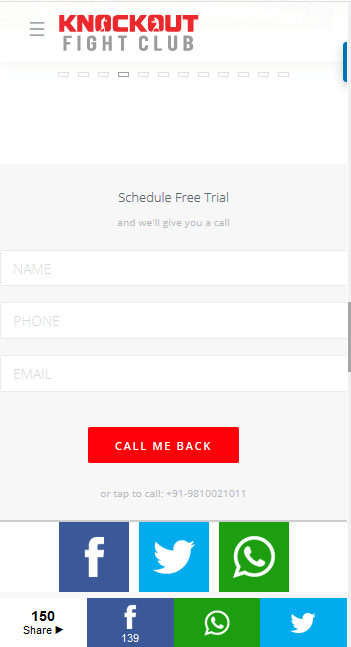
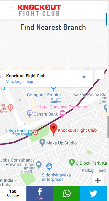
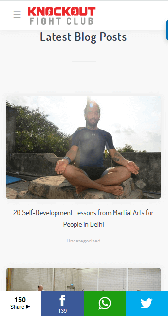
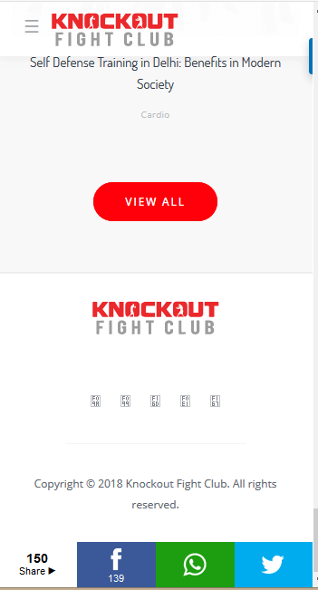
Here’s a snapshot of their website after website redesigning;
Desktop Website After Redesigning

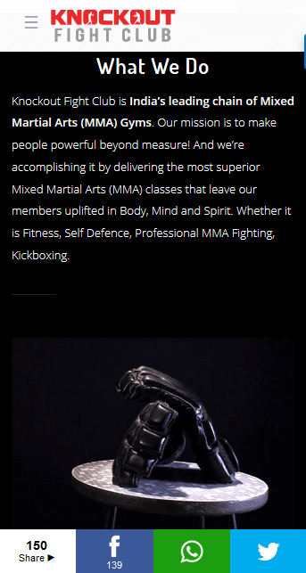
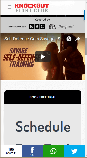
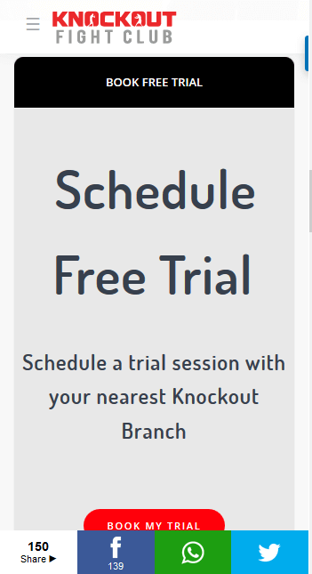
Mobile Website After Redesign

Looking for Website Redesigning?
Our website design company in Delhi will redesign your website as per your requirement. Have a look at our redesigning portfolio for better understanding.
Contact us and you are sorted for your website redesigning project.
Telecom & Security Products’ Website Redesigned by ICO WebTech
The creative team of ICO WebTech has successfully launched a website redesigned for better visuals, improved User Experience and great Search Engine visibility.
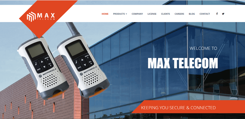
Max Telecom is a dealer of walkie talkie and security products in Delhi NCR. And they were looking to redesign their existing website to give a fresh and updated look. Moreover for this work they were looking for a local website design company in South Delhi.
Since we are in the same locality, they found us on Google’s organic results, through our SEO efforts.
Our design and development team worked together with the owner to assess the current website. And locate the trouble areas.
Their current website was not in a good shape and needed website redesigned for sure.
Our Recommendations for getting Website Redesigned
- Website is for users and for search engines both.
- Design such that the existing rankings are not harmed.
- Place the Call to Actions (CTAs) appropriately and clearly.
- Personalize your website/brand with matching colors, font, style etc.
- Make sure your website is Responsive and integrates AMP for better mobile experience.
- Focus on content placement.
Considering our directions of importance our client decided to include them in the new website design.
Before Redesigning

After Website Redesign

We also redesigned their website logo to match their brand color palette.

Old Logo

New Custom Design Logo
Furthermore, to get additional information about this website redesign project visit Max Telecom.
To get an idea of the websites designed by our website designing company in South Delhi, visit our portfolio. We are your local partners for all your Digital Marketing requirements.
Sign up for our Free website with SEO plan, just like Max Telecom did.
Get in touch with our sales team to get Proposal for your requirement.
Time for problem-solving website design upgrade for your business website
Are you happy with the performance of your business website? It is generating sales for you. Agreed! But do you think your website is doing it with full potential?
Your website ranks on first page of Google but how can you know that it is generating business which it should be. It may be giving you 1000 sales in a month but how do you know that it can’t beat that?
Well there is no answer to it no one can ever say that your website is performing to its full potential. But what can be done is to check if your website is providing real value to your customers. You are happy with new customers from your website but you can also check why others left your website.
That can be done easily with the help of Google Analytics. You see your bounce rate data and analyse it to check from which page your visitors left your website and how much time they spent on different pages before leaving. Our comprehensive guide on bounce rate will give you everything you need to know about bounce rate of your website.
If the bounce rate is high for your website then probaby
It is time for problem-solving website design upgrade for your business website
Important questions to ask before doing a design upgrade of your website are:
What problems you are looking to solve for your your business and for your customers through your website?
Can your website do it for you?
How can your website do it for you?
How can design upgrade can help your business?
1) Making your business website target diverse audience
At some point you may realize that your website targets only one type of audience but you also need diversity in your website design.
For example if you have an ecommerce market place website then you need to target two segments of audience. One segment is vendors and other segment is end customers.
You may be targeting both these customers with online marketing and SEO services. But what about your website.
You are putting your money and efforts in PPC advertising, Google AdWords, Facebook Ads and search engine optimization work. Bringing traffic to your website through different online channels but you could retain only one segment better than other because your website design is like that.
Your web designer should develop a plan depending upon the personal and cultural differentiation and identify opportunities to hit the connection with them. It includes there online behavior, shopping habits and also the color psychology at cultural and personal level.
You can read about the color psychology affecting sales conversions here.
You website designer should carefully understand the goals of your target audience and smartly include the opportunities in the website design. Obviously he would need the help of a digital marketing expert for that.
2) Improving visitors engagement on your website
What if it is not a marketplace website portal and you have a high bounce rate. There could be many reasons. Assuming you rank on top of Google then probably you are appearing in Google searches for your keywords relevant search terms.
Then why a major segment of the website visitors leave your website quickly. There is a very good chance that they do not find website engaging. Keeping your website visitors engaged is very important to reduce bounce rate and increase sales for your business.
You need to get the data about the bounce rate, like
- The pages which have high bounce rate
- What is the geographical location of these website visitors who leave your website quickly
- Which device they use to visit your website etc.
You can easily get this information from Google Analytics.
Once you have made this research then you can work on improving customer engagement on your website. Few of the things you may need to do:
- Adding pieces of fresh content targeting the left out segment. Take the help of a professional content writer.
- Improve the design elements like better and improved web page layout.
- Place right call to actions or contact forms at right positions.
- If you have pop-ups make sure they do not annoy your customers. Always better to place an exit pop-up.
- Check your website for mobile and tablet user experience.
- Pages should not be lengthy and important information should appear in first few paragraphs.
- Improve your content flow with smart internal linking.
If you do not have time to do all this or you can’t do it for technical reasons you can always look for a good web designing outsourcing company to partner with.
3) Create effective landing pages
A good way to target lost segment of your audience is to create landing pages especially for them. You can create landing pages for occasions. You can create landing pages for special services during off season of your business.
Make sure you address their problems and build trust with right content, colors, lead capturing techniques and an effective landing page design.
You should be really specific about which problems you are looking to solve. You should never fill your landing page with loads of content which may confuse your customers and make them switch to your competitor’s website.
4) Offer free and helpful advice
Include a blog on your website if you don’t have one already.
Start posting some meaningful articles focusing on solving some problems of your target customers. Make sure you are consistent with your blog posts.
Include opt-in forms. This is a good way of lead generations if your blog has some valuable information for your customers. They will happily give you their email address and become potential opportunity of sale.
Always give those visitors an option to ask questions on your blog posts. Be prompt to reply to those questions.
Use Google analytics for tracking the performance of your blog.
If you do not know how to set-up a blog on your website then you can find a professional website designing agency who can do that for you.
5) Diversified online income and revenue generation
If you are looking have diversified portfolio of online revenue generation through your website and trying to do so for a long time with little or no results. Then you need to get your website checked with the web designing experts.
A professional web design company always has a combination of web designers developers and digital marketing experts. They can guide about getting your website redesigned as per the latest income generating trends through website.
If you are running your personal blog or you have a non profit organization then you must seek the help of a good website design company for additional ways of income generation online and how to incorporate them into your website.
Few of the popular ones:
- Google adsense
- Content Marketing
- Online donation systems for non profits
- Membership systems to monetize the blog
Now you know why your website design should be improved in order to solve your business problems.
Feel free to ask any questions you have in comments below or contact us for a consultation.
Losing on Sales? May be it’s time to redesign your website!
So, did you ever reach a point where you dropped your heads thinking;
“Why are the sales going down in spite of doing everything and doing it just right?”
Well in my initial days of learning SEO basics I surely did. This is where I hit the jackpot of knowing the answer to this mind-boggling puzzle.
This can be because of your Website Design.
Weird?
But that’s true.
Wondering what’s a website’s design and development got to do with its SEO. Well my friend they both are associated when it comes to raising the search engine rankings.
As per industry experts;
“Healthy duration of any website is usually 3-4 years and in case you go beyond this your website will succumb.”
Technology keeps updating and to keep your website on a technology which was a hit 3 years back may not be a good idea in some cases. Similarly, the design which looked appealing and was made as per the trends might not fit in 3 years later.
Therefore, it is always a good practice to keep pace with the latest trends of design and technology when it comes to website designing.
But the big question here is;
What are the signs your website needs a redesign?
Except for the obvious one (i.e. the design looks outdated) there are three main concerns which lead the signals for website redesigning.
#1 Your website’s analytics is showing a downfall in conversions every-time you log in.
#2 The SEO score and overall performance of your site has dropped.
#3 The User Interface is not very impressive
Does any of the above ring a bell to you? If the answer is yes, then your website surely needs a facelift. For more details on signs of website redesigning read this article about 6 Reasons Why It Is Time for Website Redesign.
Example of Website Redesign
Before Redesigning
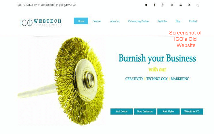
The old look is good too, but again there is no harm in improving for better.
After Redesigning

The new website of this web design company in India is more trend-friendly, user-friendly and of course SEO friendly. The use of colors in this new website is catchy and trendy.
Key points to consider when you redesign your website
While redesigning has got a lot to do with the way your website looks. But that’s not all about it. There are various factors to keep in mind while redesigning your website.
#1. Your Old Website Is Not A Junk
Redesigning does not mean to remove all the elements of your old website completely. Rather you can carefully choose to keep some of the elements from your old website like color scheme, fonts, URLs and more.
In fact use your data from your Google Analytics account to analyze which pages need a makeover in particular.
For example if people are coming to your services page but exiting from their then obviously the bounce rate of service page will increase. In this case your new website should make efforts to create interesting content, call-to-actions, e-books and other measures to keep your users hooked. And intrigue them to take the next expected step; i.e. to contact you.
#2. Sit With Your SEO Guy And Discuss The Goals
Analyze your SEO goals by logging into your Analytics for better insights.
Email address collection, encouraging downloads, buying etc. all come under goals.
It is always recommended to work on a project with a plan ahead.
Therefore it is a good idea to first know what you want from your new website in terms of sales and conversions and then go ahead with the design.
#3. Understand Your Demographics
It is very important to understand and know your audience. Target audiences change over time. This can be because of the changes you make to the products or services offered to them.
You will get this information from Google Analytics and you can then redesign your website accordingly.
For instance, if earlier your website had majority of younger audience but now it has a majority of middle age audience too. Then in this case you will have to redesign your website’s content and also the overall look and feel to suit both the audiences.
#4. Create A List Of Your To-Dos For Your Website
This is very important. Make a list of everything you have in mind to change or update in your existing website.
This can be about logo, the themes, the tools used, URL structure, navigation structure or even a new landing page. Just jot it down before you forget anything.
As an example, you might want to change your URL structure if it looks like this;
https://examplewebsite.com/p-001 or https://examplewebsite.com/8/27/2018/website-redesign
to a more SEO friendly URL i.e.
https://examplewebsite.com/website-resign
These small things matter a lot while working on the overall performance and SEO of a website.
#5. Use Colors Smartly
Who doesn’t like bright colors, right? But don’t overdo it. It’d never advised to make your website a rainbow just to be different.
Rather choose vibrant contrast colors to grab the attention of your visitors on special content like on the Call To Action (CTA) buttons to encourage users to take some action.
Here is an example:
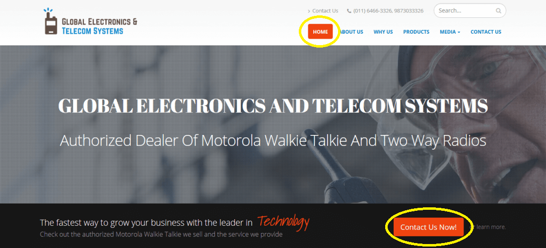
In the above website the navigation and the Call To Action buttons are highlighted from the rest of the website.
#6. Make Sure Your Website is Responsive
This is crucial.
Not everyone hooks on to a desktop for browsing. In fact mostly users surf for products and services in their free time and on their mobile phones.
This make it essential for the website owners to double check that their website is looking and functioning great on a smartphone or any other device. Answer these 6 questions when optimizing your website for mobiles.
#7. Check for Broken Links
It is very important to check your new website for any broken links. For this you can use free tools like Xenu’s Link Sleuth to check the internal broken links and fix them.
As otherwise they will increase the 404 error in your website and can adversely affect the SEO rankings of your website.
#8. Optimize Your New Website For SEO
Last but in no means the least, do not forget the SEO of your website. We are making all these efforts to increase your sales and conversions.
Therefore;
- check your keyword density,
- use right keywords,
- make sure all the images have alt tags and description
- all pages have proper meta content
- place CTAs at the right place, and
- include a Blog page
If you have all these in place and still your rankings or traffic came down you can read this article about Why did SEO Traffic Drop after Website Redesign?
Conclusion
Redesigning your website is essential if no changes have been made on your website for more than 3 years. If done in the right manner it will surely increase the traffic and boost your sales and conversions.
Analyze and use the important elements from your old website, find and implement a goal and a strategy, keep the SEO reports with you while redesigning your website.
While the ultimate goal of website redesigning stays to be an increase in sales and conversions. But refining the user experience is definitely an added advantage for the users and the owners.
Contact ICO WebTech for redesigning your website or to increase your sales and conversions.
Difference between web design and web development
Web Design vs Web Development
If you are a beginner in the web world then it is significant to learn the difference between web design and web development to make the right choices ahead.
Whenever a small business or anyone wants a website design or if they look to redesign their website they search for website design company or web designing company in Delhi in Google, which is correct.
People may also use terms like “best web design company” or top website design company or dynamic website design company. It all makes sense.
However, in over 10 years of our experience we have noticed that people also use another search term which is “web development company” or website development company” or its other variations.
But very few understand the difference between web design and web development. Hence they land up choosing web development for web design or vice-versa.
The main reason of writing this article is to give a clear picture to non- technical businesses about the difference in these two search terms. So that they can get the best professional web expert for their business needs.
We feel that web design is the most common search term used for any web related technical service. It is more of the generalization of the different services provided by website experts companies.
Let’s take a sneak peek at the difference between web design and web development and how knowing this difference can get you the best resource available in the web industry to fulfill your needs.
Understanding web design or website design.
Web design is the part of creating a website which deals with front-end capabilities of a website.
This includes the look of the website, structure of the navigation, color combinations and graphics on the website.
Web design focuses on the usability of the website and is sometimes termed as US Design.
The prime role of a web designer is to make a website as user friendly as possible without compromising on the aesthetics and the visual appeal of all the web pages in a website.
It involves the use of various design programs.
For example,
Photoshop is used to create the front-end look of the website by most of the designers and no wonder it is the best tool available.
Web design process often begins with understanding the requirement of the client and the business goals they want to achieve with their website. Understanding the business goals helps web designers to come up with the written architecture of the website in which they define the flow of the information through the website.
The second stage…
…is to design the wireframes and check with client if they are moving in the right direction. Once the client approves the wireframes, web designers can move on to designing the UX UI and come to a user friendly, visually appealing layout that provides a wonderful user experience to the website visitors.
Web design is a process and involves keeping the various design principles intact while working on creating the face of the website. It is the most creative phase of website making which every company should be careful of.
Web Designers should be able to use their imagination and creativity to the fullest to get the best possible design for a website.
Read : Eight stages of our web design process.
Understanding web development.
Now comes another term which people often use when they want to search for web design companies. We being around for over 10 years providing web design and development services in New Delhi India often get leads which land on our website’s landing pages by using “web development services in Delhi” as a search term.
But actually, they want a simple website design or change the look of their existing website by redesigning it completely.
Read more about our website redesign services here.
If you land on the website of a web development company while looking for web design services you may not get the experts for web design and it is vice versa.
Web development deals mostly with the programming part of website building process.
Once the design is ready for the website then web developers convert it into interactive prototype using HTML5, CSS, jQuery etc.
For dynamic websites PHP MySQL is used often these days. In fact, these days web developers use CMSs like WordPress, Joomla, Drupal or Magento, Shopify for ecommerce development for dynamic features of the website.
Talking about simple features accomplished by a web developer are image sliders, images, content sliders, contact forms etc.
So this is the basic role of a developer to make the static design interactive using programming skills.
Difference between Web Design and Web Development
The role of web designers and developers may look different. But to get a professional and an interactive website for your business you need these two working their best.
To attract more visitors your website should look good and also it should work properly.
These days a web developer may also know how to work with Photoshop so one guy can accomplish the task of both. But still you should be careful while choosing the web design company.
An ideal company will have dedicated designers and developers.
Learn how to choose the best company for building your website.
There should not be any communication gap between a designer and a developer working together. Because it can lead to a disaster website rather than a beautiful and functional website. The communication between the two should be simple and easy to understand. Not only among themselves but the communication should be understood by the client and the other members of the team.
Gone are the days when beautifying your website was the trend. That used to happen 20 years back. Even print designers used to design the beautiful websites.
But these days…
…if the designers and developers are not working in coordination. Then your website will not work towards the goals of the business it is supposed to achieve.
Conclusion
This article was aimed to give a clear understanding about the difference between web design and web development. A designer can also be a developer and a developer can also be a designer.
But you should be double sure if you are hiring someone with both the skills. We recommend hiring a website design and development company which has dedicated designers and developers.
Eight stages Of Our Web Design Process
ICO WebTech Private Limited is a leading web design and development company in Delhi with a perfect web design process.
We provide Website designing along with SEO and other Internet Marketing services to businesses across Delhi and all parts of India and help them increase their rankings on Google and generate more sales. We also provide outsourcing services for Web design and Digital Marketing to clients across USA, Canada, UK, Australia, Italy and help them save almost half of the cost for their digital marketing and web design work.
Being one of the best website design companies in Delhi It is our responsibility to make sure we provide maximum ROI to our clients who trust us.
We have designed a robust Web design process which tracks all the investments of our clients along with the revenue they generate from their website.
Stages of our web design process from start to finish
- Defining the project
Our web design service starts with defining the project. This starts with initial consulting. We are based at Malviya nagar, New Delhi, India but we help businesses all across India and overseas to generate more revenue and increase sales funnel through their website.
We start with defining business goals and identifying the opportunities how a well optimized website can do wonders for the overall marketing strategy. This helps our web development team to build the website exactly as per the requirement of the business.
During our initial consultation with business owners we identify the website goals and target audiences keeping the interest of stake holders in mind. We define a way how the business will stand out of the competition with a strong online presence.
- Scope of the project
Project scope is the most important and critical step of our web design service. We define the deliverable, timelines and important activities to achieve the desired results in the project definition process.
The project scope is well documented and sent for approval to our clients. After which it is uploaded on our project management tool to be available for our project teams with tasks defined with timelines for every individual involved in the project.
- Website Architecture
We then move to designing the architecture for the website. This includes basic visuals for various pages and the wireframes and the sitemap for the content flow.
This stage of our web design process provides a detailed reflection of how the content will flow through various pages of the website with maximum user engagement. It gives an overview of how the website pages will look.
This helps us to define how the customer will browse through the website and ultimately gets converted into a potential sale.
- Designing
Once the sitemap and wireframes are ready for the website, the project is transferred to our website designers. Our team of expert website designers create the style of the website with various color effects of every section to get the most appealing look for the website.
This is also a very important stage as the complete brand image is visually defined on the website design. We also check in this phase that the website looks exactly what is defined in the project definition and is targeted to achieve the goals.
The visual designs are sent to the client for approval.
- Website Development
After getting the approval from our clients we start the fifth stage of website development. This stage converts the ideas into finished plan sets.
This stage includes converting the designs into fully functional web pages using HTML5, CSS3, PHP and MySQL. That’s what our technical expertise is. Content is populated and various call to actions and lead capturing techniques are implement in this stage of our web design process.
We make sure in this stage that the website is developed for maximum conversions with a delightful user experience. We also make sure that the website is working fine on all the browsers, and it is SEO friendly so that the search engines can easily crawl every page.
We build responsive websites so this functionality is also being worked during this stage. We make the website compatible with all the devices like smartphones, tablets, desktops and laptops of all sizes.
- Website Testing
In this stage the website is placed on our testing server to check the performance of the website in real online environment. In this stage of our web design process we check the website loading speed, cross browser functionality and responsive nature.
All the critical points are thoroughly checked and website is made fool proof. Apart from checking the technical aspects we also check the misspelled words, broken images and broken links as a single mistake anywhere in the website can cost the reputation of the business.
The test server link is sent for approval to the client.
- Website Launch
Once the website is approved then the most awaited day arrives. We launch the website. But our website design process is not over here. We provide FREE support for 2 months after we launch the website.
During these 2 months we monitor the website. We take and implement the users feedback and do not leave a stone unturned if there is any scope of improvement. We constantly work towards getting the website next to perfect when it comes to performance.
We also make minor changes as required by our clients free of cost during this free support of 2 months.
- Website Maintenance
As the internet is constantly changing we make sure that the website is up to date with the new emerging trends and technologies with our website maintenance. We make the content changes to attract more visitors. We make sure that the website is secured and also remove the malware if they pop up during the 8th stage of our web design process.
We take regular backups and provide analytical insights for our clients to review the real time performance of the website. We track the number of users on the website weekly and monthly and constantly work to decrease the bounce rate of the website.
We also do the design changes as required for the changed business strategies.
Contact our expert web designers and web developers to get your website designed.
Contact us for a FREE Consultation today
6 Reasons Why It Is Time for Website Redesign
Check if it is time for Website Redesign
Why you should redesign your website?
Simply because websites are like 24 by seven sales employee who work for you round the clock. It was around 20 years back when just having a website was more than enough for your online reputation.
Time has changed and having a website is just not enough. Website design has now become a major part of your overall marketing plan. You will lose to your competition if your website is not getting visitors or they leave your website soon.
Potential clients these days judge the credibility of a business by the website design they have and how they present themselves on their website.
Now if you have a website and if doesn’t shows on top of Google search results then it is as good as having no website.
The best Website design companies in India claim to be the best but do they really make your website work for you just like a 24 by 7 sales team?
It is not just the incompetent website design companies but it is the ignorance of the small business owners who often come up with thousands of reasons to not redesign their website.
Here we give you 6 reasons why you should redesign your website right away.
#1 Your website doesn’t work on mobile.
6,586,013,574 searches are performed daily worldwide as per Smart Insights. More than 70% of searches on Google are performed on mobile devices such as smart phones and tablets.
It is due to the increase in the number of mobile devices users globally.
If you do not want to lose out on business to your competitors you should have a mobile friendly website. We also call it responsive websites. Companies which have a website that works better on mobile devices have an edge in sales over their competitors. You can check the report by Econsultancy.
#2 Your website is built using Flash.
It is not at all good to use Flash in your website because the search engines like Google cannot read Flash so your Flash website will never show up in Google search results.
Also the iPhone and iPad doesn’t support Flash either. And you know the potential market of the iPhone and iPad users around the world.
Moreover it is difficult to maintain and update a Flash website. If you really need animations in your website then you should choose the right website design company who can work with HTML5 and CSS3.
Best website development companies know how to use HTML5 along with CSS3 to give you the desired animations in your website.
#3 Your website has low search engine rankings.
Google keeps on changing its algorithm to show high quality content on top of their search results pages. Old SEO techniques like keyword stuffing in your website content will not work longer.
Also the massive link building was important way 7 years back. Now Google completely focuses on user experience and high quality content on your website. Your website should be extremely user friendly and engaging.
Link building is also important but you should be very careful with the SEO company you are working with as one wrong step might blow you with penalties from Google.
You should always choose a website design and SEO company for search engine optimization of your website who are well aware of latest Google updates and work as per them.
Read more about Unethical SEO practices here
#4 Your website doesn’t convert your visitors.
Your website should be well designed to get maximum conversions. If you see in the analytics that visitors leave your website too soon or your bounce rate is very high then it is time to redesign your website.
Pure because your website doesn’t have enough methods in place to engage your website visitors or may be there are broken links or there is outdated information which is no longer useful to your website users.
Your website should be built keeping the customers in mind and should work towards the marketing goals of your business.
An ideal website is the one which generates leads, increases conversion and ROI.
#5 Your website looks outdated.
Website design has evolved over the years and it is important that your website looks like the website of present. You can easily figure out by looking at any website that it was built 5 years back or if it is redesigned with current website design trends.
If your website is outdated then there is every chance of getting your website visitors disinterested and seeing them leaving your website.
If you know your website was built years back then it is time to get it redesign and give it a modern professional website look. Gone are the days of crazy audio on your website, animations here and there. Today it is all about a clean professional website design.
#6 Your website is slow.
If your website is slow then there are very good chances search engines like Google may not rank it. Also if some customers land on your website then they will leave as quickly as they landed. Page speed is very important if you want your website to rank high on Google and generate leads.
The best website design companies know how to speed up your website and help them rank better on search engines and give a wonderful user experience.
You can easily check your website speed performance on Google page speed tool and see how fast or slow is your website on Desktop and mobile phones.
Conclusion
It is extremely important for your website to perform and generate revenue for your business. To keep up with your competition you must have a well designed, responsive, engaging and fast loading website.
If your think any of the above reasons apply to your website then it is time you should redesign your website. Take the help of the best website design company in your area and get your website an edge.
You will see the changes in your ROI if you have a good website.
Contact our Sales team to get your website redesigned.
Contact us for a FREE consultation today
15 Top Reasons Why Visitors Leave your Website Too Soon!
Know the Top 15 Reasons why people leave your website soon
If seeking Attention is difficult, then creating interest is rare on the Web.
When you build your website from any professional website design company, you have the criteria of grabbing the attention, on your checklist. Right?
So now that you have the attention of the desired web users, it is your primary job to create engaging content for the users to develop their interest.
The content on your site should be easy to navigate and simple to understand. If at all it is confusing or clichéd, the user will get either bored or frustrated and will take the exit door.
In the initial web surfing days, “if you build it (website), it will work” tune worked. But now, to swing in thoroughly and to get the visitors stick to your site is a whole new episode. You have to set a combination of a various factors to generate interest in the visitors.
I have listed the top 15 reasons to be worked on if you want visitors to stay for longer time on your site.
People might be leaving your website because of these reasons:
1) Outdated Design
Even though looks are deceptive, but they also cast the first impression which typically is the last impression. Designs which were a hit 10 years back are looked as outdated and uninteresting now.
Make sure when a visitor visits your website he stays there, at least for the strong and attractive visuals of your website. Of course, this won’t be the only thing to keep your visitors hanging to your website. But it is a great valid point to begin with.
Website redesigning is an important aspect to keep at pace with the changing trends. Nobody would be interested in a clichéd design, so obviously they will leave your website soon.
So, update or redesign your website to match the current trends or to give it a fresh look.
Source: https://goo.gl/KF7NrX
2) Do not Overdo Your Content
The fonts, color, design everything matters when you style your content. But some designers overdo the styling which gives a very unprofessional and cheap look to your website. And trust me it does not give a very positive feedback for your website/company.

Source: https://goo.gl/BYcmgf
Style your content but remember it should not hinder while reading the text on your website.
The fonts you use should
- Be easily readable
- Have high contrast color combination
- Clean presentation
One font which you should absolutely avoid is “Comic Sans”. As an alternative, choose ornamentation-free serif or sans serif fonts for best results.
And for font size, it’s better to opt for larger fonts so that the visitors have a great experience and ease to read while they are visiting you on a desktop or a mobile device.
3) Outdated Plugins
If you are still using flash to display the most important message for your visitors, then my dear friend you will be waiting for forever. Because the users have no time or interest to install the updated versions of Flash plugins to view the content of your website.
Result; the bounce rate increases and your conversion rate will fall down further.
If your website or posts demand videos or animations then it’s better to use HTML5. In addition to this, include a summary or a transcript of the video for the users who can’t or don’t want to play the video. This is also beneficial to add on to the SEO benefits of your website.
4) Too many Ads
It would not be possible to run an ad-driven model website without ads. Comprende!
But it is totally unnecessary and very frustrating to place the ads all over the website in a greed to make more money. This is a very thoughtless way as instead of making you win (by making money), it will make you lose (as visitors will leave your site early).

Source: https://goo.gl/qK6GXf
If a visitor visits your website then he is there for some particular information. But if it becomes difficult for the visitor to go through that information because of ads hanging everywhere, he will leave the website in no time.
Running the ads is fine. But see to it that it’s not covering the entire volume of your website. Ads should not be the first thing that a visitor notices when he visits your website. Rather it should be the real content of your website which grabbed his attention.
5) Auto-play Videos/Animations
It is very annoying (and sometimes embarrassing) when a video on a website auto-plays. The immediate reaction to this unwanted, forced auto-play would be – hitting the back key.
Source: https://goo.gl/Wvj4q3
Never set the videos on auto-play mode. Allow the user to choose whether he wants to or not play the video. Doing this you also give a certain level of control to the user which is by and large loved by all.
This way you earn some brownie points and the thus spray some glue to the visitor to stick to your website.
6) Site’s navigation
Do not take this lightly.
If your site has a confusing navigation and multiple sub-levels then the user will not waste his time to find the page he is looking for.

Source: https://goo.gl/xnHqN7
Think of this as a scenario where you land on the website of your choice for the desired information. Now you are struggling to find the piece of information for which you visited that website but could not find it. What would you do?
Leave it, right?
This is why a site’s navigation has to be clear, precise and easy to locate. Reorganize your site’s navigation levels to match a user’s expectation. If you are unsure of rearranging your site’s navigation yourself, contact a good website design company and they will help you out.
7) Lengthy and Unnecessary Registration Forms
Creating gated content is great for driving genuine leads to increase the sales of the company. But doesn’t it get annoying when you have to fill lengthy registration forms for accessing everything and anything on the website? It sure does irritate me.

Source: https://goo.gl/daPQox
Do create gated content but stick to its actual purpose. Do not just restrict everything from a user. He will run away.
Protecting important documents like whitepaper, PDFs, or some videos is fine otherwise keep your website accessible to all.
Another important aspect is Registration forms. Make it a point to keep only those fields which are actually important. Other than that do not waste your as well as your visitor’s point. More important, the will not only skip registration, they will take an exit door immediately.
So avoid pointless and prolonged registration forms.
8) Slow Loading Speed
According to Hobo Web, the page loading speed difference (in seconds) hugely impacts the percentage of page abandonment.

Do not ignore this or better make this your priority. Because even after attracting users, your website takes too much time to open then no matter how good your website’s content is, user will take a U-turn.
9) Irrelevant and unappealing offers
I have noticed sometimes companies give all the attention to the graphics and designing of the offer. But this should be absolutely discouraged.
Visuals are great, but what inside it is of greater value. It should be designed and explained in a way to attract the customers. If at all you experience that visitors are coming to your website but leaving soon. Then this definitely shows a lack of connection between them and the offer.
Create an appealing offer on a landing page with a connecting call to action button, explaining the visitor the next step and the resulting benefits of taking that step.
10) Vague product/offer benefits
If the product benefits which you display on your website are not appealing and clear then obviously it would not take more than some seconds for the visitors to move away.
Think through the typical instance of the Apple iPod. The iPod features could have been in two diverse ways, like below:

Image Credit: Help Scout
The smarter way to display the features is the second one. Because iPhone buyers will not care much about 1GB or mp3. But the feature of carrying 10,000 songs with them is what will attract them.
See the difference?
This is a crucial understanding to improve the conversion ratio.
11) Missing Call-to-action button
According to smallbiztrends.com, 70% of small business B2B websites don’t have CTA or Call-To-Action buttons.
Isn’t this strange?
Why will the visitors be interested in your products or services if you aren’t even asking them to buy it from you? The fact that the CTA has to be compelling and relevant comes secondary. But more important is for you to have a CTA button after every products page, blog page or any other relevant page.
12) Fake landing page promises
Never ever create fake promises on the ad just for the sake of driving the visitors to click on your landing page. Even if you get successful on getting the visitors to your landing page, it won’t be of much use to you.
Source: https://goo.gl/N3jJ9x
Just as they find out that the information rolled on the landing page is not relevant nor does it solves their purpose they will take no time to hit the back button.
Your ultimate goal is sales, which will only happen when you share actual offers or information with the visitors. Do not confuse traffic with conversions.
13) Website is not responsive
According to official Google statements, more than 50 percent of search queries globally now come from mobile devices.
Now imagine if your site is not responsive how much potential sales/traffic/conversion you would be losing.
It is imperative for all the small, medium or large business to have a responsive website if they aim for the ultimate goal – high ROI.
14) Not using Exit Intent Technology
As per omniconvert.com the ‘Exit Intent Technology‘ can be defined as an intelligent technology or an innovative tool designed to help marketers turn and transform their abandoning website visitors into paying customers.
The website owners can make a final try to convince the abandoning website visitors to stay back and reconsider what the website has to offer.
By using a tool track if the visitor is about to leave your website. Just when he is about to click the back button present a message or an offer to make them stay on the website to learn what the website can do for them.
15) Website hacked
Everything fine still losing on the numbers?
Check your website’s admin thoroughly. It might be hacked. According to Forbes contributor James Lyne, an estimated 30,000 sites are compromised every day.
If it is not possible for you to observe your website code every day. Then introduce a monitoring tool to retain the most important factor of a user’s trust that’s essential for website conversions.
By working on the above issues you will most likely see an increase in the conversion ratio and a decrease in the bounce rate. But still if you cannot make it through contact a professional SEO company to dig in deep.
Why did SEO Traffic Drop after Website Redesign?
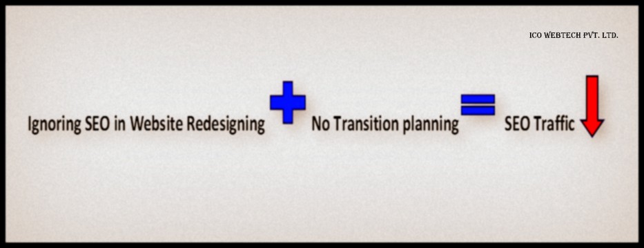
What do you think or expect when you get your website redesigned? It should look good, perform better than before and obviously increased ROI. Right? But what if it looks good now, but you lose the initial SEO traffic after redesigning.
Don’t panic.
Instead move ahead towards the solutions, for which finding the exact problem is crucial.
It may have happened because your website designing agency was not careful about a certain steps which are a mandate to at least maintain the initial SEO traffic.
The major reasons identified for the drop in SEO traffic include:
Be Realistic
Website owners must understand that after redesigning of website some percentage of existing SEO traffic will be decreased. This happens because Google has to assess the pages, design and the content of the website again.
How much is not Too Much?
A drop range of 5% – 7% in SEO traffic is expected after the redesigning of a website. Anything more than this means that something definitely went wrong while the transition and serious attention should be paid.
How much time will it take to reach Initial SEO traffic?
If the drop in SEO traffic is within the above mentioned range then the initial results will be recovered in a few weeks. But otherwise it’s directly proportional. The higher the drop percentage the longer time it will take to get back to the initial results.
Important: Relying simply on the traffic numbers is not wise. A good SEO company will also take a look at Conversion data. Because there can be chances of low traffic but high conversion rate.
Why Did Your SEO Traffic Go Down After Redesigning of Your Website?
If you have not taken necessary precautions while redesigning your website, you will end up losing high percentage of your SEO traffic. This percentage can go upto 60-70% which can cost you high loss in terms of money.
We have listed the major reasons responsible for the drop in existing SEO traffic so that you can benefit from it by correcting them beforehand itself.
Redirects Were Ignored
What are Redirects?
Redirects send the users to the new page location when they try to visit the old page. They will tell the search engines to give the old authority/rank of your pages to the new pages of your website.
Why is it important to set up Redirects?
If you have not set up Redirects then the users/visitors of your website will get errors when they visit your site’s pages. This will happen as the page address of your old website have now been changed. For example; if the contact page of your old website was www.abc.com/firm/contact/ and now after redesigning it is www.abc.com/contact/ then obviously users will get the error when they visit www.abc.com/firm/contact/ as this page no longer exists.
These errors will transfer this information to the search engines that you have poor content, and down goes your site rankings.
What should be done to correct this?
Set up 301 redirects as this will inform the search engines to transfer the rankings from the old page to the new page, as well as send users from the old page to the new page.
It is important that redirects should be written from the old page to a matching page on new site. Do not redirect every old page to the new home page.
Importance of Setting Correct Codes
The error codes that your website returns when redirects have not been set up affects the rankings of your website. To illustrate, 404 error shows up when a user tries to visit a page that no longer exists. Though, sometimes 200 error code substitutes which is a success code with the unexpected result of informing Google your site has a ton of duplicate content.
It is crucial that when you set up the redirects, they should be 301 or permanent redirects not 302 or moved temporarily. This will move the page authority to the new one without damaging the overall SERP of your website.
Site Architecture
What is Site Architecture?
A site architecture is basically the layout of your web pages. In the language of Search Engines, a site architecture supports with crawlability and indexation. It is crucial for SEO as the layout holds an important place in number of pages getting indexed in the Search Engine. This eventually impacts the capacity of traffic to your website by Search Engines.
What should be the Site Architecture like?
Site architecture or hierarchy should be such that the pages which are most important and relevant should be easily retrieved.
Google authorizes assessment from one page to the next through internal links. The pages will receive more or less value depending on where the pages are located in the hierarchy of the website.
Pages which are multiple clicks away from the important pages (generally homepage or category pages) gain less value compared to those which are placed closer.
How is SEO Traffic affected when you change the Site Architecture?
Google values and ranks the pages in a website based on its target topic. That topic necessitates some value (link juice) or a decent score to compete with the competitors. This value or link juice is achieved by hyperlinking which is seen as votes by search engines recommending that your page is valuable and worth promoting.
When a website is made again it can change the internal linking causing some pages to have less internal links or they can now be linked to from pages which have less value to pass. The new hierarchy or layout reasons pages to receive less value or score. Due to this the score of the page lowers which in turn lowers the SEO traffic for that topic.
Change in Website Content
Changes in a website design also cover certain amount of or complete change in content. This does not include minor linguistic changes. Rather we are talking about major changes to the target topics of a page, and where in the content are these significant topics placed.
Why does it affect the SEO Traffic?
The changes in content makes search engines to re-assess the authenticity and value of that page for the primary topic. If for some reason the primary keywords no longer exist in the key SEO areas like title tags, header tags, body copy, alt text etc., then the relevant score will drop, and with it the SEO traffic and search engine rankings.
Important: For this reason you must learn which keywords and topics have high ROI and traffic seeking capability. This will save you from unintentional loss of SERP.
Deleting Web Pages
Deleting the web pages in a redesign creates content gap which causes a drop in the SEO traffic.
In the expectation of creating an enhanced journey for the users, website owners accidentally create a content gaps in their websites. This gap caused by removing pages leads to a drop down of previously ranked pages and also a drop in SEO traffic of those targeted topics.
Site maps
Last but in no sense the least is your website’s sitemap. It is imperative that Google understands the structure of your site. Site map makes it easier for search engines to walk through your website. So, if Google still has the old sitemap page that no longer exists, the requests will return errors. This will drop your SEO traffic and will also have a negative impact on rankings.
If you have activated SSL in your new website, which by the way you should; then remember if your sitemap does not match the protocol of your website, search engine will not be able to crawl it correctly.
It is always a good thing to move or to change for good. But it does not harm to take the precautions. Yeah?
I have tried to cover almost all the reasons which are responsible for bringing down the SEO traffic after redesigning of a website. If yo happen to know of other reasons too please feel free to write me at here.
