A 30-minute product page audit: score your store for AI shopping
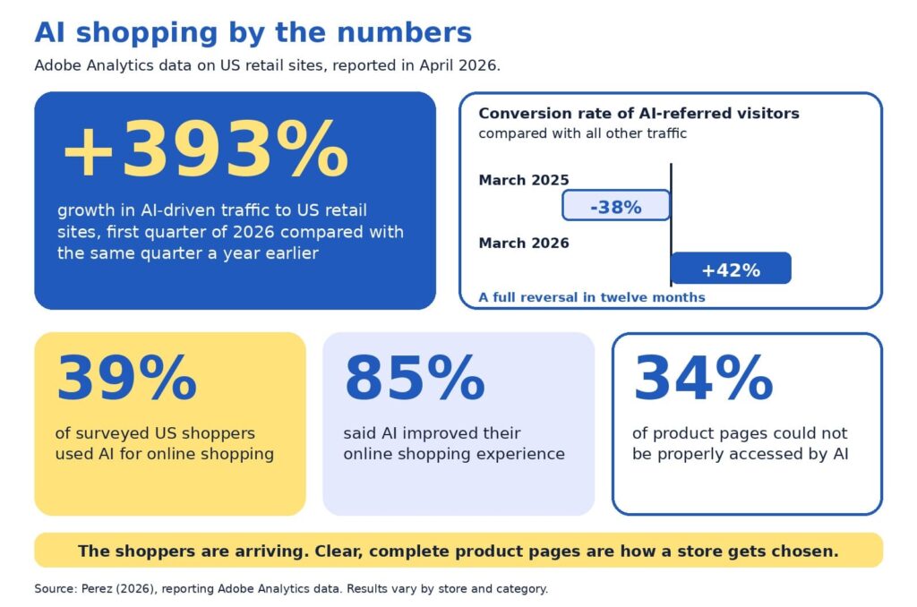
Baymard Institute’s 2026 benchmark found that 52% of desktop sites and 62% of mobile sites have product page experiences rated mediocre or worse (Scott, 2026). Adobe’s analysis of retail sites adds a second angle: about 34% of product pages could not be properly accessed by AI (Perez, 2026). Both findings describe one opportunity. Product pages are where stores win or lose, and most have room to improve.
Our companion guide, AI can recommend your product, but only your product page can sell it, explains why product pages matter so much in AI shopping. This guide is the hands-on follow-up. In about 30 minutes, you will score your own pages, find the weakest spot, and decide what to fix first.
You will get the five-P scorecard with a simple scoring rubric, an example that shows what is on the page and what sits behind it, a worked audit, an impact and effort map for choosing fixes, and a short monthly habit. Everything is written for owners and marketers who are new to this, so no technical background is needed.
A note on transparency: the scorecard is a self-assessment tool, and the example numbers are illustrative. AI shopping also changes quickly, so we point to Google’s documentation, Baymard’s research, and Adobe’s data, and we flag where details may change.
The quick version
Choose five product pages. Score each on five Ps: product facts, pictures, proof, promise, and path. Use the rubric to rate each P from 1 to 5, then fix the lowest score first, because a page is only as persuasive as its weakest P. Use the impact and effort map to pick quick wins before bigger projects, and repeat a short check every month.
What is in this guide
- Key terms in plain English
- Why an audit beats guessing
- The five-P checklist
- The scoring rubric
- How to run the audit, step by step
- Reading your scorecard
- On the page and behind the page
- A worked example
- The weakest-link rule
- Fix first: the impact and effort map
- Technical checks behind the page
- A 15-minute monthly habit
- Quick answers to common questions
Key terms in plain English
These words appear throughout the guide:
- Product page audit: a structured check of how clear, complete, and trustworthy a product page is.
- Product feed: a regularly updated file listing your products and their details for platforms such as Google.
- Structured data: hidden labels on a page, such as price and availability, that help machines read it accurately.
- Merchant Center: Google’s free tool for sharing product data across Google.
- Conversion rate: the share of visitors who buy. If 100 people visit and 3 buy, the rate is 3%.
Why an audit beats guessing
When sales feel slow, owners often reach for a redesign, a new app, or an AI tool. Those can all help, and each is easier to choose well once you know which part of the page is holding you back. An audit gives you a baseline, a ranked list of fixes, and a way to show progress.
The stakes are real. Baymard’s research puts the average documented cart abandonment rate at about 70%, which means roughly seven in ten shoppers who add something to a cart leave without buying (Baymard Institute, 2026). Product pages sit upstream of that moment, since shoppers decide whether they trust a product long before they reach checkout. TechCrunch’s report on the Adobe data describes the incentive for stores clearly:
“retailers are incentivized to make their sites AI-friendly”
Perez (2026)
The encouraging part is that the basics do most of the work. Google describes optimizing for its generative AI features as part of SEO, and it recommends keeping product and business details accurate through tools such as Merchant Center (Google Search Central, 2026). A careful audit puts exactly those basics in front of you.
The five-P checklist
Each P answers a question that shoppers and AI assistants both ask. For each one, here is what to look for on your page.
Product facts
Ask: what exactly is this? Look for a specific name that includes brand, model, and the one or two attributes people search for, plus a complete description with materials, sizes, variants, and what comes in the box. Selection should be easy too, and Baymard found that 57% of sites do not use buttons for size selection (Scott, 2026), so clear variant buttons are a simple upgrade.
Pictures
Ask: what does it look like in real life? Look for several angles, zoom, and at least one image that shows scale or the product in use. Short captions can answer questions that photos alone leave open, such as size, weight, or fit.
Proof
Ask: can I trust this? Look for genuine reviews and ratings, answers to common questions, and credentials such as certifications. Google lists review ratings among the details that can appear with product results (Google Search Central, 2025b), so visible, honest reviews help both shoppers and search.
Promise
Ask: what will I get, and when? Look for price, stock status, delivery time, shipping cost, and the return window, all near the buy button. Google notes that sharing shipping costs, especially free shipping, helps shoppers understand the total cost, and that return information can also appear in results (Google Search Central, 2025b).
Path
Ask: can people and machines reach this page easily? Look for standard links from menus and categories, a fast and mobile-friendly layout, structured data, and a smooth route to checkout. Google’s ecommerce guidance recommends linking menus to categories and categories to products, and it notes that Googlebot generally does not use a site’s search box (Google Search Central, 2025a).
The scoring rubric
Use this table to rate each P from 1 to 5. Score 1 means the information is missing or unclear, 3 means it is present but thin, and 5 means it is complete and clear. Pick the description that is closest to your page and avoid rounding up.
| The P | Score 1: missing or unclear | Score 3: present but thin | Score 5: complete and clear |
|---|---|---|---|
| Product facts | Code or vague name, short description | Clear name, basic description | Specific name, full details, variants, and what is included |
| Pictures | One small image | Several images, limited zoom | Multiple angles, zoom, scale, and captions |
| Proof | No reviews or questions answered | A few reviews, hard to find | Visible reviews and ratings with answers to common questions |
| Promise | Price or policies appear only at checkout | Policies linked from the footer | Price, stock, shipping, and returns beside the buy button |
| Path | Slow, hard to reach, or hard to read on a phone | Works, with some speed or link gaps | Fast, crawlable, structured data in place, smooth checkout |
How to run the audit, step by step
The whole audit fits in about 30 minutes. Set a timer, open a spreadsheet with one row per page, and follow these steps:
- Choose five pages (2 minutes). Pick your best sellers, plus one product that gets plenty of visits and few sales.
- View each page on a phone and a computer (5 minutes). Note anything slow, cramped, or confusing.
- Score the five Ps with the rubric (10 minutes). Write the number and one sentence of evidence for each.
- Check behind the page (8 minutes). Compare price and stock on the page with your product feed and checkout, and test the page with Google’s Rich Results Test or URL Inspection tool.
- Circle the lowest P on each page (3 minutes). That is your starting point.
- Rank the fixes (2 minutes). Use the impact and effort map later in this guide to pick quick wins first.
Be kind to yourself and honest at the same time. The goal is a clear picture of where each page stands today, since a realistic score is the most useful one.
Reading your scorecard
Plot your five scores on the radar chart below. A wide, even shape means your page is balanced, and a dent shows the P that needs attention. The chart compares an illustrative strong page with a typical page, so you can see how the shapes differ.
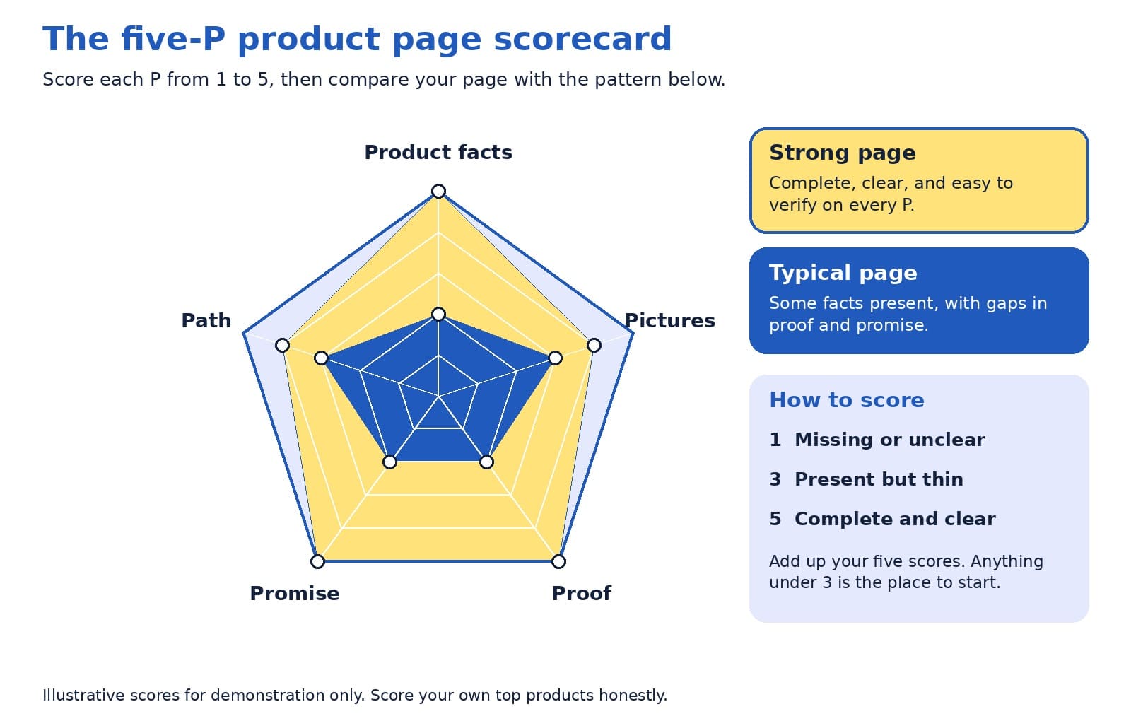
Look at the lowest point first, then at the pattern across your five pages. If the same P is low everywhere, such as proof or promise, the fix probably lives in your page template, and one change can lift every product at once.
On the page and behind the page
Shoppers read what is on the page. AI assistants and search engines also read the data behind it, through structured data and product feeds. The two should always match, since a mismatch creates doubt for people and for machines.
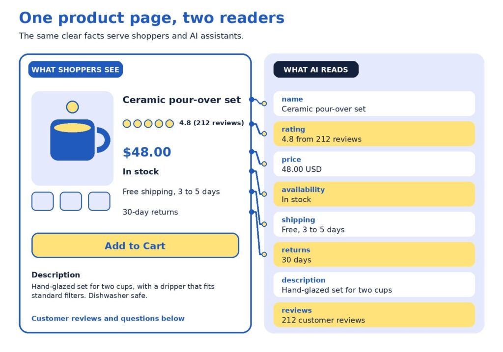
The example uses a fictional ceramic coffee set. Here is how to read it:
- The name is specific. “Ceramic pour-over set” says more than a code such as Set 02.
- The rating shows proof. A score with the number of reviews gives shoppers confidence.
- The price matches. The same number appears on the page and in the data.
- Stock status is current. Google lists availability among the details used for shopping results (Google Search Central, 2025b).
- Shipping is stated plainly. Delivery time and cost sit where shoppers decide.
- Returns are clear. A visible return window reduces hesitation.
Google’s guidance for structured data offers a helpful rule of thumb for this layer:
“as much rich product information as available”
Google Search Central (2025b)
A worked example
Here is how an audit might look for one product. The table shows a starting point and a stronger version of the same fictional coffee set.
| Page element | Starting point | Stronger version |
|---|---|---|
| Title | Set 02 | Ceramic pour-over coffee set for two, hand-glazed |
| Description | Great quality. Order today. | Size, materials, what is included, care instructions, and who it suits |
| Price and stock | Price appears at checkout | Price and stock status on the page, kept current automatically |
| Shipping and returns | See our policy page | Delivery time, cost, and return window near the buy button |
| Proof | No reviews yet | Reviews with ratings, plus answers to common questions |
Scored with the rubric, the starting page might receive 2 for product facts, 3 for pictures, 2 for proof, 2 for promise, and 3 for path. The lowest scores are proof and promise, so that is where to begin. Moving shipping and return details beside the buy button takes minutes, and inviting recent buyers to leave reviews builds proof steadily over the following weeks. After those two fixes, a clearer title and description lift the product facts score, and the page moves toward the strong pattern without a redesign.
The weakest-link rule
Here is a perspective that surprises some owners: your lowest score matters more than your average. A page with beautiful photos, a rich description, and no visible return policy may feel strong on paper, and a hesitant shopper still reads the gap. The same is true for machines, since one missing or conflicting fact, such as a price that differs between page and feed, can reduce confidence in everything else.
A product page is only as persuasive as its weakest P.
For that reason, we suggest raising your lowest P to a 3 on every top page before polishing any P to a 5. Once all five Ps reach at least a 3, tracking how assistants describe your products becomes a worthwhile next step, and our AI visibility and GEO services are designed for that stage. After that, AI-powered predictive analytics can help you decide which products to stock and promote.
Fix first: the impact and effort map
An audit usually produces a long list, so it helps to rank it. The map below sorts common fixes by impact and effort. Start with the top-left group, which delivers meaningful gains for modest work, then plan the top-right group as projects.
Placement on the map depends on your store. A shop with an automated feed may find that matching price and stock takes minutes, and a store with a custom checkout may find that mobile speed is a bigger project. Use the map as a conversation starter with your team, and move items to where they truly sit for you.
Technical checks behind the page
Structured data and product feeds
Google describes two kinds of product markup: product snippets for pages where people cannot buy directly, and merchant listings for pages where they can. It also recommends adding return policy information nested under your organization markup and marking up product variants, and it notes that providing both structured data and a Merchant Center feed maximizes eligibility (Google Search Central, 2025b).
ChatGPT’s commerce documentation describes product feeds in a similar way, as the route for sharing structured catalog data so products can be indexed and presented accurately (OpenAI, n.d.). Programs in this area change often, so check current documentation. Setup is usually a one-time job for a developer or a SEO company in Delhi.
Links, speed, and mobile
Search engines discover products by following links, so menus and category pages should link to products with standard links. Speed and mobile layout matter too, and Baymard’s 2026 benchmark shows the mobile bar is high, with 62% of mobile sites rated mediocre or worse for product pages (Scott, 2026). If app-like mobile shopping interests you, our guide to progressive web apps for ecommerce explains when they are worth the investment.
Modern storefronts
If your store runs on a headless setup, confirm that product details are visible when search engines load the page. Google suggests deploying a few pages with structured data and using the URL Inspection tool to see how Google views them (Google Search Central, 2025b). Our article on headless ecommerce explains when this approach suits smaller stores.
Trust and security
Trust includes a safe checkout. Secure connections, regular updates, and careful handling of payments protect customers and your reputation. For practical steps, read our guide to ecommerce security practices and our overview of AI-powered cybersecurity for ecommerce stores.
A 15-minute monthly habit
Product pages change as prices, stock, and policies change, so a short routine keeps them healthy. Once a month, set aside 15 minutes for these checks:
- Open your top five pages on a phone and confirm that price, stock, and shipping details are correct.
- Read the newest reviews and questions, and add answers to the page.
- Compare the page, feed, and checkout for any mismatch in price or availability.
- Re-score your lowest P and note whether it improved.
If you would like a second opinion, send us your top product pages. We will score them with the five-P rubric and return a short, ranked list of fixes.
Quick answers to common questions
How many pages should I audit? Five is enough to spot patterns without taking long. Include your best sellers and one product with plenty of visits and few sales, since that product often reveals what needs fixing.
How often should I re-run the audit? A full audit every quarter works well for many stores, with the 15-minute check each month. Re-run it after a redesign, a platform change, or a change to shipping or return policies.
Who should score the pages? Ideally, two people: someone who knows the product well, and someone who has never seen it. The newcomer’s questions often point straight at the thinnest P.
What if I have no reviews yet? Start by inviting recent buyers to share honest feedback, and answer the questions customers ask most on the page. A short, clear answers section builds proof while reviews grow.
What score is good enough? A 3 on every P is a solid foundation, and a 4 or 5 on the Ps that matter most to your customers is a strong goal. Apparel shoppers may care most about pictures and sizing, while buyers of technical products may care most about product facts.
Is this worth doing for a small store? Yes. A smaller catalog means you can bring every page up to a strong standard, and clear pages help shoppers and search tools alike.
One weak spot at a time
A product page audit turns a vague worry into a short, ranked to-do list. Score the five Ps, fix the lowest one first, match what is on the page with the data behind it, and repeat a small check every month. Each improvement helps shoppers decide and gives AI assistants and search engines clearer facts to work with.
Want help putting the scorecard to work? Our team handles ecommerce website design that builds the five Ps into every product page, and as a website design company in Delhi we create stores that are fast, clear, and easy to buy from. Our SEO company in Delhi specialists help those pages get found, and our AI visibility and GEO services help your products appear in AI answers.
References
Baymard Institute. (2026). Average documented online shopping cart abandonment rate. https://baymard.com/lists/cart-abandonment-rate
Google Search Central. (2025a, December 10). Help Google understand your ecommerce website structure. Google for Developers. https://developers.google.com/search/docs/specialty/ecommerce/help-google-understand-your-ecommerce-site-structure
Google Search Central. (2025b, December 10). Introduction to Product structured data. Google for Developers. https://developers.google.com/search/docs/appearance/structured-data/product
Google Search Central. (2026, July 10). Optimizing your website for generative AI features on Google Search. Google for Developers. https://developers.google.com/search/docs/fundamentals/ai-optimization-guide
OpenAI. (n.d.). Agentic commerce: Full documentation. https://developers.openai.com/commerce/llms-full.txt
Perez, S. (2026, April 16). AI traffic to US retailers rose 393% in Q1, and it’s boosting their revenue too. TechCrunch. https://techcrunch.com/2026/04/16/ai-traffic-to-us-retailers-rose-393-in-q1-and-its-boosting-their-revenue-too/
Scott, E. (2026). Product page UX 2026: 10 pitfalls and best practices. Baymard Institute. https://baymard.com/research-articles/current-state-ecommerce-product-page-ux


AI Can Recommend Your Product, but Only Your Product Page Can Sell It
Depending on which 2026 survey you read, somewhere between 34% and 77% of US shoppers have already used AI to help them buy something, yet the most common amount people said they would let an AI spend for them on its own was $0 (TechWyse, 2026; Supermarket News, 2026). Read that again, because it holds the whole opportunity: shoppers are happy to let AI build the shortlist, but they still want to see the product with their own eyes before they pay. That moment of looking is your product page, and it has quietly become the most valuable real estate in your store.
If you run an online store, this is good news. You do not need to chase every new AI feature to benefit from this shift. You need product pages that a machine can understand in a second and a human can trust in five, and that is a problem we know how to solve.
TL;DR
- AI assistants are now part of how people find products, but shoppers still make the final call on your product page.
- Every product page has two readers: a machine that checks your facts and a person who decides whether to trust you.
- Strong basics (accurate product data, clear photos, honest answers, fast loading) beat clever tricks.
- Fix your product pages first, then spend on anything labeled “AI optimization.”
In this blog
- The comfortable truth about AI shopping
- How an AI shopping answer finds your product
- The Two-Reader Product Page
- Reader one: make the machine’s job easy
- Reader two: make the human’s decision easy
- The take few agencies will say out loud
- The ten-point scorecard
- The foundation under the page
- Freelancer, agency, or in-house team?
- A 30-day plan you can start this week
- Quick answers
The comfortable truth about AI shopping
It is easy to read the headlines and conclude that AI is about to swallow online shopping whole, with bots comparing prices, picking winners, and checking out without a human anywhere in sight. The data tells a calmer and, for store owners, a more encouraging story. A Semrush-owned research platform surveyed 1,009 US consumers and found that 77.6% had used AI to help with a shopping decision in the previous six months, while the most common spending limit they would authorize for fully autonomous AI purchases was zero dollars (TechWyse, 2026).
Forrester’s March 2026 community survey points the same direction: people who regularly use answer engines said that finishing a purchase inside the chat was their least-adopted use, far behind asking general questions and researching product rankings (TechWyse, 2026).
Trust is the reason, and it shows up in other studies too. McKinsey’s State of the Consumer 2026 report found that 26% of consumers use generative AI for shopping, which makes shopping the top use of the technology, yet shoppers still place more trust in personal recommendations, experts, traditional search engines, and online stores than in AI-generated answers (Modaes, 2026).
Acosta Group’s study found that only 22% of shoppers who use AI for shopping trust agents to make purchases for them (Supermarket News, 2026), and Omnisend reports that a significant share of consumers worry AI favors sponsored or paid products (Omnisend, 2026).
Put those findings side by side and a clear picture forms. AI is becoming the front door to product discovery, but people still walk through your door to buy, and when they arrive they are better informed and more demanding than a typical browser. Adobe’s numbers show how quickly that has changed. In early 2025, visitors arriving from generative AI sources were 9% less likely to convert than other traffic (Adobe, 2025).
By the 2025 holiday season, Adobe measured AI referrals converting 31% better than other sources, with visitors 33% less likely to leave right away, and traffic to retail sites from AI tools up 693% year over year (Pandya, n.d.). Those visitors arrive with a short list and a purpose, which means your page has less room for vague copy and more reason to shine.
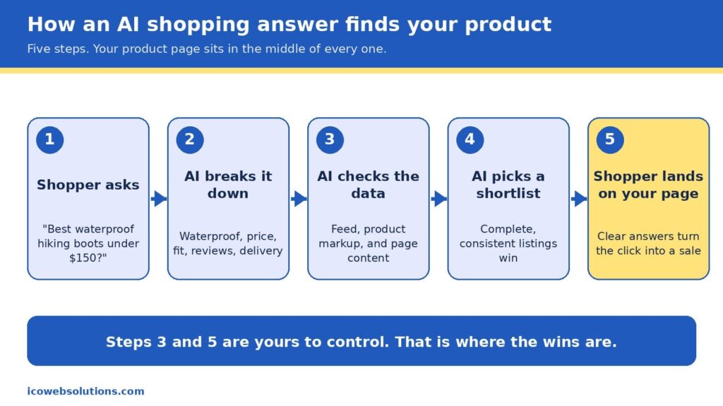
How an AI shopping answer finds your product
When a shopper types something like “best waterproof hiking boots under $150 that ship by Friday,” the assistant does not browse the web the way a person would. It breaks the request into pieces (waterproof, price ceiling, delivery date, fit, reviews), then looks for products whose data matches every piece. In Google’s case, that data comes from the Shopping Graph, a product database that, according to reporting on Google’s own figures, holds more than 50 billion listings, with about 2 billion updated every hour (Channable, n.d.). The graph is filled by the product feeds merchants submit and by the product markup on their pages, which is the hidden labeling that tells machines what a page is selling, what it costs, and whether it is in stock.
It is worth being precise here, because plenty of vendors are not. Google has not confirmed that Merchant Center data works as a direct ranking signal in AI Mode, but the product graph that feed data builds is shared infrastructure behind several of its shopping surfaces, so accurate and consistent data helps in both places (Alhena, n.d.). There is also no secret “AI schema” to install. The same product markup that has helped pages earn rich results for years is what machines read today, and the real difference is that AI systems tolerate gaps and contradictions far less than a human shopper skimming a page.
That is why the phrase “AI shopping is built on the basics” is more than a slogan. The assistant is choosing from what you have published, so the quality of your product title, price, availability, images, reviews, and return policy decides whether you make the shortlist at all. Once you do make it, the shopper clicks through and your page has to confirm what the assistant promised. In other words, the machine opens the door and the page closes the sale, which is exactly why we think of every product page as having two readers.
The Two-Reader Product Page
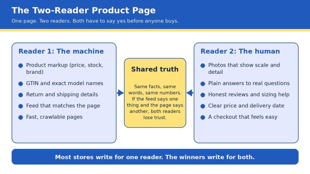
Here is the framework we use with ecommerce clients at ICO Web Solutions, and it is simple enough to remember in five seconds: every product page is read twice, once by a machine and once by a human, and it only sells when both say yes. The machine asks whether your facts are complete, consistent, and easy to verify. The human asks whether you are believable, whether the product fits their situation, and whether buying will be easy. Most stores are written for one of these readers. Some are crammed with keywords and markup but read like a spec sheet, while others are beautiful and persuasive but invisible to anything that cannot see the design.
The bridge between the two is what we call shared truth, meaning the same facts, the same words, and the same numbers everywhere they appear. If your feed says a jacket is in stock, your page says it ships in two weeks, and your reviews mention a different color, then a machine sees a conflict and a person feels a doubt, and both of them move on to the next listing. Shared truth is not glamorous work, but it is the closest thing to a free advantage in ecommerce right now, because most of your competitors have not done it.
Reader one: make the machine’s job easy
Machines are literal, patient, and unforgiving, so the best way to help them is to remove every reason to guess. Start with the basics a product page must state clearly: an exact product name that includes brand, model, and the attributes people search for, the current price and currency, availability, the barcode number (known as a GTIN) where one exists, and clear shipping and return terms. Then make sure those same details appear in your product markup, not just in the visible copy, because that markup is what many systems read first. Return policy information has also been required for Google merchant listings since 2025, so this is one of those details that has moved from nice to have into required territory (Xictron, 2026).
The next step is consistency across systems. Your store platform, your Merchant Center feed, your marketplace listings, and your on-page markup should all pull from a single source of truth, ideally a product information system or at least one carefully maintained spreadsheet that feeds everything else. A feed that disagrees with the page is one of the most common reasons good products underperform, and it is also one of the cheapest to fix. If you are rebuilding or replatforming, this is the ideal time to get it right, and our team handles it as part of ecommerce website design and development so that structured data is built into the templates rather than patched on later.
Finally, give machines something worth quoting. AI assistants tend to favor pages that answer real questions in plain language, so a short section covering what the product is best for, who it is not for, how it compares with the obvious alternative, and what customers most often ask will serve both readers at once. If you want help seeing how your catalog currently appears in AI answers,our AI visibility and GEO services can show you how your catalog appears today, and our SEO company in Delhi team makes sure the traditional search foundations are just as strong.
Reader two: make the human’s decision easy
People decide quickly, and they decide with their eyes first. In Baymard Institute’s large-scale product page testing, 56% of users began by exploring the product images, even in cases where reading the description would have been faster (Baymard Institute, n.d.-b). The same research found that 52% of sites do not add descriptive text or graphics to the images of their top-selling products, which leaves shoppers guessing about scale, weight, material, or fit. That gap is an opportunity, since a few well-chosen captions, a size comparison, or a close-up of the stitching can answer a question before it becomes a reason to leave.
Speed is the other half of the human experience, and it is more forgiving to fix than most owners expect. Google’s research found that as mobile page load time goes from one second to three seconds, the probability of a visitor bouncing rises by 32%, and from one second to ten seconds it rises by 123% (Think with Google, n.d.). Heavy images, bloated apps, and unnecessary scripts are the usual culprits, and trimming them tends to lift every other metric on the page. If your store feels slow on a phone, a fresh look from a website design company in Delhi that builds with performance in mind can pay for itself quickly.
Trust is the third piece. Honest reviews (including a few critical ones), clear sizing help, visible return terms, and a price and delivery date that never change between the search result and the cart all tell a shopper that you mean what you say. This matters even more now, because the shopper arriving from an AI answer has often already been told your product is a good fit and is simply looking for a reason to believe it. Baymard’s benchmark of leading US and European sites found that 44% had mediocre or worse product page experiences in one update (Baymard Institute, n.d.-a), so a store that gets these details right stands out quickly.
The take few agencies will say out loud
Here is the part that may make some of our own industry uncomfortable: if your product pages are thin, inconsistent, or slow, you should not buy an “AI optimization” package yet. Every month a new vendor promises to make your brand visible to chatbots, and some of them offer real value, but none of them can compensate for a catalog with missing sizes, mismatched prices, and photos that do not show the product. AI systems prioritize products with complete, structured data over products backed by bigger marketing budgets, and that rewards the patient work of cleaning up the basics over any shortcut (Xictron, 2026).
We say this as an agency that sells AI visibility work, and we say it because it is true and because it builds better long-term relationships. Acosta Group’s advisors reached a similar conclusion in their 2026 shopper study, recommending that brands begin with what they call the brilliant basics of retailer readiness before layering on AI discoverability and experiments (Supermarket News, 2026). The sequence matters: fix the page, align the data, then amplify. Reverse that order and you pay to send more visitors to a page that is not ready for them.
The ten-point scorecard
Before you spend another dollar, open your top five best-selling product pages and check each one against this list. Every yes is worth roughly a point, and anything under eight tells you where to start.
- The product title includes brand, model, and the one or two attributes shoppers actually search for.
- Price, currency, and availability match across your page, feed, and markup.
- Product markup is present and passes a rich results test.
- The barcode number (GTIN) and brand are filled in wherever they exist.
- Shipping time and return terms are visible without scrolling or clicking.
- Photos show scale, detail, and the product in use, with captions where words help.
- A short “best for, not for” section answers the top three customer questions.
- Reviews are visible, recent, and include honest critical feedback.
- The page loads in about three seconds or less on a mid-range phone.
- Checkout is reachable in two taps from the product page.
The foundation under the page
A great product page sits on top of technology, and three parts of that foundation deserve attention because they quietly shape both readers’ experience. The first is security. Shoppers who arrive from an AI recommendation are trusting someone else’s judgment, and one warning screen or suspicious checkout can undo that trust instantly. If you want a practical overview, our guides on how top brands keep their sites safe and AI-powered cybersecurity for ecommerce stores walk through the habits that protect revenue and reputation together.
The second is architecture. Flexible, fast storefronts make it far easier to keep data clean and pages light, which is one reason we have seen that headless ecommerce is no longer just for big brands, and why progressive web apps for ecommerce deserve a fair look if your shoppers are mostly on phones. Neither is right for every store, so the honest answer is to match the build to your catalog size, team, and budget rather than chase the trend.
The third is learning from your own numbers. Once the basics are in place, AI-powered predictive analytics can show you which products are about to trend, which pages leak the most visitors, and where a small fix would lift sales most. Used in that order (basics first, prediction second), the technology amplifies a strong page instead of masking a weak one.
Freelancer, agency, or in-house team?
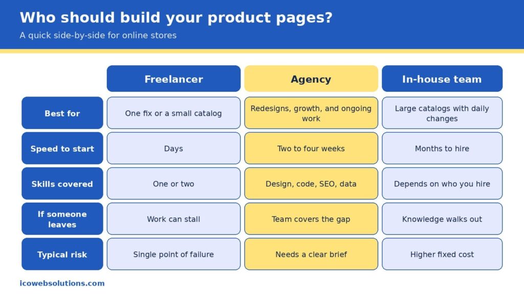
Once you know what your pages need, the practical question becomes who should do the work, and the honest answer depends on the size of the job and how long it will last. A freelancer is often the fastest and most affordable way to fix one specific problem, such as rewriting a batch of product descriptions or cleaning up markup on a small catalog, and a great one can be a joy to work with. The risk is concentration, since one person carries the design, code, search, and data knowledge in a single head, so a sick day, a new client, or a career change can stall your project right when it matters.
An in-house team gives you the deepest knowledge of your products and the tightest day-to-day control, which is ideal for large catalogs that change every day. It also brings the highest fixed cost, a hiring timeline measured in months, and the challenge of keeping specialists current in fields that change quickly. Many in-house teams do their best work when they have a partner to lend extra capacity and fresh perspective during redesigns and launches.
An agency sits in the middle by covering design, development, search, and data under one roof, so the work moves in parallel, and the knowledge does not live in one person. The trade-off is that you need to give a clear brief and choose a partner who understands ecommerce rather than websites in general. Our view is simple: pick the smallest option that can fully own the outcome. If you have a single contained fix, hire a freelancer. If you run a large operation with steady needs, build in-house. If you are redesigning, replatforming, or trying to grow visibility across search and AI at the same time, an agency usually gets you there faster and with fewer surprises.
Read more: Freelancer vs Agency vs In-House: How to Choose the Marketing Team That Fits Your Business Right Now
A 30-day plan you can start this week
You do not need a six-month roadmap to make progress, and a focused month can change how both readers experience your best products. In the first week, run the scorecard on your top five pages and write down every mismatch between your page, feed, and markup, because that list becomes your repair queue. In the second week, fix the facts: titles, prices, availability, barcode numbers, and return details, in the single source your systems share. In the third week, upgrade the human experience with better photos and captions, a short “best for, not for” section, and a speed pass that removes anything the page does not need.
In the final week, measure and expand. Compare conversion, bounce rate, and revenue per visit on the updated pages with the ones you have not touched yet, then roll the winning pattern to the rest of the catalog. By the end of the month you will have a repeatable template, evidence of what works for your customers, and a clean foundation that makes any later AI visibility work far more effective.
Quick answers
Do I need special markup for AI shopping?
No special AI-only markup exists. The standard product markup used for search and Google Shopping is what machines read, so the priority is making it complete, accurate, and consistent with your feed and page.
Will AI shopping replace my product pages?
The data suggests not soon. Shoppers are comfortable letting AI research and compare, but most are not ready to let it complete purchases, so your page remains the place where the decision is confirmed.
How long does it take to see results?
Fixes to speed, photos, and on-page answers can influence conversion within weeks, while changes to how search and AI systems understand your catalog tend to build over a longer period as the data is recrawled and refreshed.
Ready to make your product pages work for both readers?
If you would like a second set of eyes on your store, the ICO Web Solutions team can walk through your top product pages with you using the Two-Reader framework and help you turn the findings into a short, prioritized fix list, whether you build it with us or on your own. Start by telling us about your store on our ecommerce website design and development page and we will suggest clear next steps. Your shoppers are already asking AI for recommendations, and with the right product pages you can be the answer they click.
References
- Adobe. (2025, March 17). Adobe Analytics: Traffic to U.S. retail websites from generative AI sources jumps 1,200 percent. Adobe Blog. https://blog.adobe.com/en/publish/2025/03/17/adobe-analytics-traffic-to-us-retail-websites-from-generative-ai-sources-jumps-1200-percent
- Alhena. (n.d.). Two feeds, one shopper: How Google Shopping and AI visibility converge in 2026. https://alhena.ai/blog/google-shopping-ai-visibility-convergence/
- Baymard Institute. (n.d.-a). Product page UX. https://www.baymard.com/research/product-page
- Baymard Institute. (n.d.-b). Product page UX: Include descriptive text or graphics for some product images (52% don’t). https://baymard.com/research-articles/product-images-descriptive-text
- Channable. (n.d.). Google AI Mode for shopping: How it works and what merchants need to do. https://www.channable.com/blog/google-shopping-ai-mode
- Modaes. (2026). One in four consumers uses AI to shop, with Gen Z leading the way. https://www.modaes.com/global/markets/one-in-four-consumers-uses-ai-to-shop-gen-z-is-leading-the-way
- Omnisend. (2026). AI shopping report. https://www.omnisend.com/resources/reports/ai-shopping-report/
- Pandya, V. (n.d.). Adobe: AI-driven traffic surges across industries with retail experiencing biggest gains. Adobe for Business. https://business.adobe.com/blog/ai-driven-traffic-surges-across-industries
- Supermarket News. (2026, September 18). AI is becoming a shopping channel: Report. https://www.supermarketnews.com/grocery-technology/ai-is-becoming-a-shopping-channel-report
- Think with Google. (n.d.). Find out how you stack up to new industry benchmarks for mobile page speed. https://thinkwithgoogle.com/marketing-strategies/app-and-mobile/mobile-page-speed-new-industry-benchmarks/
- TechWyse. (2026). 77% of US consumers now use AI to shop, but most won’t let it spend their money. https://www.techwyse.com/news/ai-search/ai-shopping-adoption-consumer-distrust-autonomous-spending-2026
- Xictron. (2026). Product data AI optimization: Structured data 2026. https://www.xictron.com/en/blog/product-data-ai-optimization-structured-data-2026/

The Agent-Ready Website: What Changes When AI Agents Start Using Websites for Users
Websites were built around a human operating the interface. A visitor reads the page, compares information, chooses an option, fills in a form, and receives a visual confirmation when the task is complete. That operating model is becoming less exclusive. AI agents can already search for information, interpret product and service details, interact with forms, manage shopping carts, and perform parts of a transaction on a user’s behalf.
The change is no longer theoretical. On September 28, 2026, Shopify added WebMCP support for checkout, allowing browser agents to read and update checkout information and submit a purchase after buyer confirmation. Shopify’s existing storefront and cart tools mean an agent can now participate across much more of the shopping process rather than simply reading a product page.
For website owners and developers, that introduces a different engineering problem. The question is no longer only whether a page can be found and understood by search systems. A website increasingly needs to make its information, actions, permissions, and resulting state clear enough for software to use without taking control away from the person it is assisting.
SEO Still Matters, But It Is Not the Whole Problem
It would be a mistake to treat agent-ready development as a replacement for SEO.
Google’s current guidance for AI Overviews and AI Mode says the existing foundations of SEO remain relevant. Google does not require special AI markup or a separate machine-readable file for a page to be eligible for those search experiences; crawlability, internal linking, textual content, page experience, and accurate structured data remain important.
The difference appears when the task moves from finding information to completing an action. A search system may need to determine what a product is, whether a page is relevant, and what information supports the answer. An agent asked to purchase that product has additional requirements. It needs to identify the correct product and variant, understand available actions, provide the right inputs, preserve the transaction state, and determine whether the purchase was actually completed.
A website can therefore be technically healthy for search while still being difficult for an agent to operate. For example, consider an appointment-booking website. A human user can choose a service, select a time from a visual calendar, enter contact details, submit the form, and recognize the confirmation message. An agent-ready workflow needs those same steps to be explicit: the available services and time slots must be identifiable, required inputs must be clearly defined, the booking action must produce a predictable result, and the system must indicate whether the appointment was confirmed, is pending, or failed.
That distinction becomes easier to understand when separating the two requirements:
- Search accessibility: Can systems discover, crawl, interpret, and retrieve the website’s information?
- Agent usability: Can software identify an appropriate action, provide the necessary inputs, and determine what happened afterward?
- Operational control: Can the website restrict what the agent is allowed to read or change?
Traditional SEO addresses much of the first requirement. Agent-ready architecture extends the second and third.
AI Visibility Is Not the Same as Agent Readiness
AI visibility and agent readiness are related, but they solve different problems. AI visibility focuses on whether AI systems can discover, understand, and surface information from a website. Agent readiness focuses on whether software can use that information to interact with the website and complete a permitted task.
The distinction becomes clearer when separating the two requirements:
- AI visibility: Can AI systems understand and retrieve the website’s information?
- Agent readiness: Can an AI agent identify the appropriate action, provide the required inputs, and determine what happened after the action?
Consider a service website that clearly explains its consultation options, pricing, availability, and location. An AI system may be able to use that information to answer a user’s question about the service. An agent asked to book an appointment has additional requirements.
It needs to:
- Identify the service: Determine which consultation the user wants.
- Check availability: Retrieve valid appointment dates and times.
- Provide inputs: Submit the required customer and booking information.
- Execute the action: Complete the booking within its permitted scope.
- Verify the outcome: Determine whether the appointment was confirmed, is still pending, or failed.
This creates an important difference between being understandable to AI and being operable by AI. The two areas still share several foundations. Clear textual content, consistent terminology, accurate structured data, semantic markup, and well-defined information can help AI systems interpret a website. Agent readiness extends those foundations into the website’s interactive and transactional layers.
For website teams, the practical question therefore changes from:
“Can AI understand this website?” to:
“Can authorized software safely use its information and perform its important actions?”
That distinction becomes particularly important when websites move from presenting information to supporting bookings, purchases, enquiries, account changes, and other user tasks.
Pages Need Clearer Meaning
Human users are remarkably good at filling in gaps. A customer can look at a service page, infer that a blue button opens an appointment form, understand which field expects a company name, and recognize that a confirmation message means the request was accepted.
Software has less room for inference when it is responsible for performing the task correctly.
This makes semantic HTML, consistent naming, accessible labels, visible textual information, and accurate structured data more important at the implementation level. Google already recommends that important content be available in textual form and that structured data accurately reflect what users can see on the page. The goal is not to add unnecessary markup to every element. It is to remove ambiguity from the parts of the website that carry business meaning.
For example, a product page should make the following information easy to identify:
- Product name, model, and variant
- Price, currency, and current availability
- Delivery or service conditions
- Relevant policies and restrictions
- Actions available to the user
A service website has a similar requirement. A consultation page should distinguish its description from the scheduling process, identify required information, and make the confirmation state unambiguous. A clearer interface helps humans too. Agent compatibility is therefore often an extension of good information architecture rather than a completely separate discipline.
Important Actions Need Defined Interfaces
The larger architectural change comes when an agent has to operate rather than simply read a page.
Chrome’s WebMCP project is designed around this problem. WebMCP is a proposed web standard for exposing structured tools to AI agents, including through JavaScript and annotated HTML forms. Its declarative API, updated in September 2026, can turn a standard HTML form into a structured tool by defining its name, description, and input fields.
This matters because agents should not have to discover every business action by imitating a human mouse click. A reservation form, for example, may require a date, location, party size, and contact details. A structured interface can define those inputs explicitly, reducing the need for an agent to infer what each field means from surrounding page content.
Chrome’s WebMCP guidance recommends clear tool descriptions, semantic HTML, defined input schemas, reliable outputs, and testing. That is closer to API design than to traditional page optimization. When reviewing important website actions, developers should look for:
- Explicit inputs: Required values should be identifiable without relying on visual placement.
- Clear constraints: Valid ranges, formats, and available choices should be defined.
- Predictable outputs: The system should return a meaningful result rather than forcing the agent to infer success from a page change.
- Recoverable failures: Invalid or incomplete requests should return enough information for the next step to be understood.
Not every website needs WebMCP immediately. Chrome currently describes it as a proposed standard and notes limitations around browser support, tool discovery, and complex interfaces.
The broader lesson is already useful: important website actions should have explicit, predictable interfaces whether those interfaces are delivered through WebMCP, conventional APIs, forms, or another implementation.
Successful Actions Need Verifiable State
An agent cannot reliably complete a task simply by sending an instruction; it also needs to know what happened afterward.
That requirement becomes obvious in commerce. An order may be submitted successfully, rejected by a payment provider, held for additional verification, or accepted with a different delivery estimate. A human can often resolve such situations by reading the interface. An agent needs a structured and unambiguous representation of the resulting state. Google’s Universal Commerce Protocol reflects this direction by providing standardized operations for areas such as identity linking, cart building, checkout, and order management. Its documentation also addresses booking, order status, and related machine-to-machine interactions across supported experiences.
The principle applies beyond ecommerce.
A lead form should return a meaningful status rather than merely changing the page. A support workflow should distinguish between “request received,” “information required,” “escalated,” and “resolved.” An appointment system should make the confirmed time and booking reference available in a form that software can reliably interpret.
For critical workflows, teams should therefore define:
- Successful completion: What exact state confirms that the task is finished?
- Pending state: What tells the agent that the system is still processing the request?
- Failure state: What information explains why the requested operation did not complete?
- Next action: What should happen when additional user input or human intervention is required?
This is an important distinction between a website that contains actions and one that can support reliable task completion.
| Website layer | Human-oriented implementation | Agent-ready consideration |
| Information | Text, images, navigation | Clear entities, fields, relationships, and current values |
| Actions | Buttons, menus, forms | Explicit operations with defined inputs |
| State | Visual confirmation | Structured success, pending, and failure states |
| Access | User login and session | Scoped authorization and permission checks |
| Measurement | Traffic and conversion | Task completion, failure, and handoff monitoring |
The underlying website architecture may remain familiar. What changes is the level of precision expected from each layer.
Authentication Becomes Part of the Interface
Giving an agent the ability to operate a website also creates a permissions problem. An authenticated user may have access to invoices, account settings, personal information, or payment details. That does not mean an agent should be allowed to perform every available action without additional controls.
Chrome’s security guidance for WebMCP specifically addresses the risks of agents operating within authenticated browser sessions. It warns about malicious instructions embedded in tool definitions and contaminated outputs from third-party content, and recommends signals such as readOnlyHint, consequentialHint, and untrustedContentHint to distinguish lower-risk operations from actions that require greater scrutiny.
That creates a useful engineering distinction between access and authority.
A website can allow an agent to retrieve an order status while requiring confirmation before cancelling an order. It can allow an agent to read account information while requiring a separate authorization step before changing billing details. For sensitive workflows, the control model should account for:
- Read-only versus state-changing permissions
- User confirmation for consequential operations
- Scoped and time-limited authorization
- Separation of financial and account-management privileges
- Logging of agent-initiated actions
- Clear human escalation paths
The same principle applies to payments, account deletion, permission changes, and other irreversible operations. Security therefore cannot be added after the agent interface is designed. The permissions model has to be part of the action model from the beginning.
Websites Will Need to Measure Agent Tasks Differently
Traditional analytics tell a business who visited, which pages were viewed, where users dropped out, and which sessions converted. Agent interactions produce different failure points.
An agent can find the correct product but select the wrong variant. It can understand the requested service but fail to submit the form because an input was ambiguous. It can complete an operation but receive an unclear confirmation and remain uncertain about whether the task succeeded. Those failures can disappear inside conventional page analytics.
The tooling emerging around WebMCP already reflects the need for more precise testing. Chrome DevTools can inspect WebMCP tools, invoke them, and examine their inputs, outputs, and errors during development.
For sites supporting agent-operated workflows, teams may eventually need to monitor:
- Task-completion rate
- Tool or API invocation failures
- Authentication and authorization failures
- Human handoff rate
- Repeated attempts
- Average actions required to finish a task
- Percentage of tasks ending with a verifiable outcome
The important metric is not whether an agent visited the site. It is whether the site allowed the agent to complete the intended task accurately and safely.
The Web Is Starting to Expose Capabilities, Not Just Content
The scale of the change remains uncertain, and adoption is still early. Cloudflare’s 2026 analysis of 200,000 of the most visited domains found established mechanisms such as robots.txt to be widespread, while newer agent-oriented mechanisms remained extremely rare. The company found MCP Server Cards and API Catalogs on fewer than 15 sites in that dataset.
That is not evidence that every website needs to implement every emerging standard immediately. It shows that the technical conventions for software-operated websites are still being established.
This matters for developers because infrastructure decisions made now can either preserve flexibility or create another layer of technical debt later. A site that separates business logic from presentation, exposes clean APIs, maintains accurate structured data, uses semantic markup, and treats authorization as a first-class concern has more options as agent interfaces mature.
A site whose important actions depend entirely on visual inference, undocumented state changes, brittle client-side behavior, or broad session permissions will have more work to do.
What Website Teams Should Test Now
The first step is not adding an agent-specific feature for its own sake. It is reviewing the site’s most important user tasks and asking whether their requirements are explicit at the machine level.
For each critical workflow, a team should be able to answer four practical questions.
Can the agent find the required information?
Important facts should be available in clear text, with accurate relationships between products, services, prices, policies, accounts, and other entities.
Can the agent identify the correct action?
Forms, buttons, APIs, and tools should expose clear names, inputs, constraints, and outputs.
Can the agent determine the result?
Success, failure, pending status, and required follow-up should be represented clearly enough for software to act on them.
Can the site limit what the agent is allowed to do?
Read access, state-changing operations, sensitive actions, and user confirmation should have deliberately different permission requirements.
A practical review can also examine the website through five implementation areas:
- Content: Are important facts present in text and consistently named?
- Interaction: Are high-value actions explicit and predictable?
- State: Can software identify what happened after an action?
- Security: Are permissions narrow enough for the task being performed?
- Observability: Can the development team identify where an agent workflow failed?
These checks can be performed without redesigning an entire website.
They also make the concept of agent readiness more concrete. Instead of asking whether a site has “AI features,” a development team can evaluate whether its core customer journeys remain understandable and controllable when software performs part of the work.
The Website Is Becoming an Operating Surface
Markntel Advisor projects the AI agent market to grow from $10.9 billion in 2026 to $110.5 billion by 2032. This growth highlights the need for websites to support secure, reliable agent-driven tasks.
The more useful question for website teams is not whether they should “prepare for AI” in the abstract.
It is whether their most important digital workflows are sufficiently clear, structured, secure, and observable for another software system to operate them reliably on behalf of a user. Search engines made websites compete for discoverability. Agent-based systems introduce another requirement: the site must also make its information and capabilities usable by software without creating uncertainty about permissions or outcomes.
The next generation of websites will still need good content, accessible interfaces, fast performance, and strong search foundations. They will also need to expose their important information and actions with enough precision that both people and software can use them safely.
The shift is not from websites to AI. It is from websites that primarily display information to websites that can support reliable tasks.
Sources/References:
- Shopify — WebMCP support for checkout
https://shopify.dev/changelog/posts/webmcp-support-for-checkout - Chrome for Developers — WebMCP
https://developer.chrome.com/docs/ai/webmcp - Chrome for Developers — WebMCP Declarative API
https://developer.chrome.com/docs/ai/webmcp/declarative-api - Chrome for Developers — WebMCP Best Practices
https://developer.chrome.com/docs/ai/webmcp/best-practices - Chrome for Developers — Agent Security Considerations for WebMCP
https://developer.chrome.com/docs/agents/security - Chrome DevTools — Debug WebMCP Tools
https://developer.chrome.com/docs/devtools/application/webmcp - Universal Commerce Protocol — Official Specification
https://ucp.dev/specification/overview - Cloudflare — Introducing the Agent Readiness Score
https://blog.cloudflare.com/agent-readiness - Google Search Central — AI Features and Your Website
https://developers.google.com/search/docs/appearance/ai-features - Google Search Central — Optimizing for Generative AI Features on Google Search
https://developers.google.com/search/docs/fundamentals/ai-optimization-guide - Markntel Advisor — AI Agent Market Research Report
https://www.marknteladvisors.com/research-library/ai-agent-market.html - Universal Commerce Protocol — Lodging Booking Capability
https://ucp.dev/draft/specification/lodging/booking

What a good contact page looks like (and why it often decides the sale)
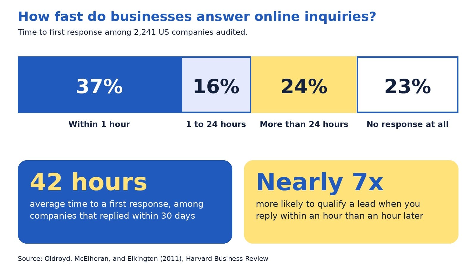
In a Harvard Business Review audit of 2,241 US companies, only 37% answered an online inquiry within an hour, 23% never answered at all, and the average first reply took 42 hours among companies that responded within 30 days (Oldroyd et al., 2011). Behind each of those numbers sat a real person who wanted to buy something.
Every one of those inquiries started on a contact page. A visitor had read enough, decided to reach out, and filled in a form or picked up the phone. That moment is where interest becomes a lead, and it is also where interest can fade. If you want to increase website inquiries, few pages repay your attention more than this one.
A fair caution: the audit is more than a decade old, so treat its exact figures as directional. The lesson still holds up well, and you can check your own numbers in a few minutes.
This guide explains, in plain English, what a good contact page includes, how to design the form, what to show so visitors trust you, and what to do after someone presses send. You will meet the four-R contact page model, see an annotated example, and finish with a 30-minute tune-up you can complete this week.
The quick answer
A good contact page makes it easy to reach you in the way each visitor prefers, asks for only what you need, shows proof that a real and responsive business stands behind the site, and keeps the promise it makes about reply time. A lead generation website works best when the contact page and your follow-up process work as one.
Inside this guide
- Why the contact page matters more than its size suggests
- Key terms in plain English
- The four-R contact page model
- Ready: easy to find and quick to use
- Reach: more than one way to get in touch
- Reassure: show a real business behind the page
- Form design: ask less and label clearly
- An annotated example
- Respond: the part that decides the sale
- A bolder view: the form is a promise, not a button
- Variations by type of business
- Common mistakes and easy fixes
- Quick answers to common questions
- A 30-minute contact page tune-up
Why the contact page matters more than its size suggests
On most websites, the contact page is one of the smallest pages. It is also one of the most important, because the people who reach it have already decided that you might be the right fit. They are no longer browsing. They are deciding whether to take a step toward you.
Many visitors also use the contact page to check that a real business stands behind the site. The Stanford Persuasive Technology Lab, which has published research-based guidelines for web credibility, lists one of them in just six words:
“Make it easy to contact you.”
Stanford Persuasive Technology Lab (n.d.)
The same guidelines explain that clearly showing a phone number, a physical address, and an email address can boost a site’s credibility, and that listing a physical address helps show a legitimate organization is behind the site (Stanford Persuasive Technology Lab, n.d.). In other words, your contact page does two jobs at once: it collects inquiries, and it builds trust before anyone writes a word.
Think of your website as a chain with four links: attract visitors, persuade them, invite them to act, and follow up. The contact page is the third link, and a weak one reduces the payoff from the design, search, and advertising work that came before it.
Key terms in plain English
A few words appear often in this guide. Here is what they mean:
- Lead: a person who has shown interest, such as by sending a message.
- Conversion rate: the share of visitors who take an action. If 100 people visit and 5 send a message, the rate is 5%.
- Call to action: the next step you invite a visitor to take, such as Request Quote.
- Form field: one box in a form, such as Name or Email.
- Tap-to-call link: a phone number that starts a call when tapped on a phone.
- Auto-reply: an automatic message that confirms you received an inquiry.
The four-R contact page model
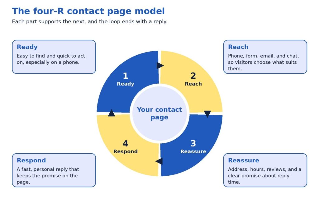
A good contact page is easier to plan when you break it into four parts. We call this the four-R contact page model, and each R answers a question a visitor may be asking.
- Ready: Can I find this page and use it quickly, even on my phone?
- Reach: Can I contact you in the way I prefer?
- Reassure: Is there a real, trustworthy business behind this?
- Respond: Will someone answer me soon, and will I know what happens next?
Most businesses spend their effort on the first two Rs, which are the visible design choices. The last two decide whether the inquiry becomes a customer, and they are the ones that get the least attention. The sections below take each part in turn.
Ready: easy to find and quick to use
Visitors cannot contact you if they cannot find the page. Put a plain Contact link in your main menu, repeat it in the footer, and show your phone number in the header so it is visible on every page. A label such as Contact or Contact us tells visitors exactly what they will find, which is usually better than a creative name.
Once visitors arrive, keep the page focused. Remove sidebars, pop-ups, and long promotional text, because every extra element competes with the one action you want, and make sure the page loads quickly on a phone.
A short form or a clear button at the bottom of each service page also lets a motivated visitor act right away.
Reach: more than one way to get in touch
People differ in how they like to contact a business. Some want to call and hear a voice, some prefer to write a message when it suits them, and some want to book a time on a calendar. A good contact page offers a primary option and one or two alternatives. Typical choices include a phone number with a tap-to-call link, a contact form, an email address, a chat window, and a booking link.
Match the primary option to your business. A heating and cooling contractor whose customers need urgent help may lead with the phone number. A consulting firm whose buyers need to explain a complex project may lead with a form and a calendar link. In both cases, showing the other options costs little and respects each visitor’s preference.
Reassure: show a real business behind the page
At the moment of contact, a visitor often feels a small amount of doubt: will anyone read this message, and is this company legitimate? Reassurance removes that doubt, and the Stanford guidelines point to the ingredients, namely a phone number, a physical address, and an email address (Stanford Persuasive Technology Lab, n.d.).
You can add more. Business hours tell visitors when to expect an answer, and a photo of the person who will reply makes the exchange feel human. A short review or rating near the form shows that others had a good experience, and a one-line privacy note, such as “We use your details only to reply to you,” helps people feel comfortable sharing an email address. Above all, state a clear promise about reply time, as long as you can keep it.
A contact page is a promise. The reply is how you keep it.
Form design: ask less and label clearly
The form is the heart of most contact pages, and research supports keeping it simple. A study by Google’s User Experience Research team and the University of Basel took three real online forms of low, medium, and high quality, improved them using established guidelines, and tested both versions with 65 participants. The improved forms led to faster completion, more successful first-time submissions, and higher satisfaction, and even the high-quality form improved (Bargas-Avila & Seckler, 2014).
The study also points to the changes that mattered most. Participants benefited when rules about format were stated before submission, when error messages appeared next to the field with the problem, and when optional and required fields were easy to tell apart. Placing labels above the fields helped people scan the form with less effort (Bargas-Avila & Seckler, 2014).
For a typical business, a strong starter form has four to five fields: name, email, an optional phone number, and a message box with a prompt such as “How can we help?” If your team qualifies leads, one extra question, such as which service the person needs, can help you reply with the right information. Every additional field gives a visitor another reason to pause, so add one only when your team will use the answer.
A few details finish the job. Use a button label that says what happens next, such as Request Quote or Book Call, and avoid a bare Submit. Keep labels visible above each field, because placeholder text inside a box disappears as soon as someone starts typing.
This also supports accessibility: the Web Content Accessibility Guidelines, a standard published by the World Wide Web Consortium, include a basic requirement that content asking for user input provides labels or instructions (World Wide Web Consortium, 2023).
Finally, choose spam protection that works quietly in the background, so real visitors never need to solve a puzzle.
An annotated example
The mockup below shows how these ideas fit together on one page for a fictional local business. The business name, number, and reviews are illustrative, so please replace them with your own details. The layout uses two columns on a computer, with the form on the left and supporting details on the right, and the same elements stack in one column on a phone.
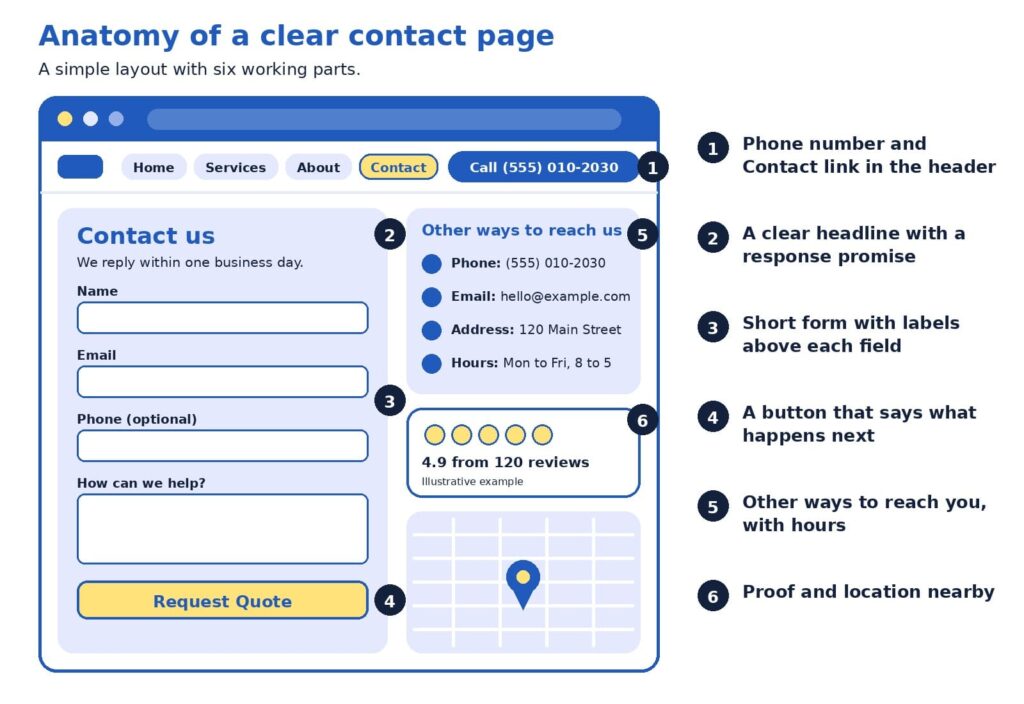
Here is how to read it, following the numbers:
- The header carries a Contact link and a phone number. A visitor on any page can reach you in one tap, which supports Ready and Reach.
- The headline includes a response promise. “We reply within one business day” sets an expectation and shows the business takes inquiries seriously.
- The form is short, with labels above each field. Phone is marked optional, so visitors who prefer email are not blocked.
- The button says what happens next. Request Quote tells the visitor exactly what the click does.
- Other ways to reach you sit beside the form. Phone, email, address, and hours are visible without scrolling, which supports Reach and Reassure.
- Proof and location sit close by. A review rating and a map show a real business that customers have used, which supports Reassure.
Respond: the part that decides the sale
A contact page can be well designed in every way and still lose sales if the reply comes late. The authors of the Harvard Business Review study put it plainly:
“most companies are not responding nearly fast enough”
Oldroyd et al. (2011)
The data behind that conclusion is worth a close look. Among the 2,241 companies audited, 37% responded within an hour, 16% responded within one to 24 hours, 24% took longer than 24 hours, and 23% never responded. The authors also reported, from a companion study of 1.25 million leads, that companies contacting a lead within an hour were nearly seven times as likely to qualify it as companies that waited one more hour, and more than 60 times as likely as companies that waited 24 hours or longer (Oldroyd et al., 2011). Marketers sometimes call this idea speed to lead: the sooner a real person replies, the more likely the conversation continues.
The good news is that a fast reply is mostly a matter of simple habits, and most small teams can build them quickly:
- Show an on-screen confirmation and send an auto-reply that says what happens next.
- Send each inquiry to a person’s phone, and name who is responsible for replying.
- Keep a few friendly reply templates ready, then personalize the first line.
- If the visitor shared a phone number, consider a call as well as an email.
Choose a reply standard that fits your business, such as within one business day or within two hours during opening hours, and publish it only when you can keep it. A modest promise that you meet every time builds more trust than an ambitious one that you miss.
A bolder view: the form is a promise, not a button
Here is a perspective that some marketing teams may hesitate to share, since it does not involve buying anything new: many businesses invest steadily in bringing visitors to the site and then lose some of them in the last step. When the contact page is clear and the reply is quick, each visitor you already attracted has a better chance of becoming a customer, which may make this one of the more cost-effective improvements available.
The most useful test costs nothing. Tonight, fill in your own contact form as a stranger would, using a different email address, and time how long it takes to receive a reply. Do the same on your phone. You will learn whether the form works, whether the message reaches the right person, and how long a real customer waits. Many owners find one surprise, such as a notification that lands in a spam folder.
Variations by type of business
The four Rs stay the same, while the emphasis shifts with the business. A local service company, such as a plumber or a clinic, usually benefits from a prominent phone number, opening hours, a service area, and a map. A business-to-business firm with longer sales cycles often does well with a short form, a calendar link, and a few lines on what happens after the first conversation. An online store sees many existing customers with questions about orders, so a short list of quick answers on shipping and returns above the form can leave the inbox for sales questions.
Common mistakes and easy fixes
Most contact page problems are small, and each one has a simple fix. Here are the ones we see most often:
- The Contact link is hard to find. Place it in the main menu and the footer, outside any dropdown.
- The phone number is an image. Use real text with a tap-to-call link.
- The button says Submit. Name the outcome, such as Send Message or Request Quote.
- The form asks for too much. Keep only the fields your team will use, and mark optional ones.
- Labels live inside the boxes. Placeholder text vanishes when someone types, so keep labels above each field.
- An error clears the form. Keep what the visitor typed, and show the message next to the field to fix (Bargas-Avila & Seckler, 2014).
- Nothing confirms the message. Show a thank-you and send an auto-reply that sets expectations.
- A puzzle blocks real people. Choose spam protection that works quietly in the background.
- Phones were not tested. Check that fields are easy to tap and the button is visible.
- Details differ across the web. Keep your phone, address, and hours consistent on your site, profiles, and listings.
- Notifications go astray. Send them to an address someone monitors, and test monthly.
A quick monthly test, which takes about five minutes, catches most of these problems before a customer does.
Quick answers to common questions
How many fields should the form have? Four or five fits most businesses: name, email, an optional phone number, and a message. Add a question only when your team will use the answer.
Is a contact form or a phone number better? Offering both usually serves more visitors, since some people prefer to talk and others prefer to write.
What should the thank-you page say? Confirm that the message arrived, state when to expect a reply, and offer a next step, such as a link to your case studies. A dedicated thank-you page also lets analytics tools count each submission as a conversion.
How do I know the form works? Submit a test inquiry each month from a computer and a phone, confirm that the notification arrives, and check that the entry appears in your reports.
What about spam? Background spam filters and hidden honeypot fields, which only automated programs fill in, screen out most unwanted messages without troubling real visitors.
Should I ask for a budget? Only if it helps you reply well. Make the field optional and explain why you ask, for example, so you can recommend the right option.
Should I show my full address if I work from home? Not necessarily. If a street address does not suit your privacy needs, a city or service area plus a phone number and email still show a real business.
Do I need live chat? It is optional. Chat suits businesses with someone available to answer during the day, and a clear form with a reliable reply promise may serve others better.
Should the page include a map? A map helps businesses that welcome visitors in person. For online-only businesses, opening hours and a description of the regions you serve are often more useful.
A 30-minute contact page tune-up
You can improve your page this week with a short checklist. Set a timer for 30 minutes and work through it:
- Add or confirm a Contact link in the menu and footer, and a phone number in the header.
- Trim the form to the fields your team uses, and label each one above the box.
- Rename the button so it states the outcome.
- Add your address, hours, and a reply-time promise.
- Submit a test inquiry on a computer and a phone, and time the reply.
Then measure the result. Count the number of contact form submissions and phone calls each month, divide by the number of visitors to the contact page, and watch the rate over time. Even a small improvement compounds, because every future visitor benefits from it.
If you would like a second opinion, send us the link to your contact page. We will review the layout, the form, and the follow-up process, then return a short list of changes ranked by likely impact.
Make the next step easy
A good contact page respects the visitor’s time and the moment of decision. It is easy to find, it offers a choice of ways to reach you, it shows the signs of a real and trustworthy business, and it is backed by a reply that arrives when you said it would. Each of those parts is within reach for a small business, and together they turn more of the visitors you already have into conversations and sales.
Planning a refresh for the whole site? Our web design agency specialists design pages that make contacting you simple, our SEO agency team brings the right visitors to them, and our digital marketing agency services connect the pieces into a steady flow of inquiries. Browse everything we offer on our services page.
References
Bargas-Avila, J., & Seckler, M. (2014, July 14). Simple is better: Making your web forms easy to use pays off. Google Research Blog. https://research.google/blog/simple-is-better-making-your-web-forms-easy-to-use-pays-off/
Oldroyd, J. B., McElheran, K., & Elkington, D. (2011). The short life of online sales leads. Harvard Business Review, 89(3), 28. https://scholarsarchive.byu.edu/facpub/9711
Stanford Persuasive Technology Lab. (n.d.). Stanford guidelines for web credibility. Stanford University. https://credibility.stanford.edu/guidelines
World Wide Web Consortium. (2023). Understanding success criterion 3.3.2: Labels or instructions. https://www.w3.org/WAI/WCAG22/Understanding/labels-or-instructions.html

How Many Pages Does a Business Website Really Need?
If you are new to websites, deciding how many pages to build can feel surprisingly high-stakes. Ask five web designers and you may hear five different numbers: five, ten, fifty, or the classic “it depends.” Each answer holds a grain of truth, and none of them tells you what to build first.
Here is why the answer matters now. A Clutch (2025) survey found that 83% of small businesses have a website, up from 64% in 2018. When most businesses are online, simply having a website no longer sets you apart. What sets a website apart is its structure: which pages it has, how they are organized, and how visitors move from one to the next.
This guide explains all of that in plain English. You will learn a starting page count for three common business types, two simple tools for choosing your pages, and what a well-organized site structure looks like, with a worked example you can adapt. The advice rests on Google’s own documentation and usability research.
One note on transparency: we found no official page-count target in the guidance we reviewed. The ranges below come from our planning experience at ICO WebTech, so please treat them as starting points that you adapt to your own customers.
The quick answer
Most small local businesses start well with roughly 6 to 12 pages. A service company with several offerings and service areas often lands between 12 and 25. An online store builds around its catalog, plus about 8 to 12 supporting pages such as shipping, returns, and contact. The better question is which questions your customers ask before they call or buy, because every page should answer one of them clearly.
Inside this guide
- Key terms in plain English
- Why the number feels hard to pin down
- What Google and usability research say
- The core, proof, growth blueprint
- The page job test
- What a good site structure looks like
- Pages for each type of business
- The three business types at a glance
- A bolder view: let customer questions set the count
- Common questions from beginners
- A 30-day page plan
Key terms in plain English
A few words come up again and again when people talk about website pages. Here is what they mean, so the rest of the guide feels comfortable.
- Site structure: how your pages are organized and connected, like a table of contents for your business.
- Navigation menu: the row of links near the top of a site that leads to the main sections.
- Internal link: a link from one page of your site to another.
- URL: the web address of a single page, such as example.com/services.
- Breadcrumbs: small links such as Home > Services > Repair that show visitors where they are.
- Hub page: a page that introduces a group of related pages and links to each.
- Call to action: the next step you invite a visitor to take, such as requesting a quote.
Why the number feels hard to pin down
Most owners worry about two opposite outcomes. A site with only a few pages may look small to a new customer. A site with dozens of pages may feel heavy to build, costly to maintain, and hard to navigate. Both worries are reasonable, and both lead to the same answer: choose each page on purpose.
Advice about search engines adds another layer. A search engine is a tool like Google that finds and lists web pages, and many guides suggest that more pages bring more visitors. Google’s SEO Starter Guide takes a calmer view. It says creating compelling, useful content will likely influence your presence in search more than any other suggestion in the guide, and it adds that existing sites can improve their structure gradually, since search engines will likely understand your pages as they are today (Google Search Central, 2025b).
What Google and usability research say
Two kinds of evidence help here: how search engines read a website, and how real people use one.
On the search side, Google’s guidance favors clarity over volume. It recommends content that is unique, easy to read, and kept current, and it advises keeping each topic at one web address, because two pages with the same information can leave visitors wondering which one is correct (Google Search Central, 2025b). On the question of how long a page should be, the guide is direct:
“there’s no magical word count target, minimum or maximum”
Google Search Central (2025b)
That is good news for beginners. A page needs to be as long as it takes to answer the visitor’s question well.
On the usability side, the Nielsen Norman Group studied a popular belief called the three-click rule. It says visitors will give up if they cannot reach a page within three clicks of the home page. Laubheimer (2019) explains that no published study supports it, and he describes the rule this way:
“an arbitrary rule of thumb that is not backed by data”
Laubheimer (2019), on the three-click rule
The same article cites research by Joshua Porter showing that visitors did not abandon tasks more often, or feel less satisfied, when a task took more than three clicks. What helps instead are clear link labels, signs that show where visitors are, fast page loading, and hub pages that group related links.
For you, this means three things:
- Useful, unique pages matter more than a high page count.
- One topic belongs at one web address.
- Clear labels help visitors more than counting clicks.
The core, proof, growth blueprint
If page count is a poor starting point, what is a better one? We suggest thinking in layers. The core, proof, growth blueprint sorts pages by the job each one does for a visitor.
- Core pages help a visitor decide. Home, services or products, about, and contact answer three basic questions: who you are, what you offer, and how to reach you. Every business needs them.
- Proof pages build trust. Case studies, reviews, a frequently asked questions page (FAQ), and pricing guidance give visitors reasons to believe your claims. Many buyers look here before they pick up the phone.
- Growth pages reach new buyers. Individual service pages, location pages, guides, and comparison pages meet people at the moment they search for something specific.
Build in that order. A site with strong core and proof pages can turn visitors into inquiries right away, and growth pages then widen the audience, since each one targets something different that people search for.
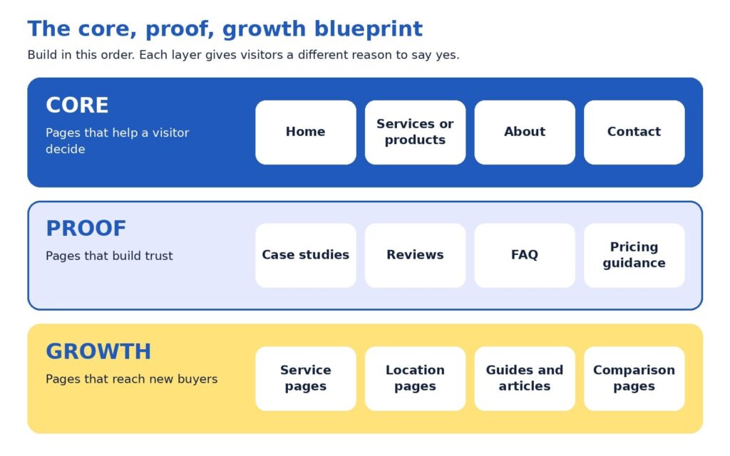
The page job test
A page earns its place by doing a job. The page job test turns that idea into three checks, and each check has a simple fix.
- One clear reader. Can you name who the page is for? When the answer is “everyone,” narrowing the focus usually sharpens the message, and the headline often writes itself.
- A distinct question. Does the page answer something that no other page answers? When two pages cover the same ground, merging them tends to create one stronger page.
- A next step. Does the page lead somewhere, such as a phone call, a form, a quote request, or a related page? A page with a next step keeps the visit moving.
Try it with a simple spreadsheet that lists your current pages. Many sites turn up a few pages to merge and some gaps where a customer’s question has no page at all. Those gaps often become the plan for the next quarter.
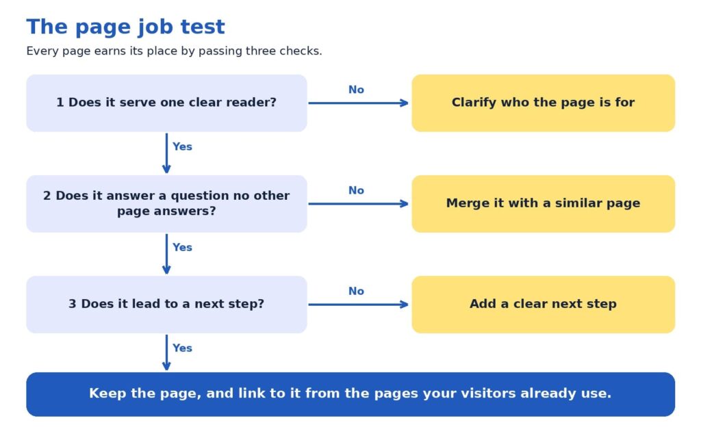
What a good site structure looks like
So far we have talked about which pages to have. Site structure is about where those pages sit and how they connect. A clear structure helps visitors find things, and Google says organizing a site logically helps both people and search engines understand how pages relate to the rest of the site (Google Search Central, 2025b).
Good structures tend to follow five habits:
- One home page, a handful of main sections, and supporting pages beneath them.
- One obvious parent for every page, so a visitor always knows where a page belongs.
- Plain names for sections, such as Services, About, and Contact.
- Related pages grouped together, such as all services under one Services section.
- Important pages linked from the home page, because Google uses links between pages to judge which ones matter most (Google Search Central, 2025a).
If a stranger can guess where a page lives before clicking, your structure is working.
The diagram below shows these habits in action for a fictional local service company, such as a heating and cooling contractor. It has 14 pages and three levels. The colors match the blueprint you just learned: blue for core pages, light blue for proof pages, and yellow for growth pages.
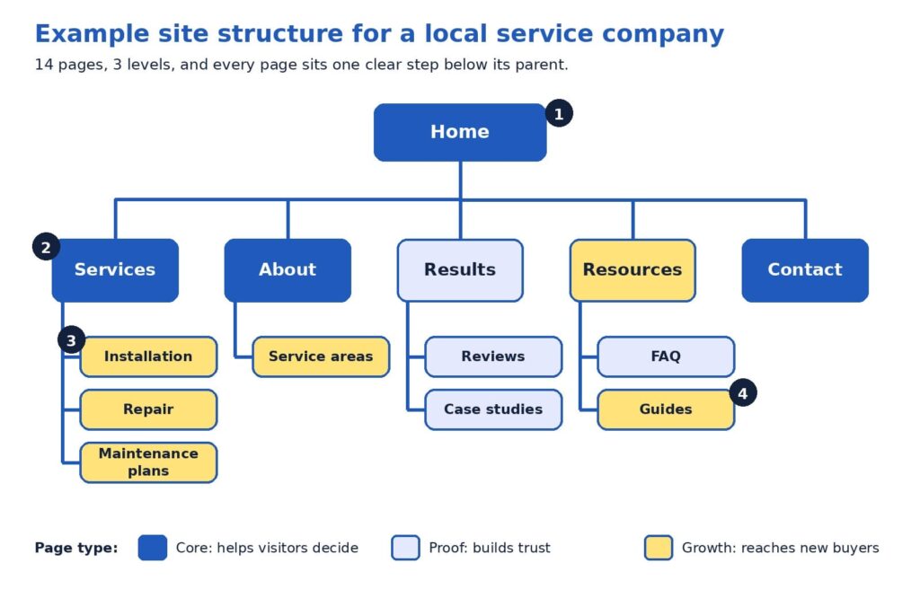
Here is how to read the diagram, following the numbers:
- The home page is the starting point. It links to every main section, so no important page is hidden. Think of it as the front door that points to every room.
- Level one holds the main sections. Services, About, Results, Resources, and Contact use plain, familiar names, and together they usually form the navigation menu. Contact stays at this level so it is one click away from anywhere.
- Level two pages each have one parent. Installation, Repair, and Maintenance plans sit under Services. A visitor who reads one can easily find the others, and the breadcrumbs read naturally: Home > Services > Repair.
- Every page is within two clicks of the home page. The reason this works is clarity. Each label tells visitors what they will find, which Nielsen Norman Group calls strong information scent (Laubheimer, 2019).
Notice how the web addresses can mirror the structure. An address like example.com/services/repair tells a visitor where they are, and Google notes that descriptive URLs help people judge whether a result will be useful (Google Search Central, 2025b).
Picture a visitor named Maria who searches for “furnace repair” and lands on the Repair page. She reads about the process, spots the breadcrumbs, and clicks Services to see the company also offers maintenance plans. She opens Reviews, feels reassured, and requests a quote. Nobody had to explain the website to her, because the structure answered each question in turn. Larger businesses add more levels, and the same habits still apply.
Pages for each type of business
Small local business
For a small local business, a first website often works well with 6 to 12 pages. Picture a neighborhood physiotherapy clinic. Its core pages are Home, Services, About with team credentials, and Contact. Its proof pages are Reviews or Results, a FAQ that covers insurance and first-visit questions, and a short page on pricing and booking. That adds up to roughly eight pages, and each one answers a question a new patient asks before calling.
Growth can follow as the clinic learns what people search for. A page for sports injuries, another for post-surgery rehabilitation, and a short guide to choosing a physiotherapist would each serve a different need. A quick check for any small site is whether it answers three visitor questions: who are you and can I trust you, what do you offer and what will it cost, and what happens next.
Service company
A service company with several offerings and service areas has more questions to answer, so the count often lands between 12 and 25 pages. The example diagram above is a good model. Add a pricing page, more case studies, and pages for the cities that bring in the most calls, and the site grows while keeping the same shape.
The word to watch is distinct. A location page earns its place when it contains something specific to that area, such as local project examples, neighborhood details, and reviews from nearby customers. Six near-identical pages that swap only the city name repeat the same information six times, which can confuse visitors (Google Search Central, 2025b). A useful test: if you can write three honest, specific sentences that belong only to a location page, the page is likely worth building. Otherwise, a short section on the services page may serve that city well.
Service pages also benefit from a consistent layout: who the service helps, how the process works, proof such as a case study or review, answers to common questions, and a clear next step such as requesting a quote.
Online store
An online store follows a different logic, because the catalog sets the number of pages. Every product has a page, and products are grouped into categories, which are pages that list related products, such as Women’s shoes or Kitchen tools. Supporting pages such as shipping, returns, size guidance, FAQ, and contact reassure shoppers at the moment of decision. We suggest budgeting for roughly 8 to 12 supporting pages beyond the catalog.
Structure matters more as the catalog grows. Google’s guidance for online stores recommends linking menus to category pages, category pages to subcategory pages, and subcategory pages to every product, so that Google’s crawlers, the programs that visit pages so they can be listed in search, can reach everything by following links. It adds that Googlebot generally does not use a site’s search box, so products reachable only through search may be missed. It also suggests linking best-selling products from the home page (Google Search Central, 2025a).
Usability research points the same way. Baymard Institute’s 2025 benchmark found that 58% of desktop and 67% of mobile sites among leading US and European online stores had mediocre-to-poor homepage and category navigation. Baymard advises dividing categories into subcategories at about 10, and aiming for at least 10 products in the deepest categories (Baymard Institute, 2025). Clear categories can be a real advantage even for modest stores.
In practice, that means the menu links to every main category, each category page links to its products, best sellers appear on the home page, and support pages are reachable from the footer and from product pages.
The three business types at a glance
The summary below puts the starting ranges side by side. Every business has its own mix of customers, offers, and goals, so use it as a planning aid and let your customers’ questions shape the final list.
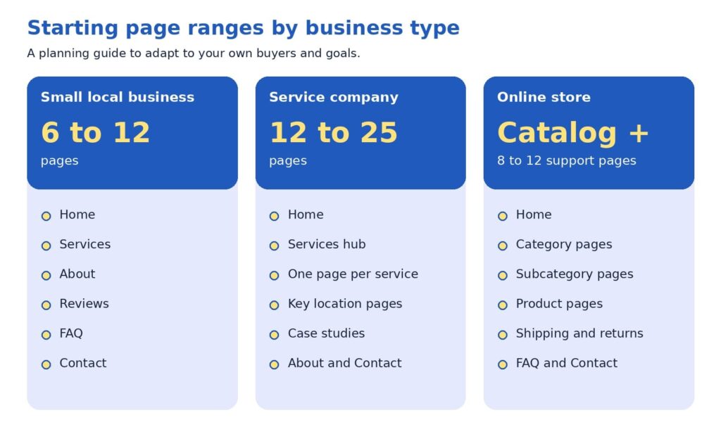
A bolder view: let customer questions set the count
Here is a perspective some web teams may hesitate to share, since a larger site means a larger project: page count is an output, never a goal. The number of pages your site needs equals the number of distinct customer questions you can answer well, grouped sensibly.
Try this exercise. List every question your last twenty prospects asked on calls, emails, and chats, and add the questions customers ask after they buy. Group similar questions together. Each group becomes a page or a clearly labeled section. A group of two questions may fit inside a services page, while a group of ten, such as pricing for a complex offer, may deserve its own page. When you finish, the page count appears on its own, and each page has a reason to exist.
This approach tends to protect budgets and results at the same time. A five-page site that answers the right questions may generate more inquiries than a fifty-page site that repeats itself, because visitors find what they need faster. It also makes growth easy to plan, since each new customer question suggests a new page or an update.
Common questions from beginners
Do we need a blog? A blog is a growth format, so it fits best after your core and proof pages are in place. It earns its keep when each article answers a real customer question and links to the relevant service page, in line with Google’s call for helpful, people-first content (Google Search Central, 2025b).
Should every service have its own page? When a service has its own customers, process, and questions, a dedicated page usually serves visitors better than a paragraph on a general page. Smaller offers that share the same customer can share a page, with clear headings for each.
How often should we revisit our page count? Once a year works well for many businesses, and launching a new service or location is another natural moment. Google’s guide encourages updating published content as needed (Google Search Central, 2025b).
A 30-day page plan
You can put all of this to work in one month. The plan below fits most small teams:
- Week 1, collect: gather customer questions from sales calls, emails, reviews, and the search queries report in Google Search Console, a free tool that shows how your site appears in Google.
- Week 2, map: sort the questions into core, proof, and growth, and mark which ones already have a page.
- Week 3, build or merge: apply the page job test, combine overlapping pages, and write the missing ones.
- Week 4, connect: update menus, add internal links, check mobile speed, and set up inquiry tracking.
Then give the changes time to work. Google’s guide suggests waiting a few weeks to assess the effect (Google Search Central, 2025b). Track inquiries, calls, form submissions, and the pages visitors view before they reach out, since those numbers show which pages are pulling their weight.
Before the new structure goes live, check that:
- Every page has a descriptive title and at least one link pointing to it.
- Each page offers a clear next step and loads quickly on a phone.
- Old addresses that were merged redirect to the new page.
- Contact details match across the site.
If you would like a second set of eyes on your current structure, send us your page list. We will run the page job test with you and return a one-page map of what to keep, merge, and add.
Your website, one question at a time
The right number of pages is the number that answers your customers’ questions clearly, and the starting ranges simply give you a place to begin. Build core pages first, add proof pages to earn trust, and let growth pages widen your reach. Give every page one parent, a plain name, and a next step, then review the results after a few weeks.
Ready to turn the plan into a site? Our website design agency in Delhi team builds page structures around customer questions, our SEO agency in Delhi specialists help those pages get found, and our digital marketing agency services keep new leads arriving.
References
Baymard Institute. (2025). Homepage and category navigation UX 2025: 67% of mobile sites have mediocre-to-poor performance. https://baymard.com/research-articles/ecommerce-navigation-best-practice
Clutch. (2025, August 21). Clutch report: No-code tools fuel website growth, yet 17% of small businesses are still offline [Press release]. Business Wire. https://www.businesswire.com/news/home/20250821848152/en/Clutch-Report-No-Code-Tools-Fuel-Website-Growth-Yet-17-of-Small-Businesses-are-Still-Offline
Google Search Central. (2025a, December 10). Help Google understand your ecommerce website structure. Google for Developers. https://developers.google.com/search/docs/specialty/ecommerce/help-google-understand-your-ecommerce-site-structure
Google Search Central. (2025b, December 10). Search engine optimization (SEO) starter guide. Google for Developers. https://developers.google.com/search/docs/fundamentals/seo-starter-guide
Laubheimer, P. (2019, August 11). The 3-click rule for navigation is false. Nielsen Norman Group. https://www.nngroup.com/articles/3-click-rule/


Freelancer vs Agency vs In-House: How to Choose the Marketing Team That Fits Your Business Right Now
Gartner’s 2025 CMO Spend Survey found that marketing budgets average 7.7% of company revenue, and 59% of the marketing leaders surveyed reported budgets that fall short of what their strategy requires (Gartner, 2025). The survey focused mostly on larger companies, yet the pattern is likely familiar to owners and marketers at any size: there is usually more worth doing than there are hours, people, or dollars to do it. That is why the question of who does the work carries so much weight.
This guide walks through freelancers, agencies, and in-house teams in plain language. It introduces a three-question tool we call the 3C Fit Framework, and it shares a perspective that many providers may hesitate to mention: the best answer often changes as your business grows, so a thoughtful sequence can work better than one permanent choice.
As a website design and digital marketing agency, we are glad to say that the right starting point for many businesses is a freelancer or an internal hire. Our goal is for you to finish this article with a clear sense of which structure fits your next twelve months, whether or not that includes working with us.
The short version
Freelancers tend to fit defined projects and quick starts. Agencies tend to fit businesses that need SEO, website design, content, and paid media to work as one plan. In-house teams tend to fit companies with steady daily marketing work and the budget for a full compensation package. The 3C Fit Framework (Capacity, Coordination, Continuity) can help you decide, and many growing businesses find that one internal owner supported by external specialists offers a strong balance.
What you will find inside:
- Why this decision shapes your marketing results
- What each option looks like in plain language
- The 3C Fit Framework
- When a freelancer is a strong choice
- When an agency is a strong choice
- When an in-house team is a strong choice
- The Owner Hours Test
- A perspective worth considering
- A simple path to decide
- Questions worth asking any provider
- How this applies to SEO, website design, and lead generation
Why this decision shapes your marketing results
Choosing between a freelancer, an agency, and an in-house hire influences more than your budget. It affects how quickly campaigns launch, how well your website, SEO, and advertising work together, and how much of your own time goes into managing the work. A team that matches your stage of growth can make each of those areas smoother, while a mismatch can slow results even when everyone involved is talented.
Talent is rarely the only variable. In many cases, a capable professional placed in a setting that suits the business need will produce more than an equally capable professional in a setting that does not. For this reason, we encourage owners and marketing managers to begin with the shape of the work and compare prices afterward.
Your answer may also evolve. A founder launching a first website may benefit from a freelancer. A company running SEO, content, and paid media together may benefit from an agency. An established business with daily campaign needs may benefit from an in-house team. Each can be the right call at the right moment, and the sections below help you recognize which moment you are in.
It also helps to define what success means before comparing options. For most businesses, success comes down to a steady flow of qualified leads, a healthy conversion rate on the website, and a cost per lead that supports profitable growth. When those targets are written down, each structure can be evaluated against them, and the conversation becomes more objective and more productive for everyone involved.
What each option looks like in plain language
The Freelancer
A freelancer is an independent professional who usually specializes in one discipline, such as copywriting, web design, SEO, or paid search. Three points summarize how this option tends to work:
- Who it suits: businesses with a defined project or a specific skill gap.
- How it works: you agree on scope, timeline, and price, and the freelancer delivers while working directly with you.
- Why owners choose it: speed, deep specialization, and the flexibility to engage help only when it is needed.
The talent pool is broad. The Upwork Research Institute (2023) estimated that 64 million Americans, or 38% of the U.S. workforce, performed freelance work in 2023, and 47% of freelancers provided knowledge services such as marketing and programming. That range gives businesses plenty of choice, and it also means that careful selection is worthwhile.
The Agency
A digital marketing agency is a team of specialists, often including strategists, SEO professionals, designers, developers, writers, and paid media managers, working within one process.
- Who it suits: businesses that need several disciplines to support one goal, such as lead generation.
- How it works: engagements usually run on a monthly retainer or a defined project, with account management and regular reporting.
- Why owners choose it: breadth of skills, shared tools, and coverage when one person is unavailable.
The In-House Team
An in-house team is made up of employees who work solely for your company.
- Who it suits: businesses with steady, daily marketing work and the budget for salaries, benefits, software, and management.
- How it works: you recruit, onboard, and lead the team, and in return they learn your products, customers, and culture in depth.
- Why owners choose it: communication is quick, and priorities can shift the same day a conversation with sales or customer service suggests a new direction.
The 3C fit framework: capacity, coordination, continuity
A useful way to compare the three options is to look at what your marketing needs from the team rather than at the team type itself. Three questions usually point toward an answer, and we call them the 3C Fit Framework.
- Capacity asks how much work needs to be produced each month, such as a set of service pages, a number of articles, a few ad campaigns, or a website rebuild. When the list of deliverables is clear and finite, a freelancer can often handle it efficiently.
- Coordination asks how closely your SEO, website, content, advertising, and analytics need to work together. Search intent informs page structure, page structure influences conversion rate, and conversion rate determines how much paid traffic is worth buying. When disciplines depend on one another this way, an agency’s shared process can reduce handoffs and keep decisions consistent.
- Continuity asks how much company knowledge needs to stay close to the work every day. Product details, sales feedback, and customer conversations all shape strong marketing, and an in-house team has the most direct access to them.
Most businesses start with one of the three C’s as their main need, and growth then adds the others. That progression is a big reason why the right structure shifts over time.
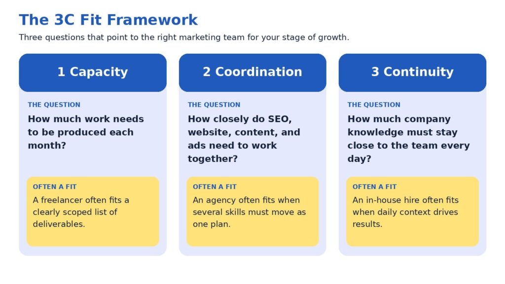
When a freelancer is a strong choice
Freelancers often shine when the goal is specific: a new landing page, a set of service pages, a technical SEO cleanup, or an email sequence. Because they work directly with you, feedback loops can be short, and many bring deep experience in a single craft. For a business testing a new offer or launching a first website, this can be an efficient way to move forward.
A few practices help the engagement go smoothly:
- Define the deliverables, the timeline, and what success looks like before work begins.
- Confirm availability for revisions and for questions after launch.
- Plan how the work connects to your other marketing channels, since one specialist typically covers one of them.
Because a freelancer usually covers one discipline, you or a teammate often serve as the coordinator who connects the pieces. Owners who enjoy that role may find this arrangement rewarding. Owners with limited time may prefer to review the Owner Hours Test later in this guide before deciding.
When an agency is a strong choice
An agency can be a strong choice when marketing outcomes depend on several disciplines moving together. Lead generation is a good example. Search visibility brings the right visitors, website design and messaging encourage them to act, paid media extends reach, and analytics show which efforts contribute to revenue. When those elements sit within one team, decisions can be made with the full picture in view.
It is also worth acknowledging that expectations of agencies are rising. In Gartner’s 2025 survey, 39% of CMOs planned to reduce agency budgets, and 22% said generative AI had lessened their reliance on external agencies for creativity and strategy. Among the top actions CMOs cited for saving on agency costs were ending unproductive relationships and streamlining agency rosters (Gartner, 2025). We see this as a healthy development, because it encourages agencies to demonstrate clear process, transparent reporting, and measurable contribution to leads and sales.
An agency may be a good fit when:
- Your goals involve more than one channel, such as SEO, website design, and paid media.
- You prefer a regular reporting rhythm and a named team over a single point of contact.
- You would like to scale activity up or down without recruiting.
The strongest agency relationships tend to feel like a partnership, with shared goals, open access to data, and honest conversations about what is working.
When an in-house team is a strong choice
An in-house team can be an excellent choice when marketing work is steady, varied, and closely tied to daily business activity. Team members learn your products, hear sales conversations firsthand, and can respond quickly when priorities change. For businesses with consistent campaign needs, that proximity can make marketing feel like a natural extension of the company.
The cost picture deserves a full view. The U.S. Bureau of Labor Statistics (2026) reports that benefits made up 30.0% of employer compensation costs for private industry workers in June 2026, with wages and salaries making up the remaining 70.0%. Using those averages for illustration, a role with $70,000 in wages would represent roughly $100,000 in total employer compensation. Recruiting adds to that figure, and the Society for Human Resource Management (SHRM, 2022) reported an average cost per hire of nearly $4,700 before any salary is paid. Software subscriptions, training, and management time are additional considerations.
A second factor is range. A single marketing hire usually brings one primary strength, such as content, paid media, or analytics, while growing businesses often need several. Many companies address this by pairing a first hire with external specialists, which leads naturally to the hybrid approach discussed below.
An in-house team may be a good fit when:
- Marketing work fills a full week, every week.
- You have a leader who can set priorities and review results.
- Your budget covers compensation, tools, and room to grow the team.
The three options side by side
The comparison below summarizes the patterns discussed so far. Individual freelancers, agencies, and companies vary, so please treat it as a starting point for your own evaluation.
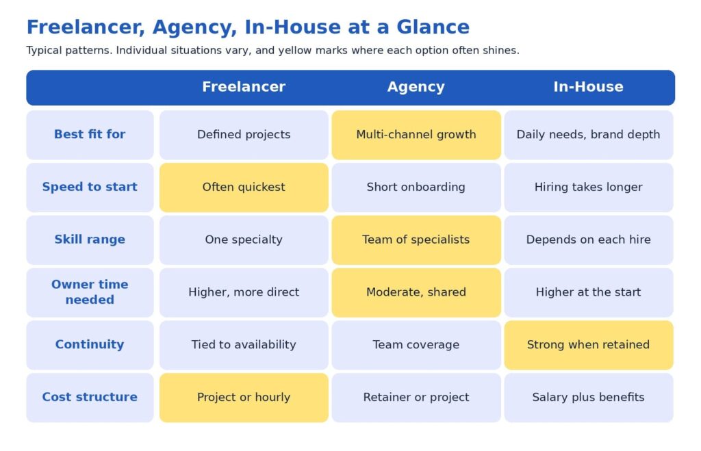
You may notice that no option leads in every row. That balance is exactly why the decision benefits from a framework instead of a ranking.
The owner hours test: a cost that rarely appears on an invoice
Every option has a price on the proposal and another one on the calendar. The calendar cost is the number of hours you and your team spend briefing, reviewing, coordinating, and following up. This cost is easy to overlook, yet it often decides whether an engagement feels smooth or demanding.
A simple test can bring it into focus. Estimate how many hours per week you are able to dedicate to directing marketing, and compare that with what each option typically asks of you. A freelancer working on several separate projects may rely on you to connect them. An agency usually supplies a project manager, which can reduce your coordination load. An in-house hire needs onboarding and ongoing leadership, especially in the first months.
If your calendar has room for hands-on direction, a freelancer or an in-house hire may fit comfortably. If your calendar is full, the coordination an agency provides may be worth more than it first appears on a proposal. Considering this early often leads to better satisfaction on both sides, because expectations match reality from the first week.
A perspective worth considering: rent execution first, then decide what to own
Here is a view that some providers may hesitate to share, because it can reduce their own project volume: many businesses may achieve better results by validating what works through external execution before building an internal team. The reasoning is practical. Early marketing involves a great deal of learning, such as which keywords bring buyers, which pages convert, and which channels produce qualified leads at a sustainable cost. External specialists can test those questions at a pace that fits your budget, and the answers then shape what a first internal hire should be responsible for.
A first hire made before those answers exist is often asked to cover strategy, writing, analytics, design coordination, and advertising at once. That is a wide range for one person, and even an excellent candidate may find it demanding to excel at every part. Starting with external execution gives the future hire a clearer job description, better data, and a stronger chance to succeed.
The same logic works as a business matures. Once you know which activities run every day and produce results, bringing a marketing leader in-house can strengthen continuity, while freelancers and agencies continue to supply specialist capacity. In short, direction can live inside the company while execution stays flexible. We find this structure tends to protect marketing ROI, since fixed costs grow only when the evidence supports it.
This perspective sometimes leads us to recommend a freelancer or an internal hire rather than our own services. We share it because clients tend to do well when the structure fits, and that outcome is good for everyone involved.
A simple path to decide
If you would like a quick way to apply the 3C Fit Framework, the path below turns three questions into a suggested starting point. It is intended as a guide for discussion with your team, so feel free to adapt it to your circumstances.
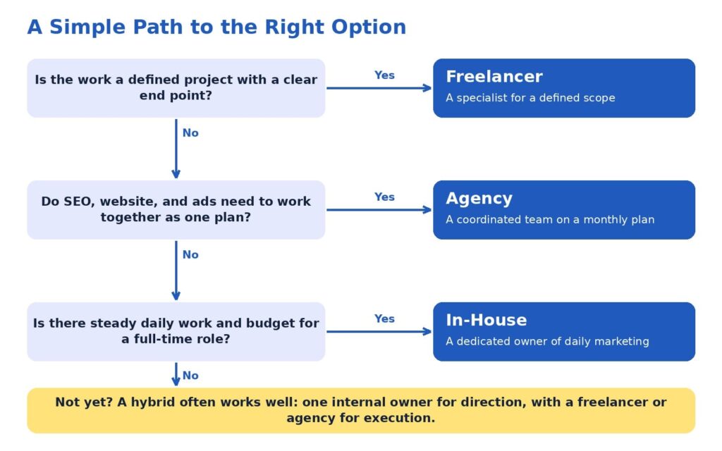
A few reminders can make the path even more useful:
- Plan around the next twelve months of goals, which is a longer horizon than the next few weeks.
- Select the option that matches your largest need, then add support where gaps appear.
- Revisit the decision once a year, since goals and budgets evolve.
Mixed answers are common and entirely fine. A business that needs defined projects today and daily management next year can begin with a freelancer or agency and plan an internal role for later, using results from the first phase to guide the hire.
Questions worth asking any provider
Whether you are speaking with a freelancer, an agency, or a candidate for an internal role, the conversation goes further when it includes specific questions. The following list can help you compare options consistently:
- Which results have you helped similar businesses achieve, and what process produced them?
- How will we measure success, and how often will we review it together?
- Who will do the daily work, and how can I reach that person?
- How will SEO, website, content, and advertising decisions be coordinated?
- What do you need from me each week to keep progress steady?
- Which numbers will you report, such as leads, conversion rate, cost per lead, and revenue influenced?
- What happens to my accounts, content, and data if we conclude our work together?
Thoughtful answers to these questions usually reveal how a provider thinks about results, communication, and long-term value. They also give you a fair way to compare very different proposals side by side.
How this applies to SEO, website design, and lead generation
SEO, website design, and lead generation make a useful case study because they depend on each other. SEO services attract the right audience by aligning pages with search intent. Website design services turn those visitors into leads or customers through clear structure, messaging, and user flow. Conversion optimization services then refine pages using real behavior data, so the same traffic produces more leads over time.
A freelancer can deliver any one of these areas with skill. An in-house marketer can manage them day to day. An agency can connect all of them into one system with shared reporting, so each improvement supports the next. At ICO WebTech, we build marketing systems that help businesses attract the right audience, convert visitors, and grow consistently, and we are glad to collaborate with freelancers and in-house teams whenever that is the best structure for a client.
If you would like a second opinion on which structure fits your goals, we would be happy to review your current setup and share what we see, including where an existing freelancer or internal team is already doing well.
Choosing with confidence
Freelancers, agencies, and in-house teams can each be the right answer. Freelancers bring focused skill and fast starts, agencies bring coordinated expertise across channels, and in-house teams bring daily context and continuity. The 3C Fit Framework helps you match those strengths to what your business needs now, and the Owner Hours Test helps you account for the time each option asks of you.
Many businesses grow best through a sequence: external execution to learn what works, an internal owner to guide direction, and specialists to keep capacity flexible. High expectations pair well with this approach, because each stage is designed to produce measurable leads and sales before the next investment is made.
If you are weighing these options for your own business, our team at ICO WebTech would enjoy helping you map the next twelve months. You can learn more about our web design agency work, our SEO agency approach, and our digital marketing agency approach to see how the pieces fit together.
References
Gartner, Inc. (2025, May 12). Gartner 2025 CMO spend survey reveals marketing budgets have flatlined at 7.7% of overall company revenue [Press release]. https://www.gartner.com/en/newsroom/press-releases/2025-05-12-gartner-2025-cmo-spend-survey-reveals-marketing-budgets-have-flatlined-at-seven-percent-of-overall-company-revenue
Society for Human Resource Management. (2022). The real costs of recruitment. https://www.shrm.org/topics-tools/news/talent-acquisition/real-costs-recruitment
U.S. Bureau of Labor Statistics. (2026). Compensation costs for private industry workers averaged $46.89 per hour worked in June 2026. The Economics Daily. https://www.bls.gov/opub/ted/2026/compensation-costs-for-private-industry-workers-averaged-46-89-per-hour-worked-in-june-2026.htm
Upwork Research Institute. (2023, December 12). Freelance Forward 2023. Upwork. https://www.upwork.com/research/freelance-forward-2023

What to check before and after a website redesign?
A website redesign is one of the few marketing projects that can lower your traffic on the day it succeeds. The site launches on time, the design is approved, and the rankings it took years to build start slipping.
That outcome isn’t inevitable. It usually traces back to a handful of decisions made, or skipped, before and after launch. This guide covers what to check at each stage so a redesign improves performance instead of resetting it.
Whether you work with a website design company in Delhi or run the project in-house, the same logic applies: a redesign is an SEO event that happens to include design.
Why Redesigns Cost Rankings
Search engines don’t see a website the way visitors do. They see a set of URLs, each with content, links, signals and a history. When a redesign changes those URLs, rewrites the content or strips out the code that carried the signals, the search engine has to re-learn what each page is and whether it still deserves to rank.
Google’s site move documentation describes the process in those terms. The move happens on a per-URL basis, and Google says it isn’t complete until Googlebot has visited every URL on both the old and new site at least once. For a medium-sized website, Google estimates that most pages take a few weeks to move through its index, and larger sites can take longer.
The same documentation tells site owners to expect temporary ranking fluctuation during the move. It also offers some reassurance: Google states that 301 and other permanent redirects don’t cause a loss in PageRank
. The advice is old and unglamorous, which is probably why so many redesigns ignore it.
The usual damage comes from four places. URLs change without redirects. Content that was quietly ranking gets deleted in the name of a cleaner site. SEO elements such as titles, canonicals and schema fail to carry over. And the new design turns out to be slower than the old one. None of these is a design problem. All of them are planning problems.
The Redesign Roadmap
The pattern across redesigns that hold their rankings is a sequence of stages, with most of the protective work done before a single page is designed. A good website redesign service will show you this sequence up front rather than starting with mockups.
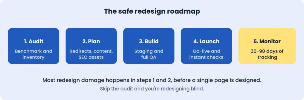 Most redesign damage happens in steps 1 and 2, before a single page is designed.
Skip the audit, and you’re redesigning blind.
Before The Redesign: Measure What You Can’t Afford To Lose
The first job is establishing a baseline. Without one, a redesign can’t be judged, and any drop in performance becomes an argument instead of a diagnosis.
Record twelve months of organic sessions and conversions, noting any seasonality. Pull your top twenty landing pages by traffic and by leads, since those are the pages the redesign must protect first. Capture rankings for the twenty or thirty keywords that matter most, along with Core Web Vitals, the number of pages Google has indexed, and the conversion rates of your forms, calls and checkout.
Keep it all in one spreadsheet. Three months after launch, this becomes the document that tells you whether the project worked.
Inventory every URL, including the forgotten ones
Crawl the live site and list every page, image, PDF and existing redirect. The pages that don’t appear in your menu are often the ones that matter, because old landing pages and forgotten blog posts tend to hold the strongest backlinks.
For each URL, note its status code, title, traffic and linking domains. This inventory becomes the foundation of the redirect plan, and it is the document teams most often wish they had started sooner.
Deciding What Stays, Merges Or Goes
A redesign is a natural moment to clear out weak content, but the decision should come from data. Pages that rank or convert should usually keep their URLs. Pages that rank on the second or third page, or that overlap with others, are candidates for strengthening or merging. Pages with no traffic and no links can go, as long as each one is redirected to its closest match.
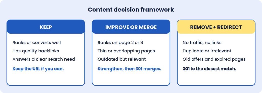 The mistake to avoid is deleting a page that has backlinks or steady traffic without a relevant redirect. Sending every retired URL to the homepage is a common shortcut, but search engines often treat it as a soft error, which means the page’s accumulated value is lost anyway.
The Redirect Map Is The Project
If a redesign changes any URLs, the redirect map is the single most important document in the whole project. It is a two-column sheet: old URL on the left, new equivalent on the right.
A few rules keep it effective. Use permanent 301 redirects rather than temporary 302s. Point each old URL straight to its final destination, so visitors and crawlers never pass through a chain. Cover images, PDFs and old blog categories, not just pages. And wherever a page doesn’t need a new address, leave the URL exactly as it was, because the best redirect is the one you never need. Google also recommends keeping redirects in place for at least a year after a move, so they shouldn’t be treated as a temporary fix to remove once rankings settle.
Test the full map on staging before launch. A few hundred correct redirects protect years of accumulated ranking history, and fixing a bad map after launch is slower and more expensive than building a good one beforehand.
SEO Assets And Tracking Don’t Migrate Themselves
Title tags, meta descriptions, heading structure, image alt text, schema markup and canonical tags are easy to lose in a rebuild, because they live in templates and plugins rather than on the visible page. A new theme can look identical to the old one while quietly dropping all of them.
Export these elements for your key pages before work starts, along with a note of how your most important pages link to one another. This is the point where an experienced SEO agency in Delhi earns its fee: involving search specialists at the planning stage costs far less than diagnosing lost rankings afterwards.
Tracking deserves the same attention. List every tool connected to the site, from analytics and Search Console to ad pixels, CRM forms, call tracking and payment gateways, then confirm each has a place in the new build. A conversion tag that goes missing for a week can distort reporting and ad optimisation for much longer than that.
A New Design Can Be A Slower One
Speed is the quiet casualty of many redesigns. Heavy sliders, large hero images, animation libraries and bloated page builders are common in modern templates, and each one adds weight that the previous, plainer site didn’t carry.
Agree speed targets before design starts. A Largest Contentful Paint under 2.5 seconds on mobile, with a stable layout that doesn’t shift as it loads, is a reasonable goal for most business sites. Alongside that, review how visitors use the current site through heatmaps, session recordings, and form drop-off. If people abandon a page for a reason, the redesign should fix it, not repeat it.
Finally, take a full backup of files and database, store a copy off the server, and agree a content freeze during the build so changes made to the live site aren’t overwritten at launch.
On Staging: Testing Before Anyone Sees It
The new site should be built and tested on a private staging URL, blocked from search engines. The block matters for the build, and removing it matters even more at launch.
Content and SEO checks come first. Test a sample of old URLs against the redirect map, with extra attention on high-traffic and high-backlink pages. Confirm that key pages kept their text, headings, images and internal links, and that titles, descriptions, canonicals and schema survived the move.
Next comes everything a visitor can do. Submit every form and confirm the notification arrives. Check layouts on real phones rather than a resized desktop browser, and run the site through Chrome, Safari, Firefox and Edge. For an online store, place a complete test order from cart to confirmation email.
Last, check the foundations: speed against the agreed targets, accessibility basics such as contrast and keyboard navigation, an active SSL certificate, current plugins, and secured admin accounts.
Launch Day: The First Hour Matters
Choose a low-traffic window and keep the old site backed up. The first move after going live is removing the noindex tag and any robots.txt block, because leaving them in place is the most common and most costly launch error.
From there, load the redirect map and test your top fifty old URLs, then submit the new XML sitemap in Search Console. Open real-time analytics to confirm that visits and conversions are being recorded, and place a live test enquiry or order. Once those pass, inform your team and key partners.
After The Redesign: What To Watch, And When
Launch is where real data begins. Search engines need time to recrawl and re-evaluate the new pages, so some ranking movement over the first few weeks is normal. The skill is telling that settling period apart from a genuine problem.
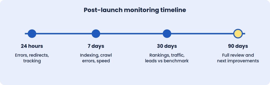
The first 24 hours
Re-test redirects and watch for 404 errors in server logs and Search Console. Confirm that tracking, forms and payments work on the live site, that pages load quickly under real traffic, and that robots.txt and meta robots tags allow crawling.
The first week
Search Console’s Pages and Crawl stats reports show how Google is handling the new site. Any 404 that appears with traffic or backlinks needs a redirect added straight away. Watch for redirect chains and loops, and review mobile usability and structured data warnings as they surface. Core Web Vitals field data also begins to accumulate here.
The first month
Compare organic traffic and conversions with the baseline using identical date ranges. Small dips in rankings are normal. Steep, sustained drops on specific pages point to a specific cause that can be traced: a missing redirect, a changed title, a removed section of content.
Review the top landing pages to see whether their rankings, titles and content survived. Study user behaviour for friction in the new layout, and update internal links that still point to old URLs so they don’t depend on redirects.
The first 90 days
By this point there’s enough data for a full technical SEO audit. Use it to refine calls to action, layouts and forms, and to refresh the content on pages that were merged, moved or shortened. Ask important referring sites to update links where the URL changed, then document what you learned and set a monthly maintenance routine.
Speed and conversion improvements can show within weeks. Rankings and organic traffic usually take longer to settle, often one to three months depending on the scale of the change.
Where Redesigns Usually Go Wrong
The most damaging mistake is also the simplest: launching with noindex still switched on. The second is redirecting everything to the homepage, which discards the relevance old pages built up.
Changing too much at once makes diagnosis nearly impossible. A new design, new URL structure, new copy, and new platform in a single release means that when something drops, nobody can say which change caused it. Google’s own guidance points the same way, advising site owners to plan changes one after the other rather than all at once. Staggering them keeps cause and effect visible.
Judging results too early is another trap. Rankings fluctuate in the first days, and a one-week verdict is rarely reliable. A 30-day and 90-day window gives a fairer picture. And finally, designing for looks rather than goals produces pages with no clear job. Each page should have one purpose and one obvious next step.
Takeaways
A Redesign Is An SEO Event
Changing URLs, content, and templates changes the signals search engines rely on. Treating the project as design-only is the root cause of most post-launch losses.
The Baseline Is Your Only Proof
Without twelve months of recorded traffic, rankings, and conversions, there is no objective way to say whether the new site performs better than the old one.
Redirects Do The Quiet Work
A complete, tested 301 map is what carries years of authority from the old site to the new one. It is the least visible part of the project and often the most valuable.
Launch Is The Start Of Monitoring
The first 90 days produce the data that shows what worked. Plan support and review time for that period, not just for launch day.
Also read: Website Redesign vs Rebuild
Questions To Ask Your Redesign Partner
A strong website redesign service should be able to show its process, not just its portfolio. Before signing, it’s worth asking:
- How will you protect our existing rankings, and who is responsible for the redirect map?
- How will success be measured, and over what period after launch?
The right company will welcome these questions and answer with specifics. Vague answers are a warning sign.
At ICO WebTech, we plan redesigns around exactly these checks. As a website design company in Delhi with technical SEO built into the process, we aim to launch new sites without losing the rankings and leads you’ve already earned. If you’d like an honest view of what a redesign would involve for your business, we’ll give you one before any work begins.

5 Signs Your WordPress Website Needs Technical Attention
A WordPress site rarely breaks all at once. It drifts. A plugin update here, a new image library there, a payment gateway change nobody tested properly, and six months later the site is technically still running but quietly costing you traffic, leads, or sales.
The good news: most of these problems give off warning signs well before they become an emergency, if you know what to look for.
Below are the five signs we see most often when a client says something feels “off” with their site. For each one, you’ll find what usually causes it and a quick way to check it yourself before deciding whether you need outside help.
Quick overview:
- Sign 1: Pages suddenly became slow
- Sign 2: Plugins are causing errors
- Sign 3: Your website isn’t being indexed
- Sign 4: Strange redirects are appearing
- Sign 5: Checkout isn’t working properly
None of these signs is a reason to panic, and none mean you chose the wrong platform. WordPress powers a substantial share of the web because it’s flexible enough to run a small local business site and a high-volume online store on the same software.
That same flexibility is why ongoing technical attention matters. A platform built to support thousands of plugins, themes, and hosting setups needs periodic maintenance to keep every moving part working together.
Sign 1: Pages Suddenly Became Slow
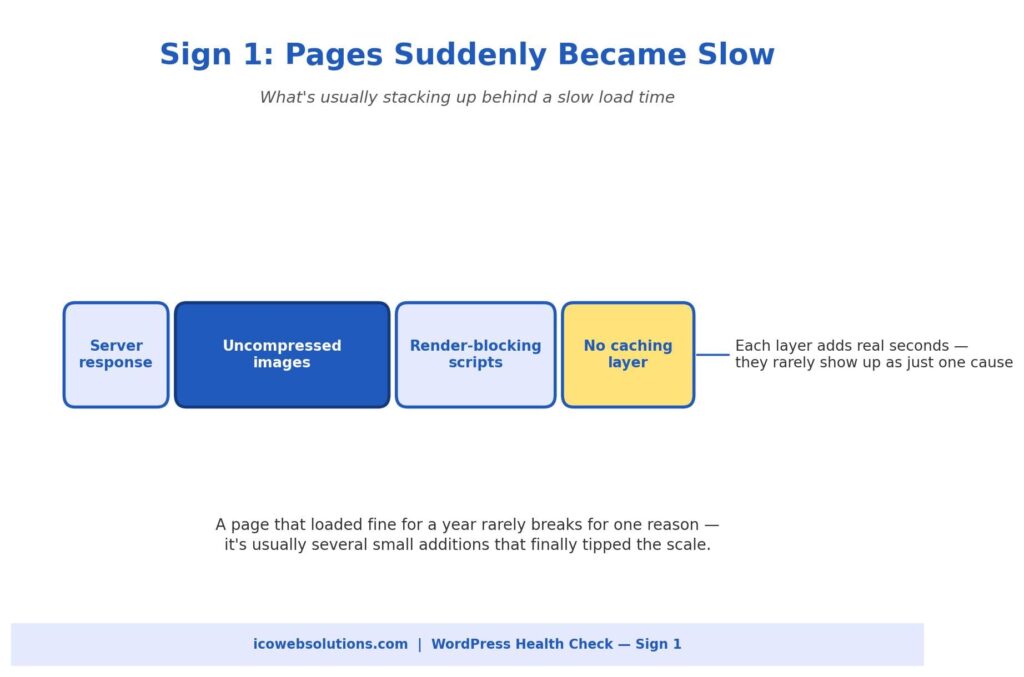
Site speed rarely collapses because of one dramatic failure. It’s almost always a slow build-up. A product page that loaded in under two seconds a year ago can creep past five or six seconds because of:
- Product images added without compression
- Plugins loading their own scripts on every page, needed or not
- A database weighed down by years of post revisions, spam comments, and old transaction logs
How to check it yourself
Run your homepage and one or two key inner pages through a free page speed testing tool. Look at what’s flagged as render-blocking or oversized rather than just the overall score.
A long list of unoptimized images, or a dozen scripts loading in the page header, is usually the real story, not a vague “server problem.” A general technical SEO check will also show whether slow load times are already affecting how search engines crawl and rank your pages, since speed has been a ranking factor for years.
DIY or get help?
Reasonable to tackle yourself (with moderate technical comfort): image compression, caching plugin setup, and deferring non-essential scripts.
Time to bring in help: your hosting plan is struggling under current traffic, or the database needs a careful, non-destructive cleanup. At that point, a website maintenance company in Delhi (or wherever your developer is based) is a safer choice than guessing your way through server changes on a live site.
Sign 2: Plugins Are Causing Errors
An occasional plugin notice is normal. These are not:
- A pattern of fatal errors
- A white screen after an update
- A plugin that works fine alone but breaks as soon as a second one is activated
Problems like these get worse the longer they’re ignored. Most conflicts happen because two plugins, or a plugin and your theme, use the same function name, hook into the same part of WordPress, or query the database in ways the other wasn’t built to expect.
How to check it yourself
Work on a staging copy of your site, not the live version.
- Deactivate plugins one at a time.
- Reload the page after each one.
- Stop when the error disappears. That’s the plugin involved.
- Check whether it has a recent update, and whether other users report the same conflict in its support forum.
This usually confirms the cause within a few minutes.
Why you shouldn’t ignore it
We’d caution against leaving a known conflict in place because the site “still works most of the time.” Intermittent fatal errors are inconsistent, which means they may be quietly affecting some visitors and not others, including search engine crawlers trying to render your pages.
A quick, deliberate fix now is almost always cheaper than a site-wide breakdown during a busy sales period.
Sign 3: Your Website Isn’t Being Indexed
This one is easy to miss because the site looks completely normal to you and every other visitor. The problem only shows up in Google Search Console, where pages (sometimes an entire section) aren’t appearing in search results.
In our experience, it almost always comes down to one of three ordinary, fixable causes:
- A robots.txt file blocking crawler access to part of the site
- A “noindex” tag left on from development or staging
- A sitemap that has gone stale, broken, or stopped updating after a plugin change
How to check it yourself
- Open your robots.txt file directly in a browser.
- Search your pages for a stray noindex tag using a free SEO browser extension.
- Resubmit your sitemap in Search Console.
This usually surfaces the issue within minutes. The tricky part is that these settings can flip back on during a theme or plugin update, so a site that indexed fine for years can suddenly start disappearing from search without anyone touching anything on purpose.
When to get help
If this has been going on for more than a few weeks, have someone run a full technical SEO audit rather than fixing only the one setting you found. These issues tend to travel in small clusters.
Sign 4: Strange Redirects Are Appearing
Unexpected redirects are one of the more alarming signs on this list, and for good reason. A visitor clicks a normal link on your site and lands on an unfamiliar domain pushing ads, fake software updates, or outright spam.
That’s rarely a simple misconfiguration. It usually points to a rule injected into your .htaccess file, your theme’s functions file, or a compromised plugin, typically as part of a broader security compromise.
What to do first
Speed matters more than thoroughness here. In this order:
- Change your WordPress admin and hosting passwords immediately.
- Check recently modified files in your hosting control panel for anything you don’t recognize.
- Run a reputable security scanner.
- Check Search Console for a Google security warning, since it affects whether new visitors can reach you safely.
When to get help
This is one of the signs where we recommend bringing in outside help sooner rather than later, even if you’re comfortable with WordPress. A redirect hijack usually means something got in, and finding every entry point it left behind, not just the one rule you noticed, takes a file-by-file review that’s easy to rush through on your own.
Sign 5: Checkout Isn’t Working Properly
For any site running WooCommerce or a similar store, a broken checkout is the most expensive item on this list. Every hour it’s down, revenue walks away, often without you hearing about it unless a customer complains.
The most common pattern isn’t a complete failure but a partial one. The cart and shipping steps work, and the process breaks at the payment handoff, where your site communicates with an outside payment gateway.
Common causes
- An expired or misconfigured SSL certificate
- A payment gateway plugin that has fallen out of date with the gateway’s API requirements
- A recent WordPress or PHP update that the checkout plugin wasn’t fully compatible with
How to check it yourself
- Place a test purchase using the payment gateway’s official test card numbers.
- Check your SSL certificate’s expiration date.
- Review your error logs around the time customers started reporting problems.
Don’t wait on this one
Because it touches money and customer trust, “we’ll get to it this week” is too slow. A short period of downtime tends to cost more than the entire fix would have. Call in help the same day you notice something’s wrong.
What These Five Signs Usually Mean Together
These problems rarely show up in isolation:
- A site that’s slow from database bloat and too many plugins is also the most likely to start throwing plugin conflict errors.
- A site compromised enough to generate strange redirects often drops out of Google’s index around the same time, since search engines quickly deprioritize sites with security issues.
If you’re noticing two or three of these at once, that’s not a coincidence. It’s a sign the site has gone without real technical maintenance for a while.
None of this means panicking or rebuilding from scratch. It means:
- A proper audit
- A prioritized fix list based on actual risk and revenue impact
- A maintenance routine (regular updates, monitoring, and a real backup strategy) so problems get caught at the small, cheap stage
A 20-minute monthly checklist
Even if you manage everything yourself, set a recurring monthly check against this list:
- Run a page speed test on your two or three most important pages.
- Confirm plugins and themes are current, and that none have been abandoned by their developers. Unmaintained plugins are one of the most common entry points for the security issues behind strange redirects.
- Glance at Search Console for any sudden drop in indexed pages.
- If you run a store, place a real test order through your own checkout.
Together these take no more than twenty minutes, and catching a problem in a routine check is almost always cheaper and less stressful than learning about it from a customer or a search engine.
Need a Hand?
If you’re experiencing any of these five signs, or you’re not sure whether your site is overdue for a proper check, our team at ICO WebTech can diagnose and fix the issue.
We work as both a website design agency in Delhi building new sites and a WordPress website development company maintaining and troubleshooting existing ones. Whether the right fix is a quick technical repair or a more thorough rebuild, we’ll tell you honestly which one you need before any work begins.


Get Your Website Problem Fixed Fast
Need Something Fixed on Your Website?
Send us your website. We’ll take a quick look and tell you exactly what’s wrong, no long forms, no sales pitch, just a straight answer.
Send Us Your Website on WhatsApp
or email us your website link instead
What Kind of Problem Are You Dealing With?
If it’s on this list, there’s a good chance we’ve already fixed it for someone else.
- WordPress errors
- Slow website
- Hacked website
- WooCommerce problems
- SSL / DNS issues
- PHP errors
- Google indexing problems
- Hosting migration
Don’t see your issue listed? Send it over anyway, there’s a good chance we can still help.
How It Works
1. Send us your website — just the link and a quick line about what’s going wrong.
2. We take a look — usually within a few hours, not days.
3. We tell you straight — what’s broken, what it’ll take to fix, and what it’ll cost.
No commitment. If it’s a five-minute fix, we’ll just tell you how.
Or Fill the Form Below
PHP Version Debt: Why Old Websites Fail the Moment Hosting Moves On
Websites rarely break because PHP changed. They break because years of skipped updates made them incompatible with anything newer.
A business owner logs in on Monday and finds a white screen. Nothing was edited. Nobody touched the site. The only thing that changed was a line in a hosting notice that never got read: the server had moved to a newer PHP version.
Agencies see this constantly, and the reaction is always the same. The owner blames the upgrade. But the upgrade did not break the website. It exposed a website that had been broken for years, waiting for a compatible environment to fail in.
That is PHP version debt: the gap between the PHP version your website was written for and the versions hosts still support. Every skipped plugin update, every abandoned theme and every custom function written a decade ago adds to it. Hosting providers eventually collect.
This article covers why the failure feels sudden, where the debt comes from, what breaks and why, and how to weigh patching against replacing. The argument matters more than any single fix, because the right fix depends on how much debt a site carries.
What PHP version debt actually is
Technical debt is a familiar idea in software. Shortcuts taken today create work later, and the work grows the longer it waits. PHP version debt is the same idea applied to a live website.
A site carries this debt when its code, plugins or theme depend on behavior that current PHP versions removed or changed. The site keeps working only because its server still runs an old release. While that stays true, the debt is invisible. The moment the server moves on, it becomes a fault.
Three things separate it from an ordinary maintenance backlog.
It is imposed from outside. Nobody chooses when a PHP version reaches end of life, and few owners choose when their host retires it.
It compounds. A site one version behind is a small job. A site six versions behind may need several components replaced at once, and each replacement has its own dependencies.
It hides. Nothing on the website announces it. Pages load, forms submit, orders arrive. Then one day they do not.
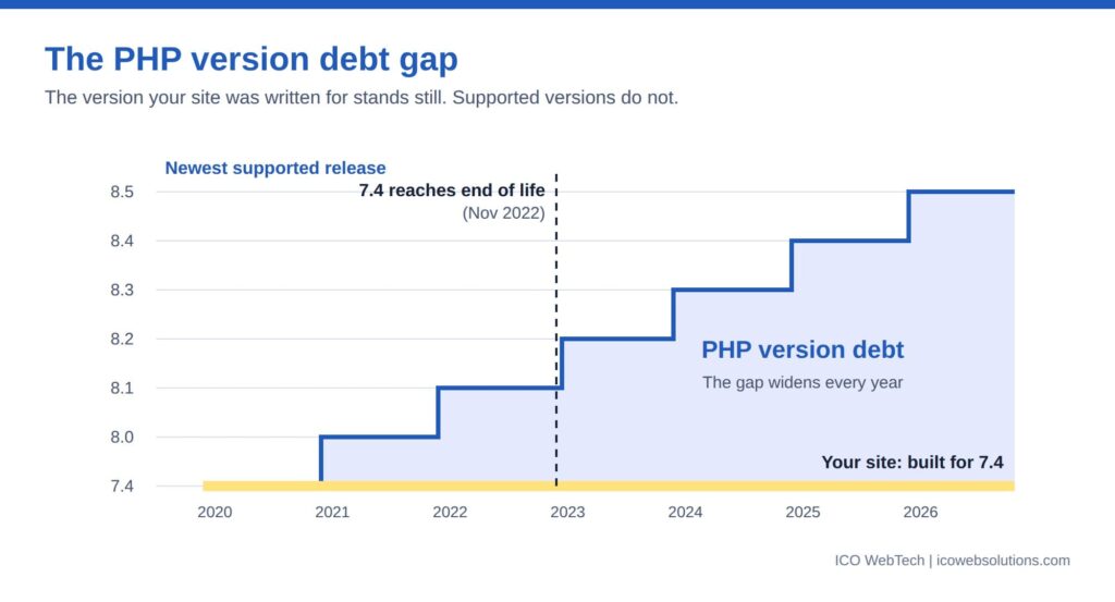

The support clock nobody watches
PHP follows a published support schedule. Each release gets a bug-fix phase, then a security-only phase, then reaches end of life: no fixes of any kind, including security patches. The table shows where versions stand as of September 2026, using dates from the PHP project.
| PHP version | End of life | Status |
|---|---|---|
| 7.4 | 28 Nov 2022 | No longer supported |
| 8.0 | 26 Nov 2023 | No longer supported |
| 8.1 | 31 Dec 2025 | No longer supported |
| 8.2 | 31 Dec 2026 | Security fixes only |
| 8.3 | 31 Dec 2027 | Security fixes only |
| 8.4 | 31 Dec 2028 | Actively supported |
| 8.5 | 31 Dec 2029 | Actively supported |
Two points follow. Sites still running any of the first three rows are already outside support, which makes them a security problem before they are a compatibility problem. End of life does not stop a site from running. It means every newly discovered vulnerability in the engine stays open.
The second point is timing. The end-of-life date for PHP 8.2 is three months away. Hosting providers set their own retirement dates, and many force an upgrade once a version loses security support. A site that runs on 8.2 today but depends on code from the 8.1 era will meet the same problem that sites on older versions have already met.
Why the failure looks sudden
The site worked on Friday and failed on Monday. To the owner, the cause is whatever changed in between, and in practice that is one setting on the server.
Hosts change PHP versions in several ways. Some fold it into a scheduled server migration. Some retire a version and move accounts to the next one. Others let customers pick a version in a control panel and default to the newest after a plan change. In every case the website’s own files stay the same, which is why nobody connects the failure to years of neglect.
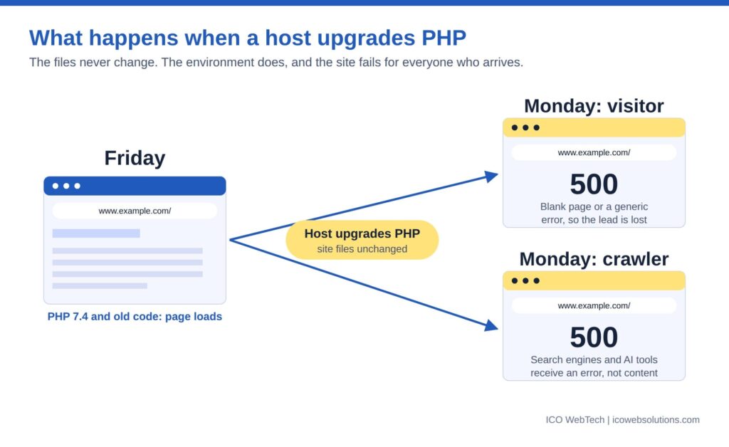
It is the same pattern covered in ICO WebTech’s post on why maintenance decides whether AI search can use your website: the most damaging problems are the ones the owner never sees. A PHP fatal error shows visitors a blank page or a generic 500 message. It shows crawlers the same thing. Search engines and AI tools that arrive during the outage receive an error where content should be, and repeated failures reduce how often they come back.
Monitoring is the gap. A basic ping or port check reports a site as up even when every page returns an error, because the server answered. Only a check that requests real pages and reads the response catches it.
Where the debt comes from
Four sources account for most of it.
Abandoned plugins and themes
A plugin that has not been updated in years was written against an older PHP release. Its author may have stopped supporting it. It works until the version it relied on disappears. Premium themes bundled with old page builders behave the same way. The site owner cannot fix these in place, because the code belongs to someone else.
Custom code written for older PHP
Bespoke functionality written a decade ago carries habits that later versions reject: functions that no longer exist, constructors named after the class, loose handling of null values. This is the debt agencies leave behind when they build and move on. A website designing agency in Delhi that delivers a site and never revisits its code hands the client a countdown, not a finished product.
Platforms pinned to the past
Every CMS, ecommerce platform and framework declares which PHP versions it supports. Upgrading PHP without upgrading the platform breaks the platform. Upgrading the platform can break every extension built for it. Heavily extended ecommerce and WordPress builds are typical cases, because each extension adds its own dependency.
Hosting on autopilot
Budget shared hosting often runs one PHP version for every customer on a server. The owner never opens the control panel. Nobody owns the question of which version the site runs on, and nobody is told when it changes.
What actually breaks
The breakage falls into predictable groups. The table explains why each one fails, not how to repair it, because the repair depends on the codebase.
| Change | Version | Why old code fails |
|---|---|---|
| mysql_* database functions removed | 7.0 | Sites written before mysqli or PDO call functions that no longer exist. Any call is a fatal error. |
| create_function() and each() removed | 8.0 | Both were common in older scripts and plugins. Calling either now stops the page. |
| Class-named constructors no longer recognized | 8.0 | Old-style constructors stop running as constructors, leaving objects uninitialized. |
| Non-static methods cannot be called statically | 8.0 | Older code that called methods this way throws errors. |
| match becomes a reserved keyword | 8.0 | Code that uses the name for its own functions or classes conflicts with the language. |
| Passing null to built-in parameters that reject it is deprecated | 8.1 | Old code passes null to string functions constantly. Notices appear, and the deprecation signals a future error. |
| Dynamic properties deprecated | 8.2 | Objects that gain undeclared properties raise notices. Common in older plugins and themes. |
Two behaviors matter more than the list. Removals produce fatal errors, which stop the page. Deprecations produce notices, which do not. That difference is where the debt hides.
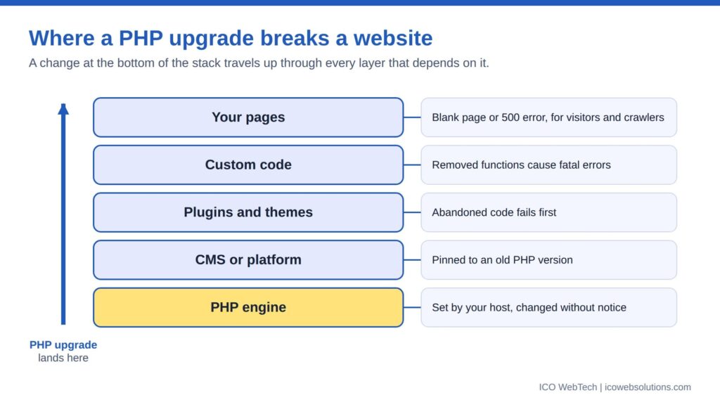

Deprecation notices are the warning nobody reads
A deprecation notice says that something works today and will not work in a future version. PHP writes it to the error log. On a production server, error display is normally switched off, so visitors see nothing and the log is rarely opened.
That creates a long period in which a site announces its own decline in a file nobody reads. A single outdated plugin can write a notice on every page load. Each one is a future failure with a date attached.
Reading that log is the earliest and cheapest form of compatibility checking. A site with a quiet log is in a different position from one whose log grows every hour, even when both look identical in a browser.
Fatal errors get fixed. Notices get ignored. The notices are the invoice arriving early.
The business cost: downtime is the cheap part
Owners price the problem as the cost of fixing a broken page. The real bill has more lines.
Lost enquiries. A blank page during business hours is a lost lead. Contact forms, checkout and booking flows fail first because they run the most custom code.
Search visibility. Server errors at crawl time reduce how reliably pages get fetched, and pages that keep failing can drop out of results until they recover. Speed shares the same root: older PHP releases generally run slower than current ones, which feeds the metrics covered in ICO WebTech’s post on the relationship between website speed and conversions.
Security exposure. After end of life, new vulnerabilities in the PHP engine stay unpatched. Sites that hold customer data or take payments sit an unpatched runtime under their own code.
Emergency pricing. Fixing a site during an outage costs more than fixing it on a calendar. Developers work under time pressure, testing gets skipped, and the fix often causes the next fault.
Forced rebuild. The last line item is the site itself. When enough components are incompatible, patching costs more than starting again, and businesses reach that decision in the worst possible week.
Set that against the cost of checking versions once a quarter. The gap explains why maintenance belongs in the budget as a running cost, not a rescue fee.
Patch, replace or rebuild: the economics
Every site with version debt faces the same three options.
Patch. Right when the debt is confined to a few components and the platform is current. It is the cheapest fix per incident, but each patch leaves the underlying dependency in place.
Replace components. Right when specific plugins or modules are abandoned and maintained alternatives exist. It costs more up front and lowers future risk.
Rebuild. Right when the platform is itself out of support, the custom code is undocumented, or the cost of the first two options approaches that of a fresh build. A workable test: if patching costs more than roughly half of a rebuild, the rebuild is the better spend, because the repairs buy nothing durable.
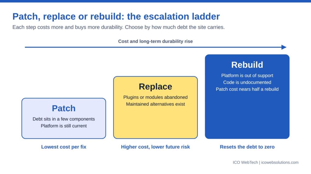

Rebuilding is not always the expensive answer. ICO WebTech’s website redesign work often starts from exactly this situation, and a rebuild is the point at which hosting, platform and code can finally be matched to each other. Hosted builders remove this class of problem because the vendor manages the runtime, at the price of flexibility, a trade-off covered in the post on choosing a website designing company or a DIY builder. A rebuild also changes URLs, which makes redirects and link hygiene part of the job; the internal linking guide covers the mechanics.
The ownership side of this problem is its own subject. Many sites carry debt because the person who built them left, a theme covered from the client’s side in the post on why business owners fire their website designer.
What a maintenance provider owes you
A plan that updates plugins and takes backups keeps a site running today. It does not manage PHP version debt. A website maintenance company in Delhi, or anywhere else, should be able to answer five questions:
- Which PHP version does each site run, and when does that version lose support?
- Is every plugin, theme and extension compatible with the next version up?
- Is there a staging copy where an upgrade gets tested before the live site changes?
- Who reads the error log, and how often?
- What is the plan when the host announces a retirement date?
These are the questions ICO WebTech’s maintenance service is built around, alongside the engineering handled by its PHP development company team. A provider that cannot answer them is maintaining a website, not the risk around it.
The same standard applies at the build stage. When comparing a website designing agency in Delhi, ask which PHP versions the finished site supports, how dependencies are documented, and who tracks compatibility after launch. An agency that answers with specifics has planned for the day the host moves on. One that changes the subject has not.
The bottom line
PHP version debt turns a routine hosting change into an emergency. The upgrade is never the cause. The cause is years of components that stopped being updated while the platform underneath kept moving.
Compatibility should be tracked on a schedule, with a named owner, before a host forces the question. The December 31, 2026 end-of-life date for PHP 8.2 is a natural deadline for that review.
Related: website maintenance, PHP development, website speed optimization and WordPress development.