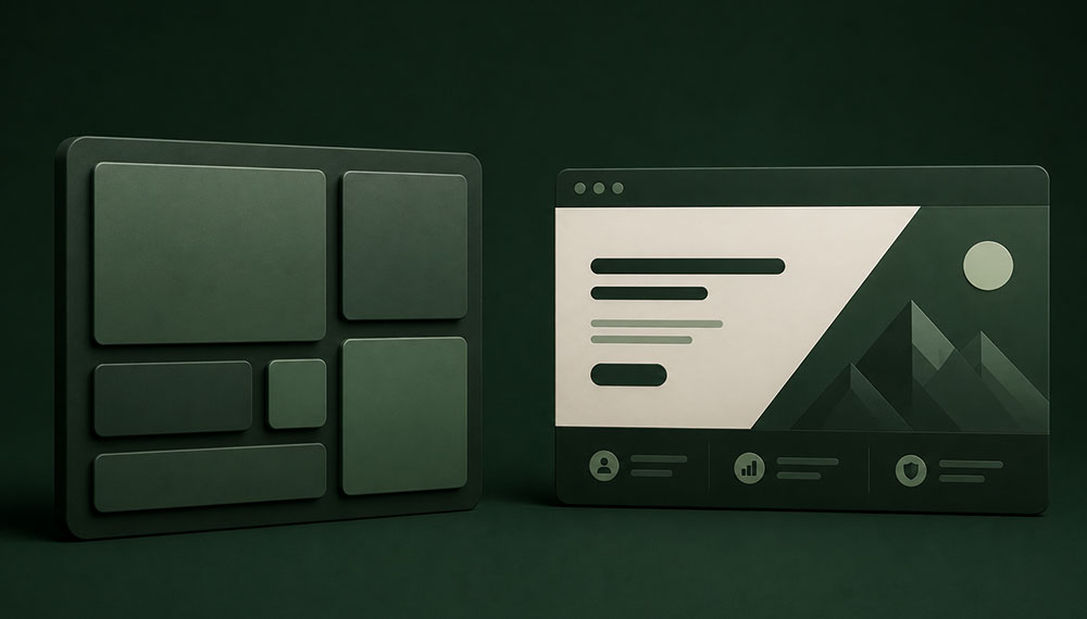
In the highly competitive world of digital enterprise marketing, a website’s above-the-fold real estate serves as a digital handshake, a product demonstration, and a sales funnel all at once. For years, the standard layout template for business-to-business (B2B) landing pages followed a highly predictable blueprint: a centered headline, a brief paragraph of subtext, a primary call-to-action (CTA) button, and perhaps a stock image or product screenshot floating to the right. However, design demands have evolved. Modern user interfaces now lean heavily on two dominant, visually striking layout philosophies: the structured modularity of the Bento Grid Layout and the editorial punch of the Asymmetric Hero Section.
This structural evolution isn’t just about aesthetics. In a landscape where the average B2B buyer guides themselves through 70% of the purchasing journey before ever engaging a sales representative, layout structures act as silent navigators. The way an interface structures its content directly governs cognitive load, dictates reading patterns, and ultimately decides whether a user scrolls downward or leaves the page entirely. Selecting the wrong visual model can quietly tank lead generation metrics, while selecting the right framework can dramatically accelerate path-to-conversion velocities. This is exactly where the analytical capabilities of a specialized B2B website designing company become essential, helping brands match visual hierarchy with actual user psychology.
To determine which layout structure wins the B2B conversion battle, we must look past superficial design trends and analyze the underlying mechanics of user interaction, cognitive processing costs, and cross-device performance optimization.
The Anatomy of the Contenders
Before testing these frameworks against hard conversion goals, we need to clarify exactly how these layout structures function at a code and structural level.
1. The Bento Grid Layout
Inspired by the traditional Japanese lunchbox and popularized by Apple’s hardware product landing pages, the Bento Grid is a modular design framework that chunks information into distinct, rounded rectangles arranged within a rigid CSS Grid layout. Each card or compartment within the grid operates as an independent content container, holding a specific product feature, data point, customer testimonial, or interactive graphic.
The core objective of the Bento Grid is to present multi-faceted data sets in a visually clean, scannable format. Rather than forcing users through a long vertical scroll of text, it maps out several distinct concepts simultaneously within a single, unified view, using variable tile sizes to indicate the relative importance of each point.
2. The Asymmetric Hero Section
In stark contrast to the structured, compartmentalized nature of the Bento Grid, the Asymmetric Hero Section deliberately avoids uniformity. It leverages intentional visual imbalances, off-center focal points, non-standard text placements, and overlapping layout elements to guide the user’s eye through a highly curated narrative sequence.
Asymmetry breaks traditional grid-alignment rules to create visual tension and dynamic movement. Instead of dividing a reader’s attention across multiple equal-weight containers, an asymmetric hero relies on a single dominant visual element—such as a bold cropped typography layout, an oversized product render, or an unusual geometric mask—balanced by strategic whitespace and minimalist type scales on the opposing side.
Cognitive Load and User Psychology in B2B Environments
To evaluate these layouts through a conversion lens, we have to look at how B2B buyers process information. Unlike business-to-consumer (B2C) shoppers, who often buy impulsively based on emotion, B2B buyers are looking to mitigate risk. They are searching for specific solutions to operational problems, analyzing technical specs, and trying to justify costs to an internal purchasing committee.
Consequently, the primary enemy of B2B conversions is cognitive friction. If a webpage forces a buyer’s brain to work too hard to understand what a company offers, they will close the tab. Human reading patterns also vary wildly depending on the structural layout they encounter. When users view an asymmetric hero section, their eyes typically follow a classic F-Shape or Z-Shape scanning pattern. They read the dominant headline from left to right, drop down to capture the subtext, and swing back to lock onto the primary conversion point. The journey is linear, controlled, and predictable.
When confronted with a Bento Grid, however, the scanning mechanism shifts to a pattern known as Grid Grazing. The eye darts around the page, drawn by the contrasting visual weights of different compartments. The user chooses their own adventure, processing data fragments non-linearly. When an enterprise brand partners with an experienced B2B website designing company, the primary goal is to engineer a layout that keeps this visual complexity low while still delivering enough meaningful value propositions to qualify the lead.
Bento Grid Layouts: The Case for Modular Data Presentation
The Bento Grid layout excels at managing multi-dimensional data without letting the screen degenerate into visual chaos. For certain B2B business models, this layout approach offers substantial conversion advantages.
The Advantages: Why Bento Wins for Complex Product Ecosystems
- High Information Density Above the Fold: If your product features an intricate mix of software dashboards, real-time analytics, and developer integrations, a Bento layout lets you show off all three value pillars simultaneously without cluttering the page.
- Natural Visual Hierarchy: By making a primary feature tile twice as large as the secondary integration or review tiles, you create a built-in hierarchy that guides the reader’s attention from big-picture value down to granular proof points.
- Perfect Integration of Social Proof: Bento grids allow you to place a G2 crowd rating badge or a recognizable client logo matrix right alongside technical feature highlights, building trust inline without requiring dedicated sub-sections.
The Conversion Roadblocks: When Bento Implodes
Despite its visual appeal, the Bento Grid can backfire if it is used to tell a sequential story. Because the layout divides focus among multiple containers, it can trigger analysis paralysis. If an analytical tile, an animated product loop, a customer testimonial, and a CTA chip are all competing for attention at the same time, the primary conversion action can easily get lost in the shuffle.
This is why a professional B2B website designing company advises against using Bento grids for long-form conceptual services. If your product requires deep education or a mindset shift before a buyer is ready to convert, chopping your narrative into four or five separate boxes will break the persuasive flow and hurt your conversion rates.
The Asymmetric Hero Section: The Case for a Singular, High-Impact Narrative
Where the Bento Grid spreads out focus across a collection of data points, the Asymmetric Hero Section concentrates energy into a single, high-impact brand statement.
The Advantages: Why Asymmetry Drives Enterprise Conversions
- Uncompromised Focus on the Primary CTA: By surrounding your headline and conversion form with generous whitespace and shifting the primary visual asset off-center, you eliminate competing distractions. The user’s eye has fewer places to go, making them much more likely to read your copy and click the form.
- Premium Brand Signaling: Asymmetric layouts feel intentional, custom-crafted, and highly editorial. For enterprise consultancies, high-ticket cybersecurity firms, or boutique technical vendors, this layout signals premium positioning and justifies a higher price point.
- Strict Narrative Control: You dictate the exact order in which the buyer consumes your message. First, they absorb the disruptive hook headline, then they parse the supporting value prop, and finally, they hit the primary lead form.
The Conversion Roadblocks: When Asymmetry Fails
Asymmetric layouts live and die by the quality of their creative assets and typography. If your headline copy is vague or your custom imagery doesn’t immediately illustrate the product, the layout will look unfinished and confusing rather than artistic and premium.
Additionally, asymmetry requires precise spatial balance. If a designer over-indexes on white space or pushes elements too far off-center, it can create an unpolished user experience that degrades brand credibility among more conservative enterprise procurement officers.
The Mobile Responsiveness Reality Check
A web design layout is only as good as its performance on mobile devices. In the B2B sector, mobile traffic accounts for over 50% of initial research actions. Executives browse solutions on their phones between meetings or during commutes, meaning your desktop layouts must translate perfectly to small screens.
This is where the two design approaches diverge dramatically from a development perspective. Bento grids are highly programmatic. Because they are built on CSS Grid architectures, collapsing a desktop Bento layout down for mobile devices is straightforward: you simply set your CSS grid template columns to a single flex column. The compartments effortlessly stack into a uniform, vertical stream of cards. While this changes the experience from a multi-directional layout into a linear vertical scroll, it preserves readability and content integrity with zero layout distortion.
Asymmetric heroes, however, require a lot more manual optimization at smaller breakpoints. Because asymmetry relies on precise visual weight distributions, overlapping elements, and specific whitespace ratios, simply stacking components vertically can quickly ruin the design. If elements aren’t carefully repositioned via CSS media queries, text blocks can easily overlap images, background shapes can distort, and your primary CTA can end up pushed far down below the fold. This responsive adaptation challenge is exactly where an experienced B2B website designing company earns its keep, ensuring that complex layout structures remain flawless across every screen size.
The Final Verdict: Strategic Mapping for Your Business Model
When choosing between a Bento Grid and an Asymmetric Hero layout, your decision shouldn’t be based on what looks trendiest on design showcases. Instead, your choice should be dictated by the structural complexity of your product and the buying behavior of your target audience.
The Bento Grid is your clear winner if: You run a self-serve B2B SaaS platform, a high-volume developer tool, or a product with highly visual dashboard interfaces. If your buyers are eager to inspect your app’s UI, check out integration options, and verify feature checklists right above the fold, the Bento structure packages those diverse details into a neat, organized home screen.
The Asymmetric Hero Section is your clear winner if: You sell enterprise software platforms, high-end professional services, or complex custom integrations that carry long sales cycles and high contract values. In these business spaces, your biggest hurdle is establishing immediate domain authority and delivering a single, clear value proposition. The asymmetric approach provides the clean focus and premium feel needed to capture executive attention and drive them toward your sales team.
Ultimately, high-converting B2B web design is about eliminating friction and directing focus. Partnering with a specialized team ensures your visual layouts align perfectly with your core lead-generation targets. Whether you choose the modular organization of the Bento Grid or the bold narrative clarity of an Asymmetric layout, the goal remains the same: clear the path for your buyers, highlight your core value, and make your conversion path completely undeniable.



Related items

The Quick Take: Most B2B companies aren’t struggling to generate leads — they’re strugglin


TL;DR: Most B2B companies are still fighting over search traffic that stopped converting y


For a B2B company operating in Okhla, a website is no longer simply an online brochure. It
