Contact Page Design Variations for higher Conversions
But why should I have a Contact Us Page?
“A Contact Page is significant to tap in the visitors and convert them into customers.”
It makes it easy for your website visitors to find “you” easily and communicate further for either some query, or investment or advertisement or even sales.
Therefore it becomes imperative for website owners to have a neat contact page design in their websites.
Additionally adding a contact us page also holds importance in Search Engine Optimization.
Wondering how?
…Because search engines like Google consider a contact us page as a quality signal. This means that a website without a Contact Page is considered as less noteworthy in comparison to your competitors.
So as to gain the maximum benefit of conversions through your contact us page you should give special attention and utmost detailing while designing it.
Check out the below 9 changes that you can make to your website or its contact page to affect the conversions positively.
#1. Separate Contact Page on Website
The users on your website do not appreciate searching for the contact information in the nick and corner of the website.
In fact this is really frustrating and you end up losing your customers.
Not only this, but also the users find that something is “fishy” about the website which is why they have hidden the contact info.
Furthermore you get extra brownie points if you navigate your customers to a socially connected page of your business. So as to stretch the comfort level to the visitors and to gain their trust.
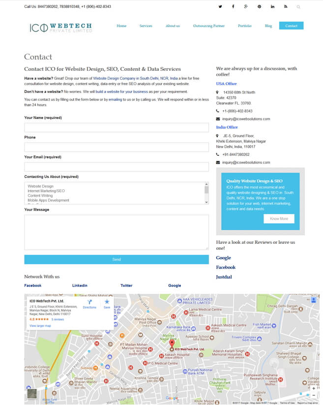
Example of a Contact Page Design:
#2. The Placement of Contact Us Page
It’s great that you have decided to have a dedicated and separate contact page in your website.
But the placement of the page on the website is crucial. It makes no sense if the user has to struggle to find that page with great efforts.
Therefore place the contact page in the main navigation menu where it is clearly visible to your website’s visitors.
Some site owners place the page in the Footer. This isn’t an encouraged practice for UX designers. Because the users are not intuitive to find the page down there. Hence they struggle to locate it.
Therefore you end up losing one conversion because of a faulty web design.
Take the stress out of your customers by loading them off the guesswork on your website to find the contact information.
A good website designer will structure your site in a fashion that the necessary and important info is right there. So that your customer finds it easy to reach out to you for any query,
#3. Construction of the contact form
The information you give on the contact page and the info you ask from you customers is extremely crucial.
But what’s more crucial?
“The manner in which the information is given or asked.”
As rightly said you have to ask if you need something. Owing to this when you create the fields on the contact form be smart to add only the necessary ones.
This means that do not ask the ancestor’s information of the user when you only need their name and email address.
But…
…there are some websites which will need more information than just name and email address to push the conversions.
Therefore choose the fields to be added on the contact form as per your website’s purpose and your target audience.
The site owners should understand that it gets really irritating for the visitor to fill 18-20 fields when all he wants to ask is about the offer code not working.
Imagine his frustration.
And there goes your conversion off the window.
Hence design wisely. Include only those fields which are important to your business.
After all this is not an examination paper where you get marks for filling the blank space.
#4. Scrutinize the queries
It’s great to capture the queries and convert them into sales. But it’s even better to study the responses you receive through your website’s submission form.
Because of the analysis of the submissions you will have an insight about the reason behind the customers’ queries.
This way you will have a better understanding of what the customers enquire about. And hence you can modify the contact page sections to address those issues in particular.
In the event that your site’s users are constantly contacting you for 4 different queries. Then it’s better to add a dropdown in the form with these 4 queries. So that the user can select the closest match to their query.
In fact by studying the submissions you can also find out if there are any other issues in your website. In other words if a website design company receives multiple queries questioning about their services. Then it is very clear that they have not specified their services in a neatly manner on their website.

For instance in the above image SpicyWeb has included a drop-down under “How can we help”. This way they segregate this enquiries to reach the specific department.
As a result they get better conversions. Because the inquiries are dealt with the professionals of that particular department.
#5. Give them more options
While contact forms are a great method to access the user query. But it is sometime not the first choice of the user. Hence it negatively impacts your conversion rate since you end up losing a high prospect customer.
Because sometimes the user contacts you in a hope to receive immediate response. Which is not possible via form submissions.
Therefore it is always advised to display other options like chat, email, phone etc. to let the users connect with you instantly.
If you do not want to display your phone number you can add the links to your social profiles. As almost everyone is on internet today networking socially. Therefore they see it as a more trusted way to connect with your business.

In the above contact page from Moo.com, you ca contact them with your queries over chat, call or email. Isn’t it much more user friendly? Try it out to increase your conversions.
#6. Test your form’s CAPTCHA
Yes we agree that CAPTCHA, a challenge-response test, before sending the query, is important to tell whether or not the user is human.
But it does not have to be irritating to the level that the user decides to quit. It takes a lot of efforts to attract the customer. Hence it hurts even more to see the customer taking a U-turn for a silly yet inattentive reason.
Use the alternatives to CAPTCHA which are simple to use and will solve the purpose of protecting the website owners from spammers.
Furthermore, make it a practice to solve the CAPTCHA yourself before you serve it to your customers. And give an honest feedback about whether or not was it irritating.
This way you benefit your users by saving their time. And in the same time you treat yourself with increased conversions.
#7. Monitor the desk
“Just receiving the enquiries through the form submissions is not enough.”
You have to reply to all the queries you receive through the information on your contact page. By not responding to the submissions you are losing big time on the potential business.
Along with reflecting a negative image of your business and the importance of your site visitors.
Make sure your contact form submissions are linked to an active email account which is checked continuously throughout the day.
So that you do not miss a single chance of conversion by tracking and responding to all the inquiries.
#8. Broken forms hurt your conversions
One ground rule in the web world which holds true for every time:
“Nothing’s perfect, nothing’s permanent.”
Absolutely! If your form was working just fine one day, it isn’t necessary it will be fine the other day too. Because these are all programming outputs. Which can face bugs all the time.
But what is hurtful is…
…to leave it as is or unattended for a long-long time.
Make it a habit to test the contact form submission at least twice a month to be affirmative of its functionality.
By doing this you are doing a big favor to your business by not losing a single business opportunity or a sales conversion.
In fact it is all the more advised to display a confirmation message like:
“Thank you for contacting us. We will get back to you within 24 hours.”
This assures the users that their message has reached you for further action.
#9. Google Maps
The business between the user and the owner is built on the foundation of trust. And this trust grows further if the owners are not hesitant of displaying their info out there.
Google maps are a great way to build that trust. In fact the website owners can tap in a lot of local business by proving the exact address on the contact page.
Even better if the address is pinned on the Google maps for the users to locate your exact address.
Conclusion
Contact Page is a mandate for all the websites.
It should not be hidden or hard to locate for your users. Because if a customer has a small query and has to struggle hard to first find the contact info. Then he’d rather look for another website with clear contact info.
And unfortunately you will end up losing a very bright prospect and conversion.
Make sure your website designer structures the contact us page as per your business requirements and is placed on the top, in the main navigation menu.
Contact us to design your Website or redesign your Contact Page
