If you are spending money on ads, SEO, or email campaigns and sending that traffic to a page that doesn’t convert, you are essentially pouring water into a leaking bucket. A landing page is often the single most important piece of your digital marketing puzzle — yet it’s the piece most businesses get wrong. In this guide, we’ll break down exactly what a landing page is, why most landing pages fail to convert, and the exact framework a professional landing page design agency uses to build pages that turn visitors into paying customers.
Whether you’re a startup founder building your first page, a marketer trying to lower your cost-per-lead, or a business owner comparing a web designing company against options elsewhere, this article will give you a practical, no-fluff roadmap.
What Is a Landing Page?
A landing page is a standalone web page created for one specific purpose: to convert a visitor into a lead or a customer.
Unlike your homepage, which usually has multiple navigation options, a blog, and links pointing in a dozen directions, a landing page is intentionally narrow. It has one headline, one offer, and one call-to-action (CTA).
Landing pages are typically the destination for:
- Google Ads or Facebook/Instagram ad campaigns
- Email marketing campaigns promoting a specific offer
- SEO-driven content targeting a high-intent keyword
- Product launches, webinars, or limited-time promotions
The core difference between a landing page and a regular website page is focus. A homepage tries to serve every visitor. A landing page tries to convert one type of visitor into one specific action — whether that’s filling out a form, booking a call, or making a purchase.
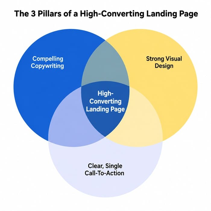
As the diagram above shows, a landing page that actually converts sits at the intersection of three things: persuasive copywriting, strong visual design, and a single, unmistakable call-to-action. Remove any one of these, and your conversion rate suffers — no matter how much traffic you send to the page.
Why Most Landing Pages Fail
Before we talk about how to build a great landing page, it’s worth understanding why so many landing pages underperform. In our experience working with clients across industries, the most common mistakes are:
- Too many distractions: A full navigation menu, footer links, and social icons give visitors an easy way to leave without converting.
- Weak or generic headlines: “Welcome to Our Company” tells the visitor nothing about what’s in it for them.
- Slow page load times: Every additional second of load time can reduce conversions significantly, especially on mobile.
- Asking for too much information upfront: Long forms scare visitors away before they’ve built any trust with your brand.
- No social proof: Without reviews, testimonials, or trust badges, visitors have no reason to believe your claims.
- Mismatched messaging: If your ad promises “50% Off” and the landing page doesn’t mention the discount above the fold, visitors bounce immediately.
The good news is that every one of these problems is fixable. Let’s go through the process step by step.
How Do I Create a Landing Page That Increases Sales?
Creating a landing page that actually drives sales isn’t about fancy animations or trendy design trends — it’s about removing friction and building trust as quickly as possible. Here is the framework we recommend:
1. Start With a Single, Clear Goal
Before you design anything, define the one action you want a visitor to take. Is it filling out a lead form? Booking a demo? Making a purchase? Every element on the page should support that single goal. If you find yourself adding a second CTA “just in case,” that’s usually a sign you need a second landing page instead.
2. Write a Benefit-Driven Headline
Your headline is the single highest-leverage piece of copy on the page. It should immediately answer the visitor’s unspoken question: “What’s in it for me?” Instead of describing your product or company, describe the outcome the visitor will get. Compare “Digital Marketing Services” to “Get 3x More Qualified Leads in 90 Days” — the second version is specific, measurable, and benefit-focused.
3. Match the Message to the Traffic Source
If someone clicks on an ad promising a free consultation, your landing page headline and offer need to reflect that exact promise. This is called “message match,” and it is one of the most overlooked conversion factors. A mismatch between the ad and the landing page is one of the fastest ways to increase your bounce rate and waste ad spend.
4. Keep the Design Clean and Focused
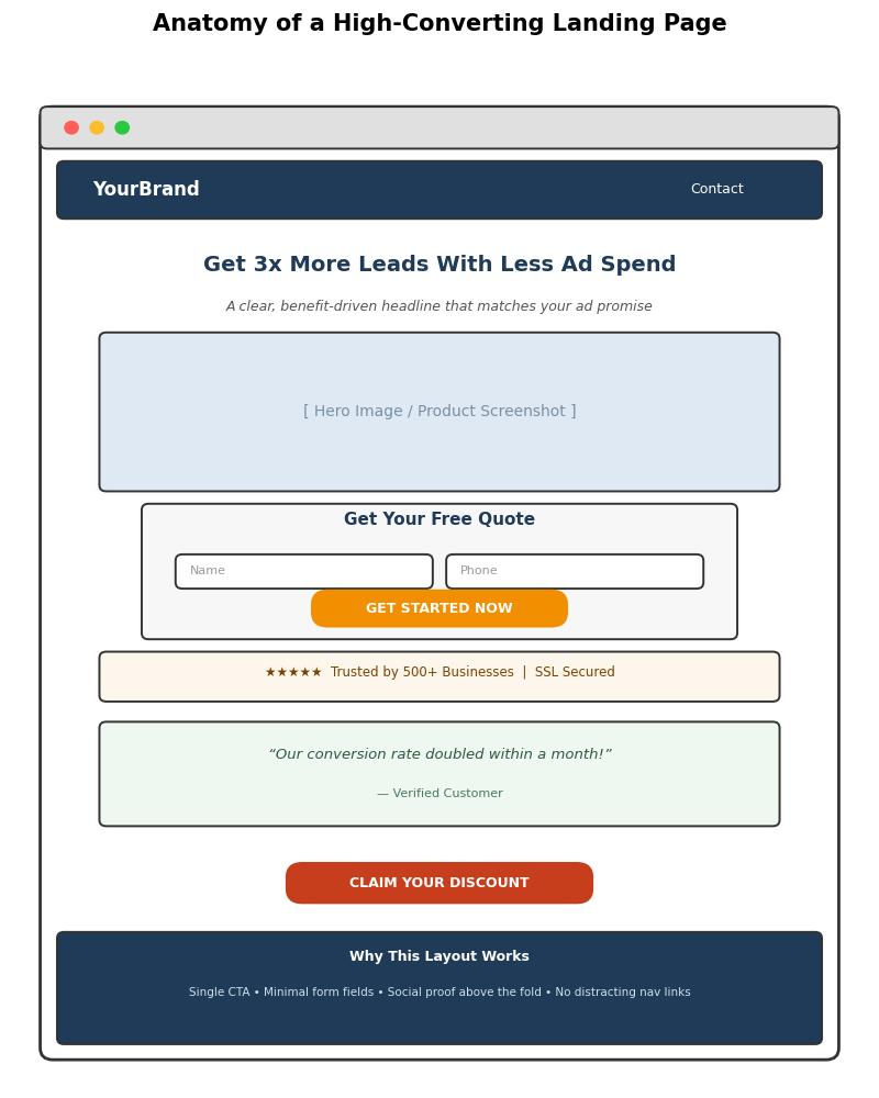
Remove the main navigation bar. Remove footer links to your blog, careers page, or social media. Every link that isn’t your CTA is a potential exit ramp. The image below shows a simplified anatomy of a landing page built for conversions — notice there’s no distracting navigation, and the CTA is the most visually prominent element on the page.
5. Use Strong, Specific Calls-to-Action
“Submit” and “Click Here” are weak CTAs because they describe an action rather than a benefit. Stronger CTAs describe what the visitor gets: “Get My Free Quote,” “Start My Free Trial,” or “Claim My Discount.” Make the CTA button visually distinct with a contrasting color, and repeat it at least once further down the page for longer landing pages.
6. Add Social Proof Above the Fold
Trust is the biggest barrier to conversion. Star ratings, client logos, testimonials, review counts, or security badges (like SSL certificates) all reduce perceived risk. Where possible, place at least one trust signal above the fold — before the visitor has to scroll.
7. Optimize for Mobile First
More than half of landing page traffic today comes from mobile devices, particularly for social media and search ad campaigns. Your form fields, buttons, and text need to be easily tappable and readable without zooming. Test your page on an actual phone, not just a resized browser window.
8. Test, Measure, and Iterate
No landing page is perfect on the first attempt. Use A/B testing to compare headlines, CTA copy, button colors, and form length. Track your conversion rate, not just your traffic volume — a page with less traffic but a higher conversion rate will often outperform a high-traffic page with poor conversion.
How Much Information Should You Ask For on a Landing Page?
This is one of the most common questions we get, and the honest answer is: as little as possible for the stage of the funnel your visitor is in.
Every additional form field reduces your conversion rate. Research across thousands of landing pages consistently shows that shorter forms convert better. However, “shorter is always better” isn’t a universal law — it depends on what you’re offering and who you’re targeting.
- Top-of-funnel offers (free ebooks, newsletter signups, free trials): Ask for name and email only. Anything more will hurt conversions.
- Mid-funnel offers (free consultations, quote requests): Name, email, and phone number are usually acceptable, since the visitor already has some intent.
- High-ticket or B2B offers (enterprise software demos, large service contracts): A slightly longer form (company name, budget range, job title) can actually improve lead quality, because it filters out unqualified visitors before your sales team spends time on them.
A good rule of thumb: for every field you add beyond the essentials, ask yourself, “Do I truly need this information right now, or can I collect it later in the sales process?” If the answer is “later,” remove the field.
How to Improve My Landing Page? (A Practical Checklist)
If you already have a landing page live and want to improve its performance without a full redesign, work through this checklist:
- Check your page load speed using a free tool and compress any oversized images.
- Confirm your headline matches the exact promise made in your ad or email.
- Remove any navigation links that aren’t your primary CTA.
- Reduce your form to the minimum number of fields necessary.
- Add or refresh testimonials, reviews, or case study results.
- Make sure your CTA button uses a color that contrasts with the rest of the page.
- Test the page on at least three different mobile devices and screen sizes.
- Add urgency or scarcity where genuinely applicable (limited slots, time-bound discounts).
- Run an A/B test on your headline — it typically has the single biggest impact on conversion rate.
- Review your analytics for drop-off points using scroll-depth or heatmap tools.
Small, incremental changes compound over time. A 1% improvement in conversion rate might sound minor, but on a page generating thousands of visits per month, that translates directly into additional revenue.
What Is the Best Landing Page Builder for Digital Marketing?
There is no single “best” landing page builder for everyone — the right choice depends on your technical comfort level, budget, and how deeply the page needs to integrate with your existing marketing stack. Here’s a general breakdown of the categories:
- Drag-and-drop SaaS builders: Platforms built specifically for landing pages offer pre-built templates, built-in A/B testing, and easy integrations with ad platforms and CRMs. These are ideal for marketers who want speed and don’t need deep customization.
- WordPress page builders: If your website already runs on WordPress, a page-builder plugin lets you create landing pages without leaving your existing hosting environment, keeping your branding and tracking scripts consistent across your whole site.
- Custom-coded landing pages: For businesses that need maximum control over performance, design, and integrations (especially for high-traffic campaigns), a custom-built page developed by a professional agency will almost always outperform template-based builders in load speed and conversion optimization.
The tool matters less than the strategy behind it. A beautifully built page using the “best” builder will still underperform if the copywriting, offer, and structure aren’t right. This is exactly why many businesses eventually bring in a specialist agency instead of relying solely on templates.
What a Landing Page Agency Does
A specialized landing page design agency does far more than just “make the page look nice.” Here’s what a professional engagement typically includes:
- Conversion research: Understanding your target audience, competitors, and existing analytics before writing a single line of copy.
- Copywriting: Crafting headlines, subheadlines, and body copy that speak directly to your visitor’s pain points and desired outcomes.
- UX and visual design: Structuring the page layout, choosing imagery, and designing a visual hierarchy that guides the eye toward the CTA.
- Development and speed optimization: Building a fast-loading, mobile-responsive page that doesn’t lose visitors to technical friction.
- A/B testing and analytics setup: Installing proper tracking (heatmaps, conversion pixels, analytics goals) and running structured tests to continually improve performance.
- Ongoing optimization: Reviewing performance data monthly or quarterly and making iterative improvements rather than treating the page as a one-time project.
The funnel below illustrates how each of these efforts maps onto the visitor’s actual journey, from the moment they see your ad to the moment they convert.
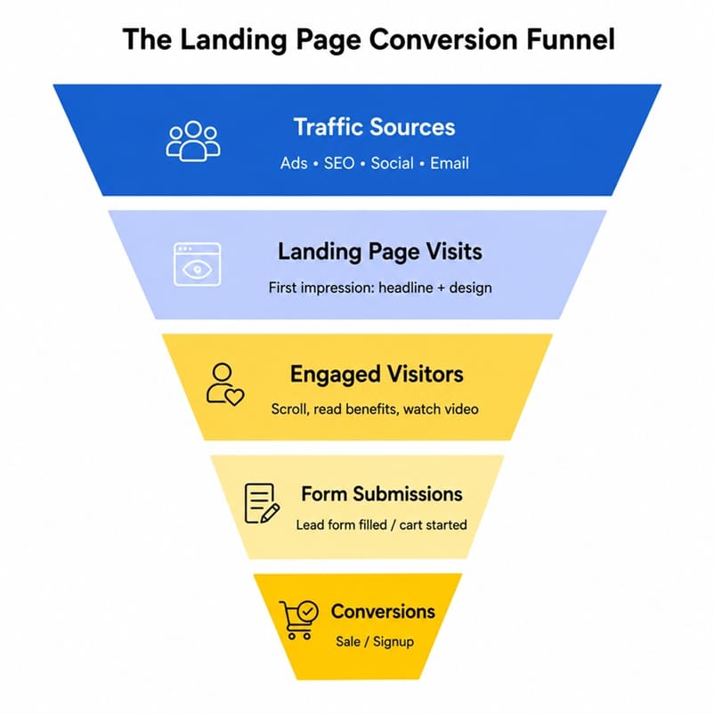
Notice that the funnel narrows at every stage. This is normal — not every visitor will convert. The job of a landing page agency is to widen each stage of the funnel as much as possible: getting more visitors to engage, more engaged visitors to submit the form, and more form submissions to become paying customers.
DIY vs. Hiring a Professional Agency
If you’re a solo founder or a very early-stage startup, building your first landing page yourself using a template builder is a reasonable starting point. It lets you test an offer quickly without a large upfront investment.
However, once you’re spending meaningful money on paid traffic, the calculation changes. A poorly converting landing page doesn’t just cost you the price of the page — it costs you every dollar of wasted ad spend sent to it. This is where working with an experienced landing page design agency pays for itself. Firms offering landing page designing in Delhi, India or landing page design services in Delhi, India combine copywriting, design, and conversion-rate-optimization expertise that most in-house teams don’t have the bandwidth to build from scratch.
If you’re evaluating options more broadly, it’s also worth comparing a web designing company in Delhi against a top-rated web design company in India to understand pricing, portfolio quality, and whether they specialize specifically in conversion-focused landing pages versus general website design — the two skill sets don’t always overlap.
Common Landing Page Mistakes to Avoid Even After Launch
Launching a landing page is not the finish line — it’s the starting point of an ongoing optimization process. Many businesses build a page, launch a campaign, and never revisit the page again, even as performance declines or the offer changes. Here are a few mistakes worth watching for after your page goes live:
- Letting the offer go stale: If your landing page promotes a “limited-time” discount that has technically expired, visitors who notice will immediately lose trust in your brand.
- Ignoring seasonal messaging: A landing page written for a summer promotion may need refreshed copy and imagery once the season changes, especially for e-commerce and travel brands.
- Not segmenting traffic: Sending both cold traffic (people who’ve never heard of you) and warm traffic (existing subscribers or retargeted visitors) to the exact same page usually means the messaging is too generic for either group. Consider building slight variations for each audience segment.
- Forgetting about page speed as content grows: Every time you add a new testimonial, video, or image to “improve” the page, you risk slowing it down. Re-test load speed after every significant edit.
- Never revisiting analytics: A landing page that converted well six months ago might be underperforming today due to increased competition, rising ad costs, or a shift in audience expectations. Set a recurring monthly or quarterly review.
Frequently Asked Questions
Do I need a different landing page for every ad campaign?
Ideally, yes — or at least for every distinct audience segment or offer. Message match between the ad and the landing page is one of the strongest predictors of conversion rate, so a single generic page trying to serve five different campaigns will almost always underperform compared to five focused pages.
How long should a landing page be?
There’s no fixed rule. Simple, low-commitment offers (like a free newsletter signup) can convert well with a short page. Higher-consideration purchases (like enterprise software or expensive services) often benefit from a longer page that addresses objections, includes more social proof, and explains the offer in more depth. Test both approaches for your specific offer.
Should a landing page include pricing?
It depends on your industry and sales process. If your pricing is competitive and straightforward, showing it upfront can filter out unqualified leads and build trust. If your offer is customized or high-ticket, it’s often better to gather contact information first and discuss pricing on a call, where your sales team can frame the value properly.
Can I use my homepage as a landing page?
Technically yes, but it’s rarely a good idea for paid campaigns. Homepages are designed to serve many different visitor intents and usually include full navigation, which gives visitors too many ways to leave without converting. A dedicated, focused landing page will almost always outperform a homepage for a specific campaign.
Final Thoughts
A high-converting landing page isn’t the result of luck or a trendy design template — it’s the result of a deliberate process: a single clear goal, a benefit-driven headline, minimal friction, strong social proof, and continuous testing. Whether you build your first page yourself or partner with a professional agency, keep coming back to the same question: does every single element on this page help move the visitor toward the one action I want them to take?
Get that right, and your landing page stops being just another web page — it becomes one of the highest-performing assets in your entire marketing funnel.


Related items

Freelancer vs Agency vs In-House: How to Choose the Marketing Team That Fits Your Business Right Now
Gartner’s 2025 CMO Spend Survey found that marketing budgets average 7.7% of company reven
A website redesign is one of the few marketing projects that can lower your traffic on the

A WordPress site rarely breaks all at once. It drifts. A plugin update here, a new image l
