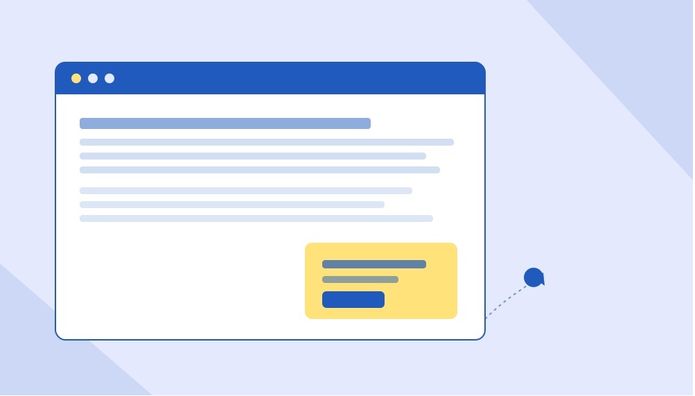
You’ve felt it yourself. You land on an article, start reading the first line, and before your eyes even adjust — bam. A full-screen popup slams down asking for your email, blocking the entire page behind a translucent grey wall. You hunt for the tiny “X” hidden in the corner, usually the size of a pixel, half-annoyed and half-impressed by how deliberately hard it is to find. Then you leave. Maybe not that page — the whole site.
Now flip the script: you’re the site owner. That same popup you just closed in frustration is sitting on your own homepage right now, and it’s probably costing you more visitors than it’s converting into leads.
This is the quiet contradiction at the center of most lead capture strategies — the tactic marketers reach for to grow their list is often the exact thing pushing people out the door before they ever get the chance to subscribe. The good news is that the fix isn’t “stop using popups.” It’s building smarter ones.
The Problem With the Popups Everyone Still Uses
Full-screen, immediate-load popups were everywhere for years because, in isolation, they worked — they’re impossible to ignore, so of course some percentage of visitors converts. But that short-term win comes with long-term costs that rarely get measured in the same dashboard.
They tank the user experience
A visitor arrives with intent — to read an article, compare a product, find an answer — and instead they’re met with an interruption before they’ve had a chance to decide if your content is even worth their time. That’s a terrible first impression, and first impressions on the web are unforgiving. Most people don’t get annoyed and stay anyway; they get annoyed and leave.
They can trigger Google penalties
This one surprises a lot of marketers. Google has explicitly penalized intrusive interstitials — the full-screen kind that cover the main content immediately on mobile — in its search rankings. A page that looks great in your CMS preview can be actively working against your SEO the moment Google’s crawler sees a wall of popup covering your content on a mobile screen.
They spike bounce rate, especially on mobile
On a small screen, a full-screen popup isn’t a small interruption — it’s the entire experience. There’s no scrolling past it, no glancing around it. Mobile visitors, who often have less patience and more competing tabs open than desktop users, bounce out at a noticeably higher rate when they’re met with an aggressive overlay before they’ve even scrolled once.
They train visitors to distrust your site
Beyond the immediate bounce, there’s a compounding trust cost. A visitor who gets ambushed by a popup on their first visit is primed to leave immediately on their second visit too — even if you’ve since toned things down. First impressions on the web don’t just affect a single session; they shape whether someone gives you a second chance at all.
Also read:
UX & Conversion Optimization
Website Speed and Conversion Relationship
So Why Do So Many Sites Still Use Them?
Mostly inertia. A lot of popup implementations are “set it and forget it” — someone installed a plugin years ago, set it to trigger immediately on page load, and nobody has revisited it since, even as the traffic mix shifted heavily toward mobile and Google’s rules changed. The tool didn’t fail; it just never got upgraded to match how people actually browse today.
The other reason is a mismeasurement problem. Teams look at “popup conversion rate” as a standalone metric and it looks great — 3%, 5%, sometimes higher. What they don’t see in that same report is the bounce rate spike, the SEO ranking dip, or the visitors who left annoyed and never came back to convert through any channel at all. A popup can win on one metric and quietly lose on three others.
The Smarter Alternative: Behavior-Triggered Overlays
The fix isn’t removing lead capture — it’s changing when and how it shows up. Instead of interrupting every single visitor the instant they land, smart popups wait for a signal that the visitor is actually engaged, then ask at a moment when saying yes feels natural rather than intrusive.
Scroll-depth triggers
Instead of firing on page load, the popup waits until a visitor has scrolled 50%, 70%, or 90% down the page. By that point, they’ve demonstrated real interest in the content — they’re no longer a stranger deciding whether to stay, they’re an engaged reader who might genuinely want more of what you’re offering. Asking for an email at that moment feels like a natural next step, not an ambush.
Time-on-page triggers
Similar logic, different signal. If a visitor has been on the page for 30, 45, or 60 seconds, they’re clearly reading, not bouncing. A popup that waits for this threshold respects the fact that the first few seconds of a visit are for orientation, not conversion.
Exit-intent triggers
This is the cleverest of the three. Exit-intent detection tracks cursor movement on desktop (or scroll-up behavior and back-button presses on mobile) to predict when someone is about to leave, and shows the offer at that exact moment. The logic is simple but powerful: if they were going to leave anyway, a well-timed offer costs nothing in terms of user experience — you’re not interrupting a reader mid-flow, you’re catching someone on their way out the door.
Lightweight code structures
Beyond timing, the technical build matters just as much. Bloated popup scripts slow down page load, which independently hurts both user experience and SEO. A well-built overlay uses lightweight, asynchronous-loading code that doesn’t compete with the core content for load priority, doesn’t block rendering, and disappears cleanly without leaving background scripts running. This is exactly the kind of performance-first thinking a good web development company in Delhi builds into a site from the ground up, rather than bolting on after the fact. The goal is an overlay that feels instant and unobtrusive, not one more thing the browser has to fight through before the page becomes usable.
What This Looked Like for One B2B Publisher
Here’s where theory meets results. A B2B publisher running a content-heavy site was using a traditional immediate-load, full-screen popup for newsletter sign-ups — the kind that appeared the second a visitor landed, regardless of device or engagement level. Sign-up numbers were decent, but mobile bounce rate was creeping upward, and organic rankings on key articles had quietly started slipping.
The fix wasn’t a redesign of the offer itself — the newsletter pitch stayed largely the same. What changed was the delivery mechanism. The full-screen interstitial was replaced with a scroll-triggered slide-in that appeared only after a visitor hit roughly 60% scroll depth, paired with an exit-intent trigger for desktop visitors who showed signs of leaving before reaching that point. The new popup was also rebuilt with a lighter script, load-tested specifically for mobile performance.
The results were the kind that get a marketing team’s attention in a single meeting: newsletter sign-up rate doubled, and mobile bounce rate dropped by 18% in the same period. Two metrics that are usually assumed to trade off against each other — more aggressive lead capture versus better user experience — moved in the same direction at once. The lesson wasn’t “popups don’t work.” It was “badly-timed popups don’t work, and well-timed ones do double duty.”
How to Rebuild Your Own Popup Strategy
If your current setup is a full-screen, immediate-load popup, here’s a practical path to something smarter.
1. Audit what you actually have live
Check every popup currently running on your site — including ones a plugin might be running by default that nobody actively configured. Note the trigger type, the device behavior, and whether it’s blocking content on mobile specifically, since that’s where Google’s interstitial penalties bite hardest.
2. Pick a trigger that matches visitor intent
Scroll depth works well for content-heavy pages where reading time matters. Time-on-page works well for product or service pages where visitors browse rather than scroll linearly. Exit-intent works everywhere but only on desktop, since mobile browsers don’t expose the same cursor-movement signals — mobile needs a scroll-based or back-button-based equivalent instead.
3. Rebuild with mobile-first performance in mind
Test the popup on an actual mobile connection speed, not just a desktop preview. Check that it doesn’t cover the full viewport, doesn’t block the ability to close it easily, and doesn’t slow down the page’s core load time. If your site’s overall mobile experience feels dated beyond just the popup, it might be worth a broader look — a experienced website design agency in Delhi can audit the whole mobile journey, not just the overlay sitting on top of it.
4. Make the offer worth the interruption
Even a perfectly timed popup underperforms if the offer behind it is generic. “Sign up for our newsletter” converts worse than a specific, tangible reason tied to what the visitor is already reading — a related guide, a checklist, a relevant discount, or early access to something useful.
5. Measure the full picture, not just the popup conversion rate
Track bounce rate, average session duration, and organic ranking movement alongside sign-up numbers. A popup redesign that improves lead capture while quietly protecting — or improving — the rest of your site health metrics is the actual win, not just the sign-up count in isolation.
The Bigger Picture
Lead capture and user experience don’t have to be in conflict. The publishers and brands getting this right have simply stopped treating popups as a blunt, one-size-fits-all interruption and started treating them as a piece of on-site content that deserves the same thought as anything else a visitor sees — right message, right moment, right device.
The instinct to interrupt every visitor immediately comes from a fear that if you wait, you’ll miss the chance to convert them. In practice, the opposite tends to be true: waiting for the right signal — engagement, intent to leave, meaningful time on page — produces an offer that feels earned rather than forced, and visitors respond to that difference even if they couldn’t articulate why.
If your current popup setup hasn’t been touched since it was first installed, there’s a good chance it’s quietly working against the very goals it was built to support. A short audit and a smarter trigger strategy is often all it takes to turn an annoyance into an asset — and it’s exactly the kind of conversion-focused fix a full-service digital marketing agency or a SEO agency can handle alongside the rest of your growth strategy.



Related items
A practical, step-by-step walkthrough of the process we actually run with clients, includi

Google’s fourth spam update of 2026 is live. The pattern across all four says more than th
What internal links are, how to plan them, and how to find and fix the problems already on