
The Invisible Leaky Bucket: Why Your SaaS Acquisition Strategy is Flawed
You are pouring millions of dollars, thousands of engineering hours, and endless creative energy into the top of your marketing funnel. Your SEO strategies are ranking, your paid ad campaigns are driving targeted traffic, and your sign-up charts are curling upward in a beautiful, venture-capital-pleasing hockey stick curve. On paper, your SaaS company is winning.
But behind the dashboard graphics lies a sobering, cash-burning reality. When you look at your product analytics for week two and week three, the drop-off is staggering. The users who enthusiastically input their email addresses and created passwords just days ago are quietly slipping out the back door. They log in once, look around a chaotic interface, get overwhelmed by a lack of direction, and log out—never to return.
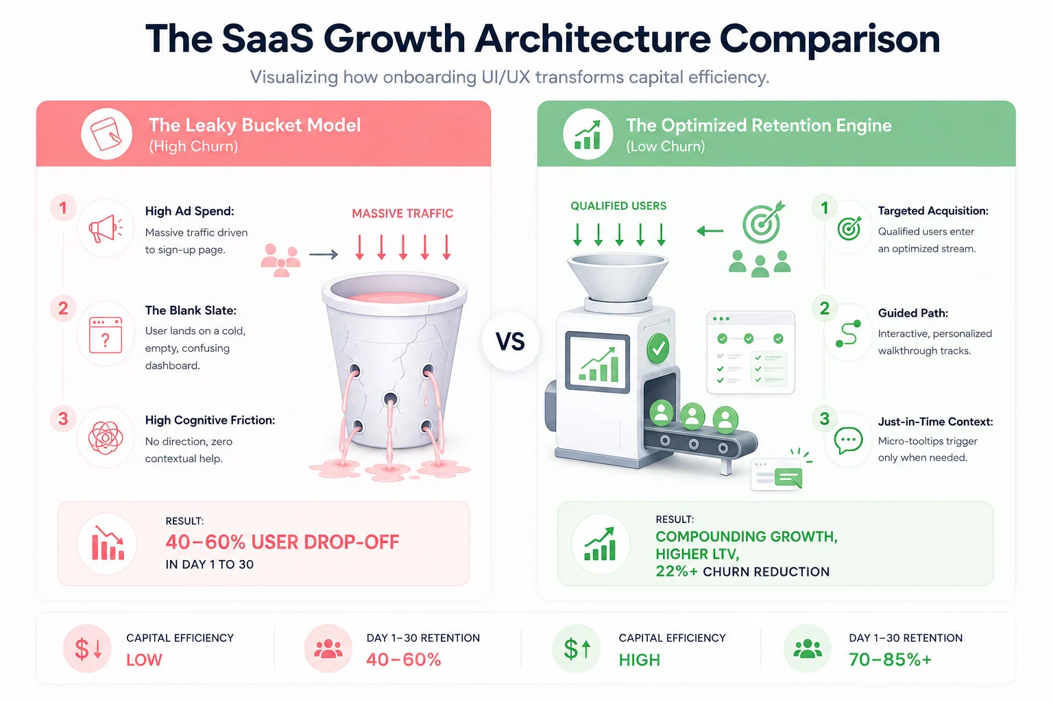
This is the classic SaaS Leaky Bucket Syndrome. Across the software-as-a-service industry, the first 30 days are a brutal proving ground. Studies consistently show that the average SaaS platform loses up to 40% to 60% of its newly registered users within the first month. They aren’t leaving because your core technology is bad or because your pricing is too high. They are leaving because your user onboarding UI/UX failed to guide them to their first meaningful breakthrough moment before their patience ran out.
In an era where alternative software platforms are just a Google search away, cognitive friction is an absolute growth killer. If your interface feels like an unmapped labyrinth, users won’t spend hours trying to figure it out; they will simply cancel their trial and find a competitor who respects their time. To plug the leak, you must transition from an *acquisition-first* mindset to an *activation-first* framework. Let’s dissect the mechanics of 30-day user churn and explore the exact UI/UX design components required to build an elite onboarding engine.
 The Psychology of the First 30 Days: Why New Users Abandon Ship
To fix a broken onboarding experience, you must look at your software interface through the eyes of an anxious, easily distracted new user. When someone signs up for your SaaS app, they are at peak motivation. They have a problem they are desperate to solve, and your marketing materials have convinced them that your platform holds the key.
However, that motivation is a highly volatile resource. The second they step past the login wall, a ticking clock begins. This is what product designers call the race to **Time to Value (TTV)**. Time to Value is the precise duration it takes for a user to realize the product’s core promise—often called the “Aha! Moment.”
If a user signs up for an invoicing tool, the Aha! Moment isn’t setting up a profile or uploading a brand logo; it is sending their very first sleek, professional invoice and seeing how easy the process is. If your UI/UX forces them to fill out 15 form fields, verify three distinct sub-accounts, and read a text-heavy manual before they can even preview an invoice, you are artificially extending your TTV. With every added layer of friction, motivation drops while frustration climbs. By day 14, when the initial excitement has completely withered away, the user quietly deletes their account or lets their trial expire without using a single advanced feature.
The Core UX Principle: Onboarding is not an administrative orientation process; it is an active continuation of your marketing department’s value proposition.
The primary driver of early-stage SaaS churn is cognitive overload. When confronted with an overwhelming array of navigation menus, charts with zero data lines, and generic multi-step product tours that point out every button on the screen without providing actual context, the human brain short-circuits. To counteract this paralysis, your onboarding UI/UX layout must be designed with extreme intentionality, using progressive disclosure to show users exactly what they need to see, precisely when they need to see it.
Architecting the Onboarding Solution: The 4 Core UI/UX Pillars
Plugging the leaks in your 30-day retention bucket requires a systemic restructuring of your platform’s interactive touchpoints. ICO WebTech approaches this problem by deploying four integrated UI/UX pillars designed to minimize friction and flatten the user learning curve.
1. Tailored Interactive In-App Walkthroughs
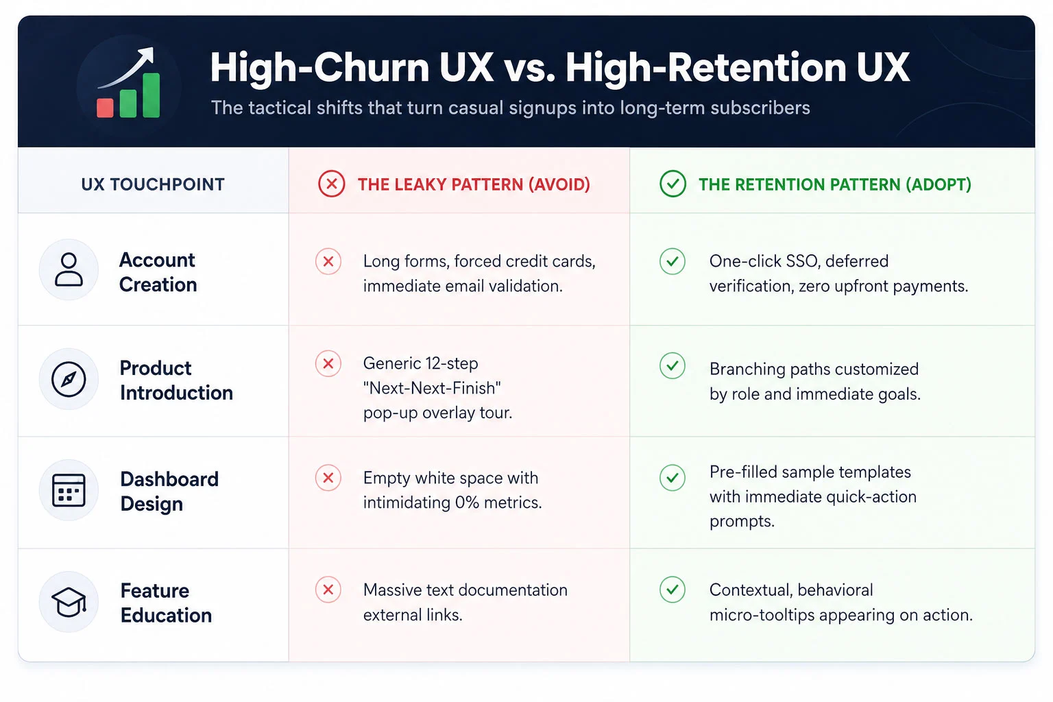
The days of the unskippable, linear 10-step product tour are dead. Modern enterprise and consumer SaaS users expect an interactive experience that adapts to their specific professional goals. Instead of showing every single user the exact same generic welcome tour, your UI should kick off with a brief, high-value segmentation window. Ask the user simple, goal-oriented questions: *”What are you looking to achieve today?”* or *”What is your primary job role?”*
Based on their selection, the interface should launch a tailored, branching interactive walkthrough. If a manager signs up for a project management tool to track team timelines, they should not be walked through the billing configuration suite. Their interactive tour should guide them exclusively through creating a project board and assigning their first task. By making the walkthrough an active, hands-on exercise rather than a passive slideshow, you dramatically accelerate product adoption and empower users through immediate action.
2. Contextual, Just-In-Time Tooltips
Nothing disrupts a user’s flow quite like an unexpected pop-up window block that hijacks the entire screen to explain a feature they aren’t ready to use yet. To build a truly humanized onboarding experience, you must replace aggressive, interruptive notifications with subtle, contextual tooltips.
Contextual tooltips are reactive design elements that trigger based on specific real-time user behavior. For instance, if a user hovers their cursor over an advanced analytics icon for more than two seconds, a micro-tooltip appears with a single clear sentence explaining what that chart tracks. If they are filling out a complex data formatting line, a small helper bubble appears with an example input style. By serving educational context in small, manageable pieces right at the point of action, you reduce the user’s reliance on external help documentation and keep them deeply immersed within your application workflow.
3. Simplified Dashboard Interfaces & Empty-State Optimization
An overlooked danger zone in SaaS UI design is the “Empty-State Dashboard.” When a user logs into a brand new account, they are often greeted by a sea of blank charts, empty folders, and confusing 0% progress tracking stats. This lack of data makes the application look dead, uninviting, and intimidating.
An elite onboarding experience treats the empty state as a prime educational landscape. Instead of a blank white box, fill that screen space with beautiful, mock-data templates that demonstrate what the product looks like when fully optimized. Insert clear, highly visible action elements directly into the empty space. For example, instead of a blank table, show an illustration with a clean button that reads: “You haven’t imported any contacts yet. click here to sync your list in 30 seconds.” By simplifying the dashboard view and removing secondary features until the primary setup actions are complete, you keep the user’s cognitive eye locked onto the critical path.
4. Frictionless, Multi-Stage Setup Steps
Requiring an exhausting configuration routine right at registration is the absolute fastest way to sink your activation rates. While your engineering team might prefer to have all database connections, API keys, and team invitations configured upfront, your UX team must advocate for the psychological comfort of the user.
Break your configuration cycle down into a frictionless, multi-stage progression. Utilize single sign-on (SSO) protocols through trusted ecosystems like Google or Microsoft to turn registration into a single-click event. Defer non-essential tasks—such as updating billing profiles, configuring advanced notifications, or customizing aesthetic themes—to later in the user lifecycle. Give users a clear visual progress indicator (e.g., a progress tracker showing 25%, 50%, or 75% completion) to gamify the setup process and leverage the human psychological urge to complete uncompleted tasks.
 Case Study: How a Fintech App Lowered 30-Day Churn by 22%
To fully grasp the financial impact of intentional onboarding design, let’s examine a real-world digital restructuring executed for a high-growth business fintech application. This platform was built to help small-to-medium business owners sync their corporate bank accounts, categorize operational expenses, and project real-time tax liabilities.
The platform possessed an incredibly powerful backend engineering architecture, but its early metrics were highly alarming. Over 45% of users who successfully linked a bank account abandoned the application before their 30-day trial period concluded. The marketing team was forced to continually scale up paid spending budgets just to replace the users they were shedding week after week.
ICO WebTech initiated a deep-dive programmatic analysis of user clickstreams and interface behavior. The insights uncovered three major UX bottlenecks:
- The Initial Shock: Immediately upon linking their accounts, users were dropped into a hyper-complex financial dashboard tracking over forty different ledger data variables simultaneously. They had no idea where to start.
- The Content Dead-End: Essential data categorization steps required users to navigating through manual filter settings nested deep within a hidden sub-menu layout.
- The Interruption Factor: A rigid, generic welcome tour kept popping up to explain advanced multi-currency features that were completely irrelevant to 85% of their domestic user base.
The Strategic Redesign Strategy
Our UI/UX design teams executed a radical overhaul of the application’s entry sequence. First, we implemented an interactive segmentation card on screen one, splitting users into two distinct onboarding tracks: *”I want to estimate my upcoming quarterly taxes”* and *”I want to cut down my weekly expense tracking time.”*
Second, we applied a progressive disclosure pattern to the main dashboard. We hid the complex, secondary analytics panels entirely during the first week of use. Instead, the interface morphed into a clean, action-oriented workspace highlighting a clear step-by-step interactive configuration checklist. When a user completed a step, a satisfying animation fired, and the next logical action was illuminated with a soft glowing tooltip block.
Finally, we introduced contextual helper micro-tips over complex financial terms. Instead of sending users off-platform to search a knowledge base for definitions, they could simply tap an interactive tool icon to see a plain-English explanation directly in line with their workflow.
The Compounding Financial Impact
The operational results surpassed all initial forecasts. Within ninety days of deploying the optimized onboarding interface, the fintech app’s 30-day user churn rate dropped by a definitive 22%. By helping users reach their financial “Aha! Moment” within the first four minutes of account creation, customer lifetime value surged, client acquisition costs stabilized, and the company transformed its product into a highly efficient, self-sustaining revenue engine.
—
Measuring What Matters: Onboarding Metrics for Product Teams
You cannot optimize what you do not measure. To build a highly effective user onboarding system, your engineering, design, and marketing product groups must align around a unified set of onboarding-focused Key Performance Indicators (KPIs). Traditional business metrics like “Total Monthly Registrations” or “Daily Active Users” are too broad to diagnose specific UI bottlenecks. Instead, focus your tracking tools on these three precise indicators:
1. The Product Activation Rate
The activation rate is the percentage of registered users who successfully execute a predetermined set of core actions that deliver initial product value. For an email marketing SaaS, this might be uploading a subscriber list and sending a test broadcast. For a design app, it might be exporting a completed canvas asset. Your product data analytics should track exactly how many users hit this activation milestone. If your signups are rising but your activation rate is flatlining, your onboarding interface is actively blocking the door.
2. Time to Value (TTV) Velocity
Track the exact number of minutes or hours that elapse between a user’s initial account creation and their realization of the product’s value. Your ongoing UI/UX updates should constantly look to compress this duration. Every form field removed, every page redirect eliminated, and every automated database integration added serves to accelerate your TTV velocity, securing a psychological win for the user before distraction sets in.
3. Drop-off Step Attribution
Utilize modern behavioral funnel mapping tools to chart every single step of your onboarding walkthrough. Analyze where the visual leaks are concentrated. Do 15% of your users abandon the process when forced to verify their phone numbers? Does a massive drop occur when they reach the team member invitation page? Pinpointing the exact interactive component where users lose momentum allows you to make targeted, data-backed design adjustments rather than relying on qualitative guesswork.
—
Plugging the Leak: Prioritizing UI/UX for Sustainable Scaling
In the highly competitive modern SaaS ecosystem, code features can be replicated, pricing models can be undercut, and marketing strategies can be copied. Your ultimate, sustainable competitive moat is the sheer quality of your user experience. The brands that win the long game are the ones that eliminate friction entirely and make using their software an absolute joy from minute one.
Continuing to fund an aggressive marketing acquisition pipeline while ignoring a confusing, high-churn user onboarding sequence is the economic equivalent of trying to fill a leaky bucket with a high-pressure firehose. It is an incredibly inefficient, deeply stressful way to build an enterprise business.
By investing in tailored interactive walkthroughs, contextual inline guidance, and simplified dashboard environments, you respect your users’ time and lower their cognitive load. You build a digital bridge that guides them securely past early friction points directly to undeniable product value. Stop letting your valuable, hard-won traffic slip away into the dark. Optimize your onboarding UI/UX architecture, plug the month-one retention leaks, and transform your platform into a compounding growth engine that retains every single user it catches.

Related items

For years, the e-commerce playbook was as simple as it was reliable: build clean product p

Take a look at your website analytics right now. If your digital footprint matches global

Most businesses treat their website like a finished product. They launch it, move on, and