Barely There, Fully There
Brands are stripping their websites down to almost nothing — skinny sans-serif type, oceans of white space, one button, one message — and it’s not laziness; it’s leverage. Done right, this “barely there” style builds trust in seconds, keeps visitors on the page longer, and pushes more of them toward a purchase. Done wrong, it’s just an empty page pretending to be a strategy. This post breaks down why the shift is happening, how to tell the difference between confident minimalism and a design cop-out, and how to bring it to your own brand without losing your personality.
In this blog:
- What “barely there” UI actually means (it’s not the same as “empty”)
- Why this shift is happening right now
- Why skinny sans-serif fonts took over modern branding
- The real psychology behind white space, backed by research
- My original framework — the Signal-to-Space Ratio
- What a barely-there screen looks like in practice
- Real websites already doing this well
- Where minimalism backfires
- A practical checklist for your own site
Here’s a number that should stop your scroll for a second:
75% of people decide whether they trust a business based on how its website looks, not on what the website says (Fahrenheit Marketing, 2025).
Not the pricing page. Not the “About Us” story you spent three weeks writing. The look. And that judgment happens fast — most visitors form an opinion of your brand within seconds of landing on your homepage. If your site is busy, cluttered, or trying to say twelve things at once, you’ve probably already lost them before they read a single word.
That’s exactly why the loudest trend in design right now is, ironically, quiet. Hyper-minimalist interfaces — thin, elegant sans-serif fonts, massive white space, one clear call to action — are showing up everywhere from Apple’s product pages to tiny D2C startups that can’t afford a design team. This isn’t a passing aesthetic. It’s a response to how overwhelmed people actually feel online, and the brands getting it right are turning that quiet look into real revenue.
What “Barely There” UI Actually Means
Let’s clear something up first, because this is where a lot of brands get it wrong. “Barely there” doesn’t mean empty. It doesn’t mean a white page with a logo and a vague sentence floating in the middle, hoping it looks expensive. True hyper-minimalism is an editing decision, not an absence of decisions. Every element that survives the cut is there because it’s doing real work — a headline that tells you exactly what the product does, one button that tells you exactly what to do next, and enough breathing room that your eye actually lands on both.
Think of it less like an empty room and more like a well-organized one. A minimalist living room isn’t a room with nothing in it — it’s a room where every object earns its place. The couch is there because you sit on it. The lamp is there because you need light. Nothing is there just to fill space. Barely-there UI works the same way. The white space isn’t a lack of content; it’s a spotlight pointed at the content that matters.
Why This Is Happening Right Now
A few forces are colliding at once to push brands toward this style, and none of them are about fashion. They’re about behavior. People are scrolling faster, reading less, and getting less patient with anything that asks for extra effort. According to research cited by Fahrenheit Marketing (2025), the average consumer attention span has dropped to roughly eight seconds, and mobile shopping now makes up nearly half of all eCommerce activity, which means your design has to work on a five-inch screen just as well as it does on a laptop. There’s simply less room, and less patience, for visual noise.
Speed plays a huge role too. A cluttered page with heavy images, animations, and plugins takes longer to load, and load time is not a small detail anymore — it’s a dealbreaker. Google’s own research shows that 53% of mobile visitors will abandon a site if it takes longer than three seconds to load (as cited in Mapletree Studio, 2025). Minimalist pages, with fewer elements to download and render, tend to load dramatically faster, which keeps people around long enough to actually convert.
Then there’s the psychology of choice itself, which is where things get genuinely interesting. A famous study out of Columbia University found that shoppers offered 24 varieties of jam were ten times less likely to actually buy one than shoppers offered just six varieties (Iyengar & Lepper, 2000). Too many options doesn’t feel like freedom — it feels like friction.
The same thing happens on a website.
A homepage with fifteen navigation links, six competing banners, and three different calls to action doesn’t give visitors more power. It gives them decision fatigue, and tired brains don’t buy things. They leave.
- Consumer attention spans are shrinking, and mobile browsing now dominates most traffic
- Faster-loading, simpler pages directly reduce bounce rates and cart abandonment
- More choices on a page can actually lower conversions, not raise them
- 75% of first impressions are driven by visual design, not written content
Also read: How to Create a High-Converting Landing Page: The Complete Guide
The Skinny Sans-Serif Takeover
If you’ve noticed that almost every modern brand seems to use the same thin, clean, slightly stretched-out font, you’re not imagining it. Skinny sans-serif typefaces have become the unofficial uniform of modern branding, and there’s a real reason beyond trend-chasing. Thin type feels calm. It doesn’t shout, and in a digital landscape full of shouting, calm reads as confident. A brand that doesn’t need bold, heavy, all-caps type to grab your attention is quietly telling you it doesn’t need to try that hard, because the product speaks for itself.
There’s a practical side to this too. Sans-serif fonts, especially lighter weights, render cleanly at almost any size, which matters enormously now that your typography has to look sharp on everything from a smartwatch to a 4K monitor. Serif fonts with their little decorative strokes can start to look fussy or even blurry at small sizes, while a clean sans-serif line stays legible and modern no matter where it shows up. Combine that with generous letter spacing, and you get type that feels less like “reading text” and more like “absorbing a message,” which is exactly the sensation most brands are chasing.
None of this means every brand should look identical, and that’s actually a real risk worth naming honestly. When everyone reaches for the same thin blue-gray sans-serif and the same amount of white space, brands start blurring together. The fix isn’t to abandon minimalism — it’s to use color, one distinctive shape, or a signature interaction to keep your barely-there design from looking like a template. Minimal doesn’t have to mean identical.
White Space Is Not Empty Space
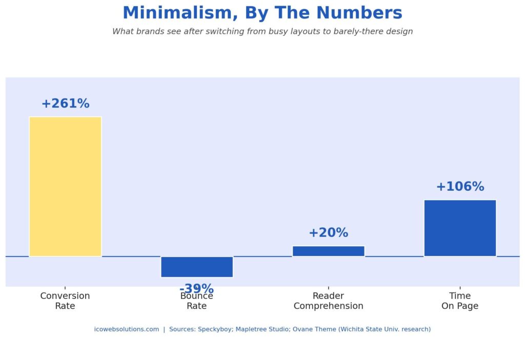
This is the part that trips up the most brands, so it’s worth sitting with. White space, sometimes called negative space, gets treated like wasted real estate by people who haven’t studied how attention actually works. But research from Wichita State University found that strategic white space between paragraphs and in page margins increased reader comprehension by nearly 20% (as cited in Ovane Theme, n.d.). That’s not a small effect. That means the empty space around your words is doing measurable work to help people actually understand what you’re saying.
Here’s the honest case study that makes this concrete.
Underwater Audio, an eCommerce brand, tested a busy, detail-packed homepage against a stripped-down, minimal version with less copy and fewer competing images. The simplified version increased conversions by 261% (Speckyboy, n.d.). That’s not a rounding error — that’s the difference between a page that works and a page that quietly loses money every single day it stays online.
White space works because it gives the brain somewhere to rest. Every image, button, and paragraph on a page is competing for a visitor’s limited attention, and when everything is fighting to be noticed, nothing actually wins. Space between elements acts like punctuation for the eyes. It tells a visitor where one idea ends and the next begins, and it makes the one thing you actually want them to notice — your product, your headline, your button — impossible to miss.
My Framework: The Signal-to-Space Ratio
Here’s where I’ll say something a little controversial, because it needs to be said. Most brands calling their redesign “minimalist” aren’t practicing minimalism at all. They’re hiding indecision behind a nice-looking template. There’s a difference between a brand that removed forty elements because none of them mattered, and a brand that never had a clear message to begin with and used white space to cover for it. One is strategy. The other is a blank canvas mistaken for confidence.
To help separate the two, I use a simple mental model I call the Signal-to-Space Ratio, or SSR. Every screen has two ingredients: signal, meaning anything that actually communicates value — your headline, your CTA, your product image — and space, meaning everything left open around it. The goal isn’t to maximize space and it isn’t to maximize signal either. It’s to find the ratio where every remaining element is doing real work, and the space around it is amplifying that work instead of hiding a lack of it.
When the ratio skews too far toward signal, you get clutter — too many messages competing at once, and visitors leave confused about what you actually want them to do. When it skews too far toward space, you get what I call ghost design — a page that looks expensive and says almost nothing, leaving visitors with no real reason to act. The sweet spot sits in between: one confident message, one clear action, and just enough space to make both impossible to miss. That’s the zone where the highest-converting, most trusted brands actually live.
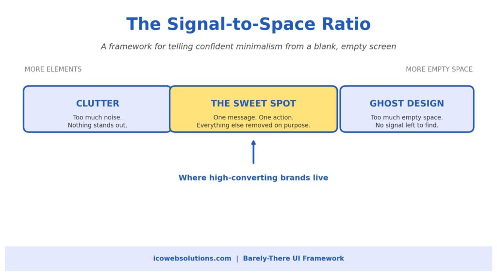
You can run this test on your own homepage right now. Ask yourself honestly: if you removed any single element on the page, would visitors understand your offer less clearly? If the answer is no, that element isn’t signal, it’s clutter, and it should probably go. If you added more space around your existing elements, would it help them stand out or just make the page feel abandoned? That answer tells you which side of the ratio you’re actually on.
What a Barely-There Screen Looks Like in Practice
It helps to see the anatomy of this laid out, because the theory is simple but the execution takes discipline. A well-built minimalist screen usually follows the same quiet structure: a short, confident headline set in a light-weight sans-serif font, a generous buffer of open space that takes up more than half the visible screen, and a single, unmissable call to action that isn’t competing with three other buttons for attention. Nothing is fighting for the spotlight because there’s only one spotlight to begin with.
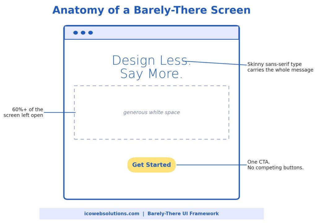
This structure also happens to be why minimalist pages tend to perform so well on mobile. When there’s only one message and one action, there’s nothing to accidentally tap, nothing to horizontally scroll past, and nothing competing with your thumb for space on a small screen. The design that looks almost too simple on a desktop monitor is often the one that actually works best in someone’s hand.
Real Websites Already Doing This Well
Reading about this concept is one thing, but it clicks a lot faster once you actually look at a live site built this way. A few brands are worth pulling up in a new tab as you read this, because they show the Signal-to-Space Ratio in action rather than just in theory.
Apple.com is probably the most studied example of this style, and for good reason. A typical Apple product page opens with one product shot, one short headline, and one link to learn more, with enormous white margins on either side. There’s no navigation clutter competing for attention above the fold. The page trusts the product photo and a handful of words to do the entire job.
Aesop, the skincare brand, takes the same logic even further. Product pages use almost entirely black text on a cream or white background, with thin typography and wide line spacing that makes the copy feel more like reading a well-designed book than browsing an online store. The restraint itself has become part of the brand’s premium positioning — the design says “considered” before you’ve read a single ingredient list.
Stripe shows how this works for a much more technical product. Despite selling a complex payments infrastructure, Stripe’s marketing pages lean on short, confident headlines, soft gradients, and generous vertical spacing between sections, so a genuinely complicated product still feels approachable and easy to scan.
Visit any of these three sites and try the Signal-to-Space Ratio test from the framework above: look at the homepage, then ask what you’d lose if you removed any single visible element. On a well-built minimal site, the honest answer is usually “quite a lot” — which is exactly the point.
Proof in the Wild: Brands Betting Big on Less
This shift isn’t limited to websites — it’s rewriting logo design too, and the pace of change over the last two years has been genuinely fast. Pentagram’s redesign of PayPal reduced the brand’s identity down to essentially just a clean wordmark, stripping away extra visual elements that had accumulated over the years (UX Studio Team, n.d.). The automotive industry tells an even bigger story: at least 14 major car brands, including Mercedes-Benz, BMW, Audi, Volkswagen, and Cadillac, have unveiled flattened, simplified logos since 2024, moving away from chrome, gradients, and 3D effects in favor of thin lines and two-dimensional marks built to look sharp on an app icon or an LED dashboard (Holloway, 2025).
What’s notable is that these aren’t small, cash-strapped startups making the shift because they can’t afford anything fancier. These are some of the most recognizable, resource-rich brands on the planet, deliberately choosing to say less. That should tell you something important: minimalism at this scale isn’t a budget decision, it’s a trust decision. When a brand strips away the extras, it’s making a quiet promise that the product underneath is strong enough to stand on its own.
- PayPal reduced its identity to a clean, simplified wordmark under Pentagram’s redesign
- Mercedes-Benz, BMW, Audi, Volkswagen, and Cadillac have all flattened their emblems since 2024
- Case studies like Underwater Audio show conversion gains over 250% from simplification alone
- Minimalist sites reliably show lower bounce rates and longer time-on-page across multiple studies
Where Minimalism Backfires
To be fair and balanced about this, hyper-minimalism isn’t automatically a win, and pretending otherwise would do you a disservice. The most common mistake is confusing “simple” with “vague.” A page can be gorgeously minimal and still fail completely if a visitor lands on it and can’t figure out, within a few seconds, what the company actually does or why they should care. Style without a clear message is just an expensive-looking dead end.
The other trap is sameness. Because so many brands are pulling from the same visual playbook right now — light blue accents, thin gray type, oceans of white — it’s genuinely easy to end up looking indistinguishable from your competitor down the street. Minimalism should sharpen your brand’s personality, not erase it. A signature color, a distinctive shape, or a slightly unexpected word choice in your headline can keep a clean design from feeling generic.
- Removing content without replacing it with a clearer message leaves visitors confused, not convinced
- Overused “safe” minimalist templates can make distinct brands look interchangeable
- Accessibility matters here too — light gray text on white backgrounds can be genuinely hard to read for many users
- Minimalism should highlight your personality, not flatten it into something forgettable
How to Bring This to Your Own Brand
The good news is that you don’t need a total rebuild to start applying this thinking. Most of the impact comes from ruthless editing rather than expensive redesigns, which means this is genuinely achievable for a small business just as much as it is for a Fortune 500 company. Start by picking the single most important action you want a visitor to take on your homepage, and then ask what’s actually standing in the way of that action being obvious.
- Pick one primary call to action per page, and remove or visually soften every competing button
- Cut your homepage headline down until it says exactly what you do in under ten words
- Increase the margin and padding around your key sections by at least 30 to 40%
- Choose one lightweight sans-serif font for headlines and stick with it across every page
- Test load speed after simplifying — faster pages keep more visitors around to convert
- Run the Signal-to-Space Ratio test: if removing it doesn’t hurt clarity, remove it
None of this has to happen overnight, and it shouldn’t. The brands that pull off “barely there” design well tend to treat it as an ongoing editing process, not a one-time redesign project. Every few months, look at your site again and ask what’s still there simply out of habit rather than purpose. That single question, asked consistently, will do more for your conversions than almost any other design change you could make.
The Bottom Line
Hyper-minimalist design isn’t about making your brand look trendy for the sake of it. It’s about respecting how little time and patience people actually have, and using every remaining pixel to earn their trust faster. The brands winning right now aren’t the ones saying the most — they’re the ones saying exactly enough, backed by real research on attention, comprehension, and conversion, and confident enough to let white space do some of the talking. That’s not emptiness. That’s editing with intention, and it’s one of the highest-leverage design decisions a brand can make in 2026.
If your website is currently trying to say everything at once, there’s a good chance it’s actually saying nothing clearly. A confident, barely-there redesign, done with the right strategy behind it, can be the difference between visitors bouncing in five seconds and visitors sticking around long enough to buy. That’s exactly the kind of work our team lives for at ICO WebTech — turning cluttered, outdated sites into clean, fast, high-converting experiences that make your brand look as sharp as it actually is.
Contact our website redesign company in India to discuss your requirements.
Keywords & Semantic Terms
- Hyper-minimalist UI design
- Minimalist web design trends
- Skinny sans-serif typography
- White space in branding
- Barely-there UI
- Modern brand identity design
- Conversion rate optimization (CRO)
- UX design principles
- Flat design and logo simplification
- Website trust and credibility
References
Fahrenheit Marketing. (2025). Minimalist web design: The future of eCommerce. https://www.fahrenheitmarketing.com/services/ecommerce/minimalist-design-future-ecommerce
Holloway, M. (2025). Latest car logos reveal a bold shift fans aren’t ready for. https://www.shop.bottegadelsarto.com/feed/latest-car-logos-672716
Iyengar, S. S., & Lepper, M. R. (2000). When choice is demotivating: Can one desire too much of a good thing? Journal of Personality and Social Psychology, 79(6), 995–1006.
Mapletree Studio. (2025). Less really is more: Web design 2025. https://mapletree.studio/blog/less-really-is-more-web-design-2025
Ovane Theme. (n.d.). The art of minimalist web design. https://ovane-theme.jkdevstudio.com/?p=24
Speckyboy. (n.d.). Flat design increases conversion rates. https://speckyboy.com/flat-design-increases-conversion-rates
UX Studio Team. (n.d.). Logo trends. https://uxstudioteam.com/ux-blog/logo-trends



Related items

Websites were built around a human operating the interface. A visitor reads the page, comp


In a Harvard Business Review audit of 2,241 US companies, only 37% answered an online inqu


If you are new to websites, deciding how many pages to build can feel surprisingly high-st
