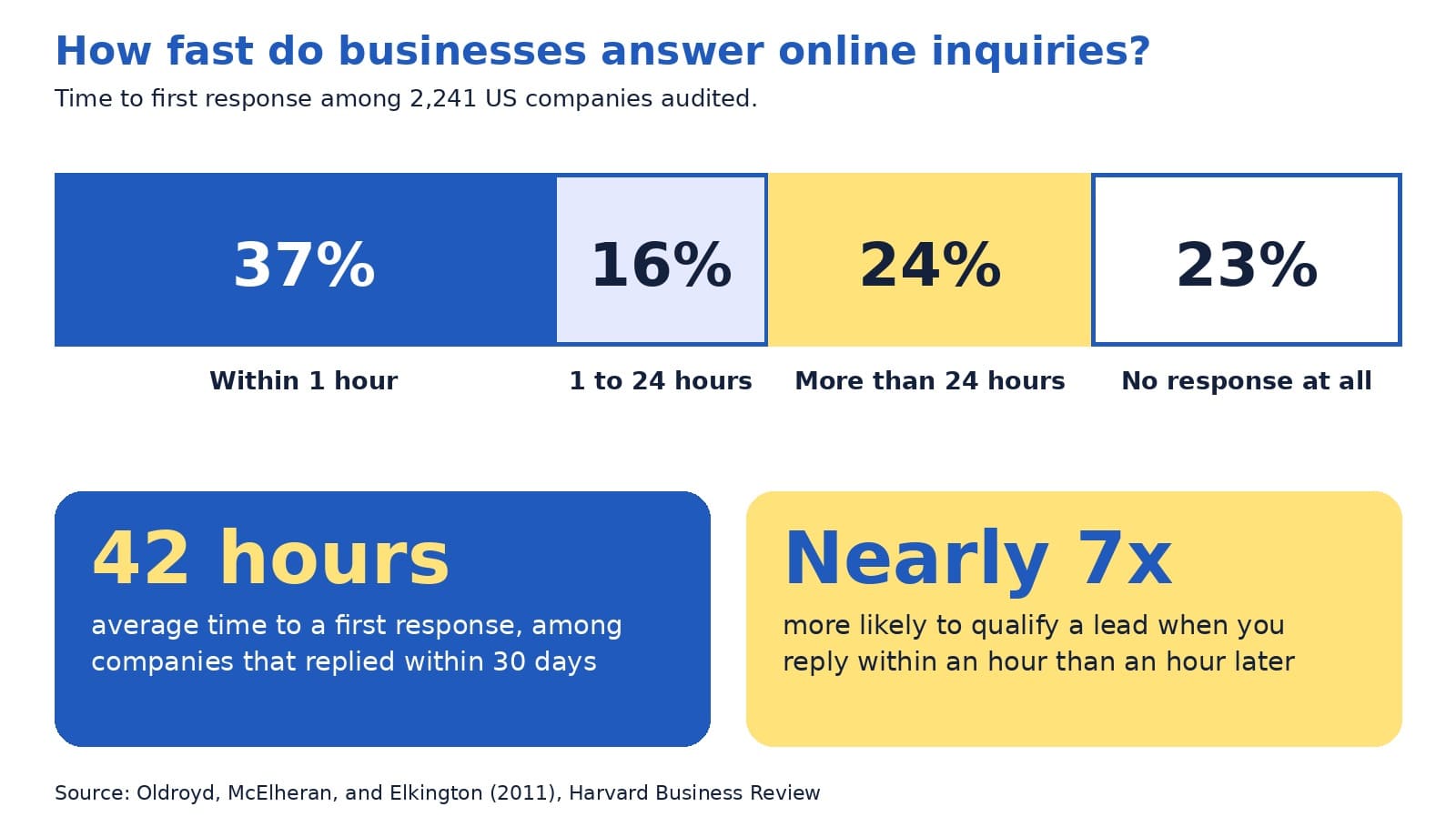
In a Harvard Business Review audit of 2,241 US companies, only 37% answered an online inquiry within an hour, 23% never answered at all, and the average first reply took 42 hours among companies that responded within 30 days (Oldroyd et al., 2011). Behind each of those numbers sat a real person who wanted to buy something.
Every one of those inquiries started on a contact page. A visitor had read enough, decided to reach out, and filled in a form or picked up the phone. That moment is where interest becomes a lead, and it is also where interest can fade. If you want to increase website inquiries, few pages repay your attention more than this one.
A fair caution: the audit is more than a decade old, so treat its exact figures as directional. The lesson still holds up well, and you can check your own numbers in a few minutes.
This guide explains, in plain English, what a good contact page includes, how to design the form, what to show so visitors trust you, and what to do after someone presses send. You will meet the four-R contact page model, see an annotated example, and finish with a 30-minute tune-up you can complete this week.
The quick answer
A good contact page makes it easy to reach you in the way each visitor prefers, asks for only what you need, shows proof that a real and responsive business stands behind the site, and keeps the promise it makes about reply time. A lead generation website works best when the contact page and your follow-up process work as one.
Inside this guide
- Why the contact page matters more than its size suggests
- Key terms in plain English
- The four-R contact page model
- Ready: easy to find and quick to use
- Reach: more than one way to get in touch
- Reassure: show a real business behind the page
- Form design: ask less and label clearly
- An annotated example
- Respond: the part that decides the sale
- A bolder view: the form is a promise, not a button
- Variations by type of business
- Common mistakes and easy fixes
- Quick answers to common questions
- A 30-minute contact page tune-up
Why the contact page matters more than its size suggests
On most websites, the contact page is one of the smallest pages. It is also one of the most important, because the people who reach it have already decided that you might be the right fit. They are no longer browsing. They are deciding whether to take a step toward you.
Many visitors also use the contact page to check that a real business stands behind the site. The Stanford Persuasive Technology Lab, which has published research-based guidelines for web credibility, lists one of them in just six words:
“Make it easy to contact you.”
Stanford Persuasive Technology Lab (n.d.)
The same guidelines explain that clearly showing a phone number, a physical address, and an email address can boost a site’s credibility, and that listing a physical address helps show a legitimate organization is behind the site (Stanford Persuasive Technology Lab, n.d.). In other words, your contact page does two jobs at once: it collects inquiries, and it builds trust before anyone writes a word.
Think of your website as a chain with four links: attract visitors, persuade them, invite them to act, and follow up. The contact page is the third link, and a weak one reduces the payoff from the design, search, and advertising work that came before it.
Key terms in plain English
A few words appear often in this guide. Here is what they mean:
- Lead: a person who has shown interest, such as by sending a message.
- Conversion rate: the share of visitors who take an action. If 100 people visit and 5 send a message, the rate is 5%.
- Call to action: the next step you invite a visitor to take, such as Request Quote.
- Form field: one box in a form, such as Name or Email.
- Tap-to-call link: a phone number that starts a call when tapped on a phone.
- Auto-reply: an automatic message that confirms you received an inquiry.
The four-R contact page model
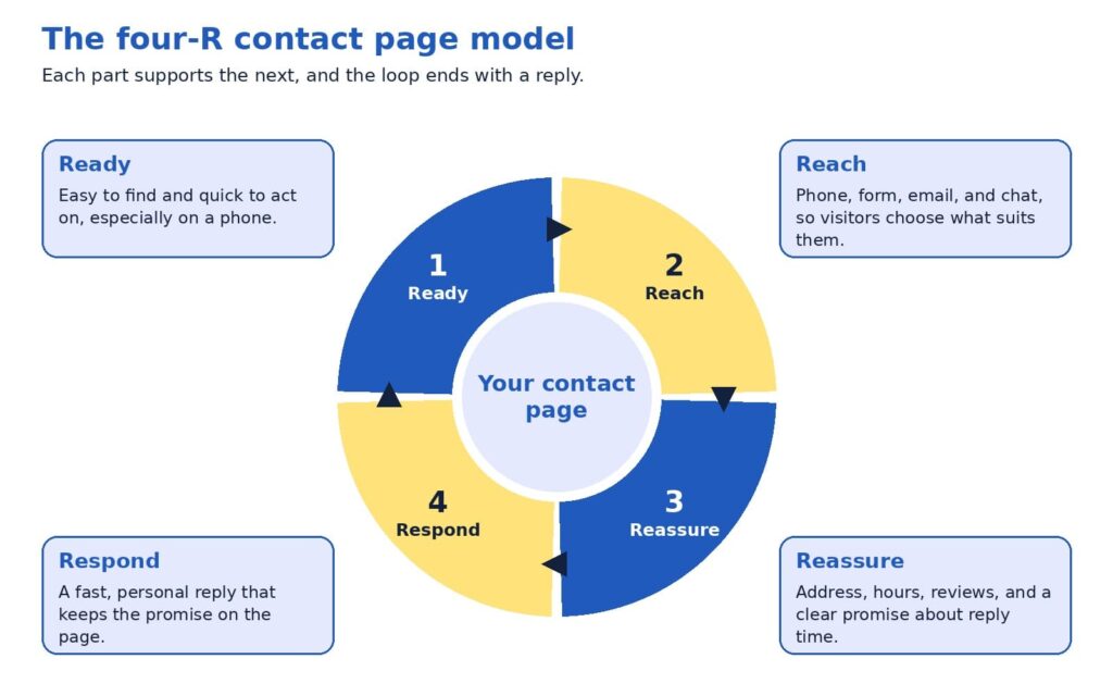
A good contact page is easier to plan when you break it into four parts. We call this the four-R contact page model, and each R answers a question a visitor may be asking.
- Ready: Can I find this page and use it quickly, even on my phone?
- Reach: Can I contact you in the way I prefer?
- Reassure: Is there a real, trustworthy business behind this?
- Respond: Will someone answer me soon, and will I know what happens next?
Most businesses spend their effort on the first two Rs, which are the visible design choices. The last two decide whether the inquiry becomes a customer, and they are the ones that get the least attention. The sections below take each part in turn.
Ready: easy to find and quick to use
Visitors cannot contact you if they cannot find the page. Put a plain Contact link in your main menu, repeat it in the footer, and show your phone number in the header so it is visible on every page. A label such as Contact or Contact us tells visitors exactly what they will find, which is usually better than a creative name.
Once visitors arrive, keep the page focused. Remove sidebars, pop-ups, and long promotional text, because every extra element competes with the one action you want, and make sure the page loads quickly on a phone.
A short form or a clear button at the bottom of each service page also lets a motivated visitor act right away.
Reach: more than one way to get in touch
People differ in how they like to contact a business. Some want to call and hear a voice, some prefer to write a message when it suits them, and some want to book a time on a calendar. A good contact page offers a primary option and one or two alternatives. Typical choices include a phone number with a tap-to-call link, a contact form, an email address, a chat window, and a booking link.
Match the primary option to your business. A heating and cooling contractor whose customers need urgent help may lead with the phone number. A consulting firm whose buyers need to explain a complex project may lead with a form and a calendar link. In both cases, showing the other options costs little and respects each visitor’s preference.
Reassure: show a real business behind the page
At the moment of contact, a visitor often feels a small amount of doubt: will anyone read this message, and is this company legitimate? Reassurance removes that doubt, and the Stanford guidelines point to the ingredients, namely a phone number, a physical address, and an email address (Stanford Persuasive Technology Lab, n.d.).
You can add more. Business hours tell visitors when to expect an answer, and a photo of the person who will reply makes the exchange feel human. A short review or rating near the form shows that others had a good experience, and a one-line privacy note, such as “We use your details only to reply to you,” helps people feel comfortable sharing an email address. Above all, state a clear promise about reply time, as long as you can keep it.
A contact page is a promise. The reply is how you keep it.
Form design: ask less and label clearly
The form is the heart of most contact pages, and research supports keeping it simple. A study by Google’s User Experience Research team and the University of Basel took three real online forms of low, medium, and high quality, improved them using established guidelines, and tested both versions with 65 participants. The improved forms led to faster completion, more successful first-time submissions, and higher satisfaction, and even the high-quality form improved (Bargas-Avila & Seckler, 2014).
The study also points to the changes that mattered most. Participants benefited when rules about format were stated before submission, when error messages appeared next to the field with the problem, and when optional and required fields were easy to tell apart. Placing labels above the fields helped people scan the form with less effort (Bargas-Avila & Seckler, 2014).
For a typical business, a strong starter form has four to five fields: name, email, an optional phone number, and a message box with a prompt such as “How can we help?” If your team qualifies leads, one extra question, such as which service the person needs, can help you reply with the right information. Every additional field gives a visitor another reason to pause, so add one only when your team will use the answer.
A few details finish the job. Use a button label that says what happens next, such as Request Quote or Book Call, and avoid a bare Submit. Keep labels visible above each field, because placeholder text inside a box disappears as soon as someone starts typing.
This also supports accessibility: the Web Content Accessibility Guidelines, a standard published by the World Wide Web Consortium, include a basic requirement that content asking for user input provides labels or instructions (World Wide Web Consortium, 2023).
Finally, choose spam protection that works quietly in the background, so real visitors never need to solve a puzzle.
An annotated example
The mockup below shows how these ideas fit together on one page for a fictional local business. The business name, number, and reviews are illustrative, so please replace them with your own details. The layout uses two columns on a computer, with the form on the left and supporting details on the right, and the same elements stack in one column on a phone.
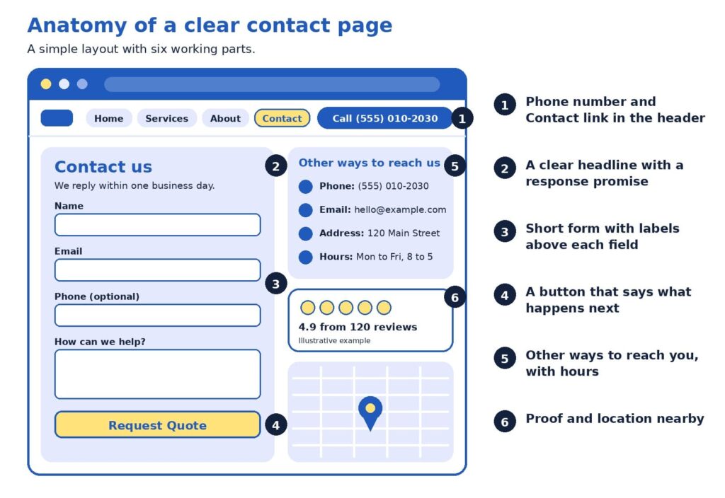
Here is how to read it, following the numbers:
- The header carries a Contact link and a phone number. A visitor on any page can reach you in one tap, which supports Ready and Reach.
- The headline includes a response promise. “We reply within one business day” sets an expectation and shows the business takes inquiries seriously.
- The form is short, with labels above each field. Phone is marked optional, so visitors who prefer email are not blocked.
- The button says what happens next. Request Quote tells the visitor exactly what the click does.
- Other ways to reach you sit beside the form. Phone, email, address, and hours are visible without scrolling, which supports Reach and Reassure.
- Proof and location sit close by. A review rating and a map show a real business that customers have used, which supports Reassure.
Respond: the part that decides the sale
A contact page can be well designed in every way and still lose sales if the reply comes late. The authors of the Harvard Business Review study put it plainly:
“most companies are not responding nearly fast enough”
Oldroyd et al. (2011)
The data behind that conclusion is worth a close look. Among the 2,241 companies audited, 37% responded within an hour, 16% responded within one to 24 hours, 24% took longer than 24 hours, and 23% never responded. The authors also reported, from a companion study of 1.25 million leads, that companies contacting a lead within an hour were nearly seven times as likely to qualify it as companies that waited one more hour, and more than 60 times as likely as companies that waited 24 hours or longer (Oldroyd et al., 2011). Marketers sometimes call this idea speed to lead: the sooner a real person replies, the more likely the conversation continues.
The good news is that a fast reply is mostly a matter of simple habits, and most small teams can build them quickly:
- Show an on-screen confirmation and send an auto-reply that says what happens next.
- Send each inquiry to a person’s phone, and name who is responsible for replying.
- Keep a few friendly reply templates ready, then personalize the first line.
- If the visitor shared a phone number, consider a call as well as an email.
Choose a reply standard that fits your business, such as within one business day or within two hours during opening hours, and publish it only when you can keep it. A modest promise that you meet every time builds more trust than an ambitious one that you miss.
A bolder view: the form is a promise, not a button
Here is a perspective that some marketing teams may hesitate to share, since it does not involve buying anything new: many businesses invest steadily in bringing visitors to the site and then lose some of them in the last step. When the contact page is clear and the reply is quick, each visitor you already attracted has a better chance of becoming a customer, which may make this one of the more cost-effective improvements available.
The most useful test costs nothing. Tonight, fill in your own contact form as a stranger would, using a different email address, and time how long it takes to receive a reply. Do the same on your phone. You will learn whether the form works, whether the message reaches the right person, and how long a real customer waits. Many owners find one surprise, such as a notification that lands in a spam folder.
Variations by type of business
The four Rs stay the same, while the emphasis shifts with the business. A local service company, such as a plumber or a clinic, usually benefits from a prominent phone number, opening hours, a service area, and a map. A business-to-business firm with longer sales cycles often does well with a short form, a calendar link, and a few lines on what happens after the first conversation. An online store sees many existing customers with questions about orders, so a short list of quick answers on shipping and returns above the form can leave the inbox for sales questions.
Common mistakes and easy fixes
Most contact page problems are small, and each one has a simple fix. Here are the ones we see most often:
- The Contact link is hard to find. Place it in the main menu and the footer, outside any dropdown.
- The phone number is an image. Use real text with a tap-to-call link.
- The button says Submit. Name the outcome, such as Send Message or Request Quote.
- The form asks for too much. Keep only the fields your team will use, and mark optional ones.
- Labels live inside the boxes. Placeholder text vanishes when someone types, so keep labels above each field.
- An error clears the form. Keep what the visitor typed, and show the message next to the field to fix (Bargas-Avila & Seckler, 2014).
- Nothing confirms the message. Show a thank-you and send an auto-reply that sets expectations.
- A puzzle blocks real people. Choose spam protection that works quietly in the background.
- Phones were not tested. Check that fields are easy to tap and the button is visible.
- Details differ across the web. Keep your phone, address, and hours consistent on your site, profiles, and listings.
- Notifications go astray. Send them to an address someone monitors, and test monthly.
A quick monthly test, which takes about five minutes, catches most of these problems before a customer does.
Quick answers to common questions
How many fields should the form have? Four or five fits most businesses: name, email, an optional phone number, and a message. Add a question only when your team will use the answer.
Is a contact form or a phone number better? Offering both usually serves more visitors, since some people prefer to talk and others prefer to write.
What should the thank-you page say? Confirm that the message arrived, state when to expect a reply, and offer a next step, such as a link to your case studies. A dedicated thank-you page also lets analytics tools count each submission as a conversion.
How do I know the form works? Submit a test inquiry each month from a computer and a phone, confirm that the notification arrives, and check that the entry appears in your reports.
What about spam? Background spam filters and hidden honeypot fields, which only automated programs fill in, screen out most unwanted messages without troubling real visitors.
Should I ask for a budget? Only if it helps you reply well. Make the field optional and explain why you ask, for example, so you can recommend the right option.
Should I show my full address if I work from home? Not necessarily. If a street address does not suit your privacy needs, a city or service area plus a phone number and email still show a real business.
Do I need live chat? It is optional. Chat suits businesses with someone available to answer during the day, and a clear form with a reliable reply promise may serve others better.
Should the page include a map? A map helps businesses that welcome visitors in person. For online-only businesses, opening hours and a description of the regions you serve are often more useful.
A 30-minute contact page tune-up
You can improve your page this week with a short checklist. Set a timer for 30 minutes and work through it:
- Add or confirm a Contact link in the menu and footer, and a phone number in the header.
- Trim the form to the fields your team uses, and label each one above the box.
- Rename the button so it states the outcome.
- Add your address, hours, and a reply-time promise.
- Submit a test inquiry on a computer and a phone, and time the reply.
Then measure the result. Count the number of contact form submissions and phone calls each month, divide by the number of visitors to the contact page, and watch the rate over time. Even a small improvement compounds, because every future visitor benefits from it.
If you would like a second opinion, send us the link to your contact page. We will review the layout, the form, and the follow-up process, then return a short list of changes ranked by likely impact.
Make the next step easy
A good contact page respects the visitor’s time and the moment of decision. It is easy to find, it offers a choice of ways to reach you, it shows the signs of a real and trustworthy business, and it is backed by a reply that arrives when you said it would. Each of those parts is within reach for a small business, and together they turn more of the visitors you already have into conversations and sales.
Planning a refresh for the whole site? Our web design agency specialists design pages that make contacting you simple, our SEO agency team brings the right visitors to them, and our digital marketing agency services connect the pieces into a steady flow of inquiries. Browse everything we offer on our services page.
References
Bargas-Avila, J., & Seckler, M. (2014, July 14). Simple is better: Making your web forms easy to use pays off. Google Research Blog. https://research.google/blog/simple-is-better-making-your-web-forms-easy-to-use-pays-off/
Oldroyd, J. B., McElheran, K., & Elkington, D. (2011). The short life of online sales leads. Harvard Business Review, 89(3), 28. https://scholarsarchive.byu.edu/facpub/9711
Stanford Persuasive Technology Lab. (n.d.). Stanford guidelines for web credibility. Stanford University. https://credibility.stanford.edu/guidelines
World Wide Web Consortium. (2023). Understanding success criterion 3.3.2: Labels or instructions. https://www.w3.org/WAI/WCAG22/Understanding/labels-or-instructions.html



Related items
Websites were built around a human operating the interface. A visitor reads the page, comp

If you are new to websites, deciding how many pages to build can feel surprisingly high-st


Freelancer vs Agency vs In-House: How to Choose the Marketing Team That Fits Your Business Right Now
Gartner’s 2025 CMO Spend Survey found that marketing budgets average 7.7% of company reven