If you are new to websites, deciding how many pages to build can feel surprisingly high-stakes. Ask five web designers and you may hear five different numbers: five, ten, fifty, or the classic “it depends.” Each answer holds a grain of truth, and none of them tells you what to build first.
Here is why the answer matters now. A Clutch (2025) survey found that 83% of small businesses have a website, up from 64% in 2018. When most businesses are online, simply having a website no longer sets you apart. What sets a website apart is its structure: which pages it has, how they are organized, and how visitors move from one to the next.
This guide explains all of that in plain English. You will learn a starting page count for three common business types, two simple tools for choosing your pages, and what a well-organized site structure looks like, with a worked example you can adapt. The advice rests on Google’s own documentation and usability research.
One note on transparency: we found no official page-count target in the guidance we reviewed. The ranges below come from our planning experience at ICO WebTech, so please treat them as starting points that you adapt to your own customers.
The quick answer
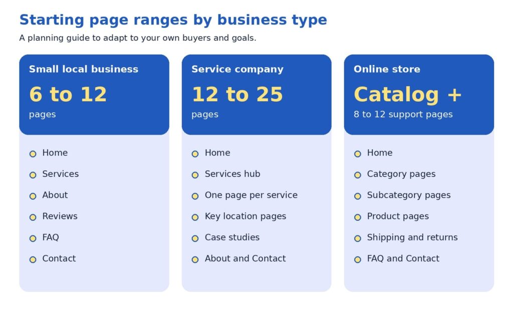
Most small local businesses start well with roughly 6 to 12 pages. A service company with several offerings and service areas often lands between 12 and 25. An online store builds around its catalog, plus about 8 to 12 supporting pages such as shipping, returns, and contact. The better question is which questions your customers ask before they call or buy, because every page should answer one of them clearly.
Inside this guide
- Key terms in plain English
- Why the number feels hard to pin down
- What Google and usability research say
- The core, proof, growth blueprint
- The page job test
- What a good site structure looks like
- Pages for each type of business
- The three business types at a glance
- A bolder view: let customer questions set the count
- Common questions from beginners
- A 30-day page plan
Key terms in plain English
A few words come up again and again when people talk about website pages. Here is what they mean, so the rest of the guide feels comfortable.
- Site structure: how your pages are organized and connected, like a table of contents for your business.
- Navigation menu: the row of links near the top of a site that leads to the main sections.
- Internal link: a link from one page of your site to another.
- URL: the web address of a single page, such as example.com/services.
- Breadcrumbs: small links such as Home > Services > Repair that show visitors where they are.
- Hub page: a page that introduces a group of related pages and links to each.
- Call to action: the next step you invite a visitor to take, such as requesting a quote.
Why the number feels hard to pin down
Most owners worry about two opposite outcomes. A site with only a few pages may look small to a new customer. A site with dozens of pages may feel heavy to build, costly to maintain, and hard to navigate. Both worries are reasonable, and both lead to the same answer: choose each page on purpose.
Advice about search engines adds another layer. A search engine is a tool like Google that finds and lists web pages, and many guides suggest that more pages bring more visitors. Google’s SEO Starter Guide takes a calmer view. It says creating compelling, useful content will likely influence your presence in search more than any other suggestion in the guide, and it adds that existing sites can improve their structure gradually, since search engines will likely understand your pages as they are today (Google Search Central, 2025b).
What Google and usability research say
Two kinds of evidence help here: how search engines read a website, and how real people use one.
On the search side, Google’s guidance favors clarity over volume. It recommends content that is unique, easy to read, and kept current, and it advises keeping each topic at one web address, because two pages with the same information can leave visitors wondering which one is correct (Google Search Central, 2025b). On the question of how long a page should be, the guide is direct:
“there’s no magical word count target, minimum or maximum”
Google Search Central (2025b)
That is good news for beginners. A page needs to be as long as it takes to answer the visitor’s question well.
On the usability side, the Nielsen Norman Group studied a popular belief called the three-click rule. It says visitors will give up if they cannot reach a page within three clicks of the home page. Laubheimer (2019) explains that no published study supports it, and he describes the rule this way:
“an arbitrary rule of thumb that is not backed by data”
Laubheimer (2019), on the three-click rule
The same article cites research by Joshua Porter showing that visitors did not abandon tasks more often, or feel less satisfied, when a task took more than three clicks. What helps instead are clear link labels, signs that show where visitors are, fast page loading, and hub pages that group related links.
For you, this means three things:
- Useful, unique pages matter more than a high page count.
- One topic belongs at one web address.
- Clear labels help visitors more than counting clicks.
The core, proof, growth blueprint
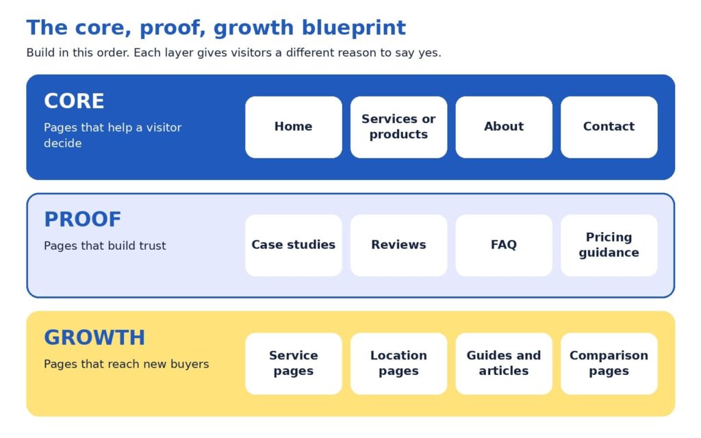
If page count is a poor starting point, what is a better one? We suggest thinking in layers. The core, proof, growth blueprint sorts pages by the job each one does for a visitor.
- Core pages help a visitor decide. Home, services or products, about, and contact answer three basic questions: who you are, what you offer, and how to reach you. Every business needs them.
- Proof pages build trust. Case studies, reviews, a frequently asked questions page (FAQ), and pricing guidance give visitors reasons to believe your claims. Many buyers look here before they pick up the phone.
- Growth pages reach new buyers. Individual service pages, location pages, guides, and comparison pages meet people at the moment they search for something specific.
Build in that order. A site with strong core and proof pages can turn visitors into inquiries right away, and growth pages then widen the audience, since each one targets something different that people search for.
The page job test
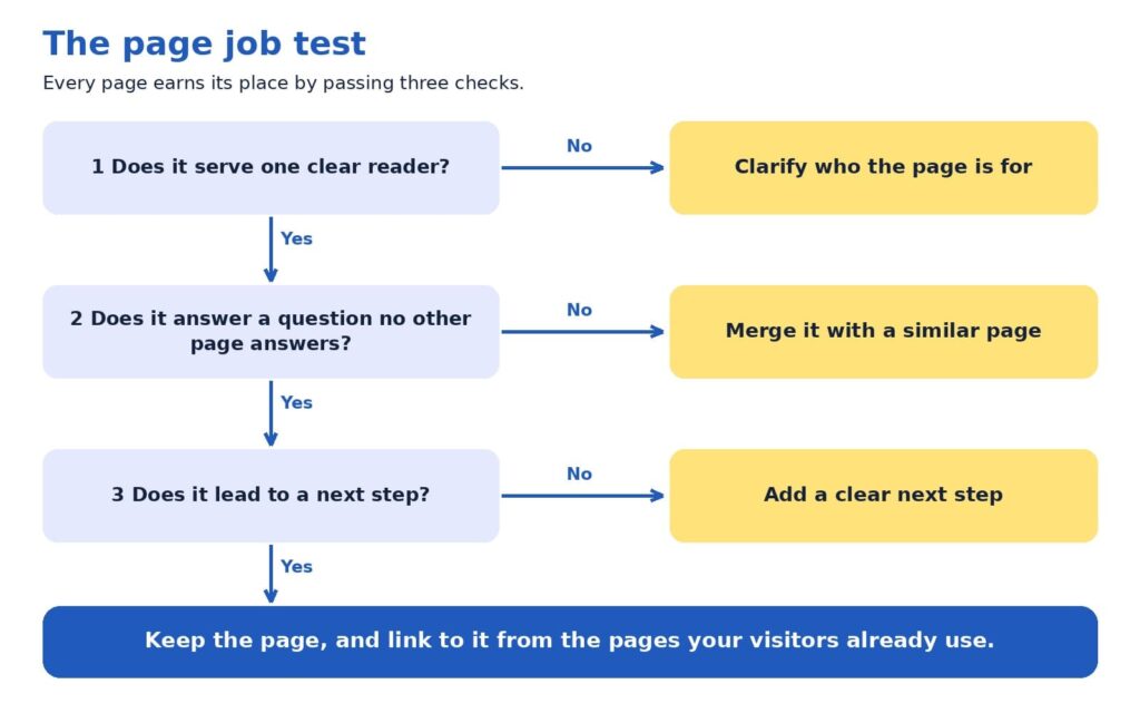
A page earns its place by doing a job. The page job test turns that idea into three checks, and each check has a simple fix.
- One clear reader. Can you name who the page is for? When the answer is “everyone,” narrowing the focus usually sharpens the message, and the headline often writes itself.
- A distinct question. Does the page answer something that no other page answers? When two pages cover the same ground, merging them tends to create one stronger page.
- A next step. Does the page lead somewhere, such as a phone call, a form, a quote request, or a related page? A page with a next step keeps the visit moving.
Try it with a simple spreadsheet that lists your current pages. Many sites turn up a few pages to merge and some gaps where a customer’s question has no page at all. Those gaps often become the plan for the next quarter.
What a good site structure looks like
So far we have talked about which pages to have. Site structure is about where those pages sit and how they connect. A clear structure helps visitors find things, and Google says organizing a site logically helps both people and search engines understand how pages relate to the rest of the site (Google Search Central, 2025b).
Good structures tend to follow five habits:
- One home page, a handful of main sections, and supporting pages beneath them.
- One obvious parent for every page, so a visitor always knows where a page belongs.
- Plain names for sections, such as Services, About, and Contact.
- Related pages grouped together, such as all services under one Services section.
- Important pages linked from the home page, because Google uses links between pages to judge which ones matter most (Google Search Central, 2025a).
If a stranger can guess where a page lives before clicking, your structure is working.
The diagram below shows these habits in action for a fictional local service company, such as a heating and cooling contractor. It has 14 pages and three levels. The colors match the blueprint you just learned: blue for core pages, light blue for proof pages, and yellow for growth pages.
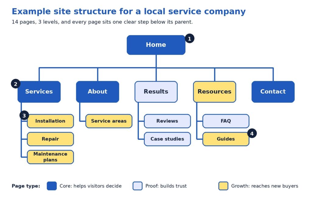
Here is how to read the diagram, following the numbers:
- The home page is the starting point. It links to every main section, so no important page is hidden. Think of it as the front door that points to every room.
- Level one holds the main sections. Services, About, Results, Resources, and Contact use plain, familiar names, and together they usually form the navigation menu. Contact stays at this level so it is one click away from anywhere.
- Level two pages each have one parent. Installation, Repair, and Maintenance plans sit under Services. A visitor who reads one can easily find the others, and the breadcrumbs read naturally: Home > Services > Repair.
- Every page is within two clicks of the home page. The reason this works is clarity. Each label tells visitors what they will find, which Nielsen Norman Group calls strong information scent (Laubheimer, 2019).
Notice how the web addresses can mirror the structure. An address like example.com/services/repair tells a visitor where they are, and Google notes that descriptive URLs help people judge whether a result will be useful (Google Search Central, 2025b).
Picture a visitor named Maria who searches for “furnace repair” and lands on the Repair page. She reads about the process, spots the breadcrumbs, and clicks Services to see the company also offers maintenance plans. She opens Reviews, feels reassured, and requests a quote. Nobody had to explain the website to her, because the structure answered each question in turn. Larger businesses add more levels, and the same habits still apply.
Pages for each type of business
Small local business
For a small local business, a first website often works well with 6 to 12 pages. Picture a neighborhood physiotherapy clinic. Its core pages are Home, Services, About with team credentials, and Contact. Its proof pages are Reviews or Results, a FAQ that covers insurance and first-visit questions, and a short page on pricing and booking. That adds up to roughly eight pages, and each one answers a question a new patient asks before calling.
Growth can follow as the clinic learns what people search for. A page for sports injuries, another for post-surgery rehabilitation, and a short guide to choosing a physiotherapist would each serve a different need. A quick check for any small site is whether it answers three visitor questions: who are you and can I trust you, what do you offer and what will it cost, and what happens next.
Service company
A service company with several offerings and service areas has more questions to answer, so the count often lands between 12 and 25 pages. The example diagram above is a good model. Add a pricing page, more case studies, and pages for the cities that bring in the most calls, and the site grows while keeping the same shape.
The word to watch is distinct. A location page earns its place when it contains something specific to that area, such as local project examples, neighborhood details, and reviews from nearby customers. Six near-identical pages that swap only the city name repeat the same information six times, which can confuse visitors (Google Search Central, 2025b). A useful test: if you can write three honest, specific sentences that belong only to a location page, the page is likely worth building. Otherwise, a short section on the services page may serve that city well.
Service pages also benefit from a consistent layout: who the service helps, how the process works, proof such as a case study or review, answers to common questions, and a clear next step such as requesting a quote.
Online store
An online store follows a different logic, because the catalog sets the number of pages. Every product has a page, and products are grouped into categories, which are pages that list related products, such as Women’s shoes or Kitchen tools. Supporting pages such as shipping, returns, size guidance, FAQ, and contact reassure shoppers at the moment of decision. We suggest budgeting for roughly 8 to 12 supporting pages beyond the catalog.
Structure matters more as the catalog grows. Google’s guidance for online stores recommends linking menus to category pages, category pages to subcategory pages, and subcategory pages to every product, so that Google’s crawlers, the programs that visit pages so they can be listed in search, can reach everything by following links. It adds that Googlebot generally does not use a site’s search box, so products reachable only through search may be missed. It also suggests linking best-selling products from the home page (Google Search Central, 2025a).
Usability research points the same way. Baymard Institute’s 2025 benchmark found that 58% of desktop and 67% of mobile sites among leading US and European online stores had mediocre-to-poor homepage and category navigation. Baymard advises dividing categories into subcategories at about 10, and aiming for at least 10 products in the deepest categories (Baymard Institute, 2025). Clear categories can be a real advantage even for modest stores.
In practice, that means the menu links to every main category, each category page links to its products, best sellers appear on the home page, and support pages are reachable from the footer and from product pages.
The three business types at a glance
The summary below puts the starting ranges side by side. Every business has its own mix of customers, offers, and goals, so use it as a planning aid and let your customers’ questions shape the final list.
A bolder view: let customer questions set the count
Here is a perspective some web teams may hesitate to share, since a larger site means a larger project: page count is an output, never a goal. The number of pages your site needs equals the number of distinct customer questions you can answer well, grouped sensibly.
Try this exercise. List every question your last twenty prospects asked on calls, emails, and chats, and add the questions customers ask after they buy. Group similar questions together. Each group becomes a page or a clearly labeled section. A group of two questions may fit inside a services page, while a group of ten, such as pricing for a complex offer, may deserve its own page. When you finish, the page count appears on its own, and each page has a reason to exist.
This approach tends to protect budgets and results at the same time. A five-page site that answers the right questions may generate more inquiries than a fifty-page site that repeats itself, because visitors find what they need faster. It also makes growth easy to plan, since each new customer question suggests a new page or an update.
Common questions from beginners
Do we need a blog? A blog is a growth format, so it fits best after your core and proof pages are in place. It earns its keep when each article answers a real customer question and links to the relevant service page, in line with Google’s call for helpful, people-first content (Google Search Central, 2025b).
Should every service have its own page? When a service has its own customers, process, and questions, a dedicated page usually serves visitors better than a paragraph on a general page. Smaller offers that share the same customer can share a page, with clear headings for each.
How often should we revisit our page count? Once a year works well for many businesses, and launching a new service or location is another natural moment. Google’s guide encourages updating published content as needed (Google Search Central, 2025b).
A 30-day page plan
You can put all of this to work in one month. The plan below fits most small teams:
- Week 1, collect: gather customer questions from sales calls, emails, reviews, and the search queries report in Google Search Console, a free tool that shows how your site appears in Google.
- Week 2, map: sort the questions into core, proof, and growth, and mark which ones already have a page.
- Week 3, build or merge: apply the page job test, combine overlapping pages, and write the missing ones.
- Week 4, connect: update menus, add internal links, check mobile speed, and set up inquiry tracking.
Then give the changes time to work. Google’s guide suggests waiting a few weeks to assess the effect (Google Search Central, 2025b). Track inquiries, calls, form submissions, and the pages visitors view before they reach out, since those numbers show which pages are pulling their weight.
Before the new structure goes live, check that:
- Every page has a descriptive title and at least one link pointing to it.
- Each page offers a clear next step and loads quickly on a phone.
- Old addresses that were merged redirect to the new page.
- Contact details match across the site.
If you would like a second set of eyes on your current structure, send us your page list. We will run the page job test with you and return a one-page map of what to keep, merge, and add.
Your website, one question at a time
The right number of pages is the number that answers your customers’ questions clearly, and the starting ranges simply give you a place to begin. Build core pages first, add proof pages to earn trust, and let growth pages widen your reach. Give every page one parent, a plain name, and a next step, then review the results after a few weeks.
Ready to turn the plan into a site? Our website design agency in Delhi team builds page structures around customer questions, our SEO agency in Delhi specialists help those pages get found, and our digital marketing agency services keep new leads arriving.
References
Baymard Institute. (2025). Homepage and category navigation UX 2025: 67% of mobile sites have mediocre-to-poor performance. https://baymard.com/research-articles/ecommerce-navigation-best-practice
Clutch. (2025, August 21). Clutch report: No-code tools fuel website growth, yet 17% of small businesses are still offline [Press release]. Business Wire. https://www.businesswire.com/news/home/20250821848152/en/Clutch-Report-No-Code-Tools-Fuel-Website-Growth-Yet-17-of-Small-Businesses-are-Still-Offline
Google Search Central. (2025a, December 10). Help Google understand your ecommerce website structure. Google for Developers. https://developers.google.com/search/docs/specialty/ecommerce/help-google-understand-your-ecommerce-site-structure
Google Search Central. (2025b, December 10). Search engine optimization (SEO) starter guide. Google for Developers. https://developers.google.com/search/docs/fundamentals/seo-starter-guide
Laubheimer, P. (2019, August 11). The 3-click rule for navigation is false. Nielsen Norman Group. https://www.nngroup.com/articles/3-click-rule/


Related items
It is Monday morning, and a new proposal has landed in your inbox. It includes a fresh lin


Freelancer vs Agency vs In-House: How to Choose the Marketing Team That Fits Your Business Right Now
Gartner’s 2025 CMO Spend Survey found that marketing budgets average 7.7% of company reven
A website redesign is one of the few marketing projects that can lower your traffic on the
