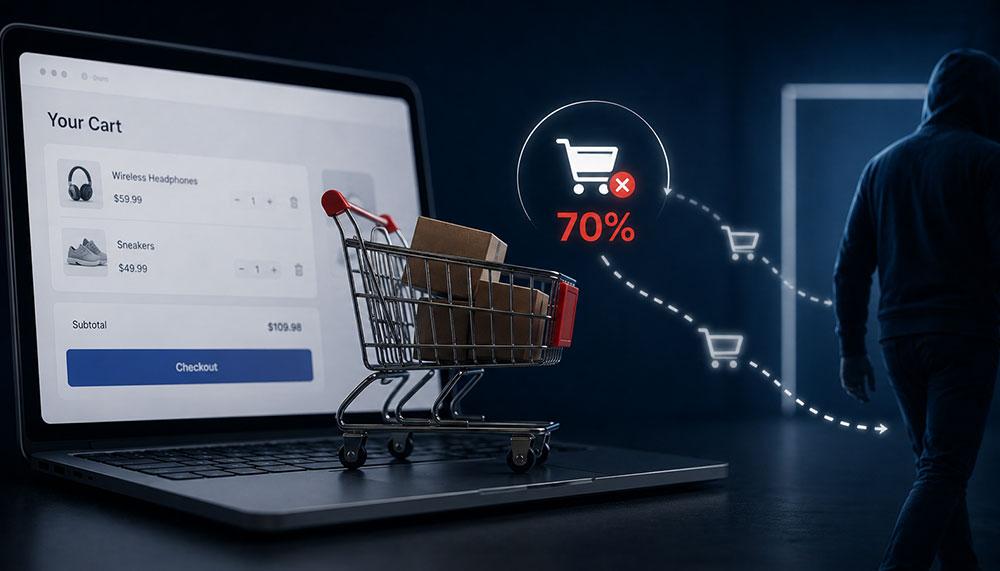
Imagine running a physical, brick-and-mortar retail store in a bustling metropolitan district. Your storefront looks exceptional, your window displays pull in hundreds of eager shoppers every hour, and your aisles are filled with customers picking up items, reading labels, and filling their shopping baskets to the brim. But as they approach the cash register, something bizarre happens: seven out of every ten shoppers suddenly drop their baskets right on the floor, turn around, and walk out the door without saying a word.
In the physical world, this would be an operational emergency. Store managers would scramble, security would investigate, and the business would halt everything to figure out why the final transaction point was causing a mass exodus. Yet, in the digital realm of e-commerce, this exact scenario plays out every single second. Brand owners celebrate skyrocketing traffic numbers, high click-through rates on social ads, and healthy “Add to Cart” metrics, all while quietly tolerating a staggering, industry-wide average cart abandonment rate that hovers stubbornly around 70%.
This is the ultimate leaky bucket of digital retail. You have already won the hardest battles: you captured the user’s short attention span, convinced them of your product’s value, outcompeted alternative brands, and motivated them to take action. Losing them during the final checkout steps isn’t just a missed sales opportunity; it is an incredibly expensive drain on your marketing budget, drastically driving up your Customer Acquisition Cost (CAC) and eroding your net profit margins. To fix this leak, e-commerce brands must stop looking at checkout as a mere administrative formality and start treating it as a critical psychological gateway that requires elite user experience engineering.
The Psychology of the Exit: Why Digital Shoppers Flee at the Finish Line
To systematically eliminate checkout friction, we have to understand the emotional state of a shopper as they enter the final transaction phase. Up until the moment they click “Proceed to Checkout,” the buyer’s journey is driven largely by desire, inspiration, and dopamine. However, the second they face the checkout layout, their mental state shifts from emotional excitement to cold, analytical logic. They are no longer thinking about how wonderful the item will look; they are calculating their financial risk, evaluating the trustworthiness of your platform, and measuring the time commitment required to complete the forms.
Any unexpected element encountered during this psychological pivot acts as a massive point of cognitive friction. The primary triggers that cause an immediate exit include:
- Forced Account Creation: Forcing a user to create a username, verify an email address, and select a password before they can give you money is the digital equivalent of demanding a background check for a cash transaction. It breaks the momentum of the purchase.
- Surprise Costs: Nothing destroys conversion velocity faster than hidden fees, unexpected processing surcharges, or bloated shipping costs revealed only on the final screen. This shatters trust instantly.
- Complex Form Fields: A long, multi-column form asking for unnecessary data (such as an obligatory fax number or multiple phone fields) triggers immediate cognitive fatigue.
- System Slowdown and Visual Instability: If the checkout pages take more than two seconds to load, or if the layout shifts unexpectedly while a user is typing, their risk-aversion instincts spike, leading them to abandon the purchase out of caution.
Mathematically, the impact of this final-stage drop-off can be quantified by tracking the exact relationship between intent and final execution. E-commerce directors use the standard Abandonment Rate formula to evaluate this vulnerability:
$$\text{Cart Abandonment Rate} = \left(1 – \frac{\text{Completed Purchases}}{\text{Created Carts}}\right) \times 100$$
When this metric climbs above the 60% threshold, it is a definitive sign that your user interface is actively working against your business goals, alienating highly motivated buyers right when they are ready to buy.
Four Pillars of a High-Conversion Checkout Architecture
Fixing the leaky bucket demands a deliberate transition toward an intentional, hyper-optimized checkout architecture. Top-tier brands don’t rely on generic, out-of-the-box platform settings. They restructure the user journey around four specific UI/UX pillars designed to minimize cognitive load, streamline data entry, and instill unshakeable buyer confidence.
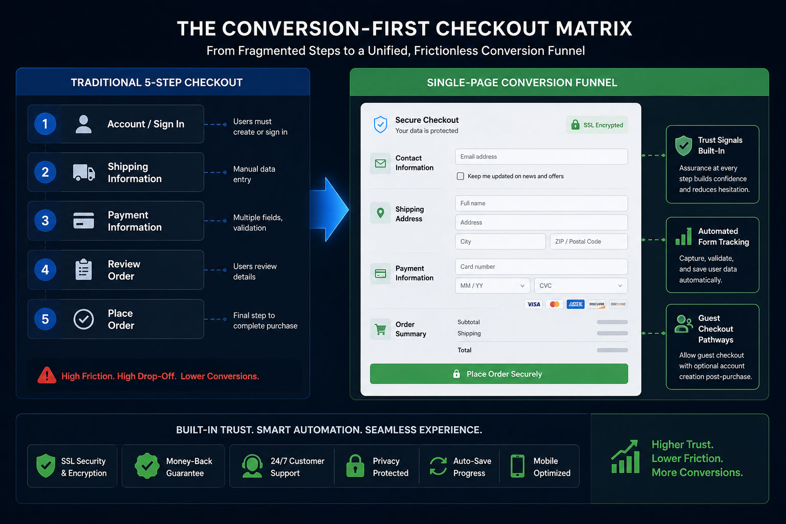
A structural map showcasing the transformation from a traditional 5-step checkout sequence into a unified, frictionless Single-Page Conversion Funnel where trust signals, automated form tracking, and guest pathways co-exist seamlessly.
1. Streamlined Single-Page Checkout Architectures
The traditional multi-step checkout—where a user must input data on page one, click next, fill in shipping details on page two, click next, choose a payment method on page three, and review on page four—is a relic of early web development. Every page load represents a point of failure where a connection can lag, a browser can crash, or a user can simply rethink their purchase decision.
Replacing this fragmented path with a clean, single-page checkout architecture changes the entire dynamic. By displaying all fields—shipping, billing, delivery options, and payment methods—on a single, intuitively organized layout, you remove the anxiety of the unknown. The shopper can clearly see the finish line from the moment they enter the checkout zone, eliminating the frustration of feeling trapped in an endless loop of form validation screens.
2. Persistent Guest Checkouts (Eliminating the Wall)
The numbers do not lie: mandatory account registration is consistently cited as one of the top reasons for cart abandonment worldwide. Consumers value their time and data privacy above all else. They do not want to become part of your database just to purchase a single commodity item.
A persistent guest checkout option serves as a wide-open doorway for your customers. By making the guest pathway the prominent, default choice, you remove a massive psychological barrier. The smart strategy is to flip the script: allow them to complete the purchase as an anonymous guest first, and then, on the final “Thank You” confirmation page, offer a one-click account creation button (“Save your details for faster tracking next time”). By delaying the ask until *after* value has been delivered, conversion rates jump dramatically.
3. Strategic Trust-Badge Placement and Security Affirmation
When a customer inputs credit card numbers or banking passwords into an online form, they are performing an act of significant digital trust. If your checkout environment looks visually inconsistent with the rest of your brand, lacks clear security iconography, or looks generic, the customer’s subconscious mind flags it as a high-risk scenario.
To overcome this, place recognized trust badges (such as SSL certification markers, payment processor logos, and data protection guarantees) exactly where the friction occurs: right next to the credit card input fields and directly underneath the primary “Complete Purchase” button. These visual security affirmations reassure the user’s subconscious exactly when they are making their final, high-stakes decision.
4. Micro-Copy Optimizations and Inline Field Validation
Micro-copy refers to the small pieces of explanatory text found inside form fields, on buttons, and within error messages. Standard, harsh micro-copy like “INVALID INPUT” or generic placeholders can frustrate users. Optimizing these small touchpoints with helpful, humanized text makes a major difference.
For example, instead of leaving a field label as “Billing Address,” add small sub-text that notes: *”Matches the address on your bank statement.”* Additionally, use inline validation—where a field turns green with a checkmark the moment a valid entry is completed, or displays a gentle, constructive tip instantly if a character is missed. This real-time feedback loop prevents the user from typing out an entire page only to be greeted by a frustrating page reload and a list of generic errors.
The Role of Technical Engineering: Choosing an Ecommerce Website Development Company in India
While the principles of UI/UX design can be easily sketched out on a whiteboard, executing them flawlessly within a live production environment requires deep technical expertise. A checkout page is a complex hub of real-world integrations, linking database logic, shipping calculator APIs, localized payment processors, tax engines, and tracking pixels simultaneously. If these integrations are poorly coded, they manifest as layout shifts, slow processing speeds, or security warnings that scare buyers away.
This is why sophisticated international brands don’t rely on amateur setups. Partnering with a specialized ecommerce website development company in India allows enterprises to access world-class engineering talent capable of building high-performance, custom checkout modules. These development firms specialize in trimming down heavy JavaScript code, optimizing server-side processing speeds, and ensuring absolute mobile responsiveness. In an environment where a mere 100-millisecond delay can slash conversion rates by 7%, working with technical experts ensures that your creative UX strategy is fully backed by powerful, robust web architecture.
Comparative Strategy: High-Friction Checkouts vs. Conversion-First Frameworks
To fully grasp why technical and visual optimization is the ultimate lever for recovering lost revenue, let’s contrast a standard checkout setup against an optimized, conversion-driven architecture:
Case Study: The 24% Recovery Matrix
To understand the massive revenue potential locked inside a broken checkout flow, we can analyze the real-world performance of a rapidly growing online apparel retailer. This brand was doing everything right on the marketing front: their social media campaigns were highly optimized, their product pages featured high-definition photography, and their unique value propositions drove high numbers of motivated buyers to click “Add to Cart.”
However, despite generating healthy traffic, their actual revenue numbers were lagging. An analytics review revealed a massive bottleneck: 74% of users who entered the checkout flow left before completing their transaction. The drop-offs peaked sharply at the shipping selection screen and the account registration wall.
The brand underwent a complete checkout redesign, executing a sequence of highly strategic UI/UX adjustments:
- The Registration Overhaul: The mandatory signup screen was removed entirely, replaced with a streamlined guest checkout option that reduced initial data-entry steps down to just an email address.
- Address Automation: They integrated the Google Maps Autofill API, allowing shoppers to simply start typing their street number and select their full address in one click, eliminating three separate input fields.
- Visual Transparency: They brought the shipping cost calculator forward into the cart drawer view, ensuring absolute transparency long before the final step.
The Operational Results: The impact was almost instantaneous. Within 30 days of deploying the optimized checkout architecture, the brand’s cart abandonment rate dropped by 24%. By simply making it incredibly easy for existing traffic to buy, the retailer captured an additional $15,000 in monthly sales almost immediately. This extra revenue was pure profit, secured without spending a single additional dollar on marketing, retargeting ads, or top-of-funnel acquisition campaigns.
The Long-Game Advantage: The Compounding Value of Frictionless Retail
In a hyper-competitive digital marketplace where ad costs rise year after year, brands cannot afford to treat their website architecture as a static brochure. Your checkout page is the engine room of your entire e-commerce enterprise. Every bit of friction you remove from this critical area doesn’t just recover a single sale; it sets off a positive chain reaction throughout your entire business model.
When you optimize your checkout flow, your Return on Ad Spend (ROAS) instantly climbs. Your marketing teams become more efficient because the traffic they generate actually converts into paying customers. Your customer support teams see fewer tickets regarding payment errors or broken forms. Most importantly, you create an exceptional first-purchase experience that builds trust, setting the stage for long-term customer loyalty and high repeat-purchase behavior.
Stop watching your hard-earned revenue slip away at the final hurdle. Prioritize your checkout UX. Streamline your forms, respect your users’ time with guest pathways, and back your design with elite engineering. When you build an effortless bridge between desire and ownership, your bottom line will naturally transform.
Is Your Checkout Process Silently Slaying Your Sales?
A single misplaced field or hidden fee can silently drain your digital storefront’s profits. Our specialized engineering and UI/UX design teams can conduct a deep-dive architecture audit to find and fix your checkout bottlenecks.

Related items
For years, the e-commerce playbook was as simple as it was reliable: build clean product p
The digital checkout is the most volatile, high-stakes environment in the entire digital e

The Origin Bottleneck: The High Cost of Dynamic Latency in B2B E-Commerce In the consumer-