How to benefit from responsive web design
Before we dig in to the details of how to benefit from responsive web design, let us first refresh our memory about what exactly is a responsive design.
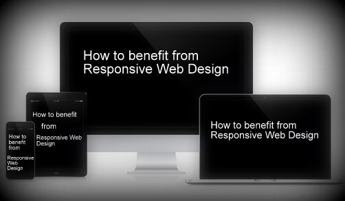
A Responsive web design seamlessly fits to any screen size, without compromising the quality of a web page.
The quality here is measured in terms of comfort in readability, navigation, clickable buttons and the overall look and feel.
As per studies there is a stratospheric increase in the percentage of internet surfs on mobile devices. Therefore it is absolutely essential for all business owners to develop a website which fits mobiles, tablets, desktops or basically screen size of any resolution.
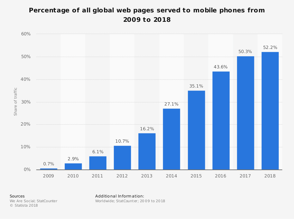
From the above study it is clear that there is a constant increase in the share of mobile phone website traffic worldwide. In fact as of February 2017, mobile holds 65.1 percent of all web traffic in Asia. This is huge.
Note: Mobile website is different from Responsive Website
Learn more about optimizing your website for mobile phones.
Planning to create a responsive website?
Read these responsive web design essentials for better insight.
Now that we know about the basics of a responsive web design, let us learn about how to benefit from responsive website design.
How can a Business Benefit from Responsive Web Design?
For a business the convenience of an online user while browsing the website is crucial. Because if the user is not comfortable to browse your website, then your potential sales goes down. And this is not a good news for any business.
Therefore it’s time to get your business loaded with benefits of using a responsive website.
How?
Read on for answers.
#1. Higher Search Engine Ranking
One of the most important benefits of a responsive website is higher SERPS. Google clearly states one of the reason for choosing responsive website design, i.e.,
A responsive website helps Google’s algorithms to precisely assign indexing rules to a web page. Rather than requiring to point directions towards the existence of related desktop/mobile pages.
Hence, making responsive web design an important Google Ranking Factor.
When you have only one strategic URL to focus on, your SEO efforts become more fruitful. Thereby giving better results in terms of search engine rankings.
#2. Increased Sales and Revenue
Just like it’s important for every business to have a website; it is equally important for a website to attract traffic and convert it into sales. So how does a business benefit from responsive web design?
Well, as said in #1, when you are making SEO efforts towards only one URL, then the outcome is better as compared to efforts towards multiple URLs.
And, second, a responsive website design allows a single compatible cascading style sheet (CSS) for a great user experience.
Further, a great user experience on your website means less bounce rate and more conversions.
#3. Easy to link
Responsive design makes it convenient for the users to share and link to your website’s content with a single URL. Unlike a website which has different websites for mobile, desktop, tablet and other devices.
If the users find the content interesting they do not have to go through the hassle of first identifying the URL and then its matching platform. One URL and you are sorted.
The sharing of content is also helpful for SEO as it gets you a genuine backlink – another reason for SEO boost.
#4. Reduces load time
You must have noticed that sometimes when you try opening a business website it redirects to a mobile version (m.website.com) and then it opens.
This is because that website is not responsive and has a different site and a different URL for mobiles.
This is not a good practice because users hate to wait. If a website redirects to a mobile version then it will obviously increase the load time. Moreover Google says that a user agent-based redirection is error-prone and can upset your site’s user experience.
Therefore shift towards a responsive website to cut down redirection and load the website quickly.
#5. Better indexing of business website
Every business website needs to be indexed by Google or other search engines so as to be found in search results. And in case of Google it’s web crawling bot discovers new and updated web pages for the purpose of indexing.
The advantage with responsive web design pages is that only a single Googlebot user agent is needed to crawl your page once. Unlike with multiple versions of a website where the Googlebot user agents have to crawl multiple times to extract all versions of the content.
Therefore it is clear that with responsive websites Google crawlers can find updates in a website more efficiently. Thereby helping in the indexing of your site’s updated content and keeping it fresh.
#6. No penalty for duplicate content
Multiple versions of a website end up creating duplicate content of your website. And Google does not like duplicate content at all. Therefore, it penalizes the website, or worst de-indexes it.
Though revoking the penalization is a tough task but upgrading to a responsive website can surely help.
Redesign your website to be a responsive one. Then request Google to re-index your website. This time Googlebot crawlers will find only one website, therefore no scope for duplicate content.
#7. Low cost development, maintenance and SEO
Responsive website designing service is the perfect solution to cut down on the money spent loosely. This is because developing a website , maintaining it and running a SEO campaign for one website is any day cheaper. In comparison to doing all this for multiple versions of a website.
Apart from the cost factor another benefit from responsive web design is the time-saving factor. By choosing responsive design you save a lot of time which can be utilized for working on core competencies of your business.
#8. Easy to track and study Google Analytics
For effective digital marketing it is important to study various factors like audiences’ behavioral flow, device used, demographics etc. And all this information can be gained from Google analytics account of a website.
Now imagine how difficult it becomes to study multiple versions of a website and collect all the info from their Analytics account and then form a strategy.
It is very confusing, unnecessary and very time consuming.
Therefore switch to a responsive website for easing and fast-tracking the monitoring process. With Google Analytics you can study how your website is performing on various devices like desktop, mobile, tablets and others.
#9. Great User Experience
The most loved benefit of responsive designing is the awesome user experience. Forget about pinching-in and out to zoom the text, or click a button.
Give your users the same experience and convenience they have while browsing your website on a desktop. They will reward you for this with the sales they make on your website.
#10. Offline browsing made easy
Majority of the smartphones and tablets in the market are HTML5 enabled. This makes them capable for offline browsing.
Therefore the responsive website users can continue viewing web content in HTML5 even when they do not have an internet connection.
Conclusion
Test your site on Google.
If you end in the green zone you are good to go.
But if your are in the red zone, contact your website designing company to quickly upgrade your website to a responsive one so as to reap its benefits.
6 Questions You Must Ask When Optimize Your Website For Mobile Phones
There is no need to explain that your website should be mobile friendly or have a responsive design or compatible with small screen sizes. With so much information available on internet we all are aware that how important it is to keep your website optimized for mobile phone devices.
Those who are not aware here is the mobile traffic data from first quarter 2017 to second quarter 2018.
Hover the bars to see the percentage traffic on mobile phones.
It is imperative that these numbers will keep on growing.
Since the advent of internet on mobile phones it is becoming easier for consumers to search for services and products and buy them on a click. It is only possible for you to reap the benefits of growing mobile traffic if you website keeps the users engaging on mobile devices and give them a smooth experience.
Here are 6 important questions you must ask when you optimize your website for mobile phone users.
1. My website looks fine on mobile phones. Is that enough for optimizing website for mobile users?
Are you using a ready made responsive theme? Like there are thousands of them available at a fraction of the cost. WordPress gives you thousands of themes which the sellers claim are fully responsive.
In realty they are just only responsive website themes which just rearrange the sections as the size of the device screens. Many of them are very poorly coded which is not possible for you to figure out until your are an experienced WordPress developer.
As per the latest Google’s research around 61% of mobile visitors don’t return to a mobile website where they had problem while browsing and almost 40% move to your competitor’s website.
There are many important aspects of a mobile friendly or responsive website which are critical to the performance of your website on mobile phone. Here are some of them.
- Mobile page speed optimization.
- Images optimization
- Plugins optimization
- Web hosting
- Website layout
If you are not a developer then you can take help from professional WordPress design agency. You can also hire dedicated WordPress developer at an affordable price
2. Should I have a separate mobile website or make my existing running website responsive in design?
These are two options you have while optimizing your website for mobile devices, first option means you make another website for mobile phones apart from your existing website. The second option is to make your website have responsive design which displays same content differently on the screens of different sizes.
Having two website means for desktops and laptops users will see www.example.com and on mobiles or tablets users will see something like m.example.com where m means mobile version of your main website.
Our experience as a web design company for over 10 years now says always go for responsive web design. We have experienced that even major search engines too like one responsive website.
3. What are the important features of a mobile phone optimized website?
There are many features of a responsive web design. Below are some of the critical ones.
User-friendly website design: Make the pages of your website user friendly as much as you can. There are thousands of mobile phone variants available and customers will invest their time on those websites which give them the best user experience on their mobile phone. Best responsive websites open perfect on every device no matter what the screen size is being used.
Prominent display of address: You need to make sure your business address is displayed very prominently to make it easy for your customers to find your information.
Click to call on phone numbers: Your business phone number should also be displayed big and bold and make sure they have click to call active on them. Users should be able to call you on a click from their phones. It is always irritating to copy the phone number from a website and pasting it in your phone to make a call.
Include a map: Always include a map for the directions to your business office. With the increasing use of GPS and services like Google maps people find it easier if they get a map on the website for directions.
4. How to make my website talk with social media?
Social media integration is the best way to advertise your business for free and get traffic to your website. If you write articles on your website make sure it can be shared smoothly with a click. If your website visitors like you articles they are most likely to share it on their social networks provided if they can do it smoothly and quick.
If you have a membership site or an ecommerce website then social login is the best and the fastest way to get users registered on your website as compared to filling up annoying registration forms on a website.
It is always advised not to overdo social media integration.
5. How will I test my website for mobile phone optimization before making it live?
You can simply check your website on different browsers to make sure it looks good on all the browsers available on mobile phones as some codes like CSS have different performance on different browsers.
You also need to check your website on as many mobile phones as possible. This doesn’t means you have to buy all these phones. These days there are so many responsive checker tools available online. Just type the keyword, ‘online responsive checker’ in Google and you will get a lot of tools available for free.
6. Should I hire a professional web design company?
There should not be a second thought on hiring a professional web designer instead of trying it yourself and messing it all. We don’t say you can’t do it but you may take months to study and then make your website responsive.
There are good website design agencies who offer web design services at an affordable cost. You can even hire dedicated web designer on a minimal monthly price.
But make sure who you are hiring, here are some FAQs on outsourcing your web design work.
What is AMP? What are its benefits? (…and how to implement it?)
Absolute guide about AMP
Google has very clear guidelines about a website’s loading speed and time. And also marks it as a ranking factor. Therefore accelerating mobile pages (AMP) has gained much importance recently.
Ideally a page load time should be 2-3 seconds
Because a user or search engines do not have all the time in the world to go through your website. And if at all it takes more than 3 seconds to load. Then unfortunately you lose both; your users and your SEO rankings.
As per Kissmetrics a one second page delay for an ecommerce website can cause a loss of $2.5 million sales per year, considering it makes $100,000 per day.
Therefore check your websites’ page load time and performance now using any of the online tools like:
https://developers.google.com/speed/pagespeed/insights/
Furthermore the page load time has to be fast (as in really fast) when it comes to Mobile pages.
That is where the Accelerate Mobile Pages comes into use.
Let’s first understand what is AMP. And then we’ll dive in deeper.
So what is AMP?
The collaboration between Google and Twitter gave birth to the AMPs plugin.
AMP is an open-source initiative led by Google to increase the performance and speed of the websites across multiple devices and distribution platforms.
Moreover it benefits the performance of web content and advertisements by stripping the HTML down to the basics. In simple words, it’s about using an already created mobile friendly page, and stripping it down to bare-bones to load quicker.
In fact Google reports that AMP pages load in less than 1 second and uses 10 times less data in comparison with the similar non-AMP pages.
Additionally this case study further proves the point that AMP pages load faster by 387% as compared to non-AMP pages.
In addition to this by Feb 1, 2018 Google expects that the content on canonical pages should match the content displayed through AMPs. So as to enhance the user experience while browsing the website pages on mobiles.
Accelerated Mobile Pages renders simplified and fast mobile user experience. Ensuring fast load time, optimized ad pop-ups and better performance with a site’s static content.
The best way to understand an AMP page is by example. Here’s one from BBC news by dbushell.com
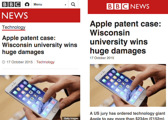
In the above image the left image is a responsive page and the right one is an AMP page.
The responsive page on left is 410KB and the AMP page is 115KB. (Woahhh…that’s huge)
The AMP page is a bare-minimum page. Whereas the responsive page has a header, footer and other article related component.
While the AMPs are more user friendly it has gained more popularity in News websites as of now.

In the above image from The Guardian, the AMP on the right side has more content above the footer. While the responsive page on left has search, breadcrumbs and lesser content.
And now the difference in size.
While the responsive page is 454kb, the AMP page is 127kb. So its quite obvious that AMPs increases the speed of mobile pages.
AMPs are structured with three fundamental workings:
1. AMP HTML
AMP HTML is basically HTML stretched with custom AMP tags. Though most tags in AMP HTML page are HTML tags. But certain HTML tags are substituted with AMP HTML components.
2. AMP JS
AMP JS does not allow any author written JavaScript. Instead it allows only asynchronous JavaScript. So as to allow JavaScript from delaying page rendering.
3. AMP Cache
The Google AMP cache is used to provide cached AMP HTML pages. It searches the AMP HTML pages, caches them, and increase the page performance automatically.
Points to keep in mind with AMPs
- Use a updated version of CSS
- No author JavaScript. Use only JavaScript library of AMP
- Ensure proper validation of websites for AMP to work fine
- AMP plugin pages do not support forms
- Set height and width to avoid strange-looking images
- For videos use AMP approved extensions
- Custom fonts have to be specially loaded for enhanced readability
Is AMP a ranking factor?
Well the answer is a yes and no combination.
No because AMP is not a direct ranking factor as per Google.
And Yes because AMP is associated with mobile friendly ranking signals of increased page speed and user experience. Hence it becomes a ranking factor indirectly.
It cannot become an individual ranking factor because…
…it has nothing to do with desktop rankings.
Therefore it isn’t becoming a ranking factor anytime soon.
Benefits of Accelerated Mobile Pages
SEO experts have observed a significant relation between website’s speed, page views and mobile rankings.
In fact when a web page loads quickly, the percentage of mobile users will view more pages of your website. Thereby decreasing your website’s bounce rate. Furthermore Google rewards such websites for delivering a great user experience, by increasing their rankings.
So while browsing you will come across AMP plugin pages with better ranking as compared to non-AMPs.
Well there are many reasons to incorporate AMP in websites. But we have tried to condense them in the below 5 reasons.
#1. Faster Page Load Speed and Time
The very obvious (as it is in the name itself) benefit of accelerated mobile pages is a fast loading page on mobile.
While a great composed content is significant for a website. But it would be of no use if the user cannot access it due to slow page load speed.
As per a study done regarding mobile load time a one second delay
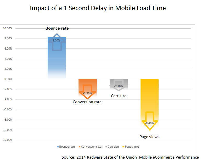
So this makes it imperative for mobile speed load time to be as low as possible. And AMP makes it easier to achieve this goal.
Start accelerating your mobile pages like now if your aim is to capture customer attention on mobiles too.
#2. Higher Rankings in Mobile Search Engine
There is a direct proportional relation between site speed, sessions and conversion rate of a web page.
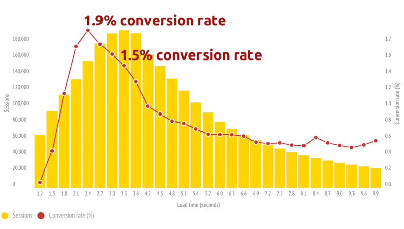
As demonstrated by a case study it is evident that a fast loading site will have more session. Thus more customers will be interested in buying your services or subscribing to your products. Thereby increasing the conversion ratio.
Although AMP is not a direct Google ranking factor. But it is very closely and significantly related to mobile page speed and user friendliness. Hence it becomes an indirect ranking factor.
#3. Supports Ads and increases ROI
What is the main motive behind starting a business???
Money, right!
So AMP extends its support by minimizing the distractions on a website page. These distractions can be the header image, sidebar, social share buttons, pop-ups and other elements. Such unnecessary elements can lose user interest.
Thus bringing down your conversion rate and the ROI.
But AMP gets you sorted for these non-essential elements on a web page.
As discussed earlier the AMPs are much light in size and uses bare HTML coding with almost no JavaScript. This makes the AMPs to be 6x lighter as compared to the desktop version of the page.
An AMP HTML page is 6x lighter in code and 5x less trackers.
Hence you get a chance to make more money from ads running in your site.
Its easier to click on the ads for the users who scroll on accelerated mobile pages.
Here’s an example
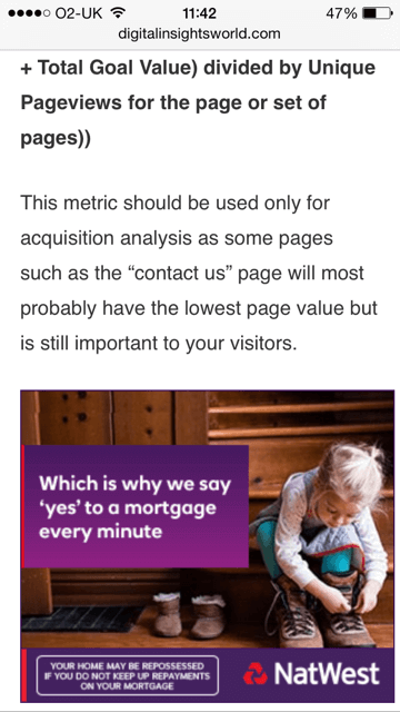
In the above image the ad is folded neat and clean and the user can click on it without any hassle.
Moreover when you decide to display ads from a third party on AMPs. Just make sure that you offer ads that take practically no time to load. And in the same time are user friendly too.
#4. Increased visibility for publishers and bloggers
Google has now started to display the results with AMP green sign, when a visitor searches for a query in mobiles.

This surely has a positive impact on the click through rate. Because it grabs more attention, which leads to more clicks.
In fact some mobile users particularly look for AMP results. Because they know these pages are going to be fast and user friendly.
#5. Track the traffic source easily
It becomes more advantageous when you are able to identify that the traffic which you are getting is from which source.
Tracking the traffic from AMPs is quite simple. Because of the analytics tools where you can get the reports and study the performance in detail.
The publishers can track the tags to monitor clicks and conversions, videos and links, new and returning visitors and more.
Responsive vs Accelerate Mobile Page
First, NO these are not similar.
While,
Responsive Design is about optimizing your desktop site for mobiles and tablets. It uses all the original tags, JavaScript, sidebars, CTAs, and all other on-page elements.
AMP on the other hand show the bare minimum. It strips down the CTAs, sidebars, header image etc, to a lighter AMP HTML version.
Responsive website design is a must for all the websites now-a-days. But accelerated mobile pages are recommended for blog and articles or primarily the publishers. Basically AMPs make more sense for content websites, newspapers and blogs.
And it is not advised to implement AMP to the whole site as it can disturb your CTAs, particularly for landing pages.
How to implement AMP?
Implementing AMPs can be quite simple with the ready to use plug-ins for WordPress websites. However for non-WordPress websites like Drupal or Magento it can be a bit thorny to implement.
You can dive in deep into the details of implementing AMP on the official site here.
Conclusion
AMP is really powerful.
If you are a content prime website then AMP is a must for you. But for other genres of website use it wisely. Because nobody likes to get hurt by losing the call-to-action buttons and the traffic associated with those clicks.
If you are looking to make your website mobile friendly, we as a website design company in India can help you achieve the goal by implementing AMP for you.
