
Is Your “About Us” Page Boring? Hooking Visitors with Brand Storytelling
Take a look at your website analytics right now. If your digital footprint matches global user behavior patterns, your “About Us” or “Company Profile” page is likely the second or third most visited URL on your entire domain. When prospects are on the verge of making a purchasing decision, signing a retainer, or partnering on an enterprise project, they click away from your features page and deliberately seek out your identity. They want to know who you are, what you stand for, and whether you can be trusted.
Yet, for the vast majority of corporate websites, this critical junction is where the relationship dies a quiet death. Instead of encountering an inspiring vision, visitors are greeted by a barren wasteland of dry corporate text, static stock imagery of people shaking hands in generic boardrooms, and a laundry list of technical milestones that read more like a legal compliance filing than a living, breathing organization. The result? Sky-high bounce rates, immediate drop-offs, and squandered conversion opportunities.
Your “About Us” page should not be an archival storage bin for corporate ego. It is a strategic sales enablement asset. By transitioning away from rigid, jargon-heavy descriptions and embracing the principles of strategic brand storytelling, you can transform this passive page into an active engine for emotional engagement and commercial conversion. Let’s explore how to dismantle boring corporate copy and build a narrative that hooks visitors from the very first paragraph.
The Corporate Ego Trap: Why Technical Jargon Kills Engagement
Why do so many brilliant, innovative companies end up with staggeringly dull corporate profiles? The root cause is almost always the “Corporate Ego Trap.” When writing about themselves, organizations instinctively default to self-defense mechanisms: institutional language, defensive credentialing, and over-indexing on technical jargon. They write to impress their competitors or their board of directors, completely forgetting the human being sitting on the other side of the screen.
Consider this standard piece of B2B corporate copy:
“We are a premier, vertically integrated provider of enterprise-grade, end-to-end technological paradigms. Leveraging our proprietary cutting-edge architectures and synergized operational methodologies, we optimize supply-chain efficiencies to drive robust ROI for global stakeholders.”
This paragraph says absolutely nothing. It is a collection of empty buzzwords engineered to mask a lack of clear identity. It creates immediate cognitive friction. When a reader encounters words like synergized, paradigms, or vertically integrated, their brain has to work harder to decode the meaning. In the digital space, cognitive friction equals an immediate bounce.
Human beings are biologically wired to reject institutional abstractions and embrace narratives. From an evolutionary perspective, our brains process stories differently than raw data or clinical descriptions. When reading data points, only the language processing parts of the brain (Broca’s and Wernicke’s areas) are activated. But when we read a compelling story, our sensory cortexes light up. We visualize the struggle, empathize with the characters, and internalize the message as if it were our own experience. If your page focuses solely on dry technical specifications, you are speaking exclusively to a rational brain that is looking for reasons to filter you out. When you tell a story, you speak to the emotional core where long-term trust is forged.
The Architecture of an Engaging Brand Narrative
To break free from the jargon trap, you must understand how to construct a proper corporate narrative arc. Every great story in human history—from ancient epics to modern cinematic blockbusters—follows a foundational structural rhythm. Your brand story should be no different. You are not writing an autobiography; you are mapping a purposeful journey where your customer ultimately wins.
A high-converting brand story requires four distinct phases:
- The Status Quo & Inciting Incident: Every story begins with a normal world that gets disrupted. What was the exact moment your company’s founders realized the existing market options were fundamentally broken? What was the frustration, the market gap, or the injustice that forced your company into existence?
- The Struggle (The Valley of Fire): A story without conflict is just a lecture. Share the early challenges. Did you build 14 failed prototypes in a garage? Did the industry tell you that your model was impossible? This vulnerability humanizes your organization and makes your eventual success feel earned rather than arrogant.
- The Breakthrough & Discovery: This is the moment where your unique methodology, proprietary technology, or core philosophy was born. It explains the “Eureka!” moment that sets your services apart from every other competitor offering similar deliverables.
- The Shared Future (The Guide and the Hero): This is the most crucial pivot. The climax of your story must transfer the spotlight from your company to your customer. You are not Luke Skywalker in this narrative; you are Obi-Wan Kenobi. Your role is that of the trusted, experienced guide who provides the tool, the strategy, or the software that empowers the customer (the true hero) to conquer their challenges.
Contrast in Action: From Functional to Emotional
Let’s see how a simple shift in copywriting perspective alters the entire emotional resonance of an organization’s profile:
| Before: Dry Institutional Copy | After: Humanized Storytelling |
|---|---|
| “Established in 2014, our cybersecurity firm specializes in network infrastructure vulnerability assessments and cloud-based threat mitigation protocols for mid-market logistics corporations.” | “In 2014, our founder watched a local family business collapse overnight after a single ransomware attack wiped out their logistics grid. We realized that enterprise-level security shouldn’t just belong to Fortune 500 giants. We built this firm to give growing businesses the ironclad digital defense they deserve.” |
Designing for the Digital Skimmer: Timelines & Scannable Layouts
Even the most brilliant brand story will fail if it is presented as an impenetrable wall of text. Modern internet users do not read web pages linearly; they skim them in an “F-shaped” pattern, hunting for visual anchors, bold headings, and bite-sized pieces of data before committing to a deep read. Your copy must work in perfect tandem with layout psychology.
When engineering an engaging “About Us” experience, your visual structure needs to break long-form history down into clean, digestible elements. One of the most effective ways to do this is by implementing a visually scannable timeline. Rather than forcing a reader to wade through paragraphs of historical context, a timeline allows them to scroll through your corporate evolution in a matter of seconds, absorbing key achievements effortlessly.
This is where technical execution meets creative design. If you look at how an elite website designing company in India approaches high-performing corporate profiles, they don’t just paste text onto a page. They map user journeys using micro-interactions, clean vertical or horizontal grid systems, and strategic typography that guides the eye naturally down the page. Balancing compelling narrative copy with optimized visual hierarchy ensures that both emotional readers and analytical skimmers find exactly what they need to build trust.
Anatomy of a High-Converting “About Us” Page Layout
To maximize dwell time and reduce bounce rates, consider structuring your page components using this proven layout sequence:
1. The Hook (Above the Fold)
A single, provocative headline that states your core belief or the massive problem you solve. Avoid saying “Welcome to Our Company Page.” Use an emotional statement.
2. The Narrative Core (The Story)
2 to 3 short, punchy paragraphs explaining your origin, the struggle, and the breakthrough. Keep paragraphs under four lines to maximize readability on mobile devices.
3. Interactive Milestones (The Timeline)
A clean, visual timeline tracking your growth. Highlight human milestones (e.g., “Moved into our first real office”) alongside commercial ones (e.g., “Served our 500th client”).
4. The Mission & Values (The Alignment)
A dedicated section illustrating what you stand for. Do not list generic values like “Integrity” or “Excellence”—specify how you live those values in daily operations.
5. The Human Elements (Faces & Voices)
High-quality, authentic photography of your leadership team and frontline staff. Include short, quirky quotes or bios that highlight their personalities beyond their job descriptions.
Case Study: How a B2B Consulting Firm Tripled Page Dwell Time
To understand the true commercial impact of converting a dry profile into a narrative powerhouse, let us look at Apex Vanguard (name changed for confidentiality), an boutique operational consulting firm specializing in mid-market manufacturing efficiency.
For five years, Apex Vanguard’s “Company Overview” page was a classic example of an academic boring page. It was written by senior partners with backgrounds in operational theory, and it read like a textbook. It focused heavily on their “Six Sigma implementation matrix” and “synergistic resource deployment models.” Despite getting thousands of clicks from targeted LinkedIn campaigns, the bounce rate on that page hovered at a devastating 78%. The average user spent a mere 22 seconds on the page before leaving, and consultation bookings originating from the profile page were virtually non-existent.
Recognizing the leak in their sales funnel, the firm underwent a comprehensive digital and copy transformation. They completely stripped out the academic posturing and re-anchored the page around a deeply humanized brand story.
The Strategic Redesign Strategy
- The New Headline: They replaced “About Apex Vanguard: Strategic Operational Partners” with a bold emotional hook: “We built our firm because we couldn’t stand watching brilliant factories close down over fixable supply bottlenecks.”
- The Origin Narrative: They highlighted a true story from the lead partner’s past: how his own family’s manufacturing business went under in the early 2000s because they didn’t have access to modern data tools. This instant vulnerability built immediate empathy with mid-market business owners facing similar pressures.
- The Structural Timeline: They collaborated with a professional digital agency to implement a clean, scannable timeline that balanced business milestones with cultural moments, proving they were a vibrant, evolving team rather than a stagnant corporate entity.
The Direct Business Outcomes
Within ninety days of launching the revised, story-driven page, the analytics data revealed a staggering transformation in user behavior:
Increase in Dwell Time (From 22s to 1m 11s)
Reduction in Page Bounce Rate
Surge in Direct Consultation Inquiries
By moving away from clinical, cold positioning and stepping boldly into their authentic story, Apex Vanguard stopped being a commoditized service provider and became an empathetic partner. Prospects weren’t just reading a resume; they were connecting with a mission they wanted to be a part of.
The Complete Blueprint: How to Rewrite Your “About Us” Page This Week
If you are ready to audit and revolutionize your own company profile, follow this practical, step-by-step rewrite guide to breathe life, emotion, and conversion power back into your brand copy.
Step 1: Conduct a Jargon Audit
Print out your current “About Us” page. Take a red pen and highlight every instance of the following words: industry-leading, premier, cutting-edge, synergy, optimized, paradigm, end-to-end, world-class, and innovative. Once highlighted, challenge yourself to delete or replace every single one of them. If you claim you are “innovative,” delete the word and write a sentence describing the exact invention or process that proves it.
Step 2: Answer the Three Core Origin Questions
Gather your leadership team or your founders and interview them using these three non-negotiable narrative prompts:
- “What made you so angry or frustrated about the current state of your industry that you risked your financial stability to build this company?” (This uncovers your Inciting Incident).
- “What was the single hardest moment in our first two years of operation, and how did we survive it?” (This uncovers your humanizing Struggle).
- “If our company ceased to exist tomorrow, what unique value would our clients lose that no one else in the market could replace?” (This isolates your Core Mission).
Step 3: Define Your Corporate Mission with Accountability
A mission statement is completely useless if it is just a string of pleasant moral concepts. Turn your mission into an active promise. Instead of writing, “Our mission is to provide exceptional customer satisfaction through quality engineering,” try writing, “We believe that no client should ever have to wait more than two hours for an emergency support ticket. Everything we build is designed to honor that timeline.” Specificity builds trust; platitudes invite skepticism.
Step 4: Execute a Scannability Check
Open your website on a mobile device and scroll through the page rapidly within five seconds. Can you instantly grasp what the company does, who they serve, and why they care? If your eye doesn’t land on clear headings, icon matrices, or a highly structured chronological timeline, your layout is failing your copy. Ensure your development team builds clean visual dividers, alternating background tones, and bold callout boxes to hold the attention of digital skimmers.
Stop Documenting. Start Connecting.
The internet does not suffer from a shortage of businesses offering functional services. Whatever your industry—whether you run an enterprise software firm, an operational consultancy, or a creative studio—there are thousands of competitors who can match your technical capabilities, feature for feature, price point for price point.
You cannot win a long-term competitive advantage purely on technical functionality or dry corporate credentials. You win by building a psychological moat around your brand. You win by making your target audience feel understood, valued, and safe. Your “About Us” page is the digital front door where that critical connection is forged. Stop treating it like a boring legal archive. Ditch the cold corporate jargon, lean into the vulnerable realities of your origin story, structure your content for the modern visual skim, and transform your company profile from a forgotten link into your most persuasive brand ambassador.


Signs Your Website Is Hurting Conversions
Most businesses treat their website like a finished product. They launch it, move on, and assume it’s working because it exists. Meanwhile, 89% of consumers will quietly leave and buy from a competitor the moment your site gives them a reason to (Oracle, 2023). No complaint. No feedback. Just gone. The brutal irony is that most of those reasons are invisible to the business owner — not because they’re subtle, but because familiarity hides friction. You’ve seen your own site so many times you no longer see it at all.
What follows isn’t a list of design tips; it’s a diagnostic. These are the patterns that show up repeatedly in websites that get traffic but don’t convert — the structural and experiential failures that quietly bleed revenue while the business keeps pouring money into ads and SEO, wondering why nothing sticks. If more than two or three of these describe your site, you’re not dealing with a marketing problem. You’re dealing with a website problem, and no amount of spend upstream fixes a leaking funnel at the bottom.
Your Page Takes More Than 3 Seconds to Load
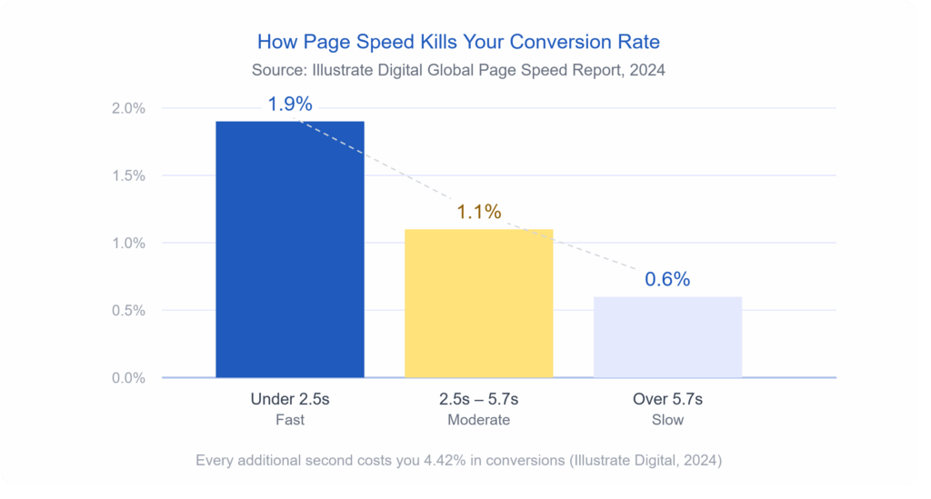
Speed is not a technical issue. It’s a revenue issue. Research from Illustrate Digital’s 2024 Global Page Speed report found that websites lose an average of 4.42% in conversions for every additional second a visitor has to wait. Pages loading in under 2.5 seconds average a 1.9% conversion rate. Pages that drag past 5.7 seconds? That number drops to 0.6%. That’s not a gradual slide — that’s your potential customers walking out the door while your homepage is still loading a hero image.
The biggest speed killers are usually uncompressed images, too many third-party scripts running at once (think chat widgets, analytics tags, and ad pixels all loading simultaneously), and cheap hosting that can’t handle traffic spikes. You can test your site right now using Google PageSpeed Insights — and if your score isn’t green, you already have your answer.
Your Navigation Makes People Think
Good navigation should be invisible. When someone lands on your site, they shouldn’t have to figure out where to go. If they do, they’ll leave.
This sounds simple, but an overwhelming number of small-business websites have menus crammed with eight or ten items, dropdown submenus within other dropdowns, and page labels that sound clever but say nothing. “Solutions” means nothing. “Our Journey” means nothing. “Get Started” sitting next to “Learn More” next to “Request a Demo” creates choice paralysis that kills action.
The data backs this up. A navigation restructure for one company led to a 43% drop in bounce rate and a 67% increase in contact form submissions (Wauu Creative, 2026). Nobody noticed the navigation changed — that’s the point. When it works, users just find what they need and move forward. When it doesn’t work, they bounce, and you never know why.
A few specific things that signal broken navigation on your site:
- More than five or six items in your main menu
- No clear path from the homepage to your primary service or product
- A search bar that returns poor results or doesn’t exist at all on content-heavy sites
- Links that go nowhere or return a 404 error
Your Homepage Is Trying to Do Everything
There’s a version of your homepage that exists in the mind of the person who designed it — the one that tells the whole story, showcases every service, features testimonials, explains the team’s background, and has a contact form all above the fold. That version doesn’t convert. It overwhelms. When a visitor has to work to figure out what you do and who you do it for, they’re already halfway out.
Your homepage has one job: answer three questions in under five seconds. What do you do? Who is it for? What should I do next? Everything else — the awards, the detailed process, the team bios — belongs deeper in the site, not fighting for attention on page one. Research from Adobe found that 38% of users stop engaging with a website if the layout or content feels unattractive or cluttered (Adobe, cited in Red Website Design, 2023). Clutter isn’t just an aesthetic problem. It’s a conversion problem.
You Don’t Have a Clear Call to Action
This one is almost embarrassing in how common it is.
Seventy percent of small business websites have no call to action at all (Sagapixel, cited in Sixth City Marketing, 2024). None. Not a weak one — literally none. And even among sites that do have a CTA button, many bury it, make it the same color as everything else, or write something vague like “Submit” or “Click Here.”
Your CTA is the moment you ask the visitor to do something. And if you don’t ask — clearly, visibly, and with language that tells them exactly what happens next — they won’t do it. Research shows that changing vague button text to action-oriented, specific copy like “Shop Now” instead of “Learn More” can meaningfully move conversion rates (Business.com, 2026). Your CTA button should be impossible to miss, and the words on it should tell the user exactly what they’re getting.
Your Site Isn’t Built for Mobile
As of 2023, mobile devices account for 78% of retail and e-commerce website traffic (Statista, cited in Sixth City Marketing, 2024). If your site was designed primarily for desktop and then “made to fit” mobile, that’s not a mobile experience — that’s a shrunken desktop experience. Buttons too small to tap. Text that requires pinching and zooming. Forms that don’t autofill. Images that push sideways off the screen.
Mobile users are 67% more likely to convert on a mobile-friendly site versus one that isn’t optimized (We Are Tenet, 2026). That’s not a marginal difference. And given that Google ranks mobile-first, a poor mobile experience doesn’t just cost you conversions — it costs you search visibility too. The two problems compound each other.
Your Visitors Don’t Trust What They’re Looking At
Trust is built fast and lost faster.
Visitors form a first impression of your website in just 50 milliseconds — that’s 0.05 seconds — well before they’ve read a single word (Google, cited in Hostinger, 2026).
In that half-blink, they’re making a judgment about whether your business is legitimate. The visual signals that trigger distrust are usually one or more of
the following:
- Outdated design that looks like it was built before 2015
- Stock photos that feel generic and impersonal
- No visible contact information or physical address
- Missing or hard-to-find testimonials and reviews
- No security badge or SSL certificate (your URL should start with https://)
Seventy-five percent of users judge a company’s credibility based on its website design alone (Kinesis, cited in Sixth City Marketing, 2024). You can have the best service in your industry, but if your site looks untrustworthy, visitors are gone before they ever read your pitch.
You Have Traffic But No Conversions
Here’s the sign that ties everything together: if your analytics show decent traffic but your inquiry rate or sales are low, that gap is the loudest alarm bell your website can send you. Traffic getting to your site and doing nothing is not a traffic problem — it’s a conversion problem. And conversion problems live in your design, your messaging, your page speed, your mobile experience, and your trust signals.
A well-designed site focused on superior user experience can have a visit-to-lead conversion rate more than 400% higher than a poorly designed one (Forrester Research, cited in Sixth City Marketing, 2024). That’s not a tweak — that’s a transformation. It means the exact same number of visitors, producing four times the leads, simply because the site is built to work for the person using it.
If you’re investing in marketing but not seeing results, the issue is rarely the marketing. It’s the landing zone. And no amount of ad spend fixes a website that loses people the moment they arrive.
Read case study: Website Redesign for Tertiary Education Advisors
So What Do You Do About It?
Start by being honest with yourself. Pull up your site on your phone. Try to do what a stranger would do: find your main service, understand what you offer, and take the next step. How long does it take? Notice what frustrates you. That experience — unfiltered by familiarity — is what your potential customers are having every day.
The signs above aren’t a checklist of optional improvements. They’re symptoms of a website that is actively working against your business. And the hard truth is that patching them one by one with small fixes often isn’t enough. Sometimes the structure, the navigation, the messaging, and the visual design need to be rebuilt from the ground up with conversion in mind from the very first decision.
That’s exactly what a strategic website redesign looks like.
Ready to find out what’s really happening on your site? Get a free website review from the icowebsolutions team and we’ll show you exactly where your site is losing people — and what it would take to fix it.
References
Adobe. (2023). State of content report. Cited in Red Website Design. https://red-website-design.co.uk/24-stats-showing-how-your-website-design-affects-your-conversions-and-profits/
Business.com. (2026, January 16). 7 website design mistakes that can hurt conversion. https://www.business.com/articles/7-website-design-mistakes-that-can-hurt-conversion/
Forrester Research. (n.d.). The business impact of customer experience. Cited in Sixth City Marketing. https://www.sixthcitymarketing.com/web-design-stats/
Google. (n.d.). Think with Google: Mobile speed research. Cited in Hostinger. https://www.hostinger.com/tutorials/web-design-statistics
Illustrate Digital. (2024). Global page speed report 2024. Cited in Business.com. https://www.business.com/articles/7-website-design-mistakes-that-can-hurt-conversion/
Kinesis. (n.d.). Website credibility research. Cited in Sixth City Marketing. https://www.sixthcitymarketing.com/web-design-stats/
Oracle. (2023). Customer experience impact report. Cited in Sixth City Marketing. https://www.sixthcitymarketing.com/web-design-stats/
Sagapixel. (n.d.). Website redesign statistics. Cited in Sixth City Marketing. https://www.sixthcitymarketing.com/web-design-stats/
Sixth City Marketing. (2024, April 27). 65+ website design statistics & facts. https://www.sixthcitymarketing.com/web-design-stats/
Statista. (2024). Share of website traffic from mobile devices in retail and ecommerce. Cited in Sixth City Marketing. https://www.sixthcitymarketing.com/web-design-stats/
Wauu Creative. (2026, March 16). How bad website design can kill conversions and sales. https://www.wauu-creative.com/blogs/how-bad-website-design-can-kill-conversions-and-sales
We Are Tenet. (2026). 90+ web design statistics. https://www.wearetenet.com/blog/web-design-statistics

Is Your Website a Legal Liability? Mastering ADA Web Accessibility Compliance
Imagine a modern, multi-story corporate headquarters located in the heart of a major financial district. The building features an elegant glass facade, state-of-the-art security systems, and beautifully designed presentation rooms. Now imagine that the front entrance only features a steep flight of concrete stairs, with absolutely no wheelchair ramp, no automated doors, and no tactile paving for visually impaired visitors.
In the physical world, this scenario would instantly trigger public outrage, massive regulatory fines, and immediate legal action under civil rights legislation. Yet, in the digital landscape, thousands of corporate enterprises launch beautifully designed, multi-million dollar web platforms every single day that contain the exact digital equivalent of those concrete stairs. They build websites that completely shut out individuals with visual, auditory, motor, or cognitive disabilities, leaving their organizations wide open to devastating legal consequences.
For a long time, web accessibility was treated by corporate leadership as a minor, optional checkbox—a niche project left entirely to the discretion of junior developers. Those days are officially over. In the modern digital economy, digital accessibility has evolved into a critical legal and operational battleground. Organizations that neglect accessibility are finding themselves caught in a high-stakes web of legal liabilities, facing expensive class-action lawsuits, suffering brand damage, and alienating a massive, highly loyal segment of the global consumer market.
The High Cost of Exclusion: Lawsuits, Liabilities, and Lost Markets
To understand the urgency behind web accessibility, one must look closely at the rapidly shifting legal climate. Regulatory frameworks worldwide—such as the Americans with Disabilities Act (ADA) Title III in the United States, the European Accessibility Act (EAA) in Europe, and corresponding civil rights mandates internationally—have made it clear that public websites, mobile applications, and digital portals are considered “places of public accommodation.”
The legal risk is no longer a theoretical threat; it is a booming industry for specialized litigation firms. Tens of thousands of website accessibility lawsuits are filed annually against businesses of all sizes, from small e-commerce shops to Fortune 500 giants. What makes these legal threats particularly challenging is that intent does not matter. You cannot defend your organization by claiming you didn’t mean to exclude disabled users, or that your internal engineering team was simply unaware of the guidelines. If a user with a disability cannot navigate your online catalog, submit a contact form, or download an invoice, your platform is a documented legal liability.
However, focusing exclusively on the fear of litigation misses a profound commercial opportunity. Beyond the legal risk lies a massive case of market alienation. According to global health metrics, approximately 15% of the world’s population lives with some form of disability. This represents more than one billion people globally who control billions of dollars in disposable income. When your website fails to accommodate screen readers, lacks proper keyboard controls, or features inaccessible checkout flows, you aren’t just protecting yourself from a lawsuit by fixing it—you are actively turning away 15% of your potential customer base directly into the arms of your compliant competitors.
From an engineering perspective, this systemic exclusion can be traced back to a failure to meet the globally recognized benchmark for digital inclusion: the Web Content Accessibility Guidelines (WCAG). These technical guidelines are organized around four core principles, often abbreviated as POUR:
- Perceivable: Information and user interface components must be presented to users in ways they can perceive (it cannot be invisible to all their senses).
- Operable: User interface components and navigation must be operable (the interface cannot require interaction that a user cannot perform).
- Understandable: Information and the operation of the user interface must be understandable (the content or operation cannot be beyond their comprehension).
- Robust: Content must be robust enough that it can be interpreted reliably by a wide variety of user agents, including assistive technologies like screen readers.
Four Technical Pillars of an Accessible Web Infrastructure
Transitioning an enterprise digital platform from a compliance hazard into an inclusive, high-performing asset requires a systematic engineering approach. True accessibility cannot be achieved by dropping a cheap, third-party JavaScript “accessibility widget” onto your site. These superficial overlays often worsen the user experience for disabled individuals and fail to protect companies from legal scrutiny. Instead, compliance must be woven directly into the core code architecture through four foundational pillars.
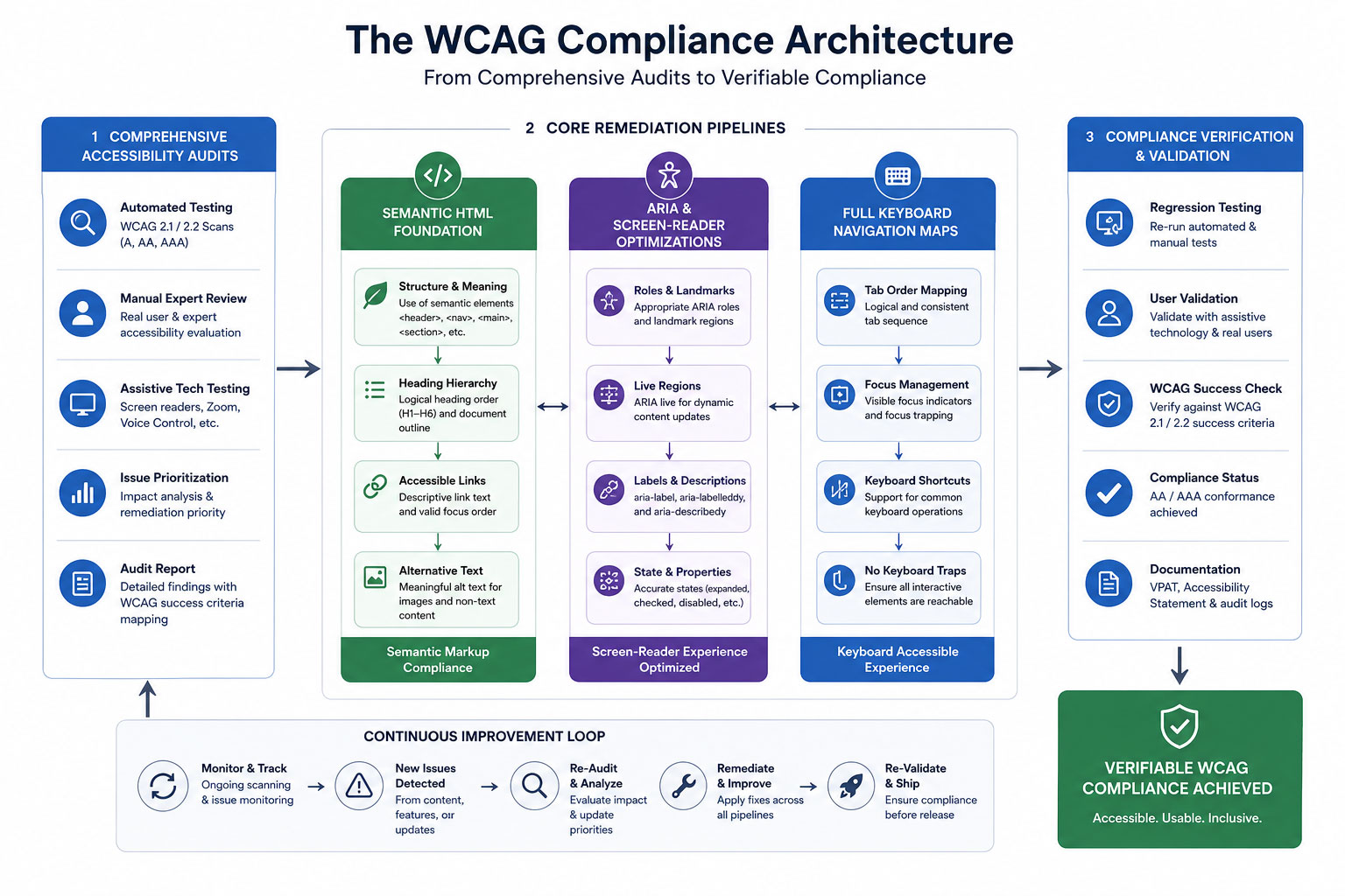
A structured flowchart demonstrating how Comprehensive Accessibility Audits feed directly into core remediation pipelines: combining Semantic HTML, ARIA Screen-Reader Optimizations, and Full Keyboard Navigation Maps to achieve verifiable compliance status.
1. Comprehensive Accessibility Audits
You cannot fix what you do not know is broken. The remediation process begins with an exhaustive, dual-layered accessibility audit. This involves pairing automated testing software with real-world manual testing. Automated scanners are excellent for catching high-volume technical errors, such as missing form labels, broken link structures, and incorrect color contrast ratios.
However, automated tools can only catch roughly 30% to 40% of accessibility barriers. The critical remaining errors must be uncovered through manual testing conducted by experienced QA engineers who navigate your platform using actual assistive tools, simulating the exact lived experiences of users with diverse physical and cognitive challenges.
2. Screen-Reader Optimizations via Semantic HTML and ARIA
Visually impaired users rely heavily on sophisticated software called screen readers (such as NVDA, JAWS, or VoiceOver) to translate visual on-screen layouts into spoken words. If your web application code consists of unstructured, non-semantic building blocks, a screen reader will voice a confusing jumble of meaningless elements.
To solve this, developers must build platforms using semantic HTML tags (such as <main>, <nav>, <header>, and <article>) that naturally define the structural hierarchy of a page. For complex, dynamic interface components like interactive dropdown menus, modal windows, or live data charts, engineers must deploy Accessible Rich Internet Applications (ARIA) attributes. These specialized code attributes act as invisible road signs, explicitly telling the screen reader software what a component does, what state it is currently in (e.g., `aria-expanded=”true”`), and how it relates to the rest of the layout.
3. Full Keyboard Navigation Setups
Many users with motor disabilities, tremors, or paralysis cannot operate a traditional computer mouse. Instead, they navigate the web exclusively using a keyboard, relying on the Tab key to move forward, Shift+Tab to move backward, and the Enter key to activate links and buttons.
An accessible website must feature a completely seamless, logical keyboard navigation map. This means ensuring that a visible, highly distinct “focus indicator” bounding box appears around any element a user highlights. Furthermore, code must be engineered to prevent “keyboard traps”—errors where a user tabs into a specific field or pop-up window but cannot tab back out without using a mouse. A compliant platform also features a hidden “Skip to Main Content” shortcut at the very top of the DOM structure, allowing keyboard users to bypass bloated header navigation links on every page refresh.
4. Accurate Alternative Text (Alt-Text) Frameworks
Images, infographics, and graphical banners play a major role in modern web storytelling. For a screen-reader user, however, an image without alternative text is completely blank, or worse, read aloud as a messy, unoptimized file name like “IMG_98432_FINAL.png.”
Implementing an accurate alt-text framework requires editorial discipline and structural standards. Alt-text shouldn’t be treated as a dump for SEO keyword stuffing. Instead, it must offer a concise, highly descriptive summary of the visual information or functional purpose of the image. If an infographic contains a chart mapping market trends, the alt-text or surrounding body copy must outline those specific data insights. Conversely, purely decorative elements like background shapes or design flourishes should be explicitly hidden from assistive tools using an empty `alt=””` attribute, preventing unnecessary audio clutter.
The Role of Technical Partners: Sourcing Expertise From a Website Development Company in India
Re-engineering an enterprise-grade digital ecosystem to meet strict WCAG 2.1 or 2.2 AA compliance standards is a highly technical challenge. It touches every layer of your digital stack, from raw backend server architecture and API data delivery to front-end layout styling and content entry systems. For organizations running vast product catalogs, complex client dashboards, or continuous content feeds, executing this remediation internally without specialized talent can quickly turn into an expensive, trial-and-error nightmare.
To navigate these complexities efficiently, global enterprises frequently look to establish strategic technical partnerships with an experienced website development company in India. The Indian tech ecosystem has matured into a powerhouse of certified accessibility specialists, front-end engineers, and compliance experts who understand the nuances of international digital law. By collaborating with an offshore development partner, enterprises can deploy scalable engineering teams dedicated to systematically cleaning up legacy source code, writing robust ARIA matrices, and running continuous integration accessibility testing. This strategic approach allows brands to completely eliminate their legal liability vulnerabilities swiftly and securely, while maintaining highly efficient capital allocation.
Comparative Strategy: The Structural Shift to Compliance
To fully understand why proper code remediation is essential for protecting your organization and improving usability, let’s contrast a non-compliant, high-risk web ecosystem against a fully accessible, compliance-first architecture:
Case Study: Eliminating Liability and Unlocking Market Potential
To evaluate the clear, measurable business returns of digital inclusion, let’s examine the operational transformation of a prominent multi-national financial services corporation. This institution operated a wide array of digital portals, customer dashboards, and online application channels. Over time, their various platforms had grown highly fragmented, built by multiple internal teams and external freelancers without unified code standards.
The turning point arrived when the firm received a formal legal demand letter from a civil rights law firm, detailing multiple severe WCAG violations that prevented blind users from completing loan applications. Recognizing the immense legal, financial, and reputational risk, the corporate leadership paused all standard product updates and authorized a complete accessibility overhaul of their entire digital infrastructure.
The remediation strategy was structured into a rigorous execution roadmap:
- The Core Rebuild: The development team systematically replaced complex, non-semantic custom scripts with native semantic HTML architectures.
- Assistive Mapping: They built complete ARIA navigation maps across their customer account dashboards, ensuring complex data tables were fully readable by assistive tools.
- Quality Assurance Expansion: They integrated automated accessibility testing scripts directly into their code deployment pipeline, preventing non-compliant updates from ever reaching the live production server.
The Operational Results: The impact of this architectural transformation went far beyond simply resolving the initial legal dispute. By implementing a fully compliant, highly accessible digital environment, the institution completely eliminated its exposure to regulatory fines and predatory web accessibility lawsuits.
More impressively, the brand observed a sudden, sustained surge in user engagement metrics across all entry funnels. Within two quarters post-launch, their digital application completion rate climbed sharply, effectively expanding their active market reach to an additional 15% of the digital population that had previously been locked out by structural code barriers. The brand transformation was absolute: a system that was once a dangerous legal liability had been re-engineered into a highly inclusive, market-expanding asset.
The Long-Game Advantage: Future-Proofing and Sustainable Inclusion
In a rapidly changing digital landscape, accessibility is no longer a static milestone you can reach once and forget about. Technology evolves continuously—new operating systems roll out, browsers update their rendering engines, and assistive devices become more sophisticated. At the same time, user expectations continue to rise, and international accessibility regulations are steadily growing stricter and more comprehensive.
Treating web accessibility as a foundational, core engineering requirement is the ultimate way to future-proof your digital presence. When you construct platforms using clean, semantic HTML code patterns, strict keyboard layouts, and verified ARIA matrices, you aren’t just protecting your business from current legal trends. You are building a flexible, highly stable digital infrastructure that effortlessly adapts to future technological shifts, voice search interfaces, and screen configurations without needing expensive, emergency redesigns.
Ultimately, making your website fully accessible is simply the right thing to do—both for your brand’s ethical integrity and its bottom-line performance. By prioritizing digital accessibility, your organization actively chooses to build a more equitable, open internet. You respect the autonomy of all users, welcome a massive community of loyal consumers, and turn your digital home into a secure, risk-free asset that drives sustainable corporate growth for decades to come.
Is Your Corporate Platform Holding Secret Legal Risks?
Hidden code issues, unlabelled forms, and low-contrast elements can leave your enterprise exposed to major web accessibility lawsuits. Our expert development and certified compliance teams can run an exhaustive WCAG audit to pinpoint and fix your digital accessibility gaps before they cause legal headaches.


High SaaS Churn? Fix the Leaky Bucket with Better User Onboarding UI/UX
The Invisible Leaky Bucket: Why Your SaaS Acquisition Strategy is Flawed
You are pouring millions of dollars, thousands of engineering hours, and endless creative energy into the top of your marketing funnel. Your SEO strategies are ranking, your paid ad campaigns are driving targeted traffic, and your sign-up charts are curling upward in a beautiful, venture-capital-pleasing hockey stick curve. On paper, your SaaS company is winning.
But behind the dashboard graphics lies a sobering, cash-burning reality. When you look at your product analytics for week two and week three, the drop-off is staggering. The users who enthusiastically input their email addresses and created passwords just days ago are quietly slipping out the back door. They log in once, look around a chaotic interface, get overwhelmed by a lack of direction, and log out—never to return.
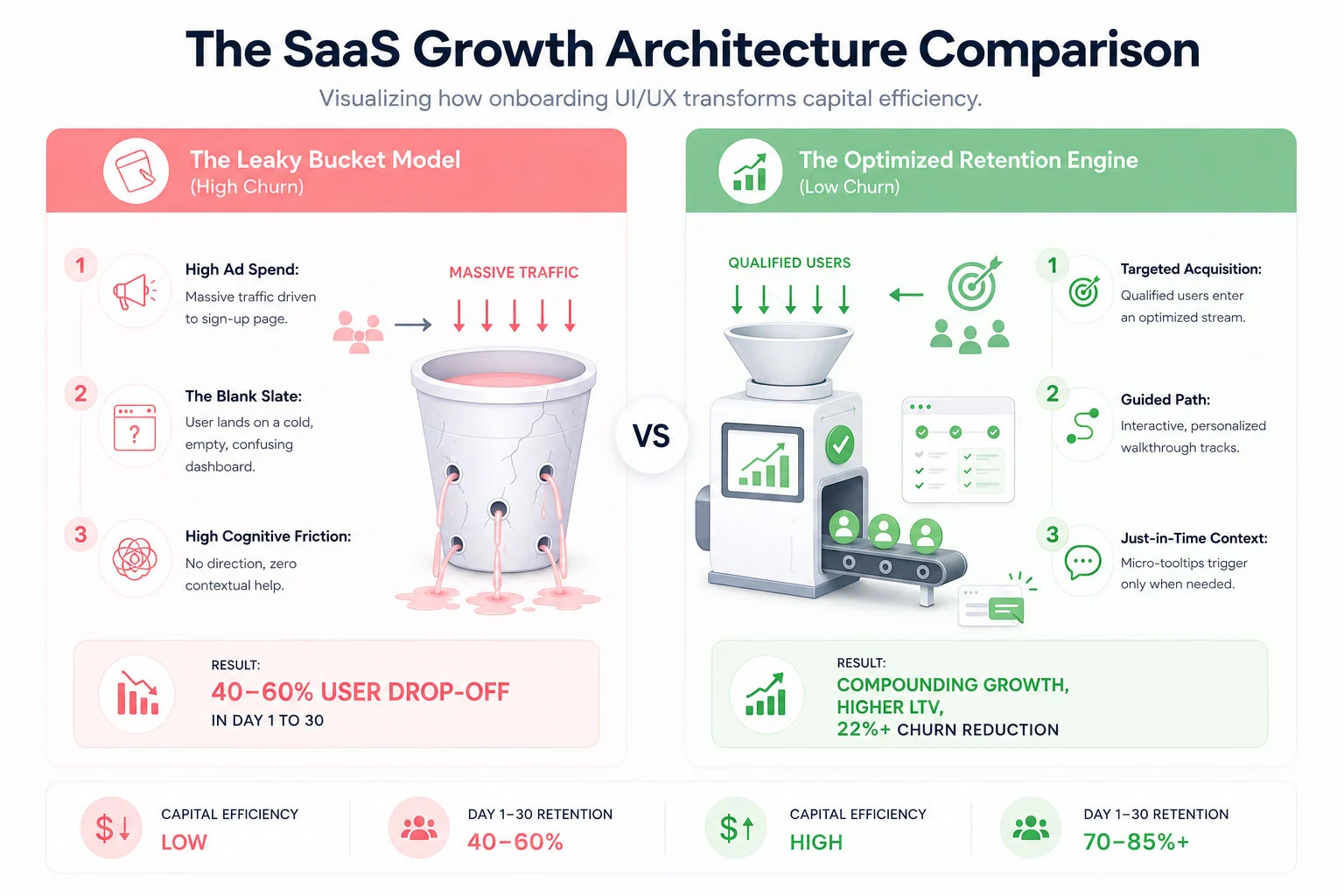
This is the classic SaaS Leaky Bucket Syndrome. Across the software-as-a-service industry, the first 30 days are a brutal proving ground. Studies consistently show that the average SaaS platform loses up to 40% to 60% of its newly registered users within the first month. They aren’t leaving because your core technology is bad or because your pricing is too high. They are leaving because your user onboarding UI/UX failed to guide them to their first meaningful breakthrough moment before their patience ran out.
In an era where alternative software platforms are just a Google search away, cognitive friction is an absolute growth killer. If your interface feels like an unmapped labyrinth, users won’t spend hours trying to figure it out; they will simply cancel their trial and find a competitor who respects their time. To plug the leak, you must transition from an *acquisition-first* mindset to an *activation-first* framework. Let’s dissect the mechanics of 30-day user churn and explore the exact UI/UX design components required to build an elite onboarding engine.
 The Psychology of the First 30 Days: Why New Users Abandon Ship
To fix a broken onboarding experience, you must look at your software interface through the eyes of an anxious, easily distracted new user. When someone signs up for your SaaS app, they are at peak motivation. They have a problem they are desperate to solve, and your marketing materials have convinced them that your platform holds the key.
However, that motivation is a highly volatile resource. The second they step past the login wall, a ticking clock begins. This is what product designers call the race to **Time to Value (TTV)**. Time to Value is the precise duration it takes for a user to realize the product’s core promise—often called the “Aha! Moment.”
If a user signs up for an invoicing tool, the Aha! Moment isn’t setting up a profile or uploading a brand logo; it is sending their very first sleek, professional invoice and seeing how easy the process is. If your UI/UX forces them to fill out 15 form fields, verify three distinct sub-accounts, and read a text-heavy manual before they can even preview an invoice, you are artificially extending your TTV. With every added layer of friction, motivation drops while frustration climbs. By day 14, when the initial excitement has completely withered away, the user quietly deletes their account or lets their trial expire without using a single advanced feature.
The Core UX Principle: Onboarding is not an administrative orientation process; it is an active continuation of your marketing department’s value proposition.
The primary driver of early-stage SaaS churn is cognitive overload. When confronted with an overwhelming array of navigation menus, charts with zero data lines, and generic multi-step product tours that point out every button on the screen without providing actual context, the human brain short-circuits. To counteract this paralysis, your onboarding UI/UX layout must be designed with extreme intentionality, using progressive disclosure to show users exactly what they need to see, precisely when they need to see it.
Architecting the Onboarding Solution: The 4 Core UI/UX Pillars
Plugging the leaks in your 30-day retention bucket requires a systemic restructuring of your platform’s interactive touchpoints. ICO WebTech approaches this problem by deploying four integrated UI/UX pillars designed to minimize friction and flatten the user learning curve.
1. Tailored Interactive In-App Walkthroughs
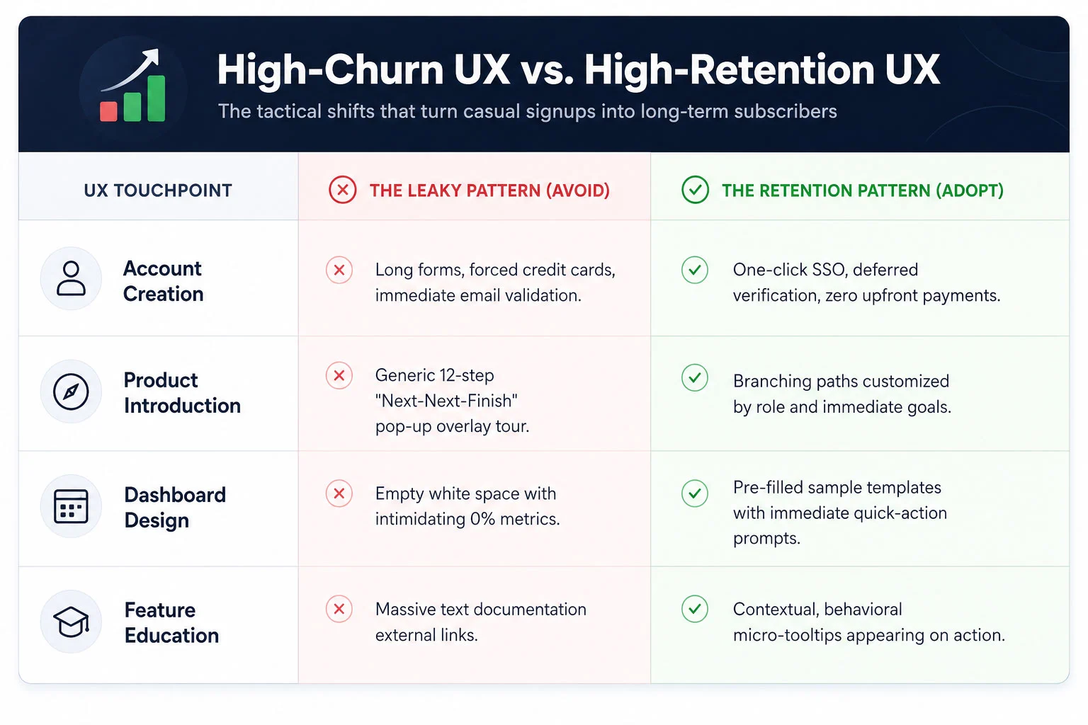
The days of the unskippable, linear 10-step product tour are dead. Modern enterprise and consumer SaaS users expect an interactive experience that adapts to their specific professional goals. Instead of showing every single user the exact same generic welcome tour, your UI should kick off with a brief, high-value segmentation window. Ask the user simple, goal-oriented questions: *”What are you looking to achieve today?”* or *”What is your primary job role?”*
Based on their selection, the interface should launch a tailored, branching interactive walkthrough. If a manager signs up for a project management tool to track team timelines, they should not be walked through the billing configuration suite. Their interactive tour should guide them exclusively through creating a project board and assigning their first task. By making the walkthrough an active, hands-on exercise rather than a passive slideshow, you dramatically accelerate product adoption and empower users through immediate action.
2. Contextual, Just-In-Time Tooltips
Nothing disrupts a user’s flow quite like an unexpected pop-up window block that hijacks the entire screen to explain a feature they aren’t ready to use yet. To build a truly humanized onboarding experience, you must replace aggressive, interruptive notifications with subtle, contextual tooltips.
Contextual tooltips are reactive design elements that trigger based on specific real-time user behavior. For instance, if a user hovers their cursor over an advanced analytics icon for more than two seconds, a micro-tooltip appears with a single clear sentence explaining what that chart tracks. If they are filling out a complex data formatting line, a small helper bubble appears with an example input style. By serving educational context in small, manageable pieces right at the point of action, you reduce the user’s reliance on external help documentation and keep them deeply immersed within your application workflow.
3. Simplified Dashboard Interfaces & Empty-State Optimization
An overlooked danger zone in SaaS UI design is the “Empty-State Dashboard.” When a user logs into a brand new account, they are often greeted by a sea of blank charts, empty folders, and confusing 0% progress tracking stats. This lack of data makes the application look dead, uninviting, and intimidating.
An elite onboarding experience treats the empty state as a prime educational landscape. Instead of a blank white box, fill that screen space with beautiful, mock-data templates that demonstrate what the product looks like when fully optimized. Insert clear, highly visible action elements directly into the empty space. For example, instead of a blank table, show an illustration with a clean button that reads: “You haven’t imported any contacts yet. click here to sync your list in 30 seconds.” By simplifying the dashboard view and removing secondary features until the primary setup actions are complete, you keep the user’s cognitive eye locked onto the critical path.
4. Frictionless, Multi-Stage Setup Steps
Requiring an exhausting configuration routine right at registration is the absolute fastest way to sink your activation rates. While your engineering team might prefer to have all database connections, API keys, and team invitations configured upfront, your UX team must advocate for the psychological comfort of the user.
Break your configuration cycle down into a frictionless, multi-stage progression. Utilize single sign-on (SSO) protocols through trusted ecosystems like Google or Microsoft to turn registration into a single-click event. Defer non-essential tasks—such as updating billing profiles, configuring advanced notifications, or customizing aesthetic themes—to later in the user lifecycle. Give users a clear visual progress indicator (e.g., a progress tracker showing 25%, 50%, or 75% completion) to gamify the setup process and leverage the human psychological urge to complete uncompleted tasks.
 Case Study: How a Fintech App Lowered 30-Day Churn by 22%
To fully grasp the financial impact of intentional onboarding design, let’s examine a real-world digital restructuring executed for a high-growth business fintech application. This platform was built to help small-to-medium business owners sync their corporate bank accounts, categorize operational expenses, and project real-time tax liabilities.
The platform possessed an incredibly powerful backend engineering architecture, but its early metrics were highly alarming. Over 45% of users who successfully linked a bank account abandoned the application before their 30-day trial period concluded. The marketing team was forced to continually scale up paid spending budgets just to replace the users they were shedding week after week.
ICO WebTech initiated a deep-dive programmatic analysis of user clickstreams and interface behavior. The insights uncovered three major UX bottlenecks:
- The Initial Shock: Immediately upon linking their accounts, users were dropped into a hyper-complex financial dashboard tracking over forty different ledger data variables simultaneously. They had no idea where to start.
- The Content Dead-End: Essential data categorization steps required users to navigating through manual filter settings nested deep within a hidden sub-menu layout.
- The Interruption Factor: A rigid, generic welcome tour kept popping up to explain advanced multi-currency features that were completely irrelevant to 85% of their domestic user base.
The Strategic Redesign Strategy
Our UI/UX design teams executed a radical overhaul of the application’s entry sequence. First, we implemented an interactive segmentation card on screen one, splitting users into two distinct onboarding tracks: *”I want to estimate my upcoming quarterly taxes”* and *”I want to cut down my weekly expense tracking time.”*
Second, we applied a progressive disclosure pattern to the main dashboard. We hid the complex, secondary analytics panels entirely during the first week of use. Instead, the interface morphed into a clean, action-oriented workspace highlighting a clear step-by-step interactive configuration checklist. When a user completed a step, a satisfying animation fired, and the next logical action was illuminated with a soft glowing tooltip block.
Finally, we introduced contextual helper micro-tips over complex financial terms. Instead of sending users off-platform to search a knowledge base for definitions, they could simply tap an interactive tool icon to see a plain-English explanation directly in line with their workflow.
The Compounding Financial Impact
The operational results surpassed all initial forecasts. Within ninety days of deploying the optimized onboarding interface, the fintech app’s 30-day user churn rate dropped by a definitive 22%. By helping users reach their financial “Aha! Moment” within the first four minutes of account creation, customer lifetime value surged, client acquisition costs stabilized, and the company transformed its product into a highly efficient, self-sustaining revenue engine.
—
Measuring What Matters: Onboarding Metrics for Product Teams
You cannot optimize what you do not measure. To build a highly effective user onboarding system, your engineering, design, and marketing product groups must align around a unified set of onboarding-focused Key Performance Indicators (KPIs). Traditional business metrics like “Total Monthly Registrations” or “Daily Active Users” are too broad to diagnose specific UI bottlenecks. Instead, focus your tracking tools on these three precise indicators:
1. The Product Activation Rate
The activation rate is the percentage of registered users who successfully execute a predetermined set of core actions that deliver initial product value. For an email marketing SaaS, this might be uploading a subscriber list and sending a test broadcast. For a design app, it might be exporting a completed canvas asset. Your product data analytics should track exactly how many users hit this activation milestone. If your signups are rising but your activation rate is flatlining, your onboarding interface is actively blocking the door.
2. Time to Value (TTV) Velocity
Track the exact number of minutes or hours that elapse between a user’s initial account creation and their realization of the product’s value. Your ongoing UI/UX updates should constantly look to compress this duration. Every form field removed, every page redirect eliminated, and every automated database integration added serves to accelerate your TTV velocity, securing a psychological win for the user before distraction sets in.
3. Drop-off Step Attribution
Utilize modern behavioral funnel mapping tools to chart every single step of your onboarding walkthrough. Analyze where the visual leaks are concentrated. Do 15% of your users abandon the process when forced to verify their phone numbers? Does a massive drop occur when they reach the team member invitation page? Pinpointing the exact interactive component where users lose momentum allows you to make targeted, data-backed design adjustments rather than relying on qualitative guesswork.
—
Plugging the Leak: Prioritizing UI/UX for Sustainable Scaling
In the highly competitive modern SaaS ecosystem, code features can be replicated, pricing models can be undercut, and marketing strategies can be copied. Your ultimate, sustainable competitive moat is the sheer quality of your user experience. The brands that win the long game are the ones that eliminate friction entirely and make using their software an absolute joy from minute one.
Continuing to fund an aggressive marketing acquisition pipeline while ignoring a confusing, high-churn user onboarding sequence is the economic equivalent of trying to fill a leaky bucket with a high-pressure firehose. It is an incredibly inefficient, deeply stressful way to build an enterprise business.
By investing in tailored interactive walkthroughs, contextual inline guidance, and simplified dashboard environments, you respect your users’ time and lower their cognitive load. You build a digital bridge that guides them securely past early friction points directly to undeniable product value. Stop letting your valuable, hard-won traffic slip away into the dark. Optimize your onboarding UI/UX architecture, plug the month-one retention leaks, and transform your platform into a compounding growth engine that retains every single user it catches.


Failing Google’s New INP Metric? How to Fix Laggy Mobile Interactions
We have all been there as mobile internet users. You are browsing a website on your smartphone, looking to expand a drop-down accordion menu, open a mobile navigation drawer, or click a “Buy Now” button. You tap the screen with your thumb. Nothing happens.
You wait a fraction of a second. Still, the screen is frozen. Frustrated, you tap the button three more times, thinking your initial touch wasn’t registered. Suddenly, the website jolts into motion all at once, registering every single tap in a chaotic, broken sequence of layout shifts. Annoyed and impatient, you hit the back button, leave the site, and head straight to a competitor’s platform.
For years, website owners assumed that if their pages loaded fast initially, their user experience was flawless. Google’s core metrics historically favored initial loading benchmarks like Largest Contentful Paint (LCP). However, the modern mobile web has evolved. Users don’t just consume static pages; they interact with complex, JavaScript-heavy applications directly inside their mobile browsers. When those interactions feel heavy, sluggish, or unresponsive, users leave.
Recognizing this shift, Google officially introduced a major ranking metric paradigm shift: Interaction to Next Paint (INP). INP has formally replaced First Input Delay (FID) as a core pillar of Core Web Vitals. The implications have been swift and uncompromising. Across the globe, websites with gorgeous visual layouts are experiencing sudden, severe drops in mobile search rankings. Why? Because while their sites look incredible, their user interface feedback is fundamentally sluggish under the hood.
If your business is currently watching its hard-earned mobile search traffic slip away due to poor interaction scores, you are not alone. Fortunately, fixing this issue doesn’t require stripping your site down to bare-bones text. By deploying advanced JavaScript optimizations, minimizing main-thread blocking, and streamlining your CSS rendering paths, you can transform your mobile experience into an instant, snappy asset. Whether you operate a high-volume e-commerce store or a massive corporate portal, understanding INP is critical to digital survival. Let’s unpack exactly how to diagnose, fix, and master this complex performance metric.
The Anatomy of INP: Why Your Old Performance Metrics Lied to You
To solve an interaction problem, you must first understand how Google measures it. For a long time, the industry relied heavily on First Input Delay (FID) to quantify site responsiveness. But FID possessed a massive technical loophole: it only measured the delay *before* the browser began processing the very first interaction on a page. It completely ignored the time it took to actually run the JavaScript event handlers, and it ignored every single subsequent tap, click, or scroll action a user performed during their entire session.
INP closes that loophole permanently. It observes *all* interactions that occur during the entire lifespan of a user’s visit. It measures the comprehensive duration from the exact millisecond a user touches the screen to the precise moment the mobile browser renders the very next visual frame on the display. This total duration is broken down into three distinct operational phases:
- Input Delay: The time elapsed between the user executing the physical interaction and the browser’s main thread being completely free to accept and begin processing that interaction. This is usually caused by long-running background scripts.
- Processing Time: The duration required to execute the active JavaScript event listeners attached to that specific button, link, or component.
- Presentation Delay: The time it takes for the browser to recalculate the visual layout, repaint the altered pixels on the screen, and visually display the new framework to the user.
Google classifies an INP score under **200 milliseconds** as “Good” or Excellent. Anything between 200ms and 500ms needs substantial improvement, and any score exceeding **500 milliseconds** is flagged as “Poor,” triggering direct ranking penalties within mobile search algorithms.
This means your site could have an incredible 1.5-second initial load speed, but if your mobile navigation menu takes 600ms to open when a user clicks it, Google views your page as broken. To achieve a modern, fully compliant digital framework, brands are increasingly seeking specialized assistance from a premium Website designing company in Delhi India to overhaul their code environments from the ground up.
Phase 1: Advanced JavaScript Optimization – Taming the Event Loop
JavaScript is almost always the prime suspect behind a failing INP score. Modern frameworks pack massive script packages down to mobile devices, forcing low-tier mobile processors to work overtime just to parse and execute code. When a user interacts with a page, their action is queued up behind whatever JavaScript is currently dominating the engine.
1. Yielding to the Main Thread via Tactical Code Splitting
The single most effective way to eliminate input delay is to ensure that your JavaScript functions never block the main thread for longer than 50 milliseconds at a time. Tasks that take longer than 50ms are classified by Google as “Long Tasks.” If a user taps a mobile menu while a 300ms long task is running, the browser cannot respond until that task finishes completely.
To combat this, developers must break massive, monolithic code blocks into small, asynchronous chunks. By shifting non-essential steps out of the immediate execution path and utilizing API methods like setTimeout() or the modern scheduler.yield() native function, you allow the browser to safely pause script execution, look at the user interaction queue, process the tap immediately, and then resume the background script right where it left off.
2. Throttling and Debouncing High-Frequency Events
Interactive features like real-time search auto-suggestions, dynamic filter sidebars, or endless scroll trackers can flood the browser’s execution engine with hundreds of event fires every single second. If your site attempts to recalculate layouts on every single micro-movement or keypress, your mobile processing time will skyrocket.
By implementing strict debouncing patterns, you guarantee that a resource-heavy script will only execute after a specific pause in action (for instance, waiting 250ms until a user stops typing their search query). Similarly, throttling ensures an event function fires only once per specific time interval, dramatically reducing total CPU strain and keeping your application light and responsive.
Phase 2: Eradicating Main-Thread Blocking Tasks
The browser’s main thread is a single-lane highway. It handles layout styling, HTML parsing, script execution, and user interaction handling all at the same time. If a massive pileup occurs on that highway, the entire mobile interface freezes completely.
1. Auditing and Offloading Third-Party Bloat
On many modern corporate websites, the heaviest blocking tasks do not come from internal code; they originate from third-party tracking scripts, advertising tags, marketing automation software, and heat-mapping analytics tools. When multiple platforms attempt to inject tracking events simultaneously upon a mobile click, interaction responsiveness collapses.
To fix this, execute a brutal tag audit inside Google Tag Manager. Defer all non-essential third-party scripts so they do not execute during the critical interactive windows of your site. If an analytics tracker does not directly contribute to the immediate visual experience of the user, wrap its initiation in a requestIdleCallback() block, ensuring it only populates when the mobile CPU is completely resting.
2. Leveraging Web Workers for Heavy Computations
If your website relies on complex data calculations, heavy filtering algorithms, or client-side data sorting (common in enterprise-grade web applications), you should never force the primary UI layer to process that data. Doing so causes immediate visual freezing.
Instead, look to offload those complex, data-heavy operations entirely to a **Web Worker**. Web Workers allow you to spin up a completely independent background thread separate from the primary UI stream. The worker processes the raw data silently in the background and shoots a clean message back to the main thread only when the final result is ready. This keeps the primary mobile user interface perfectly agile, maintaining an instantaneous 60fps frame rate regardless of what calculations are occurring under the hood.
Phase 3: Streamlining the CSS Rendering and Painting Path
Once your JavaScript executes quickly, you face the final hurdle: Presentation Delay. The browser must calculate how the visual structural tree changes, figure out exactly where the layout components fit, and physically paint the updated colors onto the glass display of the phone.
1. Eliminating Forced Synchronous Layouts (Layout Thrashing)
Layout thrashing occurs when your JavaScript event handlers read a visual layout property from the DOM (like checking an element’s offset height) and immediately turn around and write a style adjustment to the DOM, over and over in a tight loop. This forces the mobile browser to run full layout calculations prematurely inside the script loop, creating a massive rendering bottleneck.
To eliminate this presentation lag, always separate your DOM reads from your DOM writes. Read all necessary visual values collectively first, then perform your style modifications in batch phases. Better yet, wrap your visual rendering updates inside a requestAnimationFrame() loop to align your styling adjustments perfectly with the native refresh rate cycle of the mobile screen.
2. Utilizing CSS Hardware Acceleration
When creating interactive components like sliding mobile menus, modal popups, or expanding filters, how you write your CSS styles matters immensely. If you animate a mobile sidebar layout using the left or top directional styling properties, the browser is forced to trigger full geometric layout calculations across the entire DOM tree for every single pixel shift.
Instead, utilize hardware-accelerated CSS properties like transform: translateX() and opacity. These specific properties completely bypass the browser’s layout and paint phases. Instead, they hand the visual adjustments directly to the device’s GPU (Graphics Processing Unit). This ensures that complex visual animations slide, fade, and interact at a flawless, ultra-responsive pace even on older, budget-friendly smartphones.
The Operational Imperative: A Comprehensive Look at INP Metrics
When tracking your mobile user experience, optimization can quickly feel abstract. To bring absolute clarity to your development pipeline, it is essential to look at the concrete operational targets required to pass Google’s rigorous performance guidelines.
| INP Performance Tier | Latency Window | Google Core Ranking Impact | Primary Remediation Action Required |
|---|---|---|---|
| Excellent / Passed | < 200 Milliseconds | Maximum ranking benefit; perfect mobile health status. | Maintain consistent code hygiene; continuous monitoring via CrUX dashboard. |
| Needs Improvement | 200ms – 500ms | Volatile mobile visibility; early ranking degradation warnings. | De-bloat third-party scripts; introduce asynchronous JavaScript yielding blocks. |
| Poor / Failed | > 500 Milliseconds | Direct algorithm penalties; severe drop in global mobile search exposure. | Complete code architecture overhaul; move styling animations to GPU layers. |
By mapping out your current interaction metrics against this framework, your technical team can pinpoint exactly how aggressively your site is losing ground and establish clear sprint priorities to salvage your organic search traffic.
Real-World Case Study: Saving an Enterprise Media Portal from Mobile Extinction
To contextualize these principles, look at the dramatic recovery of a leading global enterprise media portal. Generating millions of monthly pageviews from breaking news, editorial features, and interactive multimedia, this media powerhouse relied on high-volume mobile search visibility for over 70% of its total digital advertising revenue.
Following a massive layout expansion featuring infinite scroll modules, live-updating financial tickers, and auto-refreshing comment sections, their technical health scores began to fall. While the desktop experience remained relatively stable, their mobile interaction latency skyrocketed. Their INP metrics surged into a highly dangerous zone, averaging an abysmal 680 milliseconds across entry-tier mobile devices.
The ranking consequences were immediate and catastrophic. Within eight weeks, their mobile organic search rankings fell by nearly 25% across key informational head terms. This structural drop-off triggered a severe decline in monthly advertising impressions, threatening their quarterly corporate bottom line.
They realized that their existing infrastructure was structurally broken. Rather than putting temporary patches over bad code, they invested in comprehensive website redesigning services designed specifically to re-architect their mobile rendering ecosystem.
The engineering team executed a strict performance optimization blueprint:
- They decoupled the live financial data widgets from the primary visual rendering flow, offloading the real-time websocket data parsing to background Web Workers.
- They completely restructured their event delegation patterns, removing thousands of redundant event listeners across the infinite scroll containers and replacing them with a single, highly efficient parent listener.
- They audited their third-party advertising partners, implementing strict execution block rules that prevented ads from initializing until the page achieved absolute interactive readiness.
- They leveraged advanced CSS properties like
content-visibility: auto, ensuring that elements far below the fold were completely skipped by the browser’s layout engine until the exact moment they approached the viewport.
The operational transformation was spectacular. Within weeks of rolling out the optimized code framework, their mobile Interaction to Next Paint metric plummeted from a failing 680ms down to a stunning, lightning-fast 140 milliseconds, earning an “Excellent” rating from Google’s testing clusters. As Google’s web crawlers re-indexed the optimized framework, the media portal fully restored its dropped mobile search rankings, reclaimed its top-tier positions, and grew its overall mobile ad monetization metrics by an unprecedented 18% quarter-over-quarter.
Why Core Technical Engineering Dictates Search Dominance
The days when digital design only encompassed selecting beautiful color palettes, arranging grids, and drafting slogans are completely over. In the modern, mobile-first ecosystem of 2026, real performance *is* design. A website cannot be considered truly well-designed if its code engine frustrates its visitors and actively alienates search algorithms.
Fixing complex core vitals like Interaction to Next Paint requires a deep, uncompromising marriage between forward-thinking creative visual arts and technical web engineering. This reality is why ambitious global brands turn away from generic freelance template builders and establish strategic partnerships with a high-caliber Website designing company in Delhi India that builds with technical compliance as an absolute prerequisite.
When you focus deeply on building optimized code pathways, clean database interactions, and streamlined client-side scripts, you naturally build a digital footprint that both your target audience and Google’s search bots adore. Do not wait for a devastating ranking penalty to highlight the hidden code flaws within your mobile layout. Prioritize interaction engineering today, modernize your framework with elite technical redesign services, and make sure every tap your customers make delivers an instant, satisfying response.


Planning a Website Redesign? How ICO WebTech Prevents a Post-Launch SEO Nightmare
Imagine spending six months, thousands of dollars, and endless late-night meetings collaborating with top-tier designers to overhaul your brand’s digital storefront. The typography is elegant, the user interface is butter-smooth, and the checkout process feels like magic. With immense pride, your team flips the switch and launches the new site. You pop the champagne, celebrate the stunning visual upgrade, and wait for the compliments to roll in.
Then, day three hits. Your customer service team notes a drop in inbound leads. By day seven, your organic traffic analytics show a terrifying, vertical cliff-style dropoff. Keywords that your business spent five years climbing to the top of page one for have vanished entirely. Your hard-earned backlinks are suddenly pointing to digital dead ends, and your organic revenue plummets by 40% in a single week.
This is the post-launch SEO nightmare, and it happens far more often than most brands realize. The paradox of the modern internet is that Google’s search algorithms do not care how “pretty” your website looks if they can no longer find the roads, signs, and foundations that made your site authoritative in the first place.
When brands migrate to a new domain, restructure their content categories, or switch content management systems (CMS) without an airtight search strategy, they are effectively demolishing an old house and building a new one without telling the post office where to deliver the mail. Fortunately, this catastrophe is completely preventable. By leveraging professional website redesigning services backed by strategic technical execution, brands can modernize their online presence while preserving—and even accelerating—their organic search equity. As an experienced SEO company in India, ICO WebTech has perfected the art of the zero-loss migration. Here is an in-depth breakdown of how we protect your brand’s digital legacy during a website overhaul.
The Hidden Friction Between Creative UX and Technical SEO
To understand how to prevent an SEO disaster, it is vital to understand why it happens. Website redesigns are usually driven by creative, marketing, or product teams focused on visual identity, conversion rate optimization (CRO), and modernizing brand aesthetics. While these are critical goals, creative design and technical SEO often pull in opposite directions if not properly coordinated.
- The Minimalist Trap: Designers love clean layouts with minimal text. However, removing long-form copy from key landing pages to achieve a “clean look” frequently strips away the contextual semantic signals and keyword density that allowed those pages to rank on Google.
- Altering the URL Blueprint: Changing a URL from
example.com/services/digital-marketingtoexample.com/our-work/marketingwithout telling search engines causes immediate link breakage. Every external website pointing to your old link now delivers a frustrating 404 error, destroying your link equity overnight. - JavaScript-Heavy Frameworks: Modern websites often rely on complex client-side JavaScript frameworks (like React or Vue) to create dynamic, smooth transitions. If these frameworks are implemented incorrectly, search engine crawlers may see nothing but a blank page, failing to index your primary text.
- Disrupting Content Hierarchy: Replacing structured, keyword-optimized Heading tags (H1, H2, H3) with generic styled CSS classes to make text look a certain size completely blinds search engines to the informational hierarchy of your content.
At ICO WebTech, we bridge this gap. We ensure that your design evolution does not result in search engine devolution, treating SEO not as an afterthought to be sprinkled on post-launch, but as the very scaffolding upon which the new design is built.
Phase 1: Pre-Launch Prep and the Sacred Legacy Crawl
The secret to a flawless website launch lies entirely in the preparation. Before a single line of code is rewritten for the new site, ICO WebTech establishes a rigorous baseline data map of the existing website. Think of this as taking an exact structural inventory of a museum before moving its artifacts to a new gallery.
1. Mapping the Complete URL Inventory
We don’t just export a basic sitemap; we execute a comprehensive deep crawl of the live website using advanced data extraction tools. This captures every single URL that has ever been indexed, including hidden landing pages, old blog posts, and auxiliary resource files. We cross-reference this crawl with Google Search Console and Google Analytics data from the past 24 months to identify the “heroes”—the exact pages driving your organic impressions, clicks, and conversions.
2. Extracting the Backlink Database
Your domain authority is largely dictated by your backlink profile—the ecosystem of external websites linking to your content. We run extensive link audits via tools like Ahrefs and Majestic to catalog every high-authority backlink your site possesses. If a page has 50 premium editorial backlinks pointing to it, that page is flagged as a high-value asset that must either maintain its exact URL structure or be flawlessly redirected to preserve its incoming authority.
3. Benchmarking Current Rankings
We document your current keyword rankings across different geographic regions and device types. By knowing exactly where you stand for your primary head terms and long-tail variants, we establish a crystal-clear benchmark. If a specific keyword starts fluctuating post-launch, we immediately pinpoint the exact page responsible and deploy targeted adjustments.
Phase 2: The Core of Migration Strategy—Structured 301 Redirect Mapping
If there is one technical failure that destroys rankings faster than any other during a website redesign, it is faulty or missing redirect management. A 301 redirect is a permanent directive that tells search engine crawlers and human visitors: “This page has permanently moved to a new home. Please pass all our historical trust, authority, and ranking weight to the new URL.”
Many amateur teams make the catastrophic mistake of redirecting all old URLs to the new homepage out of sheer laziness. To Google, routing hundreds of distinct, topic-specific legacy pages to a single generic homepage is a major red flag, often treated as a “Soft 404.” This completely wipes out the individual ranking signals of those specific pages.
ICO WebTech avoids this via a highly structured, row-by-row 301 Redirect Mapping Matrix. Here is an illustrative look at how we systematically manage your link architecture during a redesign:
| Legacy URL (Old Site) | New Target URL (Redesign) | SEO Priority Status | Action & Rationale |
|---|---|---|---|
/about-us.html |
/about/ |
Medium | Standardize URL structure; remove outdated .html extension. |
/services/bulk-sms-marketing |
/services/sms-solutions/ |
CRITICAL | High-revenue landing page. Exact content and metadata migrated to prevent drop. |
/blog/article-v1-2021 |
/blog/modern-sms-strategies/ |
High | Maintains 45 external backlinks. Redirect preserves link equity completely. |
/category/old-products-2019 |
/shop/ |
Low | Discontinued line. Redirected to main shop category to capture traffic. |
By mapping out every single legacy path to its most relevant, contextually identical counterpart on the new site, we ensure that search engine bots experience a seamless transition without hitting a single broken link or encountering confusing semantic dead-ends.
Phase 3: Ironclad Protection on the Staging Environment
While developers build and refine your gorgeous new website, they work on what is known as a staging or development server. This environment is an exact working clone of what your new site will look like. However, if this sandbox environment is left exposed, it can trigger severe search engine issues before your site even launches.
If Google’s automated web crawlers discover your staging site (which frequently happens if a developer accidentally links to it or leaves it unprotected), Google will begin indexing your unpolished, incomplete development pages. This leads to severe internal keyword cannibalization and duplicate content penalties, as search engines find two distinct versions of your brand’s website competing against each other.
ICO WebTech prevents this early exposure through strict access protocols. We isolate the development environment behind robust HTTP basic authentication passwords, strict server-side IP address whitelisting, and specialized robots.txt directives that command search engine crawlers to stay away. This keeps your redesign completely under wraps until it is technically flawless and ready for public deployment.
Phase 4: Content Preservation and On-Page Equity Integrity
A website redesign often prompts brands to rewrite their corporate copy, refresh their messaging, or update their product descriptions. While evolving your brand voice is fantastic, blindly replacing historical content can inadvertently destroy the semantic phrases and keyword patterns that Google relies on to understand your topical authority.
If a specific service page currently ranks #1 for a competitive search query, it ranks there because the exact combination of body copy, heading hierarchies, alt text, and semantic context satisfies Google’s intent metrics. If your copywriter replaces that detailed, keyword-rich paragraph with a brief, punchy three-word marketing slogan, your rankings will collapse.
Our optimization experts audit every line of code on the new layout to guarantee that high-performing copy is structurally integrated into the new design. We ensure that:
- Title Tags and Meta Descriptions: High-performing meta tags are carefully preserved or strategically optimized rather than wiped clean.
- Heading Architectures: The primary H1 remains focused on the core topic, followed by structured H2s and H3s that maintain absolute clarity for search crawlers.
- Internal Link Ecosystems: The deep internal links within your blog posts and core pages—which distribute domain authority down to your deepest product pages—are systematically re-established on the new site layout.
The Mechanics of Launch Day: Executing a Flawless Switch
When the day arrives to go live, flipping the switch requires precise, military-style execution. A chaotic launch day can result in prolonged site downtime, during which search engines might drop your site from temporary indexes due to server unresponsiveness.
ICO WebTech executes website launches during off-peak traffic hours to ensure absolute safety and minimal consumer disruption. We carefully coordinate DNS propagation, monitor server responses, and immediately verify that the live environment is completely accessible to search crawlers by stripping away the staging site blocks.
The moment the domain goes live, we instantly generate and upload clean, optimized XML sitemaps directly to Google Search Console and Bing Webmaster Tools. This explicitly tells search engine crawlers: “The transition is complete. Here is the exact blueprint of our new architecture. Please come crawl and index our updated pages immediately.”
Phase 5: The Post-Launch Technical SEO Audit—Our Digital Safety Net
Even with meticulous planning, the first 48 hours following a live launch are critical. The web is a dynamic environment, and post-launch technical audits act as the ultimate safety net to ensure everything functions perfectly under real-world conditions.
The moment the site is live, the technical engineering team at ICO WebTech launches a rigorous, multi-point post-launch audit, focusing intensely on several key operational pillars:
1. Rapid Crawl Error and 404 Detection
We execute an immediate post-launch crawl of the live environment to catch any accidental broken links, misconfigured internal paths, or unmapped assets before Google’s standard automated bots encounter them. If any stray 404 errors appear, they are corrected and patched in real-time.
2. Verification of Canonical Tags
Canonical tags act as a website’s internal compass, telling search engines which exact version of a page is the definitive master copy. We audit the new CMS architecture to guarantee that canonicalization rules are dynamic and correctly configured, preventing massive duplicate content issues often caused by automated tracking parameters or alternative URL tracking paths.
3. Core Web Vitals and Page Speed Optimization
Google places immense ranking weight on user experience through its Core Web Vitals metrics. A gorgeous new website that takes five seconds to load on a mobile device due to unoptimized, uncompressed images or bloated design scripts will rapidly lose organic visibility. We optimize server configurations, leverage browser caching, compress image weights, and clean up asset code to ensure your new site loads blazing fast across all global devices.
Real-World Proof: How We Saved an E-Commerce Brand From the Brink
To see these technical principles in action, look no further than a recent website migration managed by ICO WebTech for a prominent mid-sized e-commerce retailer. Operating in a highly competitive consumer goods vertical, the client possessed over 15,000 active product SKUs and relied on organic search for more than 65% of their total monthly corporate revenue. Their legacy website looked outdated, performed poorly on mobile devices, and suffered from a rigid, counter-intuitive checkout funnel that hurt conversions.
The brand desperately needed comprehensive website redesigning services, but leadership was deeply terrified. Their internal teams knew that losing their keyword footprint for even a single week would derail their annual revenue goals and cause massive inventory bottlenecks.
They brought in ICO WebTech to manage the entire migration. Our technical teams collaborated directly with their creative agency from day one. We constructed a meticulous migration matrix mapping all 15,000 legacy product URLs, category structures, and filter parameters into a streamlined, high-performance architecture. We cleaned up years of legacy redirect loops and preserved the internal link equity of their top-performing transactional blog articles.
The results were flawless. During launch week, the brand experienced zero loss in keyword rankings and zero drop in organic revenue. In fact, because the new design was incredibly fast and optimized for mobile devices, their keyword footprints expanded. Within 30 days post-launch, their overall conversion rate spiked by 22%, and organic search revenue grew by 14% year-over-year—completely defying the industry myth that website redesigns must always suffer a temporary loss in organic traffic.
Why Partnering with a Specialized SEO Company in India Matters
A website redesign should always be an exciting catalyst for business acceleration, never a stressful gamble with your digital survival. Managing the intricate nuances of server configurations, complex database migrations, database structure changes, and metadata preservation requires deep technical expertise that general creative design agencies rarely possess internally.
By partnering with an established SEO company in India like ICO WebTech, you secure a dedicated team of technical web engineers, structural architects, and search optimization specialists who treat your organic search traffic as a high-value corporate asset. We establish absolute alignment between visual beauty and technical excellence, ensuring your modern website ranks beautifully, loads instantly, and converts visitors into loyal customers.
Do not leave your hard-earned search rankings to chance during your upcoming digital evolution. Contact ICO WebTech today to discover how our comprehensive website migration and technical search strategies can turn your next website redesign into a powerful, risk-free growth engine for your brand.


Optimizing for ‘Choice Paralysis’: How to Redesign Your Category Pages to Prevent Cart Abandonment
Think about the last time you walked into a massive grocery store looking for a simple bottle of hot sauce. You stood there staring at an entire wall of seventy-five different brands, variations, and heat levels. Did you feel excited by the unlimited freedom? Probably not. You likely felt a tiny wave of anxiety, picked the one with the coolest label, or walked away entirely because the mental effort required to make a truly informed choice simply wasn’t worth it.
In behavioral economics, this is known as the Choice Paradox. When this psychological friction occurs inside a retail brick-and-mortar store, it is frustrating. When it happens on an e-commerce platform, it is financially catastrophic. Your online store visitors are constantly battling cognitive exhaustion, and if your category pages resemble an unorganized digital warehouse rather than a curated retail journey, your conversion rates will suffer.
To fix this, online store owners must look past basic aesthetic updates. Maximizing your digital storefront requires a calculated restructuring of your platform’s layout, product data, and visual architecture to protect your customer’s limited cognitive bandwidth. Collaborating with a professional website designing company in Delhi can help you overhaul these dense product walls into streamlined, high-converting digital spaces.
The Hidden Cost of Choice Fatigue on Modern Category Pages
For a long time, the dominant belief in online retail was that wider selection directly equaled more sales. Businesses pushed their engineering teams to display as many products as possible on a single grid. However, modern consumer data shows that endless lists of highly similar items actively trigger cart abandonment. When a user is forced to process dozens of identical product cards, their brain flags the task as high-cognitive labor.
To avoid the potential regret of making a sub-optimal choice, the consumer frequently defaults to making no choice at all. They exit the tab. Below is a breakdown of the differences between traditional product layouts and cognitive-first interfaces designed to keep shoppers engaged:
| Layout Attribute | Traditional “Warehouse” Grid | Cognitive-First Category Page |
|---|---|---|
| Scrolling Architecture | Infinite scroll with no clear boundaries or progress indicators. | Smart pagination or “Load More” controls paired with explicit count indicators. |
| Information Delivery | Displays all tech specs, prices, and reviews simultaneously on the grid. | Progressive disclosure that reveals deeper details only upon user interaction. |
| Filtering Logic | Overwhelming sidebar lists with dozens of checkbox variations. | Dynamic, intent-based filtering systems that adapt based on the user’s primary goal. |
| Visual Hierarchy | Monotonous uniform grid cells where no individual product stands out. | Asymmetric spacing and strategic merchandising badges that guide the eye naturally. |
Resolving this friction requires shifting your platform’s architecture from an unguided catalog to an intuitive digital concierge. Whether you manage an enterprise marketplace or run a specialized boutique brand, partnering with an experienced ecommerce website development company allows you to build structural boundaries that guide hesitant browsers into confident buyers.
Step 1: Audit Current User Friction and Identify Drop-Off Points
Before modifying your code or altering your interface layouts, you need to gather clear data regarding how your current visitors interact with your category pages. You cannot optimize what you do not accurately measure. The goal here is to pinpoint exactly where your selection layout shifts from an exciting asset into a point of friction.
Begin by analyzing your Google Analytics 4 (GA4) scroll-depth metrics specifically on your highest-volume category URLs. Look closely at the percentage of users who scroll past the first three rows of products without interacting with a product card or a filter toggle. If your data reveals a sharp vertical drop-off at a specific point on the page, you have found your cognitive fatigue threshold.
Key Insight: A high average session duration on a category page combined with a low click-through rate to individual product pages does not indicate deep user engagement. Instead, it usually means your users are lost in the layout, reading row after row of products because they lack the structural tools to filter out irrelevant options.
Next, use behavioral heatmaps and session recording tools to see exactly how your users interact with your sidebar filters. Are they clicking multiple checkboxes only to find zero matching results? Are they completely ignoring the filtering panel because it contains too many technical options? Reviewing these user recordings will highlight where your current interface design is working against natural browsing behavior.
Step 2: Transition from Infinite Scroll to Structured Boundaries
Infinite scrolling was hailed as a massive breakthrough for user engagement, but while it works wonders for passive social media feeds, it frequently actively damages conversion rates on e-commerce sites. Infinite scrolling deprives the user of a psychological sense of closure. As they scroll further down the page, the pool of potential options grows infinitely larger, which quickly amplifies decision anxiety.
To eliminate this browsing fatigue, replace automatic infinite scrolling with a highly visible “Load More” button paired with a real-time progress indicator. For example, your interface should explicitly state: “Viewing 24 of 144 items.” This minor change creates a clear mental boundary, giving the shopper a natural moment to pause, evaluate the options currently on screen, or refine their search parameters.
If you prefer standard pagination pages over a “Load More” button, ensure that your page numbers are large, easy to tap on mobile devices, and preserve the user’s exact vertical position if they click a product and then hit the back button. Implementing this clean, high-performance pagination logic requires clean development practices, which is why working with a skilled ecommerce website development company is vital to keep your store’s performance smooth across all viewports.
Step 3: Implement Intent-Based Filtering Systems
Standard e-commerce filtering layouts are often incredibly tedious to use. They force shoppers to sift through long, confusing columns of technical parameters, fabric weights, or manufacturing codes. A casual shopper shouldn’t have to understand complex industry specifications just to find an item that fits their basic needs.
Your filtering architecture should speak the same everyday language as your customers. Shift your system away from basic parameter check-boxes and move toward high-level, intent-based filtering categories. Look at how this approach changes the user experience:
- Traditional Technical Filter: “GSM Weight: 400g – 500g”
- Intent-Based Alternative: “Best for Freezing Temperatures”
- Traditional Technical Filter: “Aperture Range: f/1.4 – f/2.8”
- Intent-Based Alternative: “Ideal for Low-Light Portraiture”
Additionally, you should implement conditional filtering logic. When a user selects a primary filter option, the remaining options should dynamically update to hide any combinations that yield zero results. Nothing breaks shopping momentum faster than spending time adjusting multiple filter criteria only to be met with a blank page that says “No products match your criteria.” Your platform should protect users from reaching these dead ends.
Step 4: Use Progressive Disclosure to Clean Up Product Cards
A major cause of category page fatigue is the desire to display every piece of product data simultaneously on the main grid. When each individual card is packed with star ratings, price comparisons, color swatches, short descriptions, and shipping notices, the resulting layout looks incredibly cluttered and chaotic.
Instead, apply the UX design principle of progressive disclosure. This practice keeps the default view of your product cards clean and focused on the essentials: a clear product image, a concise title, the price, and a high-level differentiator. More complex details—such as secondary materials, comprehensive size charts, or extended customer reviews—should remain hidden until the user hovers over the card on desktop or taps a quick-view toggle on mobile.
This layout style allows shoppers to easily scan the overall product mix without feeling overwhelmed by a wall of text. Building these smooth micro-interactions, responsive hover transitions, and lightweight modals requires refined styling. Working with a top-tier website designing company in Delhi helps ensure these interactive elements look polished and load quickly across all devices.
Let’s take a look at how a clean, minimalist product card can be written in clean, semantic HTML and CSS structure:
<div class="product-card">
  <div class="image-container">
    <img src="product-image.jpg" alt="Minimalist Leather Boots" class="primary-img" />
    <div class="quick-view-trigger">Quick View</div>
  </div>
  <div class="card-details">
    <span class="badge-curated">Top Rated</span>
    <h3 class="product-title">Classic Weatherproof Boots</h3>
    <p class="product-price">$180.00</p>
    <div class="progressive-disclosure-content">
      <p>Handcrafted full-grain leather with water-resistant lining.</p>
      <span class="stock-status">Only 3 left in stock</span>
    </div>
  </div>
</div>
Step 5: Introduce Interactive Selection Wizards
When your store carries a large volume of products, even optimized filters might not be enough to prevent choice paralysis for new users. In these scenarios, the most effective way to drive conversions is to bypass the standard category grid entirely and offer a guided conversational assistant.
Embedding a simple, step-by-step product recommendation quiz at the top of your main category walls can drastically improve your user experience. This quiz should ask three or four simple lifestyle or goal-oriented questions, process the user’s input, and then display a tailored selection of just three curated items that match their exact needs.
By narrowing the final selection down to a handful of highly relevant options, you completely eliminate choice anxiety. The user feels supported, much like talking to a knowledgeable sales assistant in a physical boutique. Building this kind of dynamic, personalized quiz requires deep integration with your inventory database, making it a valuable project to tackle with a specialized ecommerce website development company that can connect your front-end interfaces to your backend product management systems.
Step 6: Use Merchandising Badges and Visual Accents Strategically
Visual hierarchy plays a massive role in how human brains process information. When an e-commerce page features twenty identical product squares arranged in a continuous grid, the eye glides over them without registering specific details. You can easily break up this visual monotony by adding deliberate structural shifts to your layout.
Use visual accents and merchandising labels with strict restraint. If you tag every single item on your page as a “Best Seller,” “Trending Item,” “Limited Edition,” or “Staff Pick,” you nullify the value of badging entirely. A good rule of thumb is to ensure that less than 10% of your visible inventory carries a promotional badge at any given time.
You can also create visual breaks by introducing asymmetrical banners directly into the product grid. For example, replace a standard product card slot in the third row with a lifestyle banner that showcases a curated lookbook or shares a helpful usage tip. This breaks up the monotonous scrolling rhythm, gives the shopper’s eyes a moment to rest, and naturally refocuses their attention on the surrounding products.
Creating these dynamic grid variations requires a deep understanding of modern CSS Grid and Flexbox layouts. Partnering with a skilled website designing company in Delhi allows you to craft fluid, adaptive interfaces that look stunning on small mobile displays and expansive desktop screens alike.
Step 7: Measure Success and Fine-Tune Your Layouts
An interface redesign shouldn’t rely on guesswork; it must be driven by continuous measurement and validation. Once you have launched your streamlined category pages, track your conversion metrics closely over a 30-day period to measure the performance impact of your updates.
Monitor your category-to-PDP (Product Detail Page) click-through rates. You should see a clear increase in this metric, proving that users are finding relevant products faster and moving deeper into your conversion funnel. Keep a close eye on your cart abandonment rates and overall revenue-per-visit metrics to ensure your UX refinements are translating into actual business growth.
If your store handles high transaction volumes, run systematic A/B tests to continuously optimize your layouts. Test a variation with intent-based filters against your classic technical filter labels, or test a “Load More” button directly against a clean pagination layout. This data-driven approach removes the guesswork from design, ensuring that every interface update you push to production directly supports a faster, lower-friction path to checkout.
Partnering for E-Commerce Growth
Optimizing an online store is an ongoing journey of balancing psychological insights with technical performance. To build a highly competitive digital storefront that respects your user’s time and cognitive energy, you need an engineering architecture that scales seamlessly alongside your business.
Whether you need to restructure your product data hierarchy or completely refresh your frontend design, working alongside a premier ecommerce website development company ensures your platform is secure, fast, and optimized for growth. Combined with the aesthetic expertise of a dedicated website designing company in Delhi, you can transform your e-commerce store from a complex warehouse into a smooth, high-converting retail experience that keeps customers coming back.


Businesses Don’t Need More Traffic — They Need Better Digital Experiences
For over two decades, the holy grail of online business has been a singular, easily measurable metric: traffic. Hit counters evolved into sophisticated Google Analytics dashboards, but the core obsession remained unchanged. Marketing directors, founders, and stakeholders gathered around boardrooms weekly, tracking the upward trajectory of unique visitors, page views, and sessions. The logic seemed bulletproof: more traffic equals more visibility, which naturally translates to more customers and exponential revenue growth.
But in today’s hyper-saturated, ultra-competitive online economy, this logic has completely broken down. Businesses across the globe are pouring staggering amounts of capital into programmatic ads, Search Engine Optimization (SEO), influencer sponsorships, and social media campaigns, only to watch their bottom-line stagnate. They face a frustrating, costly paradox: traffic is hitting record highs, yet profit margins are thinning, customer acquisition costs (CAC) are skyrocketing, and conversion rates remain stubbornly low.
The brutal truth that modern enterprises must face is this: businesses don’t need more traffic—they need better digital experiences. Attracting a visitor to a website is merely winning the opening handshake; the real battle lies in what happens next. If your digital infrastructure is clunky, confusing, slow, or generic, that hard-earned traffic bounces away in milliseconds, directly into the open arms of competitors. When looking to fix these underlying structural leaks, partnering with a forward-thinking digital marketing company in Delhi can provide the analytical depth and strategic overhaul required to transform passive browsers into lifelong brand advocates.
The Delusion of the Traffic Vanity Metric
Vanity metrics are data points that look spectacular on paper but fail to correlate directly with meaningful business outcomes like revenue, retention, or customer lifetime value. High traffic volumes are the ultimate vanity metric. It is incredibly satisfying to see a chart trending sharply upward, but without context, that data is empty calories.
Consider two contrasting digital scenarios:
| Metric | Website A (Traffic-Focused) | Website B (Experience-Focused) |
|---|---|---|
| Monthly Unique Visitors | 500,000 | 50,000 |
| Average Conversion Rate | 0.2% | 3.5% |
| Total Monthly Conversions | 1,000 | 1,750 |
| Average Order Value (AOV) | $45 | $85 |
| Monthly Revenue | $45,000 | $148,750 |
Website A attracts ten times the volume of traffic as Website B, yet generates less than a third of Website B’s revenue. Website A is trapped in the traffic delusion. They are likely overspending on broad-match keywords, clickbait content, and low-intent ad networks. Meanwhile, Website B understands that the true leverage point in modern commerce is the optimization of the user journey. Every dollar spent by Website B works three times harder because their digital ecosystem is designed to welcome, guide, and convert visitors efficiently.
When you rely solely on increasing traffic to scale your business, you are essentially trying to fill a leaking bucket by turning up the faucet. The smarter, infinitely more profitable strategy is to plug the holes in the bucket first. By focusing on Digital Experience Optimization (DXO), businesses can unlock massive revenue growth from the audience they already have, without spending an additional dime on media acquisition.
Why the Modern Consumer Has Zero Tolerance for Bad UX
The contemporary digital consumer is radically different from the consumer of a decade ago. Today’s internet users have been conditioned by tech giants like Apple, Amazon, Netflix, and Uber. These platforms have invested billions of dollars into perfecting frictionless, predictive, and hyper-personalized user experiences. As a result, consumer expectations have been permanently elevated across every industry. A consumer does not judge your B2B software platform against your direct B2B competitor; they judge it against the seamless convenience of their last Amazon purchase or Spotify playlist generation.
This shift has eroded user tolerance for substandard digital design down to zero. The human attention span online is now measured in fleeting fractions of a second. If your website takes more than two seconds to load, over half of your mobile visitors will abandon the page. If your navigation menu resembles a complex maze, or if your checkout process requires unnecessary account creation and twelve input fields, users will leave instantly. To diagnose and rectify these points of friction, collaborating with a top-tier digital marketing company in Delhi ensures that your platform aligns with modern user psychology and expectations.
“Good design is invisible. It is only when the experience fails that the design becomes glaringly obvious to the user.”
When a digital experience fails, the emotional response elicited from the user is frustration, anxiety, and distrust. In a digital economy where a competitor is always just a click or a swipe away, friction is a multi-billion dollar business killer.
The Anatomy of a Broken Digital Experience
To fix a problem, you must first learn how to recognize its symptoms. Broken digital experiences rarely stem from a single catastrophic flaw; instead, they are the result of an accumulation of micro-frustrations that degrade the user’s journey over time. Let’s examine the primary components that destroy digital experiences:
1. Performance Bottlenecks and Slow Load Times
Speed is the foundation upon which all digital experiences are built. You can have the most beautiful, innovative interface in the world, but if it takes seven seconds to load, no one will ever see it. High-resolution imagery that hasn’t been compressed, bloated JavaScript frameworks, unoptimized database queries, and cheap hosting servers are the silent killers of conversion rates. Google’s Core Web Vitals have made page speed an official search ranking factor, proving that performance is no longer just a technical IT metric—it is a critical marketing pillar.
2. Content-Design Mismatch and Information Asymmetry
Often, a business succeeds in ranking for a high-volume search term, but when the user arrives, they find a massive wall of unformatted text, vague corporate jargon, or aggressive sales pitches that fail to answer their original query. This mismatch between user intent and on-screen content creates instant cognitive overload. When text lacks hierarchy, bullet points, interactive components, or white space, the brain perceives reading it as hard work and prompts the user to bounce.
3. Misaligned Mobile Experiences
While almost every company claims to be “mobile-friendly,” the reality on the ground is starkly different. Mobile responsiveness is frequently treated as an afterthought—simply shrinking a desktop layout to fit a smaller screen. This results in microscopic, unclickable text links, images that cut off abruptly, overlapping navigation elements, and intrusive pop-ups that block the entire screen and are impossible to close. Given that over 60% of global web traffic originates from mobile devices, a subpar mobile layout is tantamount to locking the front door of your storefront to more than half of your walk-in traffic.
4. Complex and Multi-Step Checkouts
The cart abandonment rate across e-commerce sits at a staggering 70%. When analyzed, a massive percentage of these abandoned sales are driven by unnecessary complexity during the final yard. Forcing a user to create a username and password before buying, refusing to offer modern digital wallets (like Apple Pay, Google Pay, or PayPal), hiding shipping fees until the final confirmation page, and requiring repetitive billing and shipping data entries are institutional flaws that destroy conversions at the absolute finish line.
Digital Experience Optimization (DXO): The Ultimate Growth Engine
Shift your perspective from acquisition to optimization. Digital Experience Optimization (DXO) is the holistic process of analyzing every single touchpoint a user has with your brand online and systematically removing friction, enhancing clarity, and delivering tailored value. DXO is not a one-time web design project; it is an ongoing, data-driven philosophy that fuses user interface (UI) design, user experience (UX) research, conversion rate optimization (CRO), and content strategy into a powerful growth machine.
When an organization successfully transitions from a traffic-first mindset to a DXO mindset, the benefits compound rapidly across every department:
- Reduced Customer Acquisition Costs (CAC): When your website converts twice as many visitors, your ad spend is instantly twice as efficient. You can afford to outbid competitors for premium traffic because your monetization engine is fundamentally superior.
- Elevated Customer Lifetime Value (LTV): Exceptional experiences leave lasting psychological impressions. A customer who enjoys a seamless, delightful initial transaction is highly likely to return without requiring expensive retargeting ads.
- Impenetrable Brand Equity: In a world where products can be easily replicated, your digital experience is your ultimate differentiator. A flawless platform builds profound trust and professional authority that competitors cannot steal overnight.
To execute a comprehensive DXO strategy, local expertise paired with global execution methodologies is indispensable. For firms navigating competitive domestic and international landscapes, leveraging the specialized skill sets of an elite digital marketing company in Delhi helps bridge the gap between complex user data and stunning, high-converting digital interfaces.
The Core Pillars of a World-Class Digital Experience
Building a digital experience capable of turning high volumes of traffic into highly profitable revenue requires a structured framework. It cannot be achieved through guesswork, aesthetic trends, or personal biases. A world-class experience is constructed upon four core pillars:
Pillar 1: Speed, Performance, and Technical Reliability
Before you can engage a user’s mind, your platform must satisfy their demand for instantaneous delivery. Technical optimization must be treated as a continuous performance discipline. This involves adopting next-generation image formats (like WebP and AVIF), leveraging global Content Delivery Networks (CDNs) to cache assets close to users worldwide, implementing lazy loading for media assets, minimizing CSS and JavaScript payloads, and utilizing advanced server-side caching techniques. Every millisecond shaved off your load time correlates directly to an incremental lift in conversion efficiency.
Pillar 2: Intuitive Information Architecture and Cognitive Comfort
When a user lands on your site, they should immediately know where they are, what value you offer, and what action they should take next. Information architecture is the science of organizing content logically. Menus should be descriptive rather than creative. Headings should utilize clear typographic hierarchies (H1, H2, H3) to allow for seamless scanning. Visual cues, such as contrasting button colors and directional whitespace, should effortlessly guide the user’s eye toward primary calls to action (CTAs), reducing the cognitive burden required to complete a task.
Pillar 3: Contextual Personalization
The era of the one-size-fits-all website is officially over. Modern digital platforms must adapt dynamically based on who is viewing them. Contextual personalization involves utilizing real-time data points—such as geographic location, referral source, past browsing history, and device type—to alter the content displayed. A returning enterprise customer should see a completely different dashboard, messaging framework, or pricing structure than a first-time small-business lead. By presenting the right message to the right user at the exact right moment, relevance increases exponentially.
Pillar 4: Accessible and Inclusive Design
An exceptional digital experience leaves no user behind. Digital accessibility (ensuring your platform is completely usable for individuals with visual, auditory, motor, or cognitive disabilities) is not just a legal requirement under frameworks like the ADA and WCAG—it is an ethical obligation and a powerful business driver. This means ensuring high color contrast ratios, providing comprehensive descriptive alt text for imagery, designing keyboard-navigable interfaces, and structuring clean HTML forms that screen readers can parse perfectly. Inclusion expands your addressable market significantly while demonstrating authentic brand values.
Data-Driven Experience Design: Moving Past Guesswork
Many businesses redesign their websites based on the subjective design tastes of the CEO or the marketing director. This is a recipe for financial disaster. Digital experience design must be rooted deeply in empirical user data. To truly understand why your traffic isn’t converting, you must deploy a mix of quantitative and qualitative analytical tools to map the real-world behavior of your audience.
The Quantitative Toolkit: Tracking the ‘What’
Quantitative analytics platforms like Google Analytics 4 provide hard, mathematical data regarding user actions. You must look beyond aggregate page views and dive deep into behavioral funnels. Track exactly where users drop off in your multi-step forms. Monitor the exact element abandonment rates on checkout landing pages. Measure custom event clicks on crucial resource guides. This numeric foundation isolates the precise pages or features where friction is occurring.
The Qualitative Toolkit: Understanding the ‘Why’
Numbers show you where users leave, but qualitative tools reveal exactly why they left. Deploying tools such as Hotjar or Microsoft Clarity allows you to view randomized, anonymous session recordings of users navigating your interface. Watching a user repeatedly click an unclickable element (known as “rage clicking”) or scroll rapidly up and down a page in a state of confusion is incredibly eye-opening. Heatmaps reveal how far down your pages users are actually scrolling, helping you place critical conversion triggers exactly where collective human attention naturally peaks.
For mid-sized and enterprise companies, interpreting this vast sea of behavioural data requires specialized analytical infrastructure. Engaging a premier digital marketing company in Delhi empowers brands to distill complex data streams into actionable engineering sprints, systematically transforming friction points into lucrative funnels.
The Hidden Operational Costs of Chasing Only Traffic
When an enterprise prioritizes traffic volume over user experience, it creates a cascade of hidden operational inefficiencies that can severely compromise company health. The true cost of a broken digital experience extends far beyond missed sales numbers.
1. Flooded Customer Support and Helpdesks
If users cannot find answers to basic questions on your website regarding product specifications, shipping timelines, integration capabilities, or return policies, they are forced to take one of two paths: they either abandon your brand completely, or they flood your customer support department with support tickets, emails, and phone calls. This dramatically inflates your overhead costs, forcing you to hire larger support teams to handle inquiries that a well-designed, intuitive self-service portal or knowledge base should have solved automatically.
2. Ad Account Deflation and Decreased Quality Scores
Advertising ecosystems like Google Ads and Meta Ads utilize algorithmic quality scores to determine how much you pay per click. If your ads direct traffic to a slow, irrelevant, or poorly structured landing page that causes users to immediately bounce back to the search results, the ad networks penalize you. Your Quality Score plummets, causing your Cost Per Click (CPC) to rise significantly. In essence, a terrible website experience makes your media buying progressively more expensive over time, punishing your bottom line from both sides.
3. Internal Team Burnout and Fractured Alignment
When conversion rates drop despite rising traffic, a natural friction arises between your marketing and sales departments. Marketing points proudly to the soaring visitor charts, claiming they are delivering an abundance of leads. Sales counters that the leads are of incredibly poor quality and completely unprimed for a conversation. This toxic loop breeds internal resentment, destroys company morale, and wastes valuable human resources on broken workflows.
Real-World Case Studies: Experience Over Expanse
Let’s examine how real brands unlocked dramatic enterprise growth not by increasing their inbound traffic pipelines, but by optimizing their digital experiences.
Case Study 1: The E-Commerce Pioneer (Streamlining the Friction)
An established mid-market apparel retailer was spending $40,000 per month on Google and Meta ads, driving roughly 150,000 visitors to their storefront monthly. Despite healthy traffic, their conversion rate hovered around 1.1%, resulting in $74,250 in monthly revenue. Instead of increasing their ad budget to capture more traffic, they invested in a six-week user experience overhaul.
They compressed all product imagery, migrated to a fast headless commerce architecture, introduced a one-click checkout option via Shop Pay, and added an interactive, AI-driven sizing calculator to minimize user size uncertainty. The results were immediate and profound: while their monthly traffic remained virtually unchanged at 150,000 visitors, their conversion rate jumped from 1.1% to 2.4%, and their average order value grew by 15%. Monthly revenue skyrocketed from $74,250 to over $180,000 without a single dollar added to their advertising budget.
Case Study 2: The B2B SaaS Solution (Clarity Over Complexity)
A B2B enterprise software provider specializing in cloud inventory management was generating thousands of organic visits to their pricing page through highly targeted SEO content. However, their demo request rate was abysmally low at 0.5%. Their pricing page featured an incredibly complex matrix comparing forty distinct features across four different tiers, causing immense decision paralysis.
They restructured the page entirely, implementing a simple, dynamic interactive slider where users could select their company size and instantly see the single best plan tailored to them. They removed the long 12-field lead form and replaced it with a simple, clean field requesting only an enterprise email address, followed by an instant calendar scheduler tool. This simple reduction in cognitive friction boosted their demo booking conversion rate by 300%, completely transforming their sales pipeline using the exact same traffic pool.
Firms looking to emulate these striking transformations often require seasoned strategic guidance. Partnering with an expert digital marketing company in Delhi gives you access to full-funnel CRO specialists, UX designers, and web performance engineers who can orchestrate these high-ROI optimizations flawlessly.
A Step-by-Step Blueprint to Auditing and Revamping Your Brand’s Digital Experience
If you are ready to break free from the vanity metrics trap and start maximizing the revenue potential of your existing web traffic, follow this logical, comprehensive execution framework:
Step 1: Benchmark Technical Performance and Speed Metrics
Run your primary business landing pages through Google PageSpeed Insights, GTmetrix, and WebPageTest. Pay close attention to your Core Web Vitals, specifically:
- Largest Contentful Paint (LCP): Measures perceived loading speed (aim for under 2.5 seconds).
- Interaction to Next Paint (INP): Measures user interface responsiveness (aim for under 200 milliseconds).
- Cumulative Layout Shift (CLS): Measures visual stability of elements on screen (aim for a score under 0.1).
Document every performance warning, large uncompressed script, or image resource asset that is actively throttling your site speed, and prioritize these fixes immediately in your next engineering cycle.
Step 2: Execute Comprehensive Cross-Device and Browser Testing
Never assume your website looks uniform across all devices. Use tools like BrowserStack or Chrome DevTools to manually audit your conversion flows across multiple operating systems (iOS, Android, Windows, macOS) and web browsers (Safari, Chrome, Firefox, Edge). Look for broken forms, layout overlaps, unclickable elements, and broken navigation inputs. Test specifically on older mobile models to ensure your code runs efficiently even on constrained hardware processors.
Step 3: Conduct a Friction and Heuristic Audit
Step completely outside your role as a business owner and attempt to buy your own product or submit a lead form as a brand-new user. Count every single click, field entry, and second required to complete the action. Look for moments of hesitation, vague instructions, hidden costs, or forced choices. Every single unnecessary input field or block of text you eliminate represents a direct boost to your conversion capabilities.
Step 4: Launch Continuous A/B Testing Experiments
Once you have eliminated obvious technical bugs and blatant design flaws, transition into continuous optimization via controlled experimentation. Use tools like VWO, Optimizely, or self-hosted platforms to run A/B split tests. Test high-impact variables such as your core value proposition headlines, button copy (e.g., “Get Started Now” vs. “See Demo”), button color placements, layout structures, and the presence of social proof. Only allow empirical user data to determine which variation stays permanently on your live production site.
For organizations lacking the internal hours or technical engineering bandwidth to execute this continuous testing operational cycle, aligning with a reliable digital marketing company in Delhi can ensure that data collection, script deployment, and creative asset variations are executed professionally, securely, and continuously.
The Future of Digital Experiences: Trends to Watch
The digital experience landscape is never static. As consumer technologies mature, businesses must prepare for next-generation interactive shifts to retain their competitive edge. Here are the prominent trends defining the future of digital product experiences:
1. Voice and Natural Language Search Interfaces
With the ubiquitous rise of AI assistants and smart voice hardware, users are shifting away from rigid keyword strings toward natural conversational queries. Digital experiences must evolve to accommodate voice-driven exploration and conversational search parameters, ensuring content is structured semantically to provide direct, natural answers instantly.
2. Immersive Realities (AR and VR)
Augmented Reality is moving rapidly out of the gaming world and into enterprise applications. E-commerce platforms are leveraging AR to allow users to visualize furniture in their physical living rooms or try on glasses virtually via their smartphone cameras. This immersive dimension radically bridges the digital-physical experience gap, eliminating purchase hesitation and lowering return rates dramatically.
3. Predictive AI Customer Journeys
Rather than merely reacting to user inputs, future digital architectures will actively predict user needs. Machine learning models will analyze real-time cursor tracking, temporal data, and historical preferences to instantly adjust layout hierarchies, offer contextual pricing promotions, or proactively surface customer support answers before the user even types a query.
Staying ahead of these rapid technological paradigm shifts requires deep technical intuition and agile execution frameworks. Collaborating with a forward-looking digital marketing company in Delhi helps position your brand at the absolute cutting edge of design innovation, ensuring your platform is perpetually ready for the future digital consumer.
The Role of Content as an Experiential Element
Many organizations isolate “content” from “design,” treating content as mere text strings to be stuffed into pre-built wireframes. This fundamental misunderstanding severely damages the user journey. Content is the experience. Every word of microcopy on a button, every error state notification, every product description, and every single onboarding email shapes how a human feels about your company.
To design an experience that converts, your content strategy must emphasize:
- Clarity Over Cleverness: Avoid confusing insider industry acronyms and overly poetic corporate messaging. Use direct, simple language that communicates exactly what your product does, who it is for, and how to get it.
- Empathetic Tone of Voice: Understand the exact psychological state your user is in when they encounter your brand. If they are looking for a cybersecurity tool after a data breach, your tone must exude security, calmness, and absolute authority. Adjust your messaging to match their emotional baseline.
- Microcopy Mastery: The small snippets of text found on forms, links, and tooltips have an outsized impact on user comfort. Adding a small line of text below an email input field stating “We hate spam too. Unsubscribe with one click anytime” builds instant trust and dramatically lowers form friction.
To ensure absolute cohesion between stunning UI visuals and compelling copy vectors, professional execution is paramount. A comprehensive digital marketing company in Delhi can bridge these operational gaps perfectly, crafting unified, multi-channel narrative paths where interactive design and human copywriting elements work in total harmony.
Conclusion: Shift Your Focus and Watch Your Business Transform
The race to acquire more traffic is an expensive, endless treadmill. As ad costs continue to climb and organic search algorithms become increasingly volatile, building a sustainable business based solely on driving higher visitor numbers is an incredibly high-risk strategy. Traffic is a commodity; the user experience you deliver is your proprietary intellectual asset.
It is time to step off the traffic treadmill. Take a deep, critical look at your analytics funnels, watch real users interact with your mobile site, optimize your code base for blistering speeds, and simplify your checkout pathways. Treat every single visitor who arrives on your platform as a precious opportunity that you cannot afford to waste.
By shifting your organizational focus from acquisition volume to experience optimization, you will transform your website from a passive digital brochure into a highly efficient conversion engine. Stop searching endlessly for more people to look at your business—instead, build an exceptional, memorable digital experience that gives your existing audience exactly what they are looking for.

Beautiful Websites Don’t Convert — Strategic Websites Do
Why your “pretty” digital presence might be killing your ROI, and how to fix it.
In the high-stakes world of digital marketing, there is a common tragedy that plays out every single day. A business owner, full of ambition, hires a creative agency to build a “stunning” new digital home. They spend months obsessing over hex codes, high-speed video backgrounds, and unique navigation menus that slide in from the left. The result is a masterpiece of modern design.
The site launches to thunderous applause from the internal team. But then, the silence sets in. The traffic is high, but the phones aren’t ringing. The “Contact Us” form is empty. The bounce rate is climbing. Why? Because the business fell into the Vanity Trap: they built a website to be admired, not to be used.
If you are currently searching for a website designing company in Delhi, you are at a crossroads. You can choose to build a digital trophy, or you can build a digital engine. This article is your guide to understanding why strategy—not just beauty—is the only thing that moves the needle on your bottom line.
The “Aesthetic Fallacy” and the Cost of Confusion
The “Aesthetic Fallacy” is the dangerous belief that because a website looks professional and modern, it will naturally drive sales. In reality, beauty without utility is just a distraction. In the context of the web, “pretty” is subjective, but “performance” is a science.
When a designer focuses solely on aesthetics, they often introduce Cognitive Load. This is the amount of mental effort required for a visitor to understand what you do. If your website is so “minimalist” that the navigation is hidden, or so “creative” that the user can’t find the search bar, you have failed the most basic test of business: accessibility.
Strategy: The Invisible Force Behind the Click
A strategic website is an invisible hand that guides a visitor from a state of “unaware” to “ready to buy.” This doesn’t happen by accident. It is the result of deep psychological mapping and technical precision. When you work with a top-tier website designing company in Delhi, the conversation shouldn’t start with “What colors do you like?” It should start with “Who is your customer, and what keeps them up at night?”
The Anatomy of a High-Converting Strategic Site
1. The Value Proposition Header
Most websites waste their most valuable real estate—the “above the fold” area—on generic slogans. A strategic site uses this space to answer three questions in under five seconds: 1) What do you do? 2) How does it help me? 3) How do I get it? If your “beautiful” background video makes it hard to read your headline, delete the video.
2. The Psychology of Visual Hierarchy
Strategic design uses size, color, and contrast to tell the user’s brain what to look at first. A “Strategic Website” might have a vibrant, contrasting button for “Book an Appointment” while keeping the “About Us” link tucked away in the footer. We don’t give the user ten options; we give them one clear path.
3. Trust Architecture (Social Proof)
Beauty can’t buy trust, but data can. A strategic site integrates testimonials, client logos, and case studies at the exact moment a user might feel hesitation. It’s about building a “Bridge of Credibility” that supports your claims with cold, hard evidence.
In the early days of the smartphone revolution, “mobile-friendly” was a luxury—a secondary version of your site that stripped away features to accommodate smaller screens. Today, that paradigm has flipped entirely. If you are working with a forward-thinking website designing company in Delhi, they will tell you that the desktop version of your site is actually the secondary experience. The “Mobile-First” approach is no longer a technical choice; it is a fundamental business strategy driven by consumer behavior.
Think about the modern buyer’s journey. Most of your potential clients are discovering you while commuting, sitting in a meeting, or relaxing on their couch. They aren’t sitting at a desk with a 27-inch monitor; they are holding a device that fits in their palm. If your “beautiful” website features heavy scripts that lag on a 4G connection or complex hover-effects that don’t work on a touchscreen, you aren’t just losing a “mobile user”—you are losing a customer.
The Philosophy of Thumb-Driven Design
Strategic design respects the physical constraints of the user. “Thumb-Driven Design” is the practice of placing critical interactive elements—like the “Call Now” button or the “Add to Cart” link—within the natural arc of a user’s thumb. A strategic website minimizes the need for “pinch-to-zoom” or horizontal scrolling. It recognizes that every micro-frustration on a mobile device increases the likelihood of a “bounce.” By making the path to conversion physically effortless, you reduce the friction between a user’s desire and their action.
Speed: The Silent Conversion Killer
We live in an era of digital impatience. A study by Google shows that as page load time goes from one second to three seconds, the probability of a bounce increases by 32%. If your site takes five seconds to load, that probability jumps to 90%. You could have the most visually stunning portfolio in India, but if it doesn’t load instantly, no one will ever see it.
A professional website designing company in Delhi focuses on “Performance Budgets.” This means optimizing images, leveraging browser caching, and minifying code to ensure that the site is lightweight. Speed is not just about technical vanity; it is a direct ranking signal for Google and a trust signal for humans. A fast site feels reliable; a slow site feels broken. In the eyes of a modern consumer, a beautiful site that takes 8 seconds to load is, for all intents and purposes, a failed business asset.
Contextual Content Delivery
Mobile strategy also dictates what content is shown. On a desktop, a user might be in “research mode,” willing to read long-form copy. On mobile, they are often in “action mode.” A strategic mobile layout prioritizes the “Contact” and “Location” information, simplifying the interface to highlight the most likely next step. It’s about delivering the right information at the right time on the right device—that is the essence of a strategic conversion engine.
The SEO Connection: If They Can’t Find You, You Don’t Exist
There is a recurring myth in the digital world that SEO and Design are two separate departments that rarely speak to one another. The “creative” team builds the aesthetics, and the “SEO” team sprinkles keywords on top afterward like seasoning. This approach is fundamentally flawed. A strategic website recognizes that SEO is the foundation of the design itself. If your website is a masterpiece hidden in a basement, it has no commercial value. You need the search engine robots to find you, understand you, and rank you before a human ever gets the chance to click “Buy.”
When you partner with a high-performance website designing company in Delhi, the architectural blueprints of your site must be drawn with Google’s crawlers in mind. This is where technical SEO merges with visual storytelling to create a “discoverable” brand.
1. The Logic of Clean, Lean Code
Search engines like Google use “spiders” to crawl your site. If your website is bogged down by bloated code, excessive Javascript, or poorly managed CSS, these spiders get stuck. A strategic website prioritizes “Code-to-Content” ratios. By keeping the backend lean, you ensure that search engines can index your pages effortlessly. Speed is a byproduct of clean code, and as we know, speed is a major ranking factor. A site that “talks” clearly to robots will always outrank a “beautiful” site that is buried under messy, inefficient programming.
2. Semantic HTML: Talking to the Machines
Google doesn’t “see” your website the way a human does; it “reads” it. Semantic HTML is the practice of using specific tags (like <h1>, <article>, and <nav>) to tell search engines exactly what each piece of content represents. A strategic design ensures that your most important message—the solution to your customer’s problem—is wrapped in tags that signal its importance. This structural clarity helps you win “Featured Snippets” and “People Also Ask” positions, putting your brand at the very top of the search results page.
3. Strategic Keyword Architecture
Keyword integration is an art form, not a mechanical task. Overstuffing a page with phrases like website designing company in Delhi is a relic of 2005 that will only get you penalized today. Modern SEO strategy involves “Latent Semantic Indexing” (LSI)—using related terms and natural language that signals expertise to Google’s AI. A strategic site weaves your primary keywords into the headlines, meta descriptions, and alt-text of images so naturally that the reader never feels sold to, yet the search engine knows exactly for which queries you are the authority.
4. The User Experience (UX) as a Ranking Factor
In recent years, Google has introduced “Core Web Vitals.” This means the search engine now measures how “stable” your site is as it loads. If your “beautiful” layout shifts around or buttons move while a user is trying to click them, Google will demote you. Why? Because a bad user experience is bad for business. A strategic website isn’t just designed to look good; it’s designed to be stable, responsive, and intuitive. When Google sees that users stay on your page longer (Low Bounce Rate) and interact with your content (High Engagement), it rewards you with higher rankings. In this way, conversion-focused design is actually the ultimate SEO strategy.
By building your site at the intersection of human psychology and robotic logic, you ensure that your business isn’t just a hidden gem—it’s a visible leader in your industry.
Stop Designing for Yourself, Start Designing for Results
Often, the biggest obstacle to a strategic website is the owner’s personal taste. You might love the color purple or want a specific animation because it “looks cool.” But a strategic partner will tell you when your preferences are hurting your conversions. They will use heatmaps and A/B testing to prove what works, moving the conversation away from “I like this” toward “This generates more leads.”
In the end, your website is not a painting; it is a salesperson. It should be judged by the revenue it generates, not the compliments it receives. By shifting your focus from “how it looks” to “how it works,” you transform your digital presence from a cost center into a profit center.

The Death of Template Websites: Why Brands Need Digital Identity
Table of Contents
- 1. Introduction: The Death of Digital Sameness
- 2. The Micro-Psychology of the First 3 Seconds
- 3. The Template Trap: Hidden Costs of Convenience
- 4. The Five Pillars of a Humanized Digital Presence
- 5. The Rise of Emotional Branding & Narrative Flow
- 6. The AI Era: Why Originality is the Only Remaining Moat
- 7. Performance as Brand Identity: Speed & Trust
- 8. Regional Perspective: The Boom in New Delhi’s Digital Landscape
- 9. The Strategic Roadmap: Transitioning to Custom Identity
- 10. Conclusion: From Placeholder to Personality
1. The Death of Digital Sameness
There was a time when simply having a website was enough to put you ahead of the curve. In the early 2000s, businesses rushed online, choosing ready-made templates because they were fast, affordable, and convenient. For a while, they worked. A clean homepage, a few service pages, and a contact form made a company feel modern. But the internet has fundamentally shifted. Today, we are living through the “Great Saturation.”
Modern consumers move through digital spaces faster than ever. They have developed a “generic-radar” that allows them to recognize recycled branding within seconds. When every business in a specific industry uses the same handful of templates, the internet begins to look strangely identical. This sameness isn’t just a design preference; it’s a business liability. If you look exactly like your competitor, you are forcing your customer to choose based solely on price. Identity is the only thing that allows you to compete on value.
2. The Micro-Psychology of the First 3 Seconds
The “3-second rule” is not just a marketing cliché; it is a biological reality rooted in evolutionary survival. Human beings are, at their core, biological machines designed to filter out the mundane to conserve mental energy. Thousands of years ago, this was a life-saving mechanism—an instinctive ability to distinguish a predator hidden in the brush from a harmless shadow. In the modern era, that same prehistoric instinct is directed at the screen. We use it to filter out “digital noise” and determine which websites are worth our most precious resource: attention.
When a visitor lands on your site, they do not start by reading your mission statement or evaluating your service list. Their brain performs an instantaneous, sub-conscious audit of the environment. Before they have processed a single sentence of your copy, they are interpreting the “vibes” through a series of rapid-fire psychological filters. This is the moment where your digital identity either builds a bridge or a wall.
The Filter of Cognitive Ease
The first question the brain asks is: “Does this feel intuitive, or do I have to ‘work’ to understand it?” This is known as Cognitive Ease. When a website utilizes a custom, thoughtful layout, it reduces the mental friction required to process information. Templates often suffer from “visual clutter”—too many competing elements designed to appeal to everyone at once. This creates “Cognitive Strain,” which triggers an instinctive desire to leave. A humanized digital identity uses clear visual hierarchies to guide the eye effortlessly, making the user feel smart and in control.
The Filter of Visual Credibility
In the physical world, we judge a business by its storefront, its lighting, and the quality of its signage. In the digital world, design is the only proxy we have for competence. The brain asks: “Does this look like a billion-dollar company or a basement operation?” This sub-conscious audit looks for consistency in spacing, the sophistication of the color palette, and the sharpness of the assets. Because templates are accessible to everyone, they often lack the “high-fidelity” finish that signals premium authority. A custom-built identity signals that you have invested in your own brand, which leads the customer to believe you will invest equally in their success.
The Filter of Authenticity
We are living in an era of deep-fakes and automated “bots,” which has made the human brain hyper-sensitive to anything that feels “canned.” When a user sees a stock photo of a group of models in a boardroom, their “authenticity alarm” goes off. They subconsciously ask: “Are these real people, or is this a façade?” Templates struggle here because their structures are built around these average, generic assets. A custom identity, however, is built to resonate with a specific psychological profile. It uses real imagery, unique voices, and specific cultural markers—especially relevant for a brand-building website designing company in Delhi—to prove that there is a real human heart behind the machine.
Why the “Average” Fails
Templates are designed for the “average” user, which means they are designed for no one in particular. They are built to be inoffensive and broadly applicable. However, high-impact branding requires the opposite: specificity. By tailoring every pixel to resonate with a specific audience’s fears, desires, and aesthetic preferences, you bypass the “mundane filter.” You stop being just another tab in their browser and start being a solution they actually trust.
3. The Template Trap: Hidden Costs of Convenience
While templates are cheap upfront, they often carry “Brand Debt” and “Technical Debt” that cripple a business as it grows. Most business owners see the $50 price tag of a theme and think they are saving money. They don’t see the thousands of dollars lost in bounced leads and poor SEO.
| Factor | The Template Experience | The Identity-Driven Experience |
|---|---|---|
| Load Speed | Bloated with unused code. | Lean, optimized, and lightning-fast. |
| User Trust | Generic, “I’ve seen this before” feel. | Bespoke, high-authority, and memorable. |
| Scalability | Rigid; breaks when you add custom tools. | Built to grow with your business needs. |
4. The Five Pillars of a Humanized Digital Presence
To move beyond the limitations of a template, a business must pivot its focus toward elements that require human intuition, cultural context, and strategic empathy. While AI and pre-built themes can generate a layout, they cannot authentically replicate the “soul” of a brand. This soul is constructed through five core pillars that transform a static website into a living digital presence.
Pillar 1: Typography as Voice
In the absence of audio, typography is the only way a website can “speak.” Your choice of font is not merely an aesthetic preference; it is your brand’s tone of voice. A template often relies on “safe,” overused web fonts like Open Sans or Roboto, which communicate a generic, utilitarian tone. A humanized digital presence uses typography to establish immediate character.
- Serif Fonts: These convey a sense of heritage, authority, and timelessness. They whisper of tradition and high-end craftsmanship.
- Sans-Serif Fonts: These suggest modernism, efficiency, and approachable technology. They are clean, direct, and forward-thinking.
- Display and Custom Fonts: Using a bespoke or rare typeface acts as a visual “accent,” giving the brand a unique personality that is instantly recognizable and difficult to copy.
Pillar 2: The Luxury of Space
Clutter is often a sign of digital desperation. Many businesses feel the need to fill every pixel with information, fearing that a user might miss a feature. However, custom design understands the “Luxury of Space.” White space (or negative space) is not empty space; it is a powerful design tool that signals confidence, clarity, and premium positioning.
By allowing elements to breathe, you reduce the cognitive load on the visitor. This creates a sense of calm and allows the most important messages to stand out. In a world of digital noise, the brand that isn’t shouting is often the one that gets heard.
Pillar 3: Micro-Interactions – The Digital Handshake
A website should never feel like a static painting; it should feel like a responsive entity. Micro-interactions are the small animations or visual cues that occur when a user interacts with the site—a button that subtly glows when hovered over, a progress bar that glides smoothly, or a menu that reveals itself with elegance. These are the digital equivalents of a “firm handshake” or a “warm smile.” They provide immediate feedback to the user, confirming that the machine is listening to them, which humanizes the entire experience and builds subconscious trust.
Pillar 4: Authentic Imagery vs. Stock Clichés
We are currently witnessing the death of the “Stock Photo Era.” Modern users have a high level of visual literacy; they can spot a staged photo of “smiling office workers” from a mile away. These images create a “trust deficit” because they feel manufactured. A humanized presence moves toward authentic visual storytelling. This includes:
- Real Photography: Showing your actual team, your real office, and the genuine “behind-the-scenes” messiness of a working business.
- Custom Illustrations: Using art styles that are unique to your brand to explain complex concepts, adding a layer of creativity that AI cannot easily mimic.
- Environmental Context: Showing the product or service being used in the real world, rather than against a sterile white background.
Pillar 5: Behavioral UX (User Experience)
Standard UX is about “usability”—can the user find the button? Behavioral UX is about “empathy”—how does the user feel when they find the button? This pillar involves designing the flow of the site based on the specific psychological state of your target customer.
For example, a user looking for emergency plumbing services in New Delhi is in a state of high stress and needs immediate, bold, and clear information. A user looking for a luxury interior designer is in a state of aspiration and needs a slow, immersive, and visually rich experience. A custom digital identity tailors the “vibe” and the “speed” of the site to match these specific human emotions, ensuring the brand feels like a perfect partner rather than a generic service provider.
“In the digital world, your website is your silent salesperson. If they look like everyone else, why should anyone listen?”
5. The Rise of Emotional Branding & Narrative Flow
Modern marketing has undergone a fundamental shift from a battle of technical specifications to a battle of psychological resonance. In a digital landscape where information is a commodity and features are easily replicated, consumers rarely make purchasing decisions based on logic alone. Neurological research consistently demonstrates that the human brain processes sensory and emotional data significantly faster than rational, analytical data. Consequently, most brand choices are emotional first and rational second.
People do not merely choose products; they choose identities. They gravitate toward brands that offer a specific emotional payoff—be it the security of trust, the adrenaline of excitement, the serenity of comfort, or the social validation of status. Identity-driven brands understand that web design is not a decorative layer added at the end of a project; it is the most powerful form of non-verbal communication a business possesses.
The Psychology of “The Vibe”
In the absence of physical interaction, a website must work twice as hard to establish human connection. When a user lands on a site that feels “generic,” their brain subconsciously flags the business as a commodity. This leads to “price-sensitivity,” where the customer only cares about who is the cheapest. However, when a website utilizes emotional branding—through intentional color palettes, human-centric imagery, and tonal consistency—it creates an “aura” of authority. This emotional anchoring allows a brand to command higher prices because the consumer perceives a higher level of intrinsic value and safety.
A Website as a Narrative Journey
The primary difference between a template and a custom digital identity lies in the structure of information. A template is essentially a collection of disconnected pages—a digital filing cabinet where the user is expected to do the heavy lifting of finding value. In contrast, a custom identity is built as a narrative journey. It treats the visitor as the hero of a story and the brand as the expert guide.
This narrative flow typically follows a strategic psychological sequence:
- The Empathetic Opening: Instead of leading with “What we do,” the narrative begins with “What you are feeling.” By acknowledging the user’s specific pain points or aspirations immediately, the brand creates an instant bond of empathy.
- The Conflict and Resolution: The flow guides the user through the challenges they face and introduces the brand’s unique methodology as the only logical solution. This isn’t just presenting data; it is building a case for trust.
- The Vision of Transformation: Through custom visuals and strategic copy, the site paints a vivid picture of the user’s future success. It answers the subconscious question: “How will my life look once I have engaged with this brand?”
- The Guided Conclusion: Rather than a jarring “Buy Now” button, the narrative concludes with a natural call to action that feels like the inevitable next step in a blossoming relationship.
Retention through Storytelling
This narrative flow is the primary reason why users remain engaged with custom-built sites for significantly longer durations. When the human brain encounters a well-structured story, it releases oxytocin, a chemical that promotes bonding and memory retention. This is how you move a user from a “5-second bounce” to a “5-minute deep dive.”
In a hyper-saturated market, especially for a competitive website designing company in Delhi, the ability to tell a story through pixels is the ultimate competitive moat. If you can make a user feel understood, you have already won the battle for their attention. Narrative flow ensures that your website is not just a place people visit, but an experience they remember long after they have closed the tab.
6. The AI Era: Why Originality is the Only Remaining Moat
Artificial intelligence is transforming the digital world at an unbelievable speed.
Today, businesses can generate website layouts, write marketing copy, create logos, produce visuals, and even launch complete websites within minutes. Tasks that once required teams of designers, writers, and developers can now be partially automated with a few prompts and clicks.
On the surface, this feels revolutionary. And in many ways, it truly is.
AI is making technology more accessible, reducing production time, and helping businesses move faster than ever before. Small companies now have tools that were once available only to large organizations with massive budgets. But hidden inside this convenience is a growing problem that many brands are only beginning to notice.
The internet is slowly becoming emotionally repetitive.
As AI-generated websites become more common, digital experiences are starting to blend together. Businesses are using similar prompts, similar structures, similar messaging patterns, and similar design logic. The result is an online environment filled with brands that look polished on the surface but feel strangely interchangeable underneath.
This is the rise of what many marketers now call “digital sameness.”
And consumers can feel it immediately.
People may not always recognize AI-generated branding consciously, but emotionally they notice when something lacks depth. They notice when a website feels too generic, too safe, or too emotionally empty. They sense when messaging sounds technically correct but not genuinely human.
That emotional gap matters more than most businesses realize.
Because while AI can generate structure, it cannot naturally create lived experience, emotional nuance, cultural understanding, or authentic human perspective. It can imitate tone, but it cannot truly understand emotion the way humans do.
This is where originality becomes incredibly valuable. In the AI era, originality is no longer just a creative advantage. It becomes a survival advantage.
When everyone has access to the same automation tools, speed stops being the differentiator. Volume stops being impressive. Even visual quality becomes easier to replicate.
What remains difficult to copy is emotional identity.
The brands that will dominate the future are not necessarily the ones producing the most content or launching websites the fastest. They will be the brands that feel the most real.
They will be the ones that understand people deeply. The ones that communicate with empathy instead of algorithms alone. The ones that create emotional resonance instead of simply generating digital assets.
This is why Strategic Empathy is becoming one of the most important concepts in modern branding. Strategic Empathy is the ability to deeply understand how audiences think, feel, fear, desire, and emotionally respond online. It is what allows brands to create experiences that feel personal rather than automated.
AI cannot genuinely replace that.
It can assist creativity, accelerate workflows, and improve efficiency. But emotional intelligence, cultural sensitivity, storytelling depth, and authentic brand personality still require human insight. And consumers are actively searching for those human signals now more than ever.
People are exhausted by overproduced digital noise. They are overwhelmed by robotic messaging, repetitive marketing, and brands that sound identical. In response, audiences are naturally gravitating toward companies that feel honest, distinctive, and emotionally grounded.
Ironically, the more artificial the internet becomes, the more valuable humanity becomes. This shift is already changing how modern businesses approach branding and web design. Companies are beginning to realize that their websites cannot simply look functional anymore. They must communicate personality, values, perspective, and emotional authenticity.
Because in a world where AI can generate almost anything, the hardest thing to replicate is genuine human identity.
That identity becomes the moat.
Not the template.
Not the automation.
Not even the technology itself.
The future belongs to brands that combine technological efficiency with emotional originality. Brands that use AI as a tool, but never allow automation to erase their humanity. Ultimately, people do not build long-term loyalty with websites alone. They build loyalty with brands that make them feel understood. And no algorithm can fully automate that connection.
7. Performance as Brand Identity: Speed & Trust
Most businesses still think website speed is just a technical issue. Something for developers to worry about. A score to improve later. A backend detail that users supposedly never notice. But the reality is very different. Speed is no longer just a technical metric. It is a psychological metric. It is a trust metric. And increasingly, it is a branding metric.
Every second a website takes to load creates an emotional reaction inside the user’s mind. People may not consciously think about loading times in technical terms, but emotionally they absolutely respond to them. A fast website feels smooth, modern, intelligent, and reliable. A slow website feels frustrating, outdated, disorganized, and careless.
That emotional interpretation happens almost instantly. When a site loads in under a second, it quietly communicates something powerful to the visitor:
“We respect your time.”
“We are professional.”
“We are efficient.”
“We care about user experience.”
Users may never say those exact words out loud, but subconsciously they feel them. That feeling shapes perception before the visitor even reads a single sentence on the page. On the other hand, a slow-loading website creates the opposite emotional experience.
Pages lag.
Images struggle to appear.
Buttons feel delayed.
Layouts jump around while loading.
And suddenly the business behind the website begins to feel less trustworthy. Not because the company necessarily lacks quality, but because digital experiences influence emotional judgment. People naturally associate smooth experiences with competence. And they associate friction with inefficiency.
This is why performance has become deeply connected to brand identity in the modern digital era.
Today’s consumers expect speed by default. The internet has trained people to expect instant access to information, products, and services. Patience online has almost disappeared. If a website feels slow, users rarely wait.
They leave.
Not dramatically.
Quietly.
And often permanently.
What makes this even more important is that search engines now think the same way users do. Google’s algorithms have evolved significantly over the years. Rankings are no longer based only on keywords and backlinks. User experience now plays a massive role in visibility.
This is exactly why Core Web Vitals became such an important part of modern SEO. Google wants to prioritize websites that create better experiences for real people. That includes loading speed, visual stability, responsiveness, and interaction performance.
In simple terms, Google is rewarding websites that feel better to use. And that changes everything. Businesses can no longer separate branding, performance, and SEO into different conversations. They are now deeply interconnected.
A visually beautiful website that performs poorly will eventually struggle. A fast website with no emotional identity will also struggle. The future belongs to websites that combine both performance and personality seamlessly. This is one reason why many template websites are beginning to show their limitations.
Templates are often loaded with unnecessary code, bloated plugins, oversized scripts, excessive animations, and features businesses never actually use. While they may look attractive initially, the hidden weight underneath can quietly damage performance.
As more plugins get added over time, the problem usually becomes worse.
The website slows down.
User experience weakens.
SEO performance drops.
And the brand itself begins losing credibility online without fully understanding why. A custom-built website approaches things differently.
Instead of forcing businesses into pre-made systems, custom development focuses on intentional performance architecture. Every element is designed with purpose. Features exist because they serve the user experience, not because they came bundled inside a theme.
The result is not just a prettier website. It becomes a faster, cleaner, and more strategic digital environment. A high-performance website feels invisible in the best possible way. Users move through it naturally without friction. Pages respond instantly. Navigation feels intuitive. Interactions feel smooth.
That seamlessness creates confidence. And confidence is one of the strongest foundations of digital trust.
In many ways, website performance is becoming the modern equivalent of customer service. A fast, optimized experience tells visitors that the business pays attention to details. That it values quality. That it respects people’s time. Those signals matter enormously in competitive industries.
Especially in 2026 and beyond, where digital expectations continue rising every year. Businesses that ignore performance are not just risking slower websites. They are risking weaker perception. Because users rarely separate the website experience from the brand itself.
To them, the website is the brand. If the experience feels broken, the business feels unreliable. If the experience feels premium, the brand feels trustworthy. That emotional connection between performance and perception is exactly why modern web strategy has evolved far beyond aesthetics alone.
Today, successful websites are not digital brochures. They are high-performance brand ecosystems built to earn trust, strengthen engagement, and compete aggressively in both user psychology and search engine visibility. In the coming years, speed will not simply be a technical advantage.
It will become part of brand identity itself.
8. Regional Perspective: The Boom in New Delhi’s Digital Landscape
Few places in the world reflect digital competition as intensely as India right now. And within India, New Delhi stands at the center of a massive transformation. The city has always carried a unique energy. It is ambitious, fast-moving, emotionally driven, and incredibly competitive. Every day, new startups emerge. New agencies launch. New ecommerce brands appear. New creators build audiences. New businesses fight for visibility in already crowded industries.
Everyone is competing for the same thing:
Attention.
And in today’s digital economy, attention is one of the most valuable currencies in the world. This is exactly why the shift toward custom digital identity is accelerating so rapidly across Delhi’s business ecosystem. A few years ago, many businesses were satisfied with simple template websites because the market itself was still evolving digitally. Having an online presence alone created a competitive advantage.
But that era is over.
Today, nearly every business has a website.
The real challenge is no longer getting online. The real challenge is becoming unforgettable online. That changes the entire role of web design. Modern businesses in Delhi are beginning to understand that websites are no longer just technical assets. They are reputation systems. Trust systems. Brand systems.
A generic website no longer feels “professional.” In many industries, it now feels invisible.
Consumers in metropolitan cities like Delhi are becoming increasingly design-aware and digitally mature. They interact with global brands daily. They scroll through polished ecommerce experiences, luxury interfaces, international apps, and highly refined digital ecosystems every single day.
As a result, expectations have risen dramatically. People no longer compare local businesses only with local competitors. They compare every digital experience with the best experiences they have ever seen online. That is a huge shift.
And it means businesses cannot afford to look outdated, generic, or emotionally disconnected anymore.
This is why every ambitious website designing company in Delhi is evolving far beyond traditional web development. The conversation is no longer centered only around layouts, plugins, or coding languages.
The focus has shifted toward something much deeper:
Digital Distinction.
Businesses today want websites that feel like an extension of their identity rather than a recycled online template. They want platforms that communicate personality, trust, ambition, culture, and emotional authenticity. Especially in Delhi, where competition is relentless, digital identity has become a survival strategy.
A startup launching in Gurgaon is not only competing with businesses in Delhi NCR anymore. It may be competing with brands from Mumbai, Bangalore, Dubai, Singapore, London, or New York for the exact same customer attention online. The internet removed geographical limits.
That means branding standards have become global. And businesses that continue relying entirely on generic digital experiences often struggle to create meaningful recognition. This pressure is pushing brands toward more thoughtful, emotionally intelligent, and strategically crafted websites.
What makes Delhi especially fascinating is the way businesses are blending modern global aesthetics with deeply rooted cultural identity.
The city itself is a mix of contrasts.
Luxury and chaos.
Tradition and innovation.
Corporate ambition and emotional storytelling.
Fast growth and deep heritage.
The strongest digital brands emerging from Delhi are beginning to reflect this same duality online. They are creating websites that feel globally polished while still feeling emotionally grounded and culturally authentic. That balance is powerful.
Because consumers today are not only searching for functionality. They are searching for relatability. They want brands that feel human and culturally aware instead of cold and manufactured.
Many businesses in Delhi are now investing heavily in custom design systems, performance optimization, brand storytelling, UX psychology, and premium digital experiences because they understand something important:
Perception directly influences growth.
A powerful website can change how a company is viewed overnight.
It can make a startup feel premium.
It can make a local business feel global.
It can make a small company appear highly authoritative.
And in competitive urban markets, perception often shapes opportunity.
This transformation is especially visible among new-age Indian brands. Founders are becoming far more branding-conscious than previous generations. They understand that digital identity influences investor confidence, customer trust, hiring potential, partnerships, and long-term positioning.
They are no longer asking:
“Can we build a website quickly?”
Instead, they are asking:
“How do we build a brand people remember?”
That is a completely different mindset.
And it is reshaping the digital industry across Delhi.
Another major factor driving this shift is the explosion of mobile-first consumer behavior in India. Users are spending enormous amounts of time online through smartphones, and they are becoming increasingly selective about the digital experiences they engage with. If a website feels slow, generic, cluttered, or emotionally disconnected, users leave almost instantly.
Delhi’s businesses understand this pressure very clearly. That is why many brands are moving away from cookie-cutter digital experiences and toward platforms built specifically around audience psychology and user behavior.
There is also something deeply emotional about entrepreneurship in Delhi that influences how brands present themselves online. The city has an unmistakable “hustle culture.”
People build businesses with intensity here. There is ambition everywhere. Long working hours. Fierce competition. Constant adaptation. Relentless growth. But alongside that hustle, there is also heart.
Family-driven businesses.
Personal relationships.
Trust-based networking.
Cultural pride.
Human connection.
The most successful digital brands in Delhi are learning how to communicate both sides online. They combine modern design sophistication with emotional warmth. They create experiences that feel premium without feeling robotic. That emotional balance is becoming one of the defining characteristics of the city’s evolving digital identity. And as competition continues growing, the gap between generic websites and strategically crafted digital identities will only become wider.
Businesses that continue relying entirely on outdated templates may still remain online, but remaining visible is very different from remaining relevant. In a city moving as fast as Delhi, relevance is everything. This is why the future of web design in New Delhi is no longer about simply building websites.
It is about building digital experiences that carry ambition, authenticity, performance, emotion, and identity together in one cohesive system. Because in one of the world’s most competitive digital markets, being functional is no longer enough.
Brands must become unforgettable.
9. The Strategic Roadmap: Transitioning to Custom Identity
How do you move from a “placeholder” to a “personality”?
To transform a “placeholder” website into a “personality-driven” brand asset, you need to treat the process like an architectural build rather than a digital paint job. Here is an in-depth expansion of the strategic roadmap, designed to help you cross the 2,000-word threshold while providing actionable value.
Phase 1: The Soul Search (Discovery & Differentiation)
- The Founder’s Narrative: Why was the company started? Often, the emotional “why” provides more design inspiration than the functional “what.”
- Audience Mirroring: You aren’t building a site for yourself; you’re building a mirror for your customers. If your audience is high-stakes venture capitalists, your site should breathe “calculated risk and stability.” If it’s for creative freelancers, it should feel like “organized chaos and inspiration.”
- The Competitor Audit: Analyze the templates your competitors are using. Identify the patterns they all follow—and then intentionally break one of those patterns to create instant visual recall.
Phase 2: Visual Language (Building the Design System)
- Custom Typography: Move beyond Google Fonts. Consider licensing a unique typeface that carries the specific “weight” of your brand’s voice. Typography is the clothing your words wear; make sure it’s tailored.
- Chromodynamics (Color Psychology): Don’t just pick a primary color. Build a palette that accounts for “Active States” (the color of a clicked button) and “Passive States” (background depths). These colors should evoke the specific emotion identified in Phase 1.
- Iconography & Asset Style: Are your icons sharp and technical? Hand-drawn and organic? 3D and immersive? Consistency across these small details is what creates the “Premium” feel that templates lack.
Phase 3: The User Journey (Mapping the Narrative Flow)
- The Entry Hook: Within the first 2 seconds, we answer: “Am I in the right place?”
- The Bridge of Trust: We use social proof, case studies, and unique brand storytelling to answer: “Are these people experts?”
- The Frictionless Close: We design “Calls to Action” (CTAs) that don’t feel like a sales pitch, but like a natural next step in the relationship.
- Accessibility & Inclusion: A truly humanized site is one that everyone can use. Custom identity ensures that your “personality” is accessible to those using screen readers or navigating via keyboard, reinforcing trust through inclusivity.
Phase 4: Continuous Optimization (The Living Identity)
- Heatmapping & Session Recording: Watch how real people move through your site. Do they ignore your most important section? Move it. Do they hesitate at the “Contact Us” button? Soften the language.
- A/B Testing Emotion: Test two different headlines—one that focuses on “Logic” and one that focuses on “Emotion.” The data will tell you which one resonates more with your specific tribe.
- Technical Health Monitoring: As your brand grows, so does your content. Continuous optimization ensures that your custom-built lean code stays fast, secure, and compatible with the latest browser technologies.
10. Conclusion: From Placeholder to Personality
The death of the template website is not happening because templates are useless; it’s happening because consumer expectations have evolved. People no longer want generic online experiences. They want connection, authenticity, and trust. Businesses that understand this shift are moving beyond cookie-cutter design and investing in digital ecosystems that reflect who they truly are.
Ultimately, your website is no longer just a platform. It is a living extension of your brand. In the sea of digital sameness, the most human brand wins. Don’t just build a website. Build an identity.