
Website Navigation mistakes are mostly made because of the ignorance of either the website designer or the website owner.
But,
It is significant for the website owners to understand the importance of a great navigation menu so as to facilitate the users to find their way in a website.
What is a Website Navigation Menu?
A navigation menu or a navigation bar in a website is a significant design element which directs the users about the site orientation.
Usually it navigates the users to the most important pages or posts on the website. Thereby structuring a way for the users to find a product or service of their choice in an easy, efficient and fast manner.
An example of a website navigation menu:

In the above example, the navigation menu is self-explanatory. And the user can very easily navigate to the page of his/her choice.
Website Navigation Mistakes to avoid
It is crucial for website owners for avoid website navigation mistakes so as to lower the bounce rate and increase sales on your website.
Your website should be built such that it gives a good user experience to its visitors. Hire a website designer who is experienced and understands the concept of site structure.
#1. Positioning of the Navigation menu
The top website navigation mistakes to avoid is the position of your website’s navigation bar. In a website, the most recommended position for navigation is the top position.
This is because;
when a user lands on the homepage of your website then it becomes the responsibility of the site to navigate the user to the most important pages from there.
For increased conversions, you will want the bounce rate on homepage of your website to be less. And to make it more efficient, you must avoid wrong placement of the navigation bar.
Read how to decrease bounce rate for effective conversions.
#2. Avoid “Who” What” “Where”
Another very common navigation menu mistake is the use of general tags for the top level pages i.e. Services, Products, About etc.
General tags like “Who We Are”, “What We Do”, “Where We Work”, “Products” etc. are best to be avoided for use in navigation menu.
Instead, use their meaningful and descriptive forms like,
Who we are – Know About us
What we do – Website Designing
Where we work – Contact us
For SEO point of view also this is very important. This is because when a user types in a query in a search engine, he/she will not type products, or who we are or services.
Rather, a user will type in name of the service or product.
Therefore, it becomes extremely relevant and important to properly name and place your most important pages in the navigation menu, properly.
If you want to find out your most important and most searched for pages in your website, then log in to your Google Analytics account.
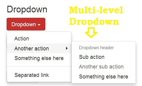
#3. Multi-level drop-downs should be avoided
Avoid multi-level drop-downs for three main reasons:
- It negatively affects SEO
- Users do not visit the parent page
- It’s really very annoying
Let’s start by talking about the first point.
So how does it affect SEO?
Basically, the programming which leads to the formation of a dropdown menu is not SEO friendly. This is because the search engines are not able to crawl through the pages in the dropdown, due to their programming.
Hence, loss in SEO rankings for those pages and related queries.
Now the next point.
When you have a drop down menu then in maximum situations the users will not visit the parent page. And will directly jump to the page of their choice. Thereby increasing the bounce rate of the parent page, which can negatively affect conversions from the parent page too.
Moreover, rolling the eyes through the dropdown menu is really annoying for users. This is because just when they made their mind to click on a parent page; there comes a drop-down.
Solution:
If you have more than 7 pages in a drop down then it’s better to use a descriptive mega drop-down menu or mega menu.
Group the pages under a parent page and then place them all in the mega menu.
An example of a grouped mega drop-down menu:
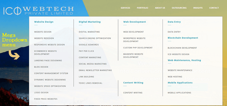
If you have many sub-pages under a parent page then introducing a mega-menu is the best option for your website.
#4. Avoid Multiple Categories or Pages in Your Navigation
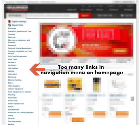
Having too many links or pages or categories in the navigation menu on the homepage is a very bad idea. This is mainly for two reasons:
- Too many items in navigation is bad for SEO
- Multiple items give a bad User Experience
Explaining Point 1.
As a general practice mostly homepage of a website is linked the most. And hence, the authority of the homepage is higher in search engines, as compared to the deeper pages. Moreover, the authority of your homepage is then passed to the internal pages, via the navigation.
Now, if your homepage has too many items in navigation, then this will ultimately mean too many links in the navigation. Therefore this will negatively affect the authority or the link juice passed from the homepage to the internal pages.
Result: the internal pages of your website will not rank higher or will not appear in search results.
An example to explain more:
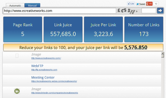 Image Credit
In the above example, it is very clearly evident that by reducing the total number of links on the homepage, the link juice passed to internal pages increases substantially.
Further, here are the number of links from some well-known quite big websites:
- SEOmoz – 75 links on home page.
- Amazon.com – approximately 200 links on home page.
- Wikipedia English language – 300 links, counting the links to the other language forms.
This is self-explanatory to the effectiveness of keeping the number of links on a home page as low as possible.
Read the Google Ranking factor to find out what factors induce a high rank in SERPs.
Explaining Point 2.
As per Classics in the History of Psychology on an average a user’s short-term memory is able to remember up to 7 items. This number can increase or decrease by 1-2 value, but on an average it is 7.
Therefore, if your website’s menu has more than 7 items, then consider grouping them under a suitable category.
Example:
 Image credit
In the above example the website designer has smartly created small groups of 4-7 items. Now these are fairly simple for a great User Experience. Because this menu is comparatively easy to scan and remember as opposed to a long list of items.
Furthermore, it’s best to avoid long lists even in groups as it is not user friendly.
#5. Avoid Random Ordering in the navigation menu
What to place in the beginning, middle and in the end is not just a random choice. Rather, it should be carefully calculated as per the data in your Google Analytics account.
Be careful about this most neglected website navigation mistakes of getting the items in the wrong order.
The items which are positioned in the beginning and at the end are supposedly the most important ones.
This is because…
…when a user land on your homepage, and rolls his eyes, the first and the last positions are the first to be scanned.
Moreover, the attention and retention by a user on a website is the maximum in the beginning and end positions. This analysis comes through the serial position effect, which also leads to the understanding of two effects:
- Primacy effect: Pages placed in the beginning of any list have more views and are easy to recall.
- Recency effect: Pages positioned in the end of a list have more probabilities of views and are easy to think of too.
Therefore;
As a best practice website navigation menu order, pages which have more views and are more important to the users should be placed in starting and ending positions.
#6. Website Navigation Mistakes on mobile
The biggest website navigation mistakes on a mobile are:
- A hidden menu, and
- Long confusing menu
Therefore the leading website designers insist on getting a responsive website design so that the menu appears in the correct form and order. And is completely visible to the users.
The most common form of Menu is displayed through a Hamburger Icon. It is basically three horizontal lines placed one above the other, giving it a kind of hamburger look.
Generally the hamburger icon is placed in the top right/left position of a website on mobile or tablet.
But unfortunately,
Some users have hard time figuring it out as the “navigation menu”.
Result: they get lost and take an exit from your website.
This mostly happens because the users do not enter mostly through the homepage of a website. Therefore, they would like to browse further to other pages. But cannot find their path to the required pages.
Hence,
It is recommended to make the hamburger icon more prominent or better add “Menu” next to the icon to make it easy for the users to understand.
Another very common mistake is the use of very long, un-grouped list of pages. This makes it very uncomfortable and confusing for the users to scroll through the list.
Therefore, make efforts to make a shorter, and grouped list of items in the navigation menu of a mobile website.
What next?
Now that you have identified the website navigation mistakes and the solutions to the, it’s time to work on fixing it. Ask your website designer to sit with your SEO expert and analyze the most visited pages from your Google Analytics account.
Then;
- add the most important pages to the beginning and end of the navigation menu,
- remove the non-critical pages from the navigation bar, and
- rename the important pages which have the potential of getting high conversions but are not getting clicks
- remove the multi-level dropdown from important parent pages
Once you have set the navigation menu in order, do not just set it and forget it.
Rather, wait to see if it’s getting you the desired results by reading your Google Analytics reports. And, if required make the changes to the navigation bar.
If you want a professional website designer to help you fix your navigation menu, then contact our website designing company in Delhi-India.